Wednesday, September 30, 2009

The Art History of Houston

Robert Boyd


There is apparently a catalog of the CAMH No Zoning show coming out (note to self: must get), and included in it is a chronology of Houston's art history since 1930. But, as the Chron tells us:

It includes an invaluable chronology of the Houston art scene's history since 1930 by Caroline Huber and the Art Guys. The chronology's meant to be updatable, too, since memories can be rusty and subject to revision. So the authors created a Wikipedia page "for participants to make additions and corrections or insert new information.
But when you go to the page, at least as this writing, here's what you find:
This page has been deleted. The deletion and move log for the page are provided below for reference. 17:06, 26 August 2009 RHaworth (talk | contribs) deleted "Houston Alternative Art" ‎ (A7: Article about an eligible subject, which does not indicate the importance or significance of the subject) (Peep, Douglas Britt, 9-29-2009)
 I don't know what's up with Wikipedia, but I will make an offer--The Great God Pan Is Dead will create a page for this chronology and update it as comments come in, if CAMH is interested! I would love to see a chronological history of Houston art and artists. (I wouldn't mind seeing the same for music and literature, too!)

Update: The Wikipedia page is now up, but with lots of caveats:

Enormous Forgotten Art Project

Robert Boyd

Back in 1987, Michael Galbreth (half of the Art Guys) co-created a human-shaped overlay on the City of Houston. He put down plaques where the hands, feet and head would be. All that remains is the right hand, which John Nova Lomax of the Houston Press recently rediscovered.


Here is how this project worked.
Using what were then top-of-the-line computers, Galbreth overlaid a human shape over the grid of the central inner loop. He then placed five plaques at the extremities - two hands, two feet, a head -- of this giant ersatz Houston-Human, along with over 150 blue silhouettes on the streets, to be used as guideposts. (Bounded by Cleburne, TSU, Alabama and the Cuney Homes, there also appears what could be interpreted by the more prurient among you as a little schlong.)

Would-be Human Tourists could go to the library or DiverseWorks's old HQ on Travis near the bayou and pick up a map which included a description and history of the project, detailed instructions on the scavenger hunt-like tour, and histories of the old Houston neighborhoods through which it passed.

"The tour is designed for people to see areas of the city with which they may not be familiar and get some sense of the neighborhoods," Galbreth said at the time, and indeed, back in 1987, there were vast areas of the Inner Loop that were Terra Incognita to polite West Side society. The Human Tour passed through most of them, including Second, Third and Fourth Ward and the Near North Side. While there are still a lot of Houstonians who have never been through some of those areas, the number is a lot smaller now that the Inner Loop has gotten so gentrified.

Galbreth reiterated to the Chron that his work was to be a permanent project. But this is Houston; nothing is permanent. He tells HairBalls that the plaque on Wichita Street and Austin in the Binz is the sole surviving relic of the Human Tour.

"Jack [Massing, the other half of the Art Guys] and I put those things down in a pretty permanent fashion. I think they've just been moved or stolen," he says. "I think people dig them up. Even though we set them in concrete, people can be very determined when they want to steal something." (John Nova Lomax, The Houston Press, 9/29/09) 
 Every now and then I get reminded again how lucky Houston is to have these guys here... What a great mostly forgotten piece of Houston art history. Here's the map:


It would have been great (if perhaps overly ambitious) to paint all the streets and building roofs bounded by that area white, so that the figure would be visible from space.

Friday, September 25, 2009

Bra Art -- Deadline September 26

I'm kind of late on the draw for this one, but there is a charity bra-decorating event coming up, but artists have to sign up for it tomorrow. The details are here. The downside is that there is a $50 entry fee (!). That goes to a breast cancer charity called The Save the Ta-Tas Foundation. (I'm not kidding.)  Some of the money will end up going to cancer research... How much, I don't know. Hopefully most of it.


For that fee, you get a a bra (which you have to pick up) and an instruction kit. The thing is, you need to sign up by tomorrow, and the bra is to be decorated by October 3.


http://charitychickshouston.com/bratober16.jpg
The bras themselves will be exhibited at a charity cocktail party at the Bering and James Art Gallery--it's called "Bratober" and is happe ning October 16. You can read more here.

Six Shows at Box 13 (plus extras!)

Robert Boyd

Last Saturday, I did a big art odyssey, hitting commercial galleries and non-profit spaces, and I was really unexcited by everything I saw. There were a few good pieces here and there (there was a nice Mark Greenwalt piece at Hooks-Epstien). But it was a mostly dispiriting experience.

That night, I planned to go to the Box 13 opening. I don't usually go to openings because I don't like to go to parties where I don't know people (which would be the norm at most openings) and it's hard to really look at the art at an opening. But my friend Matthew Guest was showing paintings there, so that solved the first problem. I'm very glad I went. The art (as you will see) was exceptional. I had a lot of fun. And if I had skipped the opening, I would have missed out on experiencing Carmen Flores's dresses as worn by human models. Flores has made old-fashioned glamorous ball-gowns out of newspapers and magazines. At the opening, she had a bunch of absolutely gorgeous models walking around, wearing the dresses, striking poses.


Carmen Flores, "One Night Stand," paper, etc., 2009

She used comics for this dress.


Carmen Flores, "One Night Stand" detail,  paper, etc., 2009


Carmen Flores, "One Night Stand," paper, etc., 2009


Carmen Flores, "One Night Stand," paper, etc.

Matt Guest is a painter who teaches up at Sam Houston State. I mentioned to him that Huntsville seemed kind of cool--a lot of good artists in the university art program, Dan Phillips and Phoenix Commotion, etc. Of course, Matt poo-pooed this notion, asserting instead that Huntsville was a depressing company town where most people work for the prison. Imagine the psychic weight of it... Still, his art is better than ever, so it can't be all bad.


Matthew Guest, "Double Barrel," acrylic on canvas, 2009

You see a kind of combination of Gary Panter and Sigmar Polke going on in his paintings.


Matthew Guest, "Broken Arrow", acrylic on canvas, 2009


Matthew Guest, "Thick Slice," acrylic on canvas, 2009

But what really strikes me is the horror vacui evident in his paintings. There is no place for the eye to rest. The parallel lines in the "background" doubly reinforce this--by being busy in and of themselves, and also having the effect of pushing the other elements into each other.

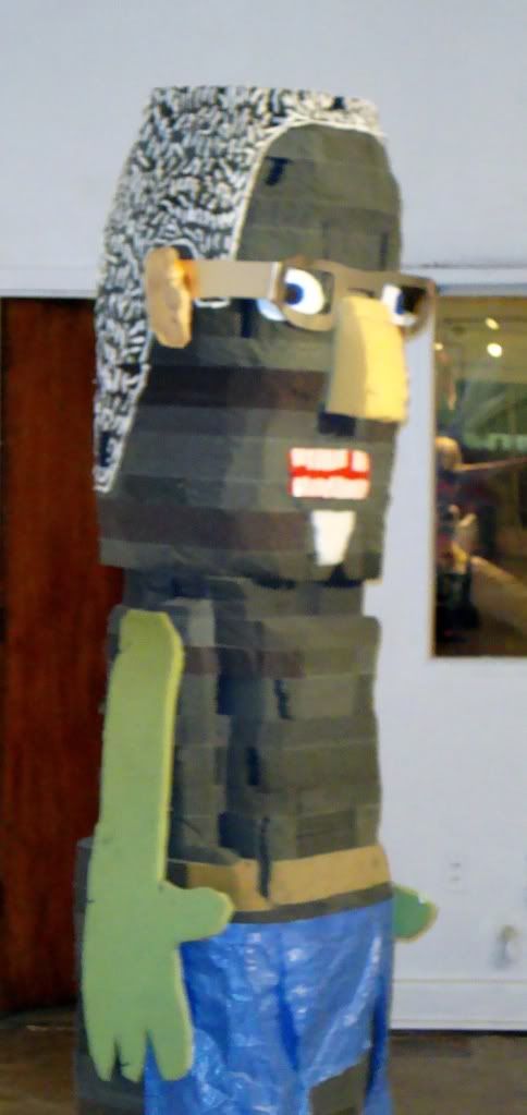
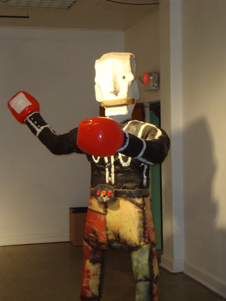
In the gallery behind Guest's was a display of sculptural figures assembled from crap by Glenn Downing.


Glenn Downing, Homemade Men and a Dog, mixed media, 2009

Downing 2
Glenn Downing, not sure the title, mixed media, 2009

They have various proportions, with painted clothes in some cases, and Mr. Potatohead assemblage concepts, as in the one above.

Downing 1
Glenn Downing, not sure the title, mixed media, 2009

They don't appear to be completely assemblage--there is some carving going on. Oh, and they are slightly larger than life-size, which makes them mildy menacing.

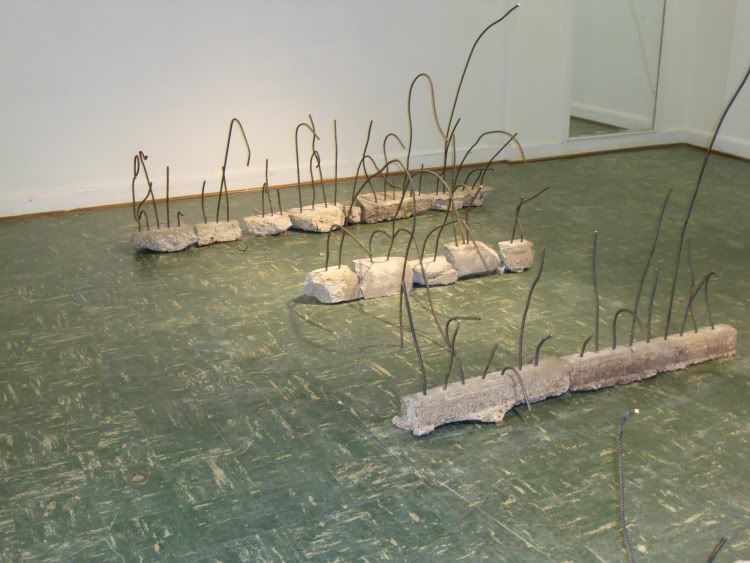
Then upstairs, there was an installation with wall art, three-dimensional objects and sound by Renata Lucia. Somehow the various elements were meant to relate to specific hurricane seasons, but I didn't really quite get that. What I liked were the twisted rebar and concrete, laid out in neat rows. It just looked beautiful, with beautiful curves.

Lucia 2
Renata Lucia, "The Sky Has No Memory," mixed media installation, 2009

Kuo
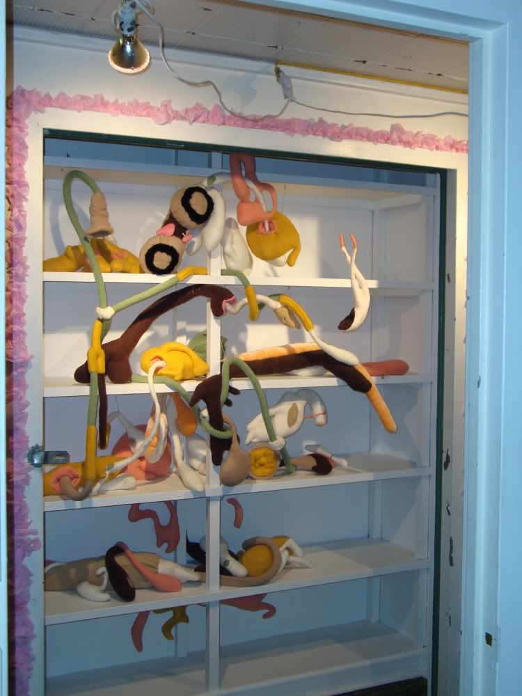
Alison Kuo, "Bawdy Issues," stuffed fleece, 2009

They gave Alison Kuo just a closet for her work, and she turned it into a perverse biology exhibit, like a 19th century specimen cabinet, but made of plush fucking alien lifeforms. I was too shy to touch them on opening night, but I think that was the intent--you can rearrange the exhibit so that different extensions are penetrating different orifices. I like it a lot, but the punning title is a bit too much.

Kantor 2
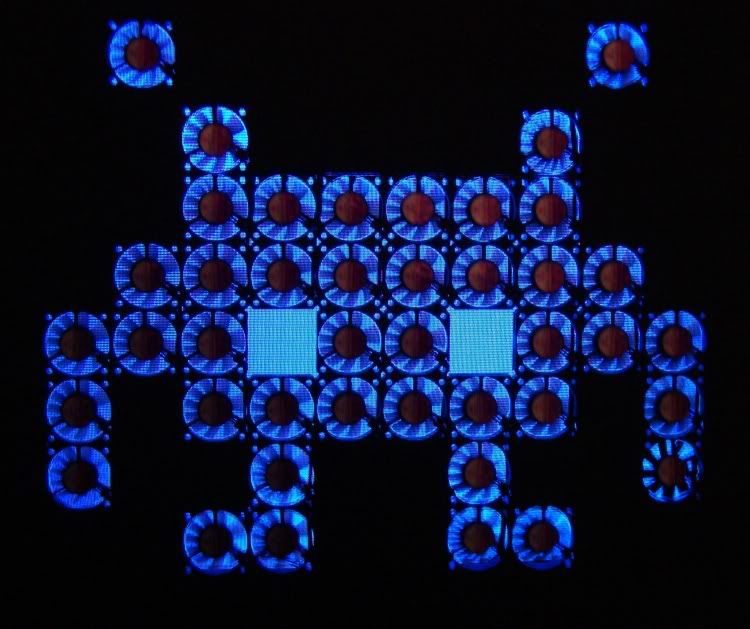
Barna Kantor, "Space Invader", video screen, fans, etc., 2009

This space invader is made of 42 small square fans, like the kind that come with your desktop computer to keep the circuits from overheating. Kantor has it rigged so that they are all running--in this picture, you see multiple blades because they are getting caught by the flicker of the TV screen. I don't know what this was all about, but I liked it because it seemed like a warm and loving depiction of our old implacable enemy.

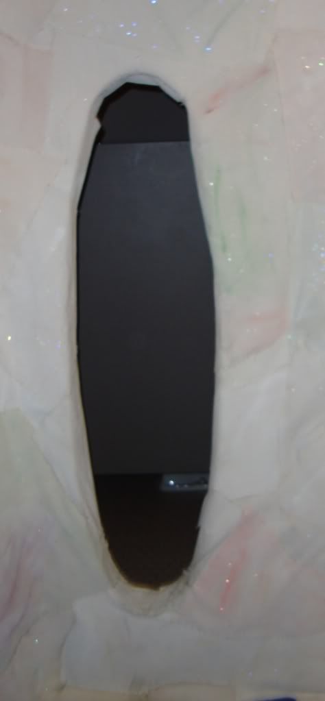
Speaking of orifices, I'm embarrassed to admit I don't know what this next installation is called. It wasn't one of the "official" openings of the night. But like Alison Kuo's, it was sewn and sexual. It required that you enter through a small orifice. Update: This room is called "My Weltanschauung: Sentient Memory Reified," created by Whitney Riley, with sound design by Doren Bernard.

Riley 2
Whitney Riley (with sound by Doren Bernard), "My Weltanschauung: Sentient Memory Reified", sewn canvas

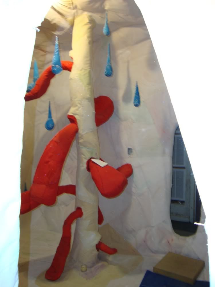
There was another orifice on the other side of the room. Inside the room, the walls and floor and ceiling were covered with sewn, painted canvas.

Riley 3
Whitney Riley (with sound by Doren Bernard), "My Weltanschauung: Sentient Memory Reified", sewn canvas

Riley 1
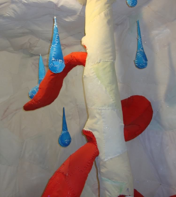
Whitney Riley (with sound by Doren Bernard), "My Weltanschauung: Sentient Memory Reified", sewn canvas

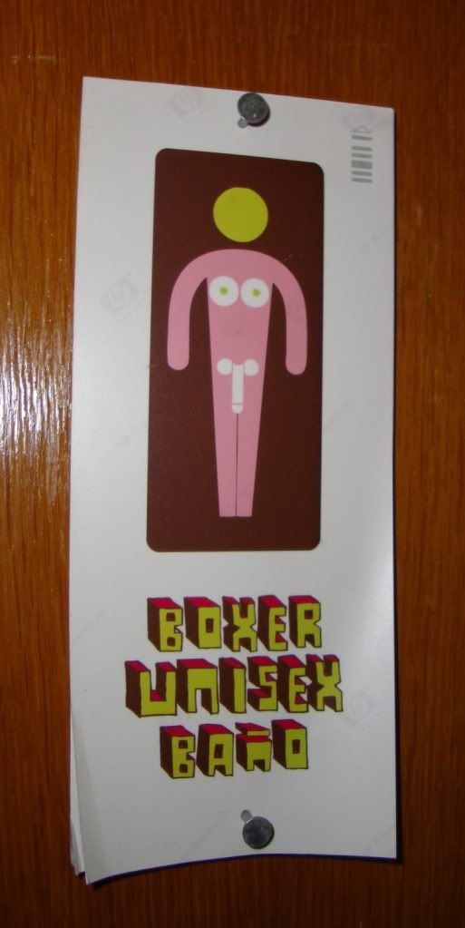
The tongues and droplets and the total surroundingness of the environment made me think of some of the surreal science fiction novels of the sixties and seventies for some reason. It was deliciously trippy. After you squeeze through the second orifice, you end up in a bathroom. Here is the bathroom sign:

bathroom sign

That deserves to be credited, too. It's fantastic funny design. If someone knows who made this sign and installation, please contact me. Update: This sign was designed by Kathy Kelley.

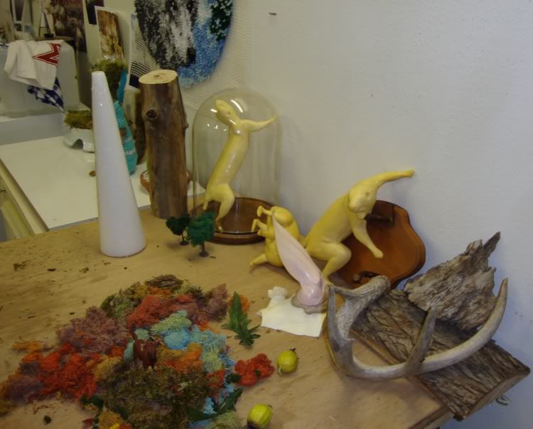
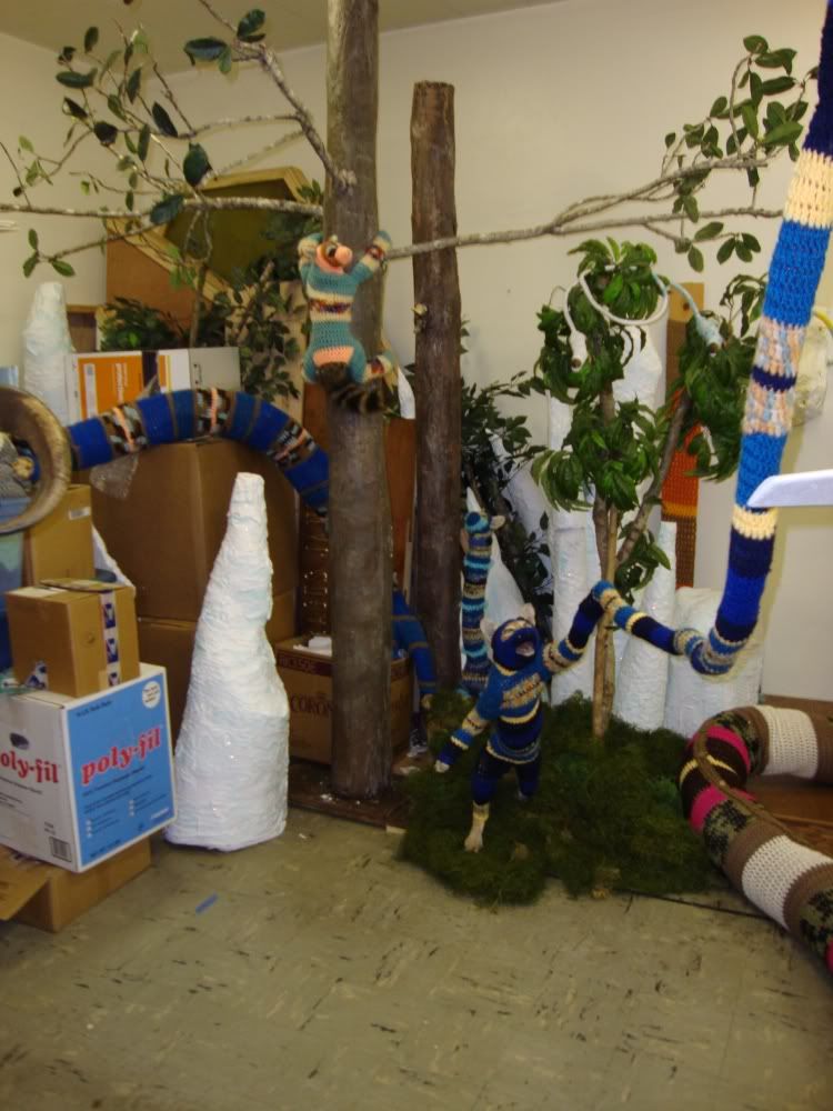
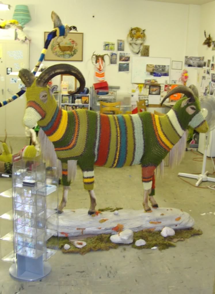
One final space I wandered into, even though it wasn't part of the exhibit, was Elaine Bradford's studio. It was open, so I assume it was OK. I hope so!

Bradford 3
Elaine Bradford's studio

I love the taxidermy forms on the table. It is interesting to imagine her putting a skin on the form, then knitting a second skin over the first skin...

Bradford 2
Elaine Bradford's studio

Bradford 1
Elaine Bradford's studio

Box 13 is fantastic. See these exhibits, please!

Sunday, September 20, 2009

Lawn Art Alert

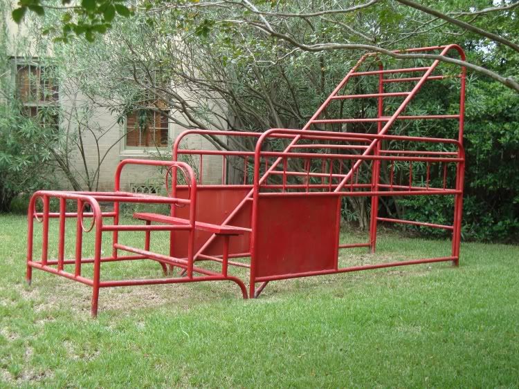
I am always looking for lawn art, which I define as sculpture in the lawns of private residences. It can be in the front yard or back yard, but it has to be visible by me without any trespassing. This one is 1836 Sunset Blvd.

Lawn Art on Sunset

If anyone knows anything about this sculpture, or any of the other lawn art I have found, please let me know!

Here is a map of the lawn art I have identified so far.

View Lawn Art in a larger map

Monday, September 14, 2009

Open Season

Robert Boyd

This weekend was the beginning of the "new season" for art. I'm not sure what that means--there were plenty of gallery shows this summer. I know in New York, well-to-do collectors head out to their summer homes, so the art industry, which is a consumer luxury item industry after all, slows down. For example, there is usually only one issue each of Art in America and Artforum in the summer. But why this should apply to Houston, I don't know.

Be that as it may, tons of shows opened in Houston last week. I only went to one opening (opening parties are not a good way to look at art). But I went to a few galleries after opening nights, however.

Diverse Works season opening show '"Now that I'm by myself," she says, "I'm not by myself, which is good."' is almost all video. I have no problem with video or film as an art-form. But I hate seeing video in a gallery. It is just not an environment conducive to watching video or film. Video (generally) demands your time. If you are going to get anything useful out of a video, you need to sit still and watch it unfold for whatever its length is. And that can be a challenge, especially if the video is perplexing, hermetic, outside your comfort zone--which is what art video mostly is.

There's a reason movie theaters are the way they are. You sit in a comfortable seat--that helps a lot while you watch two hours of film (or eight hours, if you are watching Our Hitler). The theater is dark, so it concentrates your attention on the projected image. And, perhaps most importantly, you can only see one movie at a time at a movie theater. You don't have two movies showing simultaneously, their blaring soundtracks competing in your ears for attention.

So Diverse Works for this show was the exact opposite of a movie theater--no comfy chairs, no darkened room, multiple videos (and soundtracks!) playing all at once.

I will mention the work of Laurel Nakadate. Her videos got my attention for all the wrong reasons: she is beautiful and gets naked in many of them. But they were definitely uncomfortable--she seemed to star with a bunch of weird older men, some who pretended to brutalize her or murder her, some on whom she held toy guns, instructing them to beg for mercy. The men were good sports--acting ability wasn't at a premium, and there was a lot of giggling as the dudes said things like, "Please don't kill me!"

 
Laurel Nakadate, "Beg for Your Life" still,  video, 2006

But for the most part, I just couldn't connect with the material I was seeing. That, if anything, is my main complaint about a lot of the new shows I saw this weekend. Peel Gallery, new art from Mexico City--it was just a jumble of brightly-colored faux-naif stuff. None of it felt particularly original (not a sin by any means), engaging, or memorable. The flower art up at the Barbara Davis Gallery were so forgettable that I had to look the show up to remember what I had seen there. (Still, flowers--they'll probably sell and for a commercial gallery, that's what counts.)

I had never been to CNTRL Gallery before--they had three artists up. One who was doing some kind of intervention on newspapers, making them hazy, washed-out, and unreadable; one who made rather unexciting 3-D fabric sculptures; and one who did what appeared to be severe, early-Frank-Stella-like abstractions made from carpet remnants.
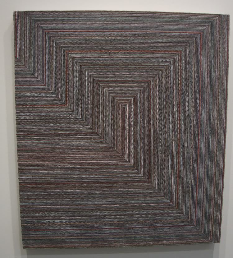
Grey Red Pink
Sasha Pierce, grey red pink, oil on canvas, 2009

But I took a closer look at Sasha Pierce's work--a lot closer.
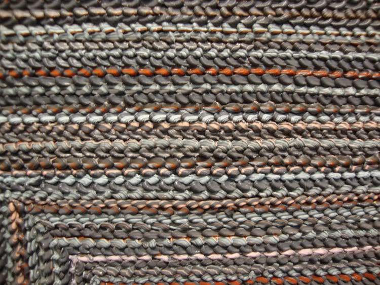
Grey Red Pink detail
Sasha Pierce, grey red pink detail, oil on canvas, 2009

This is not carpet--it's paint. How the hell did she do that?! Still, her paintings look like they were made with industrial no-stain carpet. She has accomplished something amazing in her technique, and used it to make some pretty boring paintings.

At least good old Dawolu Jabari Anderson came through. He had a show at Joan Wich of his giant comic book cover paintings and his drawings. His drawings are weak tea, obviously copied from other drawings or photographs, without any indication of drawing mastery. But his paintings are fun, pastiches of Jack Kirby comics covers but starring an "Aunt Jemima"-style character called Mam-E.
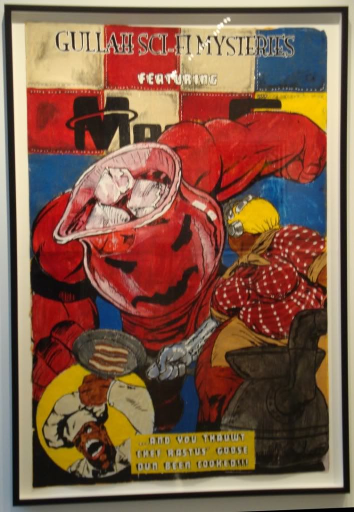
Pig Knuckles
Dawolu Jaban Anderson, "Pig knuckles served with a punch?", latex, acrylic and ink on paper, 2009

Amazing that I saw two pieces of art featuring the Kool-Aid man this weekend. One more and it'll be a trend.
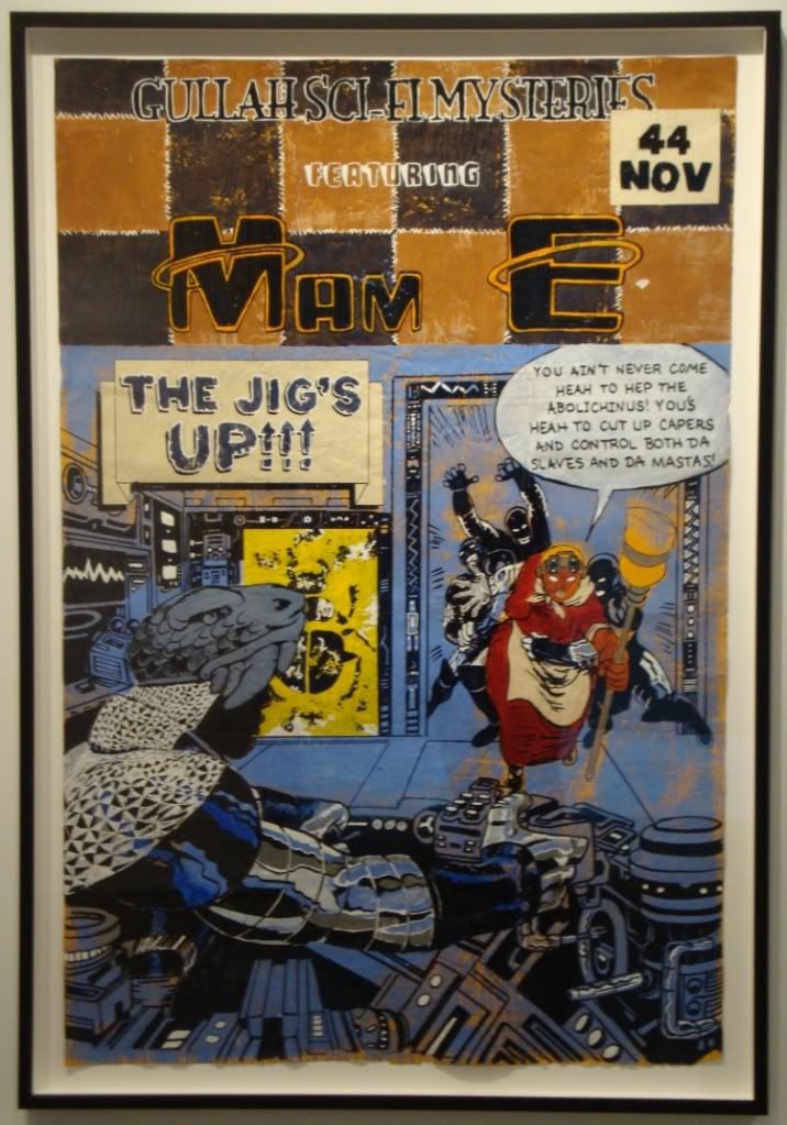
 The Jig's Up
Dawolu Jaban Anderson, "The Jig's Up", latex, acrylic and ink on paper, 2009

In the end, I think these paintings are sort of trivial, and I think riffing on Kirby creates a kind of incoherence and is a substitute for having an original idea. But even as I write those words, they seem too harsh for these humorous, likable works. (Sorry for the lameness of my photos. They always look pretty sharp when I take them. Consider it an inducement to go see the pieces in the flesh--or at least check them out on the Joan Wich website.)

One show I liked a lot even though I had low expectations was the "Collected Works" show at Inman Gallery.  The gallery is celebrating its 20th anniversary, so it put on a show of various pieces by a bunch of different artists that had been borrowed from collectors who originally bought them from Inman. I could see how this would be a way for a gallery to pat itself on the back, but it also seemed a little contrary to mission of a contempary art gallery--to bring new work to a public of potential and existing buyers. My objection was a bit abstract, I'll admit. And it went away as soon as I saw the work. It was a jumble--too many different pieces in different styles. But there was so much there that was really good that you can safely dismiss my initial reservations.
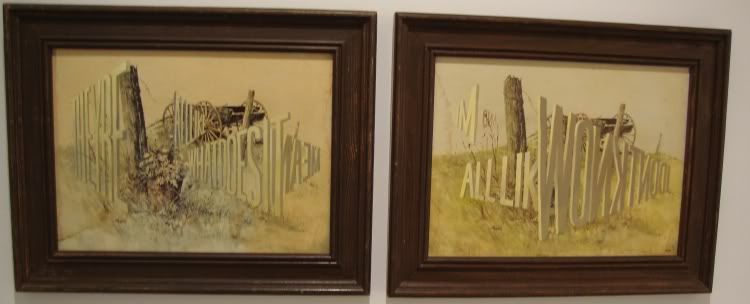
Wayne White 1
Wayne White, "They're All Like What Does It mean and I'm All Like I Don't Know," acrylic on framed lithographs, 2003

For one thing, I got to see a Wayne White word painting up close. This two-part painting is quite small and has a totally different presence than "Big Lectric Fan to Keep Me Cool While I Sleep." It's nice to be able to see this side of his work while the other big installation is up just a few blocks south.
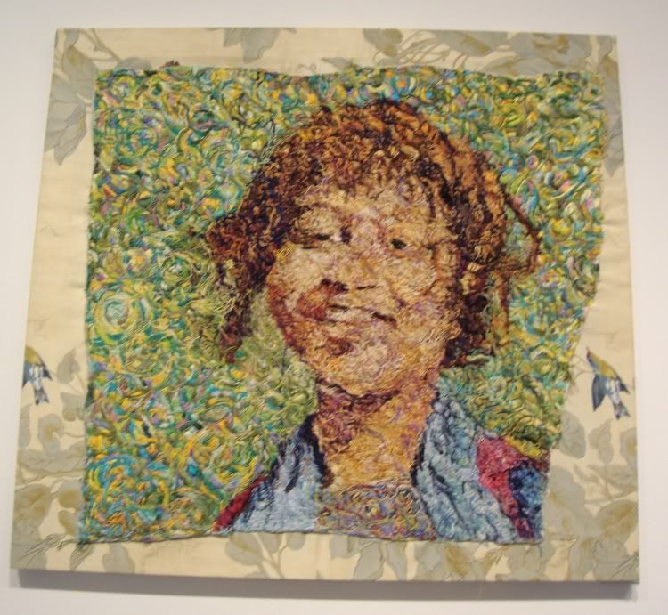
Beth Secor
Beth Secor, "Girl, Around 1938," embroidery on textile, 2008

I only really know Secor from her snarky, funny Glasstire columns. But I love this art! This is a piece that like Sasha Pierce's rewards looking close. Obviously Secor labored mightily to make this--embroidery is not a fast art. And yet it looks so expressive, so sketchy, so spontaneous. The colors are great, and it's great to see how she achieves her color effects by layering different colored threads.
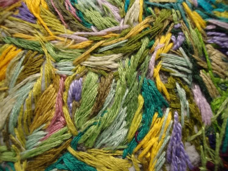
Beth Secor detail
Beth Secor, "Girl, Around 1938" detail,  embroidery on textile, 2008
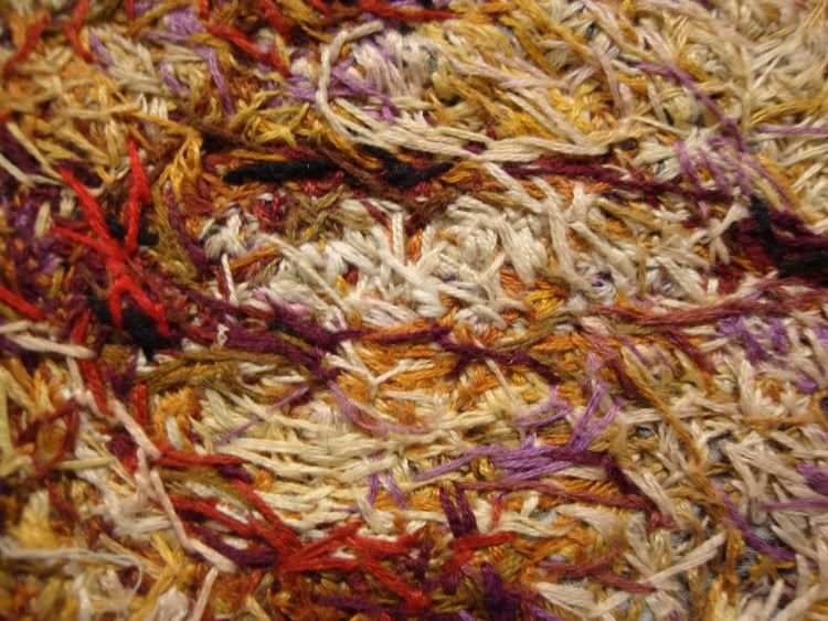
Beth Secor detail 2
Beth Secor, "Girl, Around 1938" detail,  embroidery on textile, 2008

I also liked this extremely detailed realistic domestic painting (below), especially trying to figure out what that thing in the middle of the room is. It feels vaguely menacing.
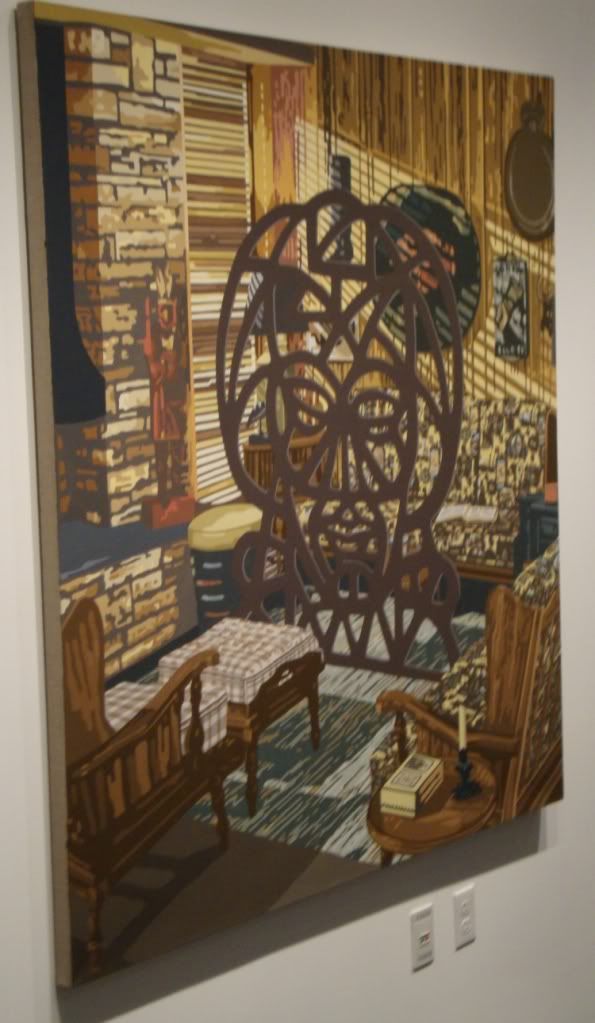
Blinds
Jim Richard, "Blinds," oil on linen, 2009

There were many other interesting pieces at the Inman--definitely worth checking out.

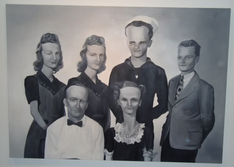
Finally, I went to The Joanna for their secret Saturday sale. I met Cody Ledvina who showed me around and told me a little about their evolving philosophy of pricing the art. Almost everything was under $200--apparently this approach was decided on after they drastically overpriced the art at the I Love You Baby show in July.The big exception were two huge canvases by Cheyenne Ramos (who normally shows at Joan Wich).
Cheyenne ramos
Cheyenne Ramos, don't know what this one is called...

Her paintings were definitely my favorites of the show there. The Joanna is a house where Mr. Ledvina lives that he rents from The Menil Foundation. They clear out the living room for the occasional exhibit. The Joanna can't put a sign out front (part of the lease agreement), but they are pretty sure that the Menil knows what they are doing.

That is all for this past weekend--but there are still plenty of shows that have just opened that I haven't seen yet. So look for more next week...

Sunday, September 13, 2009

Recent Aquisition: Green by News

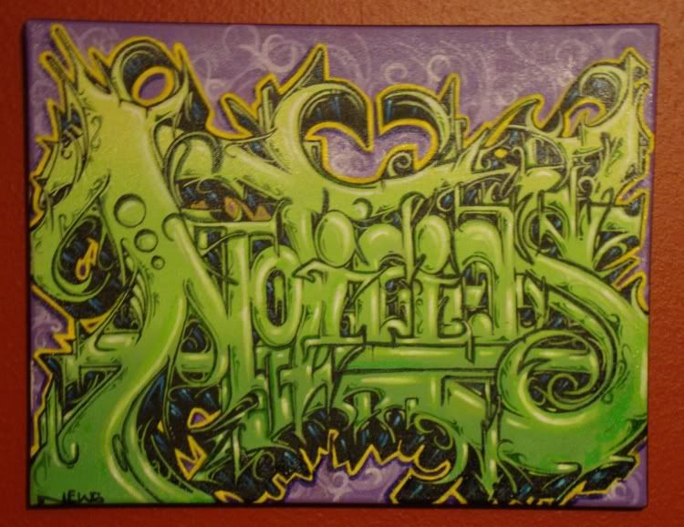
Last month I went to a show at the Aerosol Warfare gallery called Pieced Together. While I was there, I bought a small acrylic painting by a graffitist who goes by the name "News." I picked it up yesterday.
Green by News
News, Green, acrylic on canvas, 2009

News is from San Antonio and is in his early 30s, and that's all I know about him. (He's impossible to Google!)

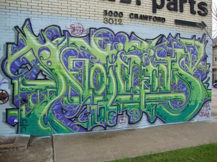
The owner of Aerosol Warfare told me that the artists in Pieced Together had decorated a building on Crawford, and that News had done a mural-sized version of "Green" there. So I went and took a photo.

News Wall Piece
News, Green, spraypaint on a wall, 2009

This building, which houses a business called X.L. Parts,  is absolutely amazing--it's well worth a walk-around.(It's where the green arrow is on the map below.)


View Larger Map

Props to XL Parts for being unbelievably good sports!

Saturday, September 12, 2009

Poke and Topiary Text Lead

With a name like "Topiary Text Lead," you know you are going to see a show that makes you say "huh?" I'm sure this title means something to the curator, but it comes off as a nonsense phrase, three random unrelated words. This show is up at Space125 Gallery, which is a space for artists who receive individual artist fellowships from the Houston Arts Alliance. Given that the criterion for being exhibited is that you have a grant from the parent organization, the incoherent title makes more sense. These artists really have nothing in common, and lumping them together doesn't do any of them any favors. If I saw some of them in different contexts, I might like the work better.

The exception is Kia Neill (who did "Stampede" at Box 13), and she manages to avoid the incoherence of the rest of the show by having work that necessarily has be separated from the other work. She is the only sculptor in the show, and in this show works with pieces of velvet. So they are laid flat on little plinths, instead of jumbled together on the walls with the other art.

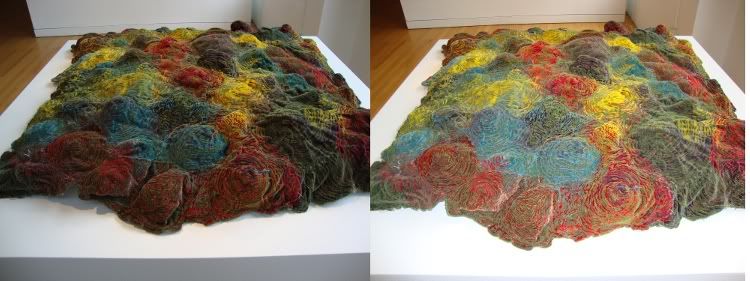
The work was in this over-bright exhibition space, but I noticed when I took a flash photo of one of the pieces how different it would look under different light. The velvet really catches light.

untitled
Kia Niell, Untitled (Multicolored Velvet), velvet, thread, polyester fibers, left--ambient light, right--flash photo

I know it looks like the flash is just washing out the colors, but what is actually happening here is that the little ridges in the piece are catching light that in the un-flashed photo are in shadow. The point I'm making is that you could get startling effects with this piece by putting spotlights on it from different angles. I assume that's intentional, but even if it's not, I like it. (Of course I really just wanted to rub my hands on this piece, but as a good citizen, I restrained myself.)

After I left Space125, I went over to FotoFest. I didn't have high hopes for Poke because of the theme--social media. First of all, most "media" art in galleries kind of bores me. A gallery is just not a good place to watch a video, for example. (Obvious exceptions would be pieces by Tony Oursler or Nam June Paik, whose work is simultaneously sculpture and video.) Second, an art show about social media just sounds like an attempt for a gallery to latch itself onto the latest cool thing. So no expectations going in.

Was I wrong--this show was great fun. The art is likely to have a shelf-life of five minutes, but for those five minutes, I loved it. You walk in and projected on the wall is a grid of hundreds of first person YouTube statements. Of course it is a cacophony of "information"--literally like watching a thousand YouTube videos of people speaking to the camera all at once. But it was so cool to look at. This piece was by Christopher Baker, but in a way, it was also by his many, many unwitting collaborators. And really, it's the unwitting collaborators that make these pieces so fun.

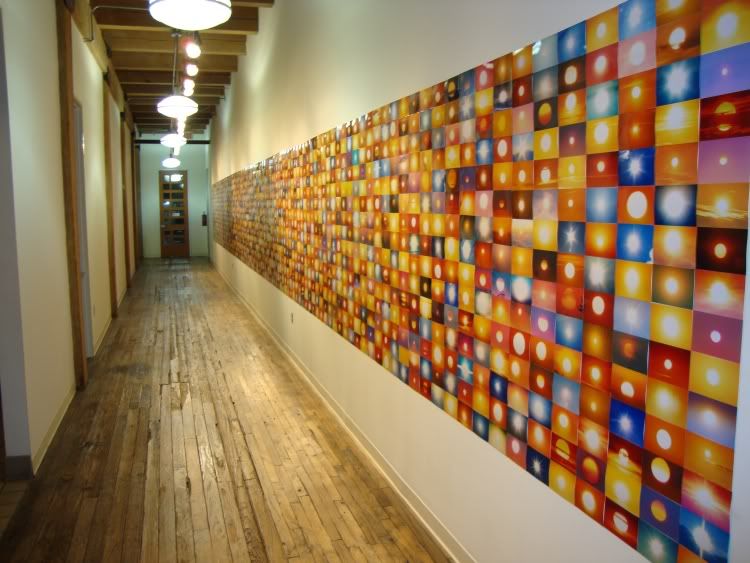
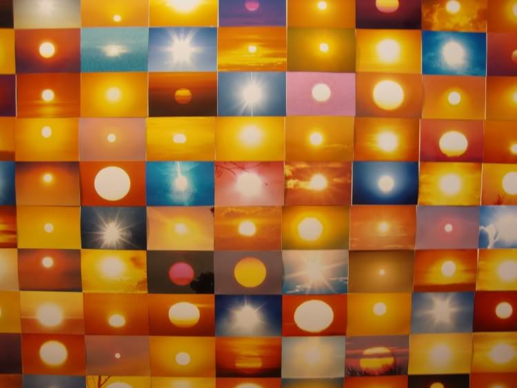
Suns From the Internet
Penelope Umbrico, Suns from the Internet, 2008-2009

Penelope Umbrico's "Suns from the Internet" couldn't exist without unwitting collaborators. What Umbrico did here was to type the word "sun" into Flickr's search engine, download the many (thousands!) of photos of sunsets, sunrises, sunny skies, etc., crop them so just the sun is showing, print them out and make this utterly fantastic mosaic.

Suns from the Internet detail
Penelope Umbrico, Suns from the Internet detail, 2008-2009

Aside from looking great, it made me think about how important the sun is to us humans. Not just in the obvious way that we wouldn't exist without it (indeed, the existence of life and civilization on this planet can be seen as an accidental result of the birth of this particular star), but that we all have a kind of personal relationship with it. Not too many of us worship it as a god these days, but we still pay technological tribute to it as if we did.

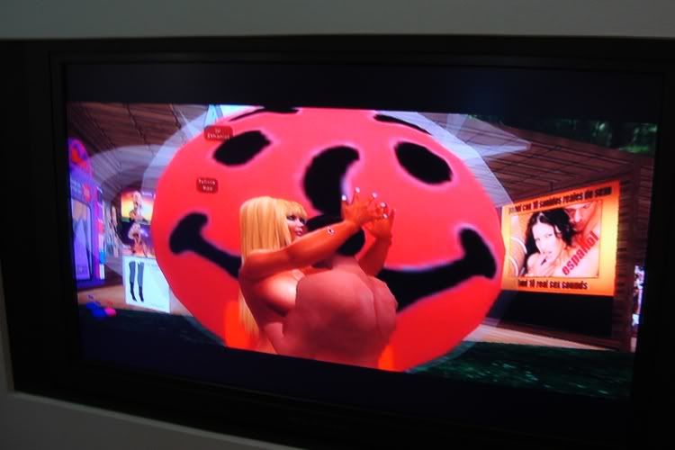
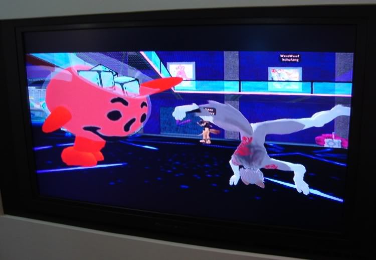
Jon Rafman's piece "Kool-Aid Man iSecond Life" hardly even seems like a work of art. It's more along the lines of a collection of prank calls. I don't mean to put it down, because really it's hugely entertaining. What he did was somehow create a Kool-Aid man avatar for himself, and then went into Second Life to see what kind of weird or cool stuff he could encounter--interesting avatars, weird landscapes, violence, sex, furries, etc.

Kool-Aid man and sexy couple
Jon Rafman, Kool-Aid Man iSecond Life detail, digital video, 2009

(Let's see if PhotoBucket lets me keep that image up.)

Kool-Aid Man dancing
Jon Rafman, Kool-Aid Man iSecond Life detail, digital video, 2009

So Rafman is sort of being a tourist in other people's weirdness. And that is awesome -- crash-through-a-brick-wall awesome.

There were other pieces in the show I liked--but you should get yourself downtown and check them out yourself. I have to admit that some of them looked like they might be interactive, but I couldn't figure out how to interact.  Whatever. I liked enough of this show to recommend it without reservations.

Rice University Should Have an Art Museum

Rice University is my alma mater (classes of 1992 and 2008). Any old owl who gets repeated dunned by the university knows that Rice has been in a construction orgy. Seriously, just in the past couple of years, Rice has built two new colleges (Duncan and McMurtry--this new class is the largest freshman class in Rice history), a new gym, a new student hangout place, the "Collaborative Research Center" and I don't know what else. And more stuff is on the drawing board. I don't know what the endowment is now post-crash, but in 2007 it was $4.67 billion. And yet they keep asking alums like me for money, and like a sucker I give it to them. (I feel like I am giving charity to rich people whenever I do.) They should spend some of this money on a museum.

(Actually, Rice should first spend its money on many more need-based scholarships and living allowances, as well as spending a big sum on outreach to working class and poor students in the Houston region through mentoring and tutoring, including the construction and operation of K-12 charter schools in HISD and Aldine ISD. But once Rice has done all of those things, it should build an art museum.)

Now Rice has its gallery, where they put up lots of cool installations (like the Wayne White installation that is there now). Some of you may recall that their used to be an institution called the Rice Museum. It was in one of the two metal buildings at the corner of Stockton and University. The story I heard was that when the Menils had a falling out with the University of St. Thomas, they essentially funded Rice's art and art history department, bringing a bunch of professors over, and building these two buildings, one for media (film and photography when I was an undergrad), and one a museum. It was at the Rice Museum that Ed Kienholz had his show on campus, and that's where I met him. Apparently it held some of the Menil's collection, but this was just a holding action until they could build their own museum. Now the old Rice Museum is the Martel Center for Continuing Studies.

Rice's museum should not be the whim of some rich person. It needs to be something with the university itself as the prime mover. (Which is not to say that rich alums can't be involved.) It could be built between the Baker Institute and the Shepherd School, closing off that awkward space into a neat quadrangle (where the new James Turrell piece is going). But there are other places on campus where it could reside.

What kind of museum should it be? My first impulse is that it should not be devoted to contemporary art. Not because I have anything against contemporary art (obviously), but Houston already has a lot of venues for contemporary art (CAMH, Lawndale, Diverse Works, the Station Museum, Project Row Houses, Box 13, many commercial galleries, etc.). That said, none of these institutions is collecting contemporary art. So perhaps that could be the function of the Rice Museum. (I assume that the MFAH is collecting some contemporary art as well, but obviously that is not its primary function.) Or it could pick some very specific art--regional art, art from a particular period or in a particular style or of a particular type of artist. Like a museum of Texas art. A museum of 19th century American art. A museum of naive or "outsider" art. A museum of comics art (obviously this one would appeal to me a lot). Whatever Rice chooses, it should be something that isn't well-covered by already existing Houston museums and institutions.

Any thoughts out there about a Rice Museum?

Friday, September 11, 2009

Whatever Happened to Mimi Pond?

As I mentioned in my previous blog post, one of the startling facts about Wayne White is that he is married to Mimi Pond. Mimi Pond was a cartoonist whose work I sort of lumped in with the new wave cartoonists of the early 80s--it looked a lot like Lynda Barry's. When I told Wayne White I was a comix fan, he said I should introduce myself to Mimi Pond. So I did.

I mentioned to her that she was one of those cartoonists I had lost track of, but she informed me (politely) that far from being one of those people who stopped cartooning, she kept doing books for awhile, and recently did work for the L.A. Times. Maybe this is common knowledge, but it was definitely news to me.


(cartoon from June 17, 2011)

I had no idea. I knew she had written the first episode of The Simpsons (pretty cool credit to have on your resume, I must say!). But aside from that, I didn't know what she had done since the '80s, or anything about her. (One exception--she makes a fictionalized appearance in David Chelsea in Love as "Lily Pad." And no, I didn't ask her about it.)


"Lilly Pad" from David Chelsea in Love


Mimi Pond at the opening of "Big Lectric Fan to Keep Me Cool While I Sleep"

Not only has she not stopped doing comics, but she is 1) going to be in the Best American Comics 2009 (Charles Burns is the guest editor this year), and 2) even more exciting, is working on a graphic novel called Over Easy. And you can read a big chunk of it on her blog!

http://mimipond.typepad.com/photos/over_easy/over_easy_page_13.jpeg  
Over Easy page 15 by Mimi Pond

The early to mid-80s were a really important time for me as far as comics goes. The quality of the new work coming up then and the evident excitement and energy of the cartoonists really hooked me for life. So it's really exciting that someone whose 80s work I read and enjoyed is coming back strong. I can't wait to read Over Easy when it's published.