Robert Boyd
This weekend was the beginning of the "new season" for art. I'm not sure what that means--there were plenty of gallery shows this summer. I know in New York, well-to-do collectors head out to their summer homes, so the art industry, which is a consumer luxury item industry after all, slows down. For example, there is usually only one issue each of
Art in America and
Artforum in the summer. But why this should apply to Houston, I don't know.
Be that as it may, tons of shows opened in Houston last week. I only went to one
opening (opening parties are not a good way to look at art). But I went to a few galleries
after opening nights, however.
Diverse Works season opening show '"Now that I'm by myself," she says, "I'm not by myself, which is good."' is almost all video. I have no problem with video or film as an art-form. But I hate seeing video in a gallery. It is just not an environment conducive to watching video or film. Video (generally) demands your time. If you are going to get anything useful out of a video, you need to sit still and watch it unfold for whatever its length is. And that can be a challenge, especially if the video is perplexing, hermetic, outside your comfort zone--which is what art video mostly is.
There's a reason movie theaters are the way they are. You sit in a comfortable seat--that helps a lot while you watch two hours of film (or eight hours, if you are watching
Our Hitler). The theater is dark, so it
concentrates your attention on the projected image. And, perhaps most importantly, you can only see one movie at a time at a movie theater. You don't have two movies showing simultaneously, their blaring soundtracks competing in your ears for attention.
So Diverse Works for this show was the exact opposite of a movie theater--no comfy chairs, no darkened room, multiple videos (and soundtracks!) playing all at once.
I will mention the work of Laurel Nakadate. Her videos got my attention for all the wrong reasons: she is beautiful and gets naked in many of them. But they were definitely uncomfortable--she seemed to star with a bunch of weird older men, some who pretended to brutalize her or murder her, some on whom she held toy guns, instructing them to beg for mercy. The men were good sports--acting ability wasn't at a premium, and there was a lot of giggling as the dudes said things like, "Please don't kill me!"
 Laurel Nakadate, "Beg for Your Life" still, video, 2006
But for the most part, I just couldn't connect with the material I was seeing. That, if anything, is my main complaint about a lot of the new shows I saw this weekend.
Peel Gallery, new art from Mexico City--it was just a jumble of brightly-colored faux-naif stuff. None of it felt particularly original (not a sin by any means), engaging, or memorable. The flower art up at the
Barbara Davis Gallery were so forgettable that I had to look the show up to remember what I had seen there. (Still,
flowers--they'll probably sell and for a commercial gallery, that's what counts.)
I had never been to CNTRL Gallery before--they had three artists up. One who was doing some kind of intervention on newspapers, making them hazy, washed-out, and unreadable; one who made rather unexciting 3-D fabric sculptures; and one who did what appeared to be severe, early-Frank-Stella-like abstractions made from carpet remnants.
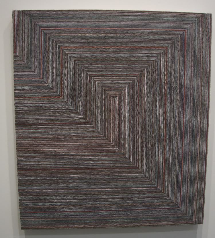 Sasha Pierce, grey red pink, oil on canvas, 2009
But I took a closer look at Sasha Pierce's work--a
lot closer.
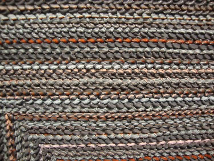 Sasha Pierce, grey red pink detail, oil on canvas, 2009
This is not carpet--it's paint. How the hell did she do that?! Still, her paintings
look like they were made with industrial no-stain carpet. She has accomplished something amazing in her technique, and used it to make some pretty boring paintings.
At least good old
Dawolu Jabari Anderson came through. He had a show at
Joan Wich of his giant comic book cover paintings and his drawings. His drawings are weak tea, obviously copied from other drawings or photographs, without any indication of drawing mastery. But his paintings are fun, pastiches of
Jack Kirby comics covers but starring an "Aunt Jemima"-style character called Mam-E.
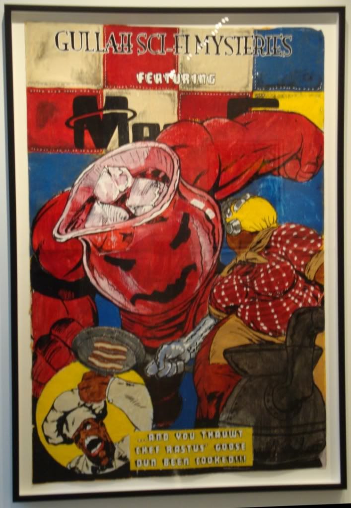 Dawolu Jaban Anderson, "Pig knuckles served with a punch?", latex, acrylic and ink on paper, 2009
Amazing that I saw
two pieces of art featuring
the Kool-Aid man this weekend. One more and it'll be a trend.
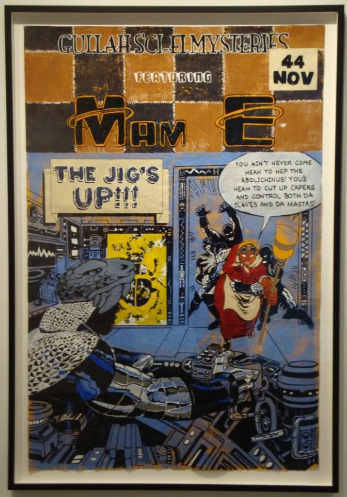 Dawolu Jaban Anderson, "The Jig's Up", latex, acrylic and ink on paper, 2009
In the end, I think these paintings are sort of trivial, and I think riffing on Kirby creates a kind of incoherence and is a substitute for having an original idea. But even as I write those words, they seem too harsh for these humorous, likable works. (Sorry for the lameness of my photos. They always look pretty sharp when I take them. Consider it an inducement to go see the pieces in the flesh--or at least check them out on the
Joan Wich website.)
One show I liked a lot even though I had low expectations was the "Collected Works" show at
Inman Gallery. The gallery is celebrating its 20th anniversary, so it put on a show of various pieces by a bunch of different artists that had been borrowed from collectors who originally bought them from Inman. I could see how this would be a way for a gallery to pat itself on the back, but it also seemed a little contrary to mission of a contempary art gallery--to bring new work to a public of potential and existing buyers. My objection was a bit abstract, I'll admit. And it went away as soon as I saw the work. It was a jumble--too many different pieces in different styles. But there was so much there that was really good that you can safely dismiss my initial reservations.
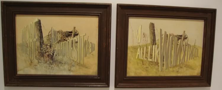 Wayne White, "They're All Like What Does It mean and I'm All Like I Don't Know," acrylic on framed lithographs, 2003
For one thing, I got to see a
Wayne White word painting up close. This two-part painting is quite small and has a totally different presence than "Big Lectric Fan to Keep Me Cool While I Sleep." It's nice to be able to see this side of his work while the other big installation is up just a few blocks south.
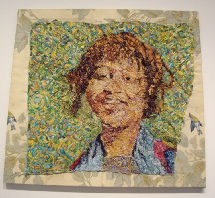 Beth Secor, "Girl, Around 1938," embroidery on textile, 2008
I only really know Secor from her snarky, funny
Glasstire columns. But I love this art! This is a piece that like Sasha Pierce's rewards looking close. Obviously Secor labored mightily to make this--embroidery is not a
fast art. And yet it looks so expressive, so sketchy, so spontaneous. The colors are great, and it's great to see how she achieves her color effects by layering different colored threads.
 Beth Secor, "Girl, Around 1938" detail, embroidery on textile, 2008
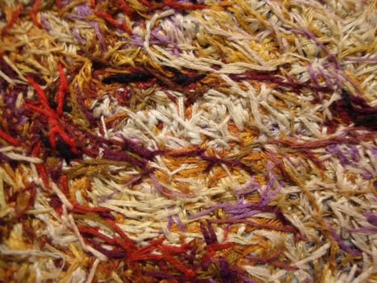 Beth Secor, "Girl, Around 1938" detail, embroidery on textile, 2008
I also liked this extremely detailed realistic domestic painting (below), especially trying to figure out what that
thing in the middle of the room is. It feels vaguely
menacing.
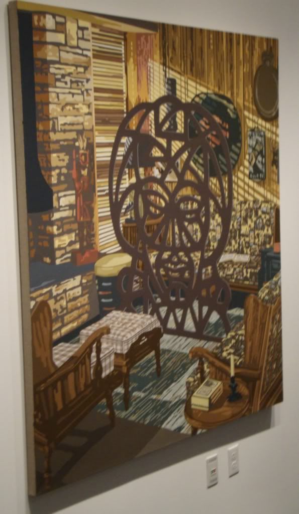 Jim Richard, "Blinds," oil on linen, 2009
There were many other interesting pieces at the Inman--definitely worth checking out.
Finally, I went to
The Joanna for their
secret Saturday sale. I met Cody Ledvina who showed me around and told me a little about their evolving philosophy of pricing the art. Almost everything was under $200--apparently this approach was decided on after they drastically overpriced the art at the
I Love You Baby show in July.The big exception were two huge canvases by Cheyenne Ramos (who normally shows at
Joan Wich).
 Cheyenne Ramos, don't know what this one is called...
Her paintings were definitely my favorites of the show there. The Joanna is a house where Mr. Ledvina lives that he rents from The Menil Foundation. They clear out the living room for the occasional exhibit. The Joanna can't put a sign out front (part of the lease agreement), but they are pretty sure that the Menil knows what they are doing.
That is all for this past weekend--but there are still plenty of shows that have just opened that I haven't seen yet. So look for more next week...


