Friday, July 30, 2010
More Recently Read Comics
Birchfield Close by Jon McNaught
This tiny book is a designer's notion of a good comic. It contains a variety of suburban vignettes, all of which appear as if you are an observer standing some distance away from them, quietly observing them and taking note. They don't cohere into a story or even have much relationship to one another. You see part of some television show. You see a cyclist fall off his bike and pick himself up. You see the aerial ballet of a large flock of birds. It's all rather impersonal, and the art reflects that. It's a lovely, gemlike piece of work.
Moving Pictures, written by Kathryn Immonen and drawn by Stuart Immonen
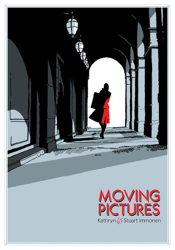
Set in an interesting milieu (the Louvre during World War II), this book is doomed by its pointlessly oblique storytelling, its terrible dialogue, and its characterless art. Apparently Stuart Immonen is a popular mainstream (i.e., super-hero) comics artist. I am unfamiliar with that work, but here he seems to be attempting a clear line style. His work resembles that of Paul Grist, but he lacks Grist's dynamism and humanity.
Weathercraft by Jim Woodring
One doesn't "review" a story like this. One genuflects before it. Mysterious as usual, we see what seems like a near redemption of that most human of creatures, Manhog.
Wally Gropius by Tim Hensley
Hensley has always been a talent to watch. Prior to this book, the coolest thing I had from him was a soundtrack he recorded for Dan Clowes' Like a Velvet Glove Cast in Iron. This book takes a lot from Clowes. Like Clowes, Hensley has an interest in the minimalist anonymous comics for small children from the 1960s and 70s. Wally Gropius is not merely a pastiche of them. I hesitate to say it is a deconstruction, because that implies a certain logical approach. Instead, Wally Gropius reads like an attempt by an alien civilization to communicate with us, having only read these comics prior to the attempt. Meaning is struggling to come to the surface of this sea of signs.
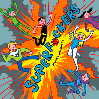
Superf*ckers by James Kochalka
Superf*ckers is a seriously funny idea, and it works for a good chunk of this book. It starts to run out of steam in the end, though. The superhero team here are a bunch of hard-partying teenagers. Instead of incomprehensible teenage super teams like the New Mutants or the Teen Titans, this team acts more like the cast of a reality show. And that's really funny. Kochalka's intensely colored art here is really pleasing as well.
Wilson by Dan Clowes
Really deserves a long, analytic review. Suffice it to say here that Wilson is really good--a story of a deeply unpleasant misanthrope told in a visually interesting and formally inventive way. It's good to see Clowes not working on mediocre movies and instead doing really great comics--the thing he was born to do.
It Was the War of the Trenches by Jacques Tardi
Another book that deserves a long, detailed review. It's a great one that you must own if you are serious about comics as art. One thing that struck me is how indebted Tardi is to Louis Ferdinand Celine. Celine's cynical "fuck it" attitude permeates French cultural production, and It Was the War of the Trenches is no exception. In this series of short stories, the luckless protagonists seem to be asking, over and over again, "Can you believe how fucked up this is?"
Recently Read Comics
It's been a while since I did one of these. Here are a few graphic novels that I have read lately.
Tiger Tea by George Herriman
Krazy Kat wasn't strictly a "continuity strip"; i.e. , there wasn't an ongoing story that went on from day to day. The "Tiger Tea" sequence was one long exception to this rule. Krazy decides to help Mr. Meeyowl, the catnip dealer, after his business collapses. She goes on a mission to retrieve an extra-strong variety of catnip called Tiger Tea, that turns her, when she drinks it, from this sweet passive being into an aggressive, pugnacious, powerful figure. And, as they say, hijinks ensue. This is a really classic sequence. I first read it when it was reprinted in an issue of RAW. The new book suffers from being overdesigned, but well worth getting. A great introduction to this classic strip.
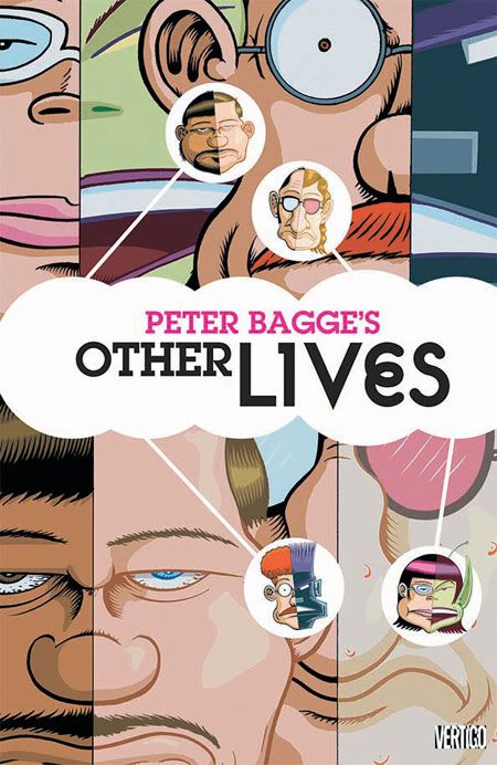
Other Lives by Peter Bagge
This new graphic novel by Peter Bagge really deserves a longer review than the few lines I am going to give it here. As far as I know, this is Bagge's first graphic novel that didn't appear serialized in comics first. But really, I think we can reasonably say that Bagge has been writing graphic novels for a long time. Hate was, in effect, two long graphic novels about one character, Buddy Bradley. His earlier narratives were by format and, I think, by authorial inclination very episodic. What kind of thrills me about Other Lives is how unepisodic it is. Everything happens fairly quickly, and the plot threads are so intertwined that it couldn't be split into chapters particularly easily. But the best thing about Other Lives is how deftly Bagge deals with a theme that is both extremely topical and ancient, that of constructed identity.
The Walking Dead, written by Robert Kirkman and drawn by Tony Moore
I thought I'd try this out since it has gotten a ton of good press, and now is going to be a TV series. I won't say it sucked, but I don't understand why people think it's so great. It seems similar, but not superior, to other "zombie" stories; The Walking Dead is, at best, a competently done pastiche. (Maybe subsequent volumes get better.)
Cartoon Workshop/Pig Tails by Paper Rad
I'll get my "hipster" union card revoked for saying this, but I thought this was boring and pretty bad. Visually, it did nothing for me. I've seen Paper Rad videos that were awesome, and Ben Jones' solo art is really cool. But this little color comic was a chore to read and not that great to look at.
The Playwright, written by Daren White and drawn by Eddie Campbell
Campbell doesn't usually collaborate with other writers, but this was a good pairing. Instead of an ordinary comic, there is a barebones written narrative that tracks Campbell's watercolors. It is a comic in the sense that both the drawings and text need each other, but it reads differently than what you might be used to. The narrative is full of nameless characters, identified by their profession. The main character is the Playwright. He comes across as completely self-absorbed and isolated, lacking any empathy. Yet his plays are highly successful. Over the course of the book, though, the Playwright opens up a bit. We start to see deeper into him. The Playwright reminded me, in some ways, of certain stories by English writers like Malcolm Bradbury, David Lodge and William Boyd, but it's hard to put my finger on how.
Red Snow by Susumu Katsumata
Publisher Drawn and Quarterly has embarked on a mission to publish important early manga in the U.S., particularly those classified as "gekiga" or dramatic manga. One can see the influence of Yoshiharu Tsuge here. The drawing is really good. But the stories didn't grab me as much as those by Yoshihiro Tatsumi. Still, they were pretty good and a refreshing alternative to most manga published in the U.S.
The Search for Smilin' Ed by Kim Deitch
So much of Kim Deitch's work hinges on demons (Waldo, the cat with a "1" on his belly is a minor sort) and aliens. But they also are intertwined with his real life, the real lives of various obscure showbiz figures, and the history of American popular culture. Do they fit together? Until reading this volume, I would have said no. But this story is one where Deitch tries to tie the various unruly strands of his many stories together. In a way, I almost prefer that these overlapping, nesting, and sometimes contradictory stories never really congeal, but The Search for Smilin' Ed is, like all of Deitch's work, a compelling and highly personal piece of work.
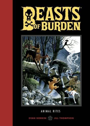
Beasts of Burden, written by Evan Dorkin and drawn by Jill Thompson
The idea of several dogs (and one cat) getting together to solve supernatural crimes is, well, pretty out there. It's not a concept that can sustain a lot of use. This book starts strong and gets harder to accept the further along you go. That said, there is a lot appealing here. Jill Thompson's art is fantastic and perfectly suited for this. The book is a pleasure to look at. My problem is, even though I was able to suspend my disbelief at first, it got harder and harder as it went along. But another problem is that the supernatural threats seemed very human. What might have worked better is if there were a world which only dogs could perceive that we humans were oblivious. And in fact, this is the case--a dog's sensorium is drastically different from a human's. That should have been played up more. The very first story in the book does this to an extent.
Catland Empire by Keith Jones
Great art, but the story seems just silly.
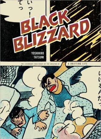
Black Blizzard by Yoshihiro Tatsumi
Only of historical interest. Tatsumi was one of the early "gekiga" artists, and this is one of the early gekiga stories. It dates from 1956, and the story is nothing special--a crime melodrama with a transparent "twist". But I guess stuff like this hadn't been seen in manga before. Apparently it broke ground. The art looks really rushed, and it was. The entire graphic novel (127 pages) was drawn in 20 days--no assistants. But as astonishing as that accomplishment is, it would be more meaningful if the book was any good.
More recently read comics are reviewed here.
Tuesday, July 27, 2010
New Acquisitions--two small collages and a purple crown
Robert Boyd
If it seems like I have been buying a lot of art lately, it's sort of true. Mostly it's just that I've received a lot of art lately and also that I finally have some time to write about art I bought earlier.
For example, this small collage by Hayden Fosdick (who has one of the best names I have ever heard). I actually got this at Gallery 1724 several months ago, but forgot about it until recently! What made me remember it was his excellent collage in The Big Show.
Hayden Fosdick, untitled (?), collage, 2010
I know nothing about Fosdick, except that I am fairly certain he bears no resemblance to this man.
I also recently bought another small collage. Cheyanne Ramos had a show at McMurtrey Gallery which featured paintings with realistic setting, but where a central figure or object had been blanked out as a silhouette and replaced by a bunch of overlapping images of processed food products. Along with these paintings, she was selling a bunch of tiny collages, where she had taken postcards, cut out the central image, and replaced it underneath with a bunch of cutouts of food product photos, perhaps from the Sunday paper coupons.
Cheyanne Ramos, untitled, collage, 2010
Her collages seem almost like "sketches" for the paintings--or at least where she worked out her basic ideas for them. Cheyanne Ramos is another artist with a cool name about whom I know little. I've seen her work at The Joanna and Box 13, as well as the McMurtrey Gallery. I know she studied to get an MFA at UH, but that's about it. You can see more of her work here.
Finally, in a drastically different medium, is this purple crown by Virginia Scotchie.
Virginia Scotchie, untitled (Purple Crown), ceramic, 2010
This I got at Goldesberry. She had shown several months ago, and I really liked her work. She made cool textures and shapes. There were a number of similarly sized pieces that were all good. It was hard choosing. I finally picked the purple crown because it seemed so absurd. It's beautiful and makes me smile. (You can see a lot more similar objects on her web page.) She is also a professor at the University of South Carolina.
Monday, July 26, 2010
Note on The Best American Comics Criticism
The Best American Comics Criticism, edited by Ben Schwartz
When I picked this up, I was at first irritated that I wasn't included. As Bender from Futurama says, "This is the worst kind of discrimination: the kind against me!" But editor Ben Schwartz writes that he limited his choices to criticism written between September 12, 2000 (the date that Pantheon released Chris Ware's Jimmy Corrigan and Daniel Clowes' David Boring) and 2008. Most of my longer critical writing about comics took place before that date. My pamphlet "Ron Regé and His Precursors" might have made the cut--it came out sometime in 2000. After that, I had a few reviews in Publishers Weekly (short and unsigned) and one really good long piece in The Comics Journal, "On Second Thought, There Is a Need for Tenchi." This was an article about the rise of manga in the U.S. and what it meant. But it wasn't criticism--it was really the first flowering of my interest in the economics and sociology of art, which readers of this blog know are subjects I return to frequently (my series of posts called "FotoFest: How to Run An Art Festival" is a direct descendant of the manga article).
While I could write about me all day, let's return to the book at hand. Schwartz picked that start date for a reason. For him, that was the date that literary comics, or "lit comics," as he calls them, went mainstream. He likens it to similar pivot points in artistic history. It's not that there was nothing before that date (obviously), but that at that moment, literary comics stopped being purely subcultural.
I think his use of the word "literary" is important. In works like David Boring and Jimmy Corrigan (not to mention Maus and many other great comics), there is a literary quality. These comics work a lot like novels. They tell long, involved stories. They aren't merely illustrated stories--the visual component is too important and too intertwined with the narrative to be an appendage. But their narratives nonetheless feel novelistic. I think this may have been what attracted a certain cohort of prose novelists to the form--Dave Eggers, Michael Chabon, Rick Moody, Jonathan Lethem, etc. This is acknowledged by Schwartz--he reproduces critical pieces by Jonathan Franzen and Rick Moody in this volume.
I found the pieces varied in quality. Schwartz, like many other people I respect, really likes a critic named Donald Phelps--Phelps has three pieces here. But I have never really warmed up to Phelps. His writing doesn't illuminate his subjects in the way I like criticism to do. Schwartz also runs several of critical pieces by cartoonists. They are a mixed bag. Chris Ware's piece about Rodolphe Topffer is excellent, Peter Bagge's piece on Spider-Man is eh. But Seth's piece on John Stanley is awful. Seth's enthusiasm is real, and possibly justified, but his writing (and thinking?) is not organized enough to explain or justify Stanley.
What I think is most interesting about the book is that in his choices of pieces, Schwartz is laying out a theory of lit comics. It's a theory that rings very true to me. Part of this theory goes that as literary comics grew, they made necessary a reevaluation and relearning of certain classic comics. For example, Little Orphan Annie and Gasoline Alley. Several of the pieces here are about classic rediscovered strips which seem to prefigure current tendencies in comics. (As Borges wrote, "Each writer creates his precursors. His work modifies our conception of the past, as it will modify the future.")
Another thing I found interesting was a hint at a certain conflict or bifurcation that exist in comics. I'm not referring to the separation of comics-as-art from comics-as-entertainment, which from where I sit appears set in stone. But within the broad category of comics-as-art, Schwartz concentrates on lit comics. But he acknowledges in the introduction that there are comics-as-art that are not lit comics. He speaks of the decisions of Sammy Harkham and Dan Nadel to take up publishing because most publishers were looking for lit comics, as opposed to the kinds of comics that interested them. And those would be, broadly speaking, art comics.
This is where things get confusing. Some people (me included) sometimes use the term "art comics" to refer to any comics where the comics' function as art is more important other functions they may have (entertainment, for example, or pedagogy). But more and more, "art comics" is meant to refer to comics that come out of an aesthetic of the visual arts more than an aesthetic of the literary arts. So think of comics by Gary Panter and Paper Rad. Whatever their comics are, they aren't "novelistic." Kramers Ergot and Non were primarily art comics anthologies. Raw was as well, except for Maus. Publishers like Fantagraphics and Drawn & Quarterly have primarily been lit comics publishers, although that changed with Drawn & Quarterly when they hired Tom Devlin as an editor. Pretty much none of the comics discussed in The Best American Comics Criticism are art comics. And I would contend that art comics are harder to write about. (I would say that in general, it is easier to write well about literature than it is to write well about visual art.)
Schwartz's collection implies a theory of lit comics, but ignores art comics. This should be a challenge to critics--there needs to be better writing about art comics.
Sunday, July 25, 2010
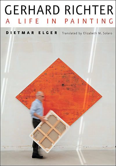
Note on Gerhard Richter: A Life in Painting
Gerhard Richter: A Life in Painting by Dietmar Elger
This book has been faulted for not delving too deep into Richter. But I don't see that as a big fault. It's part of the life-cycle of biography. First we have an official biography--and that is what this is. Elger is the director of the Gerhard Richter Archive and was Richter's secretary for a time. He had Richter's participation. Given this, the book could have been a complete whitewash, but it doesn't seem that way. What it does focus on, not surprisingly, is the work. Richter's personal life is outlined but not delved into. Now the next stage of biography for Richter will be an unofficial biography, probably after Richter's death, and it will be much more personal. That's the way it goes.
So should you wait for this next biography? Richter is 78 years old, so it might be many years before a "definitive" biography is written. But more important is that Elger's book is really good. It is substantial and beautifully illustrated. He does a good job of explaining Richter's various approaches to painting (and changes in style) over his career. He is good at describing the artistic scene in Germany, especially in the 1960s. And while he doesn't delve too deeply into Richter's personal life, he does deal with the way that Richter has a series of artistic interlocutors who important influences him--Sigmar Polke (who he met at Staatliche Kunstakademie Düsseldorf in the early '60s), Blinky Palermo, and his second wife Isa Genzken.
I've always liked Richter's paintings, and I feel I have a better understanding of them after reading this book. The book is beautiful and full of information about one of Germany's greatest artists.
Saturday, July 24, 2010
New Acquisitions--Bernar Venet and Joseph Beuys (sort of...)
I have bought art through eBay and through Heritage Auctions. So I decided to take a look and see what other internet auctions were out there. I went to this site called Live Auctioneers. What it does is host auctions for various galleries, etc. It's a little like Alibris, an online bookseller of used and collectible books that puts the stock of many different antiquarian and used booksellers up in one place. I've had lots of success with Alibris, so I thought I'd give Live Auctioneers a try.
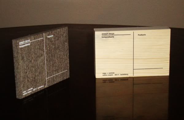
They were representing a Belgian gallery called Art Partner Gallerie. They were having a show of contemporary art, and as I looked at the lots, I decided--just to try it out--I'd put in a couple of small bids. I bid on a Bernar Venet silkscreen (I had seen a similar one recently at McClain Gallery) and a pair of "postcards" by Joseph Beuys.
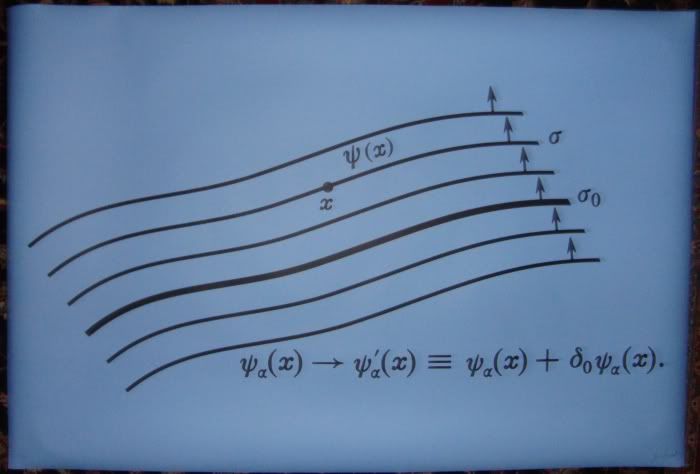
Bernar Venet, Planche Mathematique 01, silkscreen on polycarbonate, edition of 60, 2002
This thing is huge--80 x 120 cm. That was clear on the lot description, but now I have a piece that really is too big for me to hang! Oh, well. I'm satisfied. I got a bargain for it, if the prices for other "planches mathematiques" I see online are accurate.
Bernar Venet is, of course, best known for his giant metal sculptures, such as the ones in Hermann Park, at the McClain Gallery, or in front of the home of John and Becca Thrash. He also guest-starred in a really funny episode of The Madness of Art.
So that was the good part of this experiment. Here's the bad part.
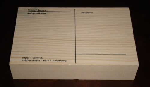
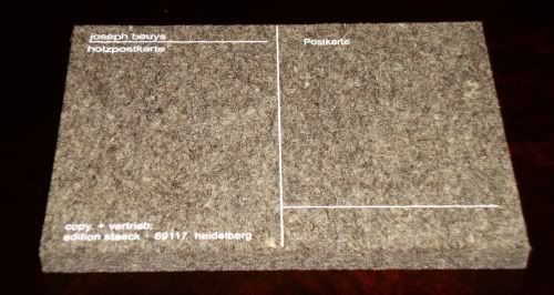
These are two Joseph Beuys postcards, produced by Edition Staeck. One is on wood, the other on Beuy's trademark thick felt. The description of the lot is here. Now my mistake in bidding on these was to not do any research. If I had, I would have learned from the Editions Staeck website that there were 100 signed and numbered postcards in this edition, but the unsigned cards are "unlimited." In this case, "unlimited" is a word that means they can produce as many as the public wants.
Then I would have looked closely at the lot description and the accompanying photo, and realized that these were not signed and numbered (unlike the Venet). So even though I didn't bid much for these things, I bid more than they are worth. I could have bought them straight from Edition Staeck for significantly less than what I actually paid for them.
Well, all in all, I came out ahead. And I learned a valuable lesson--do the research before you buy!
Age of Consent
Robert Boyd
I watched a really odd movie last night about an Australian artist Bradley Morahan (played by James Mason) who moves to a shack on a small island in the Great Barrier Reef to recharge creatively, where he meets a young woman who becomes his model and muse (Helen Mirren in her very first film role). The movie is Age of Consent (so named because the Mirren character is under the age of consent--at least according to her alcoholic granny), directed by the great Michael Powell.
The film is from 1969, and is based on Age of Consent by Norman Lindsay from 1935 (the film brings the action up to the current day).
The cover of the book looks even more pervy than the movie! And the movie was petty daring. Helen Mirren begins her long tradition of getting naked on film in this movie. (The movie faced censorship in the UK.) Not surprisingly, when you google for images from the film, you get a lot like this:
Hey, and no wonder. Helen Mirren is gorgeous! But I was fascinated, watching it, by the problem that filmmakers have in depicting art in a film. It's especially tough when an artist in a film is supposed to be good. What do you show in the movie as a fictional artist's work? For this movie, they actually had two artists producing the work supposedly produced by the Morahan character. In the opening scene, we see a show by Morahan in a New York art gallery. The work looks a lot like late Matisse. (I couldn't find any still of it, or any of the other art from the movie, online, alas--you'll have to rent the movie.) The artist for this part was John Coburn, who was actually a very distinguished Australian abstractionist. That's one way to get good art for a movie--use actual good art. The paintings from the island, including many nude paintings of Helen Mirren, were produced by another distinguished Australian artist, Paul Delprat.
And that's one thing that's really cool about this film. It is really respectful of Australian art and its traditions. Norman Lindsay was a great (if esthetically reactionary) Australian artist who, as you might guess, really, really liked to paint nude women, and in the movie, in a scene in Morahan's studio, you can see rather prominently a book about Sidney Nolan, Australia's greatest painter.
According to Wikipedia, James Mason became a mentor to Sam Neill in the 1970s. This is really interesting because Sam Neill played Norman Lindsay in the movie Sirens (1993). This movie again featured quite a bit of nudity (hard to avoid if Lindsay is your subject), including Elle Macpherson (!). And in a perfect move by the filmmakers, Paul Delprat was once again brought in to produce the "Norman Lindsay" images. (It has to be said that Delprat's art doesn't look anything like Lindsay's!)
Last year, the Houston Cinema Arts Festival featured Michael Powell's The Red Shoes. The aim of the Cinema Arts Festival is to screen movies about art. Perhaps this year, they could screen Age of Consent (in a double feature with Sirens?)
The Big Show at Lawndale, part 2
(Continued from Part 1)
The ubiquitous Emily Sloan plays a little game with the whole format of the show. Her Kenmore piece is, in itself, a curatorial act. It's as if she is staking a claim for curation as artistic act. And she is playing on the tradition of tiny art spaces. (Think of Sharon Engelstein's Gallery One Three Seven or most famously, Duchamp's Box in a Valise.) In presenting the refrigerator as an art space, she "smuggles" in all the artworks on it and in it.
Valerie Powell, Outdoor Sculpture Garden, plastic and magnets, 2010 (?)
So Valerie Powell's magnets, which are similar to other work she has done, become the "outdoor sculpture garden" for this lilliputian art space. Inside, you have things like this tiny minimalist sculpture made of butter.
Loli Fernandez-A, Homage to Judd, butter, 2010
(Its geometric regularity recalls Judd, but its material recalls Beuys.)
There were a few abstract paintings I liked. I mentioned Joseph Cohen, or course. I also enjoyed these two very different pieces.
Myke Venable, Violet/Rose/Silver, acrylic on convas, 2009
John Tapper, Sure, acrylic latex paint, ink and paper on canvas, 2009
The angled geometries of Myke Venable's piece appeal to me like a Robert Mangold painting, and I like the Philip Guston-like mark-making in Tapper's.
I'm going to close with a few disparate, unrelated pieces that I like from the show. There is not story that can be told here--and that is essentially true for the exhibit as a whole. Themes, tendencies, stories that emerge (naked ladies!) are countered or undermined by other tendencies (abstractions, feminist art). That's what you can expect from The Big Show. The work offered to the curator doesn't allow him to tell a story (beyond a story of plurality or chaos), even if he had any inclination to do so.
Hayden Fosdick, Sorrow and Despair Grip the Moon, collage, 2010
I bought a piece of Fosdick's from a show at Gallery 1724 earlier this year. His collages are simple and clever. This one really exemplifies "simple" and "clever"--but I want to also call attention to the excellent design that looks almost like early Russian avant garde design.
Joel Hernandez, Carmelita, archival inkjet print, 2008
Joel Hernandez had two great photographic portraits in the show. His subjects are shown in their own environments (I assume) and really come through as real people with constructed identities. The photos play in the fuzzy space between authenticity and artifice.
Anthony Day, Total Life Saver, floats and airbrush, 2010
Anthony Day, Total Life Saver, floats and airbrush (from above), 2010
This last piece looks like the classic "shit, the deadline's tomorrow and I haven't even started!" piece. (I did a few of those as an art student.) Still, sitting on its clean white plinth, it looks really good. And that's all ya need.(I have to say I like this better than his styrofoam pieces.)
The Big Show at Lawndale 2010, part 1
A little over a year ago, I started writing about art in Houston regularly. My reason was to use writing as an excuse to get out of the house and see art. I was becoming too much of a couch potato, see? I always went to see museum shows and whatever was happening at Diverse Works, but I wasn't going to galleries or seeing much of what was happening at the other great art spaces in Houston.
Consequently, when I saw The Big Show last year, it was with virgin eyes, so to speak. Here was a show that, in a way, captured a moment of a regional scene about which I knew nothing. So I was completely unfamiliar with the artists being shown.
Obviously this year is different. While there were still plenty of artists in the Big Show I didn't know, but this time around, I was familiar with a lot of them.
This got me thinking about curating a show like this. The concept behind The Big Show is that anyone can enter (as long as they are from the area and pay the entry fee), and some outside curator is the juror. In this case, Paul Middendorf from galleryHOMELAND in Portland. OR. He helicopters in, looks at a bunch of art, and picks some. Compare this to what a curator usually does. She has an idea--either a unifying concept or an artist whose work she is interested in or some combination. When she picks artists, she does so because she is aware of what they have done in the past. For her, the work in the show she curates has a kind of context based on her knowledge of the artists in the show.
Middendorf, on the other hand, had no idea where the artists he picked were coming from. Was a given piece that he chose the culmination of some process for an artist? Or was it a one-off? Last year, as a viewer, I was in the same circumstance as the juror. These pieces were, for me, without context (aside from the context of the show itself). This time, I have specific knowledge of some of the artists (I even own pieces by a three of them), and a more general knowledge of the scene they represent. And that made viewing the show a really different experience in 2010 than it was in 2009.
Jed Foronda, Excavation #15, excavated magazine, wood panel, white primer, 2010
Jed Foronda is one of the artists in this year's show who was also in last year's. I really liked his pieces in last year's Big Show. So much so that I bought one, The Wheels Keep on Spinning. The pieces from last year resemble this piece--they all use "excavated magazines" as part of the content. What Foronda does is to take a magazine and carve on subsequent pages more-or-less concentric shapes, which leave the magazine looking a little like a terraced open-pit mine. It is then mounted behind a white wood panel which itself has a shape cut out of it that is concentric with the cut out parts of the magazine. Last year's works were highly symmetric. The pictures were perfectly square, and the excavations were more-or-less circular. This year, the picture has a less regular shape (although it is still bilaterally symmetric), and the excavation doesn't even attempt to be regular. The work is inherently more dynamic.
Between last year's big show and this year's, I had seen no Foronda work--not in any group shows or at any galleries. But apparently he spent at least some of that time developing his excavation ideas. (But he was also drawing--see the two drawings he donated to Box 13 for their raffle.) While the basic concept remains the same, this Excavation #15 feels like a stronger piece than the earlier ones. He has extended the vocabulary of the technique he developed. I'm impressed.
I don't have last year's catalog, but I noticed a few "repeat" artists. There was another provocation by John Runnels (last year, it was the word "fuck", this year, it's lots of naked ladies), and more sickeningly realistic sculptures of mold by Jasmyne Graybill.
But more than repeat artists (there are probably many more than the three I've mentioned) are artists whose work has been seen in other venues. There is a sense that The Big Show is for "emerging" artists. But the rules state anyone can enter, so it's not surprising therefore that some more established artists have done so.
Jeff Forster, Frailty, native clay, porcelain, found object, 2010
This compelling portrait of decay by Jeff Forster was displayed at Poissant Gallery earlier this year. He's also one of the artists whose work I won at the Box 13 raffle.
Joseph Cohen, Proposition 113B, reclaimed latex and latex on walnut, 2009
Joseph Cohen, Proposition S-11, reclaimed latex, enamel and latex on driftwood and steel, 2009
Cohen's work has been shown at Wade Wilson. He's one of my favorite artists in Houston, and his work definitely stood out in the context of this show--it was simultaneously assured and daring. His paintings are inherently sculptural, and here he took the next step and displayed a painted sculpture. The work is about waist high, and it has--like his paintings--the drippy plastic look. Given the reclaimed and modest materials he uses, and the sculptural way he uses paint, I am reminded both of early Jasper Johns and Robert Rauschenberg.
Amy Weiks, Lick No. 1, hand-dyed terrycloth, Poly-fil, thread and seed beads, 2008
Weiks had work in the group show Not the Family Jewels earlier this year. She seems to be part of the fine art/craft nexus that is happening in art right now. (See the current show at CAMH, for example.) This necklace is both cute and slightly disgusting at the same time.
Several other pieces in the show also demonstrated exceptional craftsmanship. A pair of pieces that really wowed people were by Catherine Winkler Rayroud.
Catherine Winkler Rayroud, Women's Liberation? What Liberation, papercutting made in one piece with nail scissors, 2008
Catherine Winkler Rayroud, Set Yourself Free!, papercutting made in one piece with nail scissors, 2008
Catherine Winkler Rayroud, Set Yourself Free! detail, papercutting made in one piece with nail scissors, 2008
Rayroud is engaging in a strategy that, by now, is traditional in some streams of feminist art--she is using craft to deal with feminist themes. Specifically a craft that is typically associated with women. This strategy allows the work to operate on two levels. First, the content of the work (silhouette depictions of lace underwear, with feminist vignettes within the lace). Second, the medium, by being a craft associated with women, challenges the (male-defined) concept of what is art (painting, sculpture, architecture) and what is craft. Had this work been done in 1970, it would have been a revolutionary challenge to old hierarchies. But the old academic definitions of what is art and what is not has been pretty thoroughly demolished by now (with the help of feminist art). The pieces come off, in a way, as nostalgic. But they are beautiful, and there's nothing wrong with nostalgia.
But there's an irony in these pieces being in this show, because one thing you can definitely say about this Big Show--it has a lot of naked ladies.
Stuart Kimbrell, The Virgin Mary, oil paint on stretched canvas, 2010
Some were elegant. Some were absurd.
Melanie Loew, Honey Bunny, oil on found fabric on canvas, 2010
K. Eisenbeiss, Buffalo Spwy 3333, photograph, 2010
This piece is a headscratcher for me. It is an image that holds you, certainly. It's a classic sexist situation in art--naked woman with clothed man. It is hard to construct a mental narrative that matches what is in this photo. They appear to be on a high floor in a highrise building (presumably near Buffalo Speedway, although not at 3333 Buffalo Speedway--there doesn't appear to be a highrise there). The astroturf on the table is mysterious. He appears to be about to eat, and both are looking at the photographer with bland, neutral expressions. What about the photographer? Maybe if I could see some more of his (her?) work, I'd understand the piece better. Context, remember.
But K. Eisenbeiss seems to have no web presence. The "K." part carefully hides the photographer's gender. "Eisenbeiss" means "hot iron" in German. (That helps a lot. Not.)
There are several other naked or semi-naked ladies in the show. I wonder if someone took Paul Middendorf to Treasures while he was in town...
(Continued in Part 2)
Tuesday, July 20, 2010
Creature Comforts at Anya Tish
Robert Boyd
The current show at Anya Tish almost makes sense. You get kitschy irony with Wesley Harvey's ceramics, mixed with the sugar overload of Ann Wood's assemblages, the poster-colored cuteness of Mindy Kober's gouaches and the cartoony figures in Jennifer Nuttall's pieces. Dawn Black seems to be the odd artist out, to my eye. What really links these artists is that they all have achieved a certain level of local prominence in the world of non-profit artspaces like Lawndale and Box 13. The show was curated by Nuttall, but if one thinks of it from Tish's perspective, for her, as for any gallerist, taking on a new artist is a risk. A group show hedges but does not eliminate that risk. So achievement in other arenas may help a gallerist decide which risk to take. Of course, this has nothing to do with the quality of the exhibit. But as regular readers know, I like to think about the economics and sociology of visual art.
In fact, the show is pretty good. I first saw Mindy Kober's work at The Big Show last year. In that show, she had a witty piece showing a group of school children observing (being menaced?) by large floating Russian Supremacist abstract shapes. Her drawing style, outlines with flat colors and minimal details recalls old children's books, and because of that likewise recalls the absurdist cartoons of the great Glen Baxter. That approach is carried over into this show.
Mindy Kober, Not Another Kitty Painting, gouache on paper, 17 x 24", 2010
A group of Civil War-era soldiers are fighting around two gigantic kittens, one collared and immobile, the other nosing around with curiosity. The soldiers don't appear to be Union vs. Confederacy--their uniforms are all mixed up. And the "landscape" they occupy is a flat mustard-colored field. The lilliputian men, the kittens, the flat colors all scream "aw cute," a feeling only slightly mitigated by the four dead or wounded soldiers in the picture.
But her strongest drawing is Undertow, for which I don't have a reproduction. It's another gouache, but much larger--60 x 90". It's an ocean scene with the horizon at about the middle of the page. But don't let the fact that there is a horizon fool you into thinking there is a comprehensible space here. Scale is less important that fitting all the elements in--elements that relate to the ocean. So you have modern swimmers and beach-goers mixed in with Poseidon and Triton, as well as a couple of battling Patrick-O'Brian-style wooden ships. All done in Kober's simplified, story-book outline style.It's my favorite piece from this show.
Ann Wood's pieces are sculptural assemblages made with hunting decoys. (Elaine Bradford has been using decoys in her art recently as well--does that mean it's a trend?) In both her pieces, Scream and Bitter Sweet, the decoys are covered with gooey, almost edible-looking foam.
Ann Wood, Scream, decoy, polyurethane foam, flowers, plastic fruit, 2010
It looks as if the pieces were actually assembled there in the gallery, with the foam poured onto the floor. The bright pink foam in Scream--well, it screams at you. It's the first thing you notice in the room. It feels so artificial, so plastic and fake. It's both amusing and disturbing that a deer is coated with it. One could read this as a conflict between a more natural state of things and a highly artificial state. It could have an environmental interpretation. But I think it's key that the pink is really appealing. It might be a crime against nature to cover a deer in pink chemical foam, but it looks really cool.
Ann Wood, Bittersweet, decoy, foam, rubber, pushpins
I think the theme is a little more obvious in this one--bird coated with a nasty dark substance. Seems as if that has been in the news a bit lately. But that is undermined a bit by the fact that the duck is also covered with little colored dots--it looks like it has been dipped in chocolate and covered with sprinkles. Rather than being a victim of BP, it looks like a creation of Krispy Kreme. We have nature under assault, but looking sugar-sweet.
Wesley Harvey also employs cuteness in his work. Harvey teaches art in San Antonio. Like many adjunct professors, he works for multiple schools, including the Southwest School of Art and Craft (Gary Schott also teaches there). His work in this show is ironic and kitschy.
Wesley Harvey, And all the yellow bunnies..., porcelain, glaze, gold leaf, velvet, 2009
But the irony is not subversive. I don't think that's his goal. Far from undermining the saccharine nature of his subjects, Harvey seems to be ramping that aspect up. Looking at And all the yellow bunnies is like eating a pound of chocolate Easter eggs.
Jennifer Nuttall also plays with irony, but hers seems the least interesting. Smiley cartoon figures trapped in bureaucratic political nightmares. Her figures have faces that look like those of 80s punk cartoonist Krystine Kryttre.
Jennifer Nuttall, Detention & Removal, illustration board, duct and brown masking tape, oil, 2010
My problem with these pieces is that the approach Nuttall takes doesn't particularly serve her political message very well. In particular, she undercuts it with the cuteness of the characters. It's unfair of me, but I want to political art to have the power of Jacques-Louis David and the moral clarity and inclusion of the viewer of Hans Haacke.
Dawn Black, The Snake and the Rising of the Stag, goauche, ink, watercolor on paper, 2010
Dawn Black doesn't trade in irony like the rest. Her mysterious, haunting figures in their indistinct, empty spaces are both specific and dreamlike at the same time. Pictures contain hints of rituals, bizarre performances, illicit activities, etc., without being specific about what these activities might signify. Especially interesting and intriguing is the "Conceal Series," small color drawings of masked people--a huge variety of people wearing a huge variety of masks.
Dawn Black, Conceal Project #116, goauche, ink, watercolor on paper, 2010
The outfits of these figures may conceal, but they also reveal quite a bit about the character (and possibly the obsessions) of the subjects. Black's skilled drawing of clothed figures, along with a flair for the mysterious, is what makes all this work.