by Robert Boyd
Randall Kallinen is an attorney specializing in civil rights cases. His law office is in a warehouse-like space on Broadway, spitting distance from the ship channel. He has turned that space into an art gallery, and for its inaugural exhibit, the space has been crammed full of art, including a lot of his own work. His large, paint-spattered canvases are actually used as temporary wall-space in the big floor of the warehouse. Kallinen himself hosted his opening in an outfit that was half
flâneur and half Jackson Pollack.
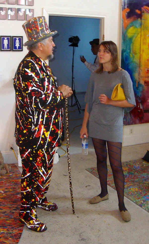 Randall Kallinen and Ariane Roesch
The opening exhibit was an overstuffed jumble of art of wildly divergent quality. (The title of the exhibit gives it all away:
Space Zombie Mayan Apocalyptic Human Sacrifice Uplift Mofo Party Plan Spring Break 2012. When you see a title like that, you know to expect sensory overload.) At first, I thought it had all the hallmarks of a
Paul Horn production--wildly overstuffed, extremely uneven. However, the show was in fact curated by sculptor
John Paul Hartman. (Confusingly, there is a minimal website for
Kallinen Horn Gallery. So even though the invite referred to Kallinen Contemporary,
Paul Horn is definitely involved and had work in the show)
Describing this show is a bit fruitless. Fortunately, I took a lot of photos and a few of them were more-or-less in focus. So presented here are a bunch of photos, some annotated, of one of the weirdest art shows I've seen in a while.
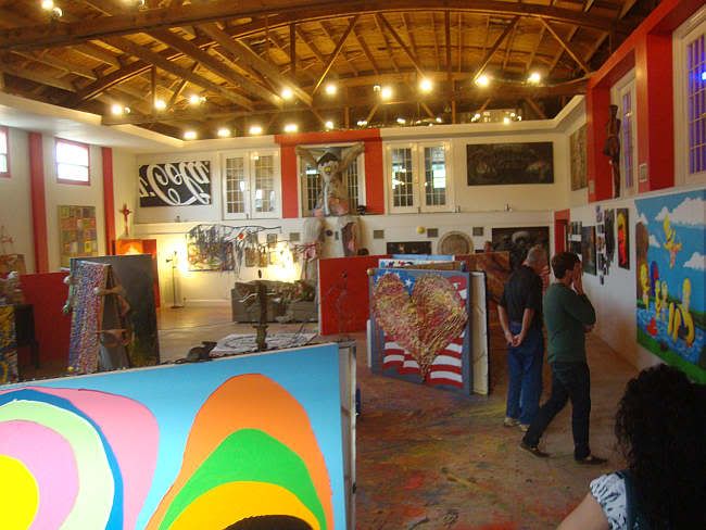 Kallinen Contemporary interior
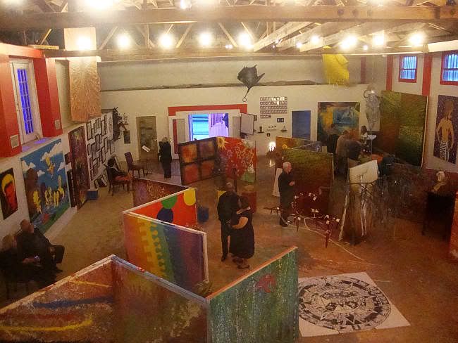 Kallinen Contemporary interior
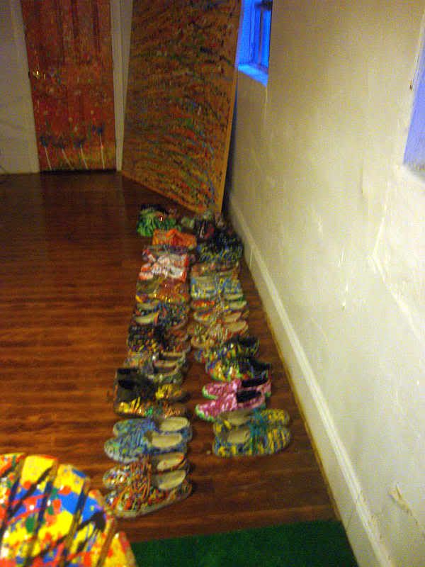 Randall Kallinen's neatly arranged paint-dripped shoes
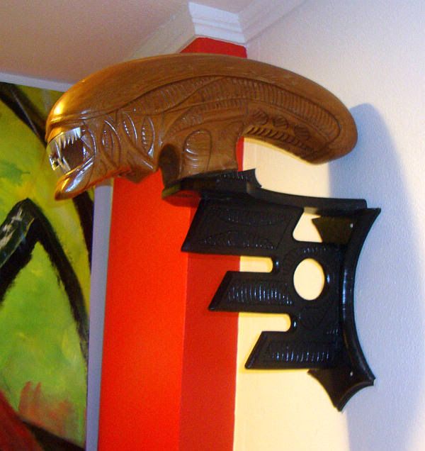 Yamin Cespedes, 8th Passenger, wood, 10" x 8" x 20" in, 2011
Yamin Cespedes
'
8th Passenger is kind of the ultimate hunting trophy. Keep your Ibexes and Siberian Tigers--I bagged an Alien!
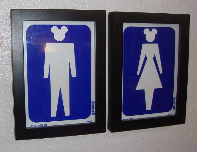 Amerimou$, Man and Woman, bathroom sign, paper, 8" x 6" each, 2011
Amerimou$ had some of the most interesting art in the show. In addition to pieces like these two bathroom signs (where he takes the simplified Mickey Mouse logo and combines it with generic "ped" figures), he also has some intriguing sculptural work.
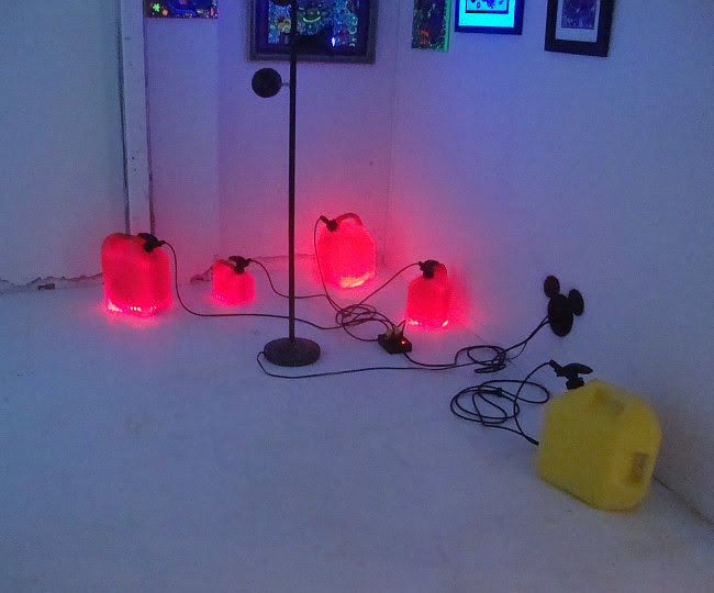 Amerimou$, Energy, fuel tanks, electric cables, light cords, surge protector, spray paint, dimensions variable, 2011
To me, this is a better piece than the "Mickey Mouse" ear pieces. Attacking Disney as a generic representation of fake plastic America, a sterilized fascist simulacrum--well, it's been done. Done over and over since the 60s. But this sculpture, while its political meaning is obvious, also has a beautiful, slightly mysterious presence. This is what makes it a stronger work.
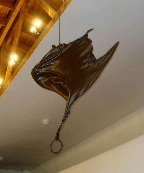 John Paul Hartman, Screaming Shadow of War, plexiglas, bronze, hand forge iron, bronzing paint, 64" x 46" x 8", 2002
I mistook this piece by John Paul Hartman for a bronze sculpture at first, but it's mostly plexiglass painted to look bronze. The bronze gives it the look of municipal sculptures--founders of universities (like the statue of William Rice in the quad at Rice University) or famous war leaders (like the Sam Houston statue in Hermann Park). What I think about when I see bronze are war memorials. I lived in rural New England, and small towns there almost always had memorials for the war dead from the Revolutionary War, the Civil War, World War I, etc. But this sculpture, a flapping wing diving down toward the viewer, is a monument to fear. We lived in fear from the skies after 9-11, and now our enemies (and many, many innocent bystanders) look fearfully to the skies for our own screaming Predators their Hellfire missiles.
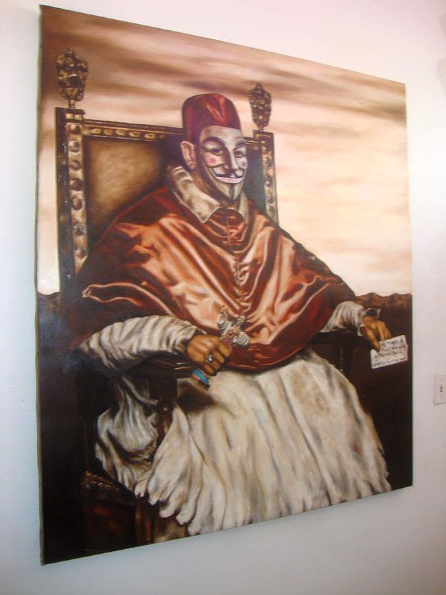 Camargo Valentino, Pope not so Innocent, oil on canvas, 56" x 48", 2009
Pope not so Innocent by Camago Valentino (who apparently studied with Odd Nerdrum!) is a tribute to Velazquez and I guess Francis Bacon, it seems to have been painted too early to be a tribute to Occupy Wall Street--but it's hard not to read it that way now.
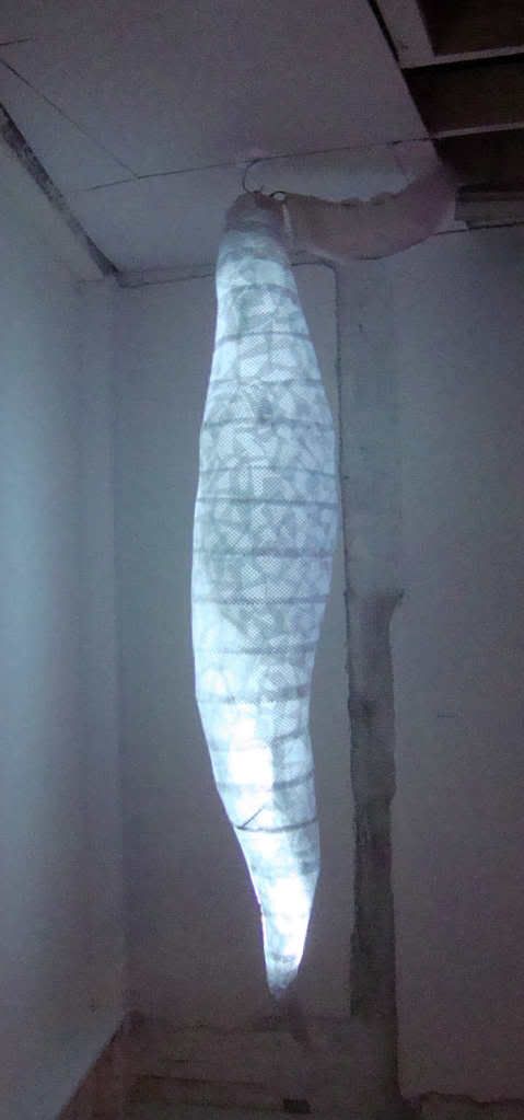 Alicia Duplan, Turn on Your Love Light, mixed media, 108" x 18" x 18", 2011
There were several glowing sculptures, including
Turn on Your Love Light by
Alicia Duplan, which I thought were excellent. They had to be displayed in a darkened room. The dark in this case becomes a part of the work.
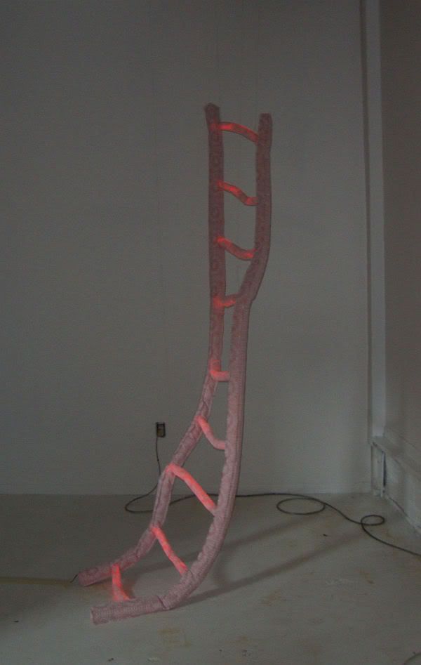 Ariane Roesch, Rung-By-Rung, mixed media, 108" x 17" x 12", 2012
Here is another self-illuminated work, this time by
Ariane Roesch.
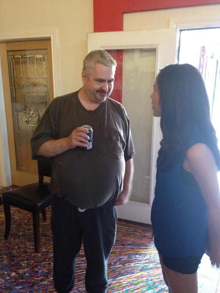 Daniel Johnston, Coke Zero in hand, chatting with a fan
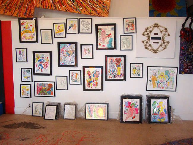 Daniel Johnston installation
Among the artists in the show was
Daniel Johnston, who showed a bunch of his drawings (and had even more stacked on the floor) and signed copies of his new graphic novel,
Space Ducks. Unfortunately, they sold out of
Space Ducks before I could buy a copy. However, I did buy the picture below:
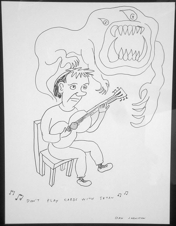 Daniel Johnston, Don't Play Cards With Satan, marker on paper, 20" x 15"
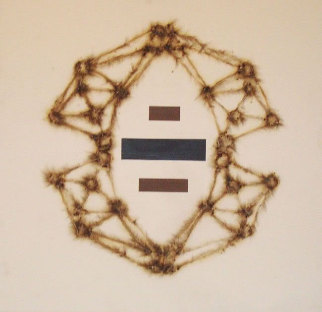 William Reid, Hostages, acrylic on canvas, 34" x 35", 2011
William Reid
is Daniel Johnston's nephew. He's a presence in Houston at various art openings, but I really knew nothing about his art until I saw his pieces here. The paintings he showed had a painted element and an element that was created with sparklers burning the surface. Naturally this makes one think of
Cai Guo-Qiang, but the work actually resembles in some ways the art of
Bill FitzGibbons, who uses a blow-torch (I believe) on his otherwise white canvases. I guess I'm saying that burning an image onto a canvas is not the most original idea in the world (let's not forget
Yves Klien's fire paintings from 1961!), but Reid does a good job of making an arresting image out of paint and burnt gesso.
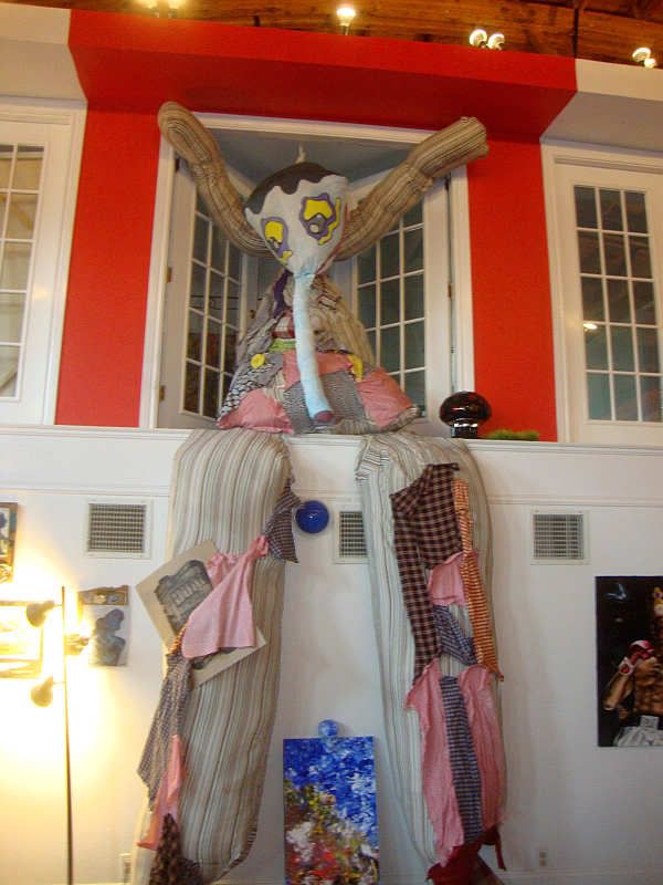 Edu Portillo, Gonzo the Clown, fabric, wood, plastic, dimensions variable, 2011
I remember seeing
Edu Portillo's,
Gonzo the Clown hanging out around the U.H. art department. Nice to see it displayed in a venue that can accommodate its immensity. This piece would scare me if I was a child, I think!
 Kelley Devine
My previous contact with
Kelley Devine had been with her paintings of super-thin model-like women, which I didn't care for. She has a sculptural installation in the show, but what caught my eye was this image on her t-shirt, where a woman (typical of the women she paints) with antlers. The antlers are textured with typography that looks like it comes from a newspaper. This shirt is related to a series of paintings she has done collectively called "
Dangerous Games." But I like the graphic quality of the shirt better than the paintings. Some of her
drawings on printed pages have this quality, as
do some of her prints. But this shirt suggests that maybe she should consider working in silkscreen, combining her drawing and printed matter in one graphically bold combination.