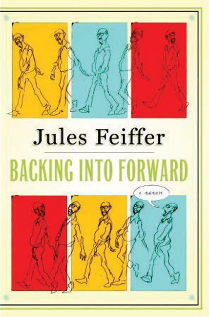
 Backing Into Forward
 by Jules Feiffer
One of my favorite cartoonists is
Jules Feiffer. He got his start in the 1950s at the fledgling
Village Voice. His work can be related to a lot of cartoonists who were coming up at the time, who he mentions as either as influences or as colleagues. The obvious ones are
Saul Steinberg,
William Steig and
Robert Osborn. He admits that in his first few weeks doing his strip, he imitated them. Then he found his own style.
The style of the day was slick and inked with a brush. It was fairly minimal, but still felt very carefully crafted. Feiffer had drawn quite a feature called
Clifford, which appeared in the
Spirit newspaper comics insert, that operated within that slick, brush-line minimal style. Early
Peanuts strips looked like that, too.
But these other guys were not worrying about slickness. Maybe it had something to do with abstract expressionism. These 1950s era New York City cartoonists couldn't have been unaware of this artistic movement, in which paint was laid down in ways that strongly showed the
hand of the artist. Indeed, the work sometimes has the feel of handwriting. (In particular the work of
Mark Tobey and
Franz Kline, but I think "handwriting" can be applied to almost all of them.) This showed in these new, sophisticated 50s cartoonists. Their work had a hand-writerly quality, and I'd say none more so than Feiffer. His almost scribbly drawings are perfect for showing body language, and its body language that propels his strips. He could not rely on a reader's familiarity with this or that character, because with a few exceptions, he didn't have repeating characters. So he had six images to make you understand the personality and inner-life of his one-off characters. His dialogue was great, witty, and perceptive. But it's body language that gives these characters life.
This memoir is rather scattered. One can tell he wrote it in bits and pieces and then tried to assemble it. It doesn't quite come together. But it is completely entertaining. He writes about his childhood and about his work-life as an adult. He is pretty reticent about his personal life, more and more so as he gets closer to the present.
Feiffer is beloved among certain art comics fans because he came up as a fan of 4-color comics and moved on to create his own highly personal comics for adults. This pathway is pretty common for art cartoonists now. But I get the impression that it was quite bizarre in Feiffer's time. Certainly Saul Steinberg didn't grow up reading
Detective Comics. Feiffer was such a super-fan that he ended up working for
Will Eisner--he eventually became the writer of
The Spirit. He describes writing his first story and realizing, when he was done, that he had written about his old neighborhood in the Bronx.
Feiffer never went to college. He wasn't a beatnik, but he did some beatnik-ish things, like hitchhiking across the country and back. (Hitchhiking was apparently a fad in the early 50s.) He was drafted but managed to avoid being sent to Korea. His experience in the Army lead him to write one of his best stories,
Munro, about a little boy who is accidentally drafted. But it wouldn't see publication until after he had established himself at
The Village Voice. It was too far out there for publishers in the early 50s.
Feiffer moved to Brooklyn and happened to be neighbors with
Norton Juster. They got to be friends, and when Juster wrote a children's book, he asked Feiffer to illustrate it. This ended up being a masterpiece--
The Phantom Tollbooth. I read it over and over as a kid, and carefully copied the Feiffer drawings. Even though this book was a great success, Feiffer wouldn't think about doing children's books again for decades--and when he finally did, he was hugely successful at it.
Backing Into Forward paints an interesting picture of the intellectual and artistic milieu of New York City in the 50s and 60s (but one could wish for some juicier stories). Although he is defends his choice to be a cartoonist, he recognizes that a lot of serious people, his readers in fact, don't take it seriously as a means of artistic expression. They see it as less than being a novelist or playwright or painter. I wonder if Feiffer didn't feel the same way, too, just a bit. Because in the end, he tried his hand at more respectable artistic pursuits--writing novels (not notably successful) and then writing plays (pretty successful).
He writes at length about his plays and his career writing them, a period that had a distinct beginning and ending. If you have read
The Man in the Ceiling, his first children's novel, you know how he feels about critics. One gets the impression that he blames them for essentially ending his career as a playwright. He writes, "Critics mean little to a play, except life or death."
I thought about this a lot.
Don Thompson wrote that in his analysis, critics and reviewers had no effect on the value of visual art. It's been proven that as far as big-budget Hollywood films go, critics have almost no effect. (They can have a great effect on the success of independent or foreign films.) So why should plays be so different?
The answer is obvious when you think about it. With both visual art and movies, you make whatever capital expenditure you're going to make early on, and then you present the work to the public. At that point, you don't have much in the way of ongoing expenses. With a play it's different. I did a very rough free cash flow spreadsheet for a play. I assumed that the investors put in $1 million. The play costs $300,000 per month to stage (salaries, janitorial, lights and heat, insurance, etc.). There are 200 seats and tickets cost $100, so a full house in a month will produce revenue of $600,000. And finally, let's assume the cost of capital is 10%. Let's say that the critic sees the dress rehearsal and has a review out the morning of opening night. Under my scenario, if the monthly drop off rate in ticket sales is 7.1% or higher, the play loses money for the investors (i.e., the net present value is less than zero). At 7.1% decay, it starts losing money on a month-by-month basis by month 9 (at which point the play is either forced to end, or else the investors pony up more money--which do you think will happen?). So if the review can effect that viewership drop-off rate, it can close a play down pretty quick. With a drop off rate of 50%, you break even on expenses in the first month, but can't keep the doors open subsequently. The investors are completely wiped out in that scenario--unless they
immediately close the play, in which case they still lose money but minimize their losses. You are an investor, you see how many seats are filled the day the review is printed, and given the free cash flow projection you did, you can very rationally decide to pull the plug right then.
My example is extremely simplistic and makes some assumptions that probably aren't true. But I think the basic theory--that a play costs a lot to perform, which makes it terribly vulnerable to reviews, has some truth. At least as far as the New York commercial theater during Feiffer's heyday.
Losing Feiffer as a playwright was not a tragedy because we gained a superb children's book author/illustrator--not to mention a pretty good memoirist.


 This one will be in October and held downtown. Houston artists--maybe you never thought of displaying your art in a small tent of your own, next to dozens of other artists and craftsmen. Perhaps you think your art won't "fit in." You might be right, but who knows? It's juried and a lot of people apply. I would strongly recommend having a mixture of more expensive pieces and cheaper pieces (perhaps prints of some kind).
