Tuesday, July 31, 2012

Trey Egan at McMurtrey Gallery

Robert Boyd

Charles Jencks wrote that one of the liberating aspects of post-modernism for an architect was that it meant you were now free to pick and choose in terms of technique and style from the entire history of architecture--as long as you realized that your work could no longer embody the ideologies of those earlier styles. This is the notion of pastiche. It's something I often think of when I see the work of young abstractionists here in Houston; artists like Geoff Hippenstiel or Stephanie Toppin. Their work resembles in some ways the work of abstract expressionist painters of the 40s and 50s. But whatever else the classic abstract expressionists were doing, they were carrying the mission of modernism forward with the formal aspects of their paintings. Obviously, that is not something that be said of any painter working in that idiom today. Just like Don Quixote in Borges' story "Pierre Menard, Author of the Quixote," the meaning of work that looks similar becomes changed depending on the context.

All this is a preface to the work of Trey Egan, on view now at McMurtrey Gallery through August 11. Egan appears to be quite young--he just got his BFA in 2008 and is working on his MFA now. But when one looks at his work, there is an unmistakable feel of painting from the 1950s.


Trey Egan, Fragmented Ceremony:Systematic Reveal, 2012, oil on canvas, 70" x 52"

The brush strokes are vigorous and emphatic. When I look at a painting like Fragmented Ceremony: Systematic Reveal, I see echoes of Willem De Kooning in both the handling of the paint and the palette. There is a choppiness to the work as if Egan is attacking the canvas. The areas of white, black and tan appear to have been made with large brushstrokes, while the pinks and red are smaller and more agitated. There is a tension between these areas.


Trey Egan, Sequence Compression; Diabolic Overthrow, 2012, oil on canvas, 52" x 70"

That tension is more apparent in Sequence Compression; Diabolic Overthrow, where a violent mass of red, black and white (which reminds me of blood and meat) are foregrounded against calm areas of blue and yellow. These are works that have emotional content, and that may be the best explanation for why an artist as young as Egan chooses to work in an idiom that peaked more than 50 years ago. It's an idiom well suited for expressing emotion. Whatever technical and formal elements there are in this painting, what comes across is anger or agitation.


Trey Egan, Everything Shows Me Its Face, 2012, oil on canvas, 70" x 52"

Everything Shows Me Its Face has a composition that just barely reaches the edge of the canvas. That fact, and the pink and grey palette, remind me of Philip Guston's abstractions. Egan even seems to be referencing Guston's nervous, skittery brush work. So that begs the question: is this a pastiche? Is Egan, in a post-modern way, making a comment on or engaging in a dialogue with Guston? Is Egan in the process of working through his relationship with Guston and De Kooning? If so, I approve--this is a worthwhile activity for a young artist. And the results are quite nice.

But one hopes that his own voice will become more pronounced as he symbolically displaces his artistic fathers. In short, his best work probably is still ahead of him.


Trey Egan, Pressure Code, 2012, oil on canvas, 47" x 36"


Share


Sunday, July 29, 2012

Grow Your Own With Jeff Schmuki

Robert Boyd

I wasn't expecting much from Jeff Schmuki's GenAIRator (on view at the Art League through August 31) when I first read about it. When I read the description, my reaction was to wonder why this was a work of art? Don't get me wrong--I recognize that since Duchamp, anything can be a work of art depending on context, intent, etc. But what I was wondering was, why bother calling this indoor growing system an artwork? There is a whole gardening subculture that appreciates this kind of homemade technology for what it is--a way to grow plants indoors. Instead of bringing these PVC pipe gardens into an art environment, why not take to people who would really understand it. What is added by putting it in an art gallery?

In short, I was skeptical. And I mention this because if an artist can win over someone who shows up prepared to dislike the art, well, that's a real achievement. Schmuki's GenAIRator snuck up on me. When you walk into the gallery, the first thing that hits you is the amplified, gurgling sound of water. You see two complex PVC pipe planters, one horizontal and one with the pipes arranged in a stair-step arrangement. Each pipe holds several round pot-like things, each of which have something growing out of it.


Jeff Schmuki, Edible Sound Producing Hydro Unit #1, 2012, mixed media (including Greek oregano, Italian parsley, silver lemon thyme, lemon verbena, sweet basil, English mint, garlic chives, variegated basil, lemon balm, curry plant, purple sage, squash)

Maybe it was just the air-conditioning, but it really felt like the air was fresher in that room. Of course, the front gallery was the perfect location for the installation. The room really let the sun in, and it makes it feel as if you are in a green house.

Edible Sound Producing Hydro Unit #1 was the horizontal planter, and it was filled with various herbs and spices. Not being a gardener, I won't comment on the quality of the set-up as a a planter. It looked complex and well-thought out, but I don't really know if this is an efficacious way to grow herbs indoors. It seemed to be working well on the days I visited. (If there are any gardeners out there who can comment on it from a horticultural standpoint, I'd appreciate your comments.)


Jeff Schmuki, Air-Filtering Hydro Unit #1, 2012, mixed media

The stairstep planter Air-Filtering Hydro Unit #1 was filled with house plants. There was a bit of a contradiction here--house plants are in your house or on your porch to beautify things. But as clever as Schmuki's set-up is, it wasn't beautiful in any conventional, decorate-your-house way. Air-Filtering Hydro Unit #1 isn't designed for artful display--it is designed to grow a lot of plants in a small space.

So that begs the question: are these grow units really for house-plants and herbs? Or are they for the urban marijuana grower? I'm sure many who saw these two structures wondered about this. And if this is the case, is filling them up with herbs and house plants a wink to the audience, the way a "smoke shop" sells one a bong "for tobacco use only"? (Or so I've heard.) I don't think this is the case--Schmuki's website states bluntly that he sees these kinds of projects as promoting ecological awareness.

It may be that Schmuki had no illicit use in mind when he designed his Units.  But if I considered this possibility, I suspect others will too. He might get some commissions that way!


Jeff Schmuki, Hydro-Drawing, 2012, inkjet on paper

In addition to the actual Units, Schmuki displayed artistically-rendered plans in oversized inkjet prints. The plan drawings, Hydro-Drawings #1-#6, feature black-and-white drawings of parts of each Unit with green areas of color added. The combination of plans and formal color elements works quite well. For me, in fact, it is the sound of the water and the wall-drawings that elevate this piece above agricultural engineering. Those two elements are lovely, and combined with the plants themselve, the installation strikes me as aesthetically pleasing in several dimensions. In short, I found myself having an unexpectedly positive aesthetic response to it. GenAIRator surprised me by being beautiful.

 
Jeff Schmuki, Hydro-Drawing, 2012, inkjet on paper


Jeff Schmuki, Hydro-Drawing, 2012, inkjet on paper


Share


Comics Art Prices Follow Up

Robert Boyd

Two weeks ago I reported on some auction prices for original comics art that I found outrageous. That auction,  the Heritage Auctions 2012 July 26-28 Vintage Comics & Comic Art Signature Auction- Beverly Hills #7063, has now ended, and in the fairness, I will now report how much those pieces finally sold for.

-->
artwork sold price realized
Frank King Gasoline Alley Daily Comic Strip Original Art dated 9-24-21 (Chicago Tribune, 1921) $322.65
Gary Panter Facetasm Illustration Original Art (Green Candy Press, 1998) $1,015.75
Jack Davis and Harvey Kurtzman Frontline Combat #1 "Enemy Assault" Title Page 1 Original Art (EC, 1951) $2,390.00
Harold Gray Little Orphan Annie Daily Comic Strip Original Art dated 4-9-27 (Chicago Tribune, 1927) $8,663.75
E. C. Segar Popeye Sunday Comic Strip Original Art dated 8-14-38 (King Features Syndicate, 1938) $8,962.50
Charles Schulz Peanuts Daily Comic Strip Original Art dated 1-7-65 (United Feature Syndicate, 1965) $15,535.00
Todd McFarlane Spider-Man #1 Cover Original Art (Marvel, 1990) $358,000.00
Todd McFarlane The Amazing Spider-Man #328 Cover Original Art (Marvel, 1990) $657,250.00


Todd McFarlane, The Amazing Spider-Man #328 Cover Original Art (Marvel, 1990)

Yes, this stupid piece of crap by Todd McFarlane, doing his rehash of other people's ideas--ideas that had long since been beaten into the ground through inane repetition--sold for more than half a million dollars. I can't imagine what hopeless philistine would spend $657,250 for this.


Frank King, Gasoline Alley Daily Comic Strip Original Art dated 9-24-21 (Chicago Tribune, 1921)

Compare that to this timeless piece of Americana from the comic strip Gasoline Alley, by one of the greatest cartoonists ever, Frank King, a genius whose portrait of America in the 20s through the 50s was an unmatched real-time comic novel. Whoever got it for $322.65 got it cheap in my view. I hope that despite the pittance they paid for it, they will treat it as if it were a priceless cultural object.

I know many of you who read this blog for its fine art news must be scratching your head a bit. It may help you understand if you substitute "Damien Hirst" for "Todd McFarlane" and "Paul Klee" for "Frank King."


Share

Thursday, July 26, 2012

Pan Recommends for the week of July 26 through August 1

Here are a few things opening in the next seven days that caught our eye.

Silence at the Menil, opens today, Thursday, July 26. Features Joseph Beuys, Marcel Broodthaers, John Cage, Marcel Duchamp, David Hammons, Tehching Hsieh, Jennie C. Jones, Jacob Kirkegaard, René Magritte, Mark Manders, Christian Marclay, Robert Morris, Bruce Nauman, Max Neuhaus, Robert Rauschenberg, Doris Salcedo, Tino Sehgal, and others. (And presumably de Chirico is part of the show since Melancholia is used to illustrate the web page for Silence.)

Sigur Rós: INNI at the Aurora Picture Show, Friday July 7, 7 pm (screening at 8 pm). This is going to include Two Star Symphony as the warm-up act. I'm not sure how to describe Sigur Rós, so I decided to outsource that task to the hive-mind of Google search:


Well, OK. Maybe that wasn't a good idea. Let's just say Sigur Rós is post-minimalist prog rock. (Don't forget that the Aurora Picture Show is now at 2442 Bartlett.)

Drawings and Air Conditioning at Front Gallery,  opens Saturday, July 28, 5 pm to 7 pm. Features Michael Blair, Biff Bolen, Clarence Chun, Megan Harrison and Erin Hunt.

Naked Tutu-Tuesday at Notsuoh featuring Cello Fury on Tuesday (duh), July 31, 7 pm. Performance art and nudity (two great things that go great together) upstairs at Notsuoh. "Bring your naked self and your Tutus to Notsuoh on Tuesday July 31st for an evening of ballet, music, and audience participatory performance art featuring Cello Fury from Pittsburg, PA and Continuum, a local Houston performance art troupe (who will also lead a movement workshop)."

Did we miss anything good? Let us know in the comments!


Share

Wednesday, July 25, 2012

Mixing It Up at Goldesberry Gallery

Robert Boyd

Summer is the season for group shows in galleries, usually taken from inventory. In the case of Goldesberry Gallery, their summer group show, Mix, consists of work by current residents at the Houston Center for Contemporary Craft. Like most such group shows, there isn't any thematic unity--but humor was a thread that wound through much of the work shown.


Nathan Dube, (from left to right) Splatter Pin #03 (Kapow!), Splatter Pin #01 (Splat!), Splatter Pin #012 (Bazinga!), 2011, silver, enamel on copper, plastic tubing and bulbs

For example, these pins by Nathan Dube are not only pieces of jewelry, but are designed the spritz unsuspecting admirers who look too close. Everything about the Splatter Pins suggests arrested development. They are expensive toys for the man who won't grow up--a widespread American malady. The images recall comic books of the most juvenile sort--they are the "sound effects" one might find in a superhero fight scene. But added on top of this fairly harmless (indeed clever) bit of nostalgia is the nasty joke-shop squirter. The bulb is filled with water (or maybe if you're the Joker, hydrofluoric acid) and squirted on anyone unlucky enough to take a close look at the pin. They're funny, but I think Dube is also making a bit of a point about men who won't grow up or get lost in nostalgia for adolescent pleasures.


Rachelle Vasquez installation

Rachel Vasquez displayed a wall of crocheted animal skins, displayed as if they were trophies. But according to her website, all of these are deceased pets of hers--gerbils, a lizard, a goldfish, a dog, and mice (I think). She names each one and gives its date of birth and death.


Rachelle Vasquez, Dottie, yarn

Her pets seem to have a high mortality rate, and there is something morbid about displaying them this way. (After all, she could memorialize them as living pets instead of the skins of dead animals.) But the effect is more funny than creepy. 


Rachelle Vasquez, Slash, yarn

When you first see them, before you learn that they were Vasquez's pets, they look like the trophies of an unusually unambitious hunter. A hunter of very small game.  Indeed, a hunter too tenderhearted to actually skin his prey (perhaps too tenderhearted to even kill it)--so our hunter crochets the skins instead.

Viewers will recall Elaine Bradford's knit animal-head trophies, where she creates colorful "skins" around taxidermy molds. It's a bit surprising that there are two artists working in this vein anywhere, much less two in the same city. But the work of Vasquez is different enough from that of Bradford that I don't think you can say she is copying Bradford. But at the same time, one can't deny the similarities. If one more area artist shows up doing work in this vein, we'll have to conclude that it's a new school.


John Zimmerman, Stratified Tire, 2012, glazed ceramic, 24" x 24" x9"

Vasquez's animals look like they may have had an encounter with John Zimmerman's Stratified Tire. Zimmerman takes two common manufactured objects and sculpts them in ceramic. They have heavily textured, irregular surfaces, very unlike the objects they depict. As Zimmerman says, they are "stratified"--literally the textures refer to to strata of rock in the Earth. The ideas of strata and of geologic time are part of Zimmerman's work--he wants to link the brand new to the ancient. He calls this approach "Big History." Whether you are on board with linking a traffic cone with the Big Bang, the result is visually engaging--it turns these mundane things into expressive handmade objects. They become ironically hero-ized in the process.


John Zimmerman, Stratified Cone, 2012, glazed ceramic, 24" x 19" x19"


Melissa Walter, Untitled (teal and black), 2012, masonite, cement, acrylic paint, charcoal, graphite, beeswax

Not all the pieces in the  exhibit are humorous. Melissa Walter's wall pieces are straightforwardly abstract. They are liminal pieces, existing between painting and sculpture. The two oblong parts are familiar in bizarre ways--I am reminded on one hand of Robert Motherwell's oblong shapes in many of his paintings and on the other of steaks. The fact that the oblongs are biomorphic reliefs makes me also think of Jean Arp. But combining that with the geometric blue and black painting on the surface is something I haven't seen before, at least not like this. Like the zips in a Barnett Newman, these lines are painted with a straight edge or tape, but also  with a rough painted edge. The lines are meant to look like they were created by hand. Walker's pieces are small--when I say they look like steaks, they are pretty close to the size of steaks. Despite the relationship they have with abstract expressionism, they feel exquisite--a word I would not associate with abstract expressionism.


Share

Monday, July 23, 2012

It Was 30 Years Ago Today

Robert Boyd


Jaime Hernandez, spread from Love & Rockets #21, July 1987

Well, maybe not today, but 30 years ago, the first issue of Love & Rockets, by Gilbert, Jaime and Mario Herenadez, was published. I was a freshman in college and wasn't reading comics. But in my sophomore year, I ended up with a room-mate who was. Through him, I was hearing about some of the cool comics being published, including Love & Rockets. The first issue I got was issue two, so I guess I can say that Love & Rockets has been my favorite comic for about 29 years. For nearly three decades, I have been reading and loving the work of Gilbert and Jaime (older brother Mario bowed out fairly early on, leaving the book to his two brilliant little bros). I've even bought original artwork by both the Gilbert and Jaime--prized pieces in my art collection.

To celebrate their thirtieth anniversary, I'm going to reprint a blog post from 2006 (Jesus Christ! I've been blogging for more than six years!) from my old blog, Wha'happen? It's a little out of date--hell, it was out of date when I wrote it. Hope all my fellow Love & Rockets devotees like it. (If you want to read more Love & Rockets--and you should--here's the place to go.)

------------------------------------------------------

Below is a hastily assembled (and probably incomplete) annotated list of songs referenced in the great comic, Love & Rockets. This is one of the all-time great comics, written and drawn by two brothers, Gilbert and Jaime Hernandez. Each brother does his own very different stories, but both were (and presumably still are) punk rock fanatics and music lovers in general. This is reflected in their work.


From Jaime's big book, Locas:
  • "All Alone in the World"--a song from a 60s Mr. McGoo special, sung by Maggie when she and Rena are lost in the desert.
  • "Friday on My Mind" by the Easybeats. Maggie, Hopey and Doyle are driving together to get rid of Maggie and Hopey's foldout couch. The song, of course, is a great example of working class Australian '60s garage rock, a huge hit.
  • "Two Faces Have I" by Lou Christie. This is a song that Hopey's band plays that Hopey always thought was called "Do Vases Have Eyes." The song is pretty weak--not nearly as good as Christie's "Lightning Strikes." But it comes from an interesting period--after Buddy Holly died but before the Beatles come on the scene. Rock was barely hanging on by its fingernails, and people like Lou Christie, the Four Seasons, and Motown each kept it alive in their own way.
  • "Valentine" by The Replacements. This is what Ray is listening to on his cheap boombox while talking about Maggie with Daffy and Joey. It basically shows that Ray has (then) current tastes in punk, but its unusually romantic nature foreshadows his relationship with Maggie. It's a less obvious choice than, say, "Alex Chilton" from the same album.
  • "You" by X. Another romantic number. Maggie is torn between Ray and Hopey. The song is reputed to have been written by Exene Cervenka for Viggo Mortensen.
  • "Whipping Post" by the Allman Brothers. Hopey has joined a hippy cover band, and this is one of their songs. This song is sort of meant to represent the opposite of Hopey's tastes, and therefore her misery at being in this situation.
  • "I Can't Do Anything" by X-Ray Specs. A flashback to Maggie and Hopey's early punk days.
  • "Dead End Justice" by the Runaways. Ditto.
  • "Wig Wam Bam" by Sweet. Jaime named a longish story after this song. This was a special song for Maggie and Letty in their childhood, before Letty died in a car crash and Maggie meets Hopey. Basically, even though Maggie and Letty were two Chicana girls, they loved 70s glam-rock and metal, which was totally uncool in their context. It was their secret thing. This is a great, hard-rocking, silly song from the early '70s.
  • "Metal Guru" by T-Rex. Another fave of Maggie and Letty, and another great song. Again an unusual choice--T-Rex had one hit in the U.S., "Bang a Gong."
  • "Deuce" by Kiss. Another that they like. (This song, by the way, sucks. Especially compared to the previous two.)
  • "I Wanna Be Sedated" by the Ramones. This great punk classic represents Maggie and Letty's discovery of punk.
  • "The American in Me" by the Avengers. A great punk song loved by Maggie and Letty. The Avengers were a relatively obscure (but excellent) San Francisco punk band.
  • "Space Station #5" by Montrose. Maggie is surprised to discover this song on a jukebox in the small Texas border town where her relatives live. This song is a lame, formless example of why people hate so much 70s rock. But it is amazing that it would show up on a jukebox.
  • "Brother Jukebox" by Mark Chestnutt. The only country song I saw. Like "Valentine," this song anchors a scene in a time and milieu. Maggie is trying to find a wrestler at a local watering hole frequented by wrestlers. This song was a brilliant choice to have playing in the background because of its lyrics give it a double-code: on one hand, it's like a lot of country songs about lonely guys who hang out in bars. But when the lyrics are written out, they seem unusually cosmic!--"Brother Jukebox, Sister Wine, Mother Freedom, Father Time."
  • Amazing Three theme song. Maggie's sister is watching this on TV.
  • "Teenage Kicks" by the Undertones. After Danita and Esther get married, Maggie walks down the street singing this old punk classic. It has an ironic effect, because marriage is inherently the end of "teenage kicks."

Dicks and Deedees. This is a weird book because it starts with Maggie's divorce. Who knew she was married?! Jaime very cleverly inserts a history between Maggie and Tony that goes back to their respective teenhoods. Because there are a lot of flashbacks to their youthful punk days, there are a lot of early punk songs.
  • "You can Cry If You Want" by the Troggs. This is playing at Maggie and Tony's "divorce party."
  • "No God" by the Germs.
  • "Blues" by the Chiefs.
  • "Dead at Birth" by the Subhumans. Three punk songs by L.A. bands from the early 80s--they give the flashbacks a time and place.


Palomar: The Heartbreak Soup Stories is the big Gilbert Hernandez book set in the Central American town
  • "Holidays in the Sun" by the Sex Pistols. This is the title of a story set in the grim prison where Jesus was sent for the crime of assaulting his wife. The title of the song is bitterly ironic, and that irony is carried over to Gilbert's story. The title also refers back to the story in which Jesus commits the crime, called "The Laughing Sun."
  • "All Tomorrow's Parties" by the Velvet Underground. Israel goes to a weird, decadent party where this song is playing in the background, appropriately enough.
  • "Rock You Like a Hurricane" by the Scorpions. This is the song prefered by heavy metal fan Gerry. And a great song it is. This is the thesis.
  • "Institutionalized" by Suicidal Tendencies. Another great song, prefered by punk fan Steve. This is the antithesis.
  • "Ace of Spades" by Motorhead. The synthesis--this is a song both Steve and Gerry can love.
  • "Burnin Love" by Elvis. When Luba is in a great mood, she dances and sings this song.


Love & Rockets: Volume 10: X--this is Gilbert's first big story set in the U.S.A. Since it deals in part with a band called "Love & Rockets" (not the well-known English band), there is a lot of music quoted. Generally speaking, the music is current or the kind of music the characters would like. But Gilbert can't resist using the music to comment on the events, whether ironically or even directly.
  • "7 & 7 Is" by Love. Steve is singing this classic 60s garage tune as he skateboards, reflecting excellent tastes way beyond what you would expect (he is a sympathetic but outstandingly stupid character).
  • "Love Me Like a Reptile" by Motorhead. Another song sung by Steve.
  • "Immigrant Song" by Led Zep. Gerry's car radio is playing this seconds before they pick up Riri, an actual illegal immigrant.
  • "Black Steel in the Hour of Chaos" by Public Enemy. Gilbert introduces some young black characters, and Erf'quake is listening to this tune.
  • "Funky Stuff" by Cool and the Gang. Riri and Maricela have this playing as they have a romantic interlude.
  • "Lethal Weapon" by Ice-T. This hard-ass song is playing as Erf'Quake's hat gets peed on by his infant son.
  • "Miss You Much" by Janet Jackson. Riri is listening to this on her headphones. I wonder why she is always listening to English-language music? No norteno, salsa, meringue, boleros?
  • "Falling" by Julie Cruise and Angelo Badalamenti. This sophisticated music is playin at Rex's mom's party. She is a Hollywood exec, and her guests are supposedly Hollywood sophisticates, but Gilbert portrays them as dishonest and fundamentally racist.
  • "Your Pretty Face is Going to Hell" by Iggy Pop. Igor speculates that this kind of music can never be commercialized. Oh, how naive!
  • "My Way" by Sid Vicious. Also playing in the background at the party (weirdly enough).
  • "Stranded in the Jungle" by the New York Dolls (or the original do-wop version by the Cadets). This is one of the songs that Sean's cover band does.
Gilbert and Jaime have great musical tastes, but one thing that I wonder is why is there no Latin music? There are plenty of opportunities where it would make sense to have a great Mexican pop song playing. This is not a criticism, just something I noticed while compiling this list.


Gilbert Hernandez, Love & Rockets no. 6, 1984


Share


Last Week

Robert Boyd


Stephanie Toppin, 2012, No. 87, acrylic on canvas

The Big Show is mostly done! Well, the show itself continues through August 11, and if you haven't seen it yet, I strongly encourage you to check it out. And next week, there will be two evenings of artist slide presentations, which should be interesting. But our reviews are done, and you can read them now:
And in addition to that, we looked at the art of Becky Soria and did a brief round-up of news from hither and yon, including Mark Flood's encounter with Cameron Diaz.


Share


Rascal Tierney Malone

Virginia Billeaud Anderson

McClain Gallery took the title of its current exhibition, It’s A Golden Time of Day, from a painting by Houston based artist Tierney Malone. Constructed in the style of an old sign and intensely approachable, Malone’s painting the gallery said evoked “a lighthearted mood.”


Tierney Malone, Golden Time of Day, 2002, Mixed media on board, 24 ½ x 48 ½ x 4

That’s the rascally thing about Malone. He creates psychically comfortable works of art, unapologetically.

Here’s an observation about Malone’s thematic use of jazz in his mixed media pieces: montages of disarranged text and images visually correlate to Coltrane’s and Monk’s musical dissonance. In her 2009 Art Lies essay about Third Ward is My Harlem, Malone’s solo exhibition at Diverse Works, Valerie Cassel Oliver beautifully assessed the jazz theme:
His large, signature paintings that fracture and reconstitute the vibrant jazz production of the 1950s shift the focus of jazz’ influence, as evidenced in the works of stalwarts like Stuart Davis and Jackson Pollock, into the realm of knowingness and embodiment. Malone’s work is not so much influenced by jazz as it is molded from its very sensibilities. Malone deconstructs the familiar to create images that allow the audience entry into the heart of Modernism and the role that jazz served to unlock this culturally prolific period. Malone’s work resonates precisely because he skillfully mines the essential elements of Modernism: music, painting and typography as design. However romantic or archaic these elements may seem in this millennium, we can’t shake their influence and continued role in shaping our future. Malone knows this, and his paintings-cum-installations lead us into a revisitation of cultural histories that technology has anesthetized us into forgetting.

Tierney Malone, Just One of Those Things, 2009, Mixed media on paper, 22 x 25

Given his extensive knowledge of jazz, Malone is indisputably cognizant of its role in modernism as Valerie pointed out. There might be an additional factor driving his art - the basic desire to tell the viewer who he is and where he comes from. Such desire explains his juxtaposing the soul food-connoting typographic element Jiffy corn muffin mix with album cover imagery and jazz related text. It also accounts for placement of a self portrait-like figure in profile against a road map showing the Alabama state border - Malone came to Houston from Alabama.

An important component of who he is and where he comes from is his relationships. In 2009 Franklin Sirmans included Malone in the Négritude exhibition at Exit Art in New York. One of the works he displayed was the text based Bert Long, a humble straight-forward tribute to an older artist for whom he feels love and respect, whom he considers a mentor and father. There’s purity in unhesitatingly presenting a collage painting of his friend’s name, especially in the face of Négritude’s lofty literary underpinning and complex references to African culture. To show an absurdly accessible and nostalgic work of art in dollar-chasing New York indicates exquisite indifference to commercial pomposities.

Using paintings, installation, and video Malone biographically illustrated who he is and where he comes from in the aforementioned Diverse Works exhibition Third Ward is My Harlem. Video text for instance stated, “A kid without a father spends his life collecting fathers,” and honored “good men.” In recognizing musicians such as Horace Grigsby, the art reminded viewers that the Third Ward fostered jazz and blues talent. And just as in the New York show, it noted significant personal bonds with text based homage to mentors and friends, a love note to Bert Long, to David McGee, and others.

I introduced myself to Malone three hours before the opening reception of his Diverse Works exhibition, which I was previewing to write a newspaper article. Installation was incomplete, and he was on his knees painting text into stencil (rapidly!). He asked my forgiveness for not greeting me properly, but it was important for him to continue painting.


Share


Sunday, July 22, 2012

The Big Show: A Little Bit of Everything Else

Robert Boyd

While The Big Show 2012 had plenty of paintings and plenty of craft-based work, the reality is that, as usual, there was a hodgepodge of all kinds of artwork. To wrap up our coverage, I want to look at a few other pieces that caught my eye.


Patrick Renner, Sunburst, 2012, found painted wood and polyurethane, 18" x 24"

I was talking to Jim Nolan the other night at the opening of a show he curated, and he spoke of the show being about painting without painting. Sunburst by Patrick Renner falls into that ambiguous category. I guess Sunburst could be considered a collage, but what is interesting about it is that Renner achieves painterly effects without actually applying paint to anything. If he had simply painted those colors on a canvas, I don't think it would have been nearly as interesting. The weathered wood scraps not only come with interesting textures and patterns of wear, they come with history. All of this was something else before.


Edward Ramsay-Morin, Cutaway Portrait #4, 2012, inkjet paper on archival paper, 17" x 15"

Cutaway Portrait #4 by Edward Ramsay-Morin is a collage of the modern sort--images joined together electronically instead of cutting and pasting actual images. The two images both seem to come from the 60s--a man with slicked-back hair, a black suit, and a skinny tie; and a photo of Earth with the Moon in the foreground, perhaps shot by an Apollo spacecraft. The man's face has been cut-away to show this image of outer space. The cutaway edge is given shading to make it appear as if the man's face was, in fact, a thin shell. The image suggests the phrase "inner space," and given the vintage of the photographic elements, one is made to think of such 60s-era explorations of "inner space" through psychedelic drugs, through meditation, through religious and shamanic ritual, etc. This juxtaposition of the human-scale with the cosmic also reminds me of William Blake's "Auguries of Innocence":
To see a world in a grain of sand,
And a heaven in a wild flower,
Hold infinity in the palm of your hand,
And eternity in an hour.
Katie Wynne, Untitled (Satin), 2011, motorized tie-rack and satin, 4" x 60" x 40"

Another piece that juxtaposed two unlike things together was Katie Wynne's weirdly beautiful Untitled (Satin). An insect-like device wriggles its "legs" on a piece of satin, gradually balling it up. The device is actually a motorized tie-rack. (Question: who on earth needs a motorized tie rack? Just curious.) The shiny black carapace and legs give this piece a decidedly creepy presence, while the blue satin radiates the appearance of luxury. The motion is hypnotic. I assume that from time to time, the tie-rack must be turned off and the satin flattened out. This is a kinetic sculpture, but it requires human intervention. What I loved was that it has a strong effect with a minimum of elements.


Tommy Gregory, Power & Priorities, 2011, cast resin, 20" x 16"

The first three pieces mentioned in this post were essentially made of found objects--old wood, repurposed images, a piece of cloth and a motorized manufactured item. When I looked at Power & Priorities by Tommy Gregory, I thought that this, too had been assembled out of found objects. But strangely enough, Gregory went through the trouble to cast the light switched and power sockets with resin. That seems like an unnecessary extra step. Still, the piece works. It may be the oldest trick in the conceptual playbook, but there is something about taking a thing that we are used to seeing in isolation and grouping it with many similar or identical things that works, as Tara Donovan has proven many times.


John Adelman, Esdras (Duelist), 2012, gel ink on paper mounted on wood panel, 30" x 48"
Similarly, John Adelman's piece Esdras (Duelist) is created using a repetitive process. He may be writing words out from the dictionary with his gel pens. Whatever the source of the words, his technique for writing them renders them illegible. They become texture and value instead of words. By using a very precise process or algorithm to create the piece, it becomes something that in theory, anyone could execute by duplicating his process, like a Sol Lewitt wall drawing. But it is extremely unlikely that anyone would voluntarily duplicate the obsessive routine Adelman used to create this piece.


Kassandra Bergman, Always, 2011, glitter and cardboard, 32" x 25"

The few pieces I've seen by Kassandra Bergman, including another one in this show called My St. Mark's Place, have been photographic. But I haven't see enough of her work to know if Always is an idiosyncratic work for Bergman. I can't precisely say why this piece appealed to me. It combines elements that are optimistic and glamorous--the glitter, the word "always"--with elements that seem mundane and boring--the nondescript sans-serif font, the minimal design. The glittery center with its promise of eternity is surrounded by a flat plane of white, a non-space, a nothingness. It makes one question the value of "always." It's like two people pledging eternal love without taking into account the daily sameness a marriage can become. (Maybe that's what I'm seeing--a reason to be thankful I'm single.)

In the end, Marco Antonini's Big Show was not unlike the others--a combination of pieces designed to appeal to the eye, pieces that demonstrated mastery, and pieces that were conceptually interesting--sometimes all in a single work. But I commend him for increasing the breadth of the show in terms of the types of work displayed while exercising his curatorial prerogative to brutally edit the show.  I hope future curators follow his lead.


Share


The Big Show 2012: Craft


In the first installment of my review of The Big Show, I suggested that for a change, painting wasn't the overwhelmingly dominant medium. So if painting is down for the year, was there a category or type of art that was up? Yes. Craft-based art was unusually well-repesented. Usually when you see craft in an art context, it carries along a conceptual underpinning that makes it acceptable within this context. You don't see much craft qua craft, craft judged primarily on its beauty and the skill of its execution. At least, you don't see it in venues like Lawndale.


Rosalind Speed, Textile, 2012, gas reduction fired porcelain clay

So it is kind of exciting that juror Marco Antonini made a point of including beautiful and intriguing pieces like Textile by Rosalind Speed. The grey and greenish colors are produced by iron in the clay through the gas reduction method. This effect, combined with the rough-hewn shape give Textile an unusually organic appearance. Speed isn't using ceramic techniques to tell us some other story--the ceramic techniques she uses are the whole point here. 

Henri Gadbois, Three Oysters and Orange and Peel, 2012, earthenware, resin and acrylic

When the artists were announced for the show, Henri Gadbois jumped out as one of the most surprising and pleasing inclusions. I'm sure he is the oldest artist in the show--Gadbois was born in 1930. He is someone who was prominent in the Houston art scene in the 1950s. I was primarily aware of him as a painter, but he has also been a ceramicist since his high school days. And it turns out he has a business, Faux Foods, making hyper-realistic ceramic foods. With these two pieces, Gadbois is showing not only his earthenware food, but by using resin and acrylic, he adds an additional layer of realism. They almost seem decadent, items delivered by room-service to a hotel suite occupied by two lovers. They are quite sensuous. And for me, they represent a link to the art history of Houston, something that is fitfully acknowledged locally. (If you want to know more about Houston's art history, see this video lecture by painter Richard Stout, this online book of interviews by Sarah Reynolds, and this timeline by Caroline Huber and The Art Guys.)


Matthew Glover, Now Is When I Wish It Was Autumn, 2012, knitted leaves

Matthew Glover knitted a small leaf storm for his installation Now Is When I Wish It Was Autumn in the stairwell between the first floor and the mezzanine. His previous work that I've seen was also knitted--large high-contrast black and white nudes. I mentioned the two fuzzy classes of craft--craft with some conceptual underpinning and craft qua craft. I don't want these artists to be stuck in these essentializing categories, but Glover definitely leans towards the conceptual side of the ledger. The myth of autumn is red leaves, brisk breezes and knit sweaters. Autumn in New England is the platonic ideal of the season. (And as a former resident of rural Massachusetts, autumn is what I miss most.) This ideal is a joke in Houston, where autumn is best characterized as a brief lessening of the volcanic heat of summer. In college, I had a leafy tree outside my dorm room. One November morning, I woke up to find that every single leaf had fallen off it overnight. My roommate turned to me and said, "Autumn's here." It wasn't exactly "Autumn Leaves." So Glover, using one signifier of autumn (warm wool clothes) simulates another signifier of autumn (beautiful red leaves). The result is beautiful, but for the full New England effect, he'd need a lot more leaves--and different varieties, too.

Matthew Glover, Now Is When I Wish It Was Autumn, 2012, knitted leaves


Wyatt John Little, Urban Flower Pot, 2012, low-fire cast ceramics, soil and plants


I think everyone who saw Wyatt John Little's Urban Flower Pot was delighted by it. No doubt not a few coveted it for their own hanging plants. This icon of urbanity--shoes tied together like a bolo, hanging from a power line--goes from eyesore to object of beauty here. The ceramic shoes are beautifully made, and each is perfectly balanced so that the plant is facing up. Wyatt John Little had another piece in the show (a collaboration with Julie Lundgren)--a sculptural object made from cast soap. So both his pieces are in media associated with craft, and both are witty and beautiful.

Mari Omori, Time Machine, 2012, soap and platter

Mari Omori's Time Machine is a collection of little geometric soap carvings in the center of shallow ceramic platter. The soap carvings have soft edges, the colors are off-white on white, and the entire piece is quite small. It's cute and clean. Omori has done other soap carvings which she calls soapworks. These parallel other series of works--teaworks and saltworks. These are substances that are simultaneously mundane and elemental. With Time Machine, the shapes recall weathered architecture from the deep past. One object appears to be an obelisk, which could be any number of Egyptian obelisks. Another resamples a specific object--the bent pyramid of Snefru. Assuming all the carvings represent ancient stone structures, the meaning of the title, Time Machine, becomes more clear.


Celia Butler, Sugar Gazing, 2011, C-print

Celia Butler is a former resident at the Houston Center for Contemporary Craft, and she uses sugar pulling, a technique that allows one to create sculptural forms from sugar, to create bows such as the one in Sugar Gazing. This photo, like many more on her website, depict a young woman (I think only one woman, sometimes wearing a wig), wearing a bow made of sugar, either on her neck or in her hair. The photos have the feel of fashion photos--the lighting is professional, the model has a blank, compliant expression and is heavily made up, staring directly at the viewer. Except for the bizarre sugar bows, one wouldn't be surprised to see these photos in an ad or clothes catalog. But the sugar bows are a completely bizarre element, reminding the viewer that she is looking at something deeply strange. The title tells us that this image is for gazing at (and we feel like we are being gazed at). There is an association between sweet and sexually desirable (one might call a lover "sweetie" or "sugar"). And fashion is like candy--something one might crave and never really have enough of. For these and other reasons, there is something about this photo that puts the viewer off-balance. It's funny and slightly creepy. It has an insinuating beauty that sticks with you.

If you took all the craft-based pieces out of The Big Show and made a separate show consisting of them solely, it would be a completely fascinating show. I wonder if Marco Antonini was thinking this as he chose these pieces. He knew he wasn't going to be able to create a unified exhibit--The Big Show is too diverse to permit that. But within the exhibit, perhaps, are several other excellent exhibits that can be put together--curated--in the viewer's mind.


Share


Friday, July 20, 2012

It's Mark Flood's World Links

Robert Boyd

 
Dan Colen, Mark Flood, Cameron Diaz

Good grief. I have no idea what to say about this picture of Mark Flood with Cameron Diaz and Dan Colen. ["There’s Something About Mark Flood: Cameron Diaz Turns Up for ‘Hateful Years'," Rozalia Jovanovic, GalleristNY at Observer.com, July 19, 2012]


Henry Moore, Sundial

Sculpture stolen by low-level scumbag. This Henry Moore sculpture, Sundial, was stolen last week. As we all know from Bubbles in The Wire (I get all my information from HBO series), drug addicts steal metal to sell to scrap dealers. Of course, this wouldn't be such a big problem if scrap dealers were honest. I hope no scrap dealer melts down this Henry Moore to sell for a few hundred pounds. But the ones who buy obviously stolen metal from junkies can't be counted on to do the right thing, I suspect. ["Another theft of a Henry Moore bronze," Illicit Cultural Property, July 13, 2012]

Now this is the way to steal art. Don't be a junkie loser--be a criminal mastermind.
A convicted art thief was found by the Brazilian Federal Police to be running an international ring from a prison in Rio de Janeiro, selling stolen art works in neighboring countries, media reports said. Laessio Rodrigues de Oliveira, who studied information science, began serving a 12-year prison sentence in 2007 for stealing and falsifying art works, the Folha de Sao Paulo newspaper reported on its Web site. The 39-year-old Rodrigues de Oliveira has been running the ring from the Bangu prison in Rio de Janeiro. ["Brazilian masterminds art thefts from behind bars," Fox News Latino, July 16, 2012]


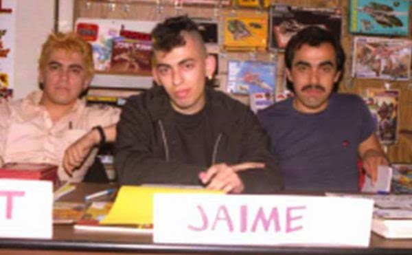
Gilbert, Jaime and Mario Hernandez in the early 80s

Jaime Hernandez channels Joe Brainard. Here are some of Love and Rockets artist Jaime Hernandez's memories of San Diego comic con, which he has been attending since the early 80s (when mohawks were still shocking).
3. I remember when I could drive there without traffic.
4. I remember when our comic debuted.
5. I remember when I met Daniel Clowes, Peter Bagge, etc…
6. I remember when the celebrities were comic artists.
["Comic-Con memories: Jaime Hernandez on San Diego’s days of ink," July 17, 2012, The Los Angeles Times
I remember when Jaime Hernandez was an ass-kicking young punk redefining comics, as opposed to a crotchety but brilliant old master. (I was thin and had lots of hair back then).


re:design (Eurydyka Kata & Rafał Szczawińsk), 2012

Guess the painter. I really love these iconic portraits of famous painters by re:design (Eurydyka Kata & Rafał Szczawiński). Most are pretty easy to guess, but a few made me scratch my head. [Hat-tip to This Isn't Happiness]


re:design (Eurydyka Kata & Rafał Szczawińsk), 2012