by Robert Boyd
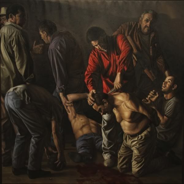
Rigoberto Gonzalez, The Zetas Cartel Beheading Their Rivals (Se Los Cargo La Chingada), Oil on linen, 7' x 7'
I always read Glasstire and use it as a resource (they have the best art listings--totally crucial for me). And I want to point people to good writing about local art. After all, we have less and less of that here as time goes on. So if you aren't already reading Glasstire, do so. And in any case, read this spectacular 2-part piece on Harlingen-based painter, Rigoberto Gonzalez, who has a provocative (if poorly lit) show up currently at the Art League. What I like about it is that even though author Sarah Frisch interviewed Gonzalez, she doesn't merely depend on the interview--she approaches the artist and his art from multiple angles. Her writing is personal, but as the article goes on, she cedes more and more ground to Gonzalez. You can read part 1 here and part 2 here.
Friday, March 30, 2012
Thursday, March 29, 2012
Voyeur
by Robert Boyd
The Kenmore is Emily Sloan's micro-artspace--a tiny dorm refrigerator which has, by now, hosted any number of art projects in various media. But none of the artists have transformed the fridge as much as David McClain. For his untitled video installation, he drilled a hole in the front of the the refrigerator and painted the exterior matt black. The intent was to make it look a little like a peep show. (But just a little--the velvet ropes add a different dimension to it). To see the video, the viewer had to walk up, bend over, and peer through the hole.
David McClain, untitled, refrigerator, paint, video, velvet ropes, 2012
The piece was set up at Skydive for their latest opening. It was tough to see the video inside, which amusingly shared space with typical refrigerator items, like a can of beer. The video itself consisted of three pieces--apparently real vintage porn starring Sylvester Stallone and (allegedly) Marilyn Monroe, and a recreation of the infamous video of ESPN sportscaster Erin Andrews naked in her hotel room. (Andrews was videotaped through a hotel peephole by stalker Michael David Barrett in 2008. The video was posted online and went viral. I suppose I could look online and find a copy of this video, but, y'know, yuck.) The recreation of the Andrews video was performed by an acquaintance of McClain's. It's not actually all that erotic--10 minutes of "Andrews" checking out her butt. I'm told it is an accurate recreation of the actual video. One could conclude from it that Andrews, a preternaturally beautiful woman like so many women newscasters, is extremely concerned about locating any possible flaw to her looks, which could be key to her success on television. It's unlike the other videos in the sense that whatever eroticism it comes from its perverse origin. But the recreated video is not like that--as a recreation, it has a deliberate erotic intent.
My problem with this is that I didn't recognize any of the videos being shown. They seemed like generic (if old) porno. So the issues of celebrity and voyeurism were lost on me. Instead, I saw it as an amusing combining of two animal instincts--food (the refrigerator and its contents) and sex. On that level, it was quite interesting.
Also interesting was the way it transformed a private, possibly shameful act--watching pornography--into a public act. In order to view the art, the viewer had to walk between two velvet ropes and bend down in front of the TV. There was no hiding what you were doing. You yourself became the object of other people's looks. You viewed the video and became the spectacle. In this way, it is a bit like Emily Moran Barwick's piece, Philanthropic Performance, which I wrote about last year.
I don't know when or where this piece will be set up again. Maybe it was a one-night only event. But it was so amusing that I hope it gets a second life.
Labels:
David McClain,
Emily Moran Barwick,
Video
Wednesday, March 28, 2012
Kramers Ergot #8 and the Art School Generation (NSFW)
by Robert Boyd
The new volume of Kramers Ergot, edited by Sammy Harkham, is out. This anthology started out as a small saddle-stitched 48-page magazine in 2000. Subsequent issues have been thicker and more book-like with an ever-expanding cast of contributors culled from the cream of the art comics movement. Issue 7 was a mammoth, tabloid-sized hardcover book. The current volume is a smaller hardcover book that at first glance could be mistaken for a generic graduate level textbook published by Wiley. The cover features the title in a fairly nondescript font, all caps. Underneath is a repeating hexagon printed in orange and gold. The image and the type are debossed into the beige cloth cover. All in all, it seems designed deliberately to be unobtrusive--the exact opposite of volume 7's attention-grabbing production.
But aside from the modesty of the exterior, one thing that struck me was how much Kramers Ergot 8 follows the classic structure of art comics anthologies going back to RAW (1980 to 1991) edited by Art Spiegelman and Françoise Mouly and Weirdo (1981 to 1993) edited by Robert Crumb, Peter Bagge, and Aline Kominsky. Like its antecedents, Kramers Ergot features avant garde comics that shade over into the art world. (With Weirdo, you had artists like Raymond Pettibon and Robert Crumb; RAW featured work by David Sandlin and Gary Panter.) Like Weirdo and RAW, Kramer's Ergot is a collection of short pieces. And like it's predecessors, Kramer's Ergot reprints of older work that no one would hitherto group with art comics. (With Weirdo, there was an incredible naive strip featuring frogs; RAW famously rediscovered the work of Fletcher Hanks.) Why would a comics anthology operating in 2012 in a quite different context as these earlier anthologies resemble them so much?
When I say different context, let me emphasize that when RAW and Weirdo were in their heyday, there were very few "graphic novels"--certain none that had a readership outside the comics subculture. Comics scarcely existed in the world of educated, artistically-sophisticated readers and viewers. The work that was interesting to Crumb, Spiegelman and Mouly at the beginning Weirdo and RAW was work that had no audience. I get the impression that Spiegelman and Mouly had a good idea of their desired constituency. They wanted to reach the artistically sophisticated readers in New York City--their peers, in other words. Weirdo was effectively aiming for readers interested in seeing work extremely far out of the mainstream--comics by the insane, the homeless, the totally untrained. Weirdo in the beginning was an art brut comic.
Given that for the most part, Weirdo and RAW were presenting works that had no pre-existing audience, it made sense to make these magazines anthologies. None of the editors knew which artists would resonate, and given their limited resources, it would have been unfair to gamble everything on one artist. An anthology was a safer bet.
But why did they publish the earlier work? I think in part because the work they were doing was such a departure from comics that had come before that they felt a need to establish an alternate art history of comics. This is not a history in the sense that the editors and cartoonists were influenced by these earlier artists (who were often extremely obscure). Instead, they wanted to show how aspects of their current practice had been anticipated. For example, Fletcher Hanks, a very primitive superhero/adventure/science fiction artist active only from 1939 to 1941, was rediscovered and reprinted in RAW. RAW was also one of the first venues to publish the work of Henry Darger.
So flash forward to 2012. The context for art comics has changed substantially. The graphic novel is a fairly popular and well-established form, thanks in part to Art Speigelman's Maus. Cartoonists whose thematic and formal approaches to comics are highly sophisticated have had success with their own books (for example, Daniel Clowes and Chris Ware). And yet, Kramer's Ergot 8, published 30 years after the first issues of RAW and Weirdo (and 20 years after those anthologies wound down), resembles them in structure. I think I know the reason why. The way to view this is to think about how cutting edge art enters the art world. If you want to show artwork that is on the very edge of contemporary art practice, you will likely show it in an artist-sun or alternative space. It will likely show up in a group show first. Solos shows, commercial galleries, and museums come later. The reason for this are the same as the reasons for the format of Kramers Ergot 8--this is still the safest and best way to introduce new, challenging work to viewers. A museum won't show this work until it has been validated by criticism and exhibition history. A commercial gallery won't show it until some commercial possibilities have been evinced. A solo show is probably out of the question because you (the gallery director) will worry about what the board of directors might think if the show is a flop. The classic art comics anthology, like the cutting edge group show at an alternative gallery, is a strategy of hedging.
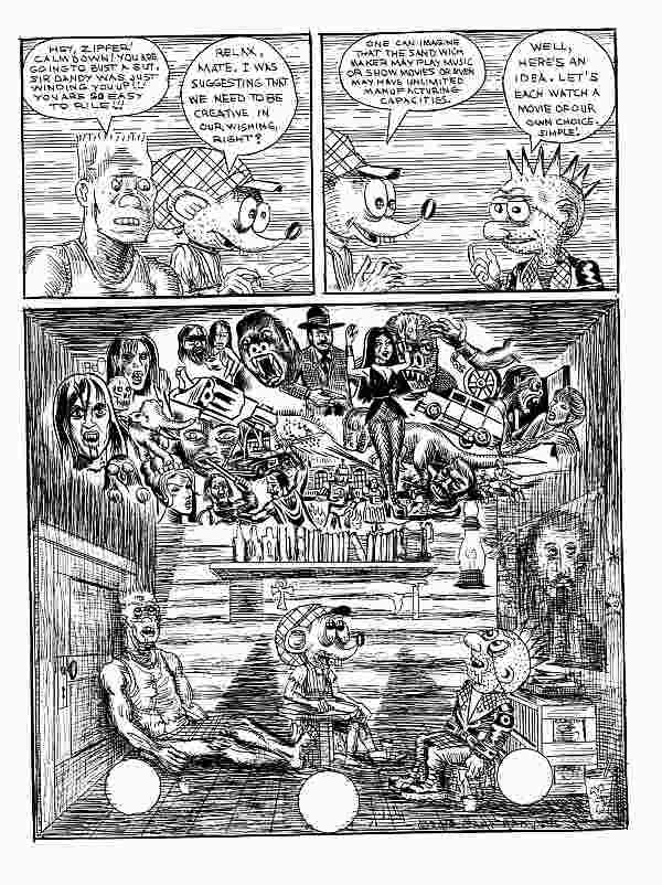
Gary Panter, Jimbo page 9, 2010
Hedging may be the reason Harkham opens with a story by Gary Panter. Panter is one of those liminal artists, existing in the outskirts of the comics world and the art world. As one of the RAW artists, his work has a pedigree. The story here, featuring his now somewhat archaic punk character Jimbo, is typical and excellent. In Jimbo's world, fast food joints are dangerous robotic entities. Jimbo lives in a consumerist dystopia, in this case a Brave New World-like space of entertainment as narcotic. It's not the most original idea, but Panter does it well. This story is curiously linear, with clear (if slightly ratty) drawing--very unlike some of his earlier classic work, such as Dal-Tokyo. When I first encountered Panter's comics in the early 80s, I was challenged by them. They worked against comics conventions I knew. I loved them because they seemed so punk. But in 20-odd years, Panter's ruptures have become familiar, and he seems less interested in playing with the form of comics. His work, curiously, is some of the most conservative in Kramer's Ergot.
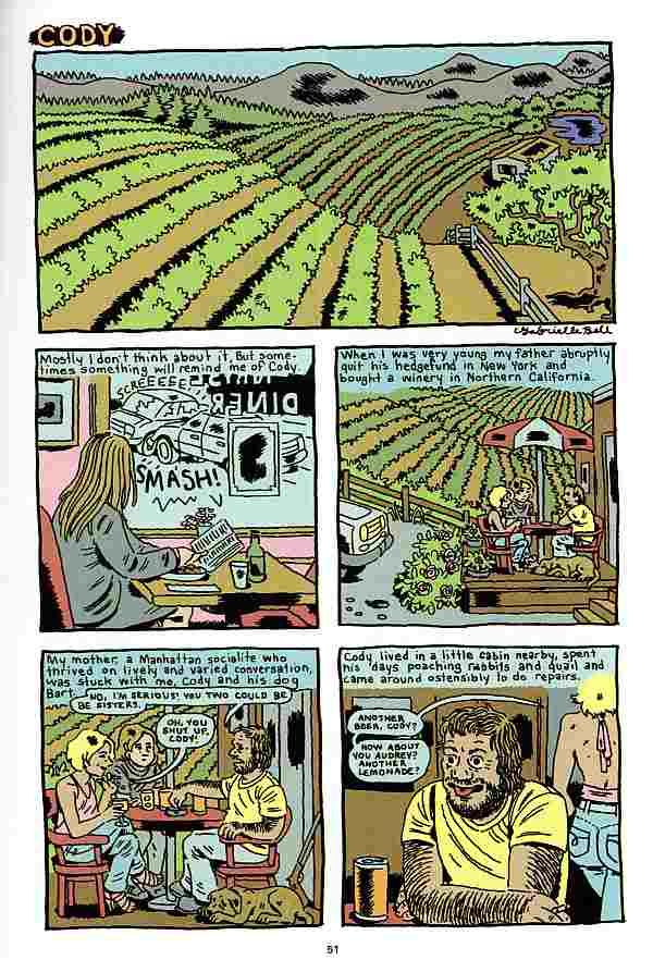
Gabrielle Bell, "Cody" page 1, 2012
The same could be said about Gabrielle Bell's story "Cody." The artwork is fairly polished and realistic (although I will say that if I saw this 30 years ago, I would have seen it as radical or experimental--which shows how much the baseline has changed). The story pretends to be autobiographical, and the set-up will strike readers as not only very realistic, but also as fitting into the tradition of alternative comics. In 1995, illustrator Debbie Dreschler started publishing a series of stories of childhood incest that had a powerful affect on the readers and creators of art comics. "Cody" at first seems similar to those Dreschler stories. But it takes a turn into unreality when the Bell character (age 13 in the story) tells her father about Cody's unwanted sexual advances. It turns out that her father was being blackmailed by Cody, and decided that since Cody was blackmailing him and about to start molesting his daughter, he had to go. Bell's father kills Cody and the two of them dispose of the body. Is any portion of this story true? Was there a creepy guy named Cody who said uncomfortable sexual things to her? (I assume she didn't just out her father as a murderer.) This kind of question comes up a lot when you read Gabrielle Bell's work. It operates in the autobiographical space--a venerable space in art comics that was dominant in the late 80s and 90s. But Bell keeps undermining autobiography. ("Cody" is the only "autobiographical" story in Kramer's Ergot 8.)
Ben Jones, "The Ultimate Character" page 10, 2012
Ben Jones is more typical of the type of artist that I associate with the Kramer's Ergot esthetic. His story "The Ultimate Character 2002" leaves behind most of the artistic concerns of the 80s and 90s alternative comics movement. His drawing is extremely unslick, but at the same time avoids the aggressive quality of early Gary Panter, Lynda Barry or Julie Doucet. The title reveals a concern about "characters," but the modern cartoonist's concern with characters is quite different from the traditional notion of characters as fictional persons with personalities and complexities (a more literary idea of a character). In Jones' comic, the word "character" means a personage with highly visual features that make him memorable and trademarkable. In this comic, the "ultimate characters" are two people with giant dog-heads for bodies. Extremely memorable and visual (once you've seen them, you will be able to recognize them by their profiles), they are characters in the new sense of the word. The unnamed pair find a strange object, they try and fail to sell it on Antiques Roadshow, and find that the object contained the body of an alien, which one of the giant dog heads eats. The drawing is minimal and lazy--it contains barely enough information to tell the story. In a way, I was reminded of a certain strain of artwork I've been seeing lately, where artists seem to be creating minimalist objects, but using deliberately shabby materials (for example, Cordy Ryman). This work is in dialogue with Minimalism and Post-Minimalism. I see artists like Ben Jones as in dialogue with earlier art comics pioneers like Gary Panter. (Jones is, like Panter, an artist in the art world, both as a solo artist and formerly as a member of the collective Paper Rad.)
I have a theory about these hybrid artists who live in the comics world and the art world simultaneously. I think they don't care about comics. Comics are another means of expression, no more important than any other. Therefore, they have no interest in elevating the form--a major project of the RAW/Weirdo generation. Using an extremely low-brow genres is just fine with them because to them it is just an aspect of the medium they are playing with. Highly polished drawing (like, say, the drawing of Dan Clowes or Chris Ware) is also not particularly important. What's important is to provide enough signifiers that tell a viewer that this is a comic you are reading. If this is their goal, it makes sense that their subject matter would not be autobiographical, or similar to realistic novels, or designed in such a clever way that you might not recognize it as a comic at first. Or, in other words, their approach is unlike the majority of American and European art comics of the 80s and 90s and most of the 2000s.
I think of these cartoonists as the "Art School Generation." It's not just that they went to art school; lots of cartoonists do that. It's that they went to elite art schools, and that some went even further and got MFAs there. They are steeped in the current thinking in contemporary art. They didn't rebel against their instruction that way Chris Ware did (Ware went to the School of the Art Institute of Chicago, one of the most elite art schools in the U.S.).
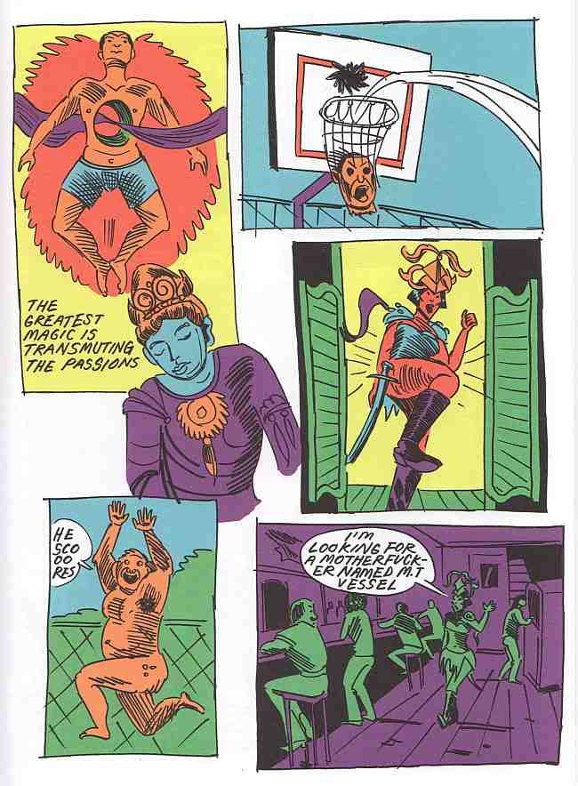
Anya Davidson, "Barbarian Bitch" page 5, 2012
Anya Davidson is, as far as I can tell, a member of the Art School Generation. She offers a comic called "Barbarian Bitch" which also embodies some of the approaches of the current generation--minimal, adolescent drawing, extreme cartoonish violence, and use of highly discredited genres (sword and sorcery/barbarian adventures in this case). In "Barbarian Bitch," Davidson weaves Buddhist sayings through the story (these sayings are by Atisha, an 11th century Tibetan Buddhist master). This is actually a bit unusual--you see plenty of references to pop culture in these comics, but not so much to classical culture. I don't know much about Davidson, but what I can glean from the internet is that she may be a graduate of SAIC.
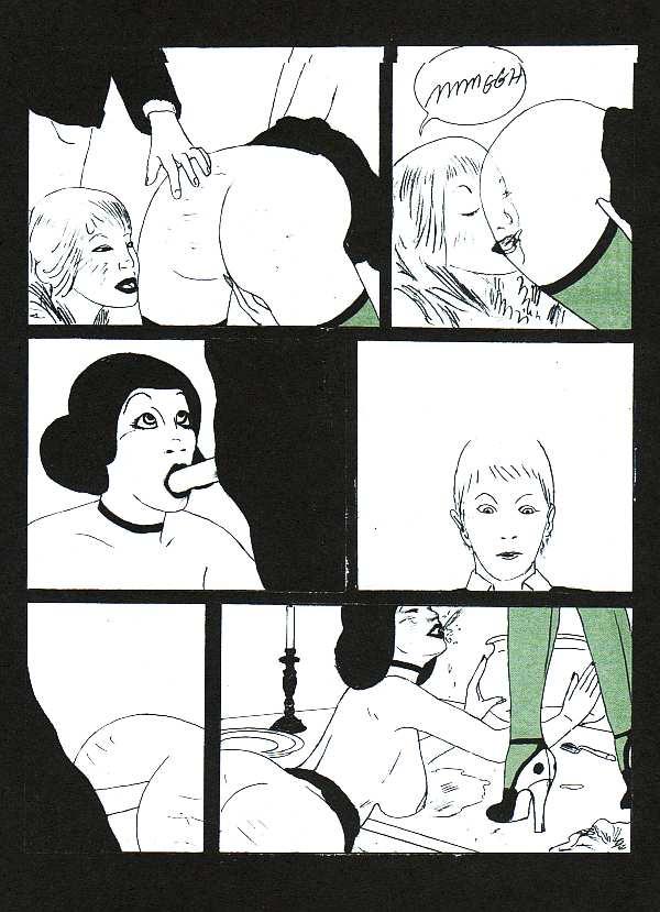
CF (Christopher Forgues), "Warm Genetics House" page 8, 2011
Perhaps the most influential of this generation of artists is CF (Christopher Forgues). His story in this issue of Kramer's Ergot is "Warm Genetics House," a perverse story of a male teacher who invites a female student to dinner at his house, where he and his sister have violent sex with the student. Forgues comes out of an elite art school background as well--The Massachusetts College of Art and Design. (Ben Jones is also an alumnus of MassArts.) I've seen work by Forgues that is highly polished with anatomically correct figures. But for his purposes, that kind of drawing isn't necessary. Here the lowbrow genre he references is porn, and he draws it just well enough to be comprehensible (even if the enigmatic story as a whole is not).
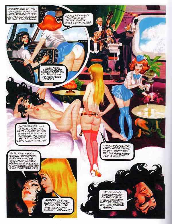
Ron Embleton and Frederic Mullally, Oh, Wicked Wanda page 6, 1975
And perhaps that reference to porn is why Harkham included a lengthy section of Oh, Wicked Wanda! by Ron Embleton and Frederic Mullalley. This comic was published in the 70s in Penthouse. Like most "sexy" comics published in men's magazines in the 60s and 70s, it was very highly produced while being completely inane at the same time. Harkham devotes an astonishing 40 pages to this tripe. Why? I'm not sure but he may be thinking that this is an exemplar of dopey porno comics, which is the kind of thing that can be quoted by art-school generation cartoonists like CF. (In CF's case, "Warm Genetics House" seems less like Oh, Wicked Wanda than like The Adventures of Phoebe Zeit-Geist by Michale O'Donoghue and Frank Springer, minus the humor.)
Takeshi Murata, Gumbone and Coke, 2011
In addition to Oh, Wicked Wanda!, Kramer's Ergot deviates from purely contemporary comics by including a portfolio of digitally altered photographic work by Takeshi Murata, an American artist working in video, photography and digital art. Aside from the striking quality of Murata's images, his inclusion may have been a statement about Kramer's Ergot context. It says that this is a comics publication with strong leanings towards contemporary visual art. That is also implied by the introduction, which discusses art history. I advise readers to skip it--it's a string of cliches and misinformation, and doesn't speak to the work that follows it.
I'm still trying to understand the work of the Art School Generation. That's one reason I wrote this review, to think through their work and its implications. As difficult as much of this work is, Kramer's Ergot remains a key publication in the broader world of art comics and for the Art School Generation.
Tuesday, March 27, 2012
Wrapped Up In Books
by Robert Boyd
Two years ago, MANUAL (the team of Ed Hill and Suzanne Bloom), had an exhibit at Moody Gallery on theme of books called The Book Project. It was a fantastic show, I thought, full of clever photos of, well, books. They were beautiful images, and for a book-lover like me, they had special resonance. But when I heard that their new show also consisted of book photos, I thought they were taking a risk of repeating themselves. Would this show would lack the freshness of the previous exhibit?
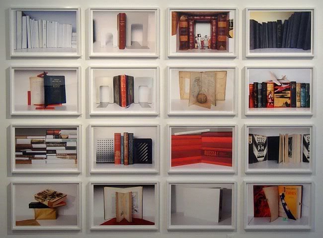
MANUAL, White Shelf Series, archival pigment prints, ed. 5, 16 pieces at 17" x 24.5" each; 81.5" x 100.75" installed
My worries were unnecessary. I actually like Picture Books, the new exhibit, better that The Book Project. What MANUAL does with their photos of books is to create formally interesting images that are also quite beautiful. But because of the subject matter of each image, there is an additional level of meaning beyond the purely visual. (This effect depends to a certain extent on being seen by a literate viewer.) It's bookish art for bookish people--the well-read, the highly educated. I used to assume that everyone who is an art-lover is like this, but experience has instructed me otherwise. I was projecting my own bookishness onto the entire art world. This is work that will have special appeal to glasses-wearing, owl-eyed bibliophiles, who are admittedly a minority.
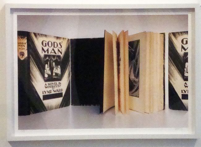
MANUAL, Lynd Ward's Man, archival pigment print, ed. 5, 17" x 24.5", 2012
Some of the photos, like Lynd Ward's Man, appear to be homages to a writer (or, in Lynd Ward's case, a visual artist) that MANUAL likes. The photo shows three copies of Ward's most famous woodcut novel, God's Man. (Actually, it may be that there is only one copy and the three images are separate photos that have been joined in Photoshop--it's hard to tell.) Beyond the images of this art deco classic, there isn't an overt attempt to link the content of Ward's book to the content of the photo. In a way, this photo is one of pure book-lust.
MANUAL, Red Russia, archival pigment print, ed. 5, 17" x 24.5", 2012
In Red Russia, MANUAL links the composition of the photo to the content of the books. It is kind of obvious (though visually striking) to show a bunch of books about Russia with red covers. But notice that the top book, The Ghost of the Executed Engineer: Technology and the Fall of the Soviet Union, is white. This book is about Soviet technology and engineering, springing from the story of Peter Palchinsky, a mining engineer who fought during the late Czarist period for improved mine safety (and whose struggle resulted in 8 years in Siberia by the Czarist government). When the Bolsheviks came to power, he supported them and continued his work for worker safety. He assumed the Soviet Government would be on his side, being a putative government of the workers. Quite the opposite--worker safety was the least of their concerns. (The White Sea Canal, built in 20 months between 1931 and 1933, had a mortality rate of 8.7%. More that 100,000 slave laborers worked on it.) Palchinsky's constant complaining about worker safety earned him a state execution. The photo shows a wall of red books with the slim white book on top. The wall could be said to represent the mammoth ill-conceived engineering projects of the Soviet Union, with the white representing the human cost of those projects.
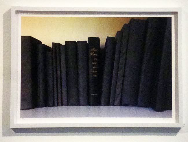
MANUAL, Black Books (Anne Frank's Diary), archival pigment print, ed. 5, 17" x 24.5", 2012
In Black Books (Anne Frank's Diary), the deeper meaning is a bit more obvious, since Anne Frank's Diary is something that most people have read or at least know about. But in case you don't , Anne Frank was teenaged girl whose Jewish family was forced to hide from the Nazis in an attic in Amsterdam for the majority of World War II. In 1944, they were betrayed, captured by the Nazis, and sent to Auschwitz. Of the Frank family, only Otto Frank, Anne's father, survived. He returned to their hiding place, found his daughter's diary, which was published and has since become a classic, a wrenching eye-witness account of the Holocaust. It's not really a "black" book, though. Anne has her ups and downs, but she remains optimistic in the book. Obviously, the was unable to write of her capture and trip to Auschwitz. But because we, the readers, know her fate, the book becomes an account of human evil--that a young intelligent girl like Anne could be mindlessly snuffed out by unthinking evil on an industrial scale. So as with Red Russia, we end up with a striking, minimal composition and a vast historic evil behind it.
Not all the photos are so serious. Some are all about design and composition, turning their books into somewhat constructivist designs.
MANUAL, Mysteries of Paris, archival pigment print, ed. 5, 31" x 22", 2012
Mysteries of Paris is one where I think design is the most important aspect of it. That isn't to say that the composition isn't related to the books. Mysteries of Paris was a serialized thriller by Eugene Sue published in France in the 1840s. I haven't read it and never will, but I can easily imagine that its hero, Rodolphe, found himself in dire straits at the end of many of the book's chapters--in other words, like all serial adventure fiction, it relied on cliffhangers.
MANUAL, Carmen and Colomba, archival pigment print, ed. 5, 43.5" x 65", 2012
Colomba & Carmen is a book by a French author, Prosper Merimee. That's all I know about it, but I don't think knowledge of the book is particularly important in MANUAL's Carmen and Colomba photo.What is important are the two black figures and the red ground--a simple, direct design. But the design is complicated a bit by what I assume is a bit of Photoshop work. The design on the cover of the book appears to extend beyond the cover, as if the book were face-down on a table with the exact same design, just slightly larger. I believe that MANUAL somehow rubberstamped the cover image to extend beyond the book. The edge of the book is easily discernible, though. One could perhaps make a comment about infinity, particularly if this were a book that toyed with such ideas. And maybe it is.
MANUAL, Mondrian on Daybed, archival pigment print, ed. 5, 31" x 21.75", 2012
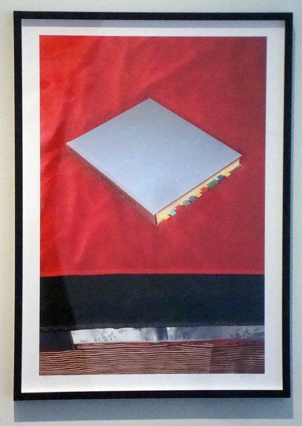
Mondrian on Daybed is a piece that has a strong, constructivism-influenced design: a Malevich square on a red background, with parallel stripes of color below. That the central element is a book on Mondrian is ironic since it is set on an angle--something Mondrian never used in his iconic geometric abstractions. But at the same time, this is a still-life that is exactly described by its title. It could be a scene from my own house--an art books with little post-it flags tossed casually on the bed as I work elsewhere. It has a kind of intellectual domesticity while simultaneously being able to be read as a flat composition.
Some of the pieces in this show are a bit more complex.
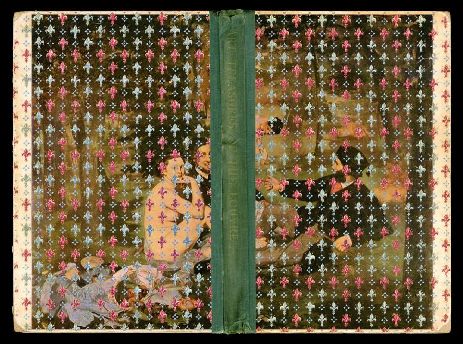
MANUAL, Treasures from the Louvre, archival pigment print, ed. 5, 36.5" x 49", 2012
This is a confusing image. Treasures from the Louvre seems to be a photo the front and back covers and spine of a book. But one can't imagine that this is the actual cover of the book. At least, the fleur de lis pattern must have been added (perhaps in Photoshop?) afterward. Maybe it was the pattern printed on the endpapers. But the result is an image that has an aggressive Frenchness.
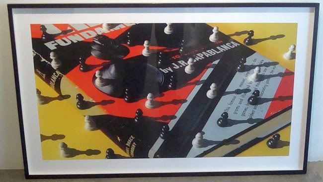
MANUAL,title unknown, date unknown
This chess-oriented print wasn't hung in the show. It was sitting in the back of the gallery on the floor. Here again, it appears that Photoshop may have been used. The black, red and blue-grey chess instruction book looks three-dimensional, but the pawns and their shadows are resting on it as if it were flat. The image of the king on the cover is being overwhelmed by pawns from another dimension. The image is an optical illusion, but it is also a beautiful composition using a limited pallet. (The yellow ground works especially well here.)
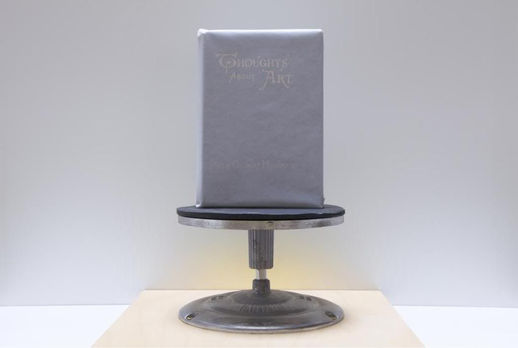
MANUAL, Thoughts About Art, archival pigment print, ed. 5, 28" x 40.5", 2012
In the end, and for personal reasons, Thoughts About Art may be my favorite piece in the show. The book in this piece is Thoughts About Art by 19th century English art critic, Philip Gilbert Hamerton. But every book of art criticism, every monograph, and blogs like the one you're reading now could have that title (not to mention Hennesy Youngman's video series). These thoughts are wrapped in tissue paper and placed on a modest pedestal--about as much glory as an art critic can hope to get, I suppose.
I'm not sure if any bigger "thoughts about art" can be pondered about Picture Books as a project. The sum may not exceed the parts. But perhaps in choosing this subject, MANUAL are acknowledging that the age of books as physical objects has begun to end. A good portion of my reading is done on a electronic devices these days, and I suspect this is generally true among people who love books for what they contain (as opposed to book-collectors, who love them as objects). This exhibit celebrates this glorious piece of not-quite-obsolete technology. It's technology well worth celebrating.
Labels:
Manual,
photography
The Scroll
by Brian Piana
So I'm getting ready for bed this past Friday night, and I'm describing to my wife a piece of art I had seen earlier that day. I began by telling her how this guy has been working on this drawing for seven years, and she immediately quips "so it speaks to you", followed by a bit of laughter as she rolled over. She's absolutely right of course; it totally does. Consider this less of a review and more of an open love letter to Randall McCabe's scroll.
Randall McCabe, untitled, ink on paper with spindles, 6.5" x 1800" (840" visible), 2005-2012 (ongoing)
The piece (officially untitled) is currently on display at Lawndale Art Center in the Project Space, the easily overlooked exhibition space tucked between the residency studios and the administration offices on the third floor. I had gone to Lawndale to check out The Photographic Mirror, a group show curated by my friend Chuy Benitez, and also take in Emily Peacock's and Linda Post & Jim Nolan's exhibitions (which Robert Boyd has already written about here and here, respectively). Yet it was McCabe's work that completely blindsided me in the best possible way.
Randall McCabe, untitled, ink on paper with spindles, 6.5" x 1800" (840" visible), 2005-2012 (ongoing)
The primary work of the exhibition – the scroll itself – wraps around approximately three quarters of the total wall space in the gallery. Thus, we're confronted with approximately 70 continuous feet of a singular drawing. Granted, the drawing is only 6 1/2 inches tall, but that thin strip wrapping around the room is commanding nonetheless. In reading the accompanying text, it is revealed that the drawing is actually 150 feet in length, yet we are only privy to this one portion. The remainder of the drawing is rolled up and concealed on two mounted spindles at either end.
The mark-making on the scroll, which is comprised mostly of short hatching lines in limited directions, immediately made me think of the work of both Sol LeWitt and Man Bartlett. I thought of LeWitt and his wall pieces because McCabe seems to be following some prescribed set of mark-making rules for this piece. Although the composition of the scroll changes as it transitions from one end of the room to the other, the underlying marks remain consistent over that span, where horizontal, vertical, and 45º diagonal lines are arranged into roughly half-inch square modules. Moreover, there's a simplicity and looseness in the appearance of the line work, which suggests that these are marks that could be made by almost anyone (trained draftsman or not).
Given its full length of 150 feet, the drawing has clearly taken a long time and has required immense dedication. Those qualities, paired with the use of small, repetitive marks, makes me think of Bartlett's circle drawings and point pieces. [Full disclosure: Bartlett has exhibited his point pieces and other works at Skydive Art Space, where I am a co-director. His work remains fresh in my mind.] Yet while Bartlett's drawings are more clinical and precise in execution, McCabe's scroll features a variety of tones, shapes, and blemishes. Another significant distinction is that both Bartlett's and LeWitt's pieces have an endgame; that is, they reach a point of completion. This drawing, however, is ongoing. It's 150 feet...and counting.
Started in 2005, McCabe has been working on the scroll for the past seven years. The section presented in the gallery accounts for (approximately) the year between late 2008 to late 2009. I can guess this because McCabe occasionally writes a date along the bottom of the drawing, and I assume these dates are related to when that section was worked on or completed. The time-stamps begin to suggest that this scroll is more than a durational drawing; it is a record, a document. It gets even more personal in a couple of spots where the numeric date is accompanied by an event in the artist's life, as shown below.
I wonder how often these personal notes are included over the entire length, and why. Has the scroll become something more than the train-of-thought exercise described in the McCabe's statement? Do such noted life events correspond or inform the drawing's composition, or are they just simply notes, detached from the surrounding marks?
The composition does shift across the room, ranging from cloud-like white spaces in the earliest segment, to completely shaded areas over the middle, and finally to landscape-esque contours towards the end. Around the time of the home burglary in 2009, the "landscape" tightens, and the white space of the drawing begins to be pinched by dark forms above and below it. A thin scratch of white leads us into the concluding spindle, where the last couple of years of the drawing reside, hidden safely away.
So of course, I now really want to see what I can't. How greedy is that? The artist himself says he has never seen more than 7 continuous feet of the drawing at any one time. Here he's giving us 70, but I'd love for a peek at all 150. The thickness of the rolled up portions on either end are evidence to the large amount of drawing left unrevealed. This only prompts more delicious questions: Why was this segment specifically chosen? Was it random? What do the most recent sections look like? The earlier ones? What other life events are recorded here? Is there any engineering feat possible that could allow a viewer to – for lack of a better word – scroll through the entire composition? But I digress. (The installation of the piece as it is, by the way, is quite nice, particularly in bending the drawing around the corners of the room.)
So, yes, my wife was indeed correct. The scroll speaks to me, and it continues to bounce around my head in the days since I saw it. I am happy that McCabe decided to share his drawing – and its great unveiling – with the rest of us.
Labels:
Brian Piana,
drawing,
Randall McCabe
Monday, March 26, 2012
You Can't Scare Me, I'm Sticking to the Links
by Robert Boyd
How To Help the Striking Sotheby's Art Handlers: Art Fag City asks that people "Stop Shopping at Sotheby's". This seems a bit unrealistic. Most people who are interested in or otherwise involved in art have never purchased anything at Sotheby's and probably never will. Furthermore, amongst those who do buy from Sotheby's, you can't really argue that they, say, buy from Christie's instead because the items they are bidding on are unique. You can't get a substitute for that art object you want from Sotheby's at Christie's or Phillips de Pury or Heritage. And finally, the buyers of art at Sotheby's are the 1%--their sympathies are likely to be with Sotheby's management more than with the working class. No, who should be targeted are the consigners. Consigners should be more-or-less indifferent about who auctions off their possessions. If you can convince someone who would have sold through Sotheby's to instead sell through Christie's, you hurt Sotheby's. [Art Fag City, "Stop Shopping at Sotheby's", Whitney Kimball and Will Brand]
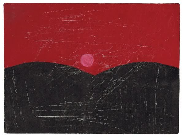
Forrest Bess, untitled, not dated
Forrest Bess is All Over the News: The New York Times critic Roberta Smith has a long article on Bess which also criticizes the Christie's sale (benefiting M.D. Anderson) for containing too many lesser works. (There is a nice slideshow, too.) Then over at Hyperallergic, longtime Bess devotee John Yau has a penetrating two-part article about the man from Bay City. ["A New Vision of a Visionary Fisherma" by Roberta Smith, The New York Times; "Without Elaboration" by John Yau part 1 and part 2, Hyperallergic]
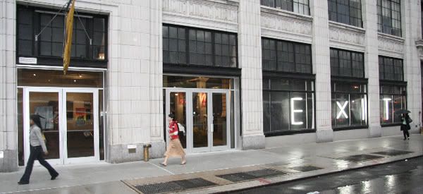
Exeunt Exit Art
Institutions that die with their founders: Exit Art was founded in 1982 as a scrappy alternative art space by Jeanette Ingberman. It's known for its commitment to emerging artists and art by "the art-world underdog, focusing almost entirely on work by minorities, women and non-mainstream artists." So says Rachel Corbett in Artnet. Ingberman died last year, and now Exit Art is shutting down with one final valedictory exhibit. The final day for Exit Art is May 20. This got me thinking. Are there many spaces like this that are run by a single person for her entire life? Spaces that close after the founder's death? I'm thinking this because I usually think the intention of non-profit space is to go on indefinitely, even though many fail to reach that goal. Even when an institution is strongly identified with one person, there is often a succession plan for the event of the founder's death. (The Menil is probably an example of this--it seemed to run quite smoothly after the death of Dominique DeMenil.) I wonder if Ingberman planned for Exit Art to exit when she did? ["Exit Art Exit Interview" by Rachel Corbett, Artnet; "The Fantastic Dream: a memorial to Jeanette" by Melissa Rachleff Burtt, Artnet]
Labels:
art spaces,
auctions,
Forrest Bess,
Jeanette Ingberman,
Sotheby's
Wednesday, March 21, 2012
Vote Now!
by Robert Boyd
The Bayou City Art Festival is coming up this weekend, and in among the lawn ornaments and hand-crafted doodads will be some art, including art at the CultureMap booth. And CultureMap is having a contest to vote for the artist to take with them. They are asking you to vote. I did--but it wasn't an easy decision! The artists they have selected are pretty good! For your considerations, the artists are Daniel Anguilu, Debra Barrera, James Ciosek, Daniel Esquivel Brandt, Jonathan Leach, Sandy Tramel, and Patrick Turk. Several of these artists have been reviewed positively here on The Great God Pan Is Dead (which might give you a hint on who I voted for). There are only 13 hours left to vote as I write this, so head on over to the CultureMap page and make your voice heard!
Tuesday, March 20, 2012
From Boston to Brazil Links
by Robert Boyd
Reid Sutton and Brad Nagar's House
I like looking at other people's art collections. That's why the Rice Design Alliance Living With Art tour would be so perfect for me. Two days, eight houses, lots of art. But alas, by the time I heard about it, it was full up. One of the houses to be toured is Reid Sutton and Brad Nagar's home, which was featured in an article in the Houston Chronicle. The article is accompanied by a short slideshow of some of the houses. I can see Rachel Hecker and Aaron Parazette paintings in this photo from Sutton and Nagar's home. See how many pieces of art you recognize. (By the way, if you are one of the lucky ones on the tour, we'd love to publish your annotated photos--or even just see them.) [RDA, The Houston Chronicle]
Jaca, painting from his exhibit at the Museu do Trabalho
Art spaces around the world 1: the Museu do Trabalho in Porto Alegre, Brazil. I stumbled across this space's Flickr page and it looks awesome. The Museu do Trabalho (literally, the "Museum of Work") was founded in 1982 to be a museum of labor. At first it was housed in the sheds below with the intention of moving into a refurbished factory. However, the factory never got refurbished so they stayed in the sheds. The space was too small for a full-on museum, so it has evolved over the years into an alternative art space. Which would not be all that exciting if the art weren't really interesting--which it is. Looks like I will have to save up for a Brazilian vacation... [Museu do Trabalho, Museo do Trabalho's Photostream]
The Museu do Trabalho
Lilian Maus, art shown at Museu do Trabalho
George Kuchar opening at Mulherin + Pollard [VernissageTV]
When underground comics met underground films. George Kuchar was a well known underground filmmaker (if you haven't seen his work, I recommend the documentary It Came From Kuchar, available on Netflix), but did you know he also dabbled in underground comics? He was friends in San Francisco with Art Spiegelman and Bill Griffith, who both occasionally appeared in Kuchar's films. They returned the favor, occasionally running his comics in their great anthology Arcade. Some of his film work is being shown at the Whitney Biennial, but if you are in New York, you can see his comics work at Mulherin+Pollard through March 25. [VernissageTV]
Awright you artist maggots--drop down and give me 50! This is one of the weirdest stories I've seen in a while. In Boston, there is a building called Midway Studios, a mixed live/work building intended for use by artists. Then, weirdly enough, a small defense contractor, Ops-Core, moved into one of the office spaces. Weird, but not alarming. But then they rented the basement, which hitherto had been theater space used by the Actors Shakespeare Project, to turn it into a manufacturing plant for military headgear. (Between moving in and taking over the basement, Ops-Core had been purchased by Gentex, a large military contractor.) When the artists complained to their landlord that they didn't want to be living on top of a military products factory, they got a letter from David Rogers, former Ops-Core CEO and now a VP at Gentex. Among other things, it said:
The false sense of entitlement of many of our fellow residents astounds me. I have lived in the neighborhood for the past 18 years and am also very familiar with the expectations of some local artists. . .The majority (and some of the most outspoken)"posers" do not create anything whatsoever. They are merely self delluted [sic] bullshitters and drama queens who use art as an excuse to justify and rationalize their pathetic existence [sic] while mooching from others to sustain a livingA rancorous public meeting was held next, and the situation is still unresolved. [The Boston Phoenix (part 1 and 2) via Hyperallergic]
Labels:
art spaces,
Art Spiegelman,
Bill Griffith,
collectors,
George Kuchar,
Jaca,
Lilian Maus
Monday, March 19, 2012
Recently Read Art Books
by Robert Boyd
Here are a few art books I've read this year. Most of them are several years old--I tend to prowl the shelves of used-book stores like Kaboom.
The Map and the Territory by Michel Houellebecq. A very interesting novel about a contemporary artist, Jed Martin. The novel starts with Martin destroying his latest painting, Jeff Koons and Damien Hirst Divide the Art Market. It was to be the last painting of a series depicting people in the context of their professions. This scene is followed by a flashback that describes Martin's upbringing, education, and progress as an artist. What I liked very much was that Martin was thoroughly modern. I know a lot of older painters who look down their noses at non-traditional mediums. But people of Martin's generation see photography (and computer programs like Photoshop) as being as legitimate as painting and fundamentally interchangeable with painting. So Jed goes from being a pure photographer to being a photographer who digitally manipulates his images to being a painter. (Later he does video with the aid of custom-designed software.) In his mind, he is adjusting his mediums in response to changes in subject matter, which have different requirements.
But the novel surprises you suddenly when Michel Houellebecq himself becomes a character--and a major one. I won't write more about it lest I spoil the plot. The focus is Martin and his parallel life's journey and artistic journey. I'd like to know what artists make of him. So often when an artist is depicted in a film or a book, the depiction rings false. But in The Map and the Territory, I was convinced.
Everybody Was So Young: Gerald and Sara Murphy, a Lost Generation Love Story by Amanda Vaill. I read Calvin Tompkins' Living Well Is the Best Revenge, which was written while Gerald and Sara Murphy were still alive. It's good, but Everybody Was So Young is better--it carries them past their golden decade in France to the more difficult 30s and 40s until their deaths. (That golden decade was fictionalized in Tender Is the Night by F. Scott Fitzgerald--the protagonists, Dick and Nicole Diver, are loosely based on the Murphys.) Murphy was a serious amateur painter whose work is now rightly considered among the best American painting of the 20th century. But his painting was not the couple's primary gift to culture--it was being the hosts for some of the greatest writers and artists of the 20th century. When I imagine how an artist gets to be great, I first think of the artists themselves, and then about the gate-keepers and promoters--the gallery owners, the editors, the curators, the impresarios, etc. But the Murphys were not gatekeepers, and yet they contributed much by virtue of their enthusiasms and friendships to literature, to painting, and to ballet. By covering their post-"Lost Generation" years, Vaill lets us see the tragedies of their lives alongside the golden peak.
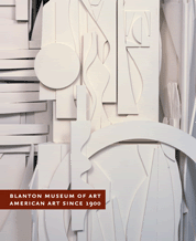
American Art Since 1900 edited by Annette DiMeo Carlozzi and Kelly Baum. Don't be mislead by this title. The American art in this book is all chosen from the collection of the Blanton Museum of Art at the University of Texas at Austin. Like most small or medium-sized museums (and like some large ones), the Blanton's collection has its idiosyncrasies. In this case, the big idiosyncrasy is that a majority of the post-war American art in their collection was donated by a single collector, novelist James Michener. Michener was a major collector who bought 297 works between 1959 to 1975 which he subsequently donated to the Blanton. He had a pretty good eye and advanced tastes--quite surprising given that Michener is the quintessential middle-brow novelist. The Blanton really lucked out. He only bought paintings, though, which leaves out a lot of important work, especially in the 60s. And he mostly avoided Pop art (one Robert Indiana painting). But he bought lots of abstract art by key artists: Franz Kline, Hans Hoffman, Joan Mitchell, Robert Motherwell, Sam Francis, Brice Marden, etc. By basing so much of their collection on Michener, it means that the Blanton has no Warhol, no Rauschenberg, no Johns, and many others of that generation. (At least I assume they didn't have work by these artists--if they did, they would have included it. This show dates from 2006, so theyt may have filled in their collection subsequently.) The other idiosyncrasy is that there is a lot of art by Texas artists here. This is not art that would normally be included in a survey exhibit of 20th century American art. That said, I'm glad for the inclusion--especially Jerry Bywaters' Oil Field Girls. Each work gets its own essay, and there are longer essays in the back by such writers as David Hickey and Raphael Rubenstein. There is also an amazing essay by Robert Kushner about Michener's collecting habits, where he critiques what Michener bought year by year.
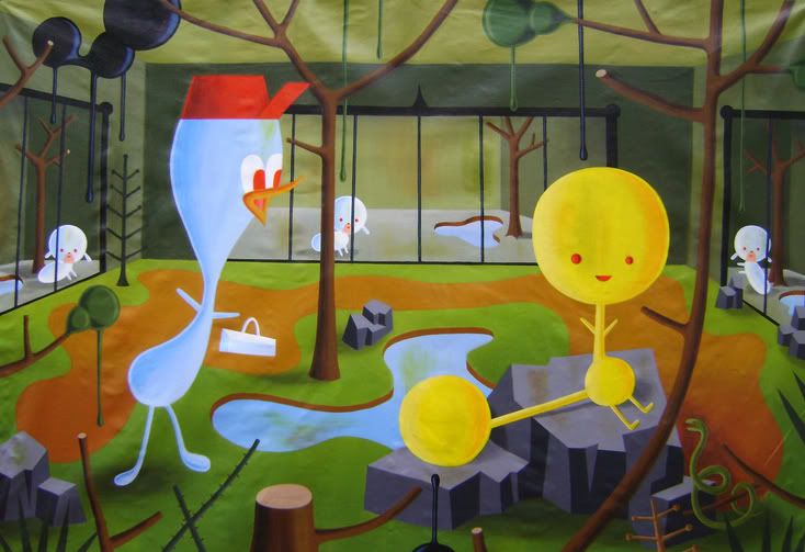
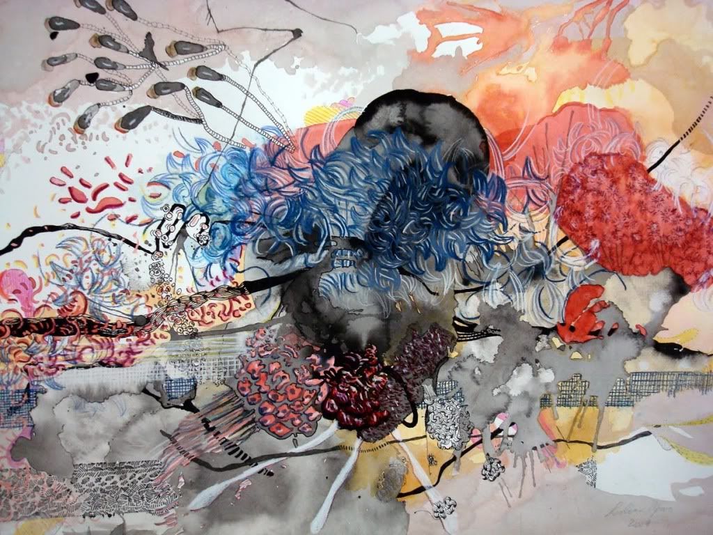
No. 1: First Works by 362 Artists by Matthew Rosenzweig and Francesca Richer. This book has an intriguing concept. They asked artists the question, what do you consider your first work of art? 362 answered. Some gave them the oldest work from their childhood. A few gave them the first work they made after they had formed the ambition of being an artist (often a work from adolescence). Most gave them the first work that they considered a mature work--work that was no longer the work of a student, or the work of a young derivative artist. With 362 artists, working an a very wide variety of media, and from several generations, you get an interesting view of art today, as well as a sense of how artists of different generation and different countries view the process of artistic maturation.
Here are a few art books I've read this year. Most of them are several years old--I tend to prowl the shelves of used-book stores like Kaboom.
The Map and the Territory by Michel Houellebecq. A very interesting novel about a contemporary artist, Jed Martin. The novel starts with Martin destroying his latest painting, Jeff Koons and Damien Hirst Divide the Art Market. It was to be the last painting of a series depicting people in the context of their professions. This scene is followed by a flashback that describes Martin's upbringing, education, and progress as an artist. What I liked very much was that Martin was thoroughly modern. I know a lot of older painters who look down their noses at non-traditional mediums. But people of Martin's generation see photography (and computer programs like Photoshop) as being as legitimate as painting and fundamentally interchangeable with painting. So Jed goes from being a pure photographer to being a photographer who digitally manipulates his images to being a painter. (Later he does video with the aid of custom-designed software.) In his mind, he is adjusting his mediums in response to changes in subject matter, which have different requirements.
But the novel surprises you suddenly when Michel Houellebecq himself becomes a character--and a major one. I won't write more about it lest I spoil the plot. The focus is Martin and his parallel life's journey and artistic journey. I'd like to know what artists make of him. So often when an artist is depicted in a film or a book, the depiction rings false. But in The Map and the Territory, I was convinced.
Everybody Was So Young: Gerald and Sara Murphy, a Lost Generation Love Story by Amanda Vaill. I read Calvin Tompkins' Living Well Is the Best Revenge, which was written while Gerald and Sara Murphy were still alive. It's good, but Everybody Was So Young is better--it carries them past their golden decade in France to the more difficult 30s and 40s until their deaths. (That golden decade was fictionalized in Tender Is the Night by F. Scott Fitzgerald--the protagonists, Dick and Nicole Diver, are loosely based on the Murphys.) Murphy was a serious amateur painter whose work is now rightly considered among the best American painting of the 20th century. But his painting was not the couple's primary gift to culture--it was being the hosts for some of the greatest writers and artists of the 20th century. When I imagine how an artist gets to be great, I first think of the artists themselves, and then about the gate-keepers and promoters--the gallery owners, the editors, the curators, the impresarios, etc. But the Murphys were not gatekeepers, and yet they contributed much by virtue of their enthusiasms and friendships to literature, to painting, and to ballet. By covering their post-"Lost Generation" years, Vaill lets us see the tragedies of their lives alongside the golden peak.
American Art Since 1900 edited by Annette DiMeo Carlozzi and Kelly Baum. Don't be mislead by this title. The American art in this book is all chosen from the collection of the Blanton Museum of Art at the University of Texas at Austin. Like most small or medium-sized museums (and like some large ones), the Blanton's collection has its idiosyncrasies. In this case, the big idiosyncrasy is that a majority of the post-war American art in their collection was donated by a single collector, novelist James Michener. Michener was a major collector who bought 297 works between 1959 to 1975 which he subsequently donated to the Blanton. He had a pretty good eye and advanced tastes--quite surprising given that Michener is the quintessential middle-brow novelist. The Blanton really lucked out. He only bought paintings, though, which leaves out a lot of important work, especially in the 60s. And he mostly avoided Pop art (one Robert Indiana painting). But he bought lots of abstract art by key artists: Franz Kline, Hans Hoffman, Joan Mitchell, Robert Motherwell, Sam Francis, Brice Marden, etc. By basing so much of their collection on Michener, it means that the Blanton has no Warhol, no Rauschenberg, no Johns, and many others of that generation. (At least I assume they didn't have work by these artists--if they did, they would have included it. This show dates from 2006, so theyt may have filled in their collection subsequently.) The other idiosyncrasy is that there is a lot of art by Texas artists here. This is not art that would normally be included in a survey exhibit of 20th century American art. That said, I'm glad for the inclusion--especially Jerry Bywaters' Oil Field Girls. Each work gets its own essay, and there are longer essays in the back by such writers as David Hickey and Raphael Rubenstein. There is also an amazing essay by Robert Kushner about Michener's collecting habits, where he critiques what Michener bought year by year.
No. 1: First Works by 362 Artists by Matthew Rosenzweig and Francesca Richer. This book has an intriguing concept. They asked artists the question, what do you consider your first work of art? 362 answered. Some gave them the oldest work from their childhood. A few gave them the first work they made after they had formed the ambition of being an artist (often a work from adolescence). Most gave them the first work that they considered a mature work--work that was no longer the work of a student, or the work of a young derivative artist. With 362 artists, working an a very wide variety of media, and from several generations, you get an interesting view of art today, as well as a sense of how artists of different generation and different countries view the process of artistic maturation.
Sunday, March 18, 2012
Subscribe to:
Posts (Atom)