Monday, May 30, 2011

Artistic Capital and Ethics

by Robert Boyd

There are artists and there are people who involve themselves with art. This latter group includes gallerists, curators, critics, collectors, art space and museum directors, grant administrators, art school deans and directors, etc. Let's call the latter group gatekeepers, because their work involves exercising judgment about art. The two groups overlap. And in that overlap lies the possibility of ethical mischief.

The gatekeepers bestow artistic capital on the artists by choosing them. We may struggle with these choices, disagree with them, disagree with the very notion that a choice must be made and certainly with the theoretical frameworks on which the choices are made, whether stated or implicit. But in the end, there is more art produced than can be experienced , displayed, written about, or collected. There necessarily needs to be a culling process. Gatekeepers do this.

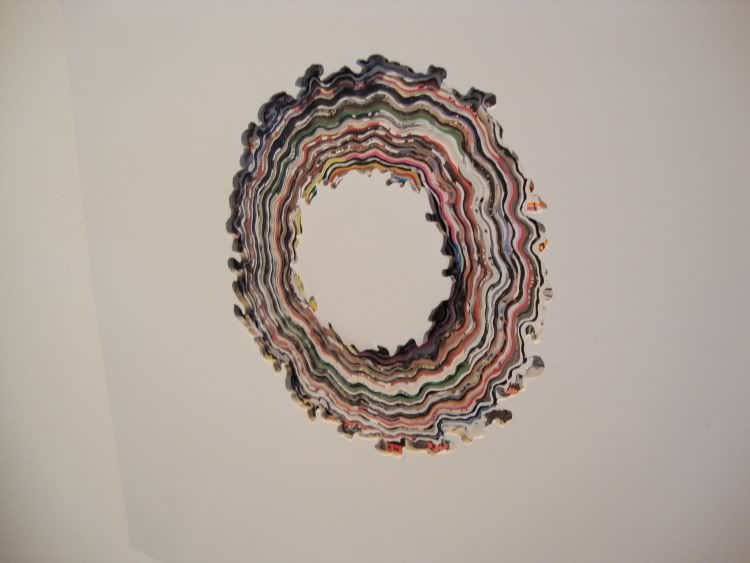
And each time a gatekeeper acts, an artist benefits. She gets some artistic capital (which, with luck, can be turned into economic capital). For example, every year Lawndale Art Center brings in a guest curator to act as the juror for The Big Show. In 2009, the juror was Laura Fried, who is an assistant curator at the St. Louis Contemporary Art Museum. Now the Big Show doesn't bestow a ton of artistic capital on the artists it shows. You haven't made it just because you had a piece in the Big Show. But it gives you a little artistic capital. You get seen by a lot of people. You get a line on your resume. And if you're lucky, you might sell a piece. That's what happened to Jed Foronda. Foronda is a young Houston artist who had two pieces in the 2009 show. I liked them and contacted him. Were they for sale? He said yes. So I bought one of them. So Foronda's artistic capital was turned into a small but nice chunk of economic capital.

But he also gained additional artistic capital by being collected. Different collectors bestow different levels of capital, of course. Charles Saatchi gives an artist he's collecting more artistic capital than, say, John and Becca Thrash, who in turn give a lot more than me. We're all collectors, but as collectors, our stock of artistic capital to spend varies wildly. But I give additional artistic capital above and beyond the meager supply I have as a collector because I'm also a critic. Foronda benefits from me not just because I bought a piece of his, but because I've written about his art. This is the way a critic bestows artistic capital. I've generally written good things about Foronda's art--but even if I had criticized it, he would have gotten a little artistic capital because being criticized by name means that your art is worth thinking about.
the wheels keep on spinning
Jed Foronda, The Wheels Keep On Spinning (detail), masonite, magazines, 2009

But Foronda's stock of artistic capital is still pretty low. He hasn't had a solo exhibit (as far as I know), which would be how a curator would shell out artistic capital, nor is he represented by a commercial gallery (as far as I know), which is the main way a gallerist pays out artistic capital.

The reason I'm talking about this is because the ability to bestow artistic capital is power. And power can be abused.
Photobucket
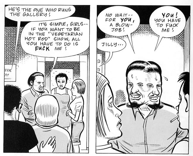
Dan Clowes, from "The Artist's Life" (collected in Pussey!)1993

This abuse can be overt and obviously malign, as in these panels from one of Dan Clowes's scabrous "Dan Pussey" stories. But a different ethical issue for gatekeepers came up in conversation this weekend. What if you are a gatekeeper? You have an artistic soul, and maybe you studied art. Maybe you're a Sunday painter. Do you exhibit your own art? Do you promote yourself as an artist, in addition to being a (gallerist, critic, curator, collector, etc.)?

My answer is that you probably shouldn't because you already have some power, some artistic capital to spend. If someone else wants to be on the receiving end of your artistic capital, they won't want to turn you down when you ask to be in a group exhibit or gallery show, or if you ask to have your stuff reviewed. So because of the power you have, you may displace an artist who has no power. You, as a gatekeeper with artistic capital to spare, might prevent an artist with none from being in an exhibit or a group show, all because of your own artistic vanity.

The thing is, there are curators and artists and gallery managers and owners and even collectors who do their own artwork. They are sincere and serious artists. But for me, from an ethical point of view, they need to be very careful about what they do with their art. They need to make sure that they are not getting shown because of their position in the art world, because of the artistic capital they have in their pockets to spend. In general, I think they should err on the side of not being exhibited. But that might be my inner goody-two-shoes talking.

Share


Sunday, May 29, 2011

We Love You, Liz

by Robert Boyd

Elizabeth Taylor died on March 23 this year, and War'Hous Visual Studio had a memorial exhibition, We Love You, Liz, up on May 29. Good curatorial ideas for group shows are hard to do--at their best, a curator can take the disparate artistic practices of various artists and help us realize some powerful commonality among them. An eagle-eyed curator can locate a school of art often before the artists realize it's happening.

But for me, it's almost always bad curatorial practice to have art built around a particular subject. For one thing, you often end up asking artists to depict something that they might never depict on their own. The work ends up being not strongly felt, not particularly meaningful for the artist--her second best work instead of her best. Conceptually, that would by my problem with Tra' Slaughter's We Love You, Liz. But it had an even bigger problem--the art just wasn't very good.

Almost all the art was painting, and these artists were painting basically realistic portraits of Elizabeth Taylor. One of the base conditions for such a portrait would be that it be recognizable as Taylor. But except in broad strokes (hair, eye color, lips), they weren't good likenesses. This was kind of shocking. If you are trying to paint in a halfway realistic manner, not being able to capture a likeness is a strong indication that you need a lot more woodshedding. Most of this art shouldn't have been in an art show--and responsibility for that falls on the curator, Tra' Slaughter.

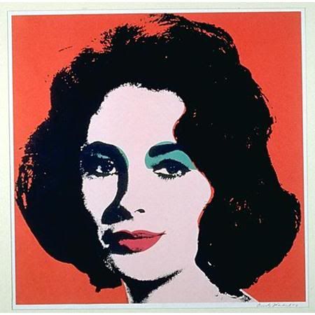
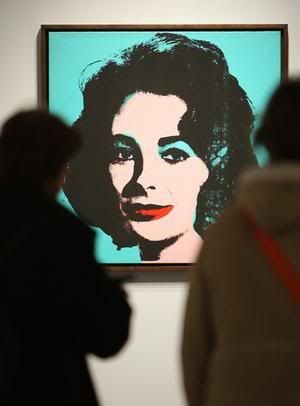
But the crazy thing is, why paint a likeness at all? Liz Taylor was an icon--it would make more sense to treat her as a signifier, a logo. That's what Andy Warhol realized, and he realized it in 1963. He didn't try to draw her (although he could have--he was a good draftsman). He just took a generic publicity photo and ran with it.

Photobucket
Andy Warhol, Liz (Colored Liz), 1963

Photobucket
people looking at an Andy Warhol Liz

So do any of the artists play with the signifier that is Elizabeth Taylor? Yes, I thought a couple did.

Photobucket
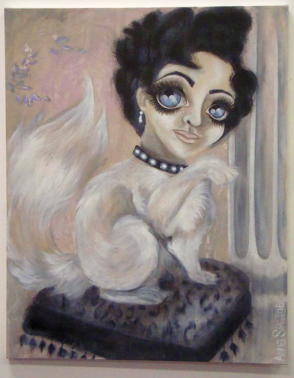
Anna Sprage, Lizcat, 2011

Anna Sprage's Lizcat takes the camp aspects of Liz and ratchets them up by combining it with other signifiers of camp. The Keane eyes, the Persian kitty, the bling and classical column all add up to a humorous and yet appealing camp explosion.It's an appropriate tribute to a star whose whole life made her a camp icon.

Photobucket
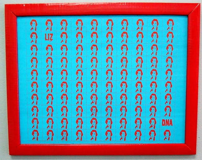
Andrea Ancira, Liz Blotter (one of four sheets displayed), 2011

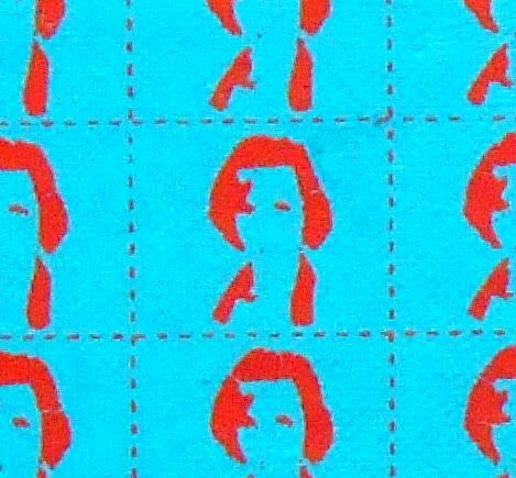
Andrea Ancira's four sheets of Liz Blotter learns from Warhol--that Liz is not a person, but an image. By taking a high-contrast photo, shrinking and simplifying it, and repeating it over and over, Ancira replicates the whole star-making process--a process that turns its subjects from human beings into mass-produced things. Plus, by putting her image on blotter paper (a common vehicle for transporting, retailing and consuming LSD), she reminds us what a free-floating signifier someone like Elizabeth Taylor is. And she links Taylor to the counterculture--a link that was always there anyway. Elizabeth Taylor to Andy Warhol to the Factory to the Exploding Plastic Inevitable to the Velvet Underground, etc. The high-contrast graphic image on the blotters recalls Warhol's own deliberately low-quality, high-contrast images of Taylor.

Photobucket
Andrea Ancira, Liz Blotter (detail), 2011

Sprague and Ancira took the theme of this exhibit and created clever, thoughtful work for it. Unfortunately, that wasn't the general case here.


Share

Friday, May 27, 2011

The Hunting Prize 2010: Leigh Anne Lester

I'm a little late here, but I did want to mention a little something about the Hunting Prize. This year, it went to Leigh Anne Lester for this piece:

Photobucket
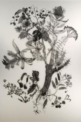
Leigh Anne Lester, Mutant Spectre, graphite on drafting film, 2010

These is a good interview with Lester at ...might be good.

I've complained about the Hunting Prize in the past, but as far as I can tell, there was nothing to complain about this year. In fact, it seems like the Prize has gotten better every year in the way it treats artists (both entrants and winners). And, perhaps most important, its choices for winners have all been pretty damn interesting, which is what you really want from a prize like this, right? So congratulations to Leigh Anne Lester, and a salute to the previous winners: Francesca Fuchs, Michael Tole, Wendy Wagner, Robyn O'Neil and Lane Hagood.


Share


Wednesday, May 25, 2011

Mary Hayslip at P.G. Contemporary

by Robert Boyd

Right now, Mary Hayslip's work is featured in a two-person exhibit , Voodoo Pop, at the Art League. She is sharing that exhibit with her old friend Trey Speegle, who is an illustrator/designer/artist in New York with Houston roots. It's a show worth seeing, especially for Speegle's various Marvin Zindler-related pieces. (Marvin Zindler is everywhere right now--in addition to the Art League, you can find him (or his doppelganger) at the Museum of Printing History and at the Box 13 POD at Discovery Green.)

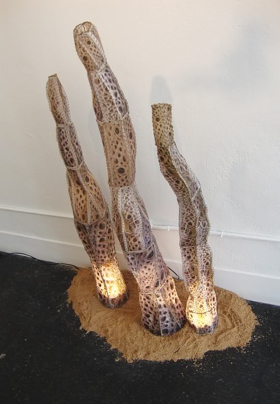
There is a simultaneous show of Mary Hayslip's work at P.G. Contemporary. (This seems to happen in Houston a lot--an artist has a show at a museum or other public space while simultaneously having a show at a commercial gallery.) Hayslip's work here is kind of artsy-craftsy. It's decorative for the most part. It has a real 80s feel to it. The Voodoo Pop exhibit shows were that came from--even the title recalls the bouncy, irony-laden music of the 80s. Think of Wall of Voodoo or Joe "King" Carrasco and the Crowns; think also of the Memphis group or Fiorucci. And while you're on this nostalgia trip, think how perfect these cacti would be in your swinging Colonial House apartment.

Photobucket
Mary Hayslip, Cacti, printed photo on vellum paper, wax linen thread and LED lights, 2002-2011

(Except if you lived in Colonial House, you'd never be able to afford these cacti--much less any Memphis furniture.) What is appealing about Cacti is their utter fakeness. This is another way it reminds me of the 80s. It's faux without even pretending to be real.

Photobucket
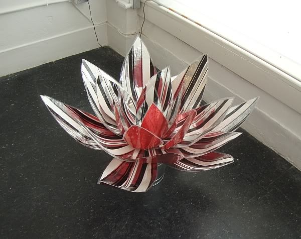
Mary Hayslip, 70s Lotus Wall Flower, 70s vintage wallpaper backed with foil, car light, galvanized bucket

The same could be said of 70s Lotus Wall Flower. No one is going to mistake this plastic item for a real plant. The work is unashamedly decorative, making no claim whatsoever to be natural--even as it depicts nature.

Photobucket
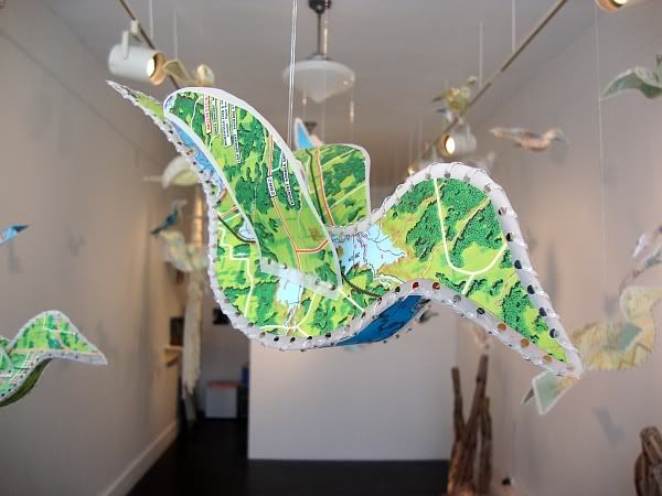
Mary Hayslip, Birds, laminated vintage maps, plastic thread

Photobucket
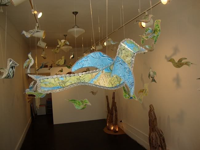
Mary Hayslip, Birds, laminated vintage maps, plastic thread

Not all the work is completely decorative, though. These birds are charming and pretty, but my making them out of maps, Hayslip invites reflection on the part of the viewer. Maps imply travel, as do birds (especially the migratory types). Freedom, flying away, getting out of town--this is a decoration designed to get you out of your easy chair, if only for a mental vacation.

Photobucket
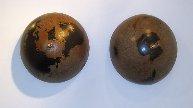
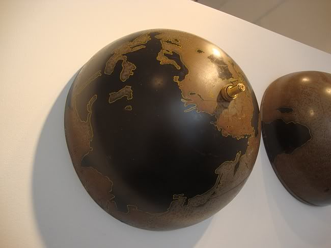
Mary Hayslip, Mother Earth, refurbished globe, brass hose valves, 1991-2011

Hayslip uses a map in this piece, as well--a rusty old globe is bisected to make these two enormous breasts. I'd say the work was merely cute except for the state of the globe. Dark and rusty, Hayslip has taken the extra step of painting the land-masses black. Is this symbolic? Is she suggesting that instead of the bright blue marble that we're used to seeing, that we humans have despoiled the planet that we should be treating like a bountiful mother? (Really bountiful.) Or is it just a color choice? It could be the latter--the rusty browns and black look great.

Photobucket
Mary Hayslip, Mother Earth (detail), refurbished globe, brass hose valves, 1991-2011

Photobucket
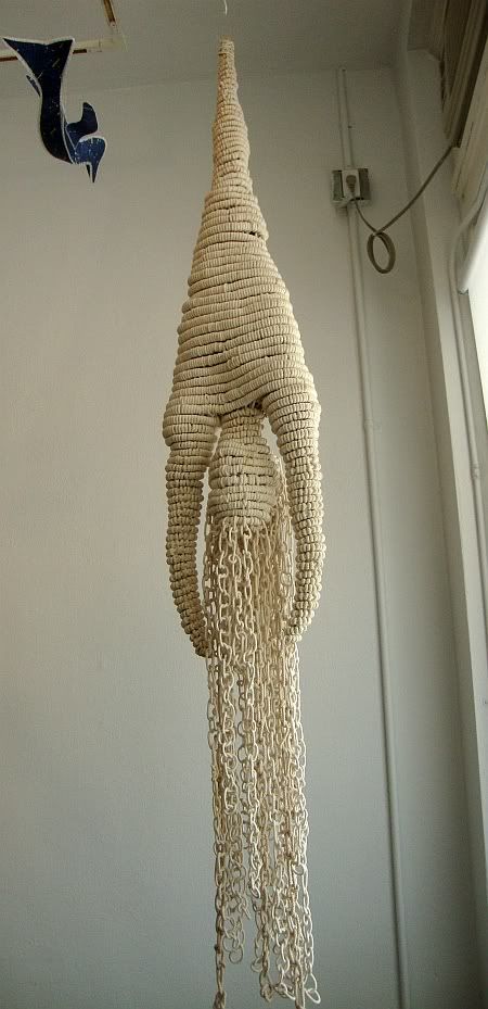
Mary Hayslip, Spirits, marine nylon rope, 2008

This slightly disturbing figure is apparently suitable for hanging outdoors due to its material, marine nylon rope. It's hard to imagine it as being merely decorative--the immediate associations I had are with the crucifixion of Peter, the display of the body of Mussolini after his execution, and the "Hanged Man" tarot card. It would be a spooky sculpture to encounter outside a gallery setting--say hanging from a tree limb in your back yard. The material, ropes, adds a disturbing layer--that the figure is bound, helpless, left to die (if not already dead). There are two of these figures in this exhibit, and of all the pieces, these are the only ones where there is no obvious attempt to be humorous or ironic. And perhaps for this reason, they stick in my mind.


Share

Tuesday, May 24, 2011

XXS: Charles LeDray at the MFAH

by Robert Boyd


Charles LeDray, Untitled (Suit with a small suit cut from it), fabric, thread,plastic, metal wood, paint, 28 1/2 x 12 x 3 inches, 2000

There is a problem with discussing Charles LeDray's work and illustrating it with photos. Untitled is a perfect example of this problem. LeDray has taken a suit (really a sportscoat, trousers, a dress-shirt and tie) and cut a tiny homunculus-version of the suit. Clever, no? Except what you can't tell from this photo is that the original suit is itself tiny--only a very, very small person indeed could ever wear it. LeDray has taken a tiny, hand-made suit and fabricated an even tinier, hand-made suit from it.


Mark Hogancamp, image from Marwencol

In the documentary film Marwencol, Mark Hogancamp, who was attacked in 2000 and suffered brain damage, creates a tiny World War II Belgian village (inhabited with foot-high dolls) as a kind of self-designed therapy. Part of this therapy involves Hogancamp taking some of his characters for a walk each day--dragging them behind him in a scale-model Jeep. In the storyline that Hogancamp has constructed for the town of Marwencol, a character representing himself is captured and tortured by the Gestapo. And this tortured character likewise drags a scale model Jeep behind him as part of his own therapy. This ever-shrinking reproduction made me think of LeDray's Untitled. And even though Hogancamp is fundamentally an outsider artist and LeDray has been exhibiting in galleries since the early 90s, I find the work similar. Both have fairly limited formal educations in art. Both have created art out of materials that might be considered feminine--dolls in Hogancamp's case, sewn materials in LeDray's case. (Hogancamp also sews costumes for the inhabitants of Marwencol.) Both artists are men, but their work could be considered feminine. Except it's not that simple, is it? Marwencol is a village of soldiers, and LeDray is sewing men's suits. (Hogancamp identifies as heterosexual, but is a cross-dresser with a fondness for women's shoes.)


Charles LeDray, Hole, fabric, thread, plastic, wood, metal, 19 1/4 x 13 1/2 x 2 1/2 inches, 1998

Even the scale of LeDray's work feminizes it. It is anti-monumental. I compare him to Hogancamp because it gives me a small handhold onto understanding the work, which I love. Gender is a part of it, but the urge to create something small--a small world, even, is also part of it. With both artists, I think of people who build small cities or buildings. Model railroad enthusiasts, for example, or doll house fanciers. There is, in some , a desire to reproduce the world in a small but highly accurate scale. There is usually an idealizing effect. The model railroad enthusiast creates a kind of ideal village for his train to pass through. Marwencol is kind of a paradise--albeit one always threatened by war. These scale models are private utopias.

LeDray is idealizes to an extent, but he also destroys his own handiwork in weird, humorous ways. He reminds me of the vaudevillian funny-men who would take scissors to the straight man's tie. But here, LeDray is both the joker and straight-man. He painstakingly makes these beautiful, tiny clothes, then wrecks them.


Charles LeDray, Torn Suit, fabric, thread, wood, metal, plastic, animal horn, acrylic paint, 29 1/4 x 13 x 3 1/4 inches, 1997-98


Charles LeDray, Untitled (Bust), fabric, thread, wood, metal, plastic, , acrylic, 4 1/2 x 9 1/2 x 2 inches, 1995

Despite the images I have just shown you, most of the tiny clothes displayed in this exhibit are not torn or cut up. Instead, LeDray has made a variety of clothes in more-or-less perfect condition. Most, but not all, are men's clothes. At some point, just making the clothes was not enough, it seems. Like Hogancamp, like the model railroad and doll house enthusiasts, LeDray decided to create a scenario, a scale-model environment, one that was meaningful to him: a men's clothing store.


Charles LeDray, Mens Suits (detail), fabric, thread, embroidery floss, batting, nylon cord, leather, leatherette, vinyl, carpet, wood, wood stain, shellac, polyurethane, paint, glue, nails, metal, metal patina, metal piping, staples, screws, paper, contact paper, cardboard, Eucaboard, plasticine clay, epoxy resin, epoxy die, Plexiglass, "Crackle Ice" styrene plastic, compact fluorescent light bulbs, light fixtures, electrical cord, dust, dimensions variable, 2006-09

Walking in to see this three-part installation is an astonishing experience. The first sensation you have is like that of walking into Legoland--delight at seeing something familiar recreated on a small scale. The attention to detail is amazing (as it is in all LeDray's work--nothing feels partially finished, nothing is a sketch or a  proposition).


Charles LeDray, Mens Suits (detail), fabric, thread, embroidery floss, batting, nylon cord, leather, leatherette, vinyl, carpet, wood, wood stain, shellac, polyurethane, paint, glue, nails, metal, metal patina, metal piping, staples, screws, paper, contact paper, cardboard, Eucaboard, plasticine clay, epoxy resin, epoxy die, Plexiglass, "Crackle Ice" styrene plastic, compact fluorescent light bulbs, light fixtures, electrical cord, dust, dimensions variable, 2006-09

This photo gives you an idea of the scale of it. In fact, as a viewer, you stand above the drop ceiling and lighting fixtures. LeDray's attention to detail is so great that he has even depicted the top of the drop ceiling realistically--it is covered with tiny scale-model dust bunnies.

So what is one to make of this tableau? We all bring our own associations to art. When I first saw it in New York last December, my reaction was--oh, very clever. But not much else. Seeing it again here in Houston, it made me think of my favorite clothing store, Harold's, which is closing down after 60 years. It actually now seems like a monument to a vanishing institution--a store where you buy a suit. After all, who wears suits all that much anymore? And here's where that play of masculine/feminine becomes delightfully confused. A place like this is historically a refuge for men; it's like the barber shop or the cigar store. Indeed, I'm reminded of Stuart Davis's 1932 mural at Rockefeller Center, Men Without Women.


Stuart Davis, Men Without Women, 1932

I have to tell you--buying a suit in a department store like Nordstroms is a very different experience than buying it in a men's clothing store. Maybe that's the simple meaning here--an homage to a vanishing institution. Again, there is a kind of utopian nostalgia in the project of making small-scale environments. Of all the things LeDray could have made, he picked a men's clothing shop.

Except that's not all. This is a three-part piece. The elegant store in the first part. Then in another part, you see what looks like the back room of a dry-cleaners. So in part one, you buy the suit and in part two, you use the suit. The third part is a thrift store--you have discarded the suit. The three spaces LeDray creates tell the life story of a suit, excluding the very beginning (manufacturing) and the very end (discarding as unwearable rags).

Anti-monumentality is a big aspect of LeDray's work, obviously. In some pieces in the show, he carries this to a logical extreme. The opposite of one big thing is a lot of little things.


Chales LeDray, Milk and Honey, 2000 vessels: glazed porcelain, glass, wood

Each of the tiny vases and teapots in Milk and Honey is an inch or two high. (And this is one of four similar works in the show.) Throughout his work, LeDray seems to be undercutting a masculinist aspect of Modernism. He rejects the big heroic piece--the enormous paintings of the abstract expressionists (and many artists since), the giant steel monuments of Mark Di Suvero, Richard Serra and others. Works that seems to say, "Look on my works, ye mighty, and despair."

This is never LeDray's message. If anything, he replaces hubris with homeliness. Like Shelley in the "Ozymandias," LeDray sometimes makes a point of reminding us of the vanity of our ambitions. Indeed, some of his works are vanitas sculptures.


Charles LeDray, Orrery, human bone, wood, glass, 2997

I was particularly struck by this one. This tiny orrery is carved from human bone, under a glass bell jar. An orrery is a now obsolete object, a mechanical model of the solar system. They reflected the flowering of human knowledge about the universe that began in the Renaissance and continued through the Enlightenment. But as those Dutch vanitas painters knew, all this wisdom was no match for death.

I've seen this exhibit twice--once at the Whitney in New York, and once at the MFAH in Houston. In the Whitney, it was displayed in fairly intimate galleries. At the MFAH, it was exhibited in the huge mezzanine space of the Law building. This space was designed by the great master of high modernist monumentality, Mies van der Rohe. And it's perfect for large artworks, but it seems to overwhelm LeDray's diminutive work. This show would have been better served in another part of the museum.But this is a small complaint, and certainly should not prevent you from seeing one of the most exciting exhibits in Houston this year.


Share


Sunday, May 22, 2011

Lo-Cal Posting: The 2011 Art Car Parade

by Robert Boyd

Sometimes Pan don't like to think to hard. Here are some photos from the 2011 Art Car Parade, which I saw with my sister and her family and some friends and their families (it's kind of a family event). Minimal commentary on the photos--the sun baked my ability to write stuff right out of my head today. If you created one of these cars, please drop me a line and I will make sure you get credit!

Photobucket

One of many Scrap Daddy cars in the show--he always blows the competition away.

Photobucket

A knit cozy for this VW bug.

Photobucket

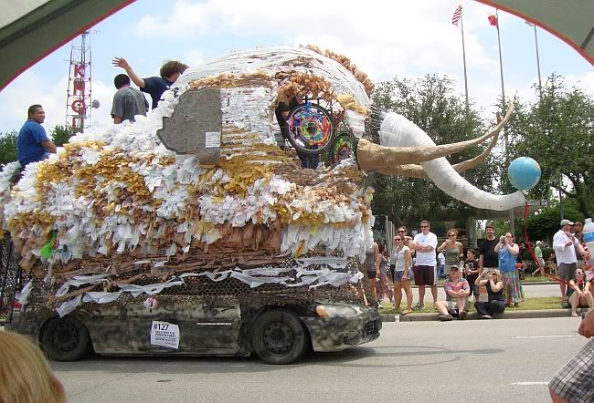
Loved this woolly mammoth.
Photobucket

Very clever construction kept the saw-blade spinning in this three-wheeled death-mobile. (Bike by Smitty Regula.)

Photobucket

I just thought the design on this bike was brilliant and beautiful.

Photobucket

The 1960s era Bat-mobile (or a replica) was in the show, but I liked this one much better.

Photobucket

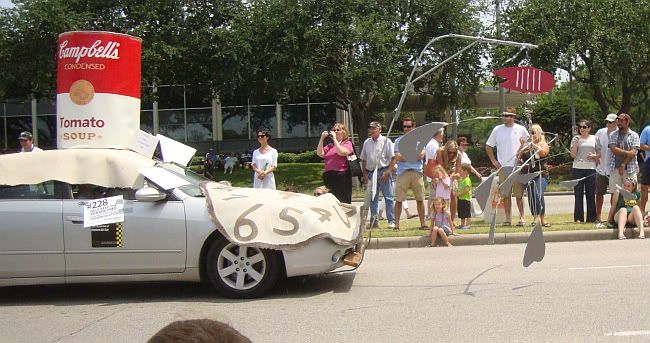
They put every modern art cliche they could on this one. A "Calder" mobile, soft watches, a Campbell's Soup can, and...

Photobucket

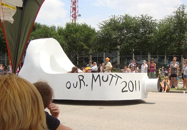
...a Giacometti (I'm not sure what they are towing).

Photobucket

This one was more elegant and kept its count of art cliches to one.

Photobucket

A lovely Alice in Wonderland tableaux.


Share

Saturday, May 21, 2011

Kickstarter in Houston

by Robert Boyd

Kickstarter is a platform for raising money for various artistic projects, whether non-profit or for profit. I've supported a couple of projects I like with small donations through it, but really never delved too deeply into what all is there. But this morning, I went to Kickstarter and typed the word "Houston" into the search engine to see what I'd see. Here are a few of the local projects that seemed worthy of support.

The Pozos Art Project. This is a deal by my old photography professor, Geoff Winningham and his wife, artist Janice Freeman. The project is to teach art to a bunch of kids in a village in Mexico (where Winningham and Freeman have a home) and in Houston. Winningham has been an outstanding teacher all his life, but teaching art to younger kids is something quite different from teaching photography to 20-something slackers (like me back in the day). They can explain it better than I can, though:


The Museum of Broken Relationships. You can go see this right now at the Blaffer. I checked it out last night and found it quite amusing. It's filled with artifacts left over from failed romantic relationships, along with little descriptions of the significance of each artifact. It's not really an art exhibit, but the act of curation of this collection is its own work of art. And they want to build a permanent Museum of Broken Relationships in Zagreb, Croatia. I find this highly symbolic. Croatia as a separate country is itself the result of a broken relationship, a six-way divorce following a some serious domestic violence.

(Why is this a Houston project? Because you have the choice of supporting the Blaffer show, the Zagreb museum, or both.)


Many Mini. This is a Skydive project. You know how most residencies involve giving an artist studio space for some period of time (a month, a year, etc.). With Many Mini, that period of time for the residency is as small as 30 minutes with a maximum of 12 hours. You can get more details here. Basically what this funds is a whole bunch of artists doing stuff. And artists doing stuff is one the most exciting things there is.

Photobucket

These are just a few of the Kickstarter projects in Houston. I am supporting each of these in my own modest way. But there are a lot more projects there trying to raise funds. I encourage you to check them out.


Share

Aaron Parazette's Color Keys

by Robert Boyd

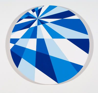
One of the challenges for any artist doing geometric abstraction is to avoid boredom. This is an oversimplification, though. Sometimes boredom is the goal--a boredom so thick and profound that it invites the viewer to fill it. Classic minimal pieces have this effect. Michael Fried wrote about this in "Art and Objecthood"--he called this quality "theatricality" and said it was the "negation of art." While I disagree with Fried's formalist puritanism, it is a useful distinction to make. A geometric abstraction by Kandinsky or Mondrian is an aesthetic object--what makes it a work of art is what it looks like, the arrangement of paint on the surface. An Yves Klein monochrome is an object where the relationship the viewer has to it is a major part of the piece--i.e., it is "theatrical." And you get painters like Ellsworth Kelly and Frank Stella who skate on the edge of this distinction. But what would you call a geometric abstraction that is reductive enough to be boring but not interesting as an object? I don't know, but I saw a lot of them at the Aaron Parazette show at McClain Gallery.

Photobucket
Aaron Parazette, Color Key #25, acrylic on linen, 2011

These paintings are called "Color Keys," which is apt. They look like color guides used by commercial designers, or the kinds of exercises student painters do to figure out what happens when you mix 50% ultramarine with 50% titanium white. I did this kind of exercise when I studied painting with Stella Sullivan. It was useful but tedious. And this kind of image has not lost its tedium for me in the intervening 30 years.

Photobucket
Aaron Parazette, Color Key #24, acrylic on linen, 2011

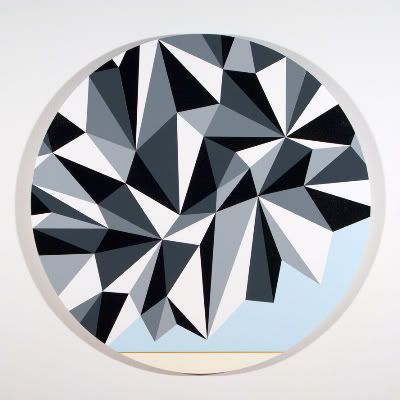
In earlier Parazette paintings, he would take flat areas of color, lay them against another flat area, but separate them by a thin line or barrier in a color that seemed to vibrate between the two others. I quite liked these--he was playing with optical qualities in a subtle and lovely way. He does this on some of the pieces here, and they are the best pieces in the show.

Photobucket
Aaron Parazette, Color Key #23, acrylic on linen, 2011

Photobucket
Aaron Parazette, Color Key #23, acrylic on linen, 2011

What is also pleasing about these pieces is that the area bound by the thin line of color is quite irregular. These area provide a contrast to the triangles that fill the rest of the paintings. These areas of color also create an ambiguous ground, creating a sense of space or depth.

These are the exception. The work here is flat in an uninteresting way. They neither engage the eye or the mind. Most of the paintings in this exhibit occupy the no-man's-land between modernist painting and minimalist object, and that no-man's-land is one boring place to be.

Photobucket
Aaron Parazette, Color Key #21, acrylic on linen, 2011


Share


Friday, May 20, 2011

Catharsis in Houston's South Hamptons

by Dean Liscum

On Saturday, 5/14/11, two Houston artists, Sharon Kopriva and Julia Claire Wallace, with completely different styles and subjects working in completely different mediums exhibited cathartic works. Both shows happened to be in (or very near) Houston's South Hampton neighborhood, which has a reputation for many things but generally not for being populated by people who embrace "the process of bringing to the surface repressed emotions, complexes, and feelings in an effort to identify and relieve them, or the result of this process."

Sharon Kopriva exhibited her show "Cathedrals, Phantoms and Naked Dogs" at Colton & Farb Gallery on North street. Walking into the main gallery, it doesn't require great powers of perception to realize that Kopriva's work is very Catholic. A menagerie of priests, nuns, and penitents have dominated her paintings, sculptures, and installations throughout her career. This series is only slightly different, introducing phantoms and dogs sometimes in place of her clerical subjects and sometimes in the company of them. In some of the larger works, Kopriva has also expanded the interior scale of her work moving from the intimate spaces of the dais and the confessional to the public spaces of cathedrals and dark forests.

Her subject combined with an aesthetic derived from Peruvian mummies renders her figures horrific. They are both dessicated and skeletal, drained and devoid of the life and joy that the fat and happy Buddha represents.

Cardinal Conte and his canines, 2009

In an Artlies interview with Darryl Lauster entitled Catharsis: Sharon Kopriva, Kopriva corrects Lauster by labeling her work "cleansing." Semantics aside, Kopriva confronts and conquers. She intentionally recreates the dread in Catholicism's milieus of malevolence. Her works consist of cadaverous priests in the medieval environs in which holy retribution or divine reparations are extracted from the penitent. Kopriva doesn't dispute the crime. After all, Catholicism is the religion that first asserted that even the most innocent of children is born with an original sin. Her works never depict an actual transgression inflagrante delicto. No where in her oeuvre does she happily portray adultery or take up the cause of the just murder or even a long weekend of coveting. Instead, she's battles against what she fears, the judgement. Her method of attack involves recreating to de-mystify and disarm. These pieces ominously foreshadow the consequences of a contemplated crime against the cross. By metaphorically recreating the scenes that inspire these fears, she de-mystifies them, de-spelling the images of their power over her.  

I just hope the well-healed patrons of Colton-Farb who can afford to buy one of her works don't put it in the nursery or the kids play room because they want Jaxon or Blythe to be exposed to fine art and the colors of Cardinal Conte's vestment match the crown molding.

As Kopriva's work hints at the irony in art that the more personal an artist's work is the more universal it becomes, Julia Clare Wallace's work ass-ffirms it. Wallace's medium of choice is performance art/video. A quintessential work of Wallace is a performance piece in which she discusses her favorite color while a hard-core porn-style movie of her plays on a screen behind her. Just a few miles from North street, Wallace debuted a piece called "Hidden Pussy In the Workplace" in the show "For the Man...The 9 to 5 Show" curated by Stephanie Saint Sanchez at Gallery 1724.

To say that Wallace has issues about sex is to capture the essence of this project. The objective of this work is to shock with her sex. The piece consists of a set of picture post cards of (presumably) Wallace's pussy and a video of her hiding these post cards in various work environments such as a construction site and a hair salon. Patrons are encouraged to purchase the post cards ($3 each) or print them for free from the site, http://www.hiddenpussy.blogspot.com/, and then document where they hide them.

Hidden Pussy in the Workplace, 2011
Wallace works with the borders of American sexual morays, identifying their limits and then gleefully leapfrogging over them. In contrast to Kopriva, Wallace is all about the act. She achieves catharsis by daring to do what is taboo. She transgresses. She flaunts her own genitalia to affirm sexuality.

However, the piece (and possible she as an artist on the subject) does not progress beyond catharsis over the shame of sex to celebrate it. In Hidden Pussy, the audience is asked to participate in the transgression by secreting and then documenting the workplace that they've "booty trapped." Presumably, this is so that the artist and others can imagine (even fantasize about) the shock and awe that discoveries of these post cards will produce. Unfortunately, the post card does not contain a note that invites the finder to go to the blog and describe the thrill they got from finding the pussy. Nor does it ask them to recall the first time or the most recent time they had sex at work. For me, the work doesn't push the pussy far enough in a good way. It doesn't use the conceit of the "hidden pussy" to serve as a mnemonic device to access or imagine gratifying/exhilarating sexual memories such as the first time the discoverer saw-touched-tasted-felt a/their pussy or the most luxuriant or enveloping, euphoric sexual experience they had.

And that's fine. Because sometimes, as these two artists demonstrate, you just gotta get the dread out.


Share