by Robert Boyd
This is intended to be the first of a new ongoing feature. Since I got new wheels, I thought I might take a few day trips and overnight trips to see art outside the Houston city limits. So after seeing an article,
"Donna Simon's Seeing Art San Antonio Tours," on
Glasstire, I decided to sign up for a tour. The big attraction was that it included a studio visit. I can figure out how to get to San Antonio's museums and galleries on my own--but seeing an artist's studio in another city was something I needed some entrée to accomplish. So to take this tour, I had to be on the road by 6:30 am on a Saturday.
Seeing Art San Antonio is a small operation run by Donna Simon. I was definitely the youngest person on the tour, and most of the other tour goers were repeat customers. (A tour costs $35 for an individual.) We met at 10 am in front of a modest house up near Fort Sam Houston. This was the studio of
Mira Hnatyshyn (pronounced NAT-uh-shin, more or less).
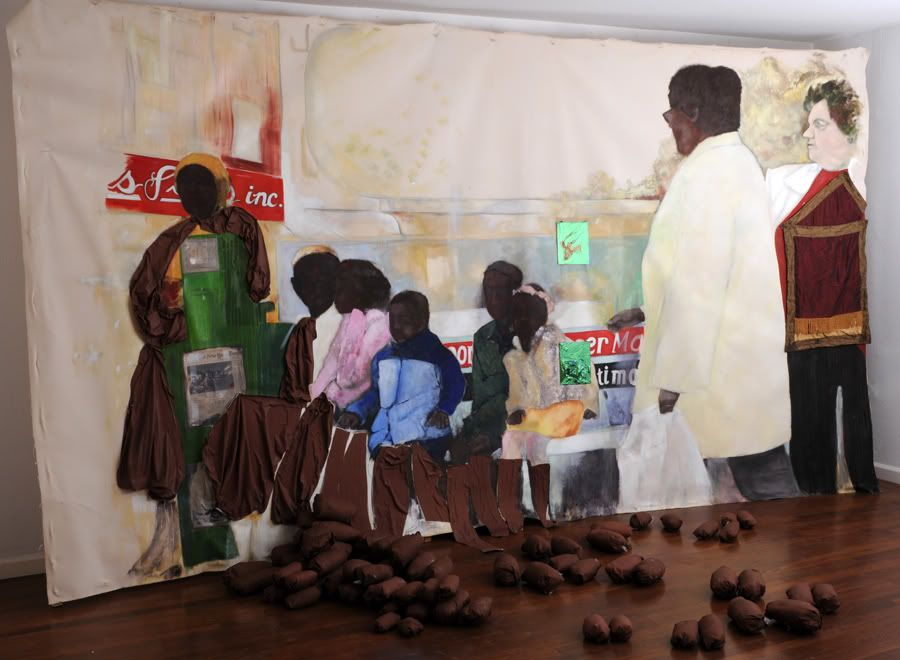 Mira Hnatyshyn, Bus Stop,oil on canvas and mixed media
The house is weird. You walk in and there's her art everywhere--which is pretty typical--but after a while, you start to realize that she works in every room. I wondered how she could live there. And she told us--she
doesn't live there. This entire house (which was quite modest, mind you) is her studio. She lives somewhere else. As a studio, it feels very strange. The ceiling is low and the rooms are small--it seems like a tough place to be creating the large scale works she creates. And, indeed, many the works on the wall were crammed floor-to-ceiling.
She works on unstretched canvas in oil. At first, I thought she was painting on unprimed canvas--a lot of her oil is highly thinned and watery. But she explained that she put down clear gesso, so the canvas was protected. Because it was unstretched, the canvases sometimes had folds in them, which she exploited to add a sculptural quality--which she amplifies by adding three-dimensional objects. For example, see the potato-like objects on the floor in front of
Bus Stop. They are part of the installation.
She gave us souvenirs before we left--photocopies of drawings she had made of Putin and Medyedev. They were apparently left over from an installation she had done.
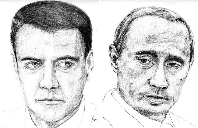 Mira Hnatyshyn, Medvedyev and Putin
Our next stop was
Blue Star Contemporary Art Center. Simon told us the story of its origin. According to her, back in 1985, the San Antonio Art Museum was working on an exhibit of local San Antonio contemporary artists. However, at the last moment, the curator was fired and the show cancelled. Enraged, the artists located an unused industrial building and hung the show there. That was the start of the Blue Star art center which has become a large, multi-building complex, housing galleries, studios, performance spaces, etc. And now far from being a big "fuck you" to the establishment it started as, it
is the establishment. It has 10 $50,000+ contributors (including a couple of multinational corporations), 11 $25,000 to $49,999 contributors, and so on. That's what happens to rebel art spaces if they last long enough.
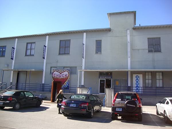 Blue Star Contemporary Art Center
The main gallery had a show by English sculptor
Phillip King. His brightly colored geometric sculptures made me think of
Anthony Caro crossed with
Al Held, maybe with a dash of
George Sugarman. He studied with Caro, so that makes sense.
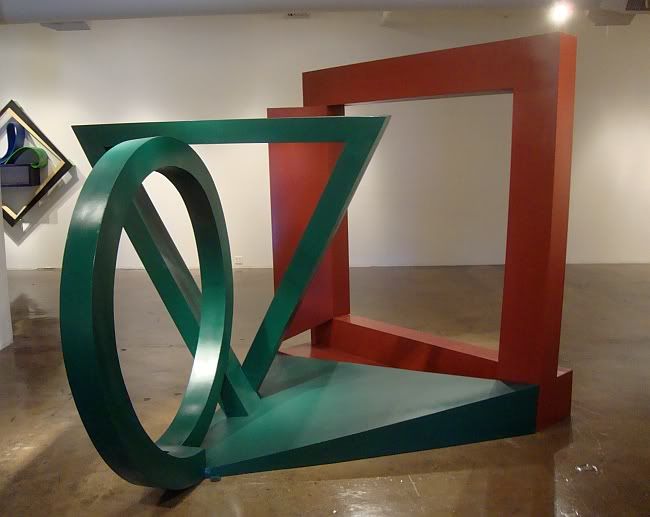 Phillip King, Darwin 1, painted stainless steel, 2011
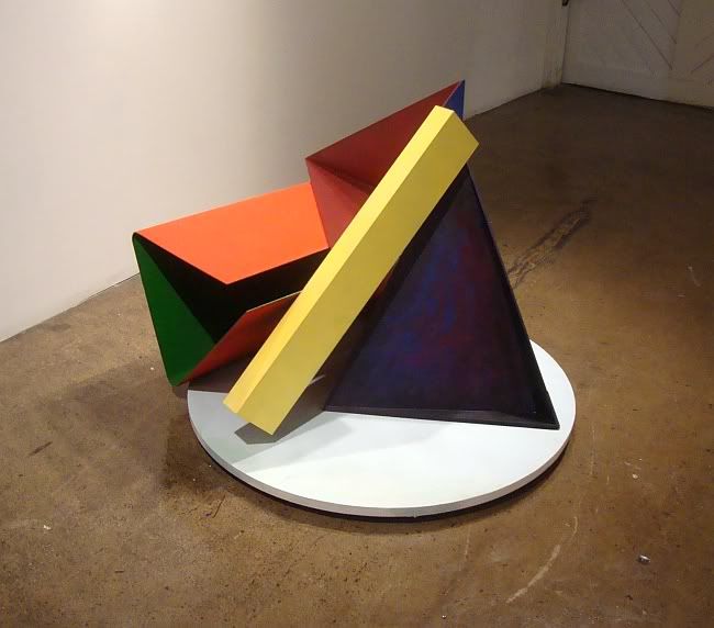 Phillip King, Yellow Beam, painted steel, 2011
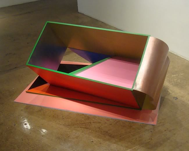 Phillip King, Pink Bottom, painted foam PVC, painted aluminum, 2011
I like this last one especially. In addition to having a witty title,
Pink Bottom seems to be a response if not a rebuke to Donald Judd's metal boxes. The addition of a tilt, of curves, of paint, of
pink--all of these seem to say, "Donald, it would have been OK to live a little." You can see King's work at Blue Star Contemporary through February 12.
This was the end of the official tour. Simon has
one more tour scheduled for January and two in February. I, however, had a little time before I had to drive back to Houston. I had lunch at the
Blue Star Brewing Company then checked out some of the other residents of the complex. The first place I visited was
Joan Grona Contemporary Art. Among the work I saw there were these paintings by
Jason Willome.
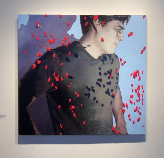 Jason Willome, Visible Inclusions in an Obscure Plane, acrylic, rayon flocking, canvas, 2011
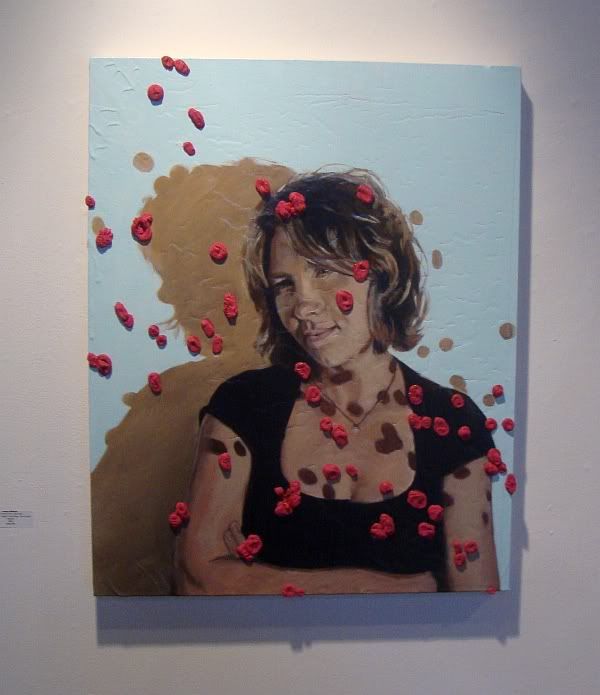 Jason Willome, A Suspicious Milieu, acrylic, rayon flocking, canvas, 2011
The pink bits that look a little like shewed bubblegum are actually little bits of nylon glued to the canvas. What I like is how these weird surface additions to the canvas interact with the picture. Willome is acting as if they are floating on the picture plane, and that the images behind them are affected by them. The nylon bits appear to cast shadows on the figures. The physical reality of these bits of fluff works with the illusion of the painted image. I can think of a couple of other examples of this--
Charles Wilson Peale's Staircase Group, in which the first stair in the picture is real, and Max Ernst's
Two Children are Frightened by a Nightingale, where the little house and fence are real and attached to the front of the painting. I'm sure there are many other examples.
In a group of buildings behind the Blue Star Contemporary Art Center is
the University of Texas-San Antonio's satellite space. Having a satellite space in the Blue Star art complex strikes me as a damn good idea--it really puts the work of its students and curators in front of the art public. It would be as if Rice or UH rented a small exhibition space in the
Independent Arts Collaborative building on in
the Hive, whenever they get built.
The current show (through January 22),
Land Portrait by the
Culture Laboratory Collective, was a bit bloodless. But I did like the tiny photographs, collectively called
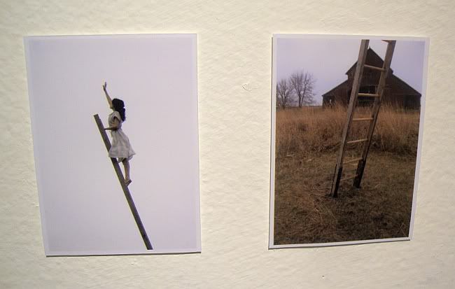
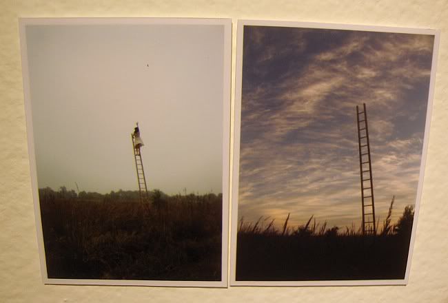
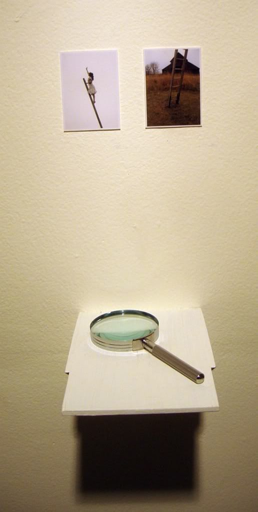
Exit Strategy, by
Loren Erdrich. They depict a tall ladder rising out of a field, sometimes with a girl in a dress at the top of the ladder.
 Loren Erdrich, Exit Strategy, photos and magnifying glasses
 Loren Erdrich, Exit Strategy, photos and magnifying glasses
 Loren Erdrich, Exit Strategy, photos and magnifying glasses
The images are nice and big here on the blog, but in the gallery, they were tiny--so tiny that the artist put a magnifying glass under each pair of images to help the viewer see them. The images are a bit surreal to begin with--by making these landscapes (and skyscapes) so tiny, another level of oddness is added.
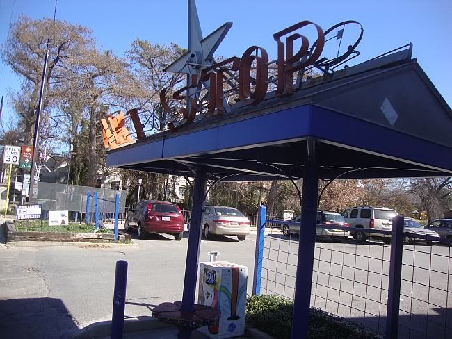
This is the bus-stop outside the complex. It is also right on the river, so you can bike or walk to it. Even cooler, there is a city "bike share" station there. The Blue Star art complex is well-worth a visit, especially on a nice day when you can also bike or walk along the river.


