Tuesday, October 27, 2009

If I Were Young, Pretty, and Female, This Would Be My Halloween Costume

Lictenstein Costume

And I am not even that big a Lichtenstein fan. But this is amazing.

(Source: Charmed by TashaMarie. Hat-tip to Buzzfeed and Matthew Yglesias.)

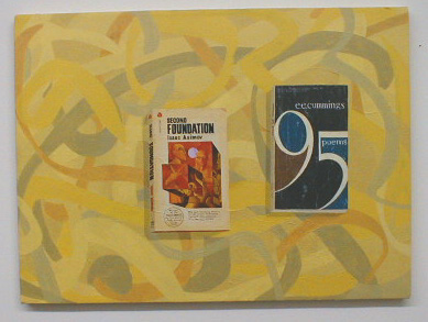
Bill Davenport covers Don Ivan Punchatz

http://www.billdavenport.com/gallery/virtualmodernblacksmith/gallerysecondfoundation.jpg
Bill Davenport, "Second Foundation", acrylic on canvas, 2000

Don Ivan Punchatz, 1936-2009

Robert Boyd

I noticed that illustrator Don Ivan Punchatz had died but didn't think much about it until yesterday when Matt Guest sent me a note on it. Guest had been a student of Punchatz at TCU, and, according to Guest, Gary Panter had been a student of Punchatz's at one point. That Punchatz had taught these two artists was enough to make me look further. It turns out that Punchatz was responsible for some iconic, trippy science fiction paperback covers that I had grown up with.


He did all the Foundation Trilogy covers that were current when I was a teen.


These were the covers of Dangerous Visions volumes 1-3. It seems like Punchatz went through a period of painting vaguely menacing monochromatic bald guys for science fiction paperbacks. It was the 60s I guess. I love 'em. (All of the above covers were taken from the blog Skiffy, where you can see lots more classic science-fiction illustration art.)

Of course, Punchatz wasn't all about naked bald guys. He did all kinds of illustration work, including great covers for National Lampoon and Time, and many, many other book covers. Matt Guest told me this one was his favorite (which says something about Matt, but I don't know what...)

Sunday, October 25, 2009

Strange Sentries in the Heights

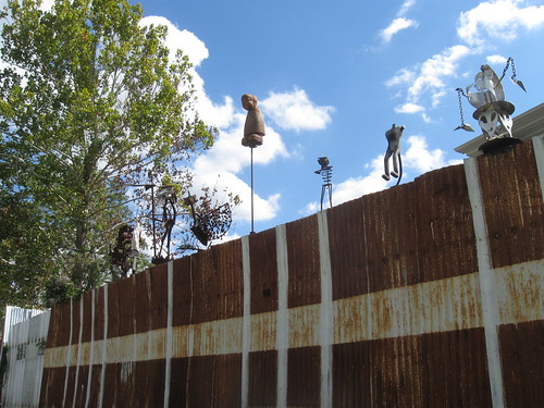
Mr. Kimberly stumbled across this wall and its strange sentries at 620 W. 9th Street.

http://farm4.static.flickr.com/3509/4031470494_91459f9076.jpg

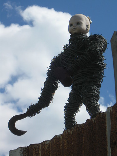
Here's a close-up view of one.

http://farm3.static.flickr.com/2625/4031470788_6bca489af5.jpg

Does anyone know what these are all about? It looks like a stockade around a post-apocalyptic retro-lithic scavager village, where they top the walls with scrap-metal totems to frighten the irradiated spirits and shambling zombie hordes that menace the degenerate remnants of the once-proud race known as homo sapiens.


(Hat tip, of course, to Neon Poisoning.)

Wednesday, October 21, 2009

Richard Martinez' Shaped Canvases

Robert Boyd

If you are driving around Rice Military looking for the Darke Gallery, the only thing to visually distinguish it from the tall townhouses that populate that neighborhood's small blocks is this sculpture:


When I went in, I met the owner of the gallery, Linda Darke Swaynos. She told me about the show they had up (paintings by Richard Martinez) and in the process described her strategy for selecting artists. Her artists tend to be art professors at various universities around Texas. As she put it, many of them are in areas with few or no art galleries and little opportunity to show their work. And practically every university in the state (and the whole country, too) has some art teachers, and many have art departments and a brace of professors. So for her, this forms a nice pool of talent from which to pick artists to exhibit.

Richard Martinez teaches art at U.T. San Antonio. His canvases are not strikingly original. When one thinks of shaped canvases and stripes, one thinks of Frank Stella works from the early '60s. Martinez' canvases are mostly monochrome (the spaces between the stripes are subtly different shades of the same color as the stripes) but unlike those early Stella pieces, they are brightly colored. The shapes, too, are different--baroque and even rococo, in a way. (This, too, recalls Stella--but the later Stella of the wall sculptures.)


Richard Martinez, Young American, 2009

The pieces also all have a single painted element in silhouette. This is another little baroque touch.


Richard Martinez, Ultra 19, 2009

There is not that much to say about these. This isn't quite a situation of "What you see is what you see." But close.


Richard Martinez, Ultra 18, 2009


Richard Martinez, Ultra 18 detail, 2009

The thing is, I like these paintings. It was pleasant being in a room with them. And that's enough.

Darke showed me another piece from her most recent show that I really liked.


Marcelyn McNeil, Study 2, painted strips of wood, 2009

Again, this was a nice piece to share a room with. It was fun to walk around it taking pictures.


Marcelyn McNeil, Study 2, painted strips of wood, 2009

I like the fact that it is a sculpture, and a fairly large one at that, but that it remains so low to the ground. I like that you have to look down to really see it. It also reminds me of canoes I saw in Brazil.

Monday, October 19, 2009

Giant Heads by the Freeway

When you are driving east on I-10 or south on I-45 in that tiny segment just north of downtown where the two freeways become one, you might notice this sculpture as you whiz by.

Giant Heads


They are actually located on a tiny little street called Elder Street in a tiny little neighborhood kind of trapped between Houston Ave. and the freeways.


The heads are, of course, by David Adickes, the guy who did the giant Sam Houston up in Huntsville, and more famously has done super-sized presidential busts. I like them--they are so out of scale that they become almost pop art. But this has been his schtick for a while (because, I assume, this is what folks commission from him.)


Look, if we're going to have giant heads visible from the freeway, lets honor some great Houstonians. I want to see a giant head group that includes Donald Barthelme, Lightnin' Hopkins, A.J. Foyt, and Jesse H. Jones. And maybe Beyonce. Who else deserves to be a giant head by the freeway? (Nominate your own choices in the comments.)

(Crossposted to my other blog, Wha'Happen?)

Sunday, October 18, 2009

Newest Acquisitions: Bill Davenport "Cans"

Wow, this was a busy Saturday, art-wise. I visited nine galleries/art spaces. I had even more to check out, but I ran out of time. I'm not like the Vogels, who would sometimes check out 20 new shows a weekend. I seriously doubt that I'll be able to write it all up this weekend, but that's OK--I can just add new posts throughout the week.

I made a slightly unexpected purchase today.
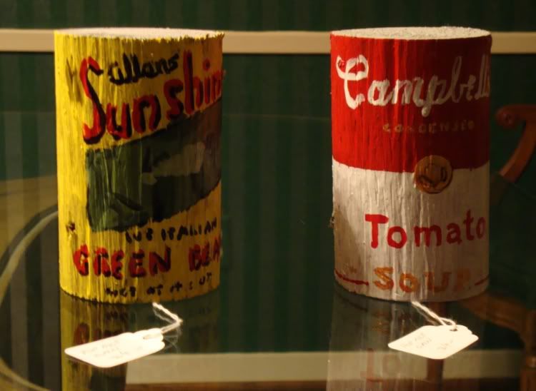
Soup Cans
Bill Davenport, Soup Cans, paint on wood

Two erzatz soup cans, painted onto cylinders of rough wood. These were found in Bill's Junk, which is the store of Bill Davenport, an artist and collector of thrift-store odds and ends, especially thrift store paintings.
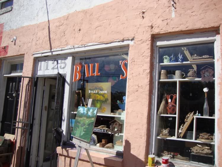
Bill's Junk exterior

Of course, if you saw the No Zoning show at the CAMH (see here, here, and here), you know who Bill Davenport is. He set up a miniature version of his store inside the CAMH for the duration. Now that No Zoning is done, he is back to his more permanent store. Davenport is an artist who likes to scour thrift stores and garage sales. Like Jim Shaw, he loves thrift store paintings. But he has too much junk, so the store is a way to get rid of them and play around with what's art and what's junk, and why things cost what they do. So I was looking at the stuff in the store, and chatting with Davenport, and I saw the "cans." He has a whole shelf of them.

"Wow, these are cool. Where did you find so many wooden 'soup cans'?" I asked, assuming he had found them at some garage sale. He confessed that he made them all himself. The wood was sawed sections of a round wood you could buy cheap at Lowes as garden decoration. He came up with the idea when he was teaching an art class for kids, and he wanted to teach them about pop art. This was a project they could do themselves.

At $24 apiece, it was worth it to get two. (I wonder what his gallery here in town--Inman--thinks about him selling them so cheap?)

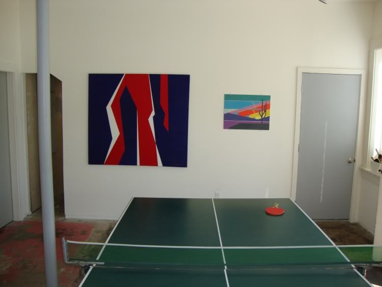
He was a chatty and willing host. He showed me the thrift store show he had hanging next door at Optical Project. It's called "Hard Edge: Ping Pong Abstraction from Houston Thrift Stores." It's a small selection of abstract thrift store paintings, including this one that inspired the whole show.
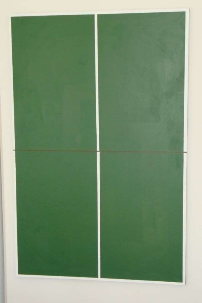
ping pong abstraction

It looks like a hand painted ping-pong table top, but it actually is a depiction of one on stretched canvas. It's pretty brilliant. Like a pop artist, this artist painted a flat representation of an actually flat thing that is also part of popular culture (not unlike a Brillo Box, for example). But like a minimalist painter, there is barely anything there. Hell, this painting makes Agnes Martin and early Frank Stella look busy. That an anonymous painter could create a painting that so perfectly encapsulated two totally contradictory 60s art movements into one painting is amazing. Davenport apparently thought so, too. He built his whole show around this painting. The show features a real ping pong table in the middle of the room.
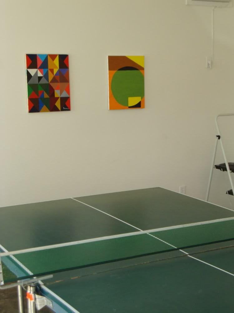
Optical installation 1

Optical installation 2

As you can see, the other abstract paintings are not terribly impressive. Davenport reckons that some of them were class exercises for high school/college art students. The big red-white-and blue painting dates from 1970, and seems to be a pretty serious effort (it's oil on linen, which is one reason it's lasted so well). But it's hideous. You can see the painter looking at it in 1980 and thinking, "Why the hell have I kept this all these years?"

After the ping pong painting, the most interesting in the show is this one:
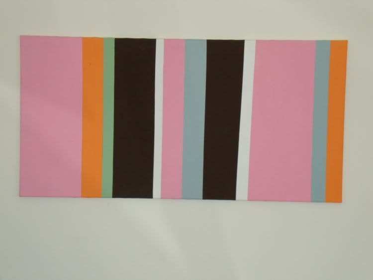
minimal thrift store pinting

It is a little like a Sean Scully or Robert Mangold. We speculated what could have been the motivation for the painter. It just doesn't seem like the kind of thing that the average Sunday painter would come up with! It's too minimal! Davenport's theory is that it was actually a purely decorative element (he theorized its use in a candy store, but I think he was reaching.) I prefer to think that it was semi-naive but intentional minimalism.

Then we played a game of ping pong (Davenport creamed me 21-6).

Oh, one last thing:
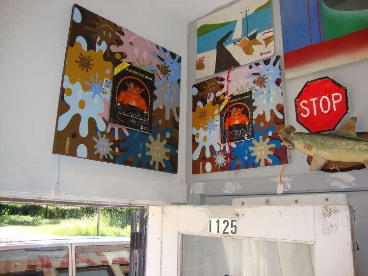
real and fake Davenports

The painting on the left is the most expensive item in the store--it's one of Davenport's own paintings. It's excellent, and really much much better than the thrift store art. There really is a difference in quality, both in terms of the concept and in the execution. But the reason that there are two of them is a story that Davenport delights to tell.

The one on the left was lost by UPS. The sender, apparently, felt so guilty that she sent a jpeg of the painting to this company in China that will make oil paintings out of any jpeg. I guess people generally send them family portraits. Lord knows what they made of this, but the result is the painting on the right. The colors are surprisingly accurate, considering they came from a jpeg. But amazingly, a year after they lost it, UPS found the original painting. So Davenport displays them both--the "real" and the copy, and has a story to tell his customers when they ask about them.
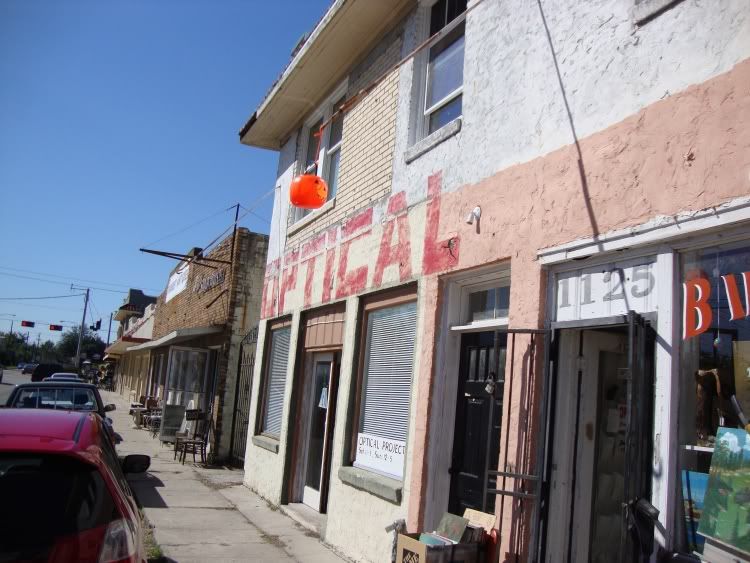
optical exterior