Showing posts sorted by relevance for query The Big Show. Sort by date Show all posts

Thursday, June 28, 2012

My Personal Big Show Scorecard

By Brian Piana

It's finally hot enough for Houstonians to complain about the heat, which means summer is in full swing in the Bayou City. This also means one of my favorite local summer art events –  The Big Show at Lawndale Art Center – is upon us. The Big Show is the largest juried exhibition in town, and it is open to anyone within a 100-mile radius of Houston who is willing to hand-deliver up to three works for jurying and pay a $30 entry fee. The guest jurors mostly come from out of state, most recently from New York, Portland, St. Louis, and Los Angeles.

I've submitted to The Big Show twice before, in 2007 and 2008. After a three year hiatus, I have decided to submit again in 2012. In preparing works to enter, I've been thinking a lot about my own personal history with what Glasstire last year deemed "the annual smorgasborg of Houston art". For no other reason than you might perhaps find it interesting, I present this history to you.


The first time I submitted work was in 2007, a month after I graduated from school with my MFA. I was pretty much on cloud nine following graduation because I had found out my proposal for an exhibition at Lawndale later that Fall had been accepted. I was going to have a solo show, and I was pretty stoked. Perhaps selfishly, I decided to try and double down by getting some work into The Big Show as a precursor to my subsequent exhibition. I took two of my most recent website abstraction inkjet prints to be framed (one shown below), and then I dropped them off and cut a check. I felt pretty good about my chances. I mean, Lawndale had just given me a show, right? I went home and hoped for a phone call.


(That's how you find out if you made the cut. A Sunday phone call means one or more of your pieces made it in. No phone call, and you have to go gather your rejected works sometime over the next two days.)

Barack's Twitter, Inkjet Print, 2007.


Alas, I didn't get a phone call, and I was devastated. Suddenly I was questioning my own merits for the forthcoming solo exhibition.  Would Lawndale think they made a mistake by giving a show to an artist who couldn't make it into The Big Show? I dreaded going to pick up the work. It felt like a walk of shame, and I couldn't shake the embarrassment of being a reject.

My reaction to not making the cut is laughable, of course, not to mention immature. (Rest assured I've grown a lot since then, and I also went on to have a fantastic experience working with Christine West, Dennis Nance, and the rest of the Lawndale crew on Lawndale Has Many Friends that fall. I have been a big fan and supporter of the space ever since.) 


The sting of rejection was softened, however, knowing that there were 371 other artists who also didn't receive a phone call and had to go back and pick up their stuff. It was then that I started to actually realize how big The Big Show really was. All told, 453 artists submitted 1143 works that year, and only 115 works from 86 artists made the cut. So only 18% of the artists that entered made it in, and only 10% of the total works brought up to Lawndale stayed for the exhibition. Clearly, the odds aren't in an individual artist's favor, and they've remained that way in the years since. Here are stats from the last five Big Shows, courtesy Dennis Nance, Lawndale's Exhibitions and Programming Director:


Year # Artists
Submitted
# Pieces
Submitted
# Artists
Selected
# Pieces
Selected
2011 404 972 73 121
2010 396 976 85 114
2009 409 995 65 95
2008 407 1014 60 95
2007 458 1143 86 115


While a 20% success rate could be a deterrent to some (and yet clearly hasn't), to others, like me, it becomes a challenge. I decided to give The Big Show another go in 2008, wanting a shot at redemption given the previous year's shutout. But this time, I came prepared. 


In the months leading up to that summer, I started thinking about taking my abstractions into the third dimension and dabbling in sculpture. With my artistic practice, I tend to work best under deadlines or with some carrot dangling out in front of me. The Big Show provided both. I tried to think about ways I could make my work stand out from the other 1,000 or so pieces that would also be submitted. I looked to the juror, which for 2008 was Aram Moshayedi, a curator from LA><ART, a nonprofit art space in Los Angeles. Soon after, I stumbled across this article about Damien Hirst's show at the Broad Contemporary Art Museum in LA, and I made my piece about that. Just as my work from the previous year, the resulting sculpture was a nondescript collection of shapes and colors. Knowing the juror wouldn't bother reading the piece's tiny information sheet, I did something I had never done before: I integrated the title into the work itself. Right on the side, clear as day, was the article's headline:


Guns guard Damien Hirst's lamb at BCAM, Wood and Acrylic Latex Paint, 2008.

The Sunday after I submitted the finished piece (along with one more inkjet print for good measure), I got a phone call. The sculpture made it in.  So, a juror from a contemporary art space in Los Angeles included an abstract work titled after a contemporary art exhibition at a Los Angeles museum. Perhaps that's entirely coincidental, but I want to believe I played the system and won. It felt awesome.

Having finally made it into The Big Show, I decided to walk away on a good note and have abstained from entering in the years since. Going 1-and-1 in a massive crapshoot seems like a win, so why tempt fate? I still look forward to it every year, and I have continued to support it when possible, via  donations or making quirky little things for the Lawndale website.

And yet now, after this three-year hiatus, I've come to miss being a part of the process. The Big Show opening is always a huge party, and it was such thrill to be part of the chosen group. The odds are still long, but I've grown to realize there's no good reason for me not to submit work. Here are three good reasons, in fact, why I will:
  1. My $30 goes to support one of my favorite art institutions in Houston.
  2. The Big Show provides motivation and a deadline for me to develop some new work and even a low-risk opportunity to explore a whole new direction.
  3. My work will be seen – however glancingly – by a new set of eyes from a curator outside of Houston. (You never know...)

See? There's really no downside. So here's what I submitted this year:


RGB and Sometimes Y: Packing Object No. 1, No. 2, and No. 3, Found Styrofoam Packing and Colored Duct Tape, 2012.

Quite different than that inkjet print from five years ago, yes? Here's a closeup:
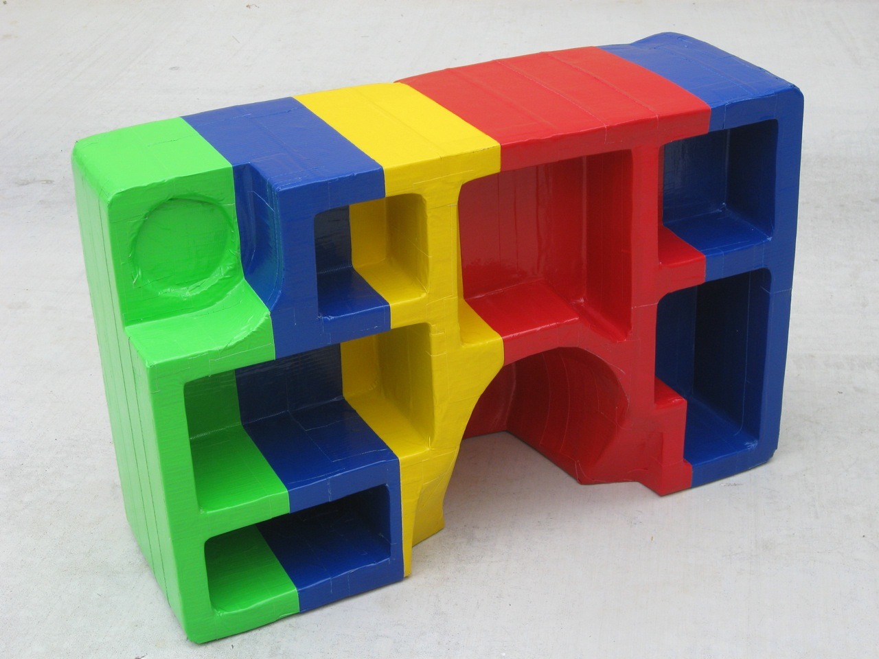
RGB and Sometimes Y: Packing Object No. 1, Found Styrofoam Packing and Colored Duct Tape, 2012.

Unlike 2008, these pieces were not made with any kind of thought to the juror. As I type this I couldn't even tell you who he or she is. (It's Marco Antonini, Gallery Director for NURTUREart in Brooklyn, by the way.) Nor am I trying to game the system as I did last time. I dropped my pieces off on Wednesday, and in doing so I've already fulfilled my three reasons for entering, as listed above. The Big Show 2012 owes me nothing more. If a piece does indeed make it in, great -- start the party! But if I don't get a phone call this weekend, I will proudly go into Lawndale on Monday, head held high, and retrieve my works. I certainly won't be the only one.

Below are some pics of the collected submissions near the end of the first day. Lawndale will be accepting more until 5pm Thursday, so if you're in the area and can afford the price tag, there's still time to drop work off. To those who have already entered or will be doing so -- good luck!

Hey -- I recognize that colorful stuff up front!


Lots and lots of paintings, of course. 


And some sculpture work too. All this was collected in the first five hours!


Share


Thursday, June 15, 2017

Open Submission Art Exhibits in London and Houston

Robert Boyd

When the Salon exhibits began in France, the only artists who could enter them were members of the Académie des Beaux-Arts. No amateurs need apply. The rules were loosened up over time, but the juries were notoriously conservative. Because of the complaints of many artists, in 1863, French emperor Louis-Napoléon Bonaparte established a second salon, the Salon des Refusés, which anyone who couldn't get into the official Salon could enter. That first Salon des Refusés featured Le déjeuner sur l'herbe by Manet.


Le déjeuner sur l'herbe, Manet, 1863

In 1768, England decided it needed it's own official art body and established the Royal Academy. It started an annual exhibit in 1769 that has run continuously until today. And unlike its French counterpart, it is open for every artist to enter. The Times Literary Supplement's podcast, Freedom, Books, Flowers & the Moon, had a very interesting segment on the latest exhibit, which just opened. The exhibit is displayed salon style in a series of rooms. Each room is "presented" by an invited artist and tend to be somewhat thematic. Each work goes through three layers of judging--one to get selected for the exhibit, one to be hung (work can be "selected but not hung," which doesn't sound any better than being not selected at all), and where in the room you are hung (near the ceiling, for instance, is not as desirable as eye-level.)

Each year they have a different coordinator, so that changes the flavor of the show each year. The show is commercial--most of the works are for sale and the big catalog lists the price. Half the money goes to the artist and half to the Royal Academy schools. This is a big fundraiser for them, and apparently for many attendees, the one time each year that they may buy a piece of art (which can be as cheap as £90 to hundreds of thousands of pounds for big name blue chip artists). You could amazingly get a Cornelia Parker for £330 (it appears to have sold already). Many of the cheaper pieces looked absolutely great--I know I'd be buying if I were there.


Cornelia Parker, Stolen Thunder (Once Removed), Digital print on hahnemühle photo rag 300gsm paper

They get about 12,000 entries and there is a submission fee of £25, so before they sell a single piece, they've made £300,000 in revenue. The process of judging that many works, even if you have a committee involved, must be intensely grueling. It used to be that artists brought in their work to be judged, but now it is done electronically.

I don't know if there are any other open call exhibits with this kind of lineage in the world. But according to the TLS reporter, the Royal Academy Summer Show is very popular, and it is my experience that similar shows elsewhere are popular, too.  The first time I entered one was in the early 90s in Seattle. I had an idea for a cube-shaped painting on wood that would have a grid of nails protruding in all six directions. I was influenced by nail-fetishes, but thought it would be interesting if the nails face out instead of in. I made this very dangerous object and then heard about an open call exhibit in town. This was before the widespread use of jpegs, so works had to be submitted in person. There was a huge line of artists to get into the display space, including me gingerly holding my piece. (I didn't make the cut. Ironically, my friend Jim Blanchard later asked if he could have it, hung it over his breakfast table, whence it fell and punctured the palm of a friend of his.)

This is all a lead-in to discuss Lawndale's Big Show, which opens July 7. This is a juried exhibit that has been held almost every year since 1984. The rules state that "The Big Show is an annual juried exhibition showcasing new work in all media by artists living within a 100-mile radius of Lawndale Art Center." If you draw a 100-mile circle around Houston, it encompasses a huge area--Lufkin, Victoria and Orange all fall well within the circle, which extends into Louisiana to the east and almost to Austin in the west. Of course, driving to those places is further than 100 miles, but as the crow flies, they all fall within the radius. Consequently, every year Lawndale gets some work from the extreme hinterlands. This pays off in spades sometimes--like in 2013 when Port Arthur teenager Avril Falgout made Black Veil Brides and won a best-in-show award.


Avril Falgout, Black Veil Brides, 2013, paper maché, 75 x 50 x 105 inches

The jurors have been pretty great over the years. Among them have been Walter Hopps (1985), Luis Jimenez (1987), Paul Schimmel (1995), Lane Relyea (1999), Michael Ray Charles (2004), and Duncan MacKenzie (2103), who was the one who awarded Falgout the 2013 award.

For the past few years, the juror has always been from out of town. The last Houston juror they had was Don Bacigalupi in 1997, who was the director of the Blaffer Gallery at the time. One reason to use out-of-towners is to get fresh eyes on the art--to have jurors who are completely unbiased, who won't feel any social pressure to pick art by their friends and acquaintances.

But this year, that has changed. The juror is Toby Kamps, a curator at the Menil and soon to be director of the Blaffer Gallery. He has long been an active participant on the Houston art scene, including his curation of No Zoning: Artists Engage Houston in 2009 at the CAMH. He sent out an email to many in Houston's local art community (including me) announcing that he would be the juror. My first thought was that the impartiality of the previous years would be out the window. Kamps knows a lot of local artists, and even if the judging is name-blind, he can tell the style and approach of artists he likes by sight.

I expressed this worry in the Facebook thread, and several artists (as well as Kamps himself) responded. One suggestion was that many of Houston's finest artists don't often apply to the Big Show. Why? I don't know exactly. It used to be that you had to physically bring the art to Lawndale, and that's a pain in the ass (especially if your art is big). But now it's electronic. Part of it is that you get rejected a lot, which sucks and seems especially like an unnecessary insult if you already have venues for your work. And I think another factor is that the Big Show has come to have a reputation for amateur work (in the best sense of the word) and showcasing emerging artists, which for an older, more established artist, may make the Big Show seem less attractive. In the Facebook thread, Kamps seemed to be specifically working against that. He sent out his Facebook post to a large selection of Houston's best-known artists. He seemed to want the Big Show to be a showcase for the best of Houston, like the old Blaffer Area Exhibits, which the Blaffer put on until 2008.

One artist contacted me expressing a worry that this change might make the Big Show seem less welcoming for emerging artists. The Big Show has been important in years past for giving emerging artists the boost they needed.

But Kamps addressed that concern. He wrote in the Facebook thread, "I want the Big Show to be really big. There'll be room for older, established artists, rising stars, and lots of new talent. I want EVERYONE to apply, whether I know them or not."

Other rule changes this year have been that artists can only submit one work (in the past, you could submit multiple works, which sometimes meant one might have several works in one show--such as the little suites of work by Matt Messinger and John Sturtevant in the 2011 Big Show). Director of Lawndale Stephanie Mitchell told me that she wanted to "challenge artists to hone in on one work made in the last year."

To encourage amateurs and emerging artists, Lawndale has reached out to schools for entries. And unlike the Royal Academy, there is no admission fee, so that is one obstacle that formerly existed removed.

Mitchell added, "Toby's line of thinking--which I very much agree with and I think is very much in the spirit of Lawndale--is that by showing a wide, diverse range of artists working across different media and at different stages of their career, everyone is elevated."

I wonder if in future Big Shows, they could sell the work as the Royal Academy does. Or would that be a bridge too far?

Saturday, July 24, 2010

The Big Show at Lawndale 2010, part 1

A little over a year ago, I started writing about art in Houston regularly. My reason was to use writing as an excuse to get out of the house and see art. I was becoming too much of a couch potato, see? I always went to see museum shows and whatever was happening at Diverse Works, but I wasn't going to galleries or seeing much of what was happening at the other great art spaces in Houston.

Consequently, when I saw The Big Show last year, it was with virgin eyes, so to speak. Here was a show that, in a way, captured a moment of a regional scene about which I knew nothing. So I was completely unfamiliar with the artists being shown.

Obviously this year is different. While there were still plenty of artists in the Big Show I didn't know, but this time around, I was familiar with a lot of them.

This got me thinking about curating a show like this. The concept behind The Big Show is that anyone can enter (as long as they are from the area and pay the entry fee), and some outside curator is the juror. In this case, Paul Middendorf from galleryHOMELAND in Portland. OR. He helicopters in, looks at a bunch of art, and picks some. Compare this to what a curator usually does. She has an idea--either a unifying concept or an artist whose work she is interested in or some combination. When she picks artists, she does so because she is aware of what they have done in the past. For her, the work in the show she curates has a kind of context based on her knowledge of the artists in the show.

Middendorf, on the other hand, had no idea where the artists he picked were coming from. Was a given piece that he chose the culmination of some process for an artist? Or was it a one-off? Last year, as a viewer, I was in the same circumstance as the juror. These pieces were, for me, without context (aside from the context of the show itself). This time, I have specific knowledge of some of the artists (I even own pieces by a three of them), and a more general knowledge of the scene they represent. And that made viewing the show a really different experience in 2010 than it was in 2009.


Jed Foronda, Excavation #15, excavated magazine, wood panel, white primer, 2010

Jed Foronda is one of the artists in this year's show who was also in last year's. I really liked his pieces in last year's Big Show. So much so that I bought one, The Wheels Keep on Spinning. The pieces from last year resemble this piece--they all use "excavated magazines" as part of the content. What Foronda does is to take a magazine and carve on subsequent pages more-or-less concentric shapes, which leave the magazine looking a little like a terraced open-pit mine. It is then mounted behind a white wood panel which itself has a shape cut out of it that is concentric with the cut out parts of the magazine. Last year's works were highly symmetric. The pictures were perfectly square, and the excavations were more-or-less circular. This year, the picture has a less regular shape (although it is still bilaterally symmetric), and the excavation doesn't even attempt to be regular. The work is inherently more dynamic.

Between last year's big show and this year's, I had seen no Foronda work--not in any group shows or at any galleries. But apparently he spent at least some of that time developing his excavation ideas. (But he was also drawing--see the two drawings he donated to Box 13 for their raffle.) While the basic concept remains the same, this Excavation #15 feels like a stronger piece than the earlier ones. He has extended the vocabulary of the technique he developed. I'm impressed.

I don't have last year's catalog, but I noticed a few "repeat" artists. There was another provocation by John Runnels (last year, it was the word "fuck", this year, it's lots of naked ladies), and more sickeningly realistic sculptures of mold by Jasmyne Graybill.

But more than repeat artists (there are probably many more than the three I've mentioned) are artists whose work has been seen in other venues. There is a sense that The Big Show is for "emerging" artists. But the rules state anyone can enter, so it's not surprising therefore that some more established artists have done so.


Jeff Forster, Frailty, native clay, porcelain, found object, 2010

This compelling portrait of decay by Jeff Forster was displayed at Poissant Gallery earlier this year. He's also one of the artists whose work I won at the Box 13 raffle.


Joseph Cohen, Proposition 113B, reclaimed latex and latex on walnut, 2009


Joseph Cohen, Proposition S-11, reclaimed latex, enamel and latex on driftwood and steel, 2009

Cohen's work has been shown at Wade Wilson. He's one of my favorite artists in Houston, and his work definitely stood out in the context of this show--it was simultaneously assured and daring. His paintings are inherently sculptural, and here he took the next step and displayed a painted sculpture. The work is about waist high, and it has--like his paintings--the drippy plastic look. Given the reclaimed and modest materials he uses, and the sculptural way he uses paint, I am reminded both of early Jasper Johns and Robert Rauschenberg.


Amy Weiks, Lick No. 1, hand-dyed terrycloth, Poly-fil, thread and seed beads, 2008

Weiks had work in the group show Not the Family Jewels earlier this year. She seems to be part of the fine art/craft nexus that is happening in art right now. (See the current show at CAMH, for example.) This necklace is both cute and slightly disgusting at the same time.

Several other pieces in the show also demonstrated exceptional craftsmanship. A pair of pieces that really wowed people were by Catherine Winkler Rayroud.


Catherine Winkler Rayroud, Women's Liberation? What Liberation, papercutting made in one piece with nail scissors, 2008


Catherine Winkler Rayroud, Set Yourself Free!, papercutting made in one piece with nail scissors, 2008


Catherine Winkler Rayroud, Set Yourself Free! detail, papercutting made in one piece with nail scissors, 2008


Catherine Winkler Rayroud, Set Yourself Free! detail, papercutting made in one piece with nail scissors, 2008

Rayroud is engaging in a strategy that, by now, is traditional in some streams of feminist art--she is using craft to deal with feminist themes. Specifically a craft that is typically associated with women. This strategy allows the work to operate on two levels. First, the content of the work (silhouette depictions of lace underwear, with feminist vignettes within the lace). Second, the medium, by being a craft associated with women, challenges the (male-defined) concept of what is art (painting, sculpture, architecture) and what is craft. Had this work been done in 1970, it would have been a revolutionary challenge to old hierarchies. But the old academic definitions of what is art and what is not has been pretty thoroughly demolished by now (with the help of feminist art). The pieces come off, in a way, as nostalgic. But they are beautiful, and there's nothing wrong with nostalgia.

But there's an irony in these pieces being in this show, because one thing you can definitely say about this Big Show--it has a lot of naked ladies.


Stuart Kimbrell, The Virgin Mary, oil paint on stretched canvas, 2010

Some were elegant. Some were absurd.


Melanie Loew, Honey Bunny, oil on found fabric on canvas, 2010


K. Eisenbeiss, Buffalo Spwy 3333, photograph, 2010

This piece is a headscratcher for me. It is an image that holds you, certainly. It's a classic sexist situation in art--naked woman with clothed man. It is hard to construct a mental narrative that matches what is in this photo. They appear to be on a high floor in a highrise building (presumably near Buffalo Speedway, although not at 3333 Buffalo Speedway--there doesn't appear to be a highrise there). The astroturf on the table is mysterious. He appears to be about to eat, and both are looking at the photographer with bland, neutral expressions. What about the photographer? Maybe if I could see some more of his (her?) work, I'd understand the piece better. Context, remember.

But K. Eisenbeiss seems to have no web presence. The "K." part carefully hides the photographer's gender. "Eisenbeiss" means "hot iron" in German. (That helps a lot. Not.)

There are several other naked or semi-naked ladies in the show. I wonder if someone took Paul Middendorf to Treasures while he was in town...

(Continued in Part 2)

Monday, July 2, 2012

Waiting for a phone call from the Big Show

Brian Piana

I did my best not to think about the jurying of this year's Big Show this past weekend. As I discussed in my post last week, the odds are heavily against you given the sheer amount of work usually submitted. Lawndale tweeted out late Thursday that they estimated having received 915 works by 381 artists, which are both the lowest marks in each category over the past six years. The odds suddenly seemed better, however marginally so.


Sunday was Call Day, when Lawndale reaches out to the artists who had work accepted. No phone call = not accepted. I wasn't sure when to expect a potential call until I happened upon a noon-time tweet from Lawndale that said they were beginning to notify accepted artists. Even though my phone's ringer was on, I found myself keeping my phone in my hand and checking the screen every few minutes. 10 minutes passed, then 15, then 20. It was at this point I started drafting this post in my head.

Alas, a little bit over an hour after their initial tweet, Lawndale tweeted again, saying all accepted artists had been notified. My phone never made a peep. 


I wasn't the only artist to get shut out, of course; Lawndale revealed that juror Marco Antonini (of Brooklyn's NURTUREArt) selected 69 works from 61 artists, meaning 329 other artists also missed out on a congratulatory phone call. The number of artists and works selected by Antonini are far lower than the averages over the past six, perhaps indicating a more "intimate" Big Show this time around. I've updated my Big Show chart from the last post to include these (unofficial) 2012 numbers:


Year # Artists
Submitted
# Pieces
Submitted
# Artists
Selected
# Pieces
Selected
2012 381 915 61 69
2011 404 972 73 121
2010 396 976 85 114
2009 409 995 65 95
2008 407 1014 60 95
2007 458 1143 86 115


I think the most noticeable number there is the 69 pieces, far fewer than any of the previous five Big Shows. I am already eager to see if the selected works are generally larger, or if there will be more space between the individual pieces in the gallery, which wouldn't necessarily be a bad thing.

Am I disappointed that I didn't make the cut? Of course! Who wouldn't want their work to be recognized from an enormous pool of local entries. Do I regret entering? Absolutely not. First, I am happy to have made a small donation (via entry fee) to one of my favorite local art spaces. And second, I possibly would have stopped working on my tape pieces after the first one had I decided not to enter the Big Show. The first one began as a visual experiment, but with The Big Show's entry fee good for one to three pieces, I was motivated to make two more. I enjoyed the development of these pieces so much, in fact, that they've spawned multiple related projects now in production. So I certainly owe The Big Show a small creative debt for acting as the "carrot" of motivation in this new work direction.


Three pieces that will NOT be part of The Big Show 2012.

While this year's exhibition may be on the small side considering years past, one thing unlikely to be diminished is the exhibition opening and party, to be held a week from Friday on July 13 from 6:30-8:30pm. It's usually THE Summer event in the Houston art scene and will be the first chance for the public to see the show. I know I'm interested in seeing the 7.5% of submitted works that actually made the cut.

If any Pan readers out there also entered The Big Show this year, please feel free to celebrate your selection or commiserate on our rejections in the comments below.


Share


Thursday, July 19, 2012

The Big Show 2012: Paintings

Robert Boyd

It's fairly common to be disappointed with The Big Show. Every year, we get this visual assault, a cacophony of conflicting, self-negating artistic ideas. There is too much to absorb and it is too hard for us to think of individual pieces in isolation, even though that is necessarily the way to view the show--after all, there is no theme, no idea behind the show. A bunch of people showed up with art and a no-doubt overwhelmed juror tried to whittle it down for us.

That said, this edition of The Big Show is different. The juror, Marco Antonini, was way pickier than his predecessors. There were only 69 pieces in the show. And beyond that, many of the pieces were quite small. It made the experience of viewing the exhibit a lot less overwhelming. Does this mean that the art on display didn't sometimes seem at odds with itself? No--I think that is a feature inherent in any big open-call juried show like The Big Show.

I want to look at a few of the many pieces in the show, and as I did last year, I'll try to slot them in some kind of logical structure--a structure that doesn't actually exist in the show, mind you. I just have a compulsive need to find some kind of order.

So first, painting. Painting tends to dominate The Big Show. I'm told that this is because the vast majority of artworks submitted are paintings. But this edition of The Big Show felt somewhat less dominated by paintings. Thirty percent of the works on display are paintings and several more are painting-like objects (like what would you call Patrick Renner's Sunburst, made of found painted wood?).


Norberto Clemente, 2011, The Worship, oil on canvas, 35" x 40"

When one thinks of Christian art, we think of images of those being venerated--Jesus, Mary, figures from the Old Testament, various saints, etc. Paintings of worshipers are more rare. In the history of Christain art, there have always been worries that images of Christ or other religious figures might be idolatrous. There were two periods of Iconoclasm in the early Orthodox church when such images were banned. But in medieval Europe, Christian images were part of the means of communicating the faith to a largely illiterate populous. But we live in the modern world, where literacy is common and images are ubiquitous and therefore relatively powerless (think of how a medieval peasant reacted to a mosaic of Christ compared with someone today sitting at his computer who can see hundreds of such mosaics at the click of a mouse). Or as Bob Dylan wrote, "flesh-colored Christs that glow in the dark/It’s easy to see without looking too far /That not much is really sacred" ("It's All Right, Ma (I'm Only Bleeding)"). So what's a painter to do?

Norberto Clemente's solution in The Worship seems sensible. He honors the worship itself instead of the worshiped. The worshiped is there by implication. But the ecstatic worshipers, hands raised and eyes closed (an aspect that I associate with Pentacostal worship) show the power of their religion.

It is interesting that Clemente doesn't try to depict a real space. Instead, he has created a montage of figures that overlap. This overlapping creates an implied space, but it is in no way a realistic space. (Unless you think this congregation has three giants in it, as seen in the upper right.) Where else do you see montages like this? I can think of two pop-culture sources. This type of montage composition was common on paperback book covers and comic-book covers in the 50s through the 70s. Clemente uses montage to effect a group portrait of expression of religious faith.


Stephanie Toppin, 2012, No. 87, acrylic on canvas

I can't speak about Stephanie Toppin's art without making a disclaimer--I own some of her work. A lot, actually--two paintings, a collage and several drawings. (I wish I owned her couch that Jim Petersen, Jr. has.) So objectivity is out the window. But I can say this--Toppin's work has evolved, even though she is still working in the same brightly-colored abstract idiom that she started with. No. 87 has drips and areas where colors blend and mottled. In short, the work is becoming more painterly. I think she may be looking at some abstract expressionist painters or color-field painters. When I think of painters who approach this kind of intense color, I think of people like Sam Francis or Helen Frankenthaler. But because they were working with thinned-down paint, their work has an airy softness to it that Toppin's doesn't. Toppin's paintings are dense and opaque. For someone who has been observing her work for quite a while, No. 87 represents a maturing. This work is less poster-like than her earlier work. She's working the paint in a way she didn't before. Toppin is still on a journey as a painter, and I'm interested in seeing the direction she's moving.


Cary Reeder, Three O'Clock Shadow, acrylic on canvas, 2012

Cary Reeder paints houses. There is a high level of precision in her work, as well as a degree of simplification (for instance, the shingles in Three O'Clock Shadow that are depicted as a flat grey shape). At first, I was reminded of Edward Hopper's house paintings. Of course, Hopper liked his shadows dark and rich. The sun-bleached pastels of Reeder's paintings make me think of Fairfield Porter's palette. I like compositions--angles and squared-off lines--that almost feel like a geometric abstraction. The utter lack of human beings in her work is slightly unnerving. But despite that, the feelings paintings like Three O'Clock Shadow induce are a middle class version of luxe, calme et volupté. In that way, too, Reeder's work recalls Fairfield Porter.


Hogan Kimbrell, The Lion Tamer, 2012, oil on canvas, 60" x 60"

Hogan Kimbrell had a piece in last year's show that was similar to the piece in this year's edition. Both last year's Athlete and this year's Lion Tamer feature outlined figures against a white background. But The Lion Tamer is a stranger, funnier work. A beaten-down lion, forced to wear a coxcomb which perhaps symbolizes his humiliation is ridden by a nearly naked young woman. The erotic is a big part of Kimbrell's work, as can be seen on his Tumblr. HKStash. The Lion Tamer in particular seems to be dealing with sexual dominance, but does it without resorting to the cliches of dominance. This is no painted Fifty Shades of Grey. It is simultaneously allegorical and psychological.


Kay Sarver, Room Service, 2012, oil on wood, 36" x 48"

Kay Sarver has a series of paintings called "The Unseen" in which she paints a person whom we might overlook--a lawn worker, a janitor, a busboy, etc.--in color while painting everything around them in sepia tones. Although her website doesn't specify it, I assume that Room Service is part of this series. Compared to Sarver's more folkloric work, "The Unseen" is quite restrained and is all the better for it. Room Service is beautiful and poignant. Her painting her reminds me a bit of the illustrations of Jacques Loustal--and that is high praise.

Of course, there were many other paintings in The Big Show. I can't say these five were typical because no particular type of painting was typical. These are five that caught my eye--that's all.

But as I said above, painting was not as dominant this year as usual. In the next installment of this review, I will look at an unexpected (but not unwelcome) trend in the show--craft-based work.

The Big Show, Lawndale Art Center, July 13 to August 11


Share

Friday, July 13, 2012

The Big Show Opens Tonight

Robert Boyd


Pan's gonna be at the opening tonight, and we look forward to seeing as many of you folks as we possibly can. Look for the big bald guy in the crazy paisley shirt. The opening is at Lawndale Art Center on Main St., just a few blocks north of the MFAH. And don't worry if you miss the opening--it'll be up through August 11.

We've already done extensive coverage of The Big Show here at Pan:
(And over at Glasstire, read Rachel Hooper's account of volunteering at The Big Show for the day of judgment. )

And if you are feeling nostalgic, we covered The Big Show in 2011, 2010, and 2009, as well.

The Big Show 2011


David P. Gray, The Question, 2011, oil on canvas
The Big Show 2010

 
Hayden Fosdick, Sorrow and Despair Grip the Moon, 2010, collage
The Big Show 2009


Mindy Kober, Contemplating the Universe, 2009, crayon and gouache on paper
See you at there!


Share


Thursday, July 14, 2011

The Big Show 2011, part 2--Brainiacs

by Robert Boyd

In part 1 of this review, I discussed what seemed to me to be the dominant theme of the exhibit--big colorful paintings. But as I said, given the size of the show and the range of work submitted, it was inevitable that there would be variety. But this isn't a thesis-antithesis sort of situation. The work in the show that is not big colorful paintings goes out in all directions. There is sculpture, video, drawing, and mixed media work. There is a lot of quieter work, work in monochromatic shades, work where there is little if any chiaroscuro. This work generally has less of a visual punch (with a few exceptions, as you will see). In general, it's less visceral and more cerebral. In a way, it's almost as if there are three shows happening simultaneously, each with its own merits.

The first piece in the show that really struck me was Casualty in Formality by Britt Ragsdale.

Photobucket
Britt Ragsdale, Casualty in Formality, suits and dress shirts, 2011

This bodiless suit(s) made me think of Charles Ledray's great exhibit at the MFAH. Now here's a weird thing. When I first saw this piece, I thought Britt Ragsdale was a man. I had jumped to this conclusion months earlier because I knew a guy named Britt when I was in high school. It didn't occur to me for a second that "Britt" could be short for, say,  "Britney." This incorrect assumption makes a difference. When I saw Ragsdale's sculptures made of women's underwear at the U.H. MFA thesis show, I thought that is was a pretty interesting choice for a man. It seemed highly sexual--like he was saying that this is something he's into. Except "he" wasn't saying that at all. Later I attended a performance by Ragsdale at Skydive--but she was silent and behind a wall, so my illusions were maintained. It was only in a conversation with Sasha Dela a few days ago that I learned the truth.

Does it make a difference whether Ragsdale is a man or a woman? Well, yes. She is making sculptures out of clothing that is defined as "women's clothes" or "men's clothes." One's relationship to these clothes is likely to be different for men than for women.

A simple reading of Casualty in Formality is that it is a visualization of the old cliche "clothes make the man." But the position--prone and bisected--makes us think about that word "casualty" more. Men rarely wear suits anymore, except in certain professions. My dad put on a suit and tie every morning to go work in an office very similar to the one I now work in. If I showed up in a suit and tie, my coworkers would think I had a job interview. In my company of several thousand workers (hundreds of whom work in our offices), only the CEO regularly wears a suit to work, and his sartorial choices are considered a sign of eccentricity. So she might be talking about the death of that kind of everyday formality.

But what I like about it is that it is a mysterious object (or pair of objects). It's set low to the ground; it's made of cloth--in short, it is quite unlike traditional sculpture. Furthermore, it is made out of the thing it depicts! I like that self-referentiality.

Ragsdale also had a video in the show (one of two videos). You can see it below.


DUET from Britt Ragsdale on Vimeo. 2010

I liked Duet as well. The man appears to be whispering something into the woman's ear. She seems to like what she hears (based on her happy expression), but her expression never changes. Their eyes blink and we can see small bodily motions, but otherwise the pair seem frozen.It's almost like they are posing for a double portrait. And this video is, in fact, a double-portrait. I'm sure some people walking by on opening night didn't even notice that it was a video. So it plays with the tension between video (a medium that implies time and motion) and still portraiture.

Another recent UH MFA who had good work in the Big Show is Emily Peacock. Her pieces were among the relatively few photographs in the exhibit.

Photobucket
Emily Peacock, Family Portrait, C-print, 2010

When I look at Peacock's work, I feel like I am looking at a snapshot with at least one very weird thing going on. With Family Portrait, we have the blurred falling cat (or dog?). I won't say these strange features undermine the quotidian nature of the snapshots as much as they force us to concentrate on the usually invisible qualities of casual family snapshots. It's easy for our eyes to pass over a snapshot like this lightly. But add a blurred falling cat to the photo, and we're forced to linger.

 Photobucket
Brain Campbell, I can't believe I'm doing this, digital photograph, 2011

Brian Campbell's photos in the Big Show also have an underlying strangeness to them.What exactly are we looking at here? Is this a photo of a person or a doll--or is a doll's face superimposed onto a woman's body? The title implies an emotional response to a situation--regret, possibly, or shame--that is belied by the wide-eyed expressionlessness of the face.

Like Britt Ragsdale, J.E. Theriot has two pieces in the show in two different media, sculpture and photography. The sculpture, Spraying Hands, is an image painted on a concrete block. the photo, Concrete The, is a photo of a word painted on a concrete block.

Photobucket
J.E. Theriot, Concrete The, photographic print on PVC, 2009

The "the" is cut off. It looks like it was typed with a manual typewriter, and we can see some ghost type underneath it. The word "concrete" in this context makes me think of "concrete poetry," poetry where the lines varied in length to create an image. It was a merging of visual art and poetry. (It had its heyday in the 1950s and 60s.) Aside from this, though, I see it as an interesting, enigmatic image.

There are plenty of painters in this "other" Big Show, but they distinguish themselves by their restraint, eschewing bright colors and aggressive compositions. Matt Messinger does have one similarity with some of the other painters I discussed in the previous Big Show post--he draws from the world of comics and cartoons.

Photobucket
Matt Messinger, 1928 (Popeye), found linen, gesso, black gesso, 1928 receipt and charcoal, 2011

His drawings remind me of model sheets--drawings of a cartoon character in different poses from different angles that were used by animators to make sure the character looked right as they were animating him.One could imagine this as the blotter of a Fleischer Studios animator--receipts, little drawings, notes to himself.

Photobucket
Matt Messinger, Whitestar Line (Heckle and Jeckle), Found linen, gesso, black gesso, pencil and charcoal, 2011

Messinger had three pieces in the show, each excellent. As I have said before about his work, his use of old cartoon/comic strip characters doesn't feel forced. I feel like he is evoking a working class nostalgia. Even his damaged, roughly gessoed canvases play into this--they look like whitewashed billboards and bleached-out hand-bills. The nostalgia evoked is not that of the nostalgia industry--the slick, licensed Betty Boop merchandise, for example. No, I would compare it to Cy Twombly, whose work likewise evokes old walls that have been covered repeatedly with graffiti. It is Twombly (and Paul Terry and E.C. Segar and Max Fleischer) I think of when I see Matt Messinger's work.

Photobucket
John Sturtevant, Almost There, acrylic on canvas, 2011


I want to apologize for this photo. The problem here is that the work is very subtle--parallel wavy yellow lines, with an extremely narrow range of values. It's an inherently difficult painting to photograph, and when you combine that fact with my terrible photography skills and cheap camera, this is what you get. I especially want to beg your indulgence here because I thought Sturtevant's paintings were two of the most interesting in the show.

Photobucket
John Sturtevant, Almost There (detail), acrylic on canvas, 2011

I'm afraid I'm quite fond of pale, difficult to photograph paintings and drawings.

Photobucket
Loli Fernandez, Zu Lang (Too Long)...,  silverpoint on board quadtych, 2011

This pale drawing by Loli Fernandez looks like a biological illustration form the 19th century--perhaps one that has faded over time. It has a squishy, haunting beauty. My photo does it little justice--go see it in person. It is part of a four-drawing suite.

Photobucket
Dran Alessi, Pieces, pencil on paper/board, 2011

Dran Alessi is (as far as I can determine) a physician. That's one thing I like about the Big Show--it brings out the Sunday painters, artists who do something as their profession and also do art. I can relate--I work for and energy company and do this blog in my spare time. I love amateurs, especially when they produce work this good.  I like the spare drawing style, and the details left out. Her broken lines remind me of those of the cartoonist R.O. Blechman. The empty space inside the outline of the figure is a an intriguing emptiness, and the marks below the figure look as if they could be all the details that would particularize the figure, fallen out and piled on the floor.

Photobucket
Jimmy Houston, Whimper, acrylic on panel, 2011

Jimmy Houston's two pieces in this show are monochrome stumblebum robots--very unlike the sleek robots of most science fiction. Houston has a great illustrational style and real humor in his work. But what is really weird is that he wasn't the only guy drawing monochromatic robots in the show.

Photobucket
Rodney Flores, Safe Place, pen and ink and colored pencil on butcher paper, 2011

If Houston's robot is post-bender, Rodney Flores is mid-bender. (I suppose both these guys are cousins to Bender, the alcoholic robot from Futurama.) The title is accurate and ironic--for some, booze is a refuge. I like Flores' use of the colored ground (the butcher paper) with the dark pencil and white pencil to add value, form and texture.

Photobucket
Catherine Winkler Rayroud, The Master of the Universe, papercutting made with scissors and scalpel, 2011

Another artist who uses humor in her work is Catherine Winkler Rayroud. She was also in last year's show.In those pieces, she cut silhouettes of lace underwear (a bra and panties) where the lace formed ironic images. With Master of the Universe, she is more straightforward. I saw this piece and thought of my brother-in-law, an avid motorcyclist. He's a successful upper-middle-class executive who likes to ride on the weekend with his buddies.This guy, as depicted by Winkler, in no way makes you think of someone powerful or rich. But the title reflects how he feels when he gets on his bike.

Britt Ragsdale's Casualty in Formalitywasn't the only sculpture in the show. In part three of this review, I'll discuss a few more sculptural objects. Whew--the Big Show is really demanding on a writer.


Share