Elizabeth Taylor died on March 23 this year, and War'Hous Visual Studio had a memorial exhibition, We Love You, Liz, up on May 29. Good curatorial ideas for group shows are hard to do--at their best, a curator can take the disparate artistic practices of various artists and help us realize some powerful commonality among them. An eagle-eyed curator can locate a school of art often before the artists realize it's happening.
But for me, it's almost always bad curatorial practice to have art built around a particular subject. For one thing, you often end up asking artists to depict something that they might never depict on their own. The work ends up being not strongly felt, not particularly meaningful for the artist--her second best work instead of her best. Conceptually, that would by my problem with Tra' Slaughter's We Love You, Liz. But it had an even bigger problem--the art just wasn't very good.
Almost all the art was painting, and these artists were painting basically realistic portraits of Elizabeth Taylor. One of the base conditions for such a portrait would be that it be recognizable as Taylor. But except in broad strokes (hair, eye color, lips), they weren't good likenesses. This was kind of shocking. If you are trying to paint in a halfway realistic manner, not being able to capture a likeness is a strong indication that you need a lot more woodshedding. Most of this art shouldn't have been in an art show--and responsibility for that falls on the curator, Tra' Slaughter.
But the crazy thing is, why paint a likeness at all? Liz Taylor was an icon--it would make more sense to treat her as a signifier, a logo. That's what Andy Warhol realized, and he realized it in 1963. He didn't try to draw her (although he could have--he was a good draftsman). He just took a generic publicity photo and ran with it.
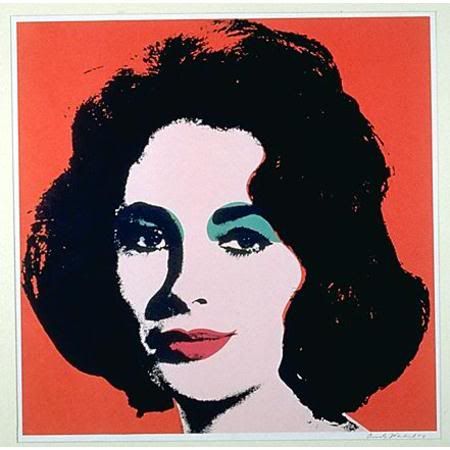
Andy Warhol, Liz (Colored Liz), 1963
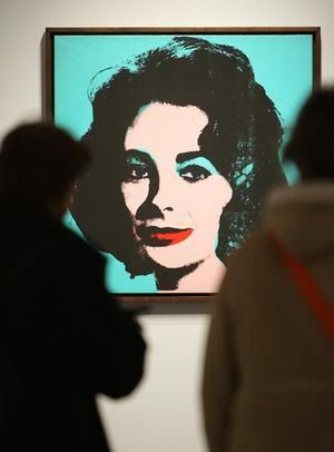
people looking at an Andy Warhol Liz
So do any of the artists play with the signifier that is Elizabeth Taylor? Yes, I thought a couple did.
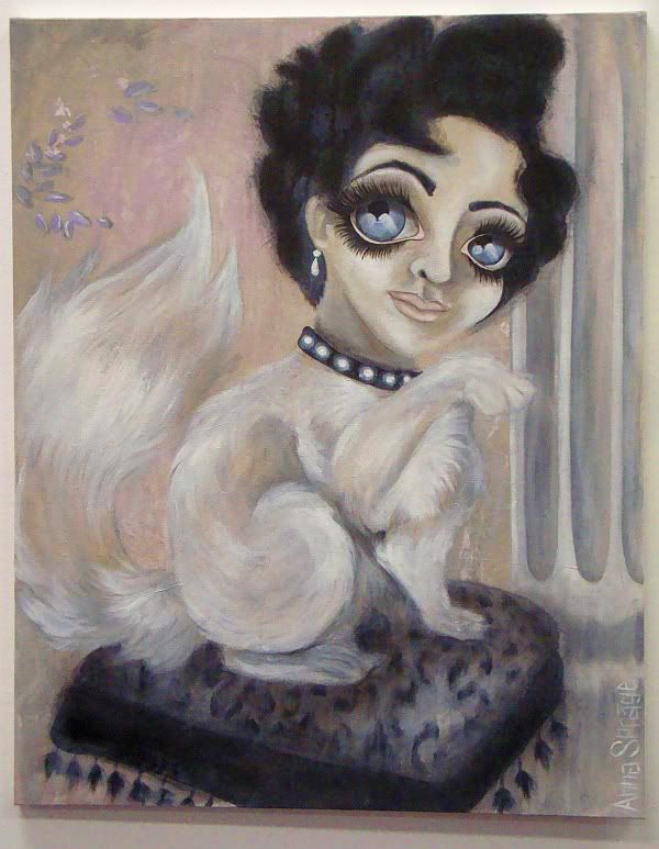
Anna Sprage, Lizcat, 2011
Anna Sprage's Lizcat takes the camp aspects of Liz and ratchets them up by combining it with other signifiers of camp. The Keane eyes, the Persian kitty, the bling and classical column all add up to a humorous and yet appealing camp explosion.It's an appropriate tribute to a star whose whole life made her a camp icon.
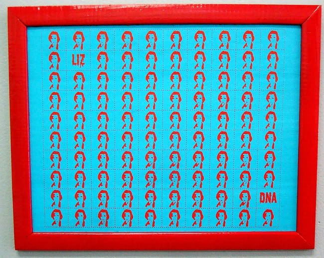
Andrea Ancira, Liz Blotter (one of four sheets displayed), 2011
Andrea Ancira's four sheets of Liz Blotter learns from Warhol--that Liz is not a person, but an image. By taking a high-contrast photo, shrinking and simplifying it, and repeating it over and over, Ancira replicates the whole star-making process--a process that turns its subjects from human beings into mass-produced things. Plus, by putting her image on blotter paper (a common vehicle for transporting, retailing and consuming LSD), she reminds us what a free-floating signifier someone like Elizabeth Taylor is. And she links Taylor to the counterculture--a link that was always there anyway. Elizabeth Taylor to Andy Warhol to the Factory to the Exploding Plastic Inevitable to the Velvet Underground, etc. The high-contrast graphic image on the blotters recalls Warhol's own deliberately low-quality, high-contrast images of Taylor.
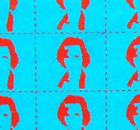
Andrea Ancira, Liz Blotter (detail), 2011
Sprague and Ancira took the theme of this exhibit and created clever, thoughtful work for it. Unfortunately, that wasn't the general case here.


No comments:
Post a Comment