Live and in Person at the Rice Media Center is a show of gig posters by silkscreen printmaker and Burning Bones Press honcho Carlos Hernandez. The show features walls full of bold, colorful posters, most advertising musical acts that have came through town over the years.

The posters are under glass (or plexiglass), which is not the ideal way to see them because of the reflections on the glass, but it's a necessary evil with work on paper. One could also criticize the clean white walls--these posters would look better in the grungy confines of a rock and roll nightclub or a dorm room wall.

Still, it's nice to see so many at once and to be able to consider them as a body of work.
The art world has problems with this kind of thing. For one thing, these are advertisements. They're fundamentally commercial. There is a client somewhere who commissioned this work. The posters don't have the autonomy that a bona fide work of "fine art" has. They aren't the pure expression of an artist's will. One might think that postmodernism would have swept away these distinctions, but not really. Maybe if we wait a few decades, the art world will come around on this stuff.
Nonetheless, rock posters certainly aren't just advertisements and they have their own art history. It's worth remembering a little of that history because it informs Hernandez's work. In San Francisco in the 60s, a group of artists began making silkscreen posters for rock shows. The one main rule of making a poster was "readability"--the type and the image had to be clear. These artists--people like Victor Moscoso, Alton Kelley, Stanley Mouse and Rick Griffin--broke that rule with glee. They created hand-drawn typography that was deliberately difficult to read, for example. They would place two colors together that were the same value, so instead of one color "popping" out from the adjacent color, the colors would have a vibratory effect that simulated a psychedelic experience. Sometimes the posters were hand-drawn, sometimes they featured photos--but the photos rarely were of the bands or singers being advertised. These artists loved to use deliberately antique graphic elements (photos, typography), modernized by being printed with intense fluorescent colors.
The sixties rock poster set the stage for future posters like this, but the idea of the artist-driven rock poster faded in the 70s as rock music became more corporate and less localized. Rock poster art was revived when the punk scene came along, first via cheap xeroxed flyers and later with the return of the silkscreen rock poster. Frank Kozik started designing flyers in Austin in 1981 and is generally credited with reviving the art of silkscreen rock posters. Kozik was not much of an illustrator, but he was a great designer. Like the 60s artists, he loved to dig up old images and recombine it in his posters--in visually arresting and often quite disturbing ways.
Après Kozik, le déluge. Soon every town had its own poster artists doing silkscreen gig posters for the local palais de rock. Here in Houston, Uncle Charlie (Charlie Hardwick) is popular, as is Hernandez.
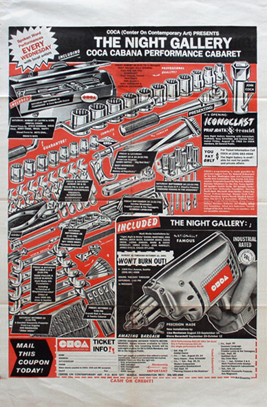
Around the same time as Kozik was recreating the silkscreened rock poster, Art Chantry was the art director for a music publication in Seattle called The Rocket. He worked with photographers and illustrators in a more-or-less traditional way, but he also started to use old images and old design--design that was, as he put it, uninfluenced by the Bauhaus or Paul Rand. The design of cruddy newspaper ads. He designed posters for rock shows and art shows at Seattle's Center on Contemporary Art where photographic images would not be halftoned, but would instead be reproduced by crude xerography. His work had a witty working-class feel--it was literally grungy and fit right in with the grunge scene in Seattle.

I mention all these artists and designers because you see a lot of their influence in Hernandez's posters. Look at the photo of Andre Williams in the poster above. It seems clear that Hernandez took an existing photo and xeroxed it, creating a rough, high contrast image. And he doesn't even try to stay "in the lines" with the red shape under the photo.

Ditto with this Supersuckers poster. The image looks vintage and slightly sleazy in a coy retro way. The photo (and the background) are reproduced in high contrast and not halftoned at all. (Halftones are a photo-mechanical method for creating print-ready images that show subtle changes in value in a given image.)


While Hernandez doesn't go as far as the San Francisco poster artists, he often uses hand-drawn lettering more for a visual effect than for ease of reading.

His lettering is distinctive. It has a feeling of being carved, as if he were doing woodblock prints or zinc plate engravings.

That "engraving" feeling extends to his drawing as well and is one of the the things that defines Hernandez's work. In addition to the influence of earlier rock poster artists, Hernandez is influenced by José-Guadalupe Posada, the great Mexican printmaker from the early 20th century. This influence was made obvious in his work for Messengers of the Posada Influence at the Museum of Printing History recently, as well as at his annual Day of the Dead Rock Stars exhibits at Cactus Records over the years.

This is what sets his poster work apart. While it is firmly in the tradition of the silkscreen rock poster that began in the 60s, the influence of Posada's Mexican revolutionary printmaking gives Hernandez's work a flavor all its own.
Live and in Person! Gig Posters and Other Printed Matter by Carlos Hernandez is on display at Rice Media Center through January 30.


The work breathes, maybe even shouts. Well deserved attention to a dynamic artist.
ReplyDeletepsbriggs