Showing posts with label Eddie Campbell. Show all posts

Saturday, March 30, 2013

6 More Comics

Robert Boyd

I meant to review a lot more comics during the time that Comics was on view at the Emergency Room, but I haven't been as diligent as I hoped. That exhibit is still on view through April 11. I hope you will find the time to go check it out. It includes original comics artwork from a variety of artists, including Otto Soglow and Walt Kelly, whose work I review below.


The Lovely Horrible Stuff by Eddie Campbell (Top Shelf, 2012). A minor work in Campbell's oeuvre. The first half deals with his own interactions with money, including incorporating himself so that he can write and draw a Batman comic (and he sees this as every bit as absurd as it sounds) and loaning his father and law $70,000. Neither of these things ends well, which reinforces Campbell's basic sense that one should keep things simple, not borrow (or lend) money, and otherwise be a good, miserly Scot. Frequent quotations from headlines about the financial meltdown and recession of 2007-09 reinforce these views

The second part of the book involves an unintended trip to the island of Yap, where giant limestone discs were famously used as "money." Campbell explores the mythology and history surrounding this custom, and also discusses the economists who have used the example of Yap to discuss financial matters such as the concept of fiat money. But he finds himself more interested in the discs as artistic objects, carved by generations of anonymous Isamu Noguchis. At the end of the book, he suggests money problems have caused a serious rift between himself and his wife, suggesting that his frugal, conservative approach to money is no cure-all.

For this book, he floats text above each panel. There is a lot of text, and as a consequence, the panels are quite small. It feels like the art is almost an afterthought. The book is in color, and Campbell makes full use of the digital toolbox, but in ways that feel unique to him. The work often involves photographs combined with drawn images and "painted" with slabs of Photoshop color. Sometimes this doesn't work, but overall, it's quite interesting. Because of their detail, photos have an effect of stopping the eye and interrupting the visual flow of a comics narrative. But Campbell's technique of digitally painting the photographic elements simplifies them in much the same way a well-crafted drawn cartoon panel is simplified. This keeps the eye moving and the narrative puttering along.

(It is interesting but probably irrelevant to note that Eddie Campbell was a student of painter Derek Boshier.)


Best of Enemies: A History of US and Middle East Relations, Part One: 1783-1953 by Jean-Pierre Filiu and David B (Self-Made Hero, 2012). Except for the first chapter, in which a Gilgamesh myth is retold using paraphrases from George Bush and Donald Rumsfeld, the content of this book is fairly straightforward. It is a brief retelling of U.S./Middle east relations, starting with our early wars with the Barbary pirate states, our inability to prevent France and Britain from carving up the Ottoman empire after World War I, our establishment of friendly relations with the Saudis during World War II (as a guarantee of oil supplies for the war effort), and finally our involvement in the Iranian coup that set the Shah up as dictator. The book stops in 1953.

There are many details of this history that I didn't know which this book, brief though it is, lays out. I am somewhat troubled by its lack of a bibliography--the authors expect the reader to simply take them at their word that these are true accounts. As I read the section on Iran, it occurred to me that while this history is little known to most Americans, every Iranian probably knows it by heart. So while we may view them simply as religious fanatics, they hold a long grudge.

The reason I think so highly of this book is because of the astonishing cartooning of David B. David B employs literary devices that a poet might use: metaphor, metonymy, etc. And he uses devices that don't really have a name because there is no literary equivalent. He employs the structure of comics so creatively that I just can't think of another artist like him. It is especially striking that he uses this vast expressive toolbox in this essentially informational book. It is not an obvious approach, and yet it works beautifully, leaving the reader with a book ten times more fascinating than it would have been with more straightforward comics illustration. David B. turns what would have been just a polemic into a work of art.

 
The Furry Trap by Josh Simmons (Fantagraphics Books, 2012). The genre of horror, it seems to me, is at a disadvantage in comics. In prose, horror can use the imagination of the reader to fill in the horrific details--an imagination that each of us has, as we can see from our nightmares. Good prose horror depends on this partnership with the reader to work. In movies, the filmmaker controls time, which means that suspense and dread can be built up to extremely high levels before being released. The simplest version of this (but very effective) is the shot of the long-anticipated bogeyman popping out at the victim/protagonists.

Comics can't really do either of these things. So how does a horror cartoonist like Josh Simmons compensate? Partly by an unflinching willingness to show extremely horrible things quite explicitly (in ways that would never fly in a movie intended for general distribution). The Furry Trap is drawn in an accessibly light-hearted style (cartoonish), but Simmons nonetheless depicts terrible things--extreme scenes of sexualized violence. (This is not a book for the kids.) But curiously, the most unsettling story is "Demonwood." It feels like the prelude to the usual Simmons story--the horror is unstoppable and it's coming, but it isn't here yet. And that is truly frightening.

 
Dotter of Her Father's Eyes by Mary M. Talbot and Bryan Talbot (Dark Horse Comics, 2012). Mary Talbot is an English feminist scholar, the daughter of a well-known Joyce scholar, James S. Atherton, and the wife of graphic novelist Bryan Talbot. Dotter of Her Father's Eyes parallels her own childhood and upbringing with that of Lucia Joyce, the tragic daughter of James Joyce. And curiously, she chooses to tell it graphic novel form, drawing on her husband's considerable talents and, it must be added, encouraging him to move in a very different direction than his previous work. The book is divided into three interwoven parts--Mary Talbot's past, drawn in brown with a sepia-tone base (with occasional flashes of color), Lucia Joyce's parts, drawn with blue and back duotone, and the scene set in the present, which is drawn with simple black outlines and flat but vibrant Tintin-ish colors. Both of the "past" sections tend towards a sketchiness that I've never seen before in Bryan Talbot's work (it is still very precise; it only feels sketchy compared to his other work).

The problem with the book is that the two stories--Mary's and Lucia's--fail to really parallel one another. Lucia's life is one of thwarted ambition and madness. Mary's is one of abuse and neglect by her father. But Mary's ambitions, it seems to me, were never thwarted at all. If anything, her father seems annoyed that she is aiming so low, and is pleased when she gets her PhD. The most interesting parts dealt with the fact that she grew up in a working class neighborhood because her father wasn't making a lot of money as a Joyce scholar. So she had an intellectual cultural upbringing that was of little use to her on the playground. (Girls make fun of her at school for not knowing who the Beatles are.) There are parts of this book that are interesting and amusing, but the whole is less than the sum of the parts.


Pogo: The Complete Daily & Sunday Comic Strips, Vol. 1 by Walt Kelly (Fantagraphics, 2011). Pogo got its start as a comic book--this origin is possibly unique in the history of comic strips. That was in 1942. Pogo was revived as a daily strip for the New York Star, a short-lived liberal newspaper, and when it folded in 1949, Pogo got picked up by a syndicate and began its glorious newspaper run. This volume reprints all the New York Star strips and all the syndicated strips through the end of 1950. Kelly's drawing style is quite mature--it's not going to evolve much from here on out. He had worked for Disney and had very slick, deft brushwork. But the strip, constrained by space that an animated movie never has to face, is visually dense, a thicket of brushed lines. His language is dense as well--in an era that is about to see the coming of such minimal strips as Peanuts, Beetle Bailey, Hi & Lois, King Aroo, etc., Pogo stands out. These are not strips that, as Wally Wood said of Nancy, take more time not to read than to decide not to read.

In the first two years we get some of the familiar tropes and most of the regular characters. There is a world series game, a gift from Porkypine to Pogo on Christmas, and so on. There are hints of the political aspect of the strip that will come to characterize it, but most of that is in the future. For these first two years, it's mostly about slapstick and wordplay.


Cartoon Monarch: Otto Soglow and the Little King by Otto Soglow, edited by Dean Mullaney (IDW, 2012). The Little King got its start in The New Yorker and made a transition to the comic strips, where it ran from the 1930s to the 1970s. Soglow was a minimalist--frequently the strips had no words at all, and even when they did, he kept them to a minimum. The drawing consisted of simple forms and elegant, thin lines. The strips dealt with a small number of themes over and over, using them as a way to create formal variations on simple ideas. It's in these variations that the strip shines. This thick, well-edited volume shows Soglow returning to the same jokes over and over again (mixed up hats and crowns, soldiers on parade, advertising signs, etc.). Some of the funniest strips are about the King's reaction to modern art. Cartoonists loved to make fun of modernist art (which I've always found ironic--the greatest cartoonists distorted and abstracted the human figure every bit as much as any modernist painter). But Soglow ends up portraying his king as a post-modernist avant la lettre. There are more than one strip where on seeing an art exhibition, the little king adds his own art--which will invariably be an advertisement or a sign with words.

There are several series of comic strip reprints that are attempting to collect the entire work of a given cartoonist on a certain comic strip--Pogo (above), Milton Caniff's Terry and the Pirates, E.C. Segar's Popeye, Frank King's Gasoline Alley, etc. But this approach is not appropriate for every classic comic strip. In the case of The Little King, it would be tedious to read 40 years worth of these strips. This well-chosen collection of Soglow's best is a better way to honor this master of minimalism. Cartoon Monarch also includes an excellent biographical essay on Soglow.

Share

Monday, February 20, 2012

Conversion Narratives

by Robert Boyd

As literary genres go, conversion narratives have it all. You get both the titillation of sin and the redemption that comes with conversion. For believers, this is as close as they can get to living in the twilight worlds of criminals and the demimonde. Cartoonist Eddie Campbell distilled the conversion narrative down to its essence in one panel from his masterpiece, Graffiti Kitchen.


Eddie Campbell, panel from Graffitti Kitchen page 4, 1988-92

The first conversion narrative (and the first autobiography written in the West) was Confessions by St. Augustine. It set the form into place and autobiographical conversion narratives have remained popular ever since. If you've ever read the Autobiography of Malcolm X, you know the one of the best parts is the "Detroit Red" section, when Malcolm was drug-dealing, gambling, robbing and pimping.And then we get the prison-house conversion.

Conversion narratives can be written or spoken. But until this weekend, I had never seen one in form of a CV. That's how artist Forrest Prince (whose show The Truth Will Set You Free is on view at P.G. Contemporary) presents his. It starts off with his life of sin.
1947 Willingly molested for money [Prince was 12 at the time--St. Augustine was a little more forgiving of the sins he committed prior to the age of 14.]
1948 Drug abuser. Babysat for prostitutes.
[...]
1953-56 USMC. Honorable discharge. 2 weeks in brig for leaving post. Sex addict on speed.
[...]
1958 Pimp and blackmailer.
1959 Dance teacher, Fred Astaire Studio. Gigolo and whore.
1960 Attempted suicide. Overdosed on sleeping pills.
[...]
1964 Arrested for running a call-girl service. Charged with pandering. Dismissed.
Then the conversion comes. The interesting thing is that he started to do art before becoming born again, but the two are clearly intertwined.
1969 Please God, save me! Began doing art work.
1972 Charged with assault to murder and carrying a pistol. Convicted; $300.00 fine (a case of a paranoid speed freak protecting himself from real and imaginary enemies).
 Surrendered to God: off meat, off drugs, off sex. PRAISE GOD!
1973 Slipped: sex, drugs and rock and roll. Still seeking, started serving.
His work was noticed by James Harithas, who gave him a one-person show at the CAMH in 1976. In some ways, his CV becomes more normal here, as he lists the exhibits he has had. But not completely normal.
1985 Larry Pfeffer Grant, $7,500. PRAISE GOD!
[...]
1992 Museum of Fine Arts, Houston, commission for a sculpture from Allison Greene. She wanted a large mirrored heart with "love" embedded in it. The deal fell through when the donor backed out, saying I wanted too much and since the Museum was not about to spend their cash on me, it was all over. But, Praise God! Bill Hill came by and snapped it right up. 
Prince also lists every time he was rejected for Lawndale's Big Show (2001, 2002, 2005, 2010).

Without Prince's conversion narrative, his work would seem pretty strange. It still seems pretty strange, but at least there is an explanation. When you look at a piece like Today's Lesson, you understand that it is the work of a highly religious convert.


Forrest Prince, Today's Lesson, blackboard, chalk, eraser, defense of animals bumper sticker, 37 x 49 x 2.25 inches, 1993

This is barely a piece of art--it's a sermon hectoring you to change the way you live.


Forrest Prince, The Money Changers Are Still In the Temples or Born Again My Ass, found objects, wood, acrylic, 22 x 15 x 5.75 inches, 2009

But Prince's Christianity is neither orthodox nor conventional. We live in a time when its hard to imagine a politically liberal form of Christianity because the Evangelical right has asserted itself so strongly that it (and fellow religious conservatives outside the evangelical movement) are the only kinds of Christianity that exist in media representations and popular culture. But Prince makes pieces like The Money Changers Are Still In the Temples or Born Again My Ass which criticizes Southern Methodist University for their association with George W. Bush.


Forrest Prince, The Money Changers Are Still In the Temples or Born Again My Ass detail, found objects, wood, acrylic, 22 x 15 x 5.75 inches, 2009


Forrest Prince, The Money Changers Are Still In the Temples or Born Again My Ass detail, found objects, wood, acrylic, 22 x 15 x 5.75 inches, 2009

His grievances aren't always religious. It's Time to Put Away Childish Things criticizes the MFAH, possibly for their baseball exhibit from 2005.  The title refers to First Corinthians 13:11: "When I was a child, I spake as a child, I understood as a child, I thought as a child: but when I became a man, I put away childish things." I interpret it as an attack on the MFAH for putting on a shallow, crowd-pleasing show that has nothing to do with art. But it may be that he sees the MFAH as a childish organization.


Forrest Prince, It's Time to Put Away Childish Things, mixed media, 16 x 12 x 6 inches, 2012


Forrest Prince, It's Time to Put Away Childish Things detail, mixed media, 16 x 12 x 6 inches, 2012

It also seems that Prince carries a grudge--after all, he includes his unsuccessful commission for the MFAH in his CV. And he remembers every time Lawndale rejected him. (Perhaps Prince needs to meditate on Matthew 5:39.)


Forrest Prince, Occupy Love, neon lights, mirror, 23 x 30 x 3.5 inches, 2011

Prince's political stance, which is always informed by his religious belief, is all over this show. Hence Occupy Love. Hence a piece exhorting the viewer to boycott Exxon-Mobil and BP. It's interesting and refreshing to see a Christian artist to take a left-wing stance in this present age, but Prince's work has some of the same weaknesses I see in much contemporary Christian art (as well as in much contemporary left-wing political art)--it's too preachy. I guess that goes with the territory. In the end, the story of Prince's conversion is more powerful than the artworks on display here.


Share

Friday, July 30, 2010

Recently Read Comics

It's been a while since I did one of these. Here are a few graphic novels that I have read lately.

http://media.ideaanddesignworks.com/idw/covers/tiger_tea/TigerTea_Cover.jpg
Tiger Tea by George Herriman
Krazy Kat wasn't strictly a "continuity strip"; i.e. , there wasn't an ongoing story that went on from day to day. The "Tiger Tea" sequence was one long exception to this rule. Krazy decides to help Mr. Meeyowl, the catnip dealer, after his business collapses. She goes on a mission to retrieve an extra-strong variety of catnip called Tiger Tea, that turns her, when she drinks it, from this sweet passive being into an aggressive, pugnacious, powerful figure. And, as they say, hijinks ensue. This is a really classic sequence. I first read it when it was reprinted in an issue of RAW. The new book suffers from being overdesigned, but well worth getting. A great introduction to this classic strip.

Peter Bagge
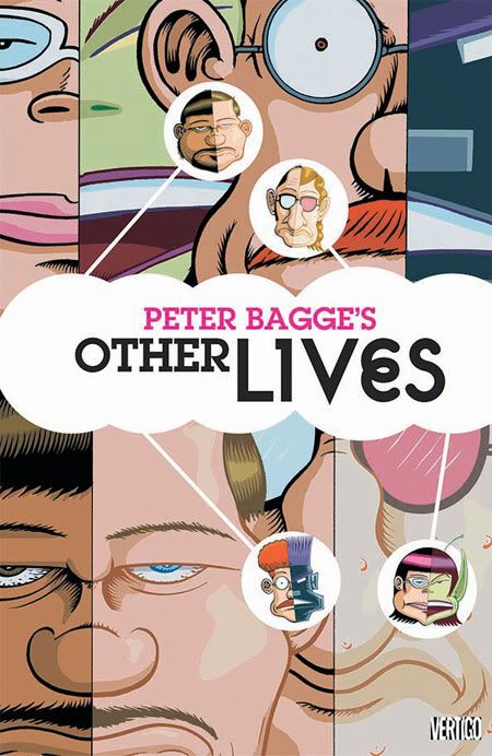
Other Lives by Peter Bagge
This new graphic novel by Peter Bagge really deserves a longer review than the few lines I am going to give it here. As far as I know, this is Bagge's first graphic novel that didn't appear serialized in comics first. But really, I think we can reasonably say that Bagge has been writing graphic novels for a long time. Hate was, in effect, two long graphic novels about one character, Buddy Bradley. His earlier narratives were by format and, I think, by authorial inclination very episodic. What kind of thrills me about Other Lives is how unepisodic it is. Everything happens fairly quickly, and the plot threads are so intertwined that it couldn't be split into chapters particularly easily. But the best thing about Other Lives is how deftly Bagge deals with a theme that is both extremely topical and ancient, that of constructed identity.

http://content-5.powells.com/cover?isbn=9781582406725
The Walking Dead, written by Robert Kirkman and drawn by Tony Moore
I thought I'd try this out since it has gotten a ton of good press, and now is going to be a TV series. I won't say it sucked, but I don't understand why people think it's so great. It seems similar, but not superior, to other "zombie" stories; The Walking Dead is, at best, a competently done pastiche. (Maybe subsequent volumes get better.)

http://www.pictureboxinc.com/images/assets/productimage/d7ab20d934abddd304d6e22ebb8b64b78a7a4e12/l/464
Cartoon Workshop/Pig Tails by Paper Rad
I'll get my "hipster" union card revoked for saying this, but I thought this was boring and pretty bad. Visually, it did nothing for me. I've seen Paper Rad videos that were awesome, and Ben Jones' solo art is really cool. But this little color comic was a chore to read and not that great to look at.

Eddie Cambell
The Playwright, written by Daren White and drawn by Eddie Campbell
Campbell doesn't usually collaborate with other writers, but this was a good pairing. Instead of an ordinary comic, there is a barebones written narrative that tracks Campbell's watercolors. It is a comic in the sense that both the drawings and text need each other, but it reads differently than what you might be used to. The narrative is full of nameless characters, identified by their profession. The main character is the Playwright. He comes across as completely self-absorbed and isolated, lacking any empathy. Yet his plays are highly successful. Over the course of the book, though, the Playwright opens up a bit. We start to see deeper into him. The Playwright reminded me, in some ways, of certain stories by English writers like Malcolm Bradbury, David Lodge and William Boyd, but it's hard to put my finger on how.

http://www.drawnandquarterly.com/imagesProduct/a49f5f35c325a4.jpg
Red Snow by Susumu Katsumata
Publisher Drawn and Quarterly has embarked on a mission to publish important early manga in the U.S., particularly those classified as "gekiga" or dramatic manga. One can see the influence of Yoshiharu Tsuge here. The drawing is really good. But the stories didn't grab me as much as those by Yoshihiro Tatsumi. Still, they were pretty good and a refreshing alternative to most manga published in the U.S.

http://www.fantagraphics.com/components/com_virtuemart/shop_image/product/d580c87065faa135b1031a08a339bd0c.jpg
The Search for Smilin' Ed by Kim Deitch
So much of Kim Deitch's work hinges on demons (Waldo, the cat with a "1" on his belly is a minor sort) and aliens. But they also are intertwined with his real life, the real lives of various obscure showbiz figures, and the history of American popular culture. Do they fit together? Until reading this volume, I would have said no. But this story is one where Deitch tries to tie the various unruly strands of his many stories together. In a way, I almost prefer that these overlapping, nesting, and sometimes contradictory stories never really congeal, but The Search for Smilin' Ed is, like all of Deitch's work, a compelling and highly personal piece of work.

Jill Thompson
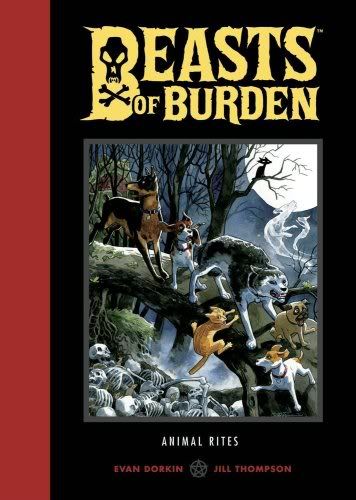
Beasts of Burden, written by Evan Dorkin and drawn by Jill Thompson
The idea of several dogs (and one cat) getting together to solve supernatural crimes is, well, pretty out there. It's not a concept that can sustain a lot of use. This book starts strong and gets harder to accept the further along you go. That said, there is a lot appealing here. Jill Thompson's art is fantastic and perfectly suited for this. The book is a pleasure to look at. My problem is, even though I was able to suspend my disbelief at first, it got harder and harder as it went along. But another problem is that the supernatural threats seemed very human. What might have worked better is if there were a world which only dogs could perceive that we humans were oblivious. And in fact, this is the case--a dog's sensorium is drastically different from a human's. That should have been played up more. The very first story in the book does this to an extent.

http://www.powells.com/cgi-bin/images.cgi?isbn=9781897299920&p=1
Catland Empire by Keith Jones
Great art, but the story seems just silly.

Yoshiharo Tatsumi
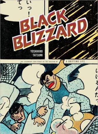
Black Blizzard by Yoshihiro Tatsumi
Only of historical interest. Tatsumi was one of the early "gekiga" artists, and this is one of the early gekiga stories. It dates from 1956, and the story is nothing special--a crime melodrama with a transparent "twist". But I guess stuff like this hadn't been seen in manga before. Apparently it broke ground. The art looks really rushed, and it was. The entire graphic novel (127 pages) was drawn in 20 days--no assistants. But as astonishing as that accomplishment is, it would be more meaningful if the book was any good.

More recently read comics are reviewed here.