Wednesday, September 2, 2009

Where Does a Work of Art Get It's Value?


Andy Warhol, Dick Tracy, 1960

This is one of the earliest pop art pictures Andy Warhol painted. After he saw Roy Lichtenstein's comics-based pieces, he gave up on using comics as a source for his own work.

The actual Chester Gould comic strip that this painting was derived from evidently dates from 1951. You can buy that original for $175,000.


So what does an original Chester Gould Dick Tracy strip usually go for? From this dealer, who sells a lot of comic strip art, your can spend between $495 and $1000 for a Dick Tracy original. That's about what I've seen from other dealers as well.

Now personally, I think Chester Gould is a great American artist, and that his original art should be worth a lot more. And while I think the multi-million dollar prices some Warhol pieces have gotten at auction are pretty ridiculous ($71 million?!), I have no problem with the idea that his art is and should be valuable.

What seems bizarre is that a piece of Chester Gould art should be worth 175 times what it might usually be worth in the market because Andy Warhol happened to have copied from it. Admittedly, it hasn't sold--$175,000 is the asking price. But this seems like a perfect example of Warhol's brand being used to enhance the value of something else. Don Thompson talks about this effect at length in The $12 Million Dollar Stuffed Shark, but usually in terms of individual artworks getting a boost from their association with branded collectors, dealers, auction houses or museums. For example, a painting at auction that came from the collection of David Rockefeller will sell for more than a similar painting by the same artist that came from Joe Shmoe's collection. In this case, a non-Warhol piece of artwork is worth more because Warhol is associated with it.

The Curious Case of the Devin Borden Hiram Butler Gallery

I swung by the Devin Borden Hiram Butler Gallery on Blossom Street on Saturday (the sixth of six galleries or museums I hit that day), and the show that was up, "Ideograms" by Matt Magee, was OK but nothing super exciting.

Pink F and Memphis
Matt Magee, Pink F (left) and Memphis (right), oil on panel, 2008 and 2009 respectively

The weird thing about this gallery, which I have noticed before, is that there is a somewhat jumbled back-room that anyone can just walk into. Galleries always have back rooms and storage spaces, and if you ask, you can often go see the art there--but sometimes not. Depending on the gallery, it's like getting into the VIP room at a nightclub. You have to be judged a (potentially) serious collector.

But not so at DBHB. You can just walk right in--indeed, I suspect many visitors do so by accident.

Hiram Butler backroom

It's cluttered and messy (like the Betz Gallery was). But unlike the Betz, you are alone in this room. So even though Mr. Magee's work didn't wow me, I was able to look around and find other work of interest.

relic 1

I'm not sure who the artist is or what the title of the piece is. It's basically a fake museum piece. The little identification card next to it is part of the piece. It reads:
Commemorative Vessel From the National Forest Service, 2044, New Mexico, U.S.A.
Attributed to Albert Staehle
This vessel was created for the centennial anniversary of Smokey the Bear in 2044. The oldest running public service message in US history, Smokey targeted children with his famous fire prevention message in print, radio, and television ads. His character was replaced by Shrek after the extinction of the black bear in the late 22nd century.

DBHB is in a beautiful location, an oasis in the rapidly urbanizing neighborhood. There is a thick canopy covering Blossom Street here, and it's all surrounded by encroaching townhouses (you know the type--3+ stories, cheaply built, with giant garages facing the street). The gallery is on a huge lot, with an immense and beautiful garden.

Hiram Butler garden

I went into HCAD to see who owned the property, as well as a few others on Blossom (which I will talk about in a later post). The owner of record of the property is Surls Butler Co. (!). In the back of the gallery (the yard that faces Fowler Street) is a small James Surls sculpture. Is Surls a co-owner of the gallery? Or was he one in the past, leaving only his name on the holding company? If he is, it's odd because he has a show up right now in Houston -- at the Barbara Davis Gallery. (Actually, the website for Barbara Davis claims that  the Surls show has ended... but that website hasn't been updated in a long time, strangely enough.)

Maybe the history of the DBHB Gallery is well-known in Houston art circles. But it seems a bit strange to me.

Tuesday, September 1, 2009

Way Too Much Art at the Betz Gallery

Going to the Betz Gallery this weekend was an experience diametrically apposed to McClain or Sonya Roesch. Betz had an event going on open to artist to sell their works for no more than $100 each. So where McClain and Roesch were elegant, spare, and gave the art displayed within substantial breathing space, Betz was riotous.

Betz Gallery 2

Work was piled together with no particular regard for whether it clashed with the adjacent pieces. This was Betz's "Art Fair". Betz is an artist-owned and operated gallery, and in the $12 Million Stuffed Shark, Don Thompson ranks them near the bottom of the pecking order for commercial galleries. Nothing I saw there Saturday really impressed me a lot, but the environment for viewing art was terrible, crowded, chaotic, visually noisy. (In other words, hung in a quieter, more still environment, I might have had a different opinion about some of the work.)

Betz Gallery 2

Painters and photographers were jumbled together with jewelry-makers and craftsmen. If you have ever been to a big arts and craft show, Betz had that feel. (It was more "art" than "craft" though.) I'm not suggesting the artists were all a bunch of low-level hacks--it was just that the way Betz was displaying them Saturday kind of turned them into hustlers, struggling to rise above the visual din to be seen. Very democratic in terms of prices, availability, access to display space--but a killer in terms of looking at the art. (Then again, I understand very non-democratic shows like Art Fair Miami Basil are similarly bad venues for looking at art, despite the blue-chip art on display.)

Cicely Miller

This is Cicely Miller from Shreveport, Louisiana. Originally from New Orleans. She makes happy art, pictures of musicians (including Michael Jackson) with bright happy colors. But she had a piece or two that touched on Katrina. I think art at this level is about creating something that ordinary non-"high net worth" folks would feel "brightens the place up." But I also hope artists like Cicely Miller will emulate her and occasionally take time out to express how they feel, and make art about things important to themselves.

Monday, August 31, 2009

Super-Deformed Medieval Dudes

Did you know that the University of Houston Downtown (soon to be renamed, as soon as they can figure out a good name--I recommend "We're Not the Harris County Prison; Yeah, That's Across the Street, I Know the Buildings Look Alike, It's Weird University" or WNHCPYTASIKBLAIWU for short) has a gallery? It's the O'Kane Gallery, and the current show is called Raw (nothing to do with the classic art comic anthology, alas). The show consists of drawings and paintings by Lisa Qualls, Mark Greenwalt, and Doug Cason. It's Greenwalt's work I want to draw attention to. He's a Galveston artist who really has a way with a pencil. His pieces look like early Rennaissance sketches, and have a little Odd Nerdrum/Heironymous Bosch strangeness to them.

Mark Greenwalt, The Gods of War, graphite, red chalk, acryilic on panel, 2008

He includes a tiny self-portrait in this piece. It looks incongruously contemporary among all these deformed medievel figures.

Mark Greenwalt, The Gods of War detail, graphite, red chalk, acryilic on panel, 2008

I'm afraid my photos don't really capture the subtlety of his drawing. (For decades now, painting has been biased by what art would reproduce well in magazines. Perhaps now, good reproduction online will give artworks an extra boost. Too bad for artists like Greenwalt...)

Mark Greenwalt, Innocence, Death, Wisdom, graphite, red chalk, acrylic on panel, 2008

I really like his work. I think these pieces demand contemplation. Certainly they reward looking very close at the surface and checking out the details.

One more thing about the O'Kane. I realize the student who works there is your average work-study employee. I was one once. But I have two suggestions for her. 1) Pretend like you get and more important like the art, even if you don't. Memorize some facts about the artists you can recite when you have visitors. 2) Don't dress like a student. Torn jeans and tee-shirts show a lack of respect for the art and the patrons. Try to look more artsy-yet-professional. Not like you just did an all-nighter writing a paper. Just saying.

The Kandy-Kolored Geometries of Jonathan Leach

I went to Gallery Sonja Roesch (home of the fastest art in the west) on Saturday. This time, they actually had some art that made me linger! The artist is Jonathan Leach, a Houston artist who does these semi-architectural geometric abstractions. The photos here don't really do justice. No photo can because the art is full of day-glo colors that can't be captured on film or pixels.

http://www.gallerysonjaroesch.com/2009_GSR_website/pics/Leach4.jpg
 This photo was lifted off the gallery's website. It gives the impression that Leach paints in pastel colors, but the reality is that these works are quite vivid.

Jonathan Leach 1

I took this one, which I think represents the range of value better, but still doesn't give you an idea of the intensity.

These two paintings are the most "architectural" of the work--the other pieces are more abstract, and a few are what I would call minimal. They are worth seeing in the flesh if you like hard-edge abstraction (which I, for one, do).

My Favorite Bits of Lawndale's 30th Anniversary Show

Robert Boyd

The great James Surls spoke about the founding of Lawndale last week. The show that is up now doesn't try to encapsulate Lawndale's entire 30-year history. It is composed of work by six artists who have all shown at Lawndale within the last five years.


Elaine Bradford, Harry With Worlds on Top, taxidermy elk's head, crocheted yarn, 2009

Elaine Bradford has been a high-profile artist in Houston. (Readers might recall that I bought a photograph of hers earlier this year.) I like the piece above because in it I see strong echoes of Dr. Seuss. I didn't see that in her taxidermy/knitting works before, but now it seems obvious. Bradford is hunting and mounting Seusses.


Elaine Bradford, Little Ram, Tiny World, plastic ram head and crocheted yarn, 2009

Emily Sloan turned the columns in the main space in Lawndale into these giant lamps. (I am assuming these columns were already there--I never really noticed them before.)


Emily Sloan, Boudoir Lamps in Black, Red and Gold, four structural columns with fabric, steel, wood and paint, 2009

I have no idea what she is saying with these "lamps" but they look cool.


Seth Alverson, Woman Bending Over, oil on canvas, 2009

Seth Alversons paintings are admirable but cringe-inducing (at least the ones I'm reproducing here). I don't really want to look at that lovingly-painted cottage cheese, but can't look away. He should hope a museum gets it, because it's hard to imagine a collector hanging this on her wall.


Seth Alverson, Tits in a Window, oil on canvas, 2009

Or this (these?)!


Mark Schatz, A Map Drawn from Memory, Torn to Pieces and Thrown into the Sea, mixed media, 2009.

Little bits of landscape, looking like a cross between Google maps satelite view and a model railroad diorama, with huge iceberg-like chunks of stone beneath them, hung upside down. The inherently creative impulse of model railroaders, plastic model builders, and diorama-makers of all stripes is art-schooled here. I approve. I've loved dioramas since I was a little kid. Here's a closer view:


Mark Schatz, A Map Drawn from Memory detail, Torn to Pieces and Thrown into the Sea, mixed media, 2009.

There are other good pieces in the show by other artists. But these were my favorites. Lawndale may not be the wild, crazy, unafraid-to-fail, anarchic place it was when James Surls started it, but it puts on a good show.

Sunday, August 30, 2009

Jason Villegas / The Art Guys at the McClain Gallery

I hit the galleries hard this weekend--six in total, three I had never been to before. I like to take pictures in galleries, but I feel a little uncomfortable doing it. Museums won't let you--the guards will sweep down on you if you try.

So I went to McClain Gallery with a different approach. I would ask for permission to take photos. I even made up business cards for this blog, to try to give a little legitimacy to my request. And I was prepared to get a "no." That would have been fine. But the reaction I got was weird. The fellow I talked to (McClain?) was indifferent to whether I took photos. But he was worried that I would write something controversial. This was a commercial gallery that existed to sell art--not to create controversy. I assured him that I had no intention of being controversial (kind of an empty promise because I have no idea what he would consider controversial). That ended my experiment with asking permission; in other galleries, I just whipped out the camera, hoping not to be kicked out. Still, given McClain dude's conditional permission, I snapped away.

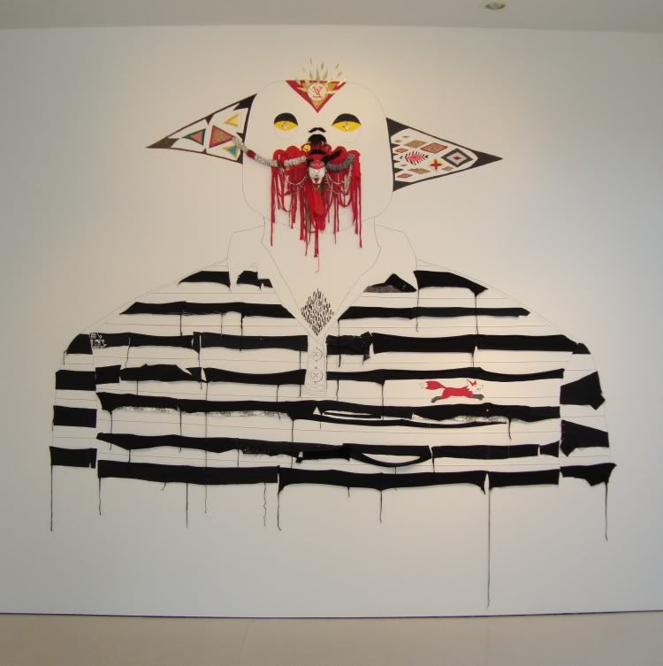
The show in the front gallery is work by Jason Villegas, who also has a show up at the CAMH. You can't ask for better advertising than that  (or, as Don Thompson writes The $12 Million Stuffed Shark, CAMH enhances Villegas' brand in the eyes of local collectors). Villegas does his own version of crap on crap. For him, the crap consists of old golf shirts found in thrift stores, particularly ones that had little animals on them. Obviously the famous brand is the Izod alligator, but it turns out that there were (are?) lots of animal knock-offs.
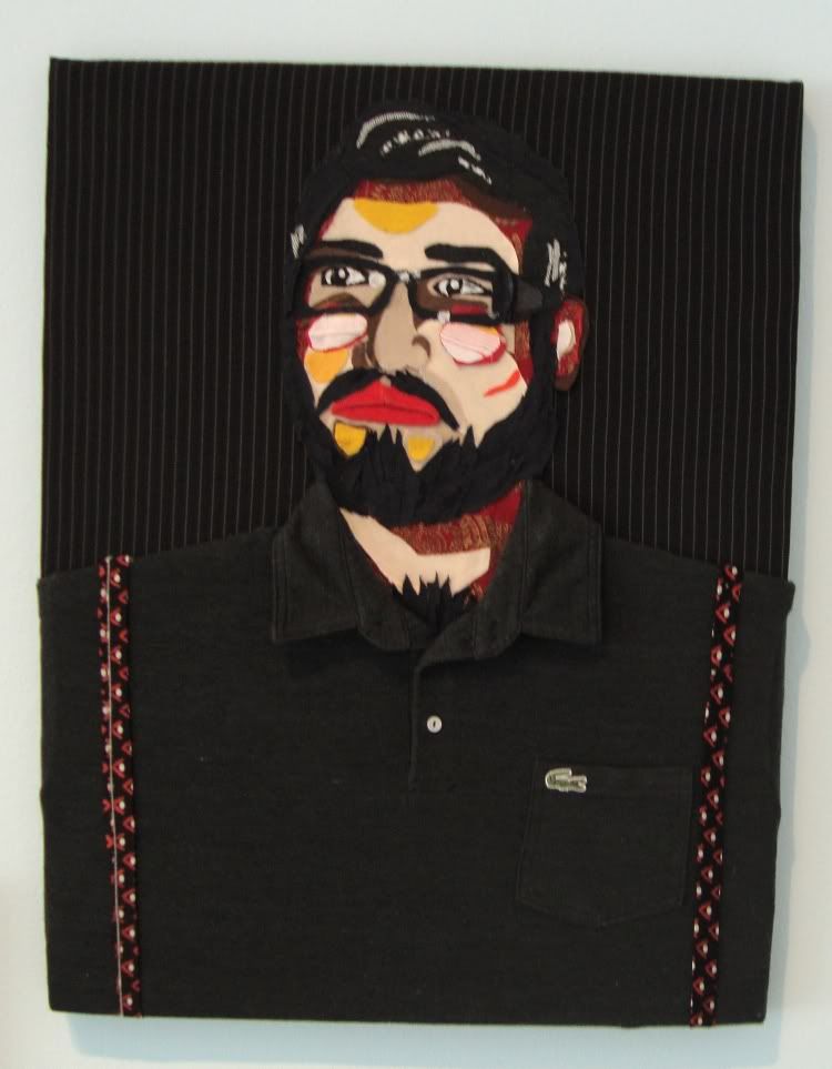
Photobucket
Conquistador, Jason Villegas, 2009

He approaches the work of tearing up and recombining golf shirts from every angle, including paintings of the assemblages. One of the pieces at CAMH consists of horizontal ripped pieces of shirts stapled to the wall in the shape of a rounded triangle. The shirt bits all have long thin curled up bits of fabric hanging down like fringe. So here at McClain, Villegas basically paints this assemblage. Twice.
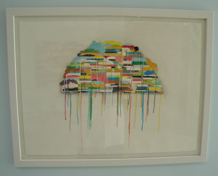
Polo Pile
Polo Pile, Jason Villegas, acrylic and marker, 2009
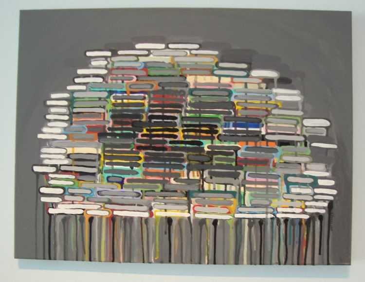
Polo Pile as Subdued Microorganism
Polo Pile Subdued as Microorganism, Jason Villegas, acrylic, 2009

The hanging fringe of the original is replaced by paint drips in these versions.

He also creates self-portraits where he takes on the animal identity of each brand.
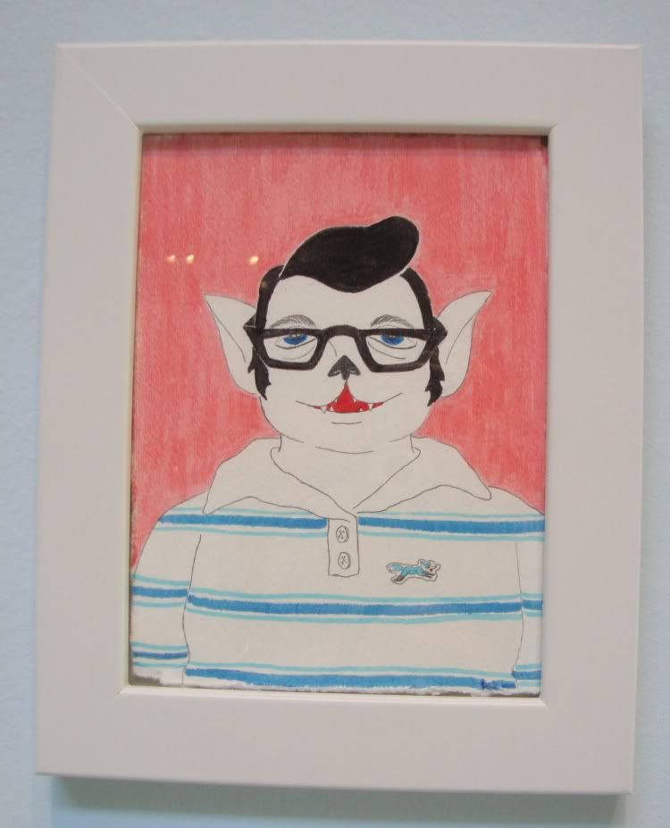
Self Portrait as Fox Brand
Self-Portrait as Fox Brand, Jason Villegas, marker and pencil, 2009
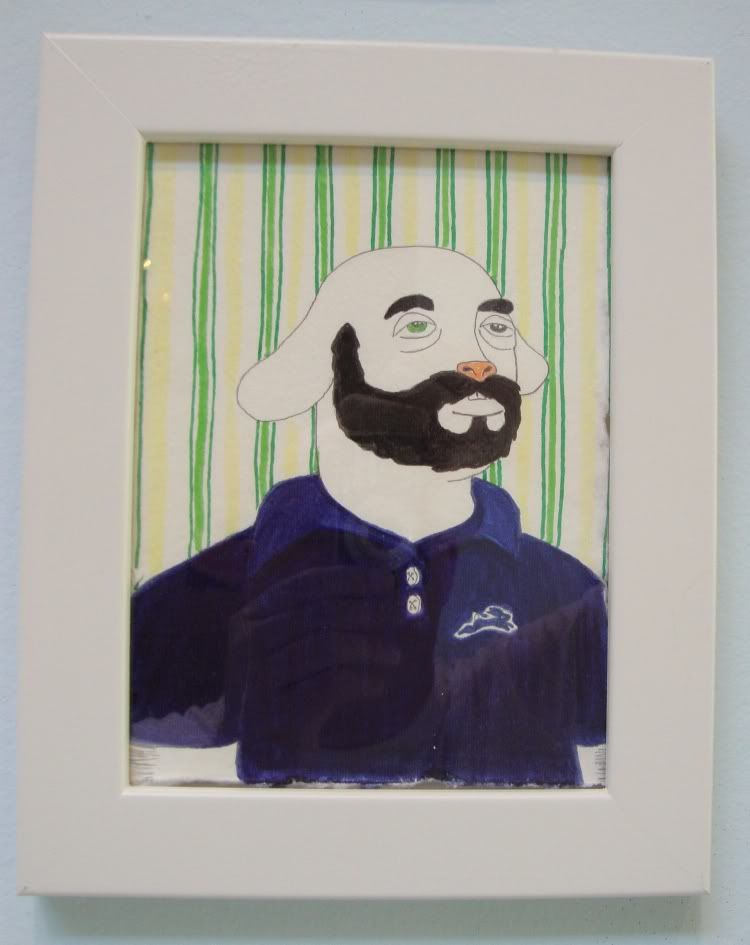
Self Portrait as Hare Brand
Self-Portrait as Hare Brand, Jason Villegas, marker and pencil, 2009

The biggest piece was drawn and stapled right to the rear wall of the gallery.
Photobucket
Fox Brand Spirit Portrait, Jason Villegas, mixed media installation, 2009
Photobucket
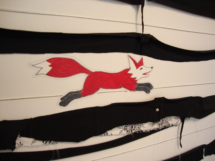
Fox Brand Spirit Portrait detail, Jason Villegas, mixed media installation, 2009

As you can see, the little fox appears to be drawn right on the wall. (Or maybe drawn on paper and pasted.) As the man I spoke with repeated emphasized, the McClain Gallery is a commercial enterprise. All these works are for sale; all of them have prices on a price list. Except this one, which is POR (price on request).

So what do you get if you buy "Fox Brand Spirit Portrait"? Does Jason Villegas come over to your house and staple the bits of torn golf shirt right on your wall? Does he draw a little fox on your plaster? I have often wondered this about installations that are sold through commercial galleries.

In a gallery in the back is a small show by The Art Guys. Whenever I see their work, I just dig their endless inventiveness and humor.
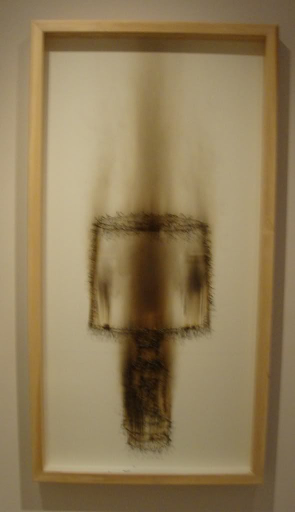
Lamp
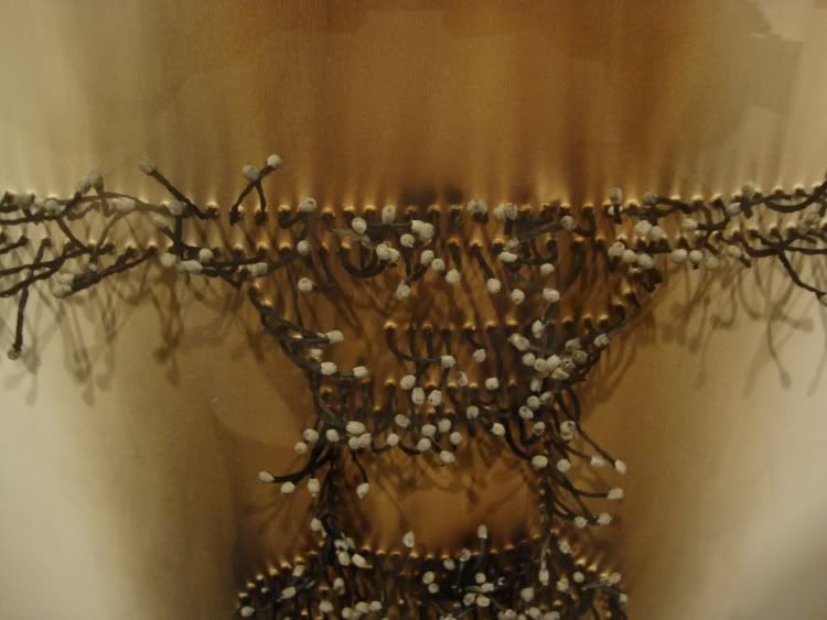
Lamp, the Art Guys, burned matches on paper, 2008

Burned matches? Yep. Here's a detail.
Lamp detail
Lamp detail, the Art Guys, burned matches on paper, 2008

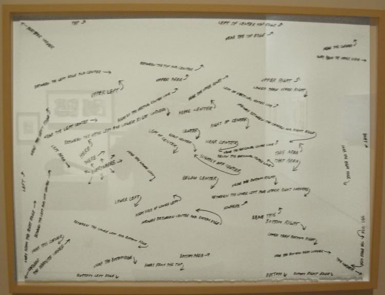
But here's my favorite piece in the show. I apologize for the poor photograph. I have done all kinds of digital manipulations to make it a little more readible.
Any of these places would be an excellent place to begin drawing
Any of These Locations Would be an Excellent Place to Begin a Drawing, the Art Guys, graphite on paper, 2008

It's hard to read, but the little phrases in this piece say things like "Left of center", "Exact center", "Slightly off-center", "Near the bottom", etc. That piece should go in a drawing textbook.

Impressions of the gallery? Very high-end commercial (although I should add that you could buy some of those Jason Villegas pieces for really decent prices). You look at the artists McClain shows, and they are almost all fairly well-known contemporary figures. In The $12 Million Dollar Stuffed Shark, Don Thompson speaks of how big New York and London galleries will have subsidiary relationships with galleries in other parts of the country, so that non-NYC galleries can market some of the big names from NYC to the hinterland. So I wonder if McClain has that kind of relationship with any blue chip galleries in NYC. Such an arrangement, I assume, would mutually benefit the artist (geographically expanding his market), local collectors (improved access to top artists' work), the local gallery (ability to show top NYC artists), and the New York gallery (improved access to non-NYC collectors). But I wonder how the contracts between the local gallery and the NYC gallery work? Of course, I have no idea if this is what McClain is doing in the first place, so please excuse this idle, completely uncontroversial speculation.