Friday, January 29, 2010

People Watching at the Barkley Hendricks Opening

So I was at the Barkley Hendricks opening tonight at CAMH. See it if you can. It's incredible. If you can't get out of your chair, though, you can see some images here and here. It was a good-looking crowd--appropriate for a bunch of paintings of stylish dudes and chicks. Here are some of the people I saw.

Barkley Hendricks
Two ladies checking out two dudes.

Barkley Hendricks
Guy looks at art, girl looks at him.

Barkley Hendricks
Rasta hat.

Barkley Hendricks
Tall, majestic woman.

Barkley Hendricks
Cutie in miniskirt and boots.

Barkley Hendricks
Cool cat.

Barkley Hendricks
Coolest cat--Barkley Hendricks himself.

BONUS! Here is a black-light installation. Expensive shit, man!


Barkley L. Hendricks, "Fela: Amen, Amen, Amen, Amen," 2002. Oil and variegated leaf on canvas, wooden frame, armature

New Acquisitions--J.R. Williams and Dennis Worden

Last year, as far as comics art went, I collected mostly classic comic strips. This year, I am going to deliberately try to collect underground, alternative and art comics original artwork. I started off with a bit of a windfall--11 pages by two artists, both of whom were key figures in the "newave" comics scene of the 1980s.

J.R. Williams
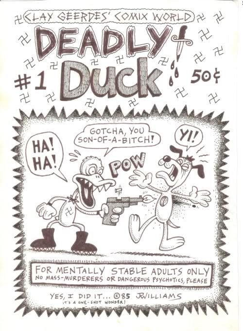
J.R. Williams, Deadly Duck cover, 1985

J.R. Williams is an artist from Portland, Oregon. The pages here are from a minicomic he did in 1985 for Clay Geerdes Comix World. Clay Geerdes was an impresario of minicomics, publishing comics for many artists at the time.

What are minicomics? I guess the strictest definition would be that they were xeroxed comics printed on a piece of letter-sized paper folded over once then again to create a 4 1/4" x 5 1/2" 8-page booklet. But in general, minicomics has come to mean any self-published, micro-print-run comic (usually xeroxed). Minicomics arose with the rise of inexpensive and ubiquitous photocopiers in the 1970s. The people who drew them were amateur cartoonists inspired by the underground comics of the '60s. They formed their own networks through the mail, which in turn lead to an international movement of minicomics. (Minicomics can be seen as a subset of the zine movement of the same period. And many fans and practitioners connected to one another through the zine magazine, Factsheet Five.)

In the early 80s, minicomics were also called "newave" comics. (There is a massive collection of "Newave" comics coming out presently from Fantagraphics Books.) That's the term under which I first became aware of them, through the great comics critic Dale Luciano's mammoth survey of the "newave" scene that ran in several issues of The Comics Journal.  Later, when I worked for Fantagraphics, I started writing a column about minicomics called "Minimalism" for The Comics Journal. I wrote it from 1992 to 1996, but it continues to this day, amazingly.

Many of the minicomics artists were really talented. They did minicomics for a variety of reasons, but for some of them, one reason was a lack of venues where they could get their work published commercially. The undergrounds pretty much died in the 1970s, and nothing took their place until the 80s. In the case of J.R. Williams, he found a home at Fantagraphics, where he had an ongoing series. But unlike many of his minicomics peers, he was a professional artist. When I first met him, he was working as an animator in Portland. He later moved up to Seattle to draw full time, and I later hired him to write a comic for me (Welcome to the Little Shop of Horrors).
J.R. Williams
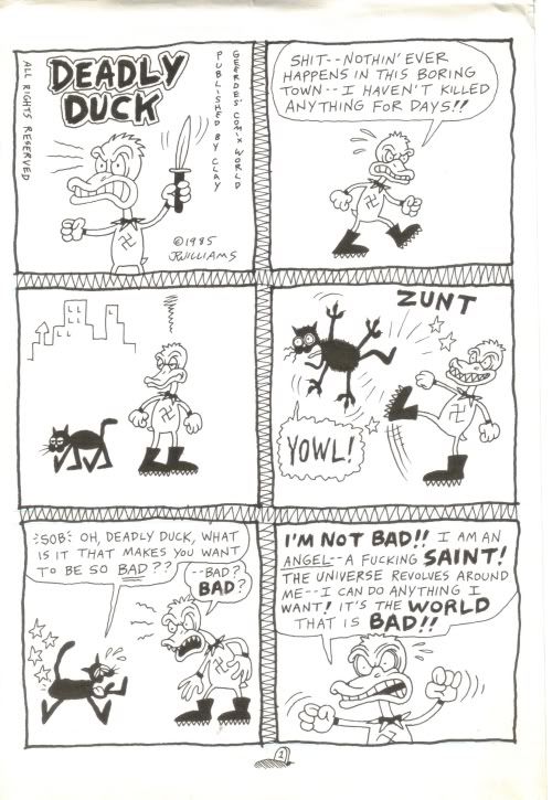
J.R. Williams, Deadly Duck page 1, 1985

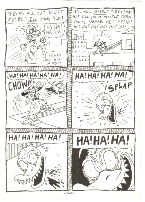
Deadly Duck was published in the classic minicomics format. Williams' originals are "two up"--twice the size of the printed pages. His minimal drawing style is highly appropriate to the medium in which he is working, as is his sole idea in this story. In seven tiny pages, you can't put in much plot or characterization. But it's a good size for barbaric yawps like this.
J.R. Williams
J.R. Williams, Deadly Duck page 7, 1985

I was able to buy all eight pages directly from Williams. They are funny and drawn really well--perfect examples of what minicomics were all about in the 1980s.

Dennis Worden comes out of the same milieu as Williams. He was from the San Diego area. He started getting published in Weirdo, had comics published by Fantagraphics and other publishers, and now does paintings, which he will happily sell to you.

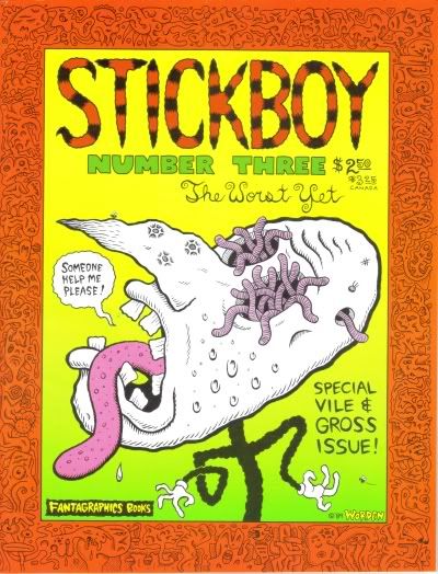
I bought three pages from Stickboy #3 (Fantagraphics, 1989). Worden drew them at pretty much their final printed size (8.5" x 11"), which is not typical (most comics are drawn larger than their final printed size). But Worden's art is so precise and clean (not to mention minimal) that they reproduce very well without having to be shrunk.
Dennis Worden
Cover of Stickboy #3

Worden, like Williams, had a powerful wise-ass punk attitude (as you will see in the pages I bought), but he also was unusually philosophical. (There is a self-mocking fan letter from Wayne White in Stickboy #3 praising Worden's philosophy.) Unlike most cartoonists Worden is an intellectual--a cranky, self-taught intellectual. I think Robert Crumb provided the path. Crumb is a universal cartoonist--within his vast work, every kind of self-examination takes place. Crumb is willing to tackle philosophical and religious ideas, and his own relationship to them, in a way that I think many cartoonists avoid out of a fear of looking foolish. Not Worden--he was quite willing to do the same and defend himself against attacks on his beliefs.

I love Worden's crisp minimal art, and always thought his comics were great. As far as I know, no one ever issued a book collection of his work. So if there is a publisher out there looking for an unusual project, I would say please publish a collection of the comics of Dennis Worden.
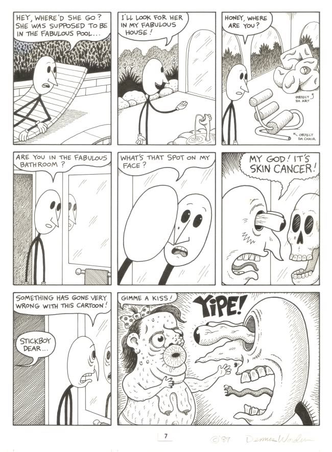
Dennis Worden
Dennis Worden, Stickboy #3, page 7, 1989
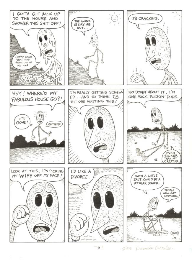
Dennis Worden
Dennis Worden, Stickboy #3, page 9, 1989

Wednesday, January 27, 2010

Note on Jim Love: From Now On

http://content-3.powells.com/cgi-bin/imageDB.cgi?isbn=9780856676093 
Jim Love: From Now On
This big book is a retrospective of the work of sculptor Jim Love. Love (1927-2005) was one of Houston's first modern artists, and his biography is a major part of the art history of Houston. This is a subject that interests me greatly (as regular readers know). In the sixties, Mad Magazine published a piece called something like "Incredibly Short Books." The titles were along the lines of "The Humility of Mohammed Ali" and "Great Military Victories of the Italian Army." On the face of it, "The Art History of Houston" would be such a book.

But I am fascinated with this history, largely because I'm here and can witness it happening. But also, because I like seeing how art history unfolds in "provincial" locations, outside the art capitals. And what is interesting about looking at art in these places is to see how it evolved in its own unique way (always, though, in a kind of dialogue with the art capitals). That's why I am fascinated with the history of the Ferus Gallery and the evolution of art in L.A. during the sixties. I am very interested in Soviet non-comformist art for the same reason. (I also happen to like the art of both places quite a lot.) I'm not suggesting Houston artists have achieved what the L.A. artists of the 60s or the non-conformist artists did, but the story of Houston's art is still interesting.

Love was one of the earliest modern artists in Houston. Love went to Baylor and fell in with the theater crowd. He started building theater sets, and eventually met Jermayne MacAgy. She hired him to be a "museum technician" at the nascent Contemporary Arts Museum in 1956. (MacAgy is a key figure in the history of art in Houston. She was hired to come to Houston by the great catalyst of art in Houston, Dominique De Menil.) It was only after he started working in the museum that Love started making art by welding bits of junk together. That was, more or less, his career until he died.

He was lumped in with the assemblagists early on, but his art isn't like Rauschenberg or Kienholz. The artist he most resembles is H.C. Westermann (from another "provincial" art city, Chicago). But Love was a lesser artist. There aren't great depths in his work, nor was he as formally inventive as his peers in New York and Chicago and Los Angeles. His work has a kind of sweet childlike quality, reflected in his subject matter--flowers, jacks, teddy bears.

As a Rice student, I saw his sculpture "Paul Bunyan Bouquet #2" on campus often (it was, and as far as I know still is, in the Lovett College courtyard). I always thought it was kind of ridiculous. I've mellowed towards it as I've gotten older. I can enjoy the charms of Love's work now. His work is visible all over Houston. (I'll try to take photos of some of the public work, and add their locations to my art map.)

This book has great photos of most of Love's work. The essays and timeline that accompany the photos give you a good idea of where Love came from and his place in the local scene. The Mel Chin piece is an especially interesting tribute.

Two More Reviews up at 29-95

Two reviews of two very different shows have been posted at 29-95.com. One is by Francis Giampietro at the new alternative venue, the Temporary Space.

Francis Giampietro
Francis Giampietro, Contrapposto, mixed media, 2009

The other show I reviewed is a group of paintings by Joseph Cohen up at Wade Wilson Art.

Joseph Cohen
Joseph Cohen, Proposition 92, reclaimed latex, enamel, automotive paint and resin on birch & pine

Joseph Cohen
Joseph Cohen, Proposition 138, reclaimed latex, enamel, automotive paint and latex on walnut

Both of these shows are excellent. If you have time, check them out.

Tuesday, January 26, 2010

Movie I Want to See

Monday, January 25, 2010

More Top Comics

As I mentioned earlier this month, I am trying to catch up on some of the 2009 comics that were on peoples' top 10 lists this year. My main resource in this is the "meta-list" at I Love Rob Liefeld. So here are a few notes on a few from that list (and one from another list) that I read recently.

http://content-5.powells.com/cgi-bin/imageDB.cgi?isbn=9781596434585 
The Color of Earth by Kim Dong Hwa. This Korean coming of age story deals entirely with a young girl's coming into knowledge about sex and love. At first it seemed a bit too cutely, but I gradually came to really love Ehwa, her mother, the "picture man", and young monk (Ehwa's age) who is smitten with her. The remote rural setting in the last century (exactly when is not clear) adds a lot. I would not have put this in my top 15 list, but definitely on the honorable mention list.

http://content-5.powells.com/cgi-bin/imageDB.cgi?isbn=9781596433755 
The Photographer by Emmanuel Guibert, Dider Lefevre, and Frederic Lemercier. OK, I have no excuse for not reading this when it came out (except that I never saw it at my local comic shop). At first, I found the visual transition from color comic to black and white photo a little hard to process, but my eye quickly got used to it. Extremely powerful. This book would definitely have made my top 15.


http://content-3.powells.com/cgi-bin/imageDB.cgi?isbn=9781606991633 
The Red Monkey Double Happiness Book by Joe Daly. I didn't know what to expect when I got this, but what I got was definitely a pleasure. These two picaresque stories of modern-day South African neo-hippies really reminds me of The Fabulous Furry Freak Brothers, without all the drugs. Protagonists Dave and Paul are naive fuck-ups who have basically decent motives. Fun, but not top 15 material. Definitely on the honorable mention list (not least for the extremely enjoyable drawing).

http://content-3.powells.com/cgi-bin/imageDB.cgi?isbn=9781561635443 
Miss Don't Touch Me by Hubert and Kerascoat. OK but nothing special. This art team more or less come out of the Sfarr-Trondheim school of mainstream French comics. Basically these artists have injected a certain degree of new life into French mainstream comics, but the problem is that while the art and stroytelling might be fresher, the stories are not necessarily all that memorable. That was my reaction to this story.


http://content-8.powells.com/cgi-bin/imageDB.cgi?isbn=9781561635238 
Little Nothings by Lewis Trondheim. On the other hand, when Trondheim does more personal work, the results are magic. I loved this book. Very possibly top 15 material.

http://content-7.powells.com/cgi-bin/imageDB.cgi?isbn=9781596433007 
Ball Peen Hammer by Adam Rapp and George O'Connor. Wow, this was terrible. A pointlessly nihilistic post-apocalyptic scenario married to lame art that reminded me of Vertigo at its worst. I can't believe this made the top 100 meta-list, but it did--#85, ahead of both Popeye vol. 4 and Tardi's You Are There. Astonishing.


http://content-1.powells.com/cgi-bin/imageDB.cgi?isbn=9780547154121 
Tamara Drewe by Posy Simmonds. Really good--better than Gemma Bovary. Simmonds did a series of strips called the Literary Life in which she poked fun at the businesses of writing, publishing, and bookselling. She seems to have taken the knowledge she acquired doing those strips and applied them liberally to Tamara Drewe, to very goo effect. The book is only marred by an ending that wraps everything up too neatly. But still, it would have made my list for sure.

Now I've read 35 of the top 100, and I'll probably read more. Despite my problems with that meta-list, it does show how good comics are now--the best of the best on that list are easily better than what has ever been available to English language readers in previous decades.

Saturday, January 23, 2010

The Forever People

Robert Pruitt
Robert Pruitt, Be of Our Space World, Charcoal, conte, mixed media, 2009

This image is from the new Robert Pruitt show at Hooks-Epstein. I wrote a review for it on 29-95.com--please check it out. It's a lovely show.