Monday, February 27, 2012

Lillian Warren's View from the Windshield

by Robert Boyd


The Pearl Fincher Museum displayed a sense of humor about itself in putting up Drive-By Landscape, an exhibit by Lillian Warren. Warren's paintings of traffic and multi-panel paintings of landscapes and city views as seen from the point-of-view of a moving car are an ironic comment on this suburban museum. Located deep in the heart of Spring, the Pearl Fincher is 27 miles away from the MFAH. Furthermore, it's well within its neighborhood (and far from any freeway), so unless you are from the area, you might need your GPS to find it. It's location is deep, deep suburbia, the land where people have to drive to get anywhere.


Lillian Warren, Traffic 19, acrylic on mylar, 36 x 48 inches, 2011

Consequently, when you see a painting like Traffic 26, it's easy to imagine I-45 going into town from Spring at 7 am. The frustrating crawl of the commute, devoid of context--I imagine the drivers chatting on the phone or eating or putting on makeup. It's not too dangerous to do these activities as 5 mph. Henry David Thoreau couldn't have imagined this scene when he wrote that "Most men lead lives of quiet desperation and go to the grave with the song still in them." But it comes to mind when I look at Warren's Traffic series.


 Lillian Warren, Traffic 26, acrylic on mylar, 40 x 30 inches, 2011

But what also comes to mind is her technique. These paintings look like watercolors. You can see where the paint pooled or leaked into other wet areas. It has the appearance of wet-on-wet watercolor painting. But watercolor painting depends on the absorbancy of the paper. Warren is painting on mylar, which is completely non-absorbant. My assumption (which surely may be wrong) is that she is using a spray bottle to wet the surface of the mylar, then painting with highly watered-down acrylics. The effect is hazy and shows the artist's hand at work. This hand-made quality of the painting is consistent throughout the work shown in this exhibit.


Lillian Warren, Interchange April 19, 6:55 pm, acrylic on canvas, 6 panels, 62 x 23 inches, 2008

About half the paintings in the show are the ghostly traffic paintings. The other half are these multi-panel landscapes like Interchange April 19, 6:55 pm.The landscapes are acrylic on canvas, and they have a soft, painterly look. I think her approach to painting is influenced by Edward Hopper, and her subject matter as well seems like an updating of Hopper's house pictures and city -scapes. The impression the viewer gets is that Warren took a series of photos while driving by a specific location and that these were the basis for the multiple images of the same landscape. The specificity of the time in the titles reinforces this.


Lillian Warren, A137 - April 01, 4:31pm, acrylic on canvas, 36 x 45", 2007

Painting the world from the point of view of the car is an important thing to do because we see the world that way. Particularly the world outside our offices, our schools, our homes. If as fuel becomes more expensive, driving becomes more of a luxury, works of art like this will remind us of both the freedom and the blandness of driving. The landscape is less important here than the sense of movement, of passing by.

I want to close on a note that is not particularly relevant to the artwork. Like lots of artists (if not most), Lillian Warren has a day job. Unlike most artists, she is an executive with an MBA working for a small strategy consultancy called Portfolio Decisions. (She was also board president for Diverse Works for many years.) I'm always intrigued by artists who exist partly in the world of business. The most famous example is probably Charles Ives, the great experimental American composer. In addition to his startling music, he ran Ives & Myrick, an insurance agency that was a pioneer in estate planning early in the last century. (Ives & Myrick was absorbed by Mutual of New York.)

For the past 150 years or so, we have had a notion of the artist as an outsider. He (or she) was bohemian and lived outside the class structure. We expected artists to be wildmen, to be anti-bourgeous, even when they became successful. Consequently, the notion of an artist who is also a businessman (and not in the Damien Hirst sense of being a successful self-promoter) is, well, shocking. But as I think about it, I think Warren's business career possibly does affect her art, especially if she is getting up every morning and commuting to the office.


Share


Sunday, February 26, 2012

Jaume Plensa, Cool Kitsch-monger

by Robert Boyd

Mirror
Jaume Plensa, Mirror, painted metal, 10 feet high, 2012

When I read about and saw photos of Mirror by Jaume Plensa, which has just been installed in the oak grove between Herring Hall and the Brochstein pavillion at Rice University, I instantly decided I hated it. And I still sort of hate it. Mirror consists of two generic figures (perhaps inspired by the figure on the pedestrian crossing sign?) facing each other, knees up with their arms around them, having some kind of intellectual dialogue, represented by their skins which consist of letters from various alphabets. You know, like two students at a university symbolizing dialogue and learning and stuff!

Mirror
Jaume Plensa, Mirror, painted metal, 10 feet high, 2012

They seem similar to another Plensa sculpture in Houston, Tolerance, a grouping of a bunch of kneeling super-generic figures with skins made out of words in many languages. And they are all getting along with one another! Because they are tolerant! So uplifting!

Mirror
 Jaume Plensa, Mirror, painted metal, 10 feet high, 2012

I hate Plansa's sculptures. They are simultaneously heavy-handed and vague. They say, "Here's an uplifting message that you can look at or not, I don't care." I realize that the generic nature of the figures is meant to give them a kind of universality, but it instead projects blandness. No one can disagree with the intent behind these pieces, but no one can be moved by them.

Mirror
 Jaume Plensa, Mirror, painted metal, 10 feet high, 2012

But that's me. Everyone except for Kelly Klassmeyer seems to love Jaume Plensa's art. When they go up in public places, his sculptures are always popular. How is it that work that seems so obviously meretricious, that seems to pander so damn hard, is so popular?

Mirror
 Jaume Plensa, Mirror (seen from inside), painted metal, 10 feet high, 2012

I found the answer when I went to photograph Mirror at twilight. In the evening, this  sculpture looks undeniably cool. I saw it and suddenly found myself questioning my earlier dismissal. The white painted metal shapes, lit from the inside by lights embedded into the ground, have a ghostly presence among the oaks outside Herring Hall.

Mirror
 Jaume Plensa, Mirror (seen from inside), painted metal, 10 feet high, 2012

And Plensa doesn't rely solely on how cool it looks at night--he includes the additional crowd-pleasing feature of interactivity. You can crawl inside these figures and look out through the cage of alphabets.

Curse you Jaume Plensa--you sucked me in! I still think the basic idea and presentation of Mirror is ridiculous. But Plensa made a pair of sculptures that look pretty neat--at night. On balance, I would rather that Rice had installed something different. But I'm willing to see some value in Mirror.


Share


Screen Idols in Arcadia

by Robert Boyd

Laura Lark painstakingly draws screen idols Steve McQueen and Jane Fonda with tiny dots. The technique is similar to the early works of Drew Friedman, but Friedman was primarily concerned with drawing celebrities who were at best not conventionally attractive and more usually downright ugly. (one notable exception was 1989's "I, Joey Heatherton," which mocked Hollywood's sex-symbol machinery). Lark's stars in this show are by contrast glamorous and attractive.

LL 2
Laura Lark, Cover, ink marker on Tyvek, 43 x 33 inches, 2011

LL 2
Laura Lark, Cover detail, ink marker on Tyvek, 43 x 33 inches, 2011

There is no drawing technique more tedious than stippling. (Friedman, its master, eventually abandoned it.) But the obsessive nature of the technique could be seen as parallel to the obsessions people have about movie stars. People build shrines to stars, cover their walls with their images. They take the place in secular society of saints or pantheons of gods. (And sometimes movie stars exist alongside saints or gods.)

I usually don't talk to the artists before I review their work, but this time, more-or-less by accident, I ended up having an email exchange about her show, The Livable Forest. Her starting point had been the myth of Diana and Actaeon (mortal hunter Actaeon accidentally discovers Diana bathing nude. She turns him into a deer and he is subsequently hunted and killed by his fellow hunters.) The wall pieces are places within a silvery forest installation.

installation view with Snowdrift
Laura Lark, Livable Forest installation view

The pile of silver bricks in the foreground is called Ruin. Behind it to the left is Jane, taken from a photo of Jane Fonda at age 16 wielding a bow. To the right is an image of Steve McQueen called Cover. The obvious way to read it in terms of the myth is that Steve McQueen is Actaeon, Jane Fonda is Diana. (McQueen died in 1980 after an operation to try to slow his terminal cancer.) But that doesn't quite work. The whole thing about Actaeon is that he is a mortal--a lesser being--who has seen a goddess. McQueen is as much a god as Fonda. And gods who transgress may be punished, but they don't die (only Pan has died).

Siren
Laura Lark,  Siren, hand-applied aluminum leaf over acrylic and brick, 40 x 31 x 20 inches, 2011

Instead it feels like The Livable Forest is a sacred grove, a place where we mortals go to worship immortals like Jane and Steve. But Steve is not really immortal. Screen idols can die.

LL 3
Laura Lark, Dreamy Steve, ink marker on Tyvek, 43 x 33 inches, 2011

LL3
Laura Lark, Dreamy Steve (detail), ink marker on Tyvek, 43 x 33 inches, 2011

One of Nicolas Poussin's most famous paintings--and most moving to me--is Et en Arcadia Ego. It depicts a group of shepherds discovering a tomb (on which "Et en Arcadia Ego" is inscribed). It refers to Arcadia as a kind of utopian place, but despite this, death is still present. The tomb is quoting death, saying "Even in Arcadia, I exist." But one shepherd is tracing the outline of another shepherd's silhouette on the tomb. This is the mythological origin of art, and it is also therefore seen as a way to get around death. Death after the invention of art is no longer oblivion--its victims are remembered through painting, drawing, poetry, etc. Art makes both the subjects and creators immortal.

Actaeon may have looked at the wrong goddess and got himself killed. But Ovid and Aeschylus and Titian and many others have sure that he will never be forgotten. And a series of Hollywood producers and directors make certain that Steve McQueen will never die--as long as we keep watching The Great Escape, Nevada Smith, Bullitt, The Getaway and many other badass movies.

The thing is, I don't think Laura Lark really intended this meaning. I've come along with an interpretation that just wasn't there before I made it up. I do this all the time, it seems. So my apologies to Laura Lark and all the artists who have suffered through my spurious readings of their work.

The Livable Forest can be seen at Devin Borden Gallery.


Share

Saturday, February 25, 2012

A Note on Open Space at the Joanna

by Robert Boyd

Feeble Protest Sign
Brendan Sullivan, Feeble Protest Sign, wood, paint, nail, 2009

The artist-run space Open Space from Baltimore had a one-night-only show at the Joanna, preceded the night before by a panel discussion at Rice. The exhibit wasn't particularly memorable--I thought the art reflected a callow approach. And that is to be expected--these artists were all very recent graduates from art school. But it was interesting to hear how they put their space together versus the usual Houston story. For one thing, their space seems enormous--a large live-work space. It is a little like Fort Thunder, but based on the photos, a lot less grungy. The artists live upstairs, and the gallery space and library is downstairs. The gallery itself looks quite professional. Even though it's an industrial space they rent (they share the building with an auto-body shop), it doesn't look raw or messy. (Of course, I'm basing this on the photos they showed. The reality might be different.) And it's not a place to show their own work--their rule is that exhibits have to be by other people.

My Cousin
Margo Benson Malter, My Cousin, wood, digital print on lycra, hardware, 2011

But one thing they do that I don't see any Houston artists' spaces doing was that they have a library. I'm not sure how the library works (can you actually check out books?), but in the mini-library they set up in the Joanna, they also were selling zines and music. So it was in effect a bookstore. Some of you may remember that Diverseworks used to have a bookstore. I've heard it was a money-loser which is why after a long time trying to make it work, they finally shut it down. I miss it. Not just for the publications I could buy (and did buy, when I had the dough), but also because it showed me what people were thinking around the country. I guess that function has been replaced by the internet.

the library
Open Space library at The Joanna

Another thing that Open Space did for this show is to produce a zine which they sold at the show. It was a transcribed conversation about how they would survive collectively in the event of some apocalyptic episode, where perhaps one third of the population of the earth just died.

Seduce & Stab

The title of the zine, Seduce & Stab, comes from the suggestion by the designer, who suggests using seduction (followed by stabbing) against perceived human threats. This conversation was pretty silly, and I get the feeling that these guys wouldn't last too long. (For example, no one suggested that following the collapse of civilization, step one would be securing water, then food.)

But what impressed me was the quality of the zine--nicely designed, well-printed (with silk-screened covers)--and while the subject matter was goofy, it was something that they had thought a lot about. Eric Bos wrote a pretty well-researched essay about a case of starvation-induced cannibalism in an arctic expedition, asking whether in similarly straitened conditions, would he and his friends do the same?

I don't know if Seduce & Stab was a one-off thing, or if the space regularly publishes pamphlets/zines. It's something I never see in Houston, and wish I did. Aside from catalogs, the Houston art scene is not about publications and not about writing. (I'm sure there are some exceptions--please educate me about them in the comments!) But the thing about pamphlets, chapbooks, and zines is that they are permanent. Buying a piece of original art might be out of the question for most people. But a $3 zine like Seduce & Stab is within most people's means. When you go to an artists' space, it's nice to be able to take something home.


Share

Fernando Mastrangelo at PG Contemporary

by Robert Boyd

installation view
This Too Shall Pass installation view

Fernando Mastrangelo's exhibit This Too Shall Pass at PG Contemporary consists of five identical Virgin Mary statues and five rectangular pedestals, along with various other objects and substances. Each Virgin is associated with a particular substance. (I couldn't tell if the statues are made of the substance, or if they are mass-produced plaster statues coated with the substance.) Each pedestal is a different color. And each grouping includes some extra stuff or object.

Sugar Epoxy
Fernando Mastrangelo, This Too Shall Pass (Sugar, Epoxy), mixed media, 32 x 15 x 7 inches (statue) and 42 x 10 x 10 inches (pedestal)

The statue is coated with sugar and epoxy, and it appears that the sugar has been painted or dyed. The object on top of the pedestal is mysterious. The combination of colors (black, blue and red) is quite striking, and lace doily provides a strong visual contrast to the black pedestal, which has the portentous presence of the monolith from 2001.

Birdseed, Epoxy
Fernando Mastrangelo, This Too Shall Pass (Bird Seed, Epoxy), mixed media, 32 x 15 x 7 inches (statue) and 42 x 10 x 10 inches (pedestal)

Mastrangelo takes his two repeated elements--the statue and the pedestal--and combines them differently for each piece. Above the statue is covered with bird seed and epoxy. Their is a wooden pentacle between the pedestal and the wall, partially obscured. I associate the pentacle with pop neo-paganism and Satanism, so perhaps we can see this piece as speaking of the opposition of Christianity and Catholocism in particular to Satanism and neo-paganism.

Salt Epoxy
Fernando Mastrangelo, This Too Shall Pass (Salt, Epoxy), mixed media, 32 x 15 x 7 inches (statue) and 42 x 10 x 10 inches (pedestal)

Goats Milk, Epoxy
Fernando Mastrangelo, This Too Shall Pass (Salt, Goat's Milk), mixed media, 32 x 15 x 7 inches (statue) and 42 x 10 x 10 inches (pedestal)

Goats Milk, Epoxy
Fernando Mastrangelo, This Too Shall Pass (Salt, Goat's Milk), mixed media, 32 x 15 x 7 inches (statue) and 42 x 10 x 10 inches (pedestal)

Gunpowder Epoxy
Fernando Mastrangelo, This Too Shall Pass (Salt, Gunpowder), mixed media, 32 x 15 x 7 inches (statue) and 42 x 10 x 10 inches (pedestal)

Mastrangelo has used various  materials to create sculptural objects to critique things he opposes (for instance, an Aztec calendar made out of cornmeal to protest NAFTA). The problem is that it is not particularly obvious what he is protesting, unless it is explained to you. I have no idea what these sculptures mean. Does he have a beef with the Catholic Church? If so, what do salt, gunpowder, goat's milk, birdseed and sugar have to do with his complaint?

This is a collection of beautiful, mysterious objects. The materials are all highly resonant. When I think of sugar, I think of the Atlantic slave trade, for example. Sugar was a labor intensive crop that for plantations in the Caribeain and Brazil absolutely depended on slaves to produce and export to Europe. And I also think of my own sweet tooth and how it damages my health. Goat's milk makes me think of goat's milk cheese and delicious pizzas. Gunpowder makes me think of China, war, and fireworks. I could go on, but the point is that not only do the pieces look beautiful, they are like a drop of water falling into the lake that is a viewer's mind, setting off ripples. The problem for the artist is that ripples go in all directions, not necessarily in the direction he intends.

If Mastrangelo is making some kind of statement about the church, it is unclear (to me) what it is. But even so, I end up liking This Too Shall Pass quite a bit. In fact, I would like it less if it all just boiled down to "the Catholic Church is bad." That would be trivial. Political messages are narrow, while the uncontrolled ripples of meaning in this show are potentially infinite.


Share


Friday, February 24, 2012

Ken Price, 1935-2012

by Robert Boyd

Ken Price
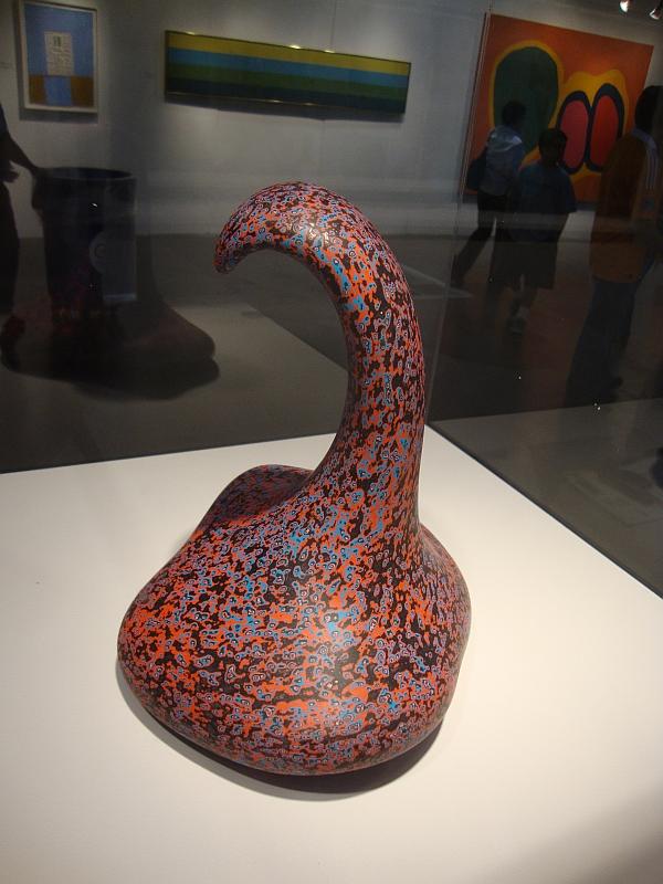
Ken Price piece that was on view at the Houston Fina Art Fair last year

Ken Price, the brilliant ceramic sculptor, one of the Ferus boys, died today in New Mexico. Jerry Saltz offers a very nice remembrance. The Menil has some Ken Price pieces, some of which were displayed last year. I hope they will be brought out again. This has been a bad month--Mike Kelley, Charlie Stagg, and now Ken Price.


Share

Wednesday, February 22, 2012

A Fine Art Resource Management Company?

by Robert Boyd

PEVETO

Seen on Colquitt last weekend.


Share