Tuesday, June 19, 2012

Things for You to Do

by Robert Boyd

We don't run a art calendar here at Pan because calendars are a pain in the ass to put together. (A tip of the hat to Glasstire, which puts together an ever-updating calendar for the whole state.) But sometimes there are blink-and-you'll-miss-them events that deserve to a heads up.


This Thursday, go see Tribulation 99: Alien Anomalies Under America at CAMH (7:30 pm, but get there early as there is limited seating). As the trailer suggests, this movie is utterly bananas, in the best possible way.

Photobucket

Then on July 28, the Houston Arts Resource Fair is taking place at St. Thomas University. This is a day-long event providing seminars and talks aimed at helping arts organizations get their shit together. Sounds like a great opportunity for networking and learning what it takes to run a successful art organization.


Share


Safari to the Suburbs 1: Luxuriant Refuse at the Pearl Fincher Museum

by Robert Boyd

I live in the suburbs. I know there are art-lovers here, but we are fairly uncommon--compared to those who live in hipper inner city neighborhoods. We are less concentrated in the population for the simple reason that the suburbs themselves are less concentrated. The suburbs place a high premium on outward conformity, so it's hard to tell who's artsy. Deeper inside the city, people are more likely to wear their artsiness outwardly--in their lawn art, their art cars, their fashions, their tattoos and hairstyles. But we suburbanites keep that stuff inside the walls of our homes. There are exceptions--the suburbs are too vast to be homogenous. But the problem with the suburbs is that there isn't enough of a concentration of artistic types to encourage arts institutions to form. Few people start galleries in the 'burbs. We hardly have any arts institutions.

But even so, there are exceptions. The Pearl Fincher Museum of Fine Art is one I've written about before. Located in Spring, it is near Steubner-Airline just north of FM 1960 on Cypresswood Dr. It's in a neighborhood that appears to be fairly upper-middle-class. The houses are the brick generica favored by Houston developers. Just to give you an idea of how spread out things are up there, the Woodlands is about 14 miles from the Pearl Fincher.  Nonetheless, the Pearl Fincher has community support--that can be seen by their well-attended openings, and their website claims that they have over 2000 donors. (They are not a 501(c)3 organization, so their finances are not reported publicly. Correction: They are a 501(c)3, but the name of the non-profit is the Cypress Creek Fine Art Association, not the Pearl Fincher Museum of Fine Art.)

Most of their previous exhibits have been exhibits by local artists (including student shows) or exhibits culled from the collections of local collectors. This seems like a good exhibition strategy for a young (established in 2008) suburban museum. It's an approach that promotes buy-in from the local artistic community. (Indeed, the Pearl Fincher has had a series of shows with the subtitle "Northwest Houston Collects".) But it's not a viable long-term strategy, because once you have that buy-in, you need to occasionally show things that are not from your own backyard. You're nurturing a local scene, and that means paying attention to that local scene, which the Pearl Fincher is doing well, but it also means injecting new ideas into that scene.

So I was excited when I heard about Luxuriant Refuse, a contemporary group show curated by Melissa Grobmyer and featuring the work of Adela Andea, Johnston Foster, Alison Foshee, Sarah Frost, Gwyneth Leech, Shawne Major, Aurora Robson, Betsabeé Romero, and Paul Villinski.
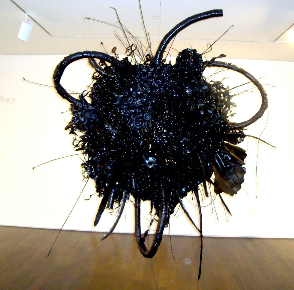
Belch
Aurora Robson, Belch (aka Tarball), 2009, discarded PET bottles, tinted polycrylic, rivets, steel armature, mica powder

Aurora Robson's work may be familiar to Houstonians from The Great Indoors, her installation at the Rice Gallery, or her installation at the Rice Recreation and Wellness Center. Those colorful pieces contrast to this large black encrusted sphere, floating slightly above eye-level like a menacing alien spacecraft.
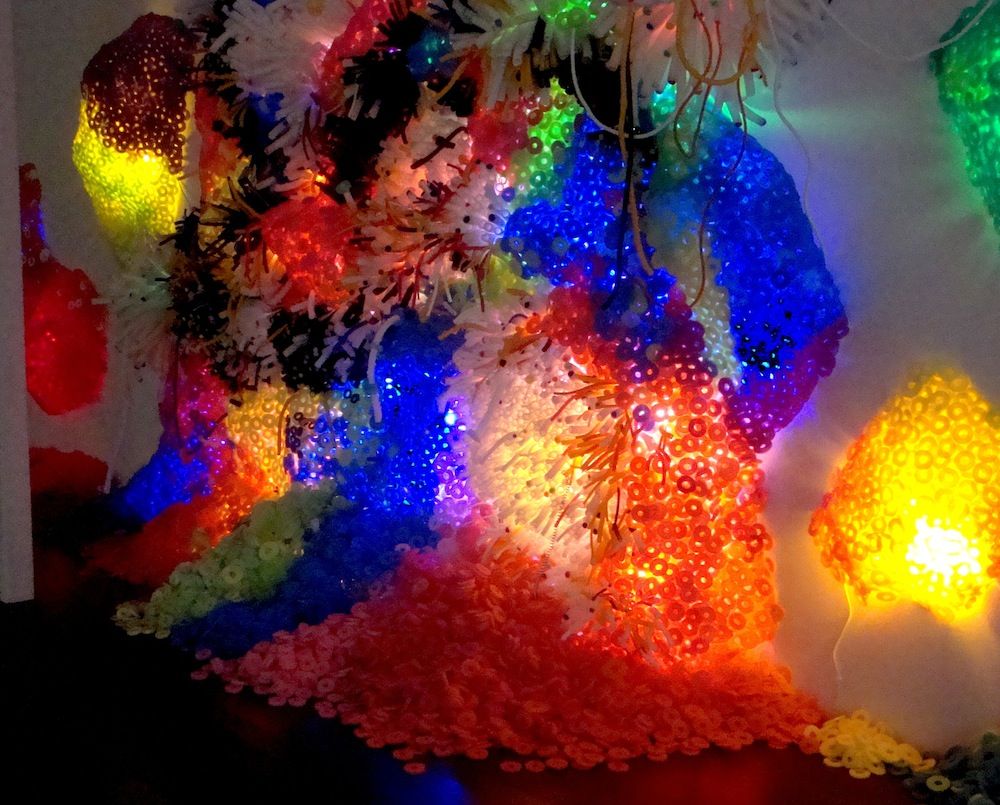
Bioluminescence
Adela Andea, Bioluminescence, 2012, pool noodles and cold cathode fluorescent lights mounted on wire mesh

Equally alien, but much more colorful is Bioluminescence by  Adela Andea. I question the categorization of pool noodles as refuse--is she actually making sculpture out of thrown-away materials, or did she buy a bunch of pool noodles new? But who cares? It's a pretty work and it's something I haven't really seen before at the Pearl Fincher--a site specific installation. (I know Andea has presented this work elsewhere, but I suspect it varies depending on the place of installation.)
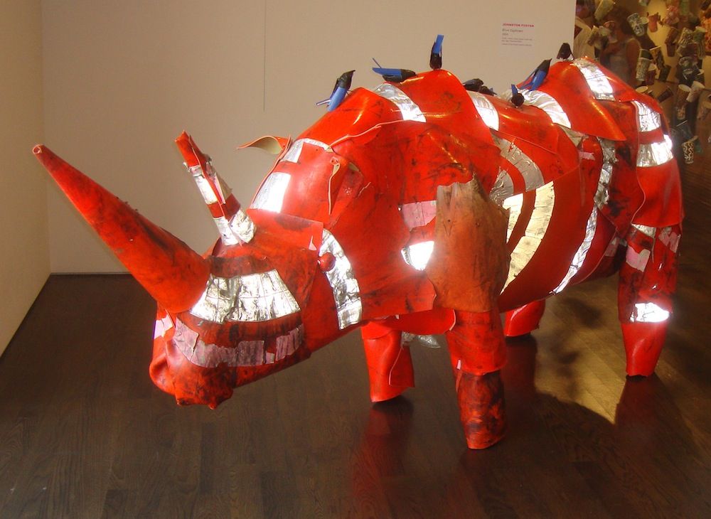
River Euphrates
Johnston Foster, River Euphrates, 2004, traffic cones, wood, plastic trash cans, duct tape, Venetian blinds

Johnston Foster's work--animals assembled from castaway plastic detritus--fits the theme of the show better. River Euphrates, a rhino made out of traffic cones, was a crowd-pleaser. The inclusion of the oxpeckers on the rhino's back was a nice touch.

The thing with pieces like River Euphrates, Bioluminescence and Belch (aka Tarball) is that they look cool. One could imagine someone curating a show of art made of trash and debris that would have been much more austere, more intellectual, more challenging. The choice here was to be accessible. Is the audience being condescended to? Is there a calculation that this suburban audience might not appreciate more difficult work? Or to put it another way, is there a deliberate choice not to alienate the audience?

(Years ago, when I worked for The Comics Journal, we were about to run an interview with cartoonist Paul Chadwick, the creator of a comic called Concrete. I mentioned to one of the editors that to me, Chadwick seemed totally mainstream and therefore should not be included in our magazine. This editor wisely responded, "To you and me he may seem mainstream, but there are many readers for whom Chadwick is quite radical." This has stuck with me and seems appropos here.)
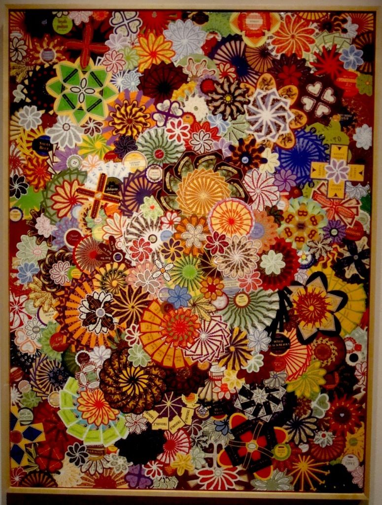
Ivanhoe
Alison Foshee, Ivanhoe, 2012, labels on canvas

The artists in this show veer between those who create work that is pretty and those whose work makes you think, "Wow, that's amazing." (Or sometimes both.) Alison Foshee uses product labels to create her beautiful, somewhat abstract flowers. 

Tire
Betsabeé Romero, 2007, Tire, carved rubber truck tire
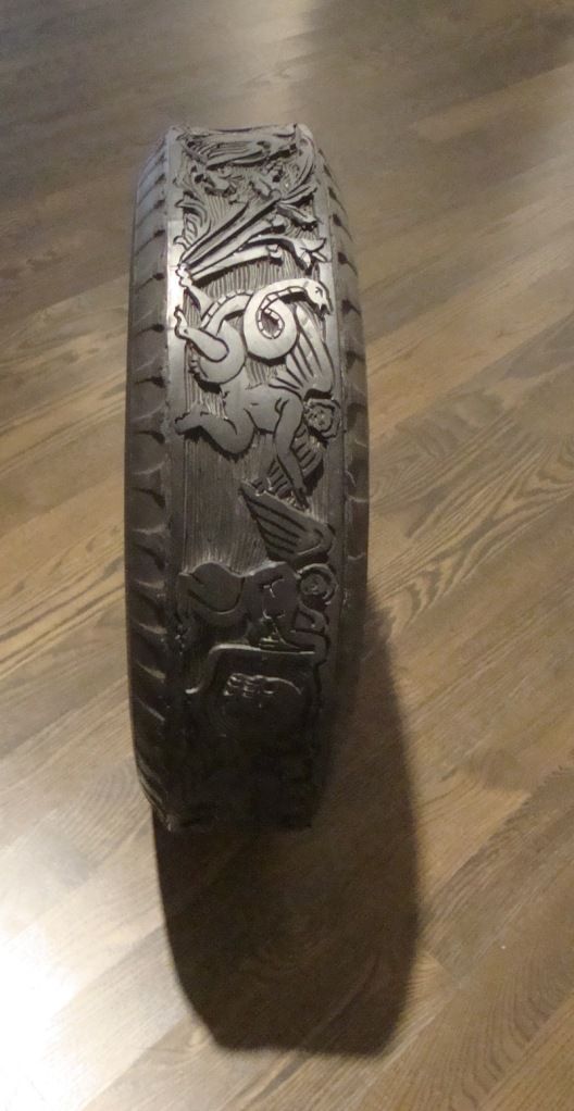
Tire
Betsabeé Romero, 2007, Tire, carved rubber truck tire

Betsabeé Romero's Tire belongs more in the "wow" category. Houstonians may remember his work which was included in the show Cosmopolitan Routes: Houston Collects Latin American Art at the MFAH.
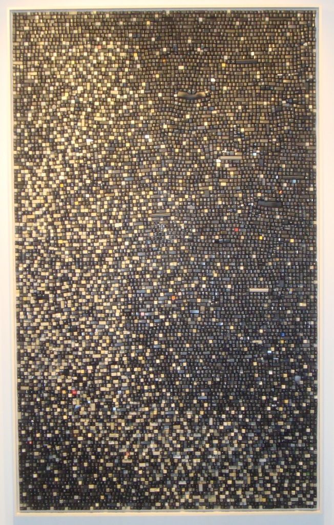
Sign Off
Sarah Frost, Sign Off, 2011, discarded computer keyboard keys

Sarah Frost is also one of the "wow" artists. Sign-Off, like many of her pieces, is composed of old computer keyboard keys. These keys are not only trash (and therefore appropriate for inclusion in this exhibit), but they're obsolete as well. Sign-Off is a formal work of light and dark, but it is also a reminder of how we produce millions of these little things knowing that most will be thrown away after at most a few years.

Frost was one of the stand-out artists at the Houston Fine Art Fair last year, and her piece there was one of the ones that sold. (I will return to the subject of the HFAF below.)
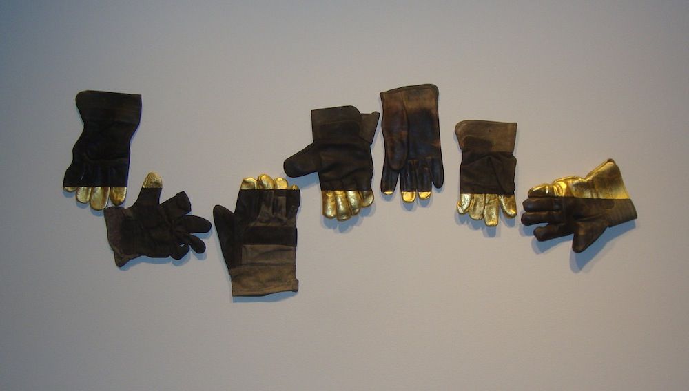
Consonance
Paul Villinski, Consonance, 1993-2006, gold leaf on found work gloves

Paul Villinski's Consonance is one work that is neither "pretty" nor "wow," and to me is perhaps the most intriguing work in the show. It combines the grungy (old work gloves) with the glamorous (gold leaf). The seven gloves are arranged horizontally so that the boundary between glove and gold leaf forms a kind of horizon line. He has, in a sense, created a landscape. This piece is from a series he did with gloves where he combined the sweaty, dirty work glove with some elegant addition, like gold leaf or embroidery.

I mentioned the Houston Fine Art Fair earlier. They sponsored this exhibit and had promotional material available for attendees on opening night. In addition, curator Melissa Grobmyer is a partner with M.K.G. Art Management, LLC., a private company that provides art acquisition and divestment services, appraisals, art inventory management, art leases and corporate archival services. Now it's not unusual for a museum show to be sponsored by a private company. It's the cost we have to pay to see exhibits in a country where the government doesn't typically pay the bills for art museums. But Luxuriant Refuse is a little different--both Hamptons Expo Group (parent company of HFAF) and M.K.G. are companies in the art business. And doing a show like this is a way to drum up business for themselves.

In fact, I think it's kind of brilliant (if ethically shaky). We know there are a lot of well-off people in North Houston. Some of them are into art, and the Pearl Fincher Museum has been cultivating those art-lovers for the past four years. M.K.G. would no doubt like to serve as art consultant for energy company executives in the Woodlands. HFAF would like the collectors who loan work to the Pearl Fincher--as well as aspirational collectors--to visit the art fair this September. I have no idea what deal was made between Hamptons Expo Group and the Pearl Fincher or between M.K.G. and the Pearl Fincher. But on the face of it, each party benefits. M.K.G. and HFAF get access to potential clients while the Pearl Fincher gets a very nice art exhibit. However, the exhibit is also risky for the Pearl Fincher--it's possible that people will see the museum as a shill for the two commercial enterprises. (Tyler Green would have a meltdown over this.)

I'm not sure how I feel. The blatant combination of art business and art museum feels a little skeevy. But I suspect that without the help of M.K.G. and Hamptons Expo Group, the Pearl Fincher would have found it difficult to mount a show like Luxurient Refuse. And that would have been a shame. It's the kind of show that can ease skeptical people into contemporary art. And I think this is an important task for museums--particularly those like the Pearl Fincher Museum located in the vast suburban plain far from the art center.


Share

Monday, June 18, 2012

Asshole

by Robert Boyd


This is a video of an asshole spray-painting on Woman in a Red Armchair (1929) by Pablo Picasso at the Menil. According to the YouTube video, the asshole is named Uriel Landeros. Assuming this is true (and I acknowledge that it may not be true), this may be his Facebook page. You can read more at Glasstire and click2houston. Of course, this incident recalls the episode in 1974 when Tony Shafrazi spray-painted some nonsense onto Picasso's Guernica. Shafrazi is now a highly successful art dealer. Perhaps that is Landeros' ambition as well.


Share

Saturday, June 16, 2012

Rice's New Mound

by Robert Boyd

James Turrell's Rice University Skyspace is finally complete. The official opening was Thursday night. I wasn't there (my invitation must have gotten lost in the mail), but you can read about it at CultureMap. Many fabulous people were there--but the article doesn't mention Turrell being present. I'm sorry I missed the light show, but Swamplot has a bunch of photos (although I'm told that photos are a poor substitute for being there). But I went to look at it yesterday afternoon.

Skyspace
James Turrell, Skyspace, 2012

I wonder what Ricardo Bofill thinks about having this earthen ziggurat plopped down in front of his broad colonnade for the Shepherd School. Personally, I think it's an improvement.

Skyspace
James Turrell, Skyspace, 2012

Art-lovers rejoice, but groundskeepers are probably thinking, "Great--now we have to mow the side of a hill every week."

Skyspace
James Turrell, Skyspace, 2012

The stairs going up lead to a balcony that looks down on the central pit. This would make an excellent dog-fighting arena.

Skyspace
James Turrell, Skyspace, 2012

Turrell apparently took his cues from the designers of airline seating when he designed these benches for the balcony.

Skyspace
James Turrell, Skyspace, 2012

This is supposed to look pretty trippy at twilight when the colored lights are operating.

Skyspace
James Turrell, Skyspace, 2012

Looking down on this from above, my first thought was that it looked like a combat pit. But sitting in the pit was nice and cool. There is something about the way this is built that makes the temperature inside the pit significantly cooler than the outside. It's a relaxing environment. Skyspace is within easy walking distance of McNair Hall, the business school building. I wish Skyspace had been here when I got my MBA (class of 2008). This would have been a pleasing place to study or just unwind. So as much as I make fun of it above, I suspect it will become a hangout for students, which is really the best thing one could hope for.


Share


Friday, June 15, 2012

Cuddly Computers by Ariane Roesch

by Robert Boyd

Bull's Head
Pablo Picasso, Bull's Head, 1942, bicycle seat and handlebars

When Picasso attached a set of handlebars to a bicycle seat to make a bull's head, he was prefiguring one of the great themes of sculpture for the next 70 years--transformation. This has frequently involved taking a subject and making a sculpture of it that transforms one or more seemingly essential quality of the subject.

Giant Soft Fan
Claes Oldenberg, Giant Soft Fan--Ghost Version, 1967, canvas, wood, polyurethane foam

This is what Claes Oldenberg did with his soft sculptures, such as the MFAH's Giant Soft Fan--Ghost Version. He takes an object that is inherently hard, an electric fan, and by rendering out of cloth turns it into something that is mostly soft and droopy. He transforms the fan in other ways, too. He turns a small object--a desktop fan--into a very large object. And he performs the fundamental Pop Art transformation--from anonymous, trivial mass-culture object to unique work of art. Since then, we have seen tiny objects rendered large, large objects made small, common objects remade with precious materials, rugged objects remade as fragile objects, innocuous objects made dangerous, etc.

I was thinking of Claes Oldenberg's sculptures when I saw Ariane Roesch's Playmates, on view at Box 13 through June 23. She has taken early computers and rendered them in felt with stuffing. She has, in effect, turned them into a cross between a throw pillow and a plushie.

Playmates
Arianne Roesch, Playmates (installation view), 2012

According to the description of the work on the Box 13 web page, Roesch is depicting computers from just at the moment when they were starting to be used in the home, when they ceased to be purely utilitarian and became partly for entertainment. (This is something of an error. Even back in the days when you had to dial up from a teletype terminal to a centralized mainframe, there were games. I remember in 7th grade wasting many hours playing a game then called "Advent," which later was marketed under the name Zork. If you know the phrase,"You are in a maze of twisty little passages, all alike," you have probably played a version of this game.)

Playmates
Arianne Roesch, Playmates (detail), 2012

The main thing here is that the computers have been transformed. They are no longer useful, but they are huggable. As much as we love our computers, as much as design-savvy computer makers have tried to turn them into attractive objects, computers still feel hard and technological to many of us. They don't feel cute and cuddly, like the Playmates do. (In Japan, robots in popular culture have long been considered "cute," but I don't think our relationship with technology is quite the same in the U.S., despite movies like Wall-E.) So Roesch's sculptural transformation is therefore quite extreme.

Playmates
Arianne Roesch, Playmates (detail), 2012

When you see these soft droopy sculptures of computers, you want to hug them. And no matter how much you love your actual computer, I bet you have never considered hugging it.


Share


Thursday, June 14, 2012

CINEPLEX at the CAMH: Part 2 -- The Presentation

by Brian Piana

Having already looked at selected works in Part 1 of my report on Perspectives 178: CINEPLEX at the Contemporary Arts Museum Houston, I want to discuss the exhibition's layout and presentation. Sounds exciting, right? The truth is, I can't remember seeing a show that left me pondering the presentation of the work as much as CINEPLEX. It's a video show, but it's unlike any video show I can recall. This is my attempt in understanding its unique setup.

Typically, video pieces require more from their presentation than other kinds of art. They change over time and aften make noise. To adequately present such works while being respectful to the works around them, they are usually isolated in some fashion. They may be placed in a separate room, for example, or tucked away in a darkened corner, or (shudder) presented with accompanying headphones to muzzle the audio component from the rest of the gallery.

CINEPLEX shows signs of this traditional approach by placing the four works in the common space on separate walls and the fifth piece in a custom-built, 46-seat theater.


Installation view of Martin Arnold's Passage à l´acte, 1993, 16mm film, at Contemporary Arts Museum Houston, from the exhibition Perspectives 178: CINEPLEX, 2012. Photo: Rick Gardner. (The theater is very cool.)

However, CINEPLEX also flies in the face of that tradition by making Les LeVeque's stroboscopic white and fifteen movies starring Charlton Heston – the most difficult piece to actually look at  – the largest in the exhibition and placing it directly opposite the gallery's entrance. It is a bold, aggressive act by curator Peter Lucas that clearly signals a departure from the norm.

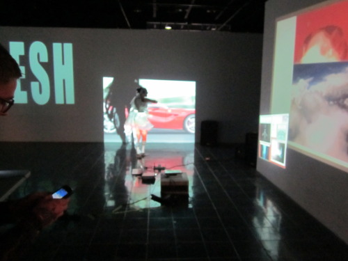
Installation view of Perspectives 178: CINEPLEX at Contemporary Arts Museum Houston, 2012. Photo: Rick Gardner. (Left: Fittingly, the show's title and statement are projected onto the wall as opposed to printed. Right: Les LeVeque's white and fifteen movies starring Charlton Heston.)


As described in Part 1, LeVeque's work is constructed from a sequence using two frames from a Charlton Heston movie followed immediately by two frames of white, and so on. For reference, you can see a clip of the film here. Being as large as it is in the space, the strobing light emitted from the work reflects on pretty much everything, including the walls displaying works by Gustaf Mantel, Frederick Brodbeck, and Christian Marclay. The piece also has an audio component. So even when you're not looking at white and fifteen movies starring Charlton Heston, its presence is seen and heard while viewing the other works.  I asked a gallery attendant if there was a break between cycles of the 15-minute piece (perhaps hoping for some familiar stillness), but there was no such reprieve.

A few days after my second visit to the gallery, I emailed the CAMH asking for images to use in these posts. I also sent along a question about white and fifteen movies starring Charlton Heston for CINEPLEX curator Peter Lucas. I was now very curious about the scale and placement of the work. I mentioned that I, personally, found it hard to "escape" the strobe effect when viewing the other pieces on display outside the theater. Was this an intentional effect, and if so, why?

Mr. Lucas kindly responded the very next day:

"Les LeVeque’s video was intentionally placed and sized to be prominent upon entering because its rapid collage of multiple movie frames and white frames immediately says something about the nature of cinema and our perception.
It was my intention for the main gallery space to include a variety of approaches to movie manipulation; for the quartet of works in that space to contrast, overlap, and interact; and for the experience of the gallery space to be strikingly different than inside the central cinema space. The gallery is meant as a more aggressive, flickering, kinetic, and de-centered environment, while the theater space has the comforts of traditional cinema presentation environment (black curtains, seats, soft or no light, and one central screen)."

I appreciate having an understanding of the story or design decisions behind an exhibition, particularly when the exhibition concept is as challenging as this. Wanting to have the works in CINEPLEX's common area interact and overlap is a very meta approach to an exhibition about repurposing, manipulating, and remixing. It's a bold idea, but the execution is holding back.

For starters, LeVeque's work owns the space. While its reflected strobing light and audio score interact with the other three works, none of them can really reciprocate. Brodbeck's Cinemetrics and Mantel's animated movie GIFs are less than 1/4 the size of white and fifteen movies starring Charlton Heston, and neither has its own audio component. LeVeque's score steps in, however, providing an unofficial audio track while viewing these smaller pieces. While it sort of works with Brodbeck's pulsating cinemetric, I don't find it to enhance the quiet nature of Mantel's pieces in any way.

Marclay's Telephones is the smallest piece in the set, presented cleverly inside an old Trinitron television. It does have audio (mostly talking and telephone ringing) which occasionally cuts through the LeVeque score. When it does, this is probably the best moment for pieces in the common area to truly interact on level footing. Yet LeVeque's and Marclay's pieces are on opposite walls and pushed down from one another (as you can see in the photo below), making it impossible to view the pieces simultaneously.

Installation view of Perspectives 178: CINEPLEX at Contemporary Arts Museum Houston, 2012. Photo: Rick Gardner. (From left to right, works by Les LeVeque, Frederick Brodbeck, Christian Marclay, and Gustaf Mantel.)


CINEPLEX seems to be trying to walk a fine line between creating a larger multimedia environment made from a collection of disparate works and showing the four works as individual pieces. It's a difficult task. LeVeque's wall sized work is the independent variable here, as removing it (as a conceptual exercise) would immediately break this tension and create a more traditional video exhibition. Conversely, another large piece could help balance out white and fifteen movies starring Charlton Heston and keep it from overpowering the other works. (Easier said than done, of course.)

Mr. Lucas's response to my question also made me think about artist Rafaël Rozendaal's BYOB series. The last "B" is for beamers, as in projectors. These one-day only events either feature a curated collection of artists or an open call, and participating artists are responsible for bringing their own video or animated works – and their own gear – to the space.

Aj Fusco, Alix Ross, Jack Ramunni, Elijah Funk (via www.byobworldwide.com)

I have never been to a BYOB event, but I imagine them to be very much like the new cinema space Mr. Lucas describes: aggressive, flickering,  kinetic, and de-centered, full of contrast, overlap, and interaction. If the CAMH ever wants to up the ante set forth by this exhibition, I can't imagine a better venue for Houston's first BYOB event. Perhaps hosting one in between shows in the large space? They've already had one at The Geffen Contemporary at MOCA Los Angeles:


One of my favorite aspects of the CAMH is that it often takes risks with its programming, and I find that to be the case with the unusual presentation of CINEPLEX. It's a great show, worthy of repeat visits. (I've been four times now.) Clearly, it's prompted a lot of thought from me on the work and how such work could be displayed. I don't think there's anything more that one can ask for from an exhibition.


Share


Wednesday, June 13, 2012

Miao Jiaxin at Box 13 (NSFW)

by Robert Boyd

Is it possible to be shocked or scandalized anymore? If so, Chinaman's Suitcase on view now at Box 13 might be the show to do it. On one hand, we live in a society where sex is pervasive. Nowadays, TV shows will have characters explain what is going on while having sex--a device called sexposition. As I was driving home from work, I noticed a grand new building being constructed on the side of a freeway--a strip club to be called "Lust." Lust will be the 26th strip club in Houston (by my count).

But Chinaman's Suitcase included a concept so amusingly perverse that I had never even considered it before. Artist Miao Jiaxin calls them "ass prints," but that phrase seems rather tame. Ass prints are what are left on the windows of Fondren Library when the Baker 13 make their monthly streak across the campus of Rice University, wearing only shaving cream. It would be more accurate to call what Jiaxin has produced "asshole prints."


Miao Jiaxin and Eijane Janet Lin, Collaboration No. IV (Assprints), 2011, archival inkjet print

Jiaxin's collaborator on Assprints is Eijane Janet Lin, who like Jiaxin got an MFA from the School of the Art Institute in 2011. (Interestingly enough, she is also a graduate of Houstons's High School for the Performing and Visual Arts.) The photo depicts Jiaxin about to apply lipstick to Lin asshole. The pair are surrounded by hundreds of prints that seem to be lipstick on tissue, presumably from her asshole. These prints look similar to those made when women "blot" freshly applied lipstick with a napkin. As Jiaxin performs this procedure, Lin--dressed in sexy stockings and a bra-- is using a small computer with a coffee cup handy. It's as if the whole process is boring and she needs something to do while Jiaxin makes his prints.

But in fact, she was actually online (her image being streamed) as this was happening, as this video from Lin's website shows.


Lin was on a sex cam site called Cam 4, showing the ass prints as they got made. Simultaneously on the site was a wide-angle view from the side showing the action basically from the same angle as the image in above. So this was a performance recorded for the art gallery crowd, but performed live for the sex cam crowd. There is an implicit challenge here--to create art what will appeal equally to both audiences. They both have highly different expectations and criteria. And both audiences are somewhat outside of the mainstream, but in very different ways.

Happy Together
Miao Jiaxin, Happy Together (detail), 2010, two archival inkjet prints

What does Jiaxin do with these asshole prints? Happy Together suggests that he scans them, colors them, and creates collages from them that resemble bouquets of flowers. There is irony in using assholes to depict a bouquet of flowers. Maybe Jiaxin is challenging our idea of beauty. Or maybe he is challenging himself to make something beautiful out of such unpromising raw material. (Artists who work with garbage, refuse and debris do something similar.) Maybe he's just fond of assholes.

Collaboration V
Miao Jiaxin and Eijane Janet Lin, Collaboration No. V (Stripper), 2011, archival inkjet print

Collaboration No. V (Stripper) is another audacious, funny image. Jiaxin and Lin are in a nondescript room. Jiaxin has the clothes and props to signal decadence--slacks, dress-shirt and loose tie, sunglasses indoors, wine glass and big cigar, stripper giving him a lapdance and perhaps weirdest of all, a revolver.  The revolver gives him kind of a gangster look, like a character from a John Woo Hong Kong action film. The fact that he has the gun aimed at his own head (but without his finger on the trigger) implies that he is a self-aware gangster--a live-fast-and-die-young sort. If that's who you are, best to maximize your pleasure today--Jiaxin is living life to the hilt in this photo.

But the really weird part is Lin, the stripper covered with money. Stripping is all about money--the stripper extracting as much money as quickly as possible from the client. And part of this is accomplished by tease--get the client excited enough to keep buying dances, without ever actually fulfilling him. But the problem in this piece is that for this transaction to occur, the client needs to take the money off Lin. For her to become progressively more exposed, she has to lose her money. The money would therefore flow in the wrong direction, from stripper to client. The circumstance portrayed here is a topsy-turvy version of the real thing.

Chinaman's Suitcase consisted of videos of performances, video stills of performances, and a performance, I Have a Dream. In I Have a Dream, Jiaxin slept through the entire performance. While he slept, a video camera put his image up on the social media site Chatroulette.

I Have a Dream
Miao Jiaxin, I Have a Dream, 2012, live performance and live-feed broadcast

The Chatroulette screen was projected on the wall. Chatroulette is a camera feed and instant messager application. What made it different from Yahoo or MSN messager was that your chat partner is randomly chosen. If you aren't interested in that partner, you can instantly change to the next randomly chosen partner. There are two things about this. First, if you go on Chatroulette, you will likely not see anyone for very long. If you aren't instantly what your randomly chosen chat partners wants to see, he (and it's 99%+ male) will quickly move on to the next partner. Second, you will see lots of random dudes masturbating.

I Have a Dream
Miao Jiaxin, I Have a Dream (screen detail), 2012, live performance and live-feed broadcast

This was a fairly tame Chatroulette chatter (his penis was inside his pants instead of out). This exhibit had more dicks than any I've ever seen. If you look at the image above, you will see that the chat partner is visible in the top panel while Jiaxin is visible in the bottom. But also visible are two people watching the performance. So all those masturbating chatters suddenly saw a bunch of people in a room standing around a guy asleep on a comically small bed. I wonder what they made of it. Were they even curious? Apparently not for most of them. They moved on after a few seconds, never pausing in their desultory wanking.

Money Laundering
Miao Jiaxin, Money Laundering (still), 2011, video documentation of a performance piece

Not all of the pieces in this show involve dicks, assholes, and/or strippers, but the hint of the illegal pervades much of the work. For instance, Money Laundering was a performance of a very literal interpretation of the metaphorical act. (Money laundering involves taking money earned illegally and disguising its origin so that it seems like legal earnings.)

Chinaman's Suitcase
Miao Jiaxin, Chinaman's Suitcase (still), 2012, video

Two of the pieces have specifically Chinese content. Chinaman's Chance showed Miao Jiaxin carefully spraypainting the carcasses of several ducks. (I couldn't tell whether they were real ducks or not.) He then put them in a suitcase and carried them through the streets to a food store, where they were hung up in the window. The video concludes with people reacting to the colorful ducks.


Chinaman's Suitcase from Miao Jiaxin on Vimeo.

The names uses a somewhat derogatory term for a person of Chinese descent that dates from the 19th century wave of Chinese immigration. And the image of ducks hanging in a store window is a stereotypical image of those urban neighborhoods that often end up with the name "Chinatown." That Jiaxin is playing around with stereotypes is obvious, but I don't quite get the colors. They're funny--they turn this food item into something obviously inedible.

Mom's Suitcase
Miao Jiaxin, Mom's Suitcase (still), 2012, video

A suitcase is the primary prop in another video, Mom's Suitcase. The repeated use of the suitcase in his videos reminds one of of his multinational existence as an overseas Chinese man.  In Mom's Suitcase, he crawls into a large suitcase wearing a suit. His mother then cuts all his clothes from his body with scissors. Then we see his mom dragging the suitcase with Jiaxin through the streets of Shanghai. It's a heavy case and you can see her struggling with it. Mama Jiaxan is definitely a trouper! This piece has a hint of the idea of smuggling in it--human smuggling. (Money Laundering also refers to smuggling, but indirectly. Much money laundering involved smuggling ill-gotten cash into countries with very secretive banking laws and then depositing the money in one of those banks.)


Mom's suitcase from Miao Jiaxin on Vimeo.

I don't want to say I understand what Jiaxin is trying to express in these works. Certainly has has something to say about sex and social media, about the condition of being an overseas Chinese person and about crime. But what precisely is not obvious. But so what? This work was immensely amusing and thought-provoking. Any artist who can sleep through a performance and still keep his audience entertained is some kind of wizard.


Share