Myke Venable's art almost dares you to say something about it. It mainly just is. Describing any particular painting in this show is a trivial, unenlightening task.
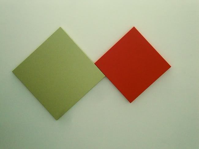
Myke Venable, MV 32 Sage/DD Orange (Dare Devil Orange), latex on canvas, 2011
Two square canvases, each hung at a 45 degree angle. the larger one is a pale yellow-green and the smaller one a bright orange. The larger is to the left of the smaller from the viewer's point of view, and the two touch each other ever-so-slightly. Once you've said all this, then what? And Venable doesn't give you anything in the titles. He's not like Barnett Newman, who would give his paintings titles like Achilles or Vir Heroicus Sublimus. Nope, Venable goes for just the facts, ma'am. Each painting is named after the color of paint used.
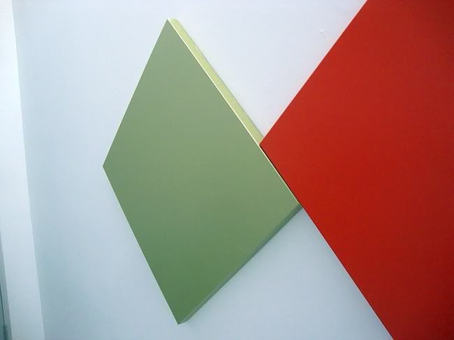
Myke Venable, MV 32 Sage/DD Orange (Dare Devil Orange), latex on canvas, 2011
These paintings are so minimal that it's reasonable to ask if they are paintings at all. They aren't framed and the colors extend over the edge of the canvas. They have a certain sculptural presence. And if one is an arch-formalist, then flatness and integrity of the picture plane are important indicators that you are in the presence of pure painting. These aren't really flat.
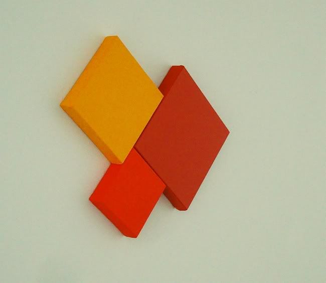
Myke Venable, MV 24 Orange, acrylic on canvas, 2011
If you go into the Gallery Sonja Roesch, it seems designed for "pure painting"--the interior is a big white neutral box. In many ways, it seems like the ideal setting to allow big modernist paintings to just be themselves--no distractions, no visual clutter.
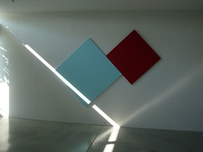
Myke Venable, MV 30 CadRed/Sky Blue, latex on canvas, 2011
It's a totally neutral space except for one thing--it has narrow clarestories on the east and west walls. So early in the morning and late in the afternoon (when the opening for this exhibit occurred), the sunlight will shoot like a laser through the windows into the space. The floor is so highly polished that it reflects the sunbeam back up. The effect of this dramatic light was to highlight the angles on Venable's wall-sized painting MV 30 CadRed/Sky Blue, which was hanging on the north wall of the gallery. So you have a painting that in a dramatic way is in dialogue with the light in the room.
This is a fundamental quality of minimalist paintings, whether Ellsworth Kelly or Agnes Martin or Venable. There is a kind of humility in these paintings, even when they are very large. The humility comes from knowing that they aren't really finished in the studio, but instead only becomes complete in situ--and this last step is not something the artist can fully control.
For example, Venable often uses fluorescent colors in his painting. If a fluorescent color is somewhere where sunlight (which contains ultraviolet light as part of its spectrum) hits it, it will have a kind of glow. But if it is an interior space that only receives artificial light, that glow will be absent. Venable doesn't control the final disposition of the painting--he doesn't know what shadows will be cast on it, what kind of light will be hitting it, etc. This is ironic. These works seem austere and hermetic, but really they depend on engagement with the world to achieve completion.
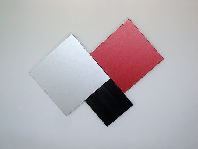
Myke Venable, MV 25 Silver/Scarlet Red/Black, acrylic on canvas, 2011
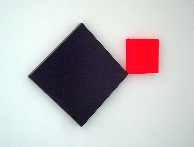
Myke Venable, MV 26 Purple/Fluorescent Pink, acrylic on canvas, 2011
(Author's note: I own two small Myke Venable paintings.)


No comments:
Post a Comment