Showing posts with label James Drake. Show all posts

Thursday, January 10, 2013

Some Questions for James Drake

Virginia Billeaud Anderson 

On January 12 Moody Gallery opens Group Exhibition of Gallery Artists, and it is unsurprising James Drake is part of the group. Surely, every time I visit Moody there are a few pieces by Drake displayed, and I’m having a memory of how parentally puffed up Betty Moody seemed on the opening night of Drake’s Station Museum exhibition.

According to Moody’s press release Drake will be showing works from his “Red Touch” series, so I contacted the artist to ask a few questions, and his replies clarified his choice of red for intensity, and the political reality underlying his series.

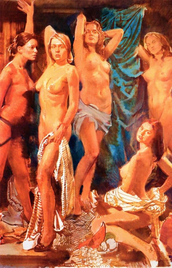
Virginia Billeaud Anderson: Your use of red pastel goes back for some years. Please comment on your attraction to it as an art medium. Are you drawn to its classic old-masterish quality?

James Drake: I started using the red pastel (chalk) about fourteen years ago while living in New York. I do not use much color, but felt an intense red was appropriate for this specific subject matter. While I love classic old master drawings these were not influenced by or based on that love and appreciation. I believe most of the “old masters” used more of a sienna color and I wanted these drawings to have an intense contemporary red.


James Drake, Red Touch #2, 1999, Pastel, charcoal and lasquox fixative on paper, 60 1/2" x 45” Courtesy of Moody Gallery 

VBA: Your works on paper seem heavily influenced by Renaissance and Baroque drawings. Do you look to them for inspiration?

JD: Yes, I have a very real passion for Renaissance/Baroque drawings and always succumb to their beauty, sensitivity, and grace. And yes, they are a tremendous inspiration.

VBA: Why do you work in very large size?

JD: I work in a very large scale because when I draw on that scale it is necessary to use my entire body and is very physical. Up and down ladders, arms swinging, pacing back and forth - it is all a part of the process. Also, most people think of drawing at a scale of about an average sheet of paper measuring 20”x30”, however, these large drawings are meant as finished pieces and not sketches for paintings or other works. And of course, there is a certain drama inherent in large works that I try to convey to the viewer.

The Red Mirror is about 11 ft. x 21 ft and I have made many other drawings in that scale and some larger. For example my drawing City of Tells is 12 ft x 32 ft and I am currently working on a drawing that will be exhibited at the Museum of Contemporary Art, San Diego (formerly the La Jolla Museum) in June of 2014 that is 15 ft in height x 342 ft in length. It is a grid divided into ten sections which are in turn, composed 1266 drawings measuring 19”x 24.”

VBA: Do you begin with a preliminary sketch? Or, for a work as large as Red Mirror, do you project an image to guide your design?

JD: Yes, I usually make preliminary sketches and in the case of The Red Mirror, made about fifty or so. Sometimes I draw a very large figure or object on a separate piece of paper and then, move that drawing around on the final large paper to establish the composition and position of the figure or object. This gives me a sense of what the final drawing might look like and I can try different placements without drawing the figure each time.


James Drake, Red Touch #1, 1999, Pastel on paper, 45” x 56” Courtesy of Moody Gallery 

VBA: There seems to be psychic distance between the Red Touch images and the more clearly political Exit Juarez, or the Trophy Room installation, two unforgettable works I saw in 2010 the evening I met you at Station. Please comment on what seems like incongruence. Or, is there a link?

JD: Actually, the Red Touch series of drawings were based on and inspired by a body of work titled Tongue-Cut Sparrows which dealt with a prison language and political issues prevalent along the U.S. Mexican border. Briefly, Tongue-Cut Sparrows depicted women using an invented sign language to communicate with their loved ones in jail or prison. They were able to stand on the street, look at the men in jail and speak to them using this sign language. I made drawings, a book, prints, and a video of this truly unique phenomenon. This piece has been shown in many museums throughout Europe and the United States, including the 2007 Venice Biennale, curated by Rob Storr.

One of the frequent phrases the women repeatedly used while signing to their loved ones was “I want to feel and touch you.” Therefore, because they were denied physical contact I made the Red Touch series and used an intense red to convey that sense of passion. I was born in Lubbock, Texas, but spent my early childhood in Guatemala. All of my family lived in Guatemala at that time and I am convinced that a lot of the issues and works I have produced are a direct response to that experience.


Share

Sunday, June 10, 2012

Invisible Curator: Fragile Weapons

by Robert Boyd

axes
James Drake, glass axes

I was out checking out galleries Saturday and saw these two glass axes by James Drake at Moody Gallery. They are resting in a bed of bubble wrap.

rifle
Charles Krafft, AK47 Rifle, slip cast hand-painted porcelain

shotgun
Charles Krafft, Mossberg Shotgun, slip cast hand-painted porcelain

Then over P.G. Contemporary were these porcelain weapons (among many others) by Seattle artist Charles Krafft. It was interesting to see all these very fragile representations of objects that are potentially very dangerous in real life. Such a representation is inherently ironic and a typical post-modern strategy (making large sculptures of small things, making soft sculptures of hard things, etc.).  Drake and Krafft are very different artists, but both of them deal with violence in their work. Another artist who deals with similar subjects in related ways is Camp Bosworth. Curators, feel free to build on this idea--free of charge.


Share


Monday, September 26, 2011

The Houston Fine Art Fair Wrap-Up, part 2

by Robert Boyd

(Part 1 is here.)

The Houston Fine Money Fair

Everyone knows that art fairs are commercial enterprises. The point is to sell artwork to people for money. Money money money. But what kind of freaked me out was how much of the art for sale was about money--and in some cases, literally made out of money!

Wagner
Mark Wagner, Gale Bill, currency and mixed media on panel, 2011

Mark Wagner had several pieces made out of carefully sliced up dollar bills at the Pavel Zubock Gallery booth, including the tour de force below.

Wagner
Mark Wagner, The Land of Milk and Honey, currency and mixed media on panel, 2011

Not to be outdone, Jonathan Ferrara Gallery from New Orleans devoted their entire booth space to the folded dollar photos of Dan Tague.

Tague
Dan Tague, Don't Tread on Me (left) and We Need a Revolution (right), archival inkjet on paper, 2011

Tague
Dan Tague, The End is Near, archival inkjet on paper, 2011

It wasn't just U.S. currency that was on display. I'm pretty sure Santiago Montoya, whose work was displayed at Arte Consultores from Bogata, Colombia, used other currencies in his money pieces.

Montoya
Santiago Montoya, Wishing Stars (diptich), paper money on stainless steel, 2011

Galleries--next year, if you want to strike an original stance, show art made out of credit cards.

Improvisation

The booths looked great--a lot of work was done to make them look just right. But what happens when you show up and you forgot to pack a display stand? You improvise.

Harvard
James Harvard, figure, mixed media on hydrostone

If you're Zane Bennett Contemporary Art, you place this $12,500 sculpture on a pile of magazines.

unknown sculpture
M. Lyons is the artist--that's all I know

(I can't remember who this artist is or what the gallery was.) I asked them if the box was part of the art and was told no. I guess you just have to do what you can...

Bad Art

I've mostly discussed art I like. I don't suppose it will surprise you that there was some pretty bad art there. Glasstire even had its readers send photos of the worst art (here, scroll down). Here are a few of my "favorites."

Buckingham
David Buckingham, Love to Love You Baby, metal [sic]

Wollanin
James Wolanin, August 1963, acrylic and resin on canvas

These lovelies were at Caldwell Snyder Gallery, which had a booth full of similarly bad art. One can imagine a scenario of, say, North Korean artists being shown slides of contemporary American art and being asked to create something similar. These pieces feel like imitations of contemporary art by artists who don't really understand contemporary art.

On the other hand, the creator of this bronze teddy bear at Schuebbe Projects looks like he knew precisely what he was doing and just didn't care. It positively revels in its stupidity. (Sorry I didn't get the artist's name.)

Schuebbe Projects teddy bear

Schuebbe Projects teddy bear

Shred on, little dude!

Arman
Arman, Dark Magnetism (Cello), mixed media on board, 1991

I like Arman's early work, and I think the nouveau realistes are somewhat underrated. But then I see something like this and think, maybe they aren't really all that underrated. This piece was on view at the Riva Yares Gallery booth.

The Houston Comics Fair

I remarked in an earlier post how an art fair resembled a comic book convention with somewhat more expensive merchandise. The Houston Fine Art Fair also resembled a comic book convention because it had comic book-esque art.

Lichtenstein
Roy Lichtenstein, Reflections on Minerva, mixed media print, 1990

Roy Lichtenstein is the classic comics appropriator, but I was still surprised to see this piece at Hollis Taggart. Suprised for two reasons--first, I thought he stopped using comics as a source in the 60s. Second, his comics-based images typically were more anonymous--not well-known characters like Wonder Woman. And yet, here she is, in a prismatic dissolving visual space. Not bad.

Muria
Magdalena Murua, Triple Vortice, paper on canvas

This piece by Magdalena Murua required cutting up little circles of comic book artwork and pasting it onto a canvas. OK comics fans--can you tell just be the colors what comic this could be? (The detail below will show more than enough to figure it out.)

Muria
Magdalena Murua, Triple Vortice (detail), paper on canvas

This piece was at the now contemporary art booth. And it appears from looking at her website that all her art involves pages of comics.

Myatt
Greely Myatt,unsure about the title, steel and air

At David Lusk Gallery, there was this piece by Greely Myatt that distilled comics down to one of its basic elements--balloons (word balloons and thought balloons).

More Bad Art

Arsen Savadov
Arsen Savadov, Les Demoiselles d'Avignon, oil on canvas, 2011

Mironova Gallery is a gallery from Kiev. Now I don't want to traffic in stereotypes, but, oh, why the hell not? You think of Russian (and Ukrainian) oligarchs--super-rich, super-crass dudes (and they are all men, as far as I can tell) buying up yachts and football teams and trophy wives and art by the metric ton. People like Roman Abramovich, Alisher Usmanov, and Ukraine's own Viktor Pinchuk. They want art that screams out how wealthy they are and what good taste they have.  So owning a pornified version of Les Demoiselles d'Avignon is perfect, because he can point out the art history behind it and the post-modern pastiche that Arsen Savadov has created, and when the boys come over for some cigars and poker, they can discuss which of these demoiselles they'd most like to fuck. (Not surprisingly, Pinchuk is a big collector of Savadov.)

Mas
Oksana Mas, BMW from the series Heart Removing, 8 cylinder engine, leather, gilt

Mas
Oksana Mas, BMW from the series Heart Removing, 8 cylinder engine, leather, gilt

Oksana Mas has created a piece that hits all the conspicuous consumption buttons at once--a BMW motor, covered with fine leather like an expensive designer purse, with gold-plated nuts and bolts! The funny thing is that this is the third leather covered motor I have seen in the past year or so. The first was a V-8 covered with a carefully sewn snakeskin cover by James Drake at his Station Museum Show. The scond was another James Drake snake-skin over engine (a motorcycle engine this time) at Moody Gallery. But the meaning of Mas's engine is quite different--her's is about consumerism and wealth, while Drake's was about masculinity. (One thinks of "Who Do You Love" by Bo Diddley: "I got a brand new house on the roadside/made from rattlesnake hide.")

The overwhelming effect of this art was an appealing to the wealth flaunting tastes of the Victor Pinchuk's of the world. But that's what old money always says about the nouveau riche--their cash can't gain them class. I hate this art, but I kind of admire its brazenness.

Whoops! Out of space!

I'll continue this in part 3.


Share


Sunday, January 30, 2011

Invisible Curator: Trophy Rooms

I think we can safely say that when human beings started hunting for sport, they probably started displaying their kills around the same time. The palaces of the ancient world were filled with the skins of animals taken in the hunt. Taxidermy developed (according to Wikipedia) in the 18th and 19th century. It was simultaneously used by hunters and naturalists--an overlapping category in those days.

Lane Hagood's Black Snake Salon is his tribute to those rooms full of stuffed specimens, put together by amateur naturalists and hunters.

Photobucket
Lane Hagood, Black Snake Salon, drawings and paintings on paper installed in a hallway, 2010

The naturalist implied by Black Snake Salon is one who, obviously, specialized in snakes. Most of Hagood's art deals with themes of collections of things--trophy rooms, curio cabinets, private museums, etc. I'll be writing more about this exhibit, "The Museum of Eterna" at The Joanna, in a subsequent post. But when I saw this room, the Invisible Curator in my mind started whispering. She reminded me of this piece:


James Drake, Trophy Room, fabricated steel, 1982

This is an environment built by James Drake. It is showing at the Station Museum right now, but I think today (January 30) is the last day you can see it. Hagood really celebrates the mentality of the collector in his pieces, including Black Snake Salon. Drake is a little more ambiguous--his work reeks of danger and power.

But the Invisible Curator wasn't done with me. She reminded me that I had recently seen a real trophy room that was pretty mind-blowing. 

Photobucket
Game Den, house at 12930 Memorial Dr.,  Houston, TX

This is a room in a house on Memorial Drive, just outside the beltway in Houston. This is my neighborhood, more-or-less. This house has always been an object of curiosity because it is so  grandiose and over-the-top. But until this week, few of us had ever seen photos of the interior. But Houston's great real estate blog Swamplot dug some up. As extreme as this room seems, it's just par for the course in this house, which can only be described as completely insane. So insane that it crosses over from totally tasteless to fascinating. I can't decide if I love it or hate it. The Game Den certainly seems like the kind of thing that James Drake was satirizing, but I suspect that Lane Hagood would approve of the obsessiveness of it.


submit to reddit  

Tuesday, December 28, 2010

My Top 10 Houston Art Shows

Robert Boyd

Hey, it's that time of year. This is my own highly idiosyncratic list. Basically, I went through all the shows I saw last year and gave them a rating from 1 to 10. If a show was above a five, I considered it for this list. I'm ranking them below from best, second best, and so on.

#1. Hand+Made at the CAMH. Great exhibit with a startling variety of performances and objects built around the idea of "craft"--which has been for so long a dirty word in contemporary art. But for me, some of my favorite artists in Houston come out of craft traditions.

#2. Barkley Hendricks at the CAMH. Super show of giant, full-figure portraits of African Americans. To me, it just defined cool. I really loved the Fela installation.

#3. James Drake at the Station Museum. Some of the best shows this year had to do with ideas of manhood or manliness. Drake really captured the stoic, mournful ideal.

#4. James Surls sculptures at Rice University. I have loved James Surls since they installed his sculpture in Market Square back in the 80s. I thought the temporary installation of sculptures at Rice was fantastic. He also had a nice show at Barbara Davis this year.

#5. Maurizio Cattelan at the Menil. Maurizio Cattelan does something kind of obvious in a way. He creates sculptures that seem as if they are three dimensional representations of some forgotten surrealist painter's paintings. The genius part of the Menil exhibit was to scatter them throughout the galleries (and on the roof), mixed in with work from the permanent collection.

Photobucket
Patricia Cronin, Memorial to a Marriage, marble at "Because We Are".

#6. Because We Are at the Station Museum. This group show dealt with LGBT civil rights, which in the wake of the defeat of gay marriage in California and now with the Smithsonian Wojnarowicz episode (not to mention the repeal of DADT), feels like it was the right exhibit at the right time. It even included an unusually powerful Wojnarowicz, Untitled (One Day This Kid...). What made this better than the run-of-the-mill agitprop exhibit was that the art was visually powerful and highly personal, as in Patricia Cronin's sculpture.

#7. Peat Duggins at Art Palace. I found this exhibit to be be thought-provoking and very, very beautiful. It delved into the relationship of religion to nature without offering easy answers. Duggins seems to have created his own personal sort of shamanism.


Andrea Dezsö, Sometimes in My Dreams I Fly detail, 2010

#8. Andrea Dezsö at the Rice gallery. Sometimes in My Dreams I Fly was the summer installation, which means the whole thing was behind glass. Dezsö created kind of a puppet-theater tableau of an alien, underground civilization. As a kid, I would have written stories about these people. As an adult, I visited it several times, charmed by her fertile imagination.

#9. Jeff Forster and Jillian Conrad at the Art League. Forster is a ceramicist who has embraced a kind of anti-craft approach. The deconstructed pieces in this show intrigued me. I felt the same about Jillian Conrad's sculptures made of construction site materials and glitter. The work of both these artists is challenging and interesting.

#10. Francis Giampietro at the Temporary Space. Another artist who dealt with masculinity as a subject this year was Francis Giampietro. I liked his heavy, somewhat dangerous assemblages, which reference body building and football.

Honorable mention:
Sarah Williams at McMurtrey Gallery
Joseph Cohen at Wade Wilson
Robert Pruitt at Hooks-Epstein
Wishing Well for Houston by Brian Piana, Aram Nagle and Heath Hayner at the Art League
Not the Family Jewels group show at Gallery 1764
Terry Suprean at the Temporary Space
Material and deStructure group show at Poissant Gallery
Ward Sanders at Hooks-Epstein
Are You There God? It's Me, Birdie group show at the Joannex
MFA Thesis show at the Blaffer Gallery
Daniel Heimbinder at the Joannex
The Big Show at Lawndale
Seth Alverson at Art Palace
Edward Lane McCarthy at Goldesberry Gallery
Boozefox at Lawndale
Tobiah Mundt at Lawndale
B-Sides at Fotofest
Poems and Pictures at the Museum of Printing History
It's Better to Regret Something You Have Done... group show at Art Palace
The New Black: Contemporary Concepts in Color and Abstraction at Williams Tower
Mark Greenwalt at Hooks-Epstein
Maria Smits at Lawndale

For commercial gallery of the year, I think I'm going to go with Art Palace, although I think Moody Gallery, Gallery 1724, Poissant Gallery and many more all had great shows, and I expect PG Contemporary to be a strong contender next year.

The choices are even harder when you go to non-profit spaces. Pretty much all of them had fantastic exhibits, performances, film presentations and more this year. But some special shoutouts to Lawndale and Box 13 and FotoFest for great years, and a special remembrance for The Temporary Space, which we always knew was going to go. A big salute to Keijiro Suzuki, whose curatorial energy was boundless.

I'm not the only one making a best-of list. Douglas Britt has his up at 29-95 (we overlap only on two shows). Has anyone else done one? Britt's is the only other one I have seen, so far...

Wednesday, October 20, 2010

James Drake at the Station Museum

Without knowing much about James Drake, I have to conclude based purely on his art that he is kind of a bad-ass. He has a bravura drawing technique, but is more than willing to drop that and do assemblage. His show at The Station Museum is full of macho imagery--not that it feels like he's saying "Check out me and my big swinging dick," but he does deal a lot with violence and with "things men like." Think of the famous Stuart Davis mural, "Men Without Woman," amp that up to 10 but also give it some anger and some mournfulness, and you start to get to James Drake.

I mean, what could be more bad-ass than this?


James Drake, Artificial Life in the Valley of the World, automobile engine, python snakeskin, 1994

A big V8 covered in tight snakeskin wrapping. Hanging from a chain. If Sailor from Wild at Heart wanted to decorate his crib, this is the kind of art he'd get. What gets me is that this is assemblage. Sure, it took serious skill to cut and sew that python skin into that complex shape, but artistically, this is all about the idea: "Wouldn't it be bitchin' to wrap a car engine in snakeskin." For an artist with prodigious drawing skills, though, this is brave. It is showing a willingness to leave his talent behind and let the idea be the thing.


James Drake, Liar, charcoal, tape on paper, 2008

And drawing talent he has in spades, as in this piece. Drake handles charcoal with vigor and powerful expression. But he also shows his drawing skills in more delicate ways, in his large cut-outs, drawings that require skill and patience. But here, the slashing, decayed charcoal is appropriate. It's an angry work. Is the figure an archetype of liars, a summation of a life of being lied to? Or is it some particular liar that Drake wanted the world to know about. Except the world will never know who he is--his face is deliberately obscured--perhaps as a warning that you never know what the next liar will look like.


James Drake, Avenida Juárez, steel, wood, roofing fabric, paper, pastel, 1989

When you see this dark and beautiful piece, and read the title, you think perhaps of the murders of women there, or maybe of the more recent narco-violence in that tragic town. But this piece predates those events. So an older reference comes to my mind. 

When you're lost in the rain in Juárez
And it's eastertime too
And your gravity fails
And negativity don't pull you through
Don't put on any airs
When your're down on Rue Morgue Avenue
They've got some hungry women there
And they really make a mess out'a you
(Bob Dylan, "Just Like Tom Thumb Blues")

Is the woman in the panel on the right a prostitute? Could be, I guess. The progression from left to right--blue panel, roofing fabic, woman--suggests someone gazing at the sky, lowering his eyes to the building (a very, very modest building), and going inside where she waits for him.


James Drake, Trophy Room, fabricated steel, 1982

This piece seems like a critique of male culture, the whole idea of "kill it and display it," as well perhaps a critique of the wealth that implies. But is it really? It's hard to say for sure--it's scary, being in a black steel room full of weapons and animals, but it's impressive, too. Drake is ambiguous here. Elsewhere, less so. He shows the tragedy of violence in some pieces.

Still, it's hard not to see his work overall as a celebration of manhood. Not in the Maxim-style "bro culture" sense, but in an older way, a Cormac McCarthy way. A celebration with big dollops of anger and regret thrown in.