Aaron Parazette's show at the Art League, Flyaway, includes on very large wall piece and six modestly-sized paintings. The difference in scale is so vast that it's really hard to see anything but Flyaway, the wall piece, when you walk into the gallery. It is facing the viewer and grabs your attention in such a way that it might be a number of minutes before you turn around and notice the other work.

Aaron Parazette, Flyaway, 2012, acrylic wall painting, 7' x 56'
Flyaway wraps around two walls. Each wall has a focal point where several lines converge. The intersections of these lines, and the edge of the painting itself, form flat geometric shapes. Parazette fills each geometric shape with a color form a narrow palette--dark green light green, dark blue, medium blue, light blue, black and white. This deliberate limiting of colors has been a prominent aspect of his art for a while now. The title of his current series of paintings, Color Key, refers to it. At his last solo exhibit, I found this approach a bit boring. But by putting it on the wall at this scale, Parazette changes the whole dynamic. Size matters. At this scale, the straight lines of the wall painting engage with the straight lines where the floor and ceiling meets the walls, and where two walls meet each other. The triangles and trapezoids echo the perspective space of the room. You are enveloped by the painting just as you are enveloped by the gallery itself. Flyaway loses the autonomy of an individual easel painting, but gains a dialogue with the architecture. Too many colors might have spoiled that dialogue. That was one thing the minimalists realized--keep it simple and suddenly it's not about the art object as an autonomous thing, it's about the viewer, the architecture, the object and their ever shifting relationships with one another. And that's what you get with Flyaway.

Aaron Parazette, Color Key 33, 2012, acrylic on linen, 15" x 22"
So the question is, how do the smaller paintings hold up against Flyaway? You have pieces like Color Key 33, with an even more restrained palette, where everything feels perfectly balanced in this perfect ellipse. This work is completely pleasant but not very exciting. The point that draws my eye and prevents it form being a work of dull perfection is the tangent pint in the upper right, where four lines converge at the edge of the canvas. They teach you not to do this in art school, and the way it pulls you in is why. It's the kind of rule-breaking you need to make this painting work.

Aaron Parazette, Color Key 36, 2012, acrylic on linen, 17" x 32"
Color Key 36 and Color Key 37 are interesting because they suggest three dimensions. They come across as orthographic projections and remind me a little bit of Al Held. And as with Al Held, there is a tension between viewing them as three-dimensional objects and a two-dimensional surface. The paintings don't allow you to make an easy choice between the two modes of seeing. It seems like an interesting departure for Parazette. But what I like most about them are the almost vibratory outlines of the various triangles and rectangles. The green shapes in Color Key 36 get a narrow orange outline, and the white shapes get a pinkish outline. The colors of the outlines shift as they are placed against larger areas of color (sky blue, black, white, yellow-green and a darker green). This shifting is what holds my attention here because even more than the ambiguously three-dimensional shapes, the shifting, vibrating outlines fail to resolve--and that is very interesting to look at. (Of course, these jpegs fail to do them justice.)

Aaron Parazette, Color Key 37, 2012, acrylic on linen, 20" x 15"
Each of these paintings has one further feature that helps to keep the viewer off balance--they aren't symmetrical. So despite a severely minimized number of visual elements, these Color Key paintings have tricky, unexpected elements. Looking at them is a little like listening to Thelonious Monk--they seem formal and austere but they repeatedly hit you with something unexpected.

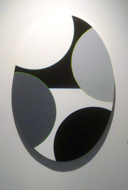
Aaron Parazette, Color Key 34, 2012, acrylic on linen, 34" x 24"
This effect is especially pronounced with Color Key 34, which looks like it really wants to be a very well-balanced symmetrical composition. Parazette's imp of the perverse won't let the viewer off that easy. Again we have the narrow colorful outlines, which take on all the more significance in this otherwise grey-tone painting. And the arrangement of the partial circles on the canvas, which feels rational, in fact continually seeks to roll the whole thing to the right.
With deliberately limited means, Parazette plays little games with his viewers. The result is highly engaging and pleasurable. And I also want to recommend the catalog that the Art League published to accompany this exhibit. In it, we get to see a small sampling of earlier Parazette work. I was pretty much completely unfamiliar with anything before the "splash paintings" from the late 1990s and was therefore pretty surprised to see where this formalist game-player had come from. Suffice it to say, the game-playing has been there all along.


No comments:
Post a Comment