If you're reading this, then you probably have read my other three reviews of comics and other items published at the Brooklyn Comics & Graphics Festival. A note on method: I'm not choosing comics to review that go together thematically or that make interesting contrasts. I have most of the comics I bought in a red canvas bag given to me by Koyama Press. So I have been reaching into the bag and pulling out four or five items at random to review. The stuff in the bag tends to be smaller, thinner items--comic books, minicomics, pamphlets, etc. I also bought several graphic novels which, being larger and heavier, are stacked separately. I'll review them once I'm done with the contents of the Koyama bag. But I wanted to mention the Koyama bag because it gives me an excuse to mention Koyama Press, which is exemplary of one aspect of what this festival is about: the fuzzing of the line between the art world and the comics world. This is how Koyama Press describes itself: "In addition to publishing books, Koyama Press has financed such diverse projects as zines, comics, artist designed t-shirts, installations, photo montage work, print folios, letterpress cards and more." And if you look at their catalog, you will find--in addition to comics--a lot of books that look much more like art books (or artists' books) than comics. Koyama Press does not come off as a comics publisher or even as a comics publisher that dabbles in art books on the side. It's an art publisher that includes comics proudly in its mix. This is something I will return to later in this review.

Gabrielle Bell, All My Dreams Come True cover, 2010
This minicomic (published by Lightful Press) by Gabrielle Bell is formatted with one panel per page. So although the story is 62 pages long, it is not terribly complex or involved. This is not to say it is uneventful. The protagonist, after an encounter on a train that leaves her with a strange man's briefcase, is flung into a series of dangerous situations in various locales. It seems to be taking place in the 30s or 40s, but it's vague. The lack of solid grounding and logic make it seem like a transcribed dream, but it is not fantastic like a dream. Motifs repeat as the scenes subtly change. I was reminded a bit of Donald Barthelme stories like "A Picture History of the War." A traditional story has anchors holding it fast to the "real world"; even a science fiction story attempts to do this, usually with a lot of exposition to explain why it could be real. Fantasy stories are praised for internal consistency, which means while they might not be anchored to the reaf world, at least they make sense on their own terms. This story (like many of Donald Barthelme's), dispenses with those anchors. It's unsettling.

Gabrielle Bell, All My Dreams Come True pp. 31-32, 2010
Update: Commenter Volsticks mentions that this story was in Kramers Ergot #7. I had completely forgotten that. The format was completely different, of course. Kramers Ergot #7 was the tabloid-sized issue, and Bell's story was presented complete on one page. So, does it change a story to present it in two drastically different ways? The art was identical in each case.

Jason Little, Gimmick Illustrated #1: Vlak chapter 1 cover, 2010
Another quasi-suspense story set partly on a train is Vlak by Jason Little. Little premiered his new graphic novel, Motel Art Improvement Service, at the festival--I will be reviewing it later. But he also had this intriguing comic. It is mostly wordless. A man arrives in an Eastern European city sometime in the early 20th century and loses his top hat. He goes to a hat store and buys a new hat. The store owner stuffs a piece of paper into the brim to help the hat fit better. Later on a train, the man discovers the piece of paper in the hat. He pulls it out, and sees this:
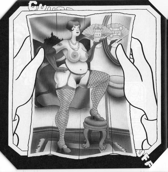
Jason Little, Gimmick Illustrated #1: Vlak chapter 1 p. 30, 2010
He is mortified by this, at least at first.

Jason Little, Gimmick Illustrated #1: Vlak chapter 1 p. 31, 2010
There is not enough here to feel out where the story is going. It has numerous little surreal touches (the steam engine is powered not by coal but by burning books) and hints of an Eric Ambler-like thriller (secret police on the train, etc.) Also, you will notice that in the pornographic photo, the woman is holding a fan. We can see the back of the fan in the mirror behind her, and on the back of the fan is a floorplan of a building--presumably the castle depicted on the front of the fan. So this suggests a spy-thriller. In any case, I am eager to see where this goes.

Madeleine Fairbairn and Robbie Guertin, Epic Love cover, 2009
Robbie Guertin and Madeleine Fairbairn are a couple, and this mini is a series of cartoons about their couple-hood. Each of the two take turns drawing cartoons.The book is consequently pretty episodic. There is no story arc here--we are plunked down in the middle of this relationship and see fairly trivial glimpses of it.

Madeleine Fairbairn and Robbie Guertin, Epic Love pp. 6 & 7, 2009
As you can see, Fairbairn and Guertin have fairly distinct drawing styles. I think Guertin is on the left and Fairbairn is on the right. These two cartoons are typical--the feel of this is casual, a fun little project that a couple can do together. They aren't particularly funny cartoons and the drawing is nothing special. In short, it's OK for a minicomic, but not something they could push much further.

Gary Panter, Jimbo cover, March 24, 2010
Gary Panter is one of the giants of comics, a somewhat polarizing figure (at least in the past) because his work skitters on (and often over) the edge of readablility. There is so much to say about Panter that I don't even want to try. Suffice it to say that he is the embodiment of this fuzzy intersection of the art world and the comics world. And this is not just because he is a painter who shows his work in galleries, but also because while most great alternative cartoonists' work can reasonably be described as literary to an extent, Panter is the one whose work feels least literary and feels most like other contemporary visual art in its approach and concerns.

Gary Panter, Jimbo pp 4 & 5, April 13, 2010 and April 15, 2010
So it's funny to pick up this Jimbo minicomic at this festival. Of all comics shows, this is one where Panter work in its most radical manifestation would be highly welcome. His progeny were present in force. And yet, this is perhaps the most straightforward Panter comic I have ever read. It has a comprehensible story with a beginning, middle and end. The dialogue is straightforward, legible, in commonplace word balloons. The panels are neatly ruled and arranged in a traditional way. The drawing is crisp and the spaces depicted have a Renaissance perspective logic to them. What's going on here?! I don't know, but this was an amusing minicomic--a trifle--by a master. A minicomic like this is a little like, I dunno, György Ligeti writing a minuet in the key of C, just to remind people that he could if he felt like it.

Joel Spaesmaker, Forest Small Book Series, Book One: La Recoleta Cemetery, Buenos Aires, Argentina., 2008
This, at first glance, could be mistaken for a minicomic. The format is minicomic-like. And if you go by Scott McCloud's hyper-formalist definition, it is a minicomic. (For a bunch of reasons, I hold no truck with that definition or any essentialist definition of comics. But many do.) And, more importantly, it was being sold at a comics show. It's in the world of comics. But when you read it, or any of the other books in the series, it's pretty clear that they aren't comics. They are closer to artists' books.

Joel Spaesmaker, Forest Small Book Series, Book Two: Of Great Masses Moving at Visionary Speeds., 2008
What is an artist's book? Here's how Wikipedia defines it:
Artists' books are works of art realized in the form of a book. They are often published in small editions, though sometimes they are produced as one-of-a-kind objects referred to as 'uniques'.
Artists' books have employed a wide range of forms, including scrolls, fold-outs, concertinas or loose items contained in a box as well as bound printed sheet. Artists have been active in printing and book production for centuries, but the artist's book is primarily a late 20th century form.Maybe the best known artist's books are those by Edward Ruscha. At least, best known to me. These include such little books as Royal Road Test and Various Small Fires and Milk. So artists' books seems pretty close to a lot of the minicomics and other small publications I've been reviewing the last few days, right?

Joel Spaesmaker, Forest Small Book Series, Book Three: Things on Walls, Volume One., 2008
By total coincidence, I have been reading a manuscript of a book by a friend of mine that has a chapter on this very subject--the differences and similarities between comics, artists' books, and children's picture books. I don't want to quote it or even name the book (it will be published in Fall of 2011 and I think is going to be an important book for anyone thing seriously about comics as art going forward). But what this chapter spoke of was how despite very real similarities between certain artists' books and certain comics, they were still viewed institutionally as distinct classes. It's the word "institutional" that is key here. A store specializing in artists' books like Printed Matter is pretty obviously not a comic book store. Even if you search the word for comics, you end up with entries that describe a book as "being told in comics format." They actually have to explain to their customers that a comic is a comic.
But comics--particularly "minicomics" in the sense of handmade comics--are very similar to artist's books, and I think we are seeing comics that cross the boundary, that inhabit both worlds. Just like we are seeing artists that inhabit both worlds. And that's why after an initial feeling of surprise, seeing this set of artist's books at the Brooklyn Comics & Graphics Show felt OK.

Joel Spaesmaker, Forest Small Book Series, Book Four: Lessons Learned, Volume One., 2008
I like Joel Spaesmaker's Small Books. They deal with his fascinations and document his life in an interesting, elliptical way. I initially picked up the set because of Book One. I once spent two days wandering around in this cemetery, La Recoleta, looking at the amazing mausoleums of Buenos Aires' elite. I was looking for Borges' grave (he is buried in Switzerland, apparently--but the internet wasn't around when I made my fruitless search). I thought it was cool that Spaesmaker had been there and recorded his trip in this 'zine. Looking back, I think it is perfect that books like this were mixed in at a comics show. Comics shows almost always include some non-comics stuff. That stuff, though, is usually stuff aimed at genre fans--movie merchandise, toys, etc. Because the Brooklyn Comics & Graphics Festival deliberately positions itself as an art comics show, it is only appropriate that the extra stuff in this show come more from the art world than from the genre entertainment world.

Joel Spaesmaker, Forest Small Book Series, Book Five, We Are Children of the Earth & Sun., 2008
Many more reviews to come. I have a little time off, so I should be able to write them all before the beginning of next year. And of course, you can read the earlier Brooklyn posts at part 1, part 2, and part 3.


Man, I gotta lay hands on that Panter mini. From what I can see here, this represents his ability to focus exactly, precisely upon a certain feeling, a certain exact emotional location via his depiction (including the physical space depicted, the style of the way the "protagonists" are drawn, his usual luscious marks, and the pace & dialouge presented. Amazing stuff.
ReplyDeleteIsn't the Gabrielle Bell book a reprint of her story from Kramers Ergot 7?
ReplyDelete