Sunday, October 31, 2010

Al Souza, Jim Love, James Drake and Jess at Moody Gallery

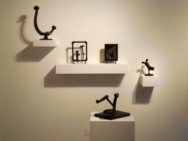
Moody Gallery has three exhibition rooms, and usually they have one big exhibit up front and in the middle room, and then a second exhibit in the back. This time, they have Al Souza in the front gallery, a show devoted to the trio of Roy Fridge, Jim Love, and David McManaway in the back and a little group show in the connecting gallery. Here's an installation view of the Fridge-Love-McManaway show showing a selection of small Jim Love sculptures.

Jim Love

The middle gallery exhibit is kind of a weird hodge-podge. It's just called "Group Exhibition," and it features work by David Ireland, Jess, James Drake, and Jay DeFeo. Why these artists?
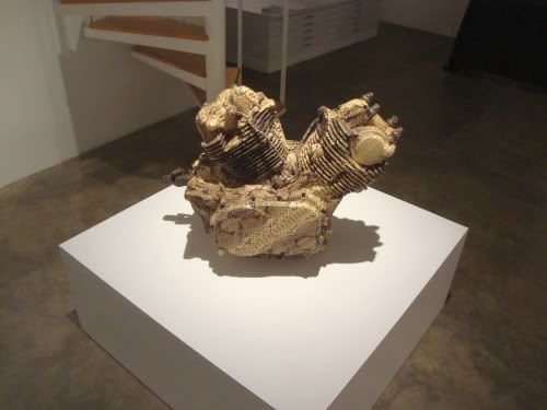
James Drake
James Drake, Snakeskin Engine, motorcycle engine, python skin, 1994

That question applied to James Drake is easy to answer. He's one of the artists that Moody Gallery represents. And right now, he has a large show on view at the Station Museum. And as Don Thompson contends in the $12 Million Dollar Stuffed Shark, being shown in a museum adds brand value to an artist. So while Drake's brand is being enhanced, why not remind people where you can buy Drake (for you have $30K to spare)?
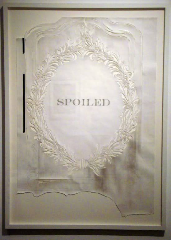
James Drake
James Drake, Spoiled, graphite, tape on hand-cut paper, 2010

But what about us plebes who don't have $30K? Well, if you're like me, and you liked the Drake show at the Station Museum, this gives you a chance to see of couple of more excellent pieces by the artist. And that's an important service that commercial art galleries perform--they are like little free museums. I don't have much to say about Snakeskin Engine that I didn't say about a similar piece at the Station Museum, but check out Spoiled! This cut-paper technique was one Drake used in a few pieces at the Station show. I didn't get a good photograph of them then, but I liked them. They seem very delicate and almost feminine, which something unexpected from an artist as consistently macho as Drake. But Drake undercuts this femininity. One of the Station Museum cut-paper pieces shows a snarling dog. This one is, obviously, spoiled--dirtied and torn. Drake's work is filled with pain and regret at male violence. Perhaps here is is addressing specifically violence by men towards women. At least, that seems like one possible reading. (This ambiguous machismo is, to me, the hallmark of certain artists associated with Texas--Drake, James Surls, and Michael Tracy.)
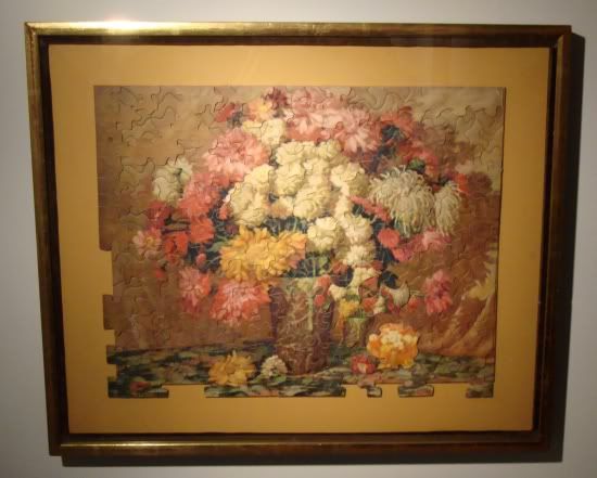
Jess
Jess, Xrysxrossanthemums, collage, 1978

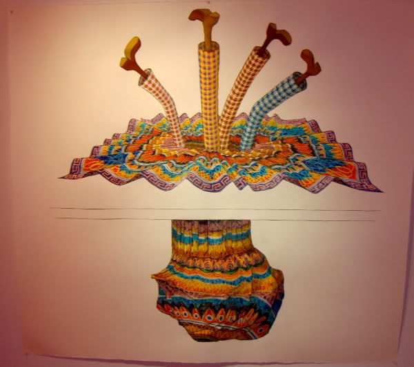
But as I mentioned, there are also pieces by Jess and Jay DeFeo, two artists associated with the San Francisco beatnik scene. Why pull these out of storage (besides their excellence)? In the case of DeFeo, she has work up right now in the Menil as part of their recent acquisitions show. A little branding there, maybe. And Jess? I don't know. While he does have work in the excellent Poems & Pictures show at the Museum of Printing History, but it's hard to imagine that adding much brand value to Jess's work. But maybe just because that show will remind a few people about Jess, Moody thought it worth the effort to bring this piece out of storage. But another reason is that it might remind people of classic Al Souza.

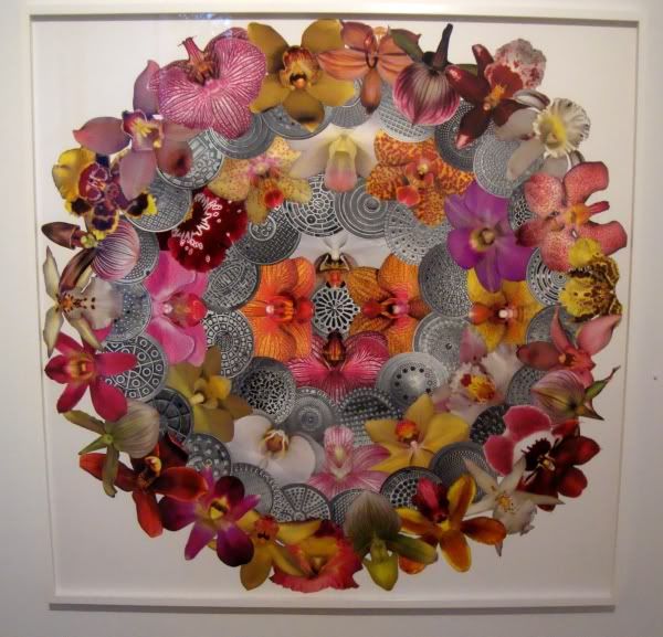
Al Souza is probably best known for creating dense collages out of picture puzzles. While there are lots of collages here, none of them are made from puzzles, and generally they feel less visually choatic than the puzzle collages. He uses circular forms in several of them, including Man Holes.
Al Souza
Al Souza, Man Holes, cut paper, 2009

This collage is arranged in six concentric circles. The circles alternate between black and white images of manhole covers and color images of orchids, with a single manhole cover at the center. I loved this utterly unexplicit but nonetheless rather smutty picture. Of course, one is supposed to think of vaginas when one looks at the orchids. Now to consider a vagina to be a "man hole" is pretty damn crass, but what can I say--it's right there on paper. (I wonder, though, if I would have made the association without the title.)

Man Holes is both beautiful and juvenile, which seems to be a tension that Souza likes to play with.
Al Souza
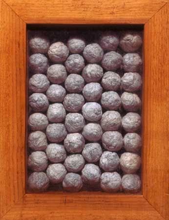
Al Souza, 46 Big Spitballs, paper in wood and glass box, 2005

This is an older piece and has even been displayed at Moody Gallery before. But even with a relative bargain price (at $3000, it's the cheapest piece in the show), it may be a hard sell. I'm guessing spitballs are a little too cutting edge for the Houston collecting community. I like it--I think it looks great and I am happy to be slightly creeped out by it.

But don't get me wrong. I picked out two works which have a kind of 11-year-old boy taboo quality to them, but the whole show is not like that. There is a lot of humor in the works, but also elegance and beauty.
Friday, October 29, 2010

Quantumdada Phase 2 at Rudolph Blume

When artists start talking about quantum physics, that's when I reach for my particle accelerator. It's dangerous ground for a curator or artist. I know we are supposed to be living in a beautiful world of cross-disciplinary art, but there are certain subjects in science and mathematics which have an undeniable appeal to writers and artists that they should resist. Mind-blowing phrases like "the uncertainty principle" and "spooky action at a distance" sound so cool that they draw artists and writers in, who then construct awkward metaphors out of these very precise and specific scientific definitions. Good for artists for trying, but rarely do they have anything useful to say about more abstruse, counterintuitive areas of science and mathematics. (Here's a notable exception: Everything and More by David Foster Wallace, who tackles infinity as a mathematical concept--not a metaphor, not a metaphysical construct.)

So I was pretty skeptical approaching Quantumdada Phase 2, up now at Rudolph Blume. (Even more skeptical after reading Michael Bise's evisceration of "Phase 1.") And in terms of saying anything interesting about quantum physics or science in general, my skepticism was rewarded. But that doesn't mean that the art was bad. On the contrary, I thought it was a pretty decent collection of pieces. The less literal they were, the less they tried to be about physics, the better they were.


Michael Brims, Oval Eyes Shaking, video, 2010

Curator Eisele Volker writes "'Oval Eyes Shaking' represents the conscious observer of this room [the front gallery]. Every room has its own conscious observer in order to represent Dada consciousness and to, hopefully, interact with the quantum world." Boy, is he putting a lot of responsibility on Michael Brims' wacky video. I like this video not because it seems in any way to "represent Dada consciousness," but because it feels like Brim has created a video version of Googly Eyes. (And of course, being the rock nerd that I am, I was also reminded of this classic.) But what I found a little weird about Volker's description was that he hoped it would interact with the quantum world. His hopes should be amply fulfilled, since like all matter and energy, Brim's video is continuously interacting with the quantum world, as the electrons in every atom in the room achieve their stochastically determined quantum states... But I assume that's not what Volker meant. But I'll confess that I don't have a clue what he means by yoking Dada and quantum physics together. Dada was a reaction to the insanity of mankind, which was slaughtering itself by the millions as the first Dadaists performed on the stage at Cabaret Voltaire. Quantum physics, as strange as its results are, is the result of supreme acts of ratiocination. Dada is deliberately irrational.

Kevin Jones
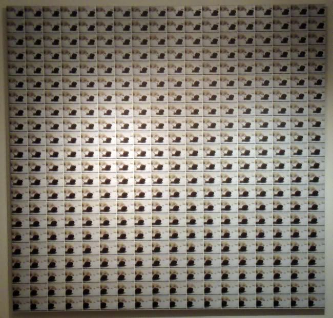
Kevin Jones, Blend, photographs

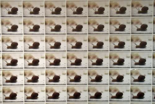
This may be my favorite piece in the show. While I don't see a connection with quantum physics, there is a connection with science. This kind of photodocumentation seems typical of how a scientist would observe a movement--carefully, deliberately, obsessively, from a single vantage point. One thinks of the work of Eadweard Muybridge and Harold Edgerton. Of course, the irony was that those to photo pioneers were capturing images that the human eye couldn't discern, whereas Kevin Jones is capturing images that we can easily see for ourselves, but would be far too boring to watch. Jones solves the boredom problem by showing them all simultaneously. The viewer doesn't have to wait for the snail to complete his transit.

Kevin Jones
Kevin Jones, Blend detail, photographs

Also in the "science-y" vein is The Path of Least Resistance by Ariane Roesch.

Ariane Roesch
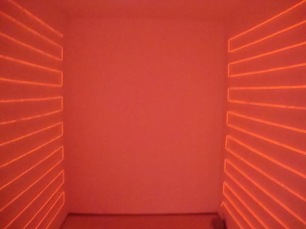
Ariane Roesch, The Path of Least Resistance, Electroluminescent Wire, 2010

Ariane Roesch has been using EL Wire in her work for a while now. EL Wire is a very clever product; basically,  it is simply copper wire coated with phosphor.

EL Wire

Of all the pieces here, this is one where a principle of quantum physics is perhaps most at its core. As electricity travels through wire, the energy causes electrons in the phosphor molecules to become excited and jump up to a higher energy level (a quantum leap). When the electrons fall, they release photons. The principle with EL Wire is not terribly different from fluorescent lamps (and like them, EL Wires are very efficient).

Being in that room had another science-y association for me.

2001

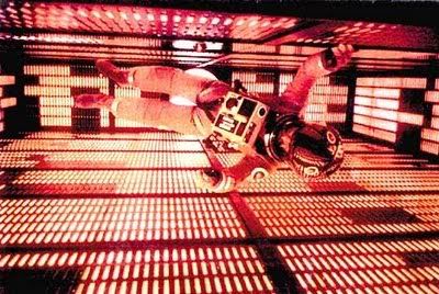
I wonder if Roesch were deliberately recalling the scene in 2001 where Bowman slowly, carefully kills HAL.

Daniel Heimbinder
Daniel Heimbinder, Entanglement, colored marker on paper

One has to wonder whether Daniel Heimbinder was inspired by the concept of quantum entanglement or if he just happened to have created one of his brilliant cartoon images--the offsprint of a Philip Guston painting and a Saul Steinberg drawing--that also just happened to work with that word, "entanglement." His entanglement and quantum entanglement are unrelated. His bears a closer relationship to the Marx Brothers than to Richard Feynman.

Greg Metz
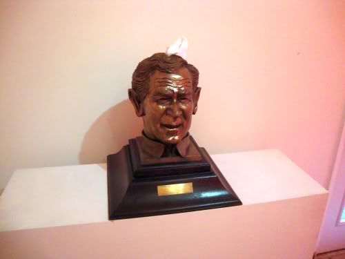
Greg Metz, George W Bush as a Kleenex dispenser, sculpture bust with tissue

Here is a piece by Greg Metz that has no obvious relationship to quantum physics at all, and only a slight one to Dada (insofar as both were anti-war expressions). The plaque reads "MY DEEPEST REGRETS TO THOSE WHO HAVE SACRIFICED THEIR LOVED ONES FOR MY IRAQ WAR". This sentiment is mocked by the goofy smile on Bush's face, and by the inadequacy of offering a tissue to a grieving spouse or parent. It's a pretty brutal, bitter piece, and it works where so many other political works fail by being personal. George Bush and his failure as a person are the subject.

You will notice that the last two pieces have a somewhat orange tint to them. That is not local color. It's the result of sharing a small room with David Graeve's piece, an orange balloon, 8 feet in diameter, hung from the ceiling. The room itself was hardly 12 feet square (I'm guessing), so this balloon dominated the room. The light reflected off the balloon gave everything an orange tint (not as orange as in Ariane Roesch's room, of course). I couldn't take a picture of it--there was no place within the room where I could get the whole balloon into my viewfinder.

This show had as its objective the task of "connecting aspects of the quantum world with the world of art as Dada." In that regard, it is a failure. However, the better way to look at the show is to ignore its stated objective and consider it as a heterogeneous collection of artworks, some good, some less so. Leave the curatorial conceit behind and see it as a group show. On this basis, I recommend it. There are pieces here worth seeing.

Tuesday, October 26, 2010

A Note on B-Sides at FotoFest

There's a good show up at FotoFest headquarters called B-Sides. It's up through December 11. As usual with FotoFest group shows, this one quite various in its contents, and the overall level of quality is high. I want to discuss just two of the artists.

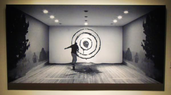
Nic Nicosia, like a lot of modern photographers, is not about capturing a perfect moment, but more about constructing one. He creates sets and then does some kind of action in them, and takes a photo of the result. Or, at least, that's what the viewer is left to conclude in the photos here.

Nic Nicosia
Nic Nicosia, Untitled (dirt target) from the Space Time Light series, archival inkjet on canvas, 2008

The implication is that the figure has been throwing dirt at a target made of dirt (or mud) smeared on the wall. Or did he create the target by throwing mud at the wall? Hard to say. He appears to be very close to the wall, and he may be in the act of smearing the dirt on, even though his body looks like he just pitched a mudball. And what about the side walls, with their grey pastoral scenes. What is their relation to dirt? And is the target even really made of dirt? It looks too "clean"--dirt (or mud) as a drawing medium is surely more difficult to handle than is implied by this image.

Nic Nicosia
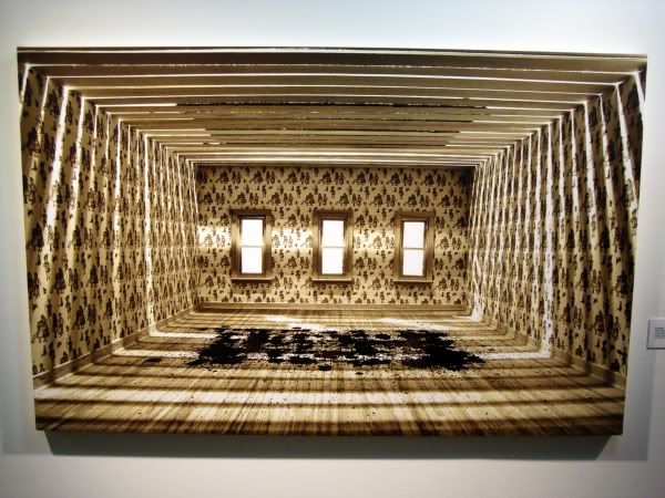
Nic Nicosia, Untitled (black rectangle) from the Space Time Light series, archival inkjet on canvas, 2008

This image was even more mysterious. But the first thing I was struck by was the beauty of it. I like the brown and tan colors, the patterns on the wall-paper and how they interact with the light coming through the slats, and how those lines of light intersect the edge of the canvas. But were are again confronted with a strange room--one that appears to have been constructed from scratch for this photo, like a soundstage for a movie.  The roof is deliberately left incomplete, and it appears that Nicosia has carefully dropped dirt (dirt!) through the exposed roof to create a rectangular pattern on the floor. Why? I have one possible answer. Nicosia may be recreating a famous physics experiment, the double-slit experiment, which was used to try to determine whether light was composed of discreet particles or whether it was waves in the ether. In Nicosia's version, dirt is substituted for light. The results appear inconclusive.

Richard Mosse went to the Delta Kappa Epsilon fraternity at Yale (both George Bushes had been members, and they were recently in the news for an offensive hazing ritual) and asked the Dekes to have a yelling contest. The rule was that you had to scream at the top of your lungs, pausing only to inhale, until you just couldn't anymore. This video records the result.


Fraternity from Richard Mosse on Vimeo.
Richard Mosse, Fraternity, video, 2007

Intense, no? And kind of psychotic. It's hard to imagine a better and more succinct explication of frat life--but more important, of guys. On Mosse's Vimeo site, one of the commenters remarks that this reminded him of new age men's groups who would do the same thing to try to tap into that inner warrior. So it's not all about "bro culture." It's men getting together. A group of guys drinking brews and screaming at the football game on the TV. A bunch of soldiers or rugby players yelling as they psyche themselves up for the battle or the game.

And, watching it (but not participating) is highly irritating and a little disquieting. As a video, it's like Bruce Naumann's Clown Torture. The person being tortured is the viewer! FotoFest had the volume for this piece at a reasonable level, but it should have been turned up loud! The real extremity of it would have come through.

(One last thought--if you wanted to have a truly scary Halloween decoration for your house, you could project Clown Torture onto a white sheet in your front yard. Of course, your neighbors would hate you.)

Monday, October 25, 2010

Yard Sale Time Machine

A few days ago, I described the best art in Houston since Fresh Paint as having been conceptual, performance-based and community-oriented. I described some of it as "social sculpture," and used Rick Lowe's Project Row Houses and Jim Pirtle's Notsuoh as examples. I could have easily added Bill Davenport's Optical Project/Bill's Junk. On Saturday, there was an event that fits right into this broad category.


This event only made sense if people came and interacted. Every participant was an artist. When one showed up, it appeared to be much like a multi-family garage sale--an especially disorganized one. Some people were selling actual artworks. Bill Davenport had located Bill's Junk there for the day.


I don't know who does these big printed globes. I remember seeing them in Discovery Park a while back. I like them. They look good hanging from neighborhood trees. Update: They are by David Graeve.


Likewise I like these lawn signs. It takes a quotidian piece of visual pollution and turns it into art. Nasty art, but art nonetheless. I had no idea who the author of this was until I called the number on the sign and got the Art Guys' answering machine.


The Art Guys also had a table there where they were roping suckers folks into their latest scheme.


They were selling a table full of ordinary (and odd) objects, each with a pair of googly eyes glued on. They were selliing for $20 each. When you bought one, you got initiated into the Googly Eye Club.


Your club membership corresponded with the number of the object you bought. Mine was #061, as you can see. By joining, I give them permission to use my picture (they took pictures of every new member).


Apparently this makes me part of the "GOOGLY EYE PROJECT," which may include a book, film, and/or website--and who knows what else? What have I signed on for here? I can't wait to find out.

So what was my googly-eyed object? A strange tapering piece of wood, painted red. It looks a little like a work with an eye at each end. Here is a picture of it, posed in front of another, completely unrelated piece of googly-eye art, Diseased Writer by Lane Hagood.


Sunday, October 24, 2010

Poems & Pictures at the Museum of Printing History

Poems & Pictures: A Renaissance in the Art of the Book (1946-1981) at the Museum of Printing History is probably the best exhibit you have never heard of going on right now. The Museum of Printing History is a low key (but wonderful) institution--indeed, unless you are specifically looking for it, you are very unlikely to stumble across it accidentally. Make an effort to find it for this show, though.

I made that effort on Friday for the opening. When I showed up, there were so few cars in the parking lot and so few people inside that I thought I had missed the opening. But no, here it was.


This is what the exhibit consists of--lots of cabinets displaying magazines and books. These are books that were the result of collaborations between artists and poets (and poet/artists). They range from quite elaborate productions--"printing orgies" (as someone once described Raw)--to mimeographed 'zines. Generally speaking, the curator has chosen work where the poet and artist worked in collaboration, although there are some cases where the poem preceded the art. Obviously this made me think of comics, but very few of these items are comics or even comics-like. Still, many feature an interweaving of text and image to a degree that recalls comics.

A lot of these pieces are printed with letterpress. If you come across letterpress printing today, it's likely to be on a wedding invitation. In the art/poetry/small press world, it is a sign of quality, a kind of old-fashioned hand-made printing job one occasionally sees in chapbooks or small press poetry books. And a lot of the books and magazines in this exhibit are printed on letterpress. But as one of the publishers included, poet Tom Raworth, was quoted in the catalog, "I mean, letterpress wasn't particular and arty, particularly in those days, it was just another way of printing." Raworth was speaking of the 1960s, and the impression one gets from the catalog was that there were a lot of old letterpresses around--some over a hundred years old--that one could pick up cheap in junk shops. So while there is an art to letterpress (and certainly a skill), these publishers were using it for much the same reason that 'zinesters of the 80s and 90s used photocopiers, and why I write a blog on Blogger--it's an economical way to communicate with a small number of like-minded individuals.

So you see in this exhibit extreme rarities like Wallace Berman's Semina 2.


Wallace Berman, Semina 2, letterpress handmade magazine

Berman was one of the Ferus artists. In his one and only Ferus show, an illustration he had drawn for Semina was declared obscene by the ultra-reactionary L.A. police. This experienced soured him on working with commercial galleries for life, and also made him very wary of printing up loads of copies of Semina. He only printed enough to give to sympathetic souls. He didn't want a bookstore or art gallery to be busted because of his work ever again. And having loads of people see it was not important to Berman. He was one of those people who is very rare today--an artist who cares not a jot for fame or success or even praise. He was a shamanic character, and only needed to communicate with a select few who were on his wavelength.

This indifference to large print-runs and fame is something pretty common among the poet/artist/publishers here. Not necessarily because they were all like Berman--but they chose a life of poetry and of working in a small-press environment. It is inherently a life and medium for a select few. So if the work was produced on something like a mimeograph, that was OK.

I think when comics fans think about the evolution of minicomics, the small-print-run art-comics that are almost always handmade items, we think about 'zines. And 'zines have a well-established history. But when I think of some of the elaborate comics produced by Fort Thunder and other art-comics publishers, and when I think about their approach to comics as an art, it feels a lot closer to Wallace Berman and Joe Brainard and the teams of Alastair Johnson and Frances Butler or Bill Berkson and Philip Guston than to any zinester.

Of course, Brainard was really into comics, and he roped his friends--basically a bunch of poets who came to New York from Tulsa, OK (weirdly enough)--into doing comics with him. Brainard's big obsession was Nancy (see The Nancy Book for the results of his obsession). His friends played along.


Ron Padgett, Nonsense appropriation of Nancy by Ernie Bushmiller

Brainard published two full-on comics, with contributions from John Ashbery, Bill Berkson, Ted Berrigan, and others.


Joe Brainard, page from C Comics #2, mimeograph, 1966


Joe Brainard, page from C Comics #2, mimeograph, 1966

There are several avant garde experiments with comics that were published in the 60s and 70s, far outside the mainstream of comics (and even outside the world of underground comics). Martin Vaughn-James, Jess (whose illustration work is represented in this show), and Brainard of course. Probably others as well. I really wish some publisher with an eye towards the art history of comics would bring these back into print.

This all barely touches on the riches here. I plan to revisit the show and soak it in some more. It's a little much to absorb in one trip. The curator, Kyle Schlesinger, has a highly personal take on all this. He is one of those poet/publishers. His small press is called Cuneiform Press--indeed, he has one of those 100+ year old letterpresses. (But perhaps the oddest thing about him is that he is a professor at the University of Houston-Victoria. You never know what kind of talent is hiding away in our more obscure universities and colleges.)

Lawndale's Dia De Los Muertos Show

Every year for the past 23, Lawndale has had a show of "retablos" made by local artists. The artists pick up an 8" x 10" piece of tin from Lawndale and can do with it pretty much anything they want. I don't think the artists are even required to use the tin, but it does provide a limit to the size of the work. Two hundred and forty-five retablos were made, many by well-known local artists, but most by artists that are, as far as I could tell, "Sunday painters."

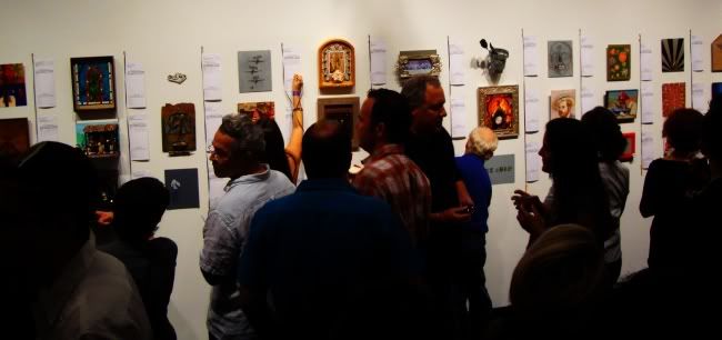
This show is a big fund-raiser for Lawndale. Funds are raised two ways. First, the works are auctioned off on opening night, and the artist can agree to give Lawndale some part of what he gets for selling her work. (Or the artist can take all of it. Or give Lawndale all of it.) Second, to attend you have to pay a fairly pricey entry fee. So this is sort of Lawndale's "gala." Like Box 13, the way they raise money is through the sale of a bunch of small artworks. In this case, it was a silent auction. Each piece had a slip of paper next to it with the title, description, artist, and minimum bid. People wrote their bids on the slip until 8:45 pm, when the auction was officially over.

Lawndale

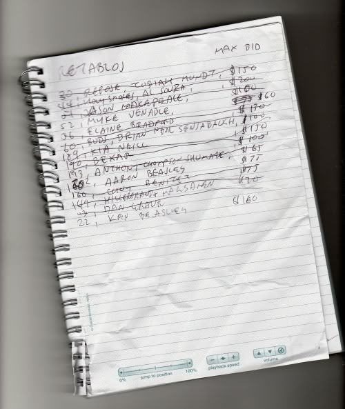
In about the middle of this picture, you can see a woman writing her bid. Now if you wanted to, you could see all the pieces in advance--Lawndale posted them on Flickr. That's what I did. Like the old comics nerd that I am, I made a "want list" before I went to the show.

Lawndale

The ones that were crossed out were ones where I was outbid. I expected that, so I'm not disappointed. Some of the names on this list are among Houston's best known artists. I would have loved to have gotten an Al Souza, but it quickly got up to $400 (and maybe more--I stopped looking after a while). One guy, a collector who signed his bids "Haynes," was constantly outbidding me--he and I had similar tastes apparently.

In the end, I won three pieces. I didn't take pictures of them, but you can see them on Flickr. Weirdly enough (and quite by accident), two of the pieces I won are by brothers, Kenneth James Beasley and Aaron Beasley. Kenneth James Beasley's piece is called Fallen Painter. Aaron Beasley's piece is a parody of Damien Hirst, called The Mental Impossibility of Life in the Mind of Something Dead. It looks like it might be a mess to keep because it contains a real dead shark in a jar. I'll let you know if it starts stinking. The third piece is by Myke Venable and it is called Recycled Retablo. Venable will be in a group show called The New Black: Contemporary Concepts in Color and Abstraction (along with Jonathan Leach, Mike Guidry and Katherine Veneman) that opens October 28, 2010, at Williams Tower. If you are in the Galleria area, check it out.

Friday, October 22, 2010

Homage to R. Crumb, My Father

Rebeca Warren
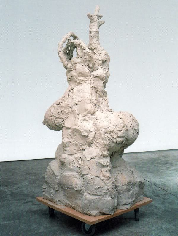
Rebecca Warren, Homage to R. Crumb, My Father, reinforced clay, MDF, wheels, 2003

I don't have much to say about this Rebecca Warren sculpture except that I found it very amusing. When I looked at the photo, I instantly thought, "That ass and that nipple look really Crumb-like." So I had to laugh when I read the title.

Note on The Ferus Gallery by Kristine McKenna

by Robert Boyd

Regular readers know I have a small obsession with the Ferus Gallery, which operated in Los Angeles between 1957 and 1967. Part of the reason for the obsession is that Ferus shows how an art scene can develop outside the artistic capital(s)--New York being the capital of the art world at that time. As someone who lives in Houston and is interested in art, I have to believe things like that can happen--that great art scenes can develop far from art capitals. But another reason for my obsession with Ferus is that Ferus has in the past and continues to this very day to impinge on my artistic life--and, it must be added, on the artistic life of Houston, Texas. Why is that?

I think it largely comes down to Walter Hopps. Hopps and Edward Kienholz were the cofounders of the Ferus Gallery. In 1979, Hopps became a consultant for the Menil Foundation, and then director of the Foundation in 1980. He was also the founding director of the Menil Museum when it opened in 1987. So Hopps had a big influence on art in Houston for a long time, and has an influence even now, years after his death. I'm fairly sure he was responsible for bringing Edward and Nancy Reddin Kienholz to Houston (I and a few fellow students spent a life-changing afternoon with them watching old Kienholz documentaries at the Rice Media Center), as well as Robert Irwin (who was an artist in residence at Rice while I was a student there). The Menil Museum has shown lots of the Ferus artists over the years--solo shows for Ken Price, Ed Kienholz, Jay DeFeo and Andy Warhol, and in group shows, work by Price, Kienholz, Larry Bell, Billy Al Bengston, DeFeo, Ed Moses, Ed Ruscha, and Warhol. Many (if not most) of these artists have work in the Menil's permanent collection. There is a show up right now, "Earth Paint Paper Wood: Recent Acquisitions," that includes pieces by Ken Price and Jay DeFeo. So five years after Hopps death, the Menil is still acquiring work by Ferus artists. And tomorrow (October 23, 2010) a gallery show of Larry Bell work is opening at The New Gallery (this show, however, has nothing to do with Hopps, as far as I can tell).


Ferus continues to fascinate me, so I snatched up THE FERUS GALLERY by Kristine McKenna. McKenna is a Los Angeles-based journalist best-known for her interviews. In this book, she tried to talk to a constellation of people associated with the Ferus Gallery--artists, Irving Blum, various collectors, spouses and siblings of key players, etc. For those who died before she could interview them (Hopps and Kienholz especially), she drew from other interviews. Out of this material, she constructed an oral history of the gallery, full of Rashomon-like contradictions. She also borrowed photographs from her subjects, including tons of casual snapshots. The book leads off with biographies of the major characters in the story, then launches into the chronologically arranged oral history.

The book is absolutely gorgeous. The design (by Lorraine Wild) is beautiful, mixing the casual photos of artists and hangers-on with color photos of the art. This is not an approach you see often in art books. If the book is strongly narrative, it usually is all text with a few illustrations of work and a few photos of the subject(s). If it's a monograph, the photos will be pretty much all artwork. McKenna and Wild realized that the snapshots of the artists were part of the story (part of the history) and were generous in reproducing them, along with images of the artwork itself.


Ken Price, B.G. Red, clay with acrylic and lacquer, 1963

The basic story of the gallery is that Kienholz and Hopps had tried to have their own galleries in the 50s, but were not notably successful. They teamed up to found Ferus. Early on, Ferus showed a lot of San Francisco artists--San Francisco had a better-developed contemporary art scene at the time--along with the youngest, most cutting edge L.A. artists they could find. At some point, Hopps bought out Kienholz's share and brought in Irving Blum as a partner in late 1958. It's unclear if Kienholz left because Blum was coming in or what. It is clear that Kienholz hated Blum and Blum didn't like Kienholz's work. It is funny that both men were partners for Hopps because they seem like complete opposites. In any case, Blum was what the gallery needed--he was suave and could chat up collectors in a way that Kienholz couldn't. Ferus kept exhibiting Kienholz's work until after Hopps left the gallery. At that point, Kienholz's animosity towards Blum caused him to jump ship to the Virginia Dwan Gallery.

In the early 60s, Hopps began curating exhibits for the Pasadena Art Museum (now the Norton Simon Museum). In 1960, he got a full-time job with the museum and left Ferus (he would become director of the museum in 1963). In a way, The Pasadena Art Museum can be seen as a non-profit Ferus outpost. Hopps displayed a lot of the same artists there. Meanwhile, Ferus displayed more and more of the new New York artists, including Andy Warhol's first solo exhibit in 1962. In that year, Hopps put together the first museum show of pop art--before it had been named--called New Paintings of Common Objects. In 1966, Hopps was hospitalized for a nervous breakdown caused by amphetamine addiction. The Pasadena Art Museum, evidently not wanting a speed freak as a director, fired him. He divorced his wife Shirley (from whom he had been separated for about a year) who then went on to marry Irving Blum the following year! And Ferus closed that year.

This book captures the personal and political dynamics pretty well. There was definitely a group who hated Blum--partly because he came in and brutally cut down the gallery's roster, and partly because he was such a slick rick. Sonia Gechtoff out-and-out accuses him of theft (and adds that she could never understand why Shirley Hopps would leave Walter for Irving).

Among the artists, there is camaraderie but also competition. All of the Ferus artists started as more-or-less abstract expressionists (except maybe Ken Price) and quickly moved away from it. Kienholz moved one direction (grungy, socially-aware assemblage), and most of the others moved a different direction (a direction sometimes called "finish fetish" for their use of high-tech manufacturing techniques). They were a bunch of macho sexists who hung out at Barney's Beanery (and, according to Judy Chicago, bragged about their "joints").  Billy Al Bengston was the self-appointed ring-leader and apparently the most competitive of the bunch (it is not surprising that he was also a professional motorcycle racer). Larry Bell remarks that when he started adding industrial glass to his work, Bengston tried to discourage him. Bell realized he had done something that Bengston wished he had done. Perhaps Bengston could see that in the end, he was not going to be top dog. (In my view, the ones art history will remember are Ruscha, Kienholz, Bell, Price, DeFeo and Irwin. And maybe Wallace Berman.)


Larry Bell in his studio, 1961

As I said, there are amazing photos in the book. I want to end with one totally insane one:


Jay DeFeo nude in front of The Rose, 1959

No other artist in the book poses nude with one of their artworks (although there are photos of Robert Irwin naked in a bathtub). So you can wonder about a double standard regarding male nudity and female nudity, etc. But I think this photo is awesome. If I were a photographer, I'd try to imitate it and get artists to pose nude in front of their work. I like the concept. Of course, there are some artists here in Houston who I'd very much enjoy seeing nude before their work--for thoroughly dishonorable reasons. But beyond the voyeuristic thrill of it, I like the idea of the artist stripped bare before the world and the work. The work, in many ways, exposes the artist already. Being nude reflects that.

Wednesday, October 20, 2010

New Acquisition: A "Nexus" Page by Steve Rude

A few weeks ago, I read in the Comics Reporter that Nexus cartoonist Steve Rude was in danger of losing his house to foreclosure. He was having kind of an eBay fire sale to stave off the sheriff (there is still stuff for sale there--check it out). I have been a fan for a long, long time, and even though Rude's art was not the kind I usually collect (specializing, as I do, in pre-1960s comic strips and more contemporary alternative and art comics), I figured this was a unique opportunity to get some and help out an artist I truly admire in his time of need.

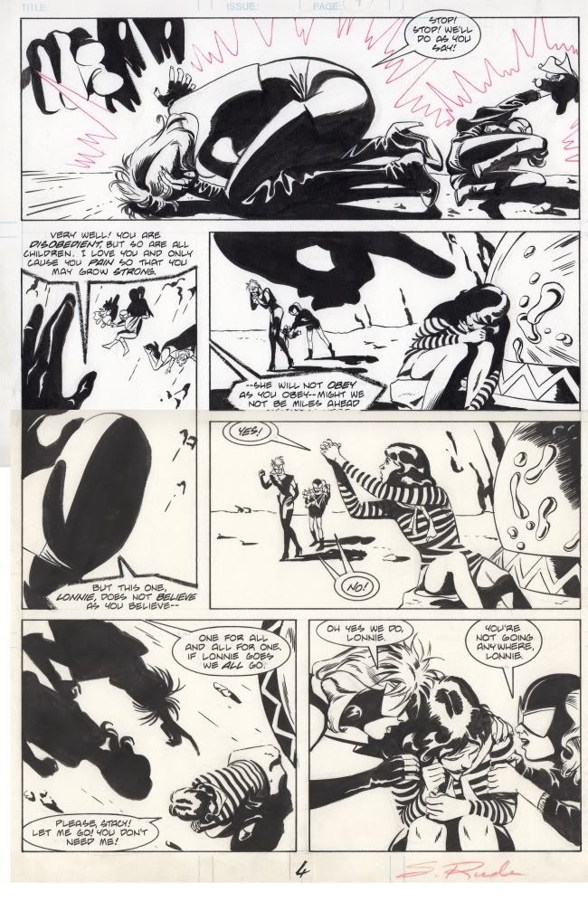
Here's the piece, scanned in color (even though the art is black and white).

Steve Rude
Steve Rude, Next Nexus issue 2, page 4, ink on bristol paper, 1989

Nexus was a comic written by Mike Baron and primarily drawn by Steve Rude. The two created the series together. It debuted in 1981 and I think I discovered it as a reader in 1982 or 83. It was a science fiction superhero series about a man in the far future who is beset by dreams that instruct him to kill mass murderers. The first murderer he kills is his own father, who had been governor of a Soviet planet and ordered its destruction when it looked like rebels might succeed in taking it over. In his guise as a cosmic avenger, the protagonist goes by the name Nexus. If he fails to heed the dreams, he starts to suffer physically some of the same injuries the victims of the murderers suffered. The series played a lot with notions of guilt, including Nexus's own.. It was clever, exciting space opera, beautifully drawn by Rude is a very clean, very old-fashioned style, one that was very much out-of-step with his peers. If I had to give it a name, I'd call it neoclassical. His elegance and simplicity recall neoclassical artists form the 18th/19th century, but even more, they recall Alex Toth and certain American magazine illustrators from the 30s to the 50s.

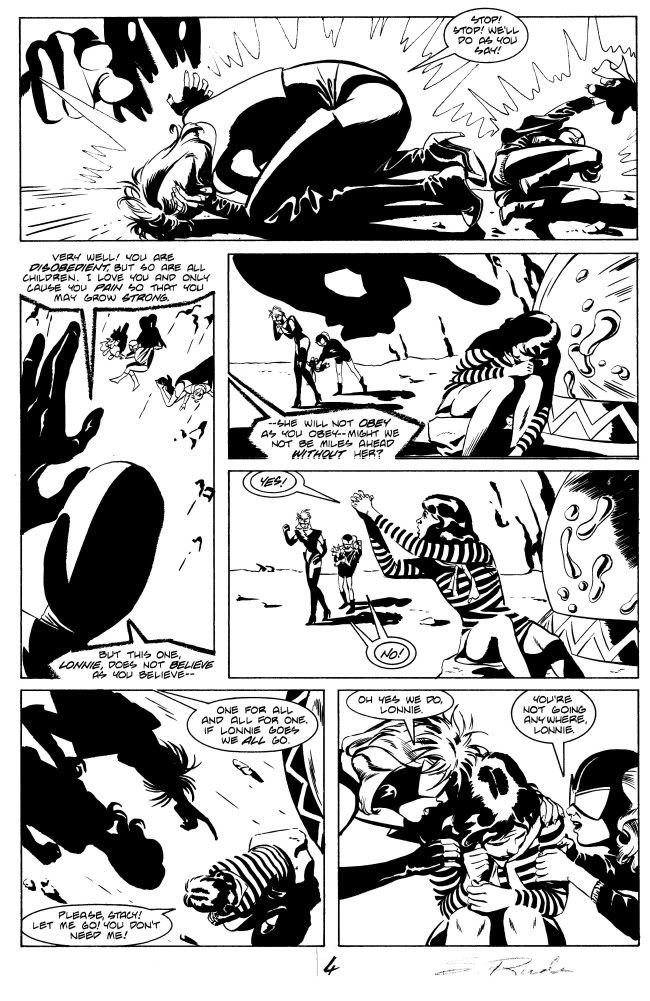
Here is a black and white scan of the same page.

Steve Rude
Steve Rude, Next Nexus issue 2, page 4, ink on bristol paper, 1989

James Drake at the Station Museum

Without knowing much about James Drake, I have to conclude based purely on his art that he is kind of a bad-ass. He has a bravura drawing technique, but is more than willing to drop that and do assemblage. His show at The Station Museum is full of macho imagery--not that it feels like he's saying "Check out me and my big swinging dick," but he does deal a lot with violence and with "things men like." Think of the famous Stuart Davis mural, "Men Without Woman," amp that up to 10 but also give it some anger and some mournfulness, and you start to get to James Drake.

I mean, what could be more bad-ass than this?


James Drake, Artificial Life in the Valley of the World, automobile engine, python snakeskin, 1994

A big V8 covered in tight snakeskin wrapping. Hanging from a chain. If Sailor from Wild at Heart wanted to decorate his crib, this is the kind of art he'd get. What gets me is that this is assemblage. Sure, it took serious skill to cut and sew that python skin into that complex shape, but artistically, this is all about the idea: "Wouldn't it be bitchin' to wrap a car engine in snakeskin." For an artist with prodigious drawing skills, though, this is brave. It is showing a willingness to leave his talent behind and let the idea be the thing.


James Drake, Liar, charcoal, tape on paper, 2008

And drawing talent he has in spades, as in this piece. Drake handles charcoal with vigor and powerful expression. But he also shows his drawing skills in more delicate ways, in his large cut-outs, drawings that require skill and patience. But here, the slashing, decayed charcoal is appropriate. It's an angry work. Is the figure an archetype of liars, a summation of a life of being lied to? Or is it some particular liar that Drake wanted the world to know about. Except the world will never know who he is--his face is deliberately obscured--perhaps as a warning that you never know what the next liar will look like.


James Drake, Avenida Juárez, steel, wood, roofing fabric, paper, pastel, 1989

When you see this dark and beautiful piece, and read the title, you think perhaps of the murders of women there, or maybe of the more recent narco-violence in that tragic town. But this piece predates those events. So an older reference comes to my mind. 

When you're lost in the rain in Juárez
And it's eastertime too
And your gravity fails
And negativity don't pull you through
Don't put on any airs
When your're down on Rue Morgue Avenue
They've got some hungry women there
And they really make a mess out'a you
(Bob Dylan, "Just Like Tom Thumb Blues")

Is the woman in the panel on the right a prostitute? Could be, I guess. The progression from left to right--blue panel, roofing fabic, woman--suggests someone gazing at the sky, lowering his eyes to the building (a very, very modest building), and going inside where she waits for him.


James Drake, Trophy Room, fabricated steel, 1982

This piece seems like a critique of male culture, the whole idea of "kill it and display it," as well perhaps a critique of the wealth that implies. But is it really? It's hard to say for sure--it's scary, being in a black steel room full of weapons and animals, but it's impressive, too. Drake is ambiguous here. Elsewhere, less so. He shows the tragedy of violence in some pieces.

Still, it's hard not to see his work overall as a celebration of manhood. Not in the Maxim-style "bro culture" sense, but in an older way, a Cormac McCarthy way. A celebration with big dollops of anger and regret thrown in.