Sunday, January 31, 2010

Sarah Williams at the McMurtrey Gallery

I reviewed this exhibit earlier this week on 29-95.com. Please read it here. The review makes it sound like all her pictures are somewhat sinister. That's a bit unfair, on my part. The day-time snow scenes aren't sinister at all, and it's only the extreme loneliness of the night scenes that makes them appear somewhat spooky. Anyway, check out the show--Williams is one hell of a good painter.

Sarah Williams
Sarah Williams, Mail Trucks, Oil on Board, 2009

Saturday, January 30, 2010

Jim Love and Aurora Robson

I was over at Rice yesterday for the El Anatsui gallery talk, and I used the opportunity to visit a couple of Jim Love sculptures. As I mentioned in an earlier post, Love was a Houston artist who built assemblage-style sculptures. "Paul Bunyan Bouquet" is a good example of this kind of work.

Jim Love
Jim Love, Paul Bunyan Bouquet #2, brass and cast iron, 1968

This is in the courtyard of Lovett College and has been there since the college was built in 1968 (as far as I know). I wonder if they include sculptures in the new colleges (Martell and the two new ones they are building now)?

Over in Hermann Park is another playful Love piece, the "Portable Trojan Bear."

Jim Love
Jim Love, Portable Trojan Bear, wood, steel, paint, 1974

This is the perfect sculpture to put beside the miniature train in Hermann Park. It almost seems to have been made with kids in mind.

Jim Love

Jim Love

The handles on the back are perfectly kid-sized.

Back at Rice, I stopped by the new Recreation Center to check out "Lift," which was recently installed. First of all, I have to say that compared to the sweaty dungeon that was the gym when I was an undergrad, this gym is freaking amazing. The exercise equipment (in a big, high-ceilinged room surrounded by windows) was super high-tech, gleamingly new. "Lift" is in the main foyer.

You can see some photos of "Lift" being installed here. Here is what it looks like now.

Aurora Robson
Aurora Robson, Lift, plastic and ?, 2009

Here's a view from directly beneath the big ball.

Aurora Robson

Unfortunately, I couldn't go up the stairs to take a looking-down shot. There is an ante-room kind of space open to the public, but to get further inside, you have to either be a Rice student, staffer, or have a membership in the gym.

Aurora Robson did a temporary installation at the Rice Gallery in 2008. Didn't see it? Well, you're in luck. The Rice Gallery publishes heavily-illustrated little books (not quite monographs) on their installations, including one for Robson's installation. These always come out after the fact. I wanted to mention it because it's a publishing program that is really unknown to the wider world, as far as I can determine. And these books are really excellent.

Aurora Robson

One last thought... "Paul Bunyan Bouquet," "Lift" and "Gli," the El Anatsui installation, were all made with trash--surplus industrial metal wheels and gears for the Jim Love piece, plastic bottles from the Robson piece, and metal liquor bottle tops for "Gli." I don't suggest any particular meaning here--it's just an interesting coincidence.

Friday, January 29, 2010

People Watching at the Barkley Hendricks Opening

So I was at the Barkley Hendricks opening tonight at CAMH. See it if you can. It's incredible. If you can't get out of your chair, though, you can see some images here and here. It was a good-looking crowd--appropriate for a bunch of paintings of stylish dudes and chicks. Here are some of the people I saw.

Barkley Hendricks
Two ladies checking out two dudes.

Barkley Hendricks
Guy looks at art, girl looks at him.

Barkley Hendricks
Rasta hat.

Barkley Hendricks
Tall, majestic woman.

Barkley Hendricks
Cutie in miniskirt and boots.

Barkley Hendricks
Cool cat.

Barkley Hendricks
Coolest cat--Barkley Hendricks himself.

BONUS! Here is a black-light installation. Expensive shit, man!


Barkley L. Hendricks, "Fela: Amen, Amen, Amen, Amen," 2002. Oil and variegated leaf on canvas, wooden frame, armature

New Acquisitions--J.R. Williams and Dennis Worden

Last year, as far as comics art went, I collected mostly classic comic strips. This year, I am going to deliberately try to collect underground, alternative and art comics original artwork. I started off with a bit of a windfall--11 pages by two artists, both of whom were key figures in the "newave" comics scene of the 1980s.

J.R. Williams
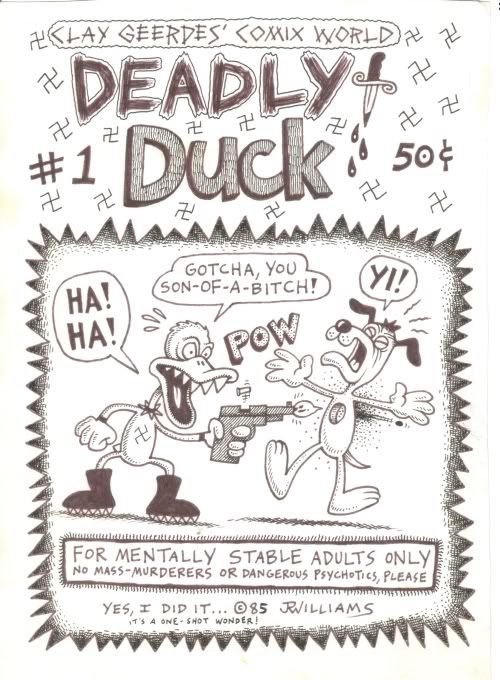
J.R. Williams, Deadly Duck cover, 1985

J.R. Williams is an artist from Portland, Oregon. The pages here are from a minicomic he did in 1985 for Clay Geerdes Comix World. Clay Geerdes was an impresario of minicomics, publishing comics for many artists at the time.

What are minicomics? I guess the strictest definition would be that they were xeroxed comics printed on a piece of letter-sized paper folded over once then again to create a 4 1/4" x 5 1/2" 8-page booklet. But in general, minicomics has come to mean any self-published, micro-print-run comic (usually xeroxed). Minicomics arose with the rise of inexpensive and ubiquitous photocopiers in the 1970s. The people who drew them were amateur cartoonists inspired by the underground comics of the '60s. They formed their own networks through the mail, which in turn lead to an international movement of minicomics. (Minicomics can be seen as a subset of the zine movement of the same period. And many fans and practitioners connected to one another through the zine magazine, Factsheet Five.)

In the early 80s, minicomics were also called "newave" comics. (There is a massive collection of "Newave" comics coming out presently from Fantagraphics Books.) That's the term under which I first became aware of them, through the great comics critic Dale Luciano's mammoth survey of the "newave" scene that ran in several issues of The Comics Journal.  Later, when I worked for Fantagraphics, I started writing a column about minicomics called "Minimalism" for The Comics Journal. I wrote it from 1992 to 1996, but it continues to this day, amazingly.

Many of the minicomics artists were really talented. They did minicomics for a variety of reasons, but for some of them, one reason was a lack of venues where they could get their work published commercially. The undergrounds pretty much died in the 1970s, and nothing took their place until the 80s. In the case of J.R. Williams, he found a home at Fantagraphics, where he had an ongoing series. But unlike many of his minicomics peers, he was a professional artist. When I first met him, he was working as an animator in Portland. He later moved up to Seattle to draw full time, and I later hired him to write a comic for me (Welcome to the Little Shop of Horrors).

J.R. Williams
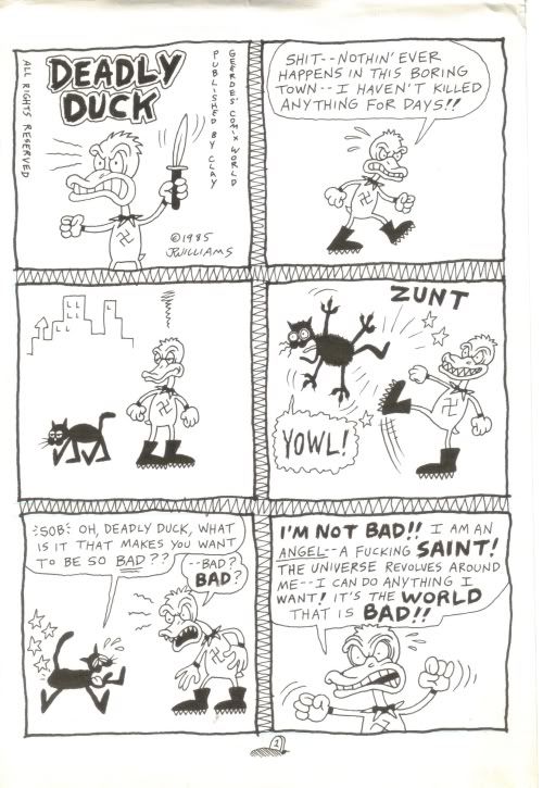
J.R. Williams, Deadly Duck page 1, 1985

Deadly Duck was published in the classic minicomics format. Williams' originals are "two up"--twice the size of the printed pages. His minimal drawing style is highly appropriate to the medium in which he is working, as is his sole idea in this story. In seven tiny pages, you can't put in much plot or characterization. But it's a good size for barbaric yawps like this.

J.R. Williams
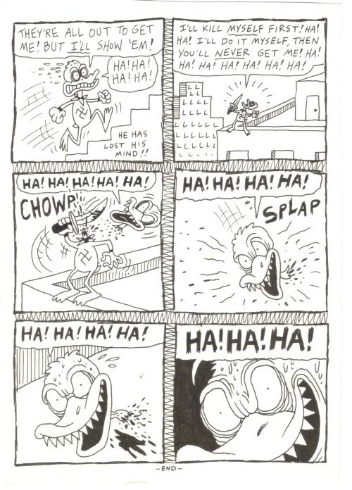
J.R. Williams, Deadly Duck page 7, 1985

I was able to buy all eight pages directly from Williams. They are funny and drawn really well--perfect examples of what minicomics were all about in the 1980s.

Dennis Worden comes out of the same milieu as Williams. He was from the San Diego area. He started getting published in Weirdo, had comics published by Fantagraphics and other publishers, and now does paintings, which he will happily sell to you.

I bought three pages from Stickboy #3 (Fantagraphics, 1989). Worden drew them at pretty much their final printed size (8.5" x 11"), which is not typical (most comics are drawn larger than their final printed size). But Worden's art is so precise and clean (not to mention minimal) that they reproduce very well without having to be shrunk.

Dennis Worden
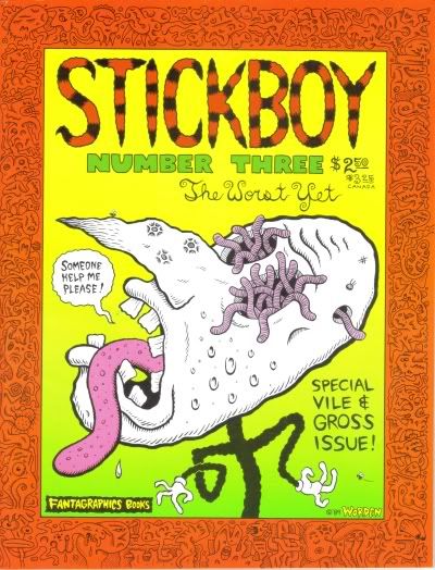
Cover of Stickboy #3

Worden, like Williams, had a powerful wise-ass punk attitude (as you will see in the pages I bought), but he also was unusually philosophical. (There is a self-mocking fan letter from Wayne White in Stickboy #3 praising Worden's philosophy.) Unlike most cartoonists Worden is an intellectual--a cranky, self-taught intellectual. I think Robert Crumb provided the path. Crumb is a universal cartoonist--within his vast work, every kind of self-examination takes place. Crumb is willing to tackle philosophical and religious ideas, and his own relationship to them, in a way that I think many cartoonists avoid out of a fear of looking foolish. Not Worden--he was quite willing to do the same and defend himself against attacks on his beliefs.

I love Worden's crisp minimal art, and always thought his comics were great. As far as I know, no one ever issued a book collection of his work. So if there is a publisher out there looking for an unusual project, I would say please publish a collection of the comics of Dennis Worden.

Dennis Worden
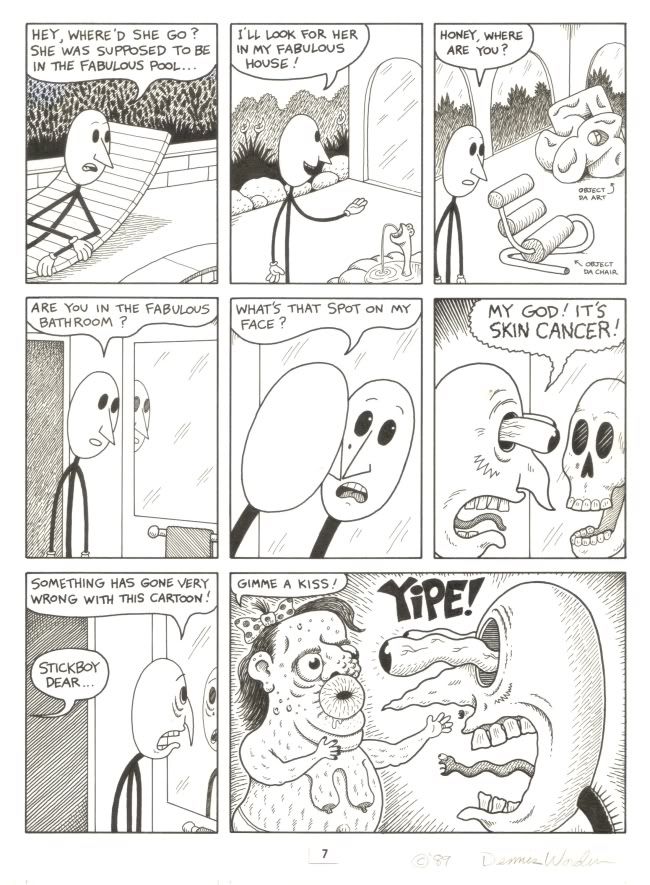
Dennis Worden, Stickboy #3, page 7, 1989

Dennis Worden
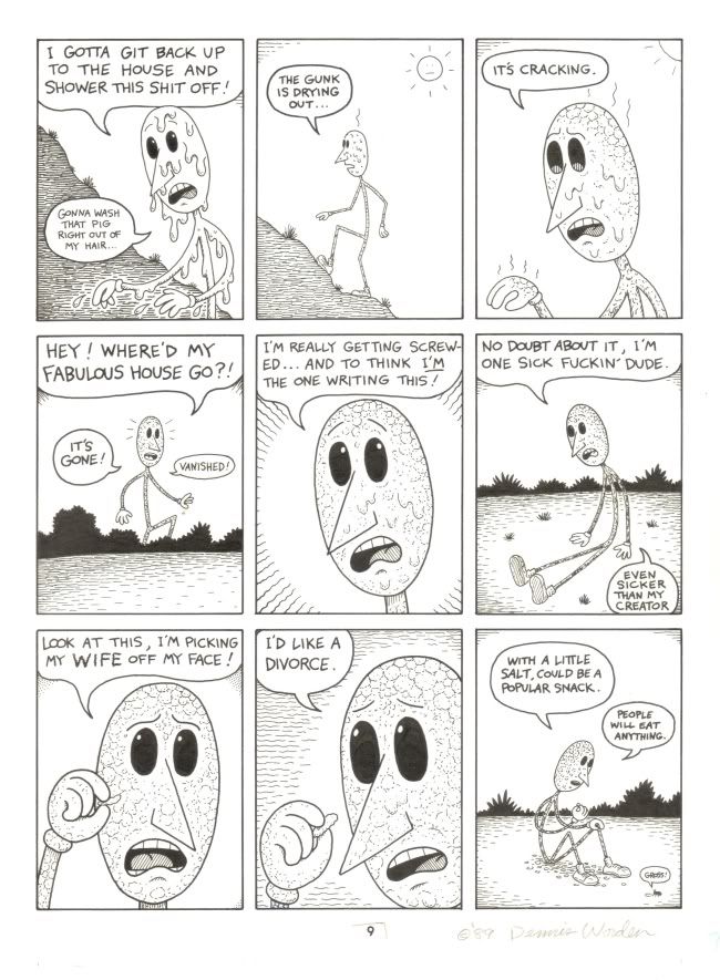
Dennis Worden, Stickboy #3, page 9, 1989

Wednesday, January 27, 2010

Note on Jim Love: From Now On

http://content-3.powells.com/cgi-bin/imageDB.cgi?isbn=9780856676093 
Jim Love: From Now On
This big book is a retrospective of the work of sculptor Jim Love. Love (1927-2005) was one of Houston's first modern artists, and his biography is a major part of the art history of Houston. This is a subject that interests me greatly (as regular readers know). In the sixties, Mad Magazine published a piece called something like "Incredibly Short Books." The titles were along the lines of "The Humility of Mohammed Ali" and "Great Military Victories of the Italian Army." On the face of it, "The Art History of Houston" would be such a book.

But I am fascinated with this history, largely because I'm here and can witness it happening. But also, because I like seeing how art history unfolds in "provincial" locations, outside the art capitals. And what is interesting about looking at art in these places is to see how it evolved in its own unique way (always, though, in a kind of dialogue with the art capitals). That's why I am fascinated with the history of the Ferus Gallery and the evolution of art in L.A. during the sixties. I am very interested in Soviet non-comformist art for the same reason. (I also happen to like the art of both places quite a lot.) I'm not suggesting Houston artists have achieved what the L.A. artists of the 60s or the non-conformist artists did, but the story of Houston's art is still interesting.

Love was one of the earliest modern artists in Houston. Love went to Baylor and fell in with the theater crowd. He started building theater sets, and eventually met Jermayne MacAgy. She hired him to be a "museum technician" at the nascent Contemporary Arts Museum in 1956. (MacAgy is a key figure in the history of art in Houston. She was hired to come to Houston by the great catalyst of art in Houston, Dominique De Menil.) It was only after he started working in the museum that Love started making art by welding bits of junk together. That was, more or less, his career until he died.

He was lumped in with the assemblagists early on, but his art isn't like Rauschenberg or Kienholz. The artist he most resembles is H.C. Westermann (from another "provincial" art city, Chicago). But Love was a lesser artist. There aren't great depths in his work, nor was he as formally inventive as his peers in New York and Chicago and Los Angeles. His work has a kind of sweet childlike quality, reflected in his subject matter--flowers, jacks, teddy bears.

As a Rice student, I saw his sculpture "Paul Bunyan Bouquet #2" on campus often (it was, and as far as I know still is, in the Lovett College courtyard). I always thought it was kind of ridiculous. I've mellowed towards it as I've gotten older. I can enjoy the charms of Love's work now. His work is visible all over Houston. (I'll try to take photos of some of the public work, and add their locations to my art map.)

This book has great photos of most of Love's work. The essays and timeline that accompany the photos give you a good idea of where Love came from and his place in the local scene. The Mel Chin piece is an especially interesting tribute.

Two More Reviews up at 29-95

Two reviews of two very different shows have been posted at 29-95.com. One is by Francis Giampietro at the new alternative venue, the Temporary Space.

Francis Giampietro
Francis Giampietro, Contrapposto, mixed media, 2009

The other show I reviewed is a group of paintings by Joseph Cohen up at Wade Wilson Art.

Joseph Cohen
Joseph Cohen, Proposition 92, reclaimed latex, enamel, automotive paint and resin on birch & pine

Joseph Cohen
Joseph Cohen, Proposition 138, reclaimed latex, enamel, automotive paint and latex on walnut

Both of these shows are excellent. If you have time, check them out.

Tuesday, January 26, 2010

Movie I Want to See

Monday, January 25, 2010

More Top Comics

As I mentioned earlier this month, I am trying to catch up on some of the 2009 comics that were on peoples' top 10 lists this year. My main resource in this is the "meta-list" at I Love Rob Liefeld. So here are a few notes on a few from that list (and one from another list) that I read recently.

http://content-5.powells.com/cgi-bin/imageDB.cgi?isbn=9781596434585 
The Color of Earth by Kim Dong Hwa. This Korean coming of age story deals entirely with a young girl's coming into knowledge about sex and love. At first it seemed a bit too cutely, but I gradually came to really love Ehwa, her mother, the "picture man", and young monk (Ehwa's age) who is smitten with her. The remote rural setting in the last century (exactly when is not clear) adds a lot. I would not have put this in my top 15 list, but definitely on the honorable mention list.

http://content-5.powells.com/cgi-bin/imageDB.cgi?isbn=9781596433755 
The Photographer by Emmanuel Guibert, Dider Lefevre, and Frederic Lemercier. OK, I have no excuse for not reading this when it came out (except that I never saw it at my local comic shop). At first, I found the visual transition from color comic to black and white photo a little hard to process, but my eye quickly got used to it. Extremely powerful. This book would definitely have made my top 15.


http://content-3.powells.com/cgi-bin/imageDB.cgi?isbn=9781606991633 
The Red Monkey Double Happiness Book by Joe Daly. I didn't know what to expect when I got this, but what I got was definitely a pleasure. These two picaresque stories of modern-day South African neo-hippies really reminds me of The Fabulous Furry Freak Brothers, without all the drugs. Protagonists Dave and Paul are naive fuck-ups who have basically decent motives. Fun, but not top 15 material. Definitely on the honorable mention list (not least for the extremely enjoyable drawing).

http://content-3.powells.com/cgi-bin/imageDB.cgi?isbn=9781561635443 
Miss Don't Touch Me by Hubert and Kerascoat. OK but nothing special. This art team more or less come out of the Sfarr-Trondheim school of mainstream French comics. Basically these artists have injected a certain degree of new life into French mainstream comics, but the problem is that while the art and stroytelling might be fresher, the stories are not necessarily all that memorable. That was my reaction to this story.


http://content-8.powells.com/cgi-bin/imageDB.cgi?isbn=9781561635238 
Little Nothings by Lewis Trondheim. On the other hand, when Trondheim does more personal work, the results are magic. I loved this book. Very possibly top 15 material.

http://content-7.powells.com/cgi-bin/imageDB.cgi?isbn=9781596433007 
Ball Peen Hammer by Adam Rapp and George O'Connor. Wow, this was terrible. A pointlessly nihilistic post-apocalyptic scenario married to lame art that reminded me of Vertigo at its worst. I can't believe this made the top 100 meta-list, but it did--#85, ahead of both Popeye vol. 4 and Tardi's You Are There. Astonishing.


http://content-1.powells.com/cgi-bin/imageDB.cgi?isbn=9780547154121 
Tamara Drewe by Posy Simmonds. Really good--better than Gemma Bovary. Simmonds did a series of strips called the Literary Life in which she poked fun at the businesses of writing, publishing, and bookselling. She seems to have taken the knowledge she acquired doing those strips and applied them liberally to Tamara Drewe, to very goo effect. The book is only marred by an ending that wraps everything up too neatly. But still, it would have made my list for sure.

Now I've read 35 of the top 100, and I'll probably read more. Despite my problems with that meta-list, it does show how good comics are now--the best of the best on that list are easily better than what has ever been available to English language readers in previous decades.

Saturday, January 23, 2010

The Forever People

Robert Pruitt
Robert Pruitt, Be of Our Space World, Charcoal, conte, mixed media, 2009

This image is from the new Robert Pruitt show at Hooks-Epstein. I wrote a review for it on 29-95.com--please check it out. It's a lovely show.

Monday, January 18, 2010

Wishing Well for Houston

I saw a whole bunch of shows this weekend, and some of them were really good. I would be writing about them here except that 29-95.com pays me to cover them over there! Sweet deal, right? But for those Pan readers--both of you guys--who are feeling neglected, I figured I better at least link to my other pieces.

So one of the shows was an installation called Wishing Well for Houston (at the Art League). I tried something I had never done before. Employing the video function on my Sony Cybershot, I interviewed one of the three artists who made the Wishing Well. You can hear my awkward questions and Brian Piana's gracious answers here at 29-95.

So go to the Art League and check it out. And while you are there, you can feast your eyes on the inspiring and sometimes moving art of the best of Houston's high school artists, the Scholastic Gold Key art exhibit. I think the Art League hosts this every year. If you took art classes in high school, you are probably familiar with this. I entered every year and never made it. Well, looking at this art, I can see why. These kids blow me away with thier talent. So a great two-fer at the Art League. Check it out.

Saturday, January 16, 2010

Best Comics of 2009, cont.

I wrote my own "Best of 2009" list here, and one caveat I made was that there were many highly regarded comics I had not read, either because I hadn't seen them yet (but surely intended to read them when I did) or because I just didn't bother.

The blogger at I Love Rob Liefeld has gathered all the best-of lists he could find to create what he calls a "Best Comics of 2009 Meta-List." It has 100 entries (although it only counts the top 97, due to ties). He used 130 lists to compile this meta-list.

First of all, this list tells me how much I didn't read last year. Of the 100 listed here, I had read 27 (including only 5 of his top 10) when I compiled my list. Even weirder (to me) is that there are five in my top 15 that don't make the meta-list at all! They are Little Orphan Annie vol. 3, Journey vol. 2, Dick Tracy vol. 8, Multiforce, and Map of My Heart. Their exclusion from the list makes me doubt its usefulness as an actual record of the best of the best. A critical consensus that says that there were 100 comics better than those in Little Orphan Annie vol. 3 is just plain wrong.

That said, I plan to dig into the list and read at least some of the titles that I seem to have overlooked. I already have read Footnotes in Gaza and am reading the big Alec book (I'm fairly sure I've read it all before in various forms). These were two that were published after I wrote my list. I also read the first volumes of 20th Century Boys and Pluto, and the first two of Scott Pilgrim. Footnotes in Gaza and Alec belong on the top 100 list (indeed, probably the top 10). I'm less sure about the others, which had their virtues but didn't blow me away. I will be reading more of Pluto and 20th Century Boys--they are both intriguing series. While I recognize the quality and verve of Scott Pilgrim, I feel too old for it. And it just seems a bit slight. It is clever, though, and well-drawn.

As I read more from the meta-list, I'll mention them here. I am certainly not going to read all the books (there is a Batman series at 15 (!) on the list--all I can say is that at the age of 46, I just have zero desire to read about a man who dresses in a leotard and leather mask and beats up criminals... I read enough of those comics, and so I am exercising my perogative to not care.)

Thursday, January 14, 2010

Wayne White Goes to the Thrift Store

The Oxford American produced this great short video of Wayne White.


SoLost: Wayne White Goes Thrifting from Oxford American on Vimeo.

(Weird fact about The Oxford American--they are located in Conway, Arkansas--which is where Southwestern Energy, my employer, has its Arkansas headquarters.)

Wednesday, January 13, 2010

Aurora Robson

I am totally stealing a couple of photos from C-Monster--I encourage you to click through and see more. The reason I'm doing this is 1) because they look so cool, and 2) because Houston has a new permanent Aurora Robson sculpture. It's going into Rice's new gym (er, I mean "recreation and wellness center"). As soon as I get a chance, I'll go over and take some photos. But in the meantime, feast your eyes on these:

http://farm3.static.flickr.com/2791/4252789440_765c9abfef.jpg

http://farm5.static.flickr.com/4068/4252018247_23bc872378.jpg

Monday, January 11, 2010

Emily Sloan at Redbud Gallery

My first professional art show review (really!) is up at 29-95.com, which is the Chron's blog for various culture around town. Please check it out. And you can read what I've written in the past about Emily Sloan on Pan here.

Sunday, January 10, 2010

Recent Acquisition: Rick O'Shay

Stan Lynde grew up on a sheep farm in Montana and became a cartoonist in the navy. After his military service, he developed a satirical strip, Rick O'Shay, set in a small Montana town called Conniption. It seems to be set in the 19th century but simultaneously in the present (the early 60s). It was a funny strip with long involved stories (relatively unusual for new comic strips at the time, which tended to be "gag a day" strips). Not surprisingly, it was strongly influenced by L'il Abner and especially Pogo. But something rather weird happened over the course of the 60s. These cartoony characters got less and less cartoony. The intrusions of the present-day into the 19th century frontier disappeared, and by the early 70s, Rick O'Shay had been transformed to a more-or-less realistic comics strip in a Western setting. There was still a lot of humor, but there was also a lot of action. It was this somewhat more serious Rick O'Shay strip that I fondly remember reading as a boy. According to Lynde, his last strip was on May 7, 1977.

This strip is dated May 20, 1977. What th--?!

Stan Lynde
Stan Lynde or Alfredo Alcala, Rick O'Shay, ink and halftone film on bristol board, 5/20/1977

Here is what it looks like in color.

Stan Lynde
Stan Lynde or Alfredo Alcala, Rick O'Shay, ink and halftone film on bristol board, 5/20/1977

As you can see, the halftone film has yellowed significantly, which is what happens with old comic strip art.

So how is it that I have a strip dated from after the last strip that in this series that was published? I can think of two possible explanations. Lynde left the strip after a contract dispute with the syndicate. The strip continued with a different writer and Alfredo Alcala on art. So even though the strip I have is signed by Lynde, it could be an Alcala strip. It looks like Lynde's artwork, but Alcala was a monstrously talented artist who could have easily aped Lynde's style, as would have been a requirement of the job in taking over the strip. But maybe Lynde worked so far in advance that when the dispute with the syndicate came to a head, he already had several weeks more already done. (Lynde doesn't mention the dispute at all in his memoir.) One factor supporting the Alcala theory is that much of Lynde's original artwork was lost in a fire at his house in Montana. So not that many Lynde originals are circulating out in the world.

I'll have to do some research on this one, but if it's a strip Lynde drew that was never published, it is certainly a curiosity. If it's an Alcala version of Lynde, well, that's less exciting than owning a Stan Lynde original, but not too bad.

Lynde left Rick O'Shay at the height of his creative powers. He drew several more strips (all of which were good, if not as successful as Rick O'Shay) and wrote some fairly creditable Western novels. He started his own publishing company, Cottonwood Publishing, and through it interested readers can purchase book collections of Rick O'Shay and his other strips, which I highly recommend. The best place to start exploring the work of this comics great would be Rick O'Shay, Hipshot and Me, which is where I got the date May 7, 1977, as the last Lynde Rick O'Shay.

Saturday, January 2, 2010

A Half Year in Art in Houston

This was a pretty weird year, because for the first half of the year, I hardly saw any exhibits. This reflects inertia on my part, and this inertia was what induced me to start this blog. The blog itself would be the inducement I needed to get the hell out the front door. Consequently, even though there were some worthwhile shows in the first half of the year, I'm concentrating mostly on the year since June. So here is my list of my favorite artists and/or events of the year.

a "pushme-pullyou" in Elaine Bradford's studio, 2009

1) Elaine Bradford. One of the few shows I saw early in the year was "The Museum of Unnatural History" by Elaine Bradford at the Art League. I loved the combination of taxidermy forms and knitting. Her work was later shown at Lawndale, and I got the opportunity to see her studio one night at Box 13.

Kathy Kelley, (not sure what the title is), rubber, 2009

2) Kathryn Kelley. Kathryn Kelley is an artist who combines a rigorous post-minimalist approach with really personal work. I am not revealing any confidences in saying that this past year has been an emotionally tough one for her--it's all over her art and her blog. I saw her solo show at Ggallery and then saw more work recently at Box 13, where she also has her studio.

Oneself by Oneself, Stephanie Toppin, 2009

3) Stephanie Toppin. I first saw Stephanie Toppin's long, super-colorful "autobiographical" abstract painting at the $timulus show Diverse Works. Then a larger version of the same piece was put up at Box 13 (above). Then she had drawings up at the Frenetic Fringe Festival, and I bought a few (they were a bargain!). Then finally, she had a show at  Rudolph Projects, where I took the plunge and bought a painting of hers.

Carlos Runcie-Tanaka, Huayco/Kawa/Rio, ceramic

4) Carlos Runcie-Tanaka. This Peruvian artist had a haunting, moving show of ceramic installations at the Station Museum, which I couldn't stop thinking about for a long time after I saw it.

http://swamplot.com/wp-content/uploads/2009/05/give-and-take-hole.jpg
Havel and Ruck, Give and Take, hollowed-out house, 2009

5) No Zoning. I said some unkind things about this show at CAMH, but loved the catalog. But for me, it was an introduction to a certain art history of Houston and group of artists who were worth knowing. I subsequently met Bill Davenport (and played ping pong with him) and Jim Pirtle, who managed to change my mind about No Zoning. (Plus there were funny comments on Facebook.)

Wayne White, Big Lectric Fan to Keep Me Cool, installation details, 2009

6) Wayne White. This painter/sculptor/cartoonist/puppeteer had a huge genius installation at the Rice Gallery--a huge cartoon head of George Jones. He also had a great art book out this year (signed copies still available at Brazos Bookstore--get it!) and even a couple of paintings at Inman Gallery.

Jorge Galvan, This Land Was Made (detail), mixed media, 2009

7) Jorge Galvan. Jorge Galvan is a student at the University of Houston. He had an installation at Project Row Houses this summer that blew me away with its use of text and construction materials to form a tribute to laborers. Then later, during the Art Crawl, I saw a functional sculpture of his called "American Bred." I liked it so much that I bought it!

Dario Robleto, An Instinct Towards Life Only a Phantom Can Know,  mixed media, 2007-2008

8) Dario Robleto. Dario Robleto's work up at Inman Gallery just blew my mind. It was so well crafted and so visually interesting, then had additional layers of meaning added when you learned what it was made of. I'm really still trying to absorb it. It was breathtaking.

One final observation--there seem to be more excellent artists in Houston who are women than who are men. In addition to the ones I listed above, I have seen and loved work by Emily Sloan, Kia O'Neill, Beth Secor, Carmen Flores, Jasmyne Graybill, and Karin Broker. (That said, there was excellent art by dudes as well--the Art Guys, Matthew Guest, Seth Alverson, and Mark Greenwalt, for example.)