by Robert Boyd
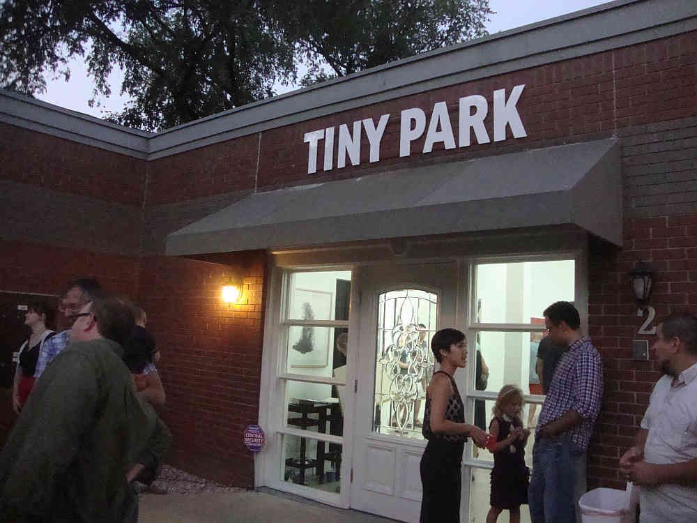
In spring, I visited various Austin art establishments and one that impressed me a lot was Tiny Park, an apartment gallery in North Austin. Last night, Tiny Park made the transition to being a storefront gallery. It's not quite what I'd call a full-fledged gallery--the owners/directors, Brian Willey and Thao Votang, both have full-time jobs which means the gallery is only open on Saturdays and occasionally during the week for special events. But it's ambitious, and I respect anyone who tries to do anything serious with art while maintaining a full-time job (which, after all, is the "business model" of The Great God Pan Is Dead).
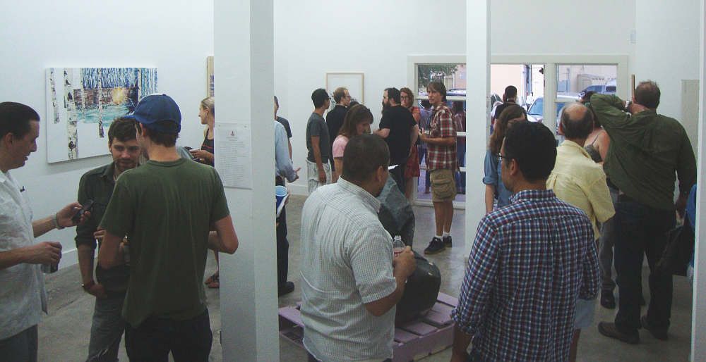
The opening, which was a "greatest hits" show rather than an exhibit of all new work, was well-attended. Jaime S. Castillo told me that roughly half the people there were the type of people who would show up to Tiny Park openings in the old apartment location, and the other half were people who showed up for gallery events but had never made the trek out to the old, relatively obscure location. (This was a very rough estimate on his part.)
Austin's gallery scene seems to always be in a state of struggle. (Not that it's a walk in the park in Houston.) I heard lamentations about Art Palace's move to Houston--and that happened two years ago. So Tiny Park is fulfilling an important role. I hope the responsibility isn't to much for them!
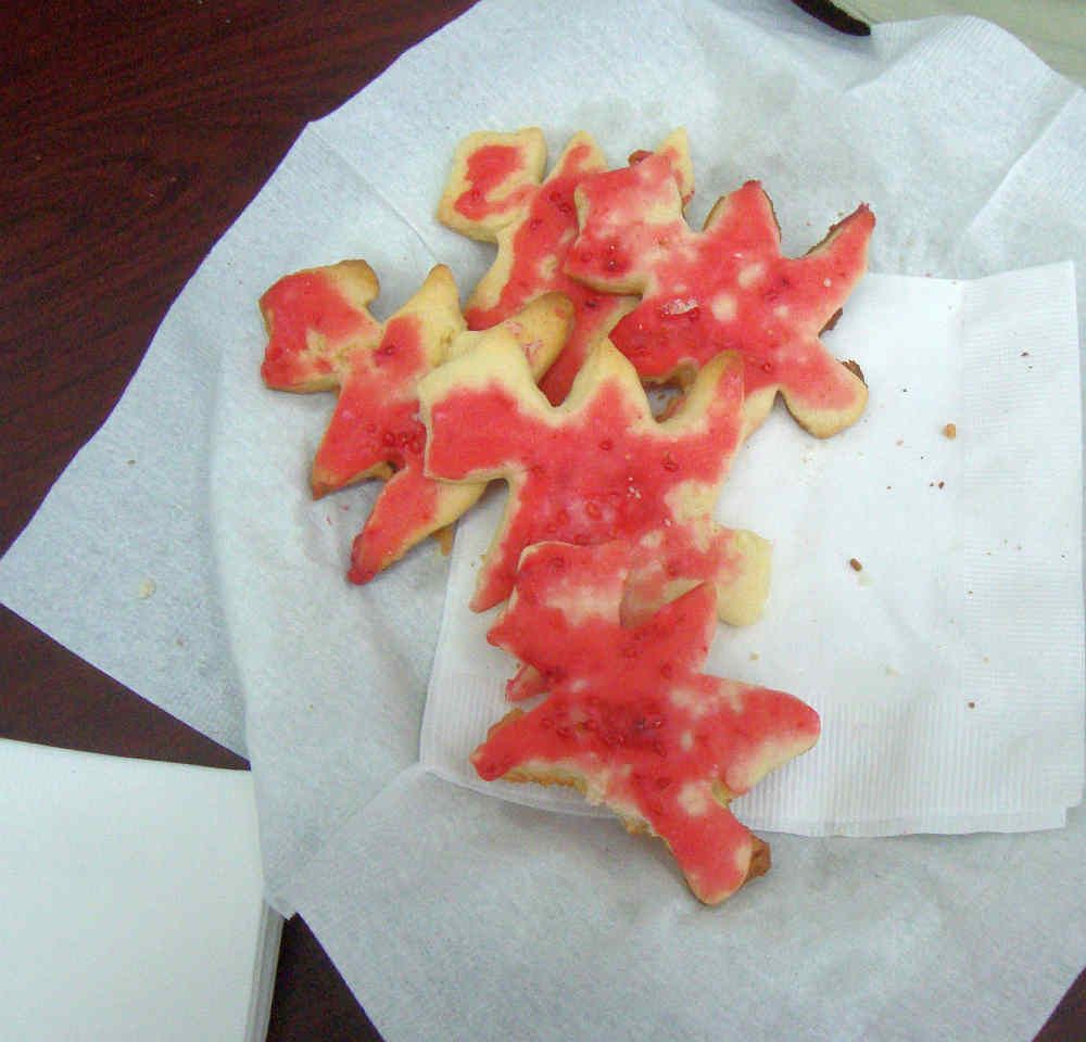
Even though it's an official white cube gallery now, it still retains a bit of the old apartment gallery vibe. Like these cookies, baked in the shape of their red Christmas tree logo.
I had seen a lot of the art here the last time I visited. But there were also pieces that were new to me that I liked a lot.
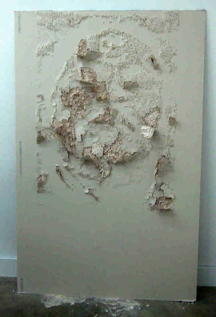
Miguel Aragón, Retrato #4, Tabla de Yesa, hand drilled drywall, 65" x 48"
My first reaction to this piece by Miguel Aragón was that this was some random piece of garbage--a chunk of damaged drywall from a construction site. In short, a typical piece of "post-craft" art. But I was quite wrong, because facing it was this piece:
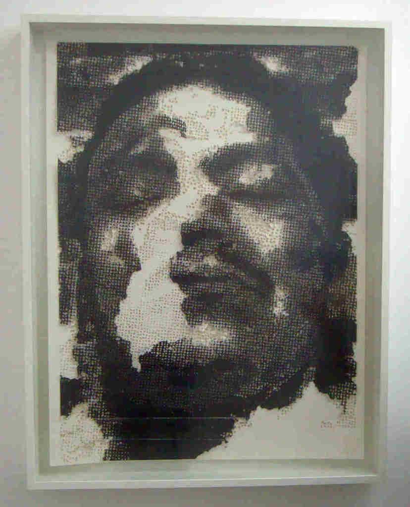
Miguel Aragón, Retrato #4, Matriz, hand drilled paper with xerox, 65" x 48"
So the drywall was a part of the process to make this piece. And the process is itself part of the piece. When you realize this, you can see the face emerging out of the drill-holes in the drywall. And the face itself is disturbing--it appears to be the face of a corpse. The damaged quality of both pieces invokes a sense of violence, and the way the image--which looks like a blow up from a newspaper photo--is partially erased reminds me of the work of Oscar Muñoz.
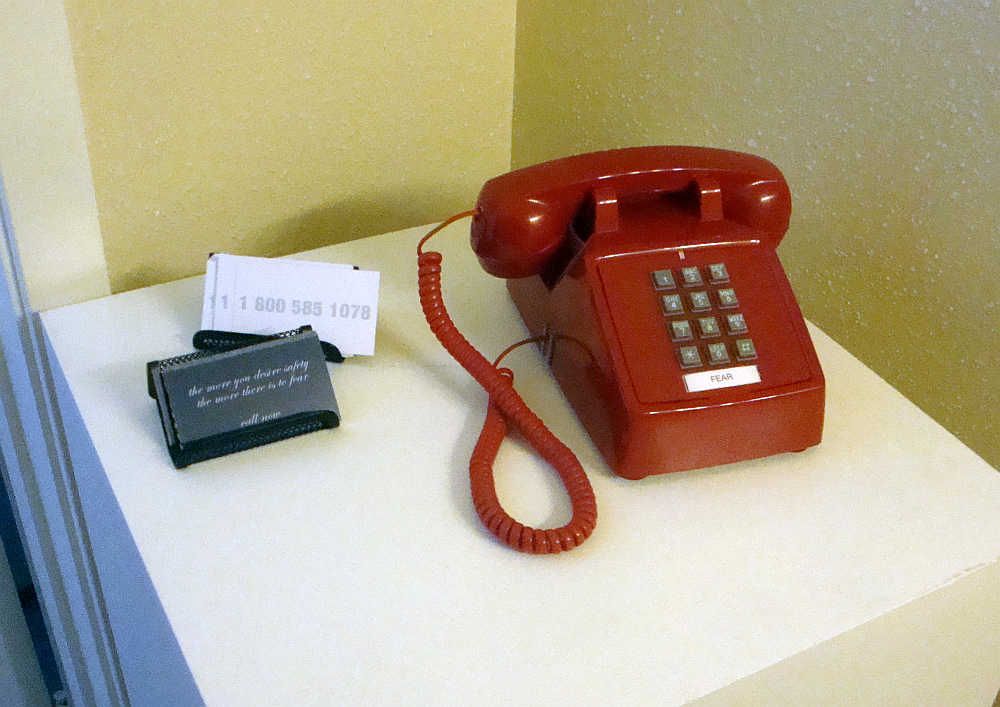
Deborah Stratman, Fear (Call Center v. 2), 2012, mixed media
Fear was in the bathroom. This piece by Deborah Stratman is one that you yourself can experience by calling 1-800-585-1078 and describing your greatest fear. Stratman has been cataloging these fears since 2004. She plans to continue doing so until 2014. What will happen then, I don't know. But until then, it might be therapeutic to tell an answering machine the thing you fear the most.
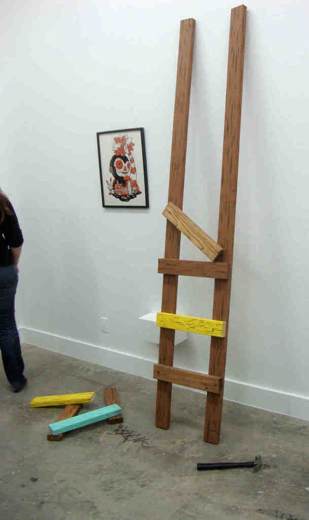
Michael Sieben, Abandoned Ladder to Heaven Sculpture, 2011, mixed media
Michael Sieben's Abandoned Ladder to Heaven Sculpture was the funniest piece in the exhibit. The ambitious goal (a ladder to Heaven) is lazily undermined. It made me think of the dream of Jacob in Genesis 28:10-19, of course, and Bernini's Ecstacy of St. Teresa, but filtered through a slacker consciousness. Instead of being an ecstatic visionary like Jacob or St. Teresa, the builder of this ladder to heaven is a lazy slob who completes three and a half rungs before giving up and leaving his tools strewn on the floor. In a way, it could be read as an allegory of certain contemporary art practices--the willingness to half-ass the job as long as the concept is minimally communicated (or not). But's that's my gripe, and Sieben might not have been thinking about that at all.
Saturday, June 30, 2012
When Billionaires Attack
by Robert Boyd
A big piece of news in the art world this week was the summary dismissal of Paul Schimmel from MoCA in Los Angeles (some MoCA board members insist he resigned). He was MoCA's chief curator for over 20 years. One of Schimmel's first shows was Helter Skelter in 1992, a group show that was generally panned at the time but in retrospect seems very important. Personally, I loved Helter Skelter. When Misfit Lit, a show of alternative comics that I helped to curate, went to LACE, I flew down from Seattle with Larry Reid and Pat Moriarity to help install it. While we were in LA, we went to see Helter Skelter at the big Temporary Contemporary building (now permanent, it is called the Geffen Contemporary). At the time, what got to me was how dirty the show was--Paul McCarthy's robotic mannequins fucking trees! Robert Williams' paintings full of tits and ass! But in retrospect--and very influentially from my point of view--was that it combined very grungy aspects of performance and conceptualism with figurative "low brow" art, and the combination worked beautifully.
Schimmel (who was a curator at the CAMH in Houston in the late 70s) was at MoCA for 20 years, so he must have been doing something right. So what happened? Here's how Mat Gleason described events:
This reminded me of an incident that has been in the news the past few weeks. This is the firing (and subsequent reinstatement) of University of Virginia President Teresa Sullivan. Sullivan, who had been president of UVA for two years, was abruptly fired by the Board of Visitors (UVA's version of trustees). The story here is complex, but similar to the MOCA story. Powerful donors and Board of Visitors members didn't like the direction Teresa Sullivan was going with the university--specifically, they wanted a very quick transition to online university classes on the Coursera model, which seems to be the flavor of the month. And, because they are rich and successful, they figured that whatever disagreements they had with Sullivan were a result of her inadequacies. The story of the scheme was leaked to the public and it quickly fell apart. The governor of Virginia quickly appointed a largely new Board of Visitors who reinstated Sullivan.
Some commentators have suggested that what the Board of Visitors was doing was part of a general attempt by conservative Republicans to seize control of higher education, which they see as one of the bastions of liberalism. After all, Virginia Bob McDonnel is a Republican and appointed all of the Board of Visitors. The suggestion is that if state universities are transformed into primarily trade and professional schools and away from the research institution/university model, they will no longer be liberal redoubts. And maybe this is true, but I think there is a slightly different (if overlapping) explanation, one which Siva Vaidhyanathan, writing about the Sullivan debacle for Slate, put his finger on.
But hasn't it always been so? Didn't Nelson Rockefeller and Stephen Clark fire founding MoMA director Alfred Barr in 1943? So how is Broad, acting through Deitch and the trustees, firing Schimmel any different? I don't think it is qualitatively different. But what we have seen is the massive rise in the number of super-wealthy individuals and a rise in this kind of meddling--whether at universities or at museums. In some cases, these wealthy individuals might be self-dealing. They get a museum to show their collection, and that causes their collection to become more valuable. But I think probably just as often there is a sense of, I'm rich, I earned my money through my wits and my savvy, therefore I am imminently qualified to be a curator or museum director--or at least pull the strings of any nominal director or curator.
In short, events like the firing of Schimmel may be just one more sign of how the balance of power in the U.S. and in the world generally has shifted away from the 99% all the more firmly into the hands of the 1%--or more realistically, the .01%. (Since the expansion of the .01% has been largely driven by economic rents extracted by the financial industry, I think we should call these people the "basis point," which is finance jargon for 1/100 of one percent.) Broad, with his fortune derived from home building and insurance, is one of the top basis points in the U.S. And he is letting us know that when it comes to running an art institution, he knows better than any seasoned professional.
A big piece of news in the art world this week was the summary dismissal of Paul Schimmel from MoCA in Los Angeles (some MoCA board members insist he resigned). He was MoCA's chief curator for over 20 years. One of Schimmel's first shows was Helter Skelter in 1992, a group show that was generally panned at the time but in retrospect seems very important. Personally, I loved Helter Skelter. When Misfit Lit, a show of alternative comics that I helped to curate, went to LACE, I flew down from Seattle with Larry Reid and Pat Moriarity to help install it. While we were in LA, we went to see Helter Skelter at the big Temporary Contemporary building (now permanent, it is called the Geffen Contemporary). At the time, what got to me was how dirty the show was--Paul McCarthy's robotic mannequins fucking trees! Robert Williams' paintings full of tits and ass! But in retrospect--and very influentially from my point of view--was that it combined very grungy aspects of performance and conceptualism with figurative "low brow" art, and the combination worked beautifully.
Schimmel (who was a curator at the CAMH in Houston in the late 70s) was at MoCA for 20 years, so he must have been doing something right. So what happened? Here's how Mat Gleason described events:
Paul Schimmel was fired at MOCA - it was the end of the fiscal year and they tightened the belt. It is easier to have a corporate sponsor pay a guest celebrity curator - the curating has been outsourced.
The design department is outsourced to Sheppard Fairey’s design company, the education department gets grants and therefore competes with the Board for power so people there are being hacked away left and right, but the cutting off of Schimmel is a bold move by the Jeffrey Deitch/Eli Broad consortium to advance the outsourced party time event based museum that will not function as a repository of great art but of great parties.
If Moca is downsized into a celebrity-curated kunsthalle style circus, it will give the blue chip Broad across the street more Gravitas. And then of course when MOCA is broke yet again - who will save MOCA by purchasing the best paintings in the collection because the museum is more concerned with event programming? The Broad Museum across the street of course. [Mat Gleason, "MOCA Fires Curator Paul Schimmel," Coagula, 6/27/2012]Eli Broad is being fingered as the evil mastermind, with Deitch as his hatchet man. Art Fag City lends some credence to this theory by pointing out Broad's recent involvement with MoCA.
According to the email, Schimmel was let go in conjunction with a number of curatorial assistants and other employees. This news comes just four years after wealthy benefactor Eli Broad pledged to donate up to $30 million over five years to the museum with “the expectation that the museum’s board and others join in this effort to solve the institution’s financial problems.” At the time, it was hailed as “the billionaire’s bailout” for the museum, which suffered losses in investments due to the stock market crash. Broad will match contributions to the endowment up to $15 million, and make annual donations of $3 million earmarked for exhibition support. ["Why Would MoCA Fire Chief Curator Paul Schimmel?", Art Fag City, June 28, 2012]But if Broad was set on taking over MOCA or acquiring some of its best work for his own museum, how would Schimmel pose a problem? AFC suggests the issue was animosity between Schimmel and Deitch.
Reporters have cited the acrimonious relationship between MoCA’s new Director Jeffrey Deitch and Chief Curator Paul Schimmel as a possible cause for dismissal. The LA Times’s Christopher Knight wrote over Twitter this morning that “[t]ensions had been brewing for a long time.”
This March, The LA Times reported that key financial personnel left the museum. Should personality conflict have been an issue, it would not surprise many. Schimmel is widely respected for exhaustive, thought-provoking exhibitions. Deitch is infamous for his belief that no distinction should exist between art and entertainment. Their personalities could not be more different.
More broadly speaking, however, the firing harkens back to the fears of critics who expressed trepidation about Deitch’s appointment in 2010. Would a man who so indiscriminately embraced kitsch be a good match for the country’s best contemporary art museum? We already had questions after we saw the cancellation of their Jack Goldstein exhibition for a show of paintings by the late actor Dennis Hopper. The firing of an internationally renowned curator only further calls his leadership into question. ["Why Would MoCA Fire Chief Curator Paul Schimmel?", Art Fag City, June 28, 2012]Jerry Saltz expresses similar opinions, fingering Broad as the man behind the scene.
Rumors of bad-blood between Schimmel and the duo of Deitch and Broad have circulated for years. That's not surprising, considering that go-go impresarios and a hard-nosed curator are like hydrogenated oil and muddy water. I've no idea whether Schimmel's shows are extravagantly expensive (as is rumored) or whether he was hard to handle (ditto). I know it's the job of a museum director to make sure curators don't run amok and overspend, though I should note that it's also a curator's job to want more. I suspect here that Deitch is probably just a pawn in Broad's game, someone to do his bidding, and that he'll eventually be gone, leaving total control in the hands of Broad and a board that he's hand-picked. (Broad is already building his own museum across the street from MoCA.)
From where I sit, the whole thing stinks. Despite solid attendance numbers, MoCA seems to be in the state the Guggenheim entered in the early 2000s, under its megalomaniacal director, Thomas Krens. MoCA is becoming a tourist attraction for one-shot visitors, a rogue institution stripped of the reputation won for it by generations of artists. Schimmel's leave-taking confirms what was already known: The institution is being damaged, enough to suggest that MoCA may no longer be a genuine member of the artistic and creative community of Los Angeles. ["Saltz on the Firing of L.A. MoCA's Chief Curator, Paul Schimmel," Jerry Saltz, Vulture, 6/28/2012]I think he may be onto something here. Broad brought in Deitch. Broad thinks his tastes and ideas, expressed through Deitch, should rule the day. Why should a curator have so much power over what art is shown? After all, it's the Broads of the world who determine what good art is these days. They do it through the auction houses, at the art fairs, through their private museums, through their displays of their private collections at public museums, and so on.
This reminded me of an incident that has been in the news the past few weeks. This is the firing (and subsequent reinstatement) of University of Virginia President Teresa Sullivan. Sullivan, who had been president of UVA for two years, was abruptly fired by the Board of Visitors (UVA's version of trustees). The story here is complex, but similar to the MOCA story. Powerful donors and Board of Visitors members didn't like the direction Teresa Sullivan was going with the university--specifically, they wanted a very quick transition to online university classes on the Coursera model, which seems to be the flavor of the month. And, because they are rich and successful, they figured that whatever disagreements they had with Sullivan were a result of her inadequacies. The story of the scheme was leaked to the public and it quickly fell apart. The governor of Virginia quickly appointed a largely new Board of Visitors who reinstated Sullivan.
Some commentators have suggested that what the Board of Visitors was doing was part of a general attempt by conservative Republicans to seize control of higher education, which they see as one of the bastions of liberalism. After all, Virginia Bob McDonnel is a Republican and appointed all of the Board of Visitors. The suggestion is that if state universities are transformed into primarily trade and professional schools and away from the research institution/university model, they will no longer be liberal redoubts. And maybe this is true, but I think there is a slightly different (if overlapping) explanation, one which Siva Vaidhyanathan, writing about the Sullivan debacle for Slate, put his finger on.
At some point in recent American history, we started assuming that if people are rich enough, they must be experts in all things. That’s why we trust Mark Zuckerberg to save Newark schools and Bill Gates to rid the world of malaria. Expertise is so 20th century. ["Strategic Mumblespeak," Siva Vaidhyanathan, Slate, 6/15/2012]And I think we are seeing this in the art world. It's a world that has always been controlled by rich people, at least on an institutional level. But there is a complex dance between professionals (curators and directors) and the big-money trustees and donors. What the MoCA firing suggests is that big money is getting impatient with this dance. And this impatience is evident everywhere these days--the museum shows highlighting specific collectors, the private museums to show off super-rich collectors' collections, etc.
But hasn't it always been so? Didn't Nelson Rockefeller and Stephen Clark fire founding MoMA director Alfred Barr in 1943? So how is Broad, acting through Deitch and the trustees, firing Schimmel any different? I don't think it is qualitatively different. But what we have seen is the massive rise in the number of super-wealthy individuals and a rise in this kind of meddling--whether at universities or at museums. In some cases, these wealthy individuals might be self-dealing. They get a museum to show their collection, and that causes their collection to become more valuable. But I think probably just as often there is a sense of, I'm rich, I earned my money through my wits and my savvy, therefore I am imminently qualified to be a curator or museum director--or at least pull the strings of any nominal director or curator.
In short, events like the firing of Schimmel may be just one more sign of how the balance of power in the U.S. and in the world generally has shifted away from the 99% all the more firmly into the hands of the 1%--or more realistically, the .01%. (Since the expansion of the .01% has been largely driven by economic rents extracted by the financial industry, I think we should call these people the "basis point," which is finance jargon for 1/100 of one percent.) Broad, with his fortune derived from home building and insurance, is one of the top basis points in the U.S. And he is letting us know that when it comes to running an art institution, he knows better than any seasoned professional.
Labels:
curating,
Eli Broad,
Jeffrey Deitch,
museums,
Paul Schimmel,
Teresa Sullivan
Thursday, June 28, 2012
You're Reading the "Best Arts Blog" in Houston
by Robert Boyd
The Houston Press's readers have voted The Great God Pan Is Dead as the Best Arts Blog in Houston in the Houston Web Awards. I'm grateful for the honor, but it got me thinking about the "competition." It's funny to even use the word "competition." Bill Davenport, who writes the news for Glasstire, occasionally expresses mild disappointment when I scoop him on some bit of news (a rare event). But I never call Dean Liscum and Virginia Billeaud Anderson into the boardroom and say, "Crush Glasstire!" while pounding my fist on the conference table. I just don't see myself in competition with other arts writers and arts blogs in town. We're all colleagues.
In any case, I consider Glasstire to be a different beast than Pan. I see Glasstire as a full-fledged magazine that happens to live on the web. It has different departments--it has feature articles, reviews, columns (which they call blogs), news, classifieds, a calendar, etc. Very unlike a blog, which is highly linear--one post after another. Glasstire is not linear--like a print magazine, it is multidimensional. The reader can enter it at various points depending on her interest. And it has a fairly large stable of writers. And I have to add that Houston is really lucky to have Glasstire around. I know I depend on it.
What else is there? Well, there is The Silo by Raphael Rubenstein. This blog won a Creative Capital/Warhol Foundation Art Writers Grant in 2010. Rubenstein is a critical studies professor at U.H. and edited a book about art writing that I really like, Critical Mess. The Silo is " a personal, revisionist 'dictionary' of contemporary art. Its primary aims are to challenge existing exclusionary accounts of art since 1960 and to offer a fresh look at some canonical artists." And this is part of the problem--at least in terms of local popularity. Rubenstein isn't reviewing current exhibits. In fact, it is pretty much impossible to see many of the artists he writes about locally. The whole project--which I love--is about constructing an alternative, highly personal art history of the past few decades of art. Another problem with The Silo is that Rubenstein is not terribly prolific. Popular blogs get updated constantly. In short, The Silo is not the kind of blog that is likely to ever win a local popularity contest like the Houston Web Awards. But it is a great blog if you like diving deeply into the obscure corners of contemporary art--which I do.
Another local arts blogger is Theodore Bale. He writes a blog called Texas, A Concept which is hosted on ArtsJournal. Bale has a music background and writes primarily about music and dance. His writing is thoughtful and incisive. But as a blogger, he has the same problem as Rubenstein--he is not very prolific. Or, to put it another way, he is not a prolific blogger. As a freelancer, he writes quite a lot for other publications, especially CultureMap. I think it's hard to be a professional freelance writer and a blogger. A freelancer needs to be continually seeking out paying work--the best paying work he can get at any given time.
There are local art blogs that are really personal blogs which have a heavy art component. One of these is Neon Poisoning by Robert Kimberly. The value of such a blog is that it has no agenda, and because of this, it can surprise you in delightful ways. For instance, this post noting the relationship between the work of Miina Äkkijyrkkä and Daniel Anguilu.
Lots of local artists have their own blogs. I've linked to Professor Art, Earl Staley's blog, many times. I like it because he frequently takes the reader through his creative process on his paintings, showing us works in progress. Brian Piana's blog, Art Falls Out, is primarily images (lucky for me he saves his writing for Pan). Some of the images are his own work, and some of it work he likes. This is a good approach for artists--showing images of work that is meaningful to them, whether their own or other people's work. But you don't need a "blog" to do this--a Pinterest board or a Tumblr work just as well. There are tons of Tumblrs that show nothing but jpegs and gifs that their author finds interesting. Another local artist, Alexandre Rosa, does this kind of thing on his blog Fiery Laundry. But the champion artist-blogger is Stephanie Toppin, who essentially has five simultaneous blogs, including Art Keeps Me Poor, fabric+lines, Obey Crochet, Hello Very Much, and Very Dead Toys. Each one more-or-less focuses on a different interest of Toppin's.
I don't know much about local blogs dealing with theater or dance or art music. I'm a visual arts guy. If you blog about art or music or dance or theater, leave your link in the comments. I'd love to read your blog.
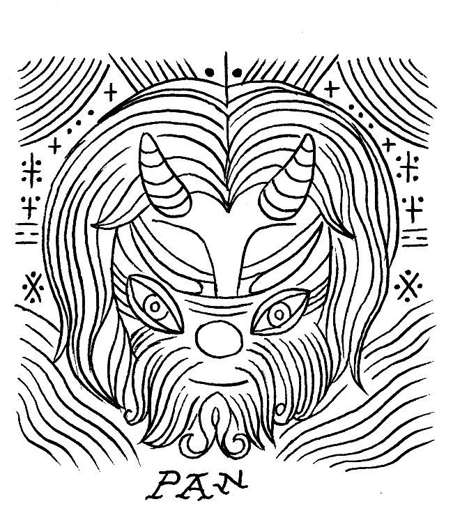
Pan by Ron Regé
The Houston Press's readers have voted The Great God Pan Is Dead as the Best Arts Blog in Houston in the Houston Web Awards. I'm grateful for the honor, but it got me thinking about the "competition." It's funny to even use the word "competition." Bill Davenport, who writes the news for Glasstire, occasionally expresses mild disappointment when I scoop him on some bit of news (a rare event). But I never call Dean Liscum and Virginia Billeaud Anderson into the boardroom and say, "Crush Glasstire!" while pounding my fist on the conference table. I just don't see myself in competition with other arts writers and arts blogs in town. We're all colleagues.
In any case, I consider Glasstire to be a different beast than Pan. I see Glasstire as a full-fledged magazine that happens to live on the web. It has different departments--it has feature articles, reviews, columns (which they call blogs), news, classifieds, a calendar, etc. Very unlike a blog, which is highly linear--one post after another. Glasstire is not linear--like a print magazine, it is multidimensional. The reader can enter it at various points depending on her interest. And it has a fairly large stable of writers. And I have to add that Houston is really lucky to have Glasstire around. I know I depend on it.
What else is there? Well, there is The Silo by Raphael Rubenstein. This blog won a Creative Capital/Warhol Foundation Art Writers Grant in 2010. Rubenstein is a critical studies professor at U.H. and edited a book about art writing that I really like, Critical Mess. The Silo is " a personal, revisionist 'dictionary' of contemporary art. Its primary aims are to challenge existing exclusionary accounts of art since 1960 and to offer a fresh look at some canonical artists." And this is part of the problem--at least in terms of local popularity. Rubenstein isn't reviewing current exhibits. In fact, it is pretty much impossible to see many of the artists he writes about locally. The whole project--which I love--is about constructing an alternative, highly personal art history of the past few decades of art. Another problem with The Silo is that Rubenstein is not terribly prolific. Popular blogs get updated constantly. In short, The Silo is not the kind of blog that is likely to ever win a local popularity contest like the Houston Web Awards. But it is a great blog if you like diving deeply into the obscure corners of contemporary art--which I do.
Another local arts blogger is Theodore Bale. He writes a blog called Texas, A Concept which is hosted on ArtsJournal. Bale has a music background and writes primarily about music and dance. His writing is thoughtful and incisive. But as a blogger, he has the same problem as Rubenstein--he is not very prolific. Or, to put it another way, he is not a prolific blogger. As a freelancer, he writes quite a lot for other publications, especially CultureMap. I think it's hard to be a professional freelance writer and a blogger. A freelancer needs to be continually seeking out paying work--the best paying work he can get at any given time.
There are local art blogs that are really personal blogs which have a heavy art component. One of these is Neon Poisoning by Robert Kimberly. The value of such a blog is that it has no agenda, and because of this, it can surprise you in delightful ways. For instance, this post noting the relationship between the work of Miina Äkkijyrkkä and Daniel Anguilu.
Lots of local artists have their own blogs. I've linked to Professor Art, Earl Staley's blog, many times. I like it because he frequently takes the reader through his creative process on his paintings, showing us works in progress. Brian Piana's blog, Art Falls Out, is primarily images (lucky for me he saves his writing for Pan). Some of the images are his own work, and some of it work he likes. This is a good approach for artists--showing images of work that is meaningful to them, whether their own or other people's work. But you don't need a "blog" to do this--a Pinterest board or a Tumblr work just as well. There are tons of Tumblrs that show nothing but jpegs and gifs that their author finds interesting. Another local artist, Alexandre Rosa, does this kind of thing on his blog Fiery Laundry. But the champion artist-blogger is Stephanie Toppin, who essentially has five simultaneous blogs, including Art Keeps Me Poor, fabric+lines, Obey Crochet, Hello Very Much, and Very Dead Toys. Each one more-or-less focuses on a different interest of Toppin's.
I don't know much about local blogs dealing with theater or dance or art music. I'm a visual arts guy. If you blog about art or music or dance or theater, leave your link in the comments. I'd love to read your blog.
My Personal Big Show Scorecard
By Brian Piana
It's finally hot enough for Houstonians to complain about the heat, which means summer is in full swing in the Bayou City. This also means one of my favorite local summer art events – The Big Show at Lawndale Art Center – is upon us. The Big Show is the largest juried exhibition in town, and it is open to anyone within a 100-mile radius of Houston who is willing to hand-deliver up to three works for jurying and pay a $30 entry fee. The guest jurors mostly come from out of state, most recently from New York, Portland, St. Louis, and Los Angeles.
I've submitted to The Big Show twice before, in 2007 and 2008. After a three year hiatus, I have decided to submit again in 2012. In preparing works to enter, I've been thinking a lot about my own personal history with what Glasstire last year deemed "the annual smorgasborg of Houston art". For no other reason than you might perhaps find it interesting, I present this history to you.
The first time I submitted work was in 2007, a month after I graduated from school with my MFA. I was pretty much on cloud nine following graduation because I had found out my proposal for an exhibition at Lawndale later that Fall had been accepted. I was going to have a solo show, and I was pretty stoked. Perhaps selfishly, I decided to try and double down by getting some work into The Big Show as a precursor to my subsequent exhibition. I took two of my most recent website abstraction inkjet prints to be framed (one shown below), and then I dropped them off and cut a check. I felt pretty good about my chances. I mean, Lawndale had just given me a show, right? I went home and hoped for a phone call.
(That's how you find out if you made the cut. A Sunday phone call means one or more of your pieces made it in. No phone call, and you have to go gather your rejected works sometime over the next two days.)
Barack's Twitter, Inkjet Print, 2007.
Alas, I didn't get a phone call, and I was devastated. Suddenly I was questioning my own merits for the forthcoming solo exhibition. Would Lawndale think they made a mistake by giving a show to an artist who couldn't make it into The Big Show? I dreaded going to pick up the work. It felt like a walk of shame, and I couldn't shake the embarrassment of being a reject.
My reaction to not making the cut is laughable, of course, not to mention immature. (Rest assured I've grown a lot since then, and I also went on to have a fantastic experience working with Christine West, Dennis Nance, and the rest of the Lawndale crew on Lawndale Has Many Friends that fall. I have been a big fan and supporter of the space ever since.)
The sting of rejection was softened, however, knowing that there were 371 other artists who also didn't receive a phone call and had to go back and pick up their stuff. It was then that I started to actually realize how big The Big Show really was. All told, 453 artists submitted 1143 works that year, and only 115 works from 86 artists made the cut. So only 18% of the artists that entered made it in, and only 10% of the total works brought up to Lawndale stayed for the exhibition. Clearly, the odds aren't in an individual artist's favor, and they've remained that way in the years since. Here are stats from the last five Big Shows, courtesy Dennis Nance, Lawndale's Exhibitions and Programming Director:
While a 20% success rate could be a deterrent to some (and yet clearly hasn't), to others, like me, it becomes a challenge. I decided to give The Big Show another go in 2008, wanting a shot at redemption given the previous year's shutout. But this time, I came prepared.
In the months leading up to that summer, I started thinking about taking my abstractions into the third dimension and dabbling in sculpture. With my artistic practice, I tend to work best under deadlines or with some carrot dangling out in front of me. The Big Show provided both. I tried to think about ways I could make my work stand out from the other 1,000 or so pieces that would also be submitted. I looked to the juror, which for 2008 was Aram Moshayedi, a curator from LA><ART, a nonprofit art space in Los Angeles. Soon after, I stumbled across this article about Damien Hirst's show at the Broad Contemporary Art Museum in LA, and I made my piece about that. Just as my work from the previous year, the resulting sculpture was a nondescript collection of shapes and colors. Knowing the juror wouldn't bother reading the piece's tiny information sheet, I did something I had never done before: I integrated the title into the work itself. Right on the side, clear as day, was the article's headline:
Guns guard Damien Hirst's lamb at BCAM, Wood and Acrylic Latex Paint, 2008.
The Sunday after I submitted the finished piece (along with one more inkjet print for good measure), I got a phone call. The sculpture made it in. So, a juror from a contemporary art space in Los Angeles included an abstract work titled after a contemporary art exhibition at a Los Angeles museum. Perhaps that's entirely coincidental, but I want to believe I played the system and won. It felt awesome.
Having finally made it into The Big Show, I decided to walk away on a good note and have abstained from entering in the years since. Going 1-and-1 in a massive crapshoot seems like a win, so why tempt fate? I still look forward to it every year, and I have continued to support it when possible, via donations or making quirky little things for the Lawndale website.
And yet now, after this three-year hiatus, I've come to miss being a part of the process. The Big Show opening is always a huge party, and it was such thrill to be part of the chosen group. The odds are still long, but I've grown to realize there's no good reason for me not to submit work. Here are three good reasons, in fact, why I will:
See? There's really no downside. So here's what I submitted this year:
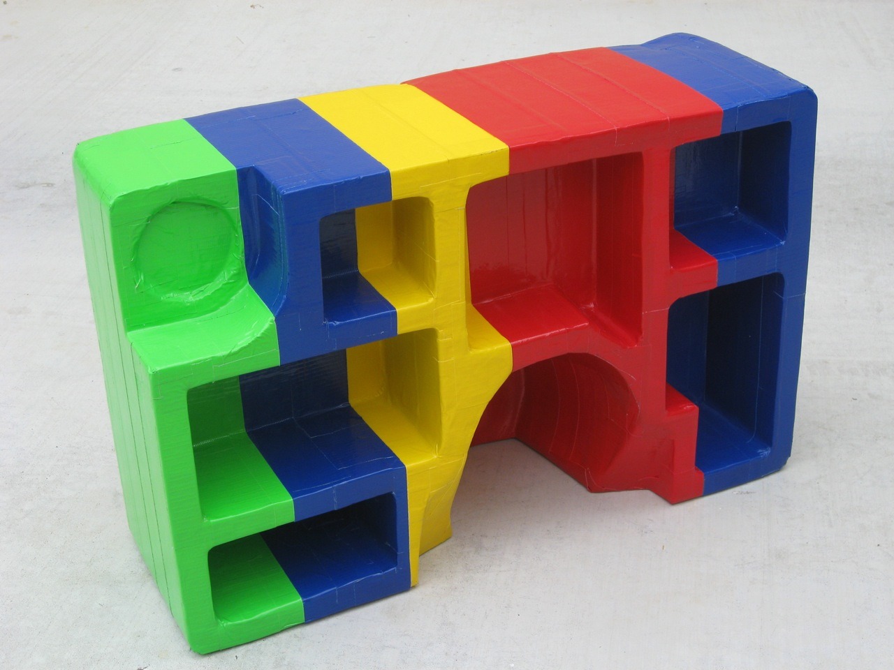
RGB and Sometimes Y: Packing Object No. 1, No. 2, and No. 3, Found Styrofoam Packing and Colored Duct Tape, 2012.
Quite different than that inkjet print from five years ago, yes? Here's a closeup:
RGB and Sometimes Y: Packing Object No. 1, Found Styrofoam Packing and Colored Duct Tape, 2012.
Unlike 2008, these pieces were not made with any kind of thought to the juror. As I type this I couldn't even tell you who he or she is. (It's Marco Antonini, Gallery Director for NURTUREart in Brooklyn, by the way.) Nor am I trying to game the system as I did last time. I dropped my pieces off on Wednesday, and in doing so I've already fulfilled my three reasons for entering, as listed above. The Big Show 2012 owes me nothing more. If a piece does indeed make it in, great -- start the party! But if I don't get a phone call this weekend, I will proudly go into Lawndale on Monday, head held high, and retrieve my works. I certainly won't be the only one.
Below are some pics of the collected submissions near the end of the first day. Lawndale will be accepting more until 5pm Thursday, so if you're in the area and can afford the price tag, there's still time to drop work off. To those who have already entered or will be doing so -- good luck!
Hey -- I recognize that colorful stuff up front!
Lots and lots of paintings, of course.
And some sculpture work too. All this was collected in the first five hours!
It's finally hot enough for Houstonians to complain about the heat, which means summer is in full swing in the Bayou City. This also means one of my favorite local summer art events – The Big Show at Lawndale Art Center – is upon us. The Big Show is the largest juried exhibition in town, and it is open to anyone within a 100-mile radius of Houston who is willing to hand-deliver up to three works for jurying and pay a $30 entry fee. The guest jurors mostly come from out of state, most recently from New York, Portland, St. Louis, and Los Angeles.
I've submitted to The Big Show twice before, in 2007 and 2008. After a three year hiatus, I have decided to submit again in 2012. In preparing works to enter, I've been thinking a lot about my own personal history with what Glasstire last year deemed "the annual smorgasborg of Houston art". For no other reason than you might perhaps find it interesting, I present this history to you.
The first time I submitted work was in 2007, a month after I graduated from school with my MFA. I was pretty much on cloud nine following graduation because I had found out my proposal for an exhibition at Lawndale later that Fall had been accepted. I was going to have a solo show, and I was pretty stoked. Perhaps selfishly, I decided to try and double down by getting some work into The Big Show as a precursor to my subsequent exhibition. I took two of my most recent website abstraction inkjet prints to be framed (one shown below), and then I dropped them off and cut a check. I felt pretty good about my chances. I mean, Lawndale had just given me a show, right? I went home and hoped for a phone call.
(That's how you find out if you made the cut. A Sunday phone call means one or more of your pieces made it in. No phone call, and you have to go gather your rejected works sometime over the next two days.)
Barack's Twitter, Inkjet Print, 2007.
Alas, I didn't get a phone call, and I was devastated. Suddenly I was questioning my own merits for the forthcoming solo exhibition. Would Lawndale think they made a mistake by giving a show to an artist who couldn't make it into The Big Show? I dreaded going to pick up the work. It felt like a walk of shame, and I couldn't shake the embarrassment of being a reject.
My reaction to not making the cut is laughable, of course, not to mention immature. (Rest assured I've grown a lot since then, and I also went on to have a fantastic experience working with Christine West, Dennis Nance, and the rest of the Lawndale crew on Lawndale Has Many Friends that fall. I have been a big fan and supporter of the space ever since.)
The sting of rejection was softened, however, knowing that there were 371 other artists who also didn't receive a phone call and had to go back and pick up their stuff. It was then that I started to actually realize how big The Big Show really was. All told, 453 artists submitted 1143 works that year, and only 115 works from 86 artists made the cut. So only 18% of the artists that entered made it in, and only 10% of the total works brought up to Lawndale stayed for the exhibition. Clearly, the odds aren't in an individual artist's favor, and they've remained that way in the years since. Here are stats from the last five Big Shows, courtesy Dennis Nance, Lawndale's Exhibitions and Programming Director:
Year | # Artists Submitted |
# Pieces Submitted |
# Artists Selected |
# Pieces Selected |
---|---|---|---|---|
2011 | 404 | 972 | 73 | 121 |
2010 | 396 | 976 | 85 | 114 |
2009 | 409 | 995 | 65 | 95 |
2008 | 407 | 1014 | 60 | 95 |
2007 | 458 | 1143 | 86 | 115 |
While a 20% success rate could be a deterrent to some (and yet clearly hasn't), to others, like me, it becomes a challenge. I decided to give The Big Show another go in 2008, wanting a shot at redemption given the previous year's shutout. But this time, I came prepared.
In the months leading up to that summer, I started thinking about taking my abstractions into the third dimension and dabbling in sculpture. With my artistic practice, I tend to work best under deadlines or with some carrot dangling out in front of me. The Big Show provided both. I tried to think about ways I could make my work stand out from the other 1,000 or so pieces that would also be submitted. I looked to the juror, which for 2008 was Aram Moshayedi, a curator from LA><ART, a nonprofit art space in Los Angeles. Soon after, I stumbled across this article about Damien Hirst's show at the Broad Contemporary Art Museum in LA, and I made my piece about that. Just as my work from the previous year, the resulting sculpture was a nondescript collection of shapes and colors. Knowing the juror wouldn't bother reading the piece's tiny information sheet, I did something I had never done before: I integrated the title into the work itself. Right on the side, clear as day, was the article's headline:
Guns guard Damien Hirst's lamb at BCAM, Wood and Acrylic Latex Paint, 2008.
The Sunday after I submitted the finished piece (along with one more inkjet print for good measure), I got a phone call. The sculpture made it in. So, a juror from a contemporary art space in Los Angeles included an abstract work titled after a contemporary art exhibition at a Los Angeles museum. Perhaps that's entirely coincidental, but I want to believe I played the system and won. It felt awesome.
Having finally made it into The Big Show, I decided to walk away on a good note and have abstained from entering in the years since. Going 1-and-1 in a massive crapshoot seems like a win, so why tempt fate? I still look forward to it every year, and I have continued to support it when possible, via donations or making quirky little things for the Lawndale website.
And yet now, after this three-year hiatus, I've come to miss being a part of the process. The Big Show opening is always a huge party, and it was such thrill to be part of the chosen group. The odds are still long, but I've grown to realize there's no good reason for me not to submit work. Here are three good reasons, in fact, why I will:
- My $30 goes to support one of my favorite art institutions in Houston.
- The Big Show provides motivation and a deadline for me to develop some new work and even a low-risk opportunity to explore a whole new direction.
- My work will be seen – however glancingly – by a new set of eyes from a curator outside of Houston. (You never know...)
See? There's really no downside. So here's what I submitted this year:
RGB and Sometimes Y: Packing Object No. 1, No. 2, and No. 3, Found Styrofoam Packing and Colored Duct Tape, 2012.
Quite different than that inkjet print from five years ago, yes? Here's a closeup:
RGB and Sometimes Y: Packing Object No. 1, Found Styrofoam Packing and Colored Duct Tape, 2012.
Unlike 2008, these pieces were not made with any kind of thought to the juror. As I type this I couldn't even tell you who he or she is. (It's Marco Antonini, Gallery Director for NURTUREart in Brooklyn, by the way.) Nor am I trying to game the system as I did last time. I dropped my pieces off on Wednesday, and in doing so I've already fulfilled my three reasons for entering, as listed above. The Big Show 2012 owes me nothing more. If a piece does indeed make it in, great -- start the party! But if I don't get a phone call this weekend, I will proudly go into Lawndale on Monday, head held high, and retrieve my works. I certainly won't be the only one.
Below are some pics of the collected submissions near the end of the first day. Lawndale will be accepting more until 5pm Thursday, so if you're in the area and can afford the price tag, there's still time to drop work off. To those who have already entered or will be doing so -- good luck!
Lots and lots of paintings, of course.
And some sculpture work too. All this was collected in the first five hours!
Labels:
Brian Piana,
infographics,
juried exhibits,
sculpture
Wednesday, June 27, 2012
Some Paintings by Perry House
by Robert Boyd
Until I saw Elegant Violence, Perry House's exhibit at the Art Car Museum, I wasn't all that familiar with his work. I had seen Perry House's last two gallery shows (at Nau-Haus and d.m. allison), both of which featured paintings of candy-colored suburban houses being blown away. Elegant Violence features work from 30 years of his career, and was, for me, a revelation. House is a veteran of Fresh Paint, a key exhibit in Houston's art history, but he has been a painter for far longer and has been a fixture on the Houston art scene since the mid-70s. Elegant Violence isn't a full-scale retrospective, but it does cover a significant span of time. I want to look at four paintings, completed between 1989 and 2007.
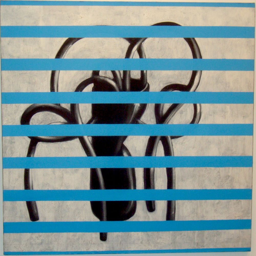
Perry House, The Vase (Intrusion Blue), 1989, acrylic on canvas, 48" x 48"
The Vase (Intrusion Blue) depicts a black modern vase with four black hoses or tendrils in it. One end of each of the hoses is in the vase and the other ends rest on the same surface the vase rests on. But that surface is not depicted--instead, the vase and the hoses are floating against a splotchy white background. Then layered on top are a series of very flat blue horizontal stripes. Every aspect of this piece is sets up an expectation that is foiled. The vase--realistically modeled--should be resting on a surface, casting a shadow, etc. The vase should be empty or have flowers in it. And the painterly underneath is overlaid by flat geometric elements. (The stripes remind me of a horizontal Daniel Buren.) The whole thing has a mysterious presence. The stripes remind me of blinds, and looking through blinds makes me think of spies or peeping toms. But why would anyone spy on this weird black vase? And what are these tendrils?
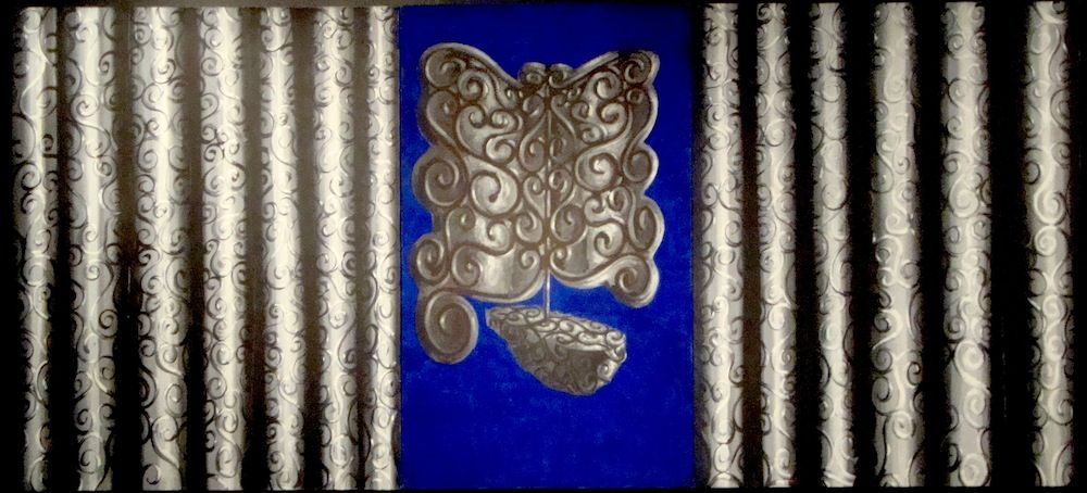
Perry House, The Curtain, The Ship of Fools, 1991, acrylic on canvas, 60" x 132"
There is a sailboat and a curtain made of the same material in The Curtain, The Ship of Fools. The material is dull and metallic with curly filigree. But it doesn't make sense that these are the same material. The curtain must be cloth. The boat however appears solid. Or maybe it is made of cloth--maybe that's why it's a ship of fools. The Curtain, The Ship of Fools, like The Vase (Intrusion Blue), features a well-modelled black-and-white image combined with a single flat color--in this case, ultramarine blue.
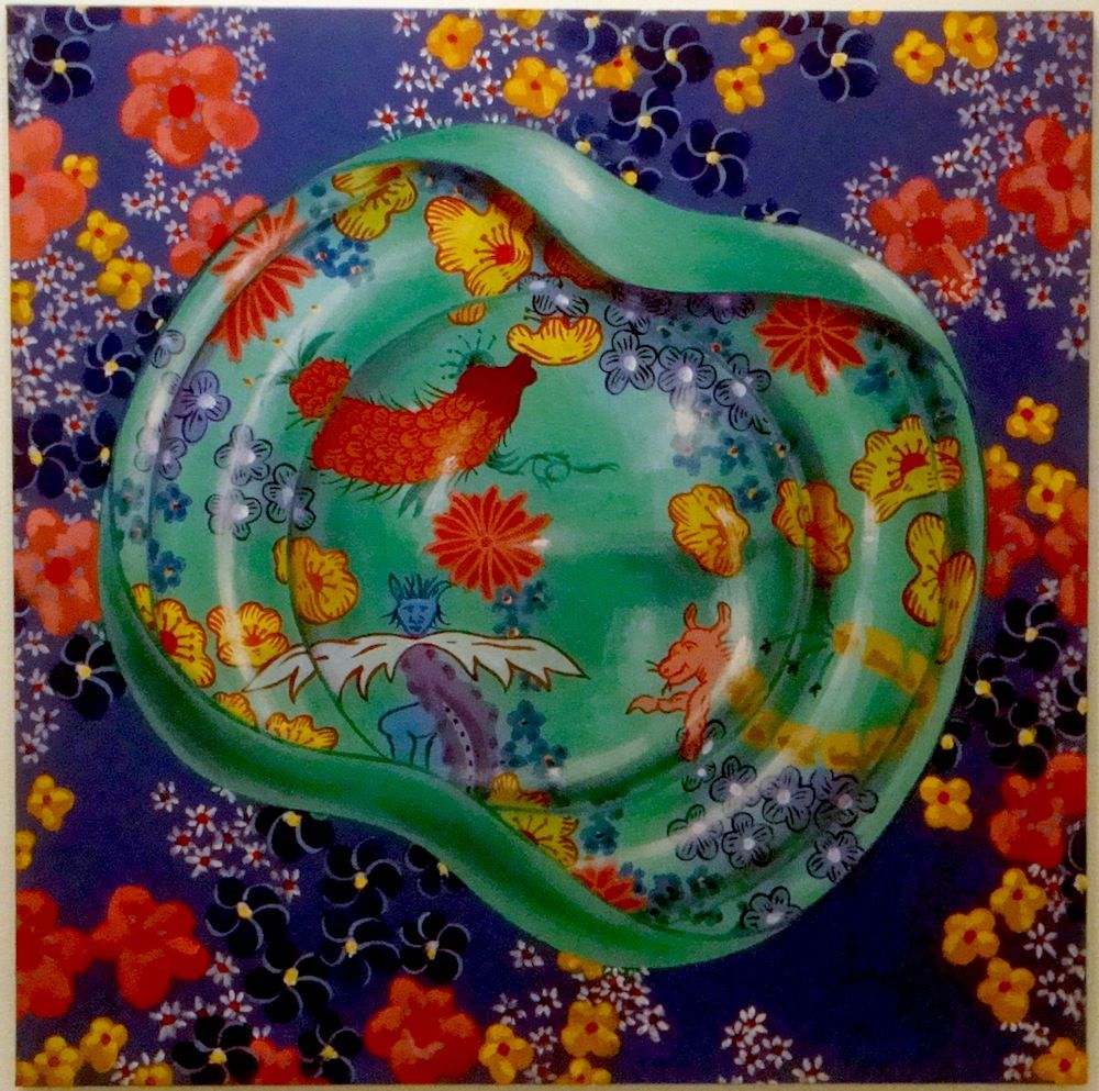
Perry House, Double Chintz I (Southern Dinners Series), 2003, acrylic on canvas, 36" x 36"
Twelve years later, color comes to the fore in Double Chintz I (Southern Dinners Series). "Chintz" was originally a term applied to brightly-colored printed cloth, and later was applied to mass-produced ceramic objects with similar patterns. So we have the green object (which could be ceramic, I suppose) against what I assume is cloth. I interpret this as something seen from above. The green object looks a little like a bedpan, but it's hard to say what it actually is. The primary thing is that we have two aggressive floral patterns juxtaposed. Unlike the previous two pieces, color is quite important here. In each of the two chintz patterns, we see red and yellow flowers against a background color--violet for the surface and green for the "bedpan." And our eyes perceive the red and yellow differently against green as opposed to violet. This piece deals with our perceptions of color--it's weirdly similar to James Turrell's new Skyspace at Rice University in this regard. This piece makes it hard for me to take House at face value when he said, "The fact is I’m not very aware of color. I focus on value, what’s needed to make forms recede."
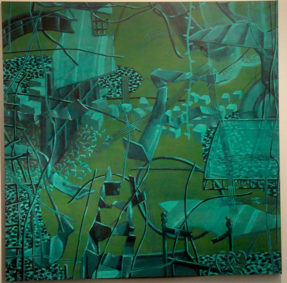
Perry House, 7.25.07 (Aftermath Series), 2007, acrylic on canvas, 60" x 60"
But that statement could be true in regards to pieces like 7.25.07. There are basically two colors in this painting--a blue-green with various values and a flat yellow-green as the ground. And here, House is using differences in value to create volume and depth. This counterbalances the jumbled composition--a random landscape of twisted metal, crumbling blocks and rubble. This painting is from the Aftermath Series, and the implication is that we are witnessing a building or street after some explosive violence--a terrorist attack or aerial bombing or shelling. There are areas of Homs that look like this now.
The common thing for all these paintings is an inchoate feeling of menace. That menace is not overt, except in 7.25.07. But nonetheless, I sense it when I look at his paintings. Like certain surrealist paintings, they suggest a creeping dread or anxiety--which is not overpowering, but rather is gradually sneaking up on you. Not all of his work has this feeling, but much of it does.
Until I saw Elegant Violence, Perry House's exhibit at the Art Car Museum, I wasn't all that familiar with his work. I had seen Perry House's last two gallery shows (at Nau-Haus and d.m. allison), both of which featured paintings of candy-colored suburban houses being blown away. Elegant Violence features work from 30 years of his career, and was, for me, a revelation. House is a veteran of Fresh Paint, a key exhibit in Houston's art history, but he has been a painter for far longer and has been a fixture on the Houston art scene since the mid-70s. Elegant Violence isn't a full-scale retrospective, but it does cover a significant span of time. I want to look at four paintings, completed between 1989 and 2007.
Perry House, The Vase (Intrusion Blue), 1989, acrylic on canvas, 48" x 48"
The Vase (Intrusion Blue) depicts a black modern vase with four black hoses or tendrils in it. One end of each of the hoses is in the vase and the other ends rest on the same surface the vase rests on. But that surface is not depicted--instead, the vase and the hoses are floating against a splotchy white background. Then layered on top are a series of very flat blue horizontal stripes. Every aspect of this piece is sets up an expectation that is foiled. The vase--realistically modeled--should be resting on a surface, casting a shadow, etc. The vase should be empty or have flowers in it. And the painterly underneath is overlaid by flat geometric elements. (The stripes remind me of a horizontal Daniel Buren.) The whole thing has a mysterious presence. The stripes remind me of blinds, and looking through blinds makes me think of spies or peeping toms. But why would anyone spy on this weird black vase? And what are these tendrils?
Perry House, The Curtain, The Ship of Fools, 1991, acrylic on canvas, 60" x 132"
There is a sailboat and a curtain made of the same material in The Curtain, The Ship of Fools. The material is dull and metallic with curly filigree. But it doesn't make sense that these are the same material. The curtain must be cloth. The boat however appears solid. Or maybe it is made of cloth--maybe that's why it's a ship of fools. The Curtain, The Ship of Fools, like The Vase (Intrusion Blue), features a well-modelled black-and-white image combined with a single flat color--in this case, ultramarine blue.
Perry House, Double Chintz I (Southern Dinners Series), 2003, acrylic on canvas, 36" x 36"
Twelve years later, color comes to the fore in Double Chintz I (Southern Dinners Series). "Chintz" was originally a term applied to brightly-colored printed cloth, and later was applied to mass-produced ceramic objects with similar patterns. So we have the green object (which could be ceramic, I suppose) against what I assume is cloth. I interpret this as something seen from above. The green object looks a little like a bedpan, but it's hard to say what it actually is. The primary thing is that we have two aggressive floral patterns juxtaposed. Unlike the previous two pieces, color is quite important here. In each of the two chintz patterns, we see red and yellow flowers against a background color--violet for the surface and green for the "bedpan." And our eyes perceive the red and yellow differently against green as opposed to violet. This piece deals with our perceptions of color--it's weirdly similar to James Turrell's new Skyspace at Rice University in this regard. This piece makes it hard for me to take House at face value when he said, "The fact is I’m not very aware of color. I focus on value, what’s needed to make forms recede."
Perry House, 7.25.07 (Aftermath Series), 2007, acrylic on canvas, 60" x 60"
But that statement could be true in regards to pieces like 7.25.07. There are basically two colors in this painting--a blue-green with various values and a flat yellow-green as the ground. And here, House is using differences in value to create volume and depth. This counterbalances the jumbled composition--a random landscape of twisted metal, crumbling blocks and rubble. This painting is from the Aftermath Series, and the implication is that we are witnessing a building or street after some explosive violence--a terrorist attack or aerial bombing or shelling. There are areas of Homs that look like this now.
The common thing for all these paintings is an inchoate feeling of menace. That menace is not overt, except in 7.25.07. But nonetheless, I sense it when I look at his paintings. Like certain surrealist paintings, they suggest a creeping dread or anxiety--which is not overpowering, but rather is gradually sneaking up on you. Not all of his work has this feeling, but much of it does.
Labels:
painting,
Perry House
Tuesday, June 26, 2012
RIP Artnet Magazine
Robert Boyd
I have a really fat RSS Feed, and it sends me posts from many, many art blogs and online art magazines--Hyperallergic, Art Fag City, C-Monster, Bad at Sports, and many more. For the past couple of years, my favorite reading has come from Artnet Magazine. I liked its lack of theoretical baggage. I liked the fact that the writers wrote as if they had never seen the MLA Handbook. I like the fact that it blatantly acknowledged that art was a thing that was bought and sold. I liked Jerry Saltz's good-natured cheerleading. I liked Charlie Finch's snarky demolition of art world cant. I liked Hunter Drohojowska-Philp and Tony Fitzpatrick. Key word--"liked" in past tense. It shut down yesterday.
But I was a late-comer to Artnet Magazine. As I've been reading its obituaries, I am even more astonished by its story. The magazine, which is part of the larger Artnet art market information service, started in 1995. The internet was still steam-powered back then! And during all that time, it's had one editor, Walter Robinson, who is quite a character.
There is a great profile of Robinson from earlier this year at GalleristNY. His life in the New York art world of the 70s, 80s and 90s is totally fascinating. Here are a couple of choice bits, but read the whole thing.
Charlie Finch makes his goodbye on the Artnet site, writing, "Nothing lasts forever, but it is a shame that, at the point at which Artnet Magazine's content is more comprehensive and lucid than ever, that it will disappear. I've worked with Walter Robinson for 15 years. Everything you read about him is true, he's a gentleman, the art world loves him, he's a brilliant painter, he's the best editor of his generation, and he will land on his feet." Finch is a controversial writer, but I love his no-bullshit tone. Hell, if I could, I'd hire him to write for The Great God Pan Is Dead (Mr. Finch--email me!). He, too, will land on his feet and survive to offend again.
Jerry Saltz's writing always appeared on Artnet Magazine (as well as in other places--Artnet seemed to have some kind of blanket reprint deal with him). He wrote a typically generous farewell to the magazine.
I have a really fat RSS Feed, and it sends me posts from many, many art blogs and online art magazines--Hyperallergic, Art Fag City, C-Monster, Bad at Sports, and many more. For the past couple of years, my favorite reading has come from Artnet Magazine. I liked its lack of theoretical baggage. I liked the fact that the writers wrote as if they had never seen the MLA Handbook. I like the fact that it blatantly acknowledged that art was a thing that was bought and sold. I liked Jerry Saltz's good-natured cheerleading. I liked Charlie Finch's snarky demolition of art world cant. I liked Hunter Drohojowska-Philp and Tony Fitzpatrick. Key word--"liked" in past tense. It shut down yesterday.
But I was a late-comer to Artnet Magazine. As I've been reading its obituaries, I am even more astonished by its story. The magazine, which is part of the larger Artnet art market information service, started in 1995. The internet was still steam-powered back then! And during all that time, it's had one editor, Walter Robinson, who is quite a character.
There is a great profile of Robinson from earlier this year at GalleristNY. His life in the New York art world of the 70s, 80s and 90s is totally fascinating. Here are a couple of choice bits, but read the whole thing.
It was a fertile time for art writing and publishing, and the deAk-Robinson-Cohn trio began putting out a journal, Art-Rite, on cheap newsprint. “We wanted people to throw it away,” Ms. deAk once told an art historian. “We didn’t want to contribute to raising the value of art.”
“Magazines like Artforum were so adult,” Mr. Robinson said. “If you look back at those Art-Rites, we were so immature.”
Artists designed the covers. Ed Ruscha photographed a wax candle shaped like a devil for the front, an angel for the back. Pat Steir’s had three roses, each a different color. “They hand-printed all of them on the floor of the loft,” Ms. Steir told us. To make the print, they used a potato. “It was cheap,” she said. “No one had any money.”
While producing the magazine, artist Sol LeWitt, Mr. Robinson and Ms. deAk, along with a handful of other artists, founded Printed Matter, the now-nonprofit bookstore located in Chelsea. He bartended and made the social rounds. “He fucked every girl in the art world in the ’70s,” said Mr. McCormick. ["Art Net: The Life and Times of Walter Robinson," Andrew Russeth, January 24, 2012, GalleristNY]That's an enviable young manhood, if I may say so! If that was all he ever really achieved, that would have been plenty. But he was also an artist and writer and editor. And he started the infamous cable access art show, GalleryBeat (see Guest of Cindy Sherman for some prime GalleryBeat).
“There was that certain ‘bad’ painting aesthetic that he did, but a lot of his work was touching, sweet paintings, that had subtlety,” said Cathy Lebowitz, who joined Art in America in the late ’80s. Mr. Robinson was something of a mentor for her, and after they had known each other for a few years, she joined him and Mr. H-O on their public-access television show, GalleryBeat.
The show started in 1993. The two men regularly visited galleries during the week and one day Mr. H-O decided that it would be worth bringing along a camera. The tone of the show is about as far from the realm of academic discourse as one can imagine. “It came from about the third grade, I think,” Mr. H-O said.
“They would be in the office conspiring,” Betsy Baker, then editor in chief of Art in America, said. Every once in a while dealers would throw them out, as was known to happen at Andrea Rosen, PaceWildenstein and the Dia Center for the Arts, which prohibited filming. After Dia ejected them on camera, Mr. Robinson becomes as incensed as he seems capable of being.
“The thing about the Dia Center for the Arts is that what they do is bullshit,” he says briskly. “The money floods in from the rich people who write it all off on their taxes. They charge you four bucks to go into this place. They hardly ever do any exhibitions, and they won’t let us in to show you a little TV. It’s the worst things about contemporary art—elitist, snobby and stupid.” ["Art Net: The Life and Times of Walter Robinson," Andrew Russeth, January 24, 2012, GalleristNY]I love it. I feel that way too about art galleries and museums and art spaces that restrict people (me in particular) from taking photos. Read the whole piece. It's almost an outline of his life, because his life has been so eventful that it's impossible to provide to much detail. The article careens from one thing to another, with Robinson interacting with many of the best critics and artists around before they found success. It's an exhilarating read.
Charlie Finch makes his goodbye on the Artnet site, writing, "Nothing lasts forever, but it is a shame that, at the point at which Artnet Magazine's content is more comprehensive and lucid than ever, that it will disappear. I've worked with Walter Robinson for 15 years. Everything you read about him is true, he's a gentleman, the art world loves him, he's a brilliant painter, he's the best editor of his generation, and he will land on his feet." Finch is a controversial writer, but I love his no-bullshit tone. Hell, if I could, I'd hire him to write for The Great God Pan Is Dead (Mr. Finch--email me!). He, too, will land on his feet and survive to offend again.
Jerry Saltz's writing always appeared on Artnet Magazine (as well as in other places--Artnet seemed to have some kind of blanket reprint deal with him). He wrote a typically generous farewell to the magazine.
My heart skipped a beat when I heard the news. Everything I've written since 1998 has been republished on Artnet — often with pithier titles (supplied by Robinson), always with much better and way more pictures (many taken by Robinson). For years, I wasn't paid at all by Artnet. Even though I was as almost-broke then as I almost am now, it felt fine. Once I got paid, it topped out in the low three figures. I loved every second of it.
Mostly because of the way that Walter edited and oversaw Artnet. No jargon. No unbearably long multi-footnoted, almost unreadable art-historical pieces — except all the ones by Donald Kuspitt, whom Walter loved and defended. Then there was Charlie Finch, a planetoid unto himself, the writer whom everyone read. (Charlie may be the porn star of the art world. Half of all hits go to him.) He played marauding Omega to Walter's laid-back Beta. Never an alpha dog, Walter instead was always eager around, entertained by, and amazed with everything going on around him. He could dis things, even us writers, but with a big heart.["Jerry Saltz on the End of artnet.com's Magazine," 6/25/2012, The Vulture]Saltz points out that the art market services will survive while the magazine dies. That seems like the way of the world--the art world, at least. Money becomes ever more important (at least in the blue-chip neighborhoods of the art world) while criticism grows more irrelevant. It's a little unnerving that a lively site like Artnet Magazine could die off so suddenly. I'm sure its writers will find new homes--they're good, after all. I look forward to seeing what they do next.
Labels:
art writing,
Charlie Finch,
criticism,
Jerry Saltz,
Walter Robinson
Xenia Fedorchenko’s No Free Lunch: A Closer Look
Virginia Billeaud Anderson
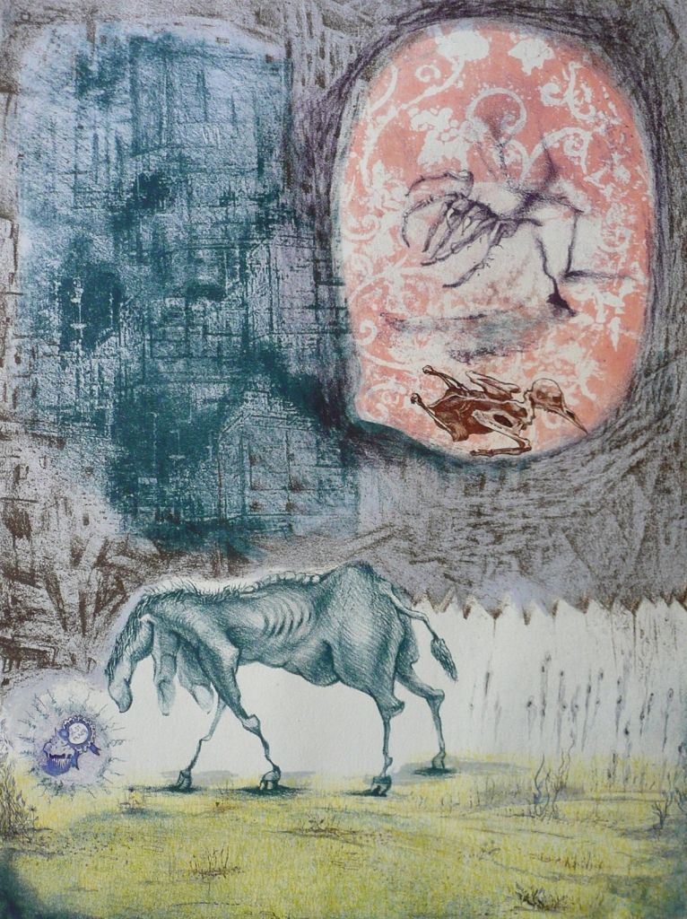
At first glance it seems like a spastic horse, until you notice fingers on its neck and that bony dinosaur back ridge. Distant architecture with barely discernible towers and turrets bespeak medieval Europe, but a flying bird skeleton indicates something more hellish. I’m looking at Xenia Fedorchenko’s No Free Lunch, a stone litho and intaglio print in the group exhibition Heavy Hitters at Peveto through July 7.
Xenia Fedorchenko, No Free Lunch, 2012, lithography & intaglio, 15 1/4 x 20 1/4 inches
I first encountered Fedorchenko’s art in 2007 when she exhibited a copper plate etching of a severely disfigured nude in Lawndale’s Big Show. Its knee warts and sagging tits made me want to meet the artist who turned out to be Russian born, and who the year before had moved from the east coast to Beaumont to teach at Lamar University. With Untitled at Lawndale, Fedorchenko was making her Houston exhibition debut.
The Lawndale print was part of an on ongoing series of grotesque nudes meant to penetrate our excessive focus on outer appearance. Face lifts and other surface concerns, Fedorchenko believes, distance us from our corporeality. We “exist in a body without embodying it,” she told me.
The past colors her perspective. Fedorchenko lived in Moscow before the collapse of the Soviet Union, where there was scarcity, contrasted to American abundance. Arguably, people who experience waiting in line for necessities are probably less concerned with cellulite and perfect teeth.
I am recalling a nude she printed a few years back at Texas Collaborative, Dan Allison’s Houston print shop. It had a basketball shaped stomach and a painfully tiny penis atop wrinkly thin legs. Despite these afflictions, it wore a self satisfied smirk.
As previously mentioned, in No Free Lunch a bird carcass flies above the dinosaur “horse.” This motif of a flying “demon” is a compositional element shared with many of the nudes, which also include small flying figures. The flying demon it turns out is derived from devils who torture the damned in medieval depictions of Hell, particularly from the distinct current of Northern European medieval expressionism that includes the beaked, horned and scaly devils by Martin Schongauer who attack poor Saint Anthony. The flying dead bird’s thorny reptilian features relate it to Schongauer’s devils, and also to Matthias Grunewald’s devils with bird-like features. Grunewald also painted scaly dragon devils, some covered with mucous and excrement. Those who rape the wicked while they fly are very similar to Xenia’s flying caressing nudes.
In 2007 I noticed in one of her prints a fish emerging from a nude’s vagina, which directly quotes Bosch, who seems near hysteria in his dedication to helping sinners understand how horrible Hell is. In Bosch’s imagination torture can be even more hideous than a fish in your crotch. Many of his wicked have sharp objects up their butts. It was unnecessary to ask Fedorchenko if she looked closely at Bosch because her print included letterpress text of his writing, “a false paradise, sinful and demonic, the inhabitants of which would be damned.”
Fedorchenko’s treatment of skin also references medieval narrations of Hell in which devils are portrayed with rotting skin and the miserable sinners have diseased skin. Grunewald painted a corpse with syphilitic lesions that are art historically notorious. Fedorchenko’s blemished and pocked flesh, like to the putrefied rib cage on her horse, nods in that direction.
Not having spoken to Fedorchenko since 2007, I contacted her to hear the latest. Fedorchenko replied from Florence, it’s her semester break, said she could better reply when she arrived in Venice, and then wrote from Venice. She continues her teaching schedule, recently exhibited art in Saint Louis Missouri, and spends quite a bit of time giving printing demonstrations at other universities, recently at a university in California.
What’s with the horse? “The horse, a beast of labor,” she said, “symbolizes the average citizen, out of shape, overworked and tired.” According to Fedorchenko its small head and weird body indicate it’s confused, unsure of its surroundings and possibly defeated. The imposing disorganized city threatens. “Occasionally life presents the horse-being with a seemingly wonderful opportunity, the award-winning cup-cake/muffin thing, but still the being hesitates to seize it as a bird-killing monster may be lurking.”
“There’s no free lunch,” she wrote from Venice.
Labels:
prints,
Xenia Fedorchenko
Monday, June 25, 2012
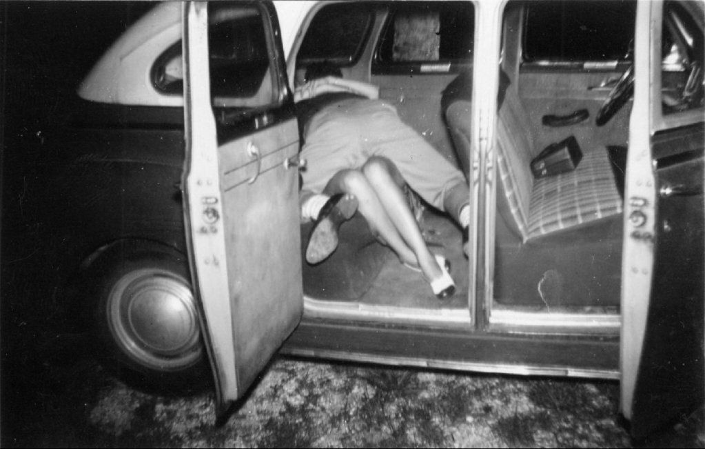
No Comment: Back Seats
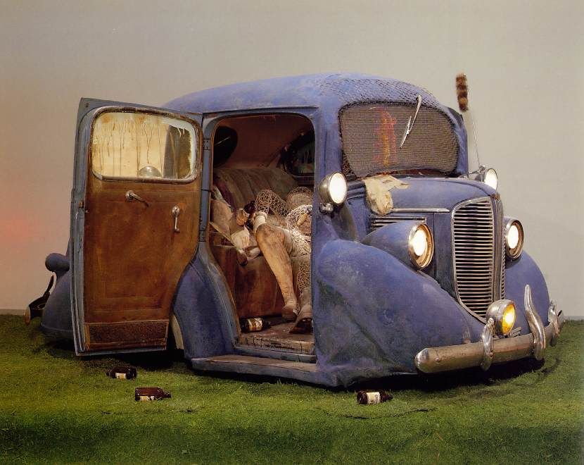
Edward Kienholz, Back Seat Dodge '38, 1964, polyester resin, paint, fiberglass, and flock, truncated 1938 Dodge, clothing, chicken wire, beer bottles, artificial grass, and plaster cast, 66 x 240 x 144 in (via an awesome Russian Ed Kienholz website)
Bobby Smith, untitled (Tampa, FL), 1950s, from the The Rex Maniscalco Collection of Bobby Smith Photographs and Other Materials at the University of South Florida Libraries (via I've Had Dreams Like That)
Labels:
Bobby Smith,
Ed Kienholz,
photography,
sculpture
Aroused: A Closer Look at Mark Williams’ Untitled 2012
Virginia Billeaud Anderson
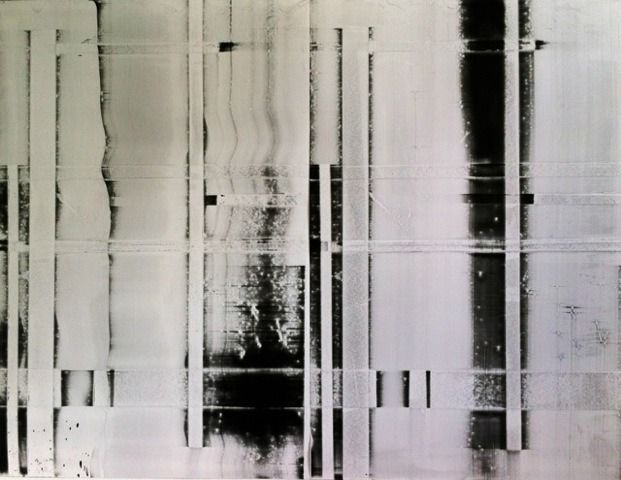
Not long after the gurus at ARTnews defined his paint application as “mechanical,” Mark Williams offers a restless geometric abstraction with ambiguous blurred elements that veer into gestural. You have to stand before Untitled, 2012 at Wade Wilson Art to see its vitality, this work’s uneven paint, enhancing imperfections and overall translucence are not visible in a reproduction.
The shift from controlled and programmatic to somewhat disordered made me want to ask questions so I contacted Williams. He made Untitled he said by painting oil on polypropylene with a silkscreen squeegee. First he created a grid by placing vertical and horizontal strips of tape on glass. In constructing this preliminary “design” or template, applying and removing tape, he worked intuitively. The grid’s resulting imperfections compel him to call it “a broken grid.” He then painted the sheet of plastic as it lay above the grid, and here was also improvisational, applying paint as messy and liberated as he pleased.
Mark Williams, Untitled, 2012, Oil on polypropylene, 40" x 52"
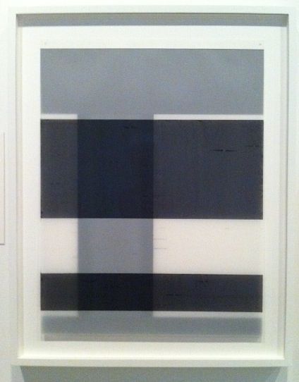
When I met Williams he used tape more precisely. To create Untitled, 2011, painted layers of frosted mylar for the Synthetic Supports: Plastic is the New Paper exhibition at the Museum of Fine Arts, he used tape to design the painted areas. We discussed the fact that tape had a different role for the Wade Wilson piece. “It is true,” he said. “I have eliminated the use of tape as a masking element. Now tape has a new function, it becomes a template.”
The 2011 show at MFAH thematically focused on the use of polymer by contemporary artists such as Williams, and in it he showed that layers of painted plastic assumed weird depth and refraction. For that show Curator Rebecca Dunham also pulled from MFAH’s permanent collection, so we got to see art by some of the biggies, such as two drawings by Jasper Johns who pioneered the technique of ink on plastic. “I’m hanging next to a Man Ray,” Lucinda Cobley who was also in the show told me, “it can’t get better than that.”
Mark Williams, Untitled, 2011, Paint on stacked layers of mylar in the exhibition Synthetic Supports: Plastic is the New Paper
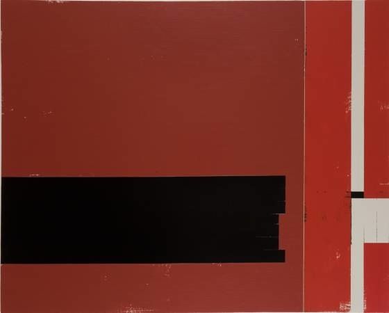
Williams did not begin experimenting with plastic until 2010, so ARTnews could not have known of looser brushstrokes to come. In his article Christopher French described Williams’ use of tape to paint large monochrome geometric forms on canvas and correctly noted busy-ness from opposing geometrics and “uncertainty” at the forms’ edges, by which he meant expressive irregularities at the tape-defined borders, as in the painting Choice. The critic went on to write, “If the main forms broadcast a straightforward geometry, his marginalia add the sort of pathos associated with Robert Motherwell’s paintings,” and that is a lovely thing to say about a painter.
Mark Williams, Choice, 2006, Acrylic on canvas, 40” x 60”
Ink drawings from 2007 and 2008 indicate a certain delight in imprecise forms and serve as forewarning of gestural strokes on plastic. These works on paper are elegantly ill-defined. He recently displayed drawings in a solo exhibition at the Galerie Schlegl in Zurich.
Mark Williams, Untitled #9, 2008, Ink on paper drawing, 12” x 9”
Summing up his thoughts about Untitled, 2012 at Wade Wilson, Williams said, “it is the result of my ongoing interest in structure (the grid) and gesture (the paint).” But he appears to be aroused by the paint.
Williams and I had booze together (research) so I know a little about him. For years he has worked as an art installer at MoMA. Now try to imagine having your hands, literally, on that art, installing the de Kooning show, the Cindy Sherman, moving works in and out for light and temperature control. How can that not overwhelmingly impact his output?
So who does he look at? “As I move through the museum certain works do catch my eye,” he said. “Some favorite artists are: Robert Mangold, Brice Marden, Anne Truitt, Donald Judd, Robert Ryman, Mark Rothko, Dan Flavin and Blinky Palermo.” Ryman is included in the Impressions show at Wade Wilson Art through July 7.
Labels:
drawing,
Mark Williams,
painting
Thursday, June 21, 2012
A Note on Brass Tacks at GGallery
by Robert Boyd
Brass Tacks, a group exhibit at GGallery, started by asking three San Antonio artists to invite other artists. So the first three artists essentially curate the rest of the show. The thing is, I'm not sure who the first three artists are. In any case, its a novel curatorial tactic, and the results are generally pretty appealing. Here are some of the pieces I liked.
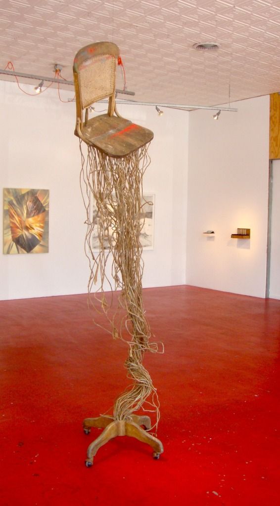
The first piece you see when you enter the gallery is Ronny Unraveling by Clay McClure. McClure starts with antique and used wooden furniture and transforms it.
Clay McClure, Ronny Unraveling, 2011, wood chair, paper rope
This piece struck me as a sculpture of a moment frozen in time--a fantastic moment during which a chair has become possessed by some plant spirit and explosively sprouted roots. When you see Ronny Unraveling, you can see in your minds eye the moments just before--when the chair was an ordinary chair and when it started growing. The piece has an Alice in Wonderland strangeness, accentuated by the fact that the seat, back and bottom of the structure are clearly parts of a very real and very ordinary chair.
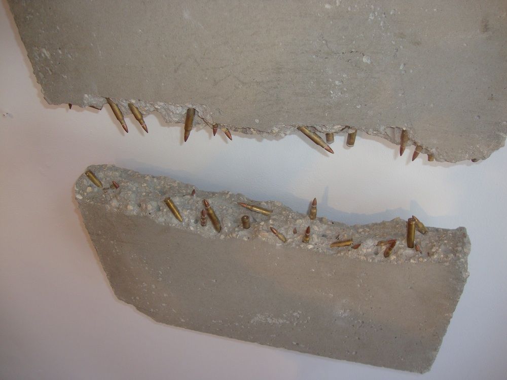
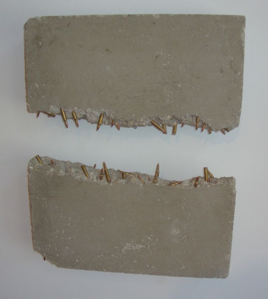
Joseph A. Duarte, Mouth, 2011, inert bullets, concrete
Joseph A. Duarte uses bullets in his two pieces. Inert bullets are bullets without gunpowder or any propellant. Mouth is a sculptural depiction of a mouth, with ragged concrete gums and snaggly bullet teeth. Mouth is both ridiculous and menacing, and the use of bullets reinforces this.
Joseph A. Duarte, Mouth, 2011, inert bullets, concrete
Mouth is not quite toothless, but it doesn't seem particularly threatening. The inert bullets are impotent.
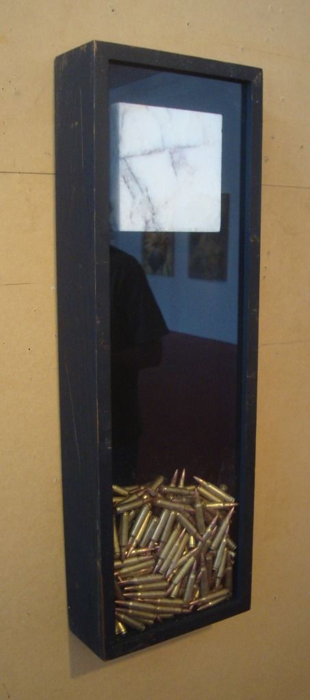
Joseph A. Duarte, War Is a Lot of Things, 2011, inert bullets, marble
War Is a Lot of Things is more elegant than Mouth. The lovely piece of marble suspended over the bullets is prettier than the ragged concrete of Mouth. Even the bullets look better--stacked together in a glass enclosure, they show the viewer their noble brass jackets. Mouth is the old soldier as he is; War Is a Lot of Things is that soldier in his pressed uniform wearing his medals for Veterans Day.
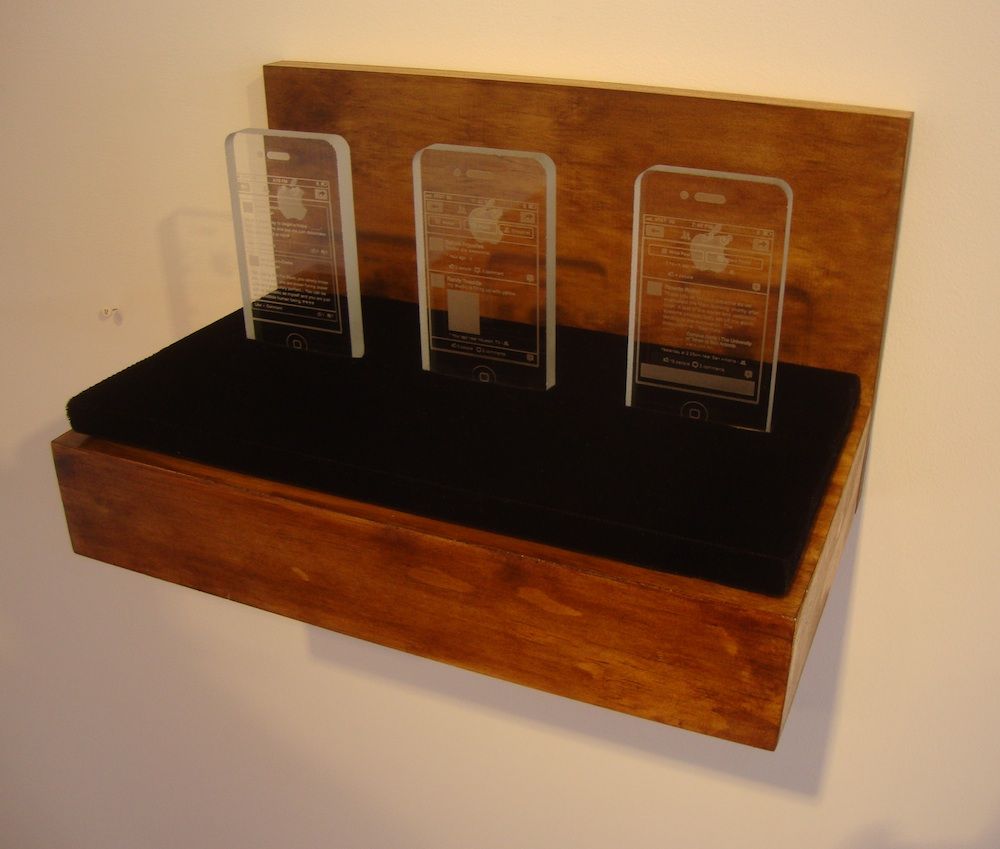
Tommy Gregory, I thank God for teaching me humility, 2012, optic crystal
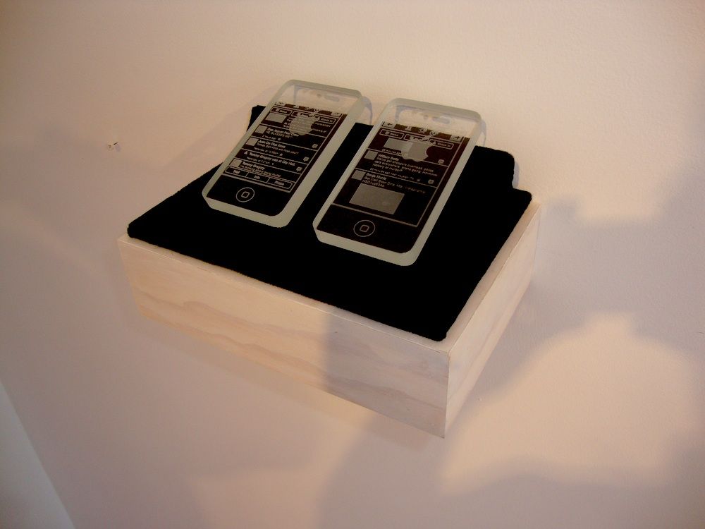
And speaking of elegant, I loved Tommy Gregory's crystal iPhones. They are appropriate monuments to this wonderful piece of technology--and they will last far longer than iPhones which, after all, will surely be obsolete in a few years. I realize that they could be read as ironic--that they could be seen to make a critical comment on our powerful attachment to our gadgets. But given that it could be read either way, I choose to read it as a straightforward homage to the iPhone.
Tommy Gregory, I keep them as a reminder they're not killing me, 2012, optic crystal
Almost as important as the objects themselves are the displays. They communicate a sense that these are important, precious objects.
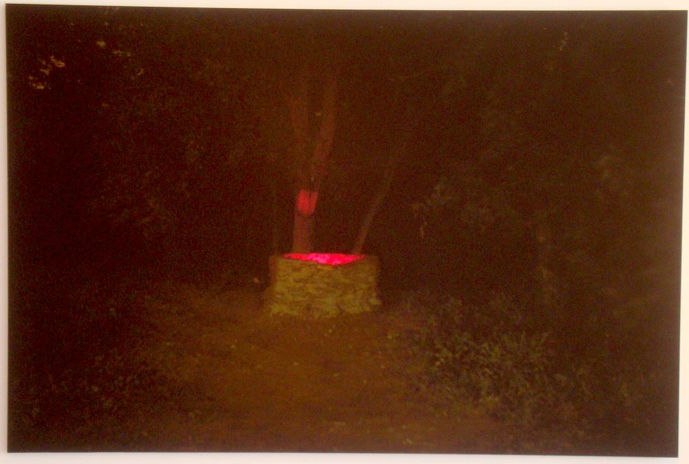
Justin Parr, Time will take care of itself, just leave time alone, 2011, archival pigment print
Justin Parr contributed this spooky image, Time will take care of itself, just leave time alone. The stone well at night with a red glow from inside--it feels like something out of Twin Peaks. You don't want to look into that well, but you are compelled to.
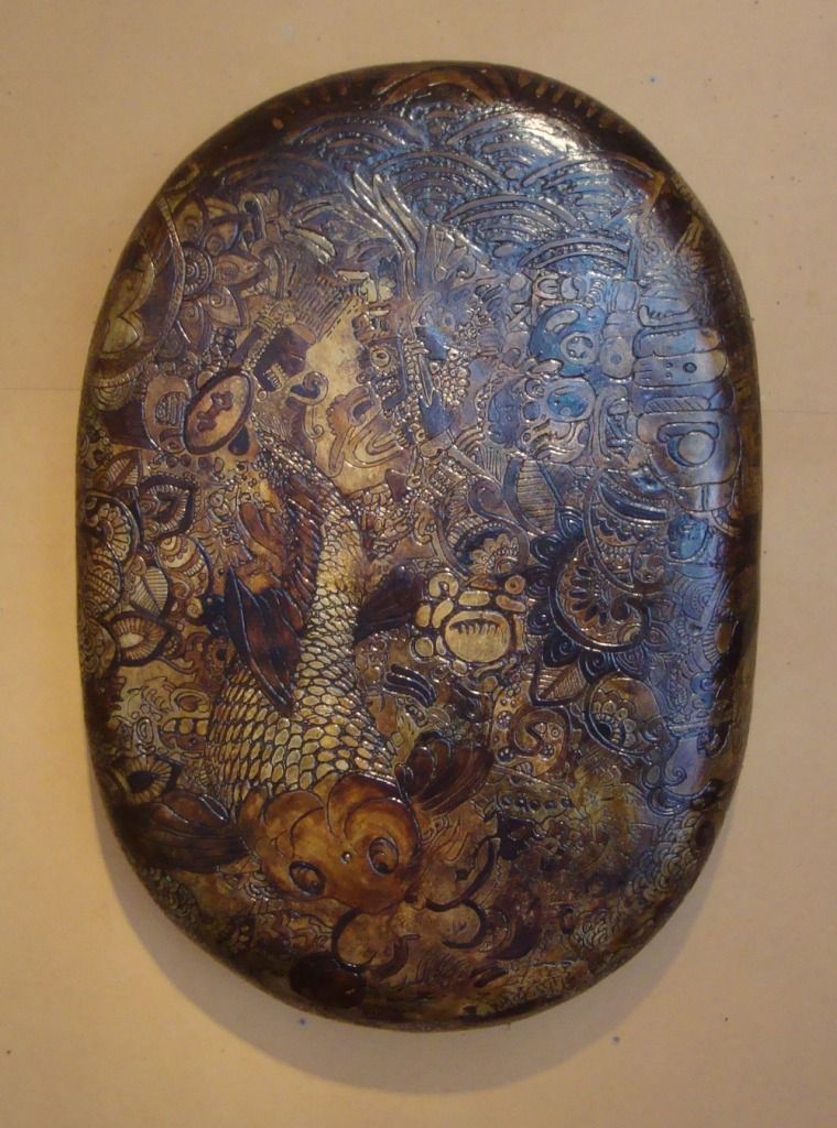
Willie Sanchez, Mezclar, 2012, plaster, tar, polyurethane
Mezclar is the Spanish verb "to mix", and Willie Sanchez's Mezclar appears to mix Mesoamerican graphic elements with Japanese elements. The oval-shaped surface recalls a turtle shell, and the dark blotchy stain has a highly organic look. Mexclar feels more like an archeological artifact than a piece of contemporary art. An artifact from a non-existent culture, a mixture of other cultures. One could probably concoct a convincing historical explanation for this piece. The culture that created it valued beauty--that much seems certain.
Brass Tacks is up through June 29.
Wednesday, June 20, 2012
Safari to the Suburbs 2: Suchu Dance at West Oaks Art House
by Robert Boyd
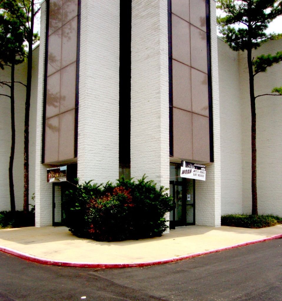
Last November, we heard about how a long-deserted J.C. Penneys store at West Oaks Mall on Hwy 6 was to be used as some kind of art space. This month, we finally got to see that start up. Suchu Dance staged a site specific dance there as part of their annual Big Range Dance Festival. And the space now has a name--the West Oaks Art House (WOAH).
The signage was modest--disappointingly so for such a large building. The exterior wall of the WOAH is huge and white--imagine what an ambitious artist could do with it. Or they could leave it white and project images or movies on it at night. In any case, the signage should be a little more visible.
Inside was a vast, virtually empty room. In the center were the escalators, but they had been curtained off. The structure has two floors (at least) with very high ceilings. In addition to the vast open space, there are offices and storage space and changing rooms. But all of them have largely been stripped clean. Sharsten Plenge, the director of WOAH, explained that when she arrived, the place was a mess and had many cats living inside. (It had been abandoned since 2003.)
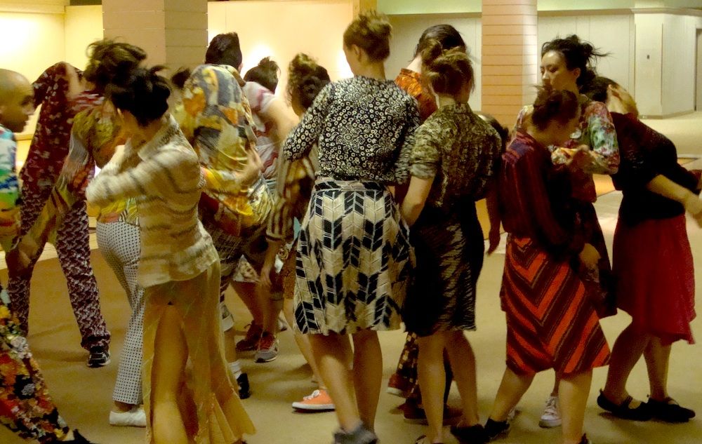
So Suchu Dance designed a dance performance that would use the entire space. In the picture above, you see the dancers all grouped together, but that was relatively rare during the course of the long performance.
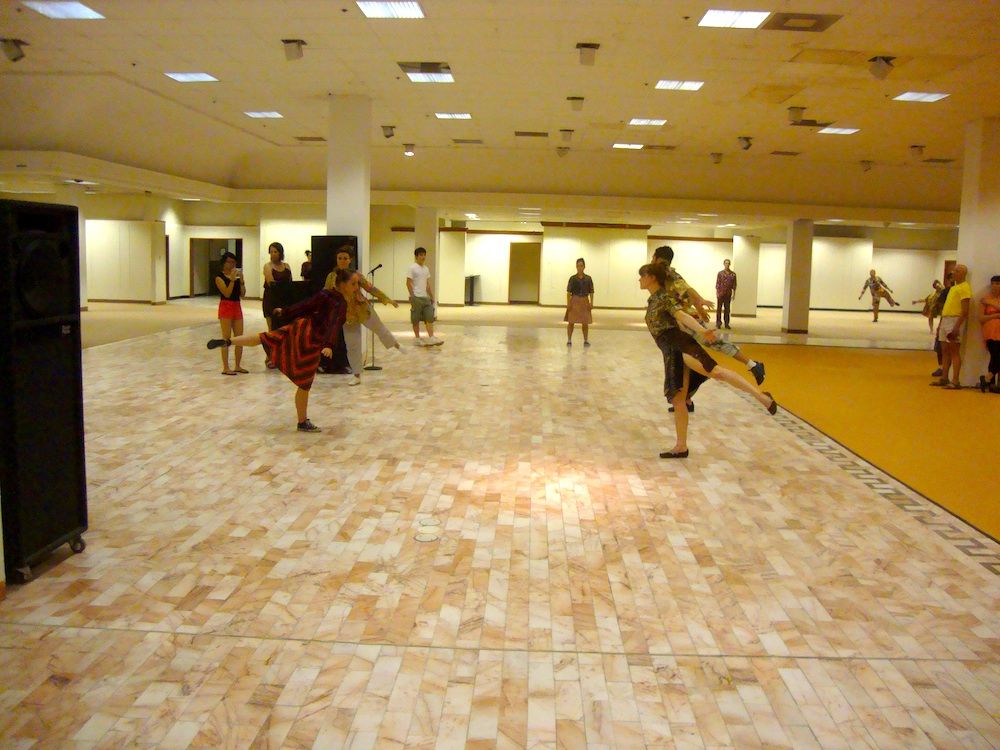
This was more typical--the dancers spread out, activating various parts of this space simultaneously, with audience members right there among them.
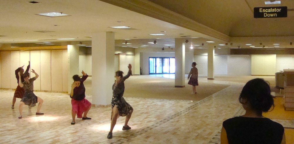
And store signage still hangs from the ceiling, reminding you that you are in an empty department store.
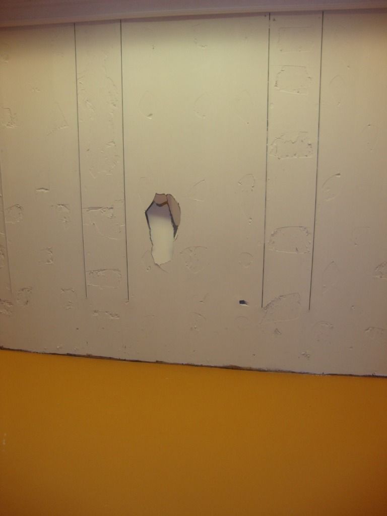
The dancers got pretty vigorous--and one of them kicked a hole in the wall. I asked Plenge abut this and she replied, "I kind of love the hole in the wall—it is like a souvenir of the energy that Suchu graced WOAH with." This may say something about how she plans to let artists use the space. Artists would no doubt appreciate the flexibility to figuratively (and literally) knock holes in the wall.
But there are still problems with the space. Its distance from the center of art in Houston, inside the Loop, remains an issue. This dance performance was sparsely attended, which is perhaps to be expected for WOAH's first event. But if WOAH is interested in the participation of the Houston art scene, more effort will need to be expended promoting its events. Something more than a Facebook page. The other problem is that Plenge doesn't live in Houston. She commutes from Los Angeles (where Pacific Retail Capital Partners, the owner of West Oaks Mall, is headquartered). Depending on what her goals are for the space, I think WOAH needs a full-time director to turn this into a continuously operating performance venue/art space. On the other hand, if she sees it as a large empty space in which to stage occasional art events, maybe a full-time director would be superfluous.
The Pearl Fincher Museum of Fine Art in Spring has made a multi-year, sustained effort to reach out to the North Houston/Spring community in which it resides. I don't know if Plenge is planning on doing something similar for the far West side area or if she is planning on concentrating her efforts on attracting arts enthusiasts from in-town to make the 22 mile trek to West Oaks Mall (or a combination of the two). And the big question is, will WOAH be doing any collaborations with Toby Keith at his new joint in the mall, I Love This Bar and Grill?
One last note. I identify the Pearl Fincher and WOAH as suburban arts institutions. That may seem to lump them together, but the reality is that they are very far away from each other--23 miles driving distance. This speaks to difficulty in establishing a suburban art scene--the diffuse nature of the suburbs mitigates against getting a critical mass. This is one reason why artists move to certain neighborhoods in big cities--they can be close to their peers and their institutional support. I think the relative isolation from other institutions (private and non-profit) and from arts-heavy neighborhoods will always be obstacles for the Pearl Fincher and for WOAH.
Labels:
Suchu Dance
Subscribe to:
Posts (Atom)