Thursday, March 31, 2011

Where Texas and France Collide

by Robert Boyd

One thing I know nothing about is high society, and I fear that anything I would have to say about it would make me sound like a rube. But so be it! Last night I attended the second annual Texan-French Alliance for the Arts art award and auction. The event was held at Decorative Center Houston at Woodway and Sage. A friend wondered why it was being held is such an out-of-the-way place. The answer is obvious--the Decorative Center was perfectly equidistant between River Oaks and Memorial. The second I walked in, I felt under-dressed. I had come straight from work and was in my usual Dockers and white dress shirt (no jacket), but the real reason I felt under-dressed was that so many people there were in finely tailored clothes--designer dresses and bespoke suits. They radiated wealth. It was a very different crowd than one might see at a Box 13 fundraiser--a fact I will return to later.

The space was big and bare and it somewhat overwhelmed the art on display.


(Photo by Robert Boyd)

But the art was very nice--beautiful pieces like this:


Allison Hunter, Untitled (parakeets), Digital color photograph facemounted to non-glare plexi-glass , 2009. (Photo courtesy of TFAA.)

And this:


Susie Rosmarin, Pattern Painting #4, acrylic on canvas, 2010. (Photo courtesy of TFAA.)

(You can see all the work here.)

Many of the artists were present. There was a small selection of French artists and a larger selection of Houston-area artists--people like Jonathan Leach, Francesca Fuchs, Geoff Hippenstiel, Alison Hunter, and Marcelyn McNeil and probably others. David McGee won the big prize for the artists that night--a fellowship to spend some time in Paris.

As I said, there were some knock-out outfits there. I should have taken lots of pictures, but I'm not fashion photographer. But here's one of Martha Finger, who was the co-chair of the event. She was wearing a really va-va-voom dress that night.


(Photo by Robert Boyd)

And as Cary Wolfe (standing behind her) can probably testify, it looks every bit as good from the back!

My friend also made an astute comment--she said there were lots of young faces on old bodies. It was a little freaky. But generally the impression was one of wealth and status. The tickets were $80 apiece (I got in free--I guess because I'm "press".) So I wonder, what does the TFAA have that Box 13 doesn't. I don't mean to pick on Box 13--it could be Freneticore or Labotanica or any scrappy small arts organization in Houston. Don't get me wrong--the TFAA does lovely things. If you liked those amazing Bernar Venet sculptures in Hermann Park (now moved to Oyster Creek Park in Sugar Land), thank the TFAA. But broadly speaking, it's hard for me to say that the TFAA is more important or more deserving than Box 13. The TFAA's revenue in 2009 was over $170,000; Box 13's was $60,000. (Organizations like Lawndale, Project Row Houses, and Diverse Works tend to be closer to $1,000,000 in annual revenue.)

I realize it sounds a bit like I'm setting up a class distinction--TFAA is high society, Box 13 is bohemian. The reason Box 13 is on my mind is that they recently held their big fund-raiser--you can read about it and see pictures here. And they even had at least one crossover artist participate--Jonathan Leach had pieces in both shows. But the crowds were very different, the vibe was different, and the prices at the TFAA auction--while not extravagant--were far higher than what people were paying at Box 13. It was a totally different experience--economically and socially. And I wonder why.

One of the exciting things about the TFAA event was live auction. It was conducted in a very lively manner by Wade Wilson. Has anyone else has ever noticed the striking similarity between Wade Wilson and 70s country crooner Charlie Rich?


Charlie Rich and Wade Wilson

I'm going to start calling Wade Wilson "The Silver Fox." I hope he knows the words to "The Most Beautiful Girl." In any case, he made an excellent auctioneer.


(Photo by Robert Boyd)


submit to reddit

Lots of Art at the Houston Permitting Center

by Robert Boyd

After my last depressing post, I want to cheer readers up a little. I follow a blog called the Rockbridge Times written by artist Mary Margaret Hansen. You should put it on your RSS feed. She doesn't post frequently, but it's always good when she does. And this post from last week was an eye-opener.

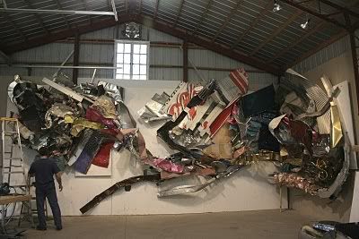
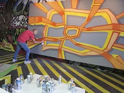
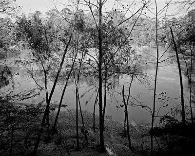
The Houston Permitting Center on Washington Ave. is where you go to get all those pesky permits the city requires (although I think the city is working to put as much of that online as possible). When they decided to refurbish the old building, they hired Studio RED as the architects. I don't know if Studio RED hired Hansen to coordinate the art, or if the city did--in any case, Hansen was in charge of putting together a lot of art for the building, working closely with Studio RED. And it looks like it will be fantastic when it's done. Here's some of the art in progress:

Photobucket

The piece above is a Havel & Ruck mural.

Photobucket

Here is Gonzo 247 doing a mural for the parking garage (I think).

Photobucket

Geoff Winningham has some photos blown up and printed on metal. (Winningham was a professor of mine at Rice.)

There's lots more at Rockbridge Times. This project reminds me of Second Seating, a big installation Hansen did in 2009 where she also corralled a bunch of artists into doing their own bits. Hansen is somewhere between a curator, an impresario and a conductor for this. I can't wait til it's finished. As much as I would normally want to avoid the Permitting Center, this stuff will make it worth the visit.


submit to reddit

Wednesday, March 30, 2011

Art Lies to Cease Publication

by Robert Boyd

Photobucket

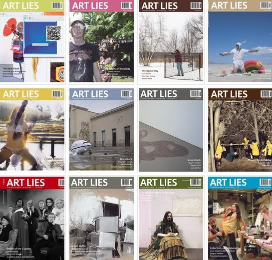
I'm somewhat shocked by this news. Art Lies is ceasing publication. Here is the letter they sent out:
It is with sincere gratitude for your support over the years that we announce that Art Lies will cease production and publication of our printed journal and website content as the organization enters a period of hiatus and reflection beginning in May 2011. We look forward to completing our scheduled projects for spring 2011, including publication of the print and online editions of our upcoming issue, No. 68, “Architecture Is Not Art,” featuring Mary Ellen Carroll as Guest Editorial Contributor, and production of a special print-on-demand edition and public panel on April 16 in collaboration with the 2011 Texas Biennial.

The Board of Directors’ decision has not come lightly. Print criticism, an increasingly precarious enterprise with the advent of digital media, has come to a crux in recent times. We have been fortunate to maintain a consistent and uncompromised output, responding to the changing dynamics of our field and readership with a diversified media presence. Today, facing the nationwide decrease in arts funding, our efforts have proven financially unsustainable.

We are proud of the distinguished organization Art Lies has become over the last seventeen years. To think of how we began as a local, grassroots photocopied publication and grew to produce an internationally circulated, multiplatform journal with a unique voice speaks to the hard work and dedication of many individuals over nearly two decades, including our contributors, Editorial Advisory Board, staff, advertisers, vendors and stakeholders.

We are proud to call Texas our home and are gratified to have played a key role in contributing to the growth of our local and regional art community. Through sixty-eight printed issues and related programming, we elevated recognition of Texas as a place where significant contemporary art is not only produced but also written about and discussed eloquently and professionally. We brought national attention and leading-edge ideas to Texas by inviting notable critics to Houston via the Art Lies Distinguished Critic Lecture Series, and by inviting eminent arts professionals to our pages via our Guest Editorial Contributor Program. Through commissioned writing and projects, we helped cultivate writers that we believe are the future of art criticism in this state and beyond.

Your recent and encouraging generosity is allowing us to publish our spring/summer 2011 issue to the standards you have come to expect from Art Lies. We hope to see you at our Issue No. 68 / Bon Voyage Party! Please look for details on our website and in coming email newsletters. Our website will remain accessible during this period, and if you wish to contact us or purchase back issues, we will accommodate those requests through the website or by contacting our office.

During our upcoming period of reevaluation and reimagining, we look forward to engaging with each of you—we welcome your thoughts and ideas regarding what Art Lies can and will become. We are extremely thankful to you all.

Sincerely,

Art Lies Board of Directors and Staff
So the problem here is in part the classic issue of a print publication failing to adapt to the online world fast enough. Art Lies has actually drastically expanded their online presence in the past few months, but I guess it was too little, too late. And they spoke to a tight arts funding environment, with less money from governments and foundations whose endowments took big hits in 2008. I also wonder if advertising revenues have dropped. One thing that always shocks me is that galleries still advertise so heavily in art magazines (although I assume prices go up and down). Don Thompson wrote that based on his research, art critics and art magazines had no particular influence on the price of artwork. And, indeed, by the time a magazine gets around to reviewing a gallery show, and even most museum shows, the exhibit is usually long gone. (I think Art Lies tried to address that problem with their online reviews. Personally, I try to never review a show that readers can't still see.)

I don't know what this means for the future of art criticism in the state. We have Glasstire (but I wish they would expand their criticism and long-form writings in general), we have Might Be Good..., and we have various staff and freelance reviewers at The Houston Chronicle and the Houston Press. But personally I still want to see more people writing--whether reviews in the classic sense, or longer pieces of criticism, or scene reports from flâneurs, or whatever. Let a thousand flowers bloom.

At the risk of seeming like a complete vulture, if any Art Lies writers are looking for a platform, I would be interested in hosting new work. I pay precisely nothing, and your writing would be read by a couple of hundred really nice people, but at least it would be out there. (And I should add that starting your own art blog is easy and fun--the old-media notion that you had to be published by someone else to be legit is history--see, for example, C-Monster and Art Fag City.)

Art Lies is Dead. Long Live Art Lies!

It's Raining Horses

by Robert Boyd

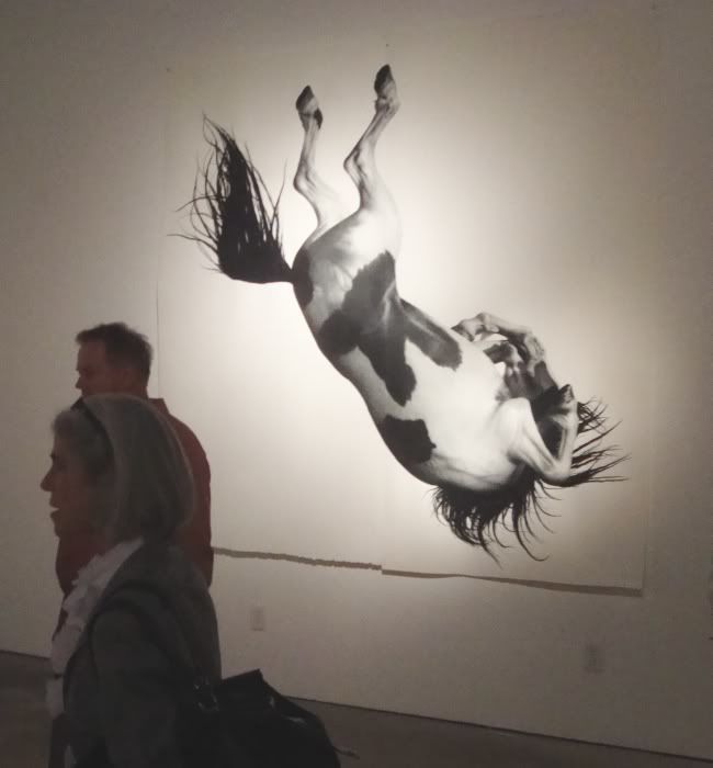
One of the most surprising and most powerful shows that opened this week was by Larassa Kabel at Peel Gallery. Peel has been showing some interesting work by artists who have had some success in New York or L.A. or some other "serious" art town (see this, for example). But as far as I can tell, Larassa Kabel has never had a solo show outside of Iowa! So Peel is to be commended for finding this artist and taking a chance on her.

Of course, it helps that her work is so striking. One thing you just don't see very often are life-size drawings of horses.

Photobucket
Larassa Kabel, Any Minute Now, Bay, colored pencil on paper, 2011. (Photo by Robert Boyd.)

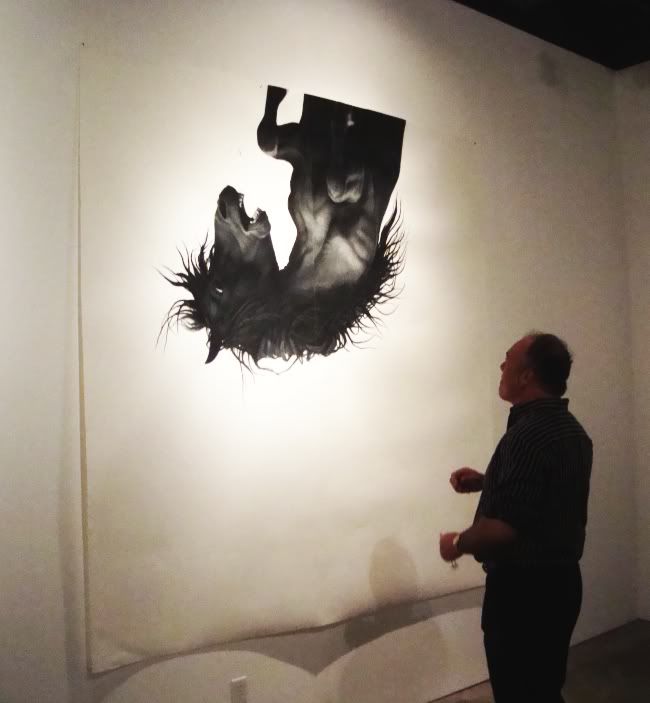
I usually try not to have people in my photos of art, but here it's useful. They give you an idea of the huge scale of these pieces (96" square). The images are majestic and terrifying. I immediately thought of those old western movies where megalomaniac directors would stampede horses off cliffs--all for the visual drama of it.

Photobucket
Larassa Kabel, Any Minute Now, The Black, colored pencil on paper, 2011. (Photo by Robert Boyd.)

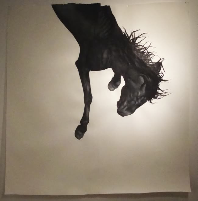
At first looking at these, I assumed they were some large-scale print from a much smaller drawing. The surface was so perfect. These drawings reward close examination. But once you get very close, you can see the subtle evidence of a human hand. Although these drawings are extremely precise, there is something very liberating for an artist to be able to draw on this scale. But freedom can be terrifying too. The terrifying feeling of falling can be associated with the terrifying feeling of filling 96 square inches with a perfect drawing. I guess I'm saying that maybe these falling horses say something about Kabel as an artist.

Photobucket
Larassa Kabel, Any Minute Now, The Black, colored pencil on paper, 2011. (Photo by Robert Boyd.)

But maybe they were chosen for their drama and for the challenge of drawing them. In any case, her large horse drawings are very different from her smaller pieces in the show.

Photobucket
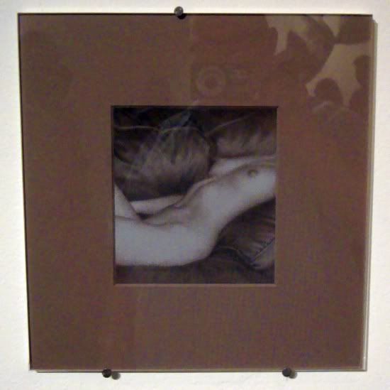
Larassa Kabel, Lay Z Boy, colored pencil on paper, 2011. (Photo by Robert Boyd.)

This drawing is 5.25" by 5". Her small drawings seem more obviously photo-derived than the big horse drawings. They are often erotic, and if not erotic, at least somewhat sexually charged. The drawing technique is identical to the large horse drawings, but the small size makes them seem "fuzzier", more soft-focus, which in turn reinforces the eroticism.

See this show--it's worth the experience to see these enormous, powerful drawings in the flesh.


submit to reddit

Tuesday, March 29, 2011

There will be Bise

by Dean Liscum

Michael Bise's show "Blood Poison" at Moody Gallery is similar to his previous shows. It's all about Bise and his relationships: the good, the bad, the ugly, but never the indifferent. Bise continues to make painstakingly detailed graphite drawings from scenes of his life. The overall theme of his oeuvre consists of his personal traumas and dysfunctions writ large but in minuscule detail. Fortunately for him, his very personal experiences translate into universal narratives that everyone but the Brady Bunch can relate to. In "Blood Poison," he gives us suicide, animal abuse, grade-school alienation, along with his reliably ambiguous and unsettling portraiture, and that old time religion.

But Bise's subjects don't give his work gravitas. The details do. In Husband, a child on a changing table stares at the viewer while a crease in the sheet on which he's lying progresses across his diaper and into a torso-long scar. Children is your standard 70's elementary school class picture replete with the usual suspects: the bully, the outcast, the class clown, the popular one. Bise embellishes it with perfectly round, empty circles that obscure some children's faces and obliterate others.

Typically, his pieces with religious themes don't record his religious experience so much as they document acts of inculcation that he and others have endured. Heather's Baptism is a perfect example of this. When you first view the work from across the room, it looks like two white figures against a black background. It looks disappointingly simple. I figured Bise had run out of time and slapped a coat of ink or gauche around the preacher and his baptizee. Up close, I was delighted to see that not only was the entire area penciled in, the water's currents undulate across the body of water, precisely and rhythmically. That level of detail is quintessential Bise.

Family is always fuel for Bise. For me, his most powerful and subtle piece in this show is Mom and Dad.

http://2.bp.blogspot.com/-G0eXzpyvKmg/TZFH0nivwJI/AAAAAAAAVEs/GW76TqdfT10/s1600/Blood+Poisoning+by+Michael+Bise.jpgMichael Bise, Mom and Dad, graphite on paper, 2011

Details overwhelm this piece from the defiance in his parents' stares to their emotional distance despite their physical contact. You can extrapolate an entire existence evident from the the mantle piece menagerie, the white-washed Jesus, and the competing patterns on the couch, afghan, throw-pillows, and shawl. If that's not enough, use the pose of Mom's hand to conduct a quick Rorschach test.

Then there's Uncle Corky. Never to be out-done, he's a close second. Suicide rendered so subtly I almost missed it, yet so immediately, I couldn't possibly.

http://4.bp.blogspot.com/-CF4wx7xO1Z8/TZFH1IjjiYI/AAAAAAAAVE4/eO3WKBsmjM0/s1600/Uncle+Corky+by+Michael+Bise.jpg
Michael Bise, Uncle Corky, graphite on paper, 2011

Holly's Backdrop is more ambiguous Bise, which never leaves you fumbling towards ecstacy. The Puppy Song will either end up on a Marilyn Manson CD cover or a P.E.T.A. poster or both.

In this series, Bise uses empty circles to obscure faces or details. He employs the technique inconsistently, and it's not always clear if these "white spots" are metaphorical absences or just flash spots faithfully reproduced from a photograph that he may be modeling the work after. Nothing wrong with ambiguity, but for me, these effects lack the power of  the subtle distortions in his earlier series: Holy Ghost!, Birthday, and Windows. In those, the way in which he foreshortened and warped the background to draw the viewer in, to subtly emphasize the subject, to re-center the work and restructure it's geometry heightened their emotional impact.  To me, that is Bise.

I'm not sure what personal issues lie at the root of Bise's creativity. I hope he works through all of them...but not too soon, because I've still got a lot of work of my own and his art resonates with it.


submit to reddit

Monday, March 28, 2011

Cheap thrills at DOMY's "Chisel Story Rust"

by Dean Liscum

I like Warhol. I like found shit. I like non-intuitive associations/connections. Thus, I like some works of art for no other reason than I like them.

The show "Chisel Story Rust," which thanks to Amanda Jones and Chad Hopper, I now know is an anagram of "history cluster," has got a couple of these candidates for me. The raw materials for this show were bought at yard sales, traded for at swap meets, and collected from the artists' lives. In other words, the pieces all have a history even though that history may be unknowable. The artists do not enhance or adulterate these items. They only arrange and present them.

Think Duchamp, think Warhol, think photography, think Borge's Pierre Menard, Author of the Quixote.

It plays out simply for we the viewers. Faced with objects that are re-presented in a context other than the one in which they were created or for which they were meant to be used, we apply our own associations from the history cluster or clusterfuck that's been our lives so far, and enjoy. Not genius, but occasionally pleasurable.

Here are my guilty pleasures:


Amanda Jones and Chad Hopper, Double Backward, mixed media, 2010

(I love Candy Corns. Someone could put them in a jar of piss and call it art and I'd bite.)


Amanda Jones and Chad Hopper, Party Monster, mixed media, 2010


Amanda Jones and Chad Hopper, Mutant Mobile, mixed media, 2010

(Best viewed lying on your back near a can of spilled beer)


Amanda Jones and Chad Hopper, Shout Bouquet, mixed media, 2010

Sunday, March 27, 2011

Kenneth James Beasley at Rudolph Blume

by Robert Boyd

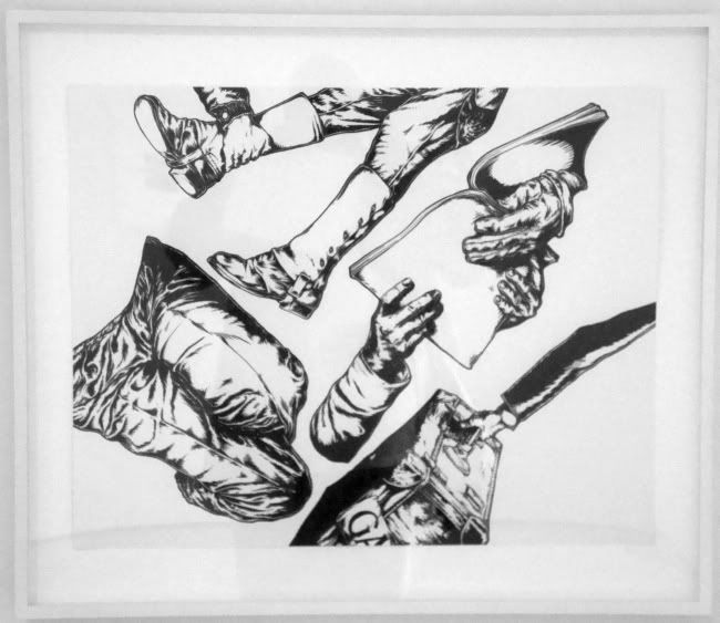
I missed the opening for this show somehow, but I'm glad I was able to catch up. I like Beasley's new thing, these disturbing fragmented drawings. I have liked them ever since a won a very small one in the silent auction at the Retablo show last year at Lawndale. So I am not an unbiased observer of this work.

Photobucket
Kenneth James Beasley, Hymnal-Suitcase-Spat, pigmented acrylic ink on paper, 2010. (Photo by Robert Boyd.)

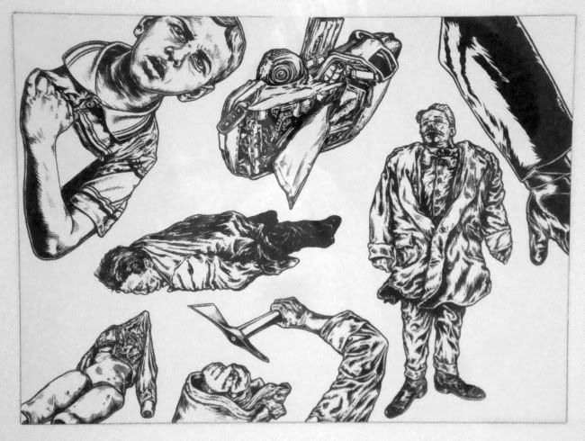
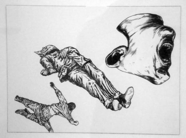
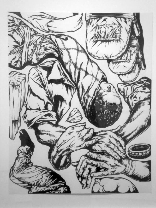
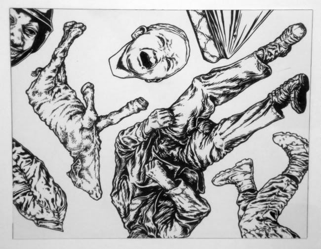
Kenneth James Beasley calls these works "accumulations" that are composed of  "collage components." That's accurate as far as it goes. (It also would be a reasonable description of his quite different earlier work.) The drawn pieces typically feature several elements which are fragments of a human body (although occasionally complete figures appear). The fragments are related to the titles, which consist of a series of seemingly unrelated words like Hymnal-Suitcase-Spat. In this case, the style of the suitcase, the presence of spats (particularly the military-looking spats drawn hear) and the hymnal give this an old fashioned feel. Not nostalgic, though. The fragments are too weird to be nostalgic, and the presence of the hand grabbing the leg implies a certain strange menace. 

Photobucket
Kenneth James Beasley, Dummy-Pickaxe-Wreck, pigmented acrylic ink on paper, 2010. (Photo by Robert Boyd.)


This feeling of menace pervades Beasley's drawn work. I hate to use such a cliched term, but the work is quite noirish. It feels like fragments of forgotten Jim Thompson novels, or like such movies as Out of the Past or Night of the Hunter

Photobucket
Kenneth James Beasley, Dead-Carry-Yell, pigmented acrylic ink on paper, 2010. (Photo by Robert Boyd.)
The drawing accentuates this. In fact, it strongly reminds me of the drawing style of contemporary cartoonist Tim Lane, who is mining some of the same territory. Like Lane, Beasley is presenting ambiguous works. The fragments don't cohere into an obvious narrative. I have always thought the weakness of the detective fiction genre is the need for a resolution--for the case to be solved. Every reader of crime fiction knows that the best parts are the mystery, the feeling of unresolved menace. That is the feeling you get in Beasley's work.

Photobucket
Kenneth James Beasley, Chairs-Embrace, pigmented acrylic ink on paper, 2010. (Photo by Robert Boyd.)

He varies each composition with the number of elements, the size and relative scale of the elements, and the amount of white space. These may be signals about which elements are most important. Beyond the formal composition, I can see two metaphorical ways of looking at these fragments. First, imagine you are a police detective or a sheriff who has a grisly, disturbing crime to solve. These fragments could represent the only information you have, and out of such fragmentary information, you must construct a narrative. You must impose logic and reason onto this chaos and violence. And you wonder if you can.

Photobucket 
Kenneth James Beasley, Calf-Scream-Mattress, pigmented acrylic ink on paper, 2010. (Photo by Robert Boyd.)

Or, imagine that you were part of this. What part, you don't know--victim? Bystander? Murderer? But trauma--physical or mental--is preventing you from remembering it. All you have are fragments, which torment you in their suggestiveness without telling you your part.

I have no idea if Beasley thought of any of these things while drawing them. Did Beasley have a narrative  in mind for each accumulation? Or are they the result of some random choice, some oblique strategy? I'd be curious to know, but I don't think it matters in the end. Viewers will attempt to make sense of these disquieting images any way they can.


submit to reddit  

Candy Chang's Before I Die

by Robert Boyd

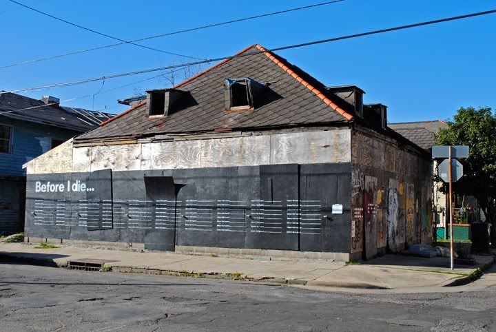
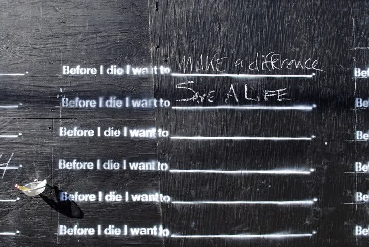
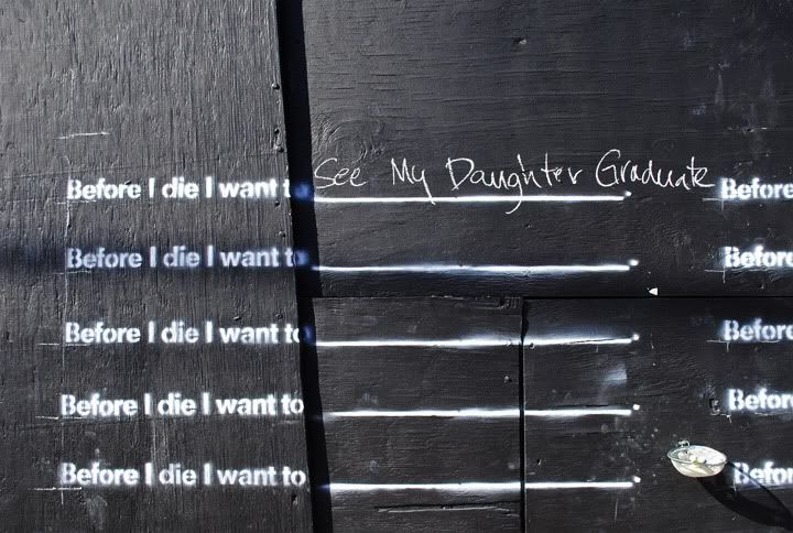
Before I Die, a public art installation in New Orleans by Candy Chang, is one of the most inspiring pieces of public art I've ever seen.

Photobucket
Candy Chang, Before I Die, installation with chalkboards and chalk, 2011. (Photo from Candy Chang's website.)

Photobucket
Candy Chang, Before I Die detail, installation with chalkboards and chalk, 2011. (Photo from Candy Chang's website.)

Photobucket
Candy Chang, Before I Die detail, installation with chalkboards and chalk, 2011. (Photo from Candy Chang's website.)


submit to reddit

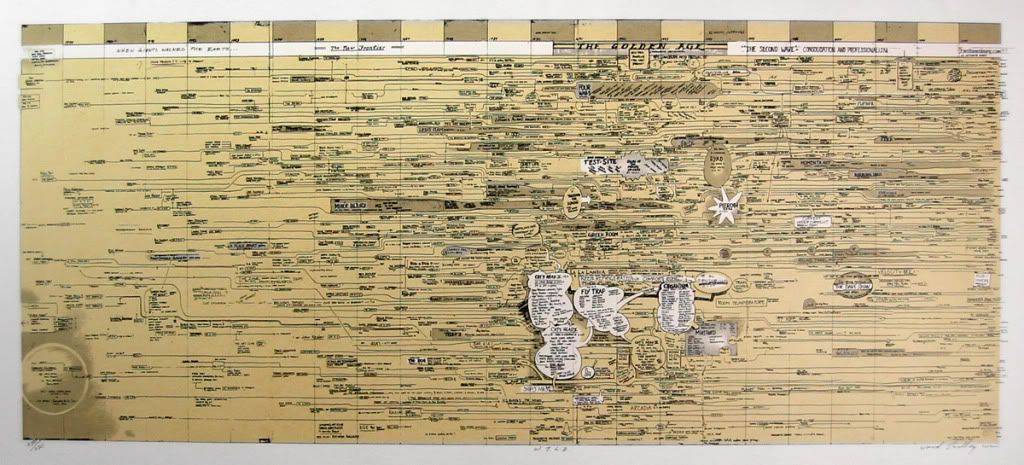
I Wish Someone Would Make a Chart Like this for Houston

Photobucket
Ward Shelley, Williamsburg Timeline Drawing, Serigraph, 2002

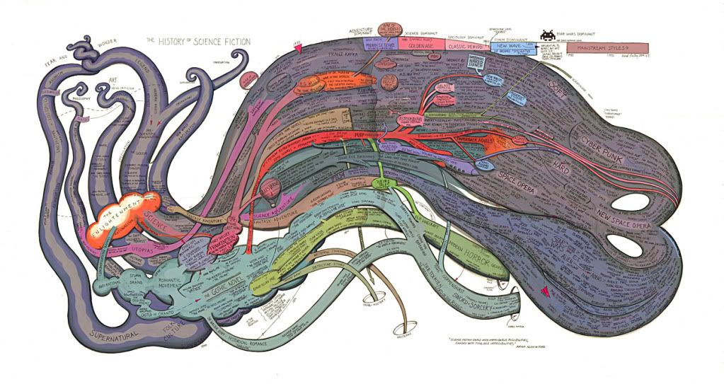
Ward Shelley has been attracting a lot of attention for his beautiful hand-drawn data visualizations, like this taxonomy/history of science fiction.

Photobucket
Ward Shelley, The History of Science Fiction, ver. 1, ink and markers (?) on paper

His history of art in Williamsburg (a hip, artsy neighborhood in Brooklyn) is detailed and rewards close examination. As readers of this blog know, I like looking at Houston's art history (see here and here). I follow some great blogs by older Houston artists who offer great insights to what happened in Houston, artwise (see Earl Staley and M. M. Hansen). But it's hard to put it all together. Hey Ward Shelley--are you up to the challenge of doing a visual art history of a place you likely know nothing about?


submit to reddit

Invisible Curator: Nearly Monochrome Paintings

By Robert Boyd

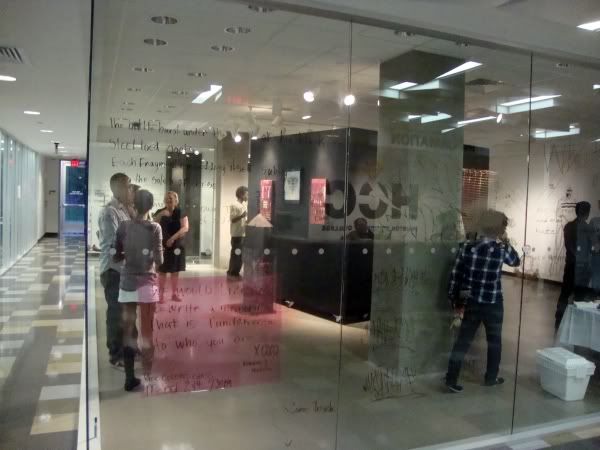
I went to the art gallery at HCC Northeast at Northline for the first time this week to see the Robert McShan/Michella Fanini exhibit Rose Colored Glass. It's an awkward space.

Photobucket

It's a glass box, which makes it pretty hard to hang art. But curator Jonathan Lopez explained that it had one big advantage. Because it's a glass box, students (and anyone else) can see the art whenever the building is open--and the building is open until 10 pm most nights. This is a semi-exception to the rule that community college galleries must have the most inconvenient hours possible. It's a nice show--see it if you have a chance.

Photobucket
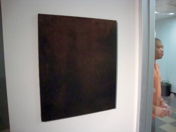
Robert McShan, not sure what the title is or the media!, 2010 (Photo by Robert Boyd.)

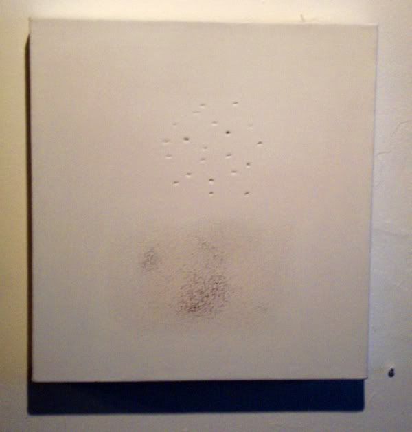
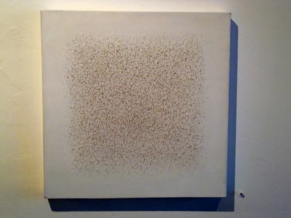
This piece by Robert McShan woke up the invisible curator. It's almost monochromatic, but if you look close you can see more than one color--it appears to have colored powder or sand in the surface. I saw similar pieces this weekend. So that's the theme of this week's Invisible Curator show--almost monochrome paintings. It has a little to do with the gallery talk by Christian Eckart that I wrote about, who spoke at length about monochrome paintings and the sublime.

The other nearly monochrome works I saw were at Labotanica. The exhibit, Painting as Performance, was curated by Ayanna Jolivet McCloud and it is her paintings I want to call attention to.

Photobucket
Ayanna Jolivet McCloud, untitled,acrylic on canvas, 2009. (Photo by Robert Boyd.)

Photobucket
Ayanna Jolivet McCloud, untitled,acrylic on canvas, 2003-2010. (Photo by Robert Boyd.)

These obviously refer Robert Ryman.  But perhaps what makes these "performances" are the deliberate damage to the picture plan--the dents and gouges. But if we count that as performance, can't we count the act of putting painting on the surface as an act of performance, too? That was the idea behind "Action Painting."

Photobucket
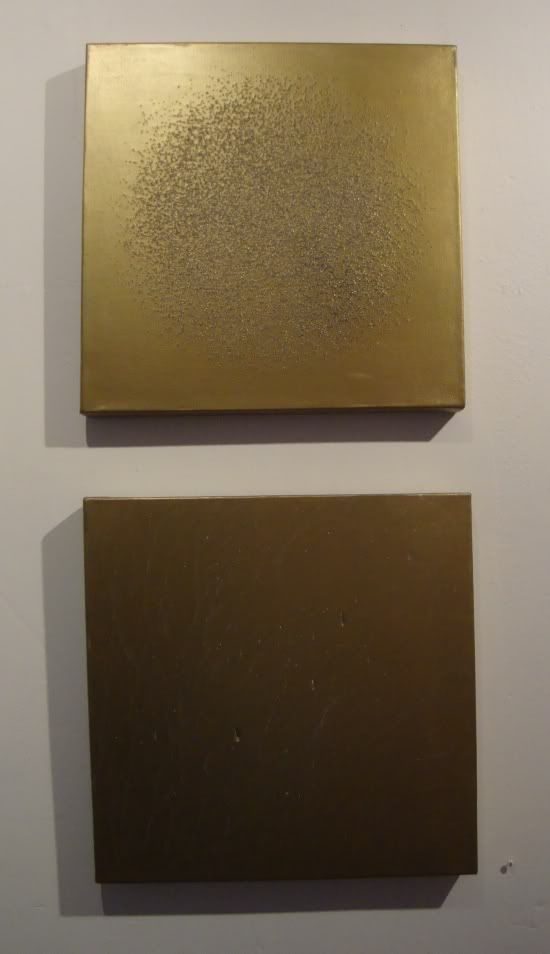
Ayanna Jolivet McCloud, untitled (Diptych),acrylic on canvas, 2011. (Photo by Robert Boyd.)

This pair more directly references performance by virtue of recalling Yves Klien--an artist deeply involved in the metaphysical qualities of monochrome paintings but also deeply involved in performance--including performative aspects of painting (painting using nude women as "brushes", painting with fire, etc.)

So a small two person imaginary exhibit. Monochromatic work--or nearly monochromatic works--can be thought-provoking and even quite emotional. McCloud and McShan have produced excellent, interesting works.


submit to reddit

Saturday, March 26, 2011

Christian Eckart and the Sublime

By Robert Boyd

A couple of weeks ago, I went over to the McClain Gallery to hear Christian Eckart speak. He is an extremely articulate describer and defender of his art, which is a bit unusual. After all, artists are no more required to be articulate than engineers are. Talking about their own work is not their main thing. In this room ful of fans, collectors and at least one other artist, Jonathan Leach. Eckart indicated that he had given this talk before, but it sounded casual and off the cuff.


Christian Eckart standing next to the Absurd Vehicle. (photo by Robert Boyd)

Eckart got his start as an artist in the late 80s and was sort of lumped in with that movement of artists that includes Jeff Koons and Peter Halley. But he's lived in Houston for the past eight years. (Naturally I am curious why he moved to Houston, even though it's none of my business. While he has taught here and there around town, he is not a full-time tenure-track professor. So I can only imagine he moved here for his wife's job, whatever that may be. Correction: Eckart emailed me and said that he moved to Houston because he believed it to be a first class art town. Amazing! Pat yourself on the back, Houston. Perhaps my incorrect guesses are a reflection of my inferiority complex about Houston, an example of "cultural cringe."

He spoke up about what New York was like in the late 70s going into the 80s--he called Neoexpressionism "pretty retrograde." He places himself with the "Neo-Conceptual" artists. At this point he was asking himself "What is a painting?" and his work reflected it.

"I found myself being very attracted to the work of [Mark] Rothko and [Barnett] Newman." In short, he was attracted to painters whose work dealt with the sublime. He refers to the sublime as "a first principle." He describes the sublime as being related in some way to "one's finitude in relation to infinity or of nature." He locates the sublime as a kind of post-enlightenment artistic goal, where artists who were able to express those feelings of the infinite by painting God had to turn in this new rational, scientific age to new conceptions of infinity. So in the 19th century, it was landscapes--breathtaking, terrifying landscapes and seascapes. J.M.W. Turner, for example.

Then it takes a turn in the 20th century with Malevich. Eckart calls his paintings empty gestures, and says Malevich is "super-interesting" because with his work, you  "could consume the painting, but you had to earn the art." That statement struck me as a good description of much art in the 20th century and beyond.

Eckart spoke of this kind of a work as a "zero project." "To me, the void is the twentieth century version of trying to identify the sublime. Ultimately, the white monochrome [painting] is the single most important artistic artifact of the 20th century. The white monochrome could only have emerged in the 20th century as an important artifact."

"My work has always been about locating the intersection where a painting may become an artwork. Paintings are paintings. Rothko paintings are art. One of my theories [when you take] all the words I came up with for the sublime, those are all words you could use to describe the experience of a fetus in the womb. In fact, when people break down and cry in front of a Rothko, different psychologists have suggested that the reason why people have that very emotional thing is that the light in the Rothko paintings might be reminding people of the prenatal experience. The kind of light you see through your eyelids when you close them tight."

"There is a drive in the human organism towards metaphysics [and] spirituality which is really important. The only thing we can quantify as a metaphysical experience might be that prenatal experience."


Christian Eckart, The Absurd Vehicle, wheels, metal, fiberglass, autopaint, lacquer, chrome, 2010

So much of Eckart's work is about paintings (without actually being painting), which makes this nutty construct stands out as, well, absurd--both on the face of it but also within his oeuvre. But in his mind, it all fits. "This started out as a painting that became a sculpture that became a time machine that became and oracle." But he can step back from the sublime when talking about it. "Anyway, it's just a crazy machine. It's really the first time that the impact of moving to Texas sort of asserted itself in my work." He speaks specifically of the influence of choppers and hot rods and air travel. (The doubled wheels are meant to recall a jet's landing gear.)


Christian Eckart, The Absurd Vehicle detail, wheels, metal, fiberglass, autopaint, lacquer, chrome, 2010. (Photo by Robert Boyd)

His ideas about the history and lineage of the sublime, and his place in it, put him at direct odds with Thomas McEvilley, whose critical work has been largely about repudiating the sublime in art. Yes to Duchamp, no to Malevich. I plan to write at greater length about McEvilley one of these days, but it was fascinating to hear an artist take a position that, as articulated, both describes his own work pretty well and stands in opposition to McEvilley. I'd love to hear a debate between Eckart and McEvilley.


Action shot of Christian Eckart and a bystander. (Photo by Robert Boyd.)

Eckart didn't just talk about theory. He talked about how the works were made and the high-tech fabrication methods used in producing them, which were fascinating. Artists are always using the latest technologies, whether it is the Impressionists using paint in tubes to do plein air paintings of Christian Eckart using a computer controlled lathe to fabricate a metal wall sculpture.

 
Eckart showing the back of a computer-designed and fabricated piece. (Photo by Robert Boyd.)

You can see a lot more photographs of the art in this exhibit at the McClain Gallery webpage--it's worth a look if you didn't get a chance to see the work in person.


submit to reddit