Showing posts with label Stephanie Toppin. Show all posts

Thursday, August 2, 2012

Pan Recommends for the week of August 2 through August 8


The Big Slide Show part 2 at Lawndale, Thursday, August 2, 6 pm. A bunch of artists from the Big Show stand up and awkwardly talk about their own work. Come hear Matt Adams, Caleb Churchill, Jessica Crute, Daniela Koontz, Liza Littlefield, Chad Maydwell, Tracey Meyer, Pen Morrison, Donna Perkins, Cary Reeder and Stephanie Toppin.

The Ai Weiwei documentary, Never Sorry, opens Friday, August 3rd at the Sundance Theater.  Should be awesome.

The Bridge Club performing Medium at Art Palace, Saturday, August 4, 6-8 pm. The Bridge Club killed with their performance Natural Resources at Lawndale in 2011, so we have high hopes for Medium.

Emily Sloan's Recreational Aesthetics: "Please Don't Tell My Parents" at Darke Gallery, Saturday, August 4, 2 to 4 pm. Virginia Billeaud Anderson writes, "I don’t know what it is, but Emily used the same title for the video she presented in the 2011 Big Show, in which her film character slapped a black man’s naked ass, and that outrageous work of art that made me decide it was worth being at Lawndale and tolerating the crowd and heat." Spanking? We're there!

Cornucopia Incorporated at Kallinen Contemporary, Saturday, August 4, 7-11 pm. Another overstuffed Randall Kallinen production (55 artists, at least!) down by the Ship Channel. Among the artists are Daniel Johnston, Solomon Kane, Norberto Clemente, Catfish Perez and many more!

What are you looking forward to next week? Tell us in the comments.


Share

Monday, July 23, 2012

Last Week

Robert Boyd


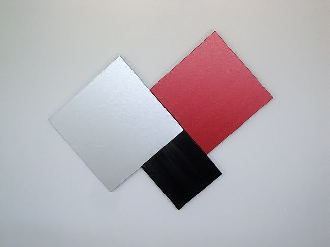
Stephanie Toppin, 2012, No. 87, acrylic on canvas

The Big Show is mostly done! Well, the show itself continues through August 11, and if you haven't seen it yet, I strongly encourage you to check it out. And next week, there will be two evenings of artist slide presentations, which should be interesting. But our reviews are done, and you can read them now:
And in addition to that, we looked at the art of Becky Soria and did a brief round-up of news from hither and yon, including Mark Flood's encounter with Cameron Diaz.


Share


Thursday, July 19, 2012

The Big Show 2012: Paintings

Robert Boyd

It's fairly common to be disappointed with The Big Show. Every year, we get this visual assault, a cacophony of conflicting, self-negating artistic ideas. There is too much to absorb and it is too hard for us to think of individual pieces in isolation, even though that is necessarily the way to view the show--after all, there is no theme, no idea behind the show. A bunch of people showed up with art and a no-doubt overwhelmed juror tried to whittle it down for us.

That said, this edition of The Big Show is different. The juror, Marco Antonini, was way pickier than his predecessors. There were only 69 pieces in the show. And beyond that, many of the pieces were quite small. It made the experience of viewing the exhibit a lot less overwhelming. Does this mean that the art on display didn't sometimes seem at odds with itself? No--I think that is a feature inherent in any big open-call juried show like The Big Show.

I want to look at a few of the many pieces in the show, and as I did last year, I'll try to slot them in some kind of logical structure--a structure that doesn't actually exist in the show, mind you. I just have a compulsive need to find some kind of order.

So first, painting. Painting tends to dominate The Big Show. I'm told that this is because the vast majority of artworks submitted are paintings. But this edition of The Big Show felt somewhat less dominated by paintings. Thirty percent of the works on display are paintings and several more are painting-like objects (like what would you call Patrick Renner's Sunburst, made of found painted wood?).


Norberto Clemente, 2011, The Worship, oil on canvas, 35" x 40"

When one thinks of Christian art, we think of images of those being venerated--Jesus, Mary, figures from the Old Testament, various saints, etc. Paintings of worshipers are more rare. In the history of Christain art, there have always been worries that images of Christ or other religious figures might be idolatrous. There were two periods of Iconoclasm in the early Orthodox church when such images were banned. But in medieval Europe, Christian images were part of the means of communicating the faith to a largely illiterate populous. But we live in the modern world, where literacy is common and images are ubiquitous and therefore relatively powerless (think of how a medieval peasant reacted to a mosaic of Christ compared with someone today sitting at his computer who can see hundreds of such mosaics at the click of a mouse). Or as Bob Dylan wrote, "flesh-colored Christs that glow in the dark/It’s easy to see without looking too far /That not much is really sacred" ("It's All Right, Ma (I'm Only Bleeding)"). So what's a painter to do?

Norberto Clemente's solution in The Worship seems sensible. He honors the worship itself instead of the worshiped. The worshiped is there by implication. But the ecstatic worshipers, hands raised and eyes closed (an aspect that I associate with Pentacostal worship) show the power of their religion.

It is interesting that Clemente doesn't try to depict a real space. Instead, he has created a montage of figures that overlap. This overlapping creates an implied space, but it is in no way a realistic space. (Unless you think this congregation has three giants in it, as seen in the upper right.) Where else do you see montages like this? I can think of two pop-culture sources. This type of montage composition was common on paperback book covers and comic-book covers in the 50s through the 70s. Clemente uses montage to effect a group portrait of expression of religious faith.


Stephanie Toppin, 2012, No. 87, acrylic on canvas

I can't speak about Stephanie Toppin's art without making a disclaimer--I own some of her work. A lot, actually--two paintings, a collage and several drawings. (I wish I owned her couch that Jim Petersen, Jr. has.) So objectivity is out the window. But I can say this--Toppin's work has evolved, even though she is still working in the same brightly-colored abstract idiom that she started with. No. 87 has drips and areas where colors blend and mottled. In short, the work is becoming more painterly. I think she may be looking at some abstract expressionist painters or color-field painters. When I think of painters who approach this kind of intense color, I think of people like Sam Francis or Helen Frankenthaler. But because they were working with thinned-down paint, their work has an airy softness to it that Toppin's doesn't. Toppin's paintings are dense and opaque. For someone who has been observing her work for quite a while, No. 87 represents a maturing. This work is less poster-like than her earlier work. She's working the paint in a way she didn't before. Toppin is still on a journey as a painter, and I'm interested in seeing the direction she's moving.


Cary Reeder, Three O'Clock Shadow, acrylic on canvas, 2012

Cary Reeder paints houses. There is a high level of precision in her work, as well as a degree of simplification (for instance, the shingles in Three O'Clock Shadow that are depicted as a flat grey shape). At first, I was reminded of Edward Hopper's house paintings. Of course, Hopper liked his shadows dark and rich. The sun-bleached pastels of Reeder's paintings make me think of Fairfield Porter's palette. I like compositions--angles and squared-off lines--that almost feel like a geometric abstraction. The utter lack of human beings in her work is slightly unnerving. But despite that, the feelings paintings like Three O'Clock Shadow induce are a middle class version of luxe, calme et volupté. In that way, too, Reeder's work recalls Fairfield Porter.


Hogan Kimbrell, The Lion Tamer, 2012, oil on canvas, 60" x 60"

Hogan Kimbrell had a piece in last year's show that was similar to the piece in this year's edition. Both last year's Athlete and this year's Lion Tamer feature outlined figures against a white background. But The Lion Tamer is a stranger, funnier work. A beaten-down lion, forced to wear a coxcomb which perhaps symbolizes his humiliation is ridden by a nearly naked young woman. The erotic is a big part of Kimbrell's work, as can be seen on his Tumblr. HKStash. The Lion Tamer in particular seems to be dealing with sexual dominance, but does it without resorting to the cliches of dominance. This is no painted Fifty Shades of Grey. It is simultaneously allegorical and psychological.


Kay Sarver, Room Service, 2012, oil on wood, 36" x 48"

Kay Sarver has a series of paintings called "The Unseen" in which she paints a person whom we might overlook--a lawn worker, a janitor, a busboy, etc.--in color while painting everything around them in sepia tones. Although her website doesn't specify it, I assume that Room Service is part of this series. Compared to Sarver's more folkloric work, "The Unseen" is quite restrained and is all the better for it. Room Service is beautiful and poignant. Her painting her reminds me a bit of the illustrations of Jacques Loustal--and that is high praise.

Of course, there were many other paintings in The Big Show. I can't say these five were typical because no particular type of painting was typical. These are five that caught my eye--that's all.

But as I said above, painting was not as dominant this year as usual. In the next installment of this review, I will look at an unexpected (but not unwelcome) trend in the show--craft-based work.

The Big Show, Lawndale Art Center, July 13 to August 11


Share

Thursday, June 28, 2012

You're Reading the "Best Arts Blog" in Houston

by Robert Boyd

Photobucket
Pan by Ron Regé

The Houston Press's readers have voted The Great God Pan Is Dead as the Best Arts Blog in Houston in the Houston Web Awards. I'm grateful for the honor, but it got me thinking about the "competition." It's funny to even use the word "competition." Bill Davenport, who writes the news for Glasstire, occasionally expresses mild disappointment when I scoop him on some bit of news (a rare event). But I never call Dean Liscum and Virginia Billeaud Anderson into the boardroom and say, "Crush Glasstire!" while pounding my fist on the conference table. I just don't see myself in competition with other arts writers and arts blogs in town. We're all colleagues.

Photobucket

In any case, I consider Glasstire to be a different beast than Pan. I see Glasstire as a full-fledged magazine that happens to live on the web. It has different departments--it has feature articles, reviews, columns (which they call blogs), news, classifieds, a calendar, etc. Very unlike a blog, which is highly linear--one post after another. Glasstire is not linear--like a print magazine, it is multidimensional. The reader can enter it at various points depending on her interest. And it has a fairly large stable of writers. And I have to add that Houston is really lucky to have Glasstire around. I know I depend on it.

Photobucket

What else is there? Well, there is The Silo by Raphael Rubenstein. This blog won a Creative Capital/Warhol Foundation Art Writers Grant in 2010. Rubenstein is a critical studies professor at U.H. and edited a book about art writing that I really like, Critical Mess. The Silo is " a personal, revisionist 'dictionary' of contemporary art. Its primary aims are to challenge existing exclusionary accounts of art since 1960 and to offer a fresh look at some canonical artists." And this is part of the problem--at least in terms of local popularity. Rubenstein isn't reviewing current exhibits. In fact, it is pretty much impossible to see many of the artists he writes about locally. The whole project--which I love--is about constructing an alternative, highly personal art history of the past few decades of art. Another problem with The Silo is that Rubenstein is not terribly prolific. Popular blogs get updated constantly. In short, The Silo is not the kind of blog that is likely to ever win a local popularity contest like the Houston Web Awards. But it is a great blog if you like diving deeply into the obscure corners of contemporary art--which I do.

Another local arts blogger is Theodore Bale. He writes a blog called Texas, A Concept which is hosted on ArtsJournal. Bale has a music background and writes primarily about music and dance. His writing is thoughtful and incisive. But as a blogger, he has the same problem as Rubenstein--he is not very prolific. Or, to put it another way, he is not a prolific blogger. As a freelancer, he writes quite a lot for other publications, especially CultureMap. I think it's hard to be a professional freelance writer and a blogger. A freelancer needs to be continually seeking out paying work--the best paying work he can get at any given time.

There are local art blogs that are really personal blogs which have a heavy art component. One of these is Neon Poisoning by Robert Kimberly. The value of such a blog is that it has no agenda, and because of this, it can surprise you in delightful ways. For instance, this post noting the relationship between the work of Miina Äkkijyrkkä and Daniel Anguilu.

Photobucket

Lots of local artists have their own blogs. I've linked to Professor Art, Earl Staley's blog, many times. I like it because he frequently takes the reader through his creative process on his paintings, showing us works in progress. Brian Piana's blog, Art Falls Out, is primarily images (lucky for me he saves his writing for Pan). Some of the images are his own work, and some of it work he likes. This is a good approach for artists--showing images of work that is meaningful to them, whether their own or other people's work. But you don't need a "blog" to do this--a Pinterest board or a Tumblr work just as well. There are tons of Tumblrs that show nothing but jpegs and gifs that their author finds interesting. Another local artist, Alexandre Rosa, does this kind of thing on his blog Fiery Laundry. But the champion artist-blogger is Stephanie Toppin, who essentially has five simultaneous blogs, including Art Keeps Me Poor, fabric+lines, Obey Crochet, Hello Very Much, and Very Dead Toys. Each one more-or-less focuses on a different interest of Toppin's.

I don't know much about local blogs dealing with theater or dance or art music. I'm a visual arts guy. If you blog about art or music or dance or theater, leave your link in the comments. I'd love to read your blog.


Share

Thursday, June 7, 2012

No One Goes to Summer Fest to Check Out The Art

by Robert Boyd

No one except me. And I had a press pass. The point is, a big music festival like the Free Press Summer Fest brings people interested in music and partying, not necessarily in that order. Anything extra is at best icing on the cake. Otherwise, it's something to be ignored. On top of that, any visual art at an event like Summer Fest is going to be competing with a lot of other stuff for your attention--a festival like this is all about sensory overload. Compare this to the calm, quiet environment of a museum, where it's all about making the art the center of your attention.

So given these challenges, what art works at Summer Fest and what doesn't? Broadly speaking, I'm going to say that pictures don't work. They are too static and have too much competition--not the least are enormous video screens flanking the main stages.

Fancypants/Hay Merchant painting

For example, there were several paintings that may or may not have been by Matt Messinger hanging in the "Fancypants" tents. [Correction: These paintings were not by Matt Messinger. I don't know who they were by. They were apparently brought by The Hay Merchant, who was the concessionaire in this tent.] Access to these air-conditioned tents cost paying festival-goers an extra $40. The Fancypants tents were a refuge from the heat and a bar all in one. Did the people inside these tents particularly notice these relatively subtle paintings hanging from the ceiling? In a different setting, they might have had a very different presence, but here, they felt extraneous.

Fancypants/Hay Merchant painting

Fancypants/Hay Merchant painting

But maybe these somewhat austere, monochromatic paintings are not appropriate for Summer Fest. Perhaps larger, more colorful paintings would attract more attention. Molly Clark had several colorful, cartoony banners. I found her characters amusing and delightful.

Molly Clark, banner paintings on a pedestrian overpass

These cute monsters were hanging up on a pedestrian bridge over Allan Parkway (under which most festival-goers had to walk to enter or leave SummerFest).

Molly Clark, painted banner

This one was attached to a fence at the top of the embankment above one of the main stages. All her banners were large, colorful, and cute, done in a style that recalls both children's book illustration and the "cute brut" style of alternative comics typical of such artists as James Kochalka. In short, they have a lot of appeal. But did people stop to check them out? I'm sure some did, but that wasn't the norm.

people ignoring art

Instead of attentive viewers, this art was greeted with indifferent crowds rushing to and fro--to the next act on a different stage, to the porto-potty, to get water or beer to drink, or to the Fancypants air-conditioned tent to cool off. As nice as Molly Clark's art is, it just wasn't in the right place to be noticed.

Eric Castorena, banner on pedestrian overpass

The same could be said about Eric Castorena's witty mashup of Davy Crockett and Tom Waits.

Amie Jones, Eyes Over Texas

Even Amie Jones' massive god's eye-like constructions, Eyes Over Texas, seemed to struggle to compete with the other attention-grabbing aspects of the festival. In just a slightly different setting, I think these two cosmic eyes would be very striking--unsettling, even. But here, it was hard to get people to look up.

The point is that paintings (or things like Eyes Over Texas, which acted like paintings by virtue of being hung up) had a tough time commanding people's attention. Given this, what might work better is something that intervenes. Something that is physically in your path. In short, sculptural objects would seem to have an advantage in this venue.

Michael C. Rodriguez, installation at Summer Fest

Michael C Rodriguez's installation was more of a painting than a sculpture, but because it was free-standing, it had a sculptural presence.It was hard to avoid this large Roy Lichtenstein-ish painting, and people huddled in its shade. Its size and location helped it be seen--it wasn't unobtrusive like some of the other artwork. I like the tattoo on the female figure's arm.

Brett Osborne, With All Music Blaring, I Can Hardly See Straight, ceramic

Brett Osborne's With All Music Blaring, I Can Hardly See Straight has a smaller footprint than the Michael C. Rodriguez piece. Note to future Summer Fest sculptors--work big. Osborne is better known as a tattoo artist than a sculptor, but I found this piece pretty ingenious. I will confess--I would have been nervous to display a large ceramic piece like this among the sixty thousand intoxicated Summer Fest patrons.

Brett Osborne, With All Music Blaring, I Can Hardly See Straight (detail), ceramic

Jacob Calle, They Give Us Their Artifacts As Gifts to Prove They Existed

Chelsea Paquette, They Give Us Their Artifacts As Gifts to Prove They Existed

Jacob Calle's dinosaur and Chelsea Paquette's mammoth were pretty nice, but they were placed in an out-of-the-way spot (near the entrance, but once you entered you were already past them). So they didn't accomplish the task of getting in your way--which was an important means of getting your art noticed at Summer Fest.

Henry Moore, Large Spindle Piece, bronze, 132 inches

The finest sculpture at Summer Fest got the least respect. Henry Moore's Large Spindle Piece is a permanent feature of the park, and I guess the Summer Fest people had to protect it. At least, I assume that's why they fenced it. But even worse than the fence is the random crap surrounding it.

Perhaps the best way to make a splash artistically at Summer Fest was to do performance instead of static art. I don't know who these "protesters" were, but I sure noticed them. (And I heartily agree--Summer Fest was hell--unless you could retreat into an air-conditioned Fancypants tent from time to time.)
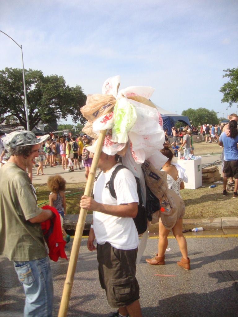
trash carrier
countercollectivecollectivecollective, Countercrawlture

I am pretty sure that these guys with plastic bindles were part of countercollectivecollectivecollective's Countercrawlture. So there was a mobile performance aspect (the bindle guys) and a stationary aspect.
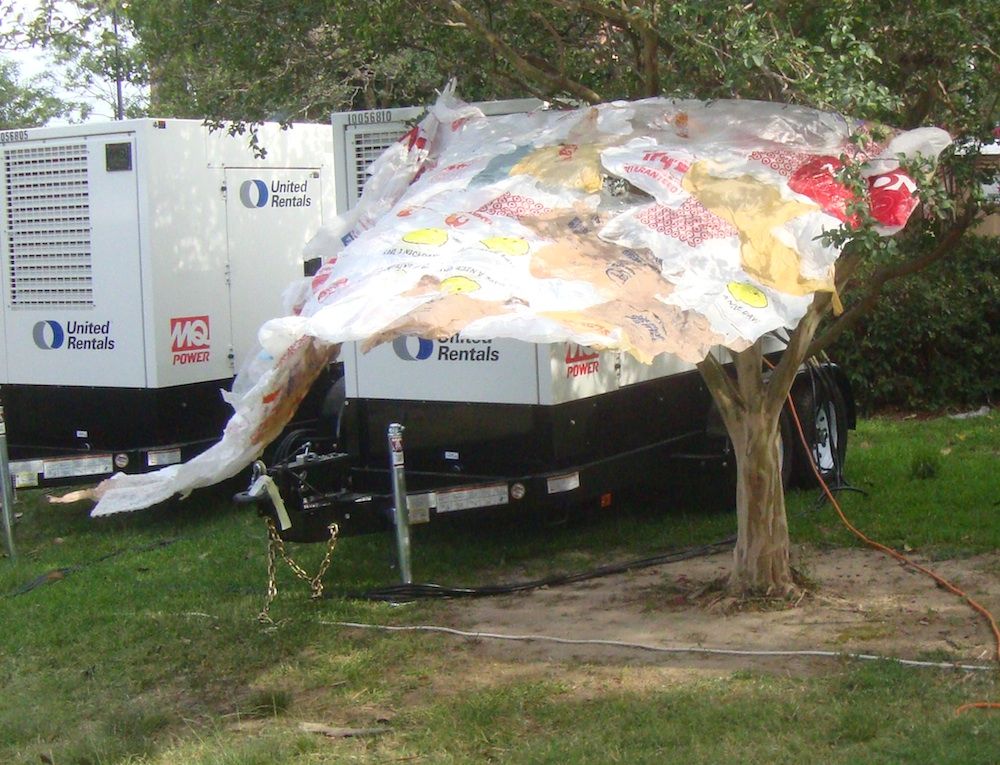
banner
countercollectivecollectivecollective, Countercrawlture

The stationary part included these banners made of plastic bags.
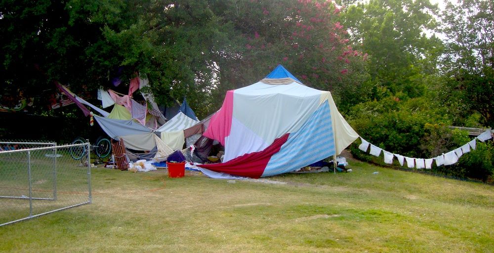
encampment
countercollectivecollectivecollective, Countercrawlture

Yes, right on the edge of Summer Fest, an orgy of consumption, was this art installation that looked like a homeless encampment. My understanding was that it was meant to be a place where you could get away from the crowds and take a nap. And it was in fact in a curiously peaceful part of the Summer Fest area--the area behind stage 3 where there was a group of oak trees providing shade. The part that looks like a laundry line on the right was a string of Walmart plastic bags with one bottle or can in each.

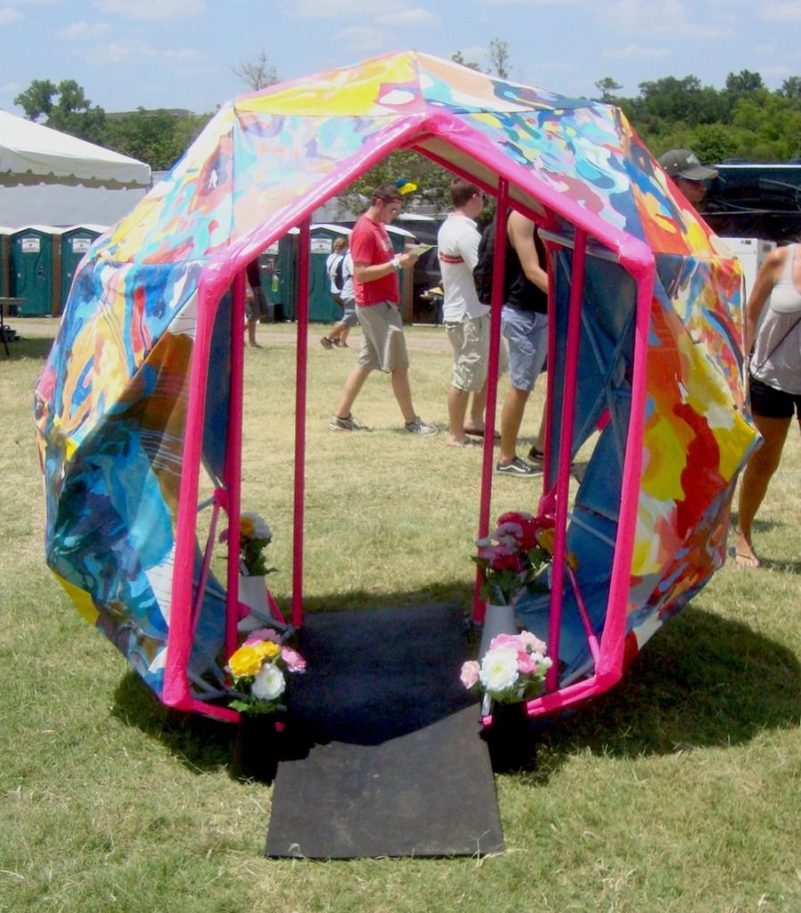
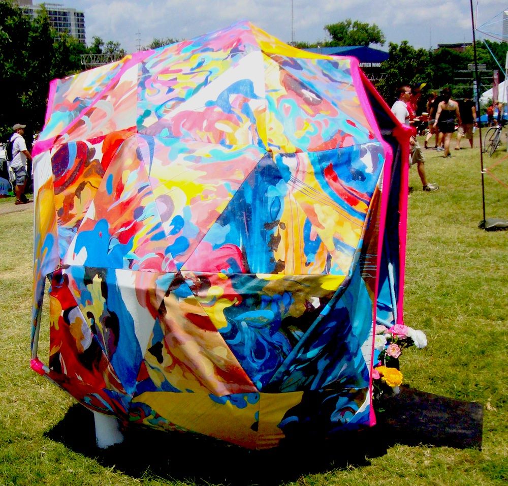
The work that worked best was, like Countercrawlture, interactive. I think that is one of the keys to a successful piece of art at Summer Fest. On that count, Stephanie Toppin's person-sized geodesic dome, Imaginary Head Space, worked.
Imaginary Headspace
Stephanie Toppin, Imaginary Head Space
Imaginary Headspace
Stephanie Toppin, Imaginary Head Space

Imaginary Head Space was just big enough to accommodate one person--or maybe two if they were small. There wasn't anything to do inside it except get out of the sun and hang out. Toppin told me that she was worried that people would leave garbage or worse in it. Her nightmare was coming in Sunday morning and finding poop inside. However, mostly what people left was not bad--some people even left flowers in it.
Terra Antenna
Woody Golden, Terra Antenna, styrofoam and wood

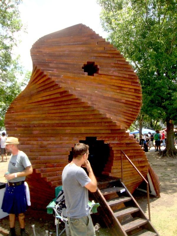
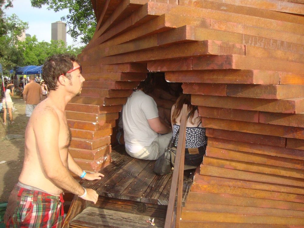
Another place to hang-out was Woody Golden's Terra Antenna. This enormous styrofoam and wood structure worked because it was large, it was in the way (you had to walk past it, pretty much), and it was interactive in that it had a space inside where people could chill out (and probably smoke some weed, but I never witnessed that).
Terra Antenna
Woody Golden, Terra Antenna, styrofoam and wood

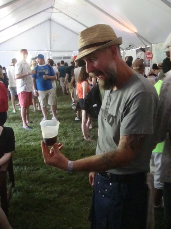
Like all the artists, Golden had free access to the Fancypants tent. But they didn't give the artists free beer. He was shocked when he learned the beers there cost $7, even for artists. An outrage!
Woody Golden
No respect for artists in the Fancypants tent

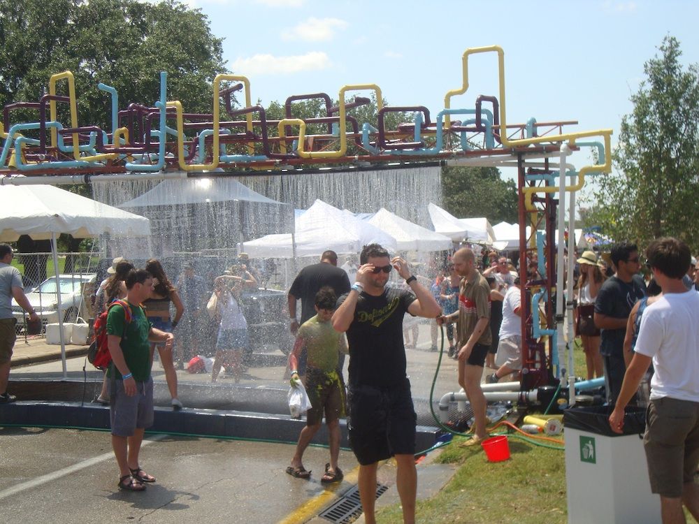
So I've established that the best pieces of art at Summer Fest should be highly visible, they should be big, they should be in the way, and they should be interactive. These are the pieces that people will notice among the general hullabaloo of a music festival. And the piece that best embodied all these qualities was Water Gate, a collaboration between Exurb and TX/RX Labs. These are two groups of artistic tinkerers that I would describe as engineering-oriented art collectives. (I've written quite a bit about Exurb in the past.) In a way, this seems like the perfect kind of art for Houston--we're a city lousy with engineers, after all. Houston needs its own E.A.T.
Water Gate
Exurb and TX/RX Labs, Water Gate, pvc pipe, electronic equipment, pumps, water

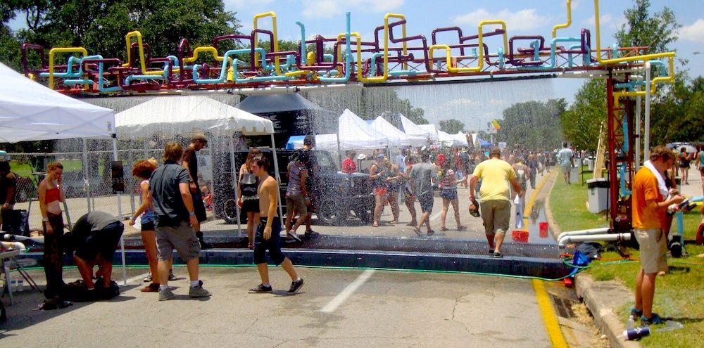
Water Gate straddled the westbound lanes of Allen Parkway. It rained a continuous curtain of water on overheated festival-goers who needed a spritz. And it had a motion detector that could tell if there was someone walking up--and a small gap in the curtain of water would appear whenever this happened.

Water Gate
Exurb and TX/RX Labs, Water Gate, pvc pipe, electronic equipment, pumps, water
Water Gate
Exurb and TX/RX Labs, Water Gate, pvc pipe, electronic equipment, pumps, water

The only problem with Water Gate was that they suffered technical problems. This is the danger with all engineering projects. The design may be sound, and the testing and commissioning may be perfect, but until you are operating in field conditions, you don't know what will happen. In this case, they failed to anticipate how dirty the people going through the gate would be. Specifically, a lot of people came through the Water Gate after having ridden on Patrick Doyle's Paint Slide. This was another interactive art piece (a highly successful one, judging by the number of paint-coated people I saw), where people literally slide down the side of a hill on a slide covered with wet paint. So these colorful, paint-spattered people would use Water Gate to clean off a bit. The paint (and dirt) ended up clogging one of the pumps that was circulating the water, and by late afternoon Sunday, Water Gate wasn't working anymore.

Disappointing, sure. But now they know--it's just an engineering problem to be fixed. The concept is sound and the piece is beautiful. Water Gate is exactly the kind of installation you would want to have a hot summer festival. I hope Exurb and TX/RX Labs work out the bugs and install it at other events this summer.


Share

Wednesday, December 21, 2011

Robert Boyd's 2011 Honorable Mention

All of the shows listed below were excellent, and on a different day, I might have placed any one of them in the top 10.

Lisa Gralnick: The Gold Standard at Center for Contemporary Craft. This was a very interesting show that included sculptures made of plaster and gold--where the percent of gold was determined by how much gold it would take to buy the thing depicted.


Stephanie Toppin's couch in Jim Peterson, Jr.'s garage

Stephanie Toppin's couch. Of all the things associated with the Art Car Parade this year, this is my favorite. After the parade, Toppin's couch was lost for several months until I happened to find it at Jim Peterson, Jr.'s house. Mystery solved!


The Time Travel Research Institute Presents by Patrick Turk at Art League. Instead of his usual dense psychedelic collages, Turk made these pieces have a sense of physical space and even added motion to some. Mindblowing.

Jim Nolan, Today is Tomorrow at Art Palace. Jim Nolan's art is what happens when minimalism goes downscale. Made often from items purchased at 99¢ Only stores, it is the perfect art for our belt-tightening times.

Photobucket
Jim Woodring, Lazy Robinson, charcoal on paper

Jim Woodring and Marc Bell, Walpurgis Afternoon at Lawndale. I'm picking a show I curated, which is a bit unfair. What can I say? I thought it was great--two cartooonists/painters whose work I've admired for decades, and between whom I felt there was a connection. It seemed natural.


Raul Gonzalez, More Work Ahead, ink and spray paint on floor laminate, 2010

Raul Gonzalez at the Caroline Collective. Raul Gonzalez is a real street artist--and by that, he paints Houston's streets and uses as motifs street signs. Indeed, the colors of street signs pervade his work. He has created the vision of Houston that seems most true.

Photobucket
Myke Venable, MV 25 Silver/Scarlet Red/Black, acrylic on canvas, 2011

Myke Venable at Sonia Roesch. The only way these paintings could be more minimal would be to turn them from two or three color paintings to one-color paintings. As a consequence of their minimal content, they lack autonomy--they collaborate, in a sense, with the room they're in. And that's what I like about them.

Southern/Pacific at Lawndale. Really lovely show filled with interesting pieces curated by recent transplant to Houston, Paul Middendorf. This was road-trip art--he picked up art in Portland, Oregon (where he used to live) and Marfa and finally Houston. It was a fine way to introduce Houston art viewers to some interesting out-of-towners.

 
Hagit Barkai, Aisen and Tyson, Oil on canvas, 2010

Hagit Barkai, Resistance at Nau-Haus. Hagit Barkai's paintings linger in my mind. It's not the extreme one, the ones showing highly distressed people--although those are good. It's piece like Aisen and Tyson and Home More or Less that stick with me.


Dennis Harper and Friends, iPageant at the Joanna. This show was a giant performance extravaganza. Dennis Harper constructed some of his patented oversized paper sculptures--this time of a 60s era television soundstage. It was within this construct, aided by multiple closed-circuit televisions, that Harper staged his variety show. I only hope it wasn't a one-time event.

Ward Sanders at Hooks Epstein. San Antonio artist Ward Sanders has had four shows at Hooks-Epstein, but for this one, he added a new element. In addition to his mysterious, lovingly-created boxes, he has a piece of text. It turns out his writing, at least in these short fragments, is excellent. The world of visual art could lose Sanders to the literary world.

Ibsen Espada, Reformulaciones at New Gallery. One of the original Fresh Paint artists, Espada has apparently laid low for a while. This show was a powerful (and hopefully triumphal) return. Muscular abstractions.

Photobucket
Sharon Engelstein's Green Golly got its own room at Pan Y Circos

Pan y Circos at PG Contemporary. Curated by yours truly. We had a huge space for this group show, and it turned out great. I am especially proud to have brought El Dinersito by Jorge Galvan to the attention of Houston's art crowd.

Robert Pruitt, You Are Your Own Twin at Hooks Epstein. Every time I've seen Pruitt's portraits, I've loved them. There seems to be a rising generation of artists and intellectuals who are heavily invested in African American identity and history and simultaneously into science fiction and gaming and other nerdy pursuits. For example, the writer Ta-Nehisi Coates. And Robert Pruitt.

Kim Dingle at Front Gallery. The Front Gallery is Houston's newest gallery, and its smallest. The inaugural show, full of oil-sketches of hyper-active girls, was a fantastic beginning.

Lisa Qualls, absence at Koelsch. Here is a highly conceptual show (portraits of an ancestor who left behind no visual image) that is simultaneously highly personal. I found it quite moving.


Share

Monday, December 19, 2011

The Best (and Worst) of 2011 -- The Houston Art Community Fails to Reach a Consensus (part 2)

by Robert Boyd

This is continued from part 1. The shows/events listed below are everything that got one vote from the 14 respondents to my poll.

Howard Sherman, Apocalyptic Wallpaper at McMurtrey. This show actually got two votes, but one was from Howard Sherman himself! I approve of an artist having high self-esteem, but thought it wouldn't be right to count that toward the total. Mark Flood also liked this show.

Alex Jones' protest against the Federal Reserve bank on Allen Pkwy. This odd entry on the list came from Mark Flood: "Maybe not art but I loved [the] Alex Jones led a protest against the Federal Reserve bank on Allen Pkwy., sorta connected with occupy."

Ancestors of the Lake: Art of Lake Sentani and Humboldt Bay, New Guinea at the Menil. Mark Flood wrote, "I also loved [the Menil's] Ancestors of the Lake: Art of Lake Sentani and Humboldt Bay, New Guinea. It makes me sound like a Menil groupie but believe me I'm not."

Salon of Beauty by Ana Serrano
Ana Serrano, House of Beauty installation view, mixed media, 2011

Ana Serrano's Salon of Beauty at Rice Gallery. An anonymous respondent said, "I love to be totally immersed in an artist's world. This was spectacular! I wish I could visit it still."

BOX of Curiosities PODA Project by various Box 13 artists. This was one of the choices of an anonymous respondent.


Carlos Cruz-Diez: Color in Space and Time at MFAH. This color-saturated show was one of Devon Britt-Darby's favorites.

Photobucket
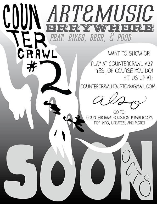
CounterCrawl flyer

CounterCrawl. A bicycling trip through various art studios struck a chord which performance artist Carrie Schneider.

The Cy Twombly Gallery shortly after his death. One of the most moving responses I got to my poll wass this one by painter/collagist/crochetist Stephanie Toppin: "To take an extremely personal take on this that I have not really told or blogged to anyone about, I did the very typical artist thing and visited the Cy Twombly gallery after he died. He is a part of the realm of painters that mak[es] me fall in love with not art, but paint. The relationship to canvas is what I could gawk at, spending hours away. I don't know what I really went for, but I had to go to satisfy the itch of not going. I wanted to think about art now that moved me like this. I felt scared. This year has been a personal rollercoaster for me and art has always been my safe place. For the first time, life seemed marked. I am not afraid of death, I am afraid of artist's death, of an art death. It actually hurts me to type this. Maybe I always felt that his painting lived, the possibility of more, and with his death they truly stopped. All of it became history. This is all there is.

"I know it is dramatic. I wish I was better at communicating a feeling that I can hardly contain. I've been thinking about it for days. I just wanted to tell you, it doesn't matter if you post this. I wish there was a show that shined above this for me.

"Art seems so fast now, there are so many pop up shows and work around every corner. I applaud the energy, I think it helps the public know and understand arts contribution to the culture of the city. I guess I am romantic. I want more slow art. I will have to stew on that."

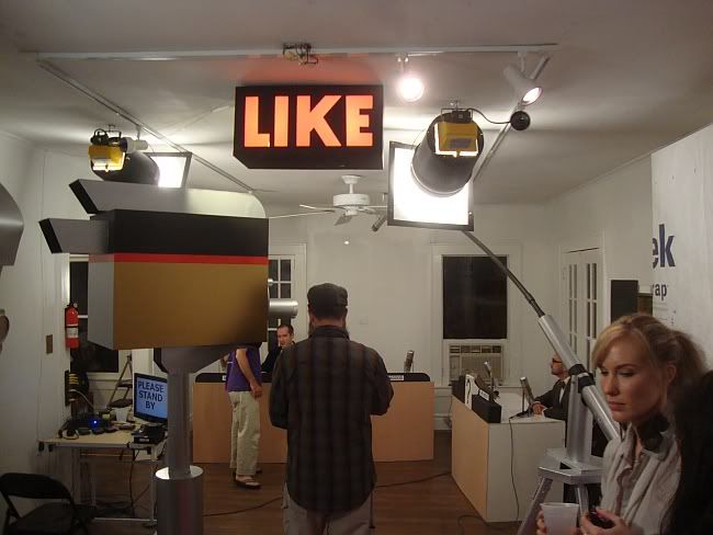
LIKE
Dennis Harper, iPageant, performance with paper props, 2011

iPageant, Dennis Harper & friends at the Joanna. An anonymous respondent wrote, "I was really disappointed with Nancy Douthey's performance, and I wish there was more time spent on the game show portion of the exhibition, but this was great." (Personally, I liked Douthey's performance, but I agree the game show should have kept going--hopefully they will restage it sometime.)

The Devon Britt-Darby saga. Emily Sloan voted for "Devon Britt-Darby's life, art, religion, sexcapades!"


Donald Moffett: The Extravagant Vein at CAMH. And speaking of Devon Britt-Darby, this is one of his top choices of the year.

Photobucket
Emily Peacock, MeeMee and Me, C Print, 2010

Emily Peacock. One anonymous correspondent wrote voted for "anything Emily Peacock does," which raises a point--there are artists that you see here and there who may not have a solo exhibit, but the sum of their work makes a big impact. I can see that effect with Peacock's photography.

Francis Giampietro & Jeremy DePrez, The Power of Negative Feedback at Lawndale. This two-man show garnered a vote from one of my anonymous respondents.

(Because I've reached the limit on the number of characters I can have in my "tags", I'm going to contiunue this in part 3--and part 4 and part 5. Onward!)


Share