"If there is a flaw in the work, it's that it's too good." [Kelly Klaasmeyer, decrying the high level of craftsmenship in Seth Mittag's new exhibit, part of the Prospectors show at Lawndale, "Lawndale's Stellar Studio Show," May 30, 2012, The Houston Press]I wonder if Jacques-Louis David ever got criticism like this?
Thursday, May 31, 2012
Most Obnoxious Piece of Criticism This Week
Studio Visit: Perry House
by Virginia Billeaud Anderson
“Richard Stout is sweet. He called to tell me he’s going to miss my opening because he’ll be in Rome. I told him fuck you. Did you know my first art class was at a small mom and pop school across the street from Richard’s house? It was the Texas Academy of Art. I didn’t know Richard then, it was 1963.
At this point in my studio visit, Perry and I are talking about “the old days.”
“I can’t drive in front of what used to be the 11th Street Café without thinking about Lucas and Don and Dick. We met there every day, I mean every day. We drank a lot of beer, talked a bunch of b.s. We also talked about art. Lucas would talk about Mexico, and Don about the art scene in London, and Dick, well Dick was Dick. Mostly we talked about women.
It’s weird, Lucas quit smoking and drinking, Wray quit, the others quit smoking and drinking, and they’re all gone, and I’m still here, smoking and drinking. But remember I was 10 years younger (b. 1943). When I did my “Southern Dinner” series and I painted fish on those distorted bowls. That was for Lucas, because he loved to fish – did you know Lucas died fishing?”
Well yes, possessing a tiny bit of knowledge about Houston artists, I knew Lucas Johnson died fishing. Let’s turn to the topic of influence. Was his art impacted by the years he spent with Lucas, Don Foster and Dick Wray? “Well only in one way,” Perry said. “Everybody was working big, so I thought, I’ll work big. So now I have a lot of big paintings.” He pointed to large canvases stacked against the wall.
Perry gave me a tour of the living space above his studio. There are artworks in the small kitchen and also a few framed articles about him. One glossy mag published an image of a collector’s fancy living room decorated with Perry’s triptych The Fountain - The Dead Tree - The X-House, but incorrectly attributed the painting. In his bedroom he pointed to an antique head board that framed the bed in which his daughter was born. The head board is one of the recurring pieces of iconography in his art. Another repeated motif is the broken pearl necklace. It’s from a memory of pearls breaking during teenage car sex, and he employs it to alliterate transience.
And back downstairs he showed me some of his student works from around 1969, the earliest output he considered “successful.” These were made at the California College of Arts and Crafts in Oakland where Perry finished his MFA in 1971. Hippie-dippy Berkeley in '69 must have been um, memorable. Perry’s grin speaks nostalgia and amazement, and then he reflected on the tasteless studio building in which he painted. “There were Hells Angels on one side and Black Panthers on the other.”
How did the Texas boy get to California? It was after his military service, during which he worked design jobs, and devoured art publications. “I was in the library looking at university catalogs, and someone on the opposite side of the bookshelf pushed some books, and the Berkeley catalog fell into my hands.” But prior to entering a university art program, there was a distinctly transformational moment. “It came when I viewed the Phillips Collection. When I saw that I knew I would be a painter.”
Perry taught at Cal State in Bakersfield until the mid-seventies when he returned to Houston. The decision to return was made after reading an Art in America article that described Houston’s vibrant art scene as one in which an artist could actually survive. For 40 something years he has been making art and teaching.
Teaching was necessary. Perry did not have the personality to act available and kiss up to collectors. “I had no ability to aggressively chase money so I had to teach. Playing up to collectors can feel awful, the things we have to do to sell paintings can be nasty business.” Through the years he taught at Glassell, the Art Institute, and Houston Community College.
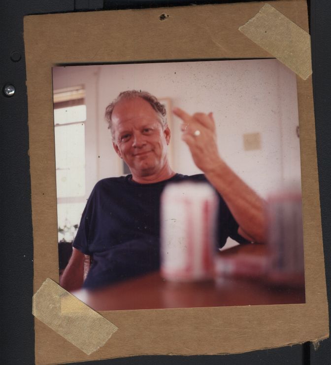
Photo of Perry House by Casey Williams, 1996
“Did I tell you I got fired from Contemporary Art Museum for fighting with Rolf Westfall?” After returning to Houston, Perry worked for a short while for Jim Harithas at CAM as a museum assistant. One day Westfall pissed him off, “so I slugged him. We fought and I was fired.” The time spent around Jim Harithas though was revelatory. Jim did pain in the ass things like make the staff re-paint an entire gallery until the color was precisely the shade he had in mind, but his presentation was impeccable. “I’ve never seen anyone install a show as well as Jim.”
In Houston he began to have regular exhibitions. Barbara Rose and Susie Kalil included him in the 1985 Fresh Paint: The Houston School at the MFAH, where his art is in the permanent collection. Kalil mounted a solo exhibition at Diverse Works. There were shows at the Art League and Lawndale, and several at the Glassell.
And he gained gallery representation. The Graham Gallery gave him an exhibition, so did Robison Gallery, he had numerous years with Davis and McClain when they partnered, he showed at Betty Moody, at McMurtrey, and at Inman. His most recent alliance is with gallerist Dan Allison. Exhibition exposure stretched to other Texas cities, as well as to Los Angeles, Kansas City Missouri, New Orleans and New York.
Perry House, Untitled, Acrylic on Canvas, 1983 (courtesy Nau-Haus)
As one would expect, his exhibitions elicited critical commentary. Newspaper critics Mimi Crossley, Susan Chadwick and Patricia Johnson covered him, and he was reviewed in Art Lies and ArtPapers. Art critic Tom Moody wrote insightfully about him in blog reviews and in Art Forum. In discourse about a multi-panel piece from the 70s, Moody proclaimed it “Di Chirico-esque in mood.” He called another piece “classically surreal” and went on to say, “at the risk of sounding like ad copy, no one in Houston (or anywhere) does work quite like this.”
Perry House, untitled, acrylic, early 70s (courtesy of Tom Moody)
Moody found his brushwork distinct. “The paintings are done in acrylic. House has a technique of layering washes of thinned out black over a finished image to give a kind of fractal scrim livening up the paint's inherent flat inertness. It's kind of an artificial aging patina but has nothing to do with making it look old--just more complex.”
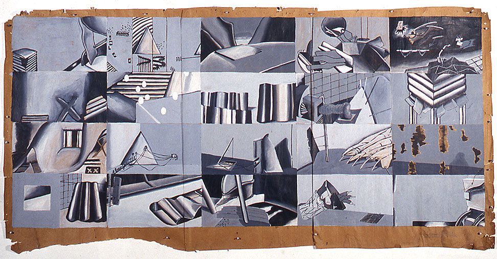
In the center of the studio is a load bearing stud with a sheet of discolored paper nailed to it. Years ago Perry wrote on it the words “sectioned,” “distorted,” “exploded.” Major categories within his oeuvre intimate these notions.
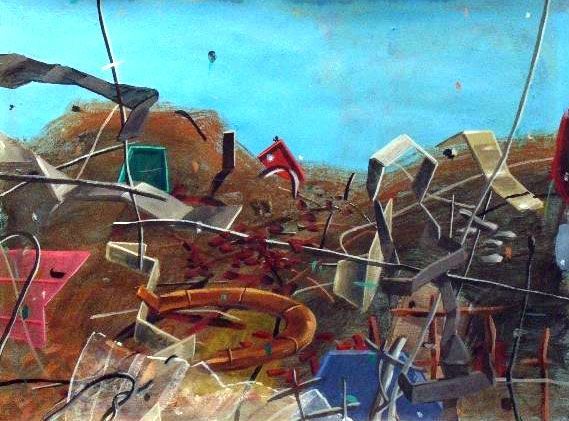
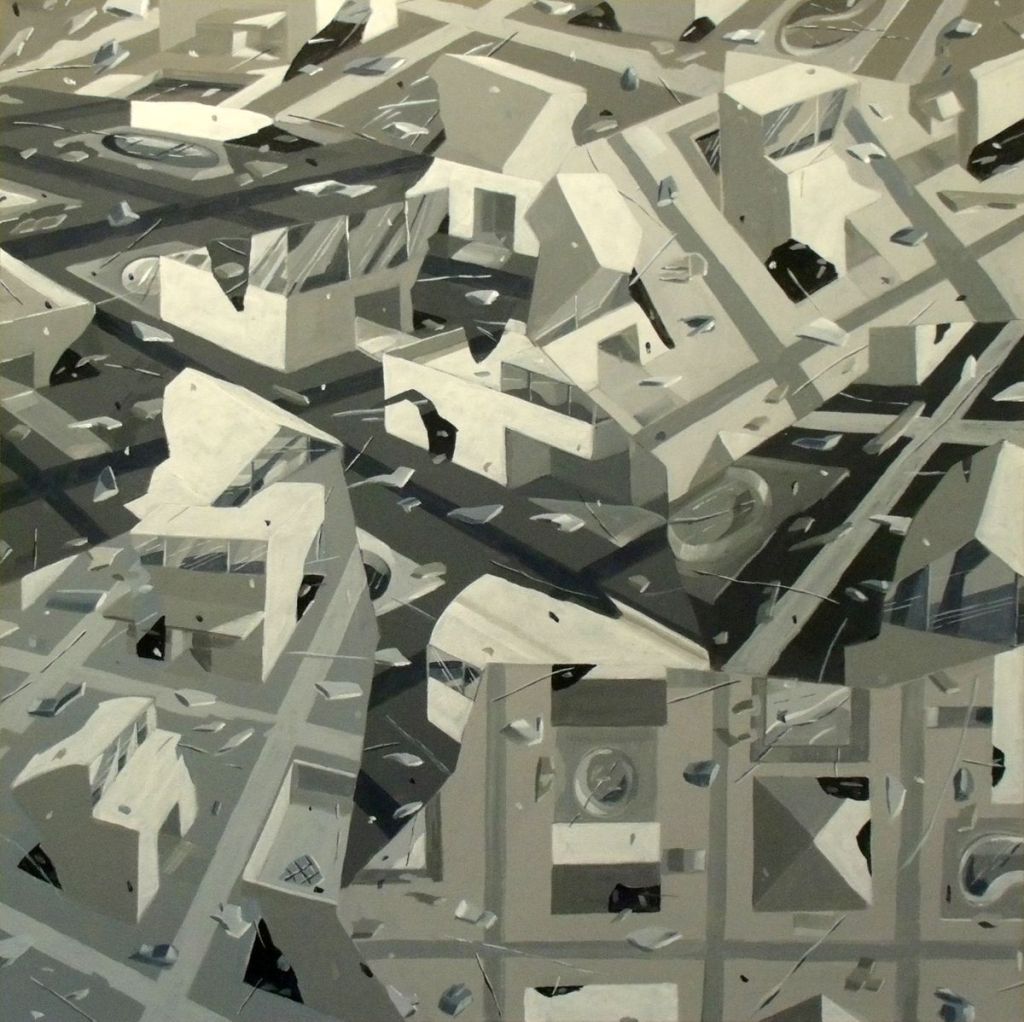
Abstract paintings in the “Explosion” series have forms that are fractured and distorted. Some of the elements are recognizable and some are not. He said he began the “Explosion” series after the Oklahoma City bombing. “I watched coverage on television and saw that crumbled façade. The paintings are an important metaphor for life’s impermanence.”
The “Happyville” series mutated from the “Explosions.” “Happyville’s” more readable architectonic forms are similarly fractured and exploded. During our discussion about “Happyville” Perry opened his studio door and pointed to his neighbor’s house. “I looked at that house and wondered what would happen if it exploded and had Walt Disney colors.” That was in 2008. Terrorism was on his mind, “you know we’ll be attacked again, nothing’s going to stop that,” and so was the mortgage crises, “all of those upside down houses.”
Driving series such as “Explosion” and “Happyville” is a thorny incongruence. The art is directed by two imperatives - elegance and violence. And you can also find those two words scribbled on the discolored paper nailed to the stud. “There’s something beautifully sculptural and elegant about terrorism.”
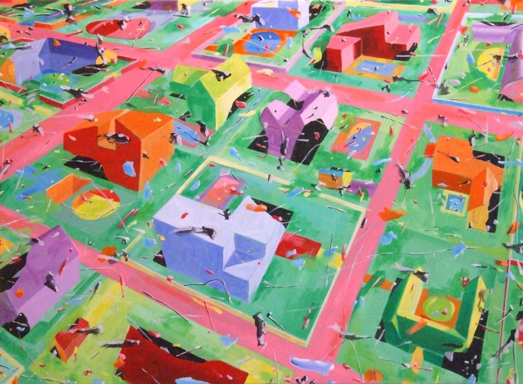
Perry House, from the Happyville Series, 2008-2009, Acrylic on Canvas
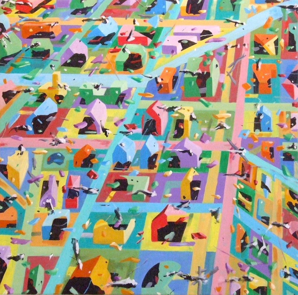
Perry House, from the Happyville Series, 2008-2009, Acrylic on Canvas
“ArtForum called me a good colorist. The fact is I’m not very aware of color. I focus on value, what’s needed to make forms recede.” Well perhaps, but “Happyville’s” shrilly pastels sublimate violence.
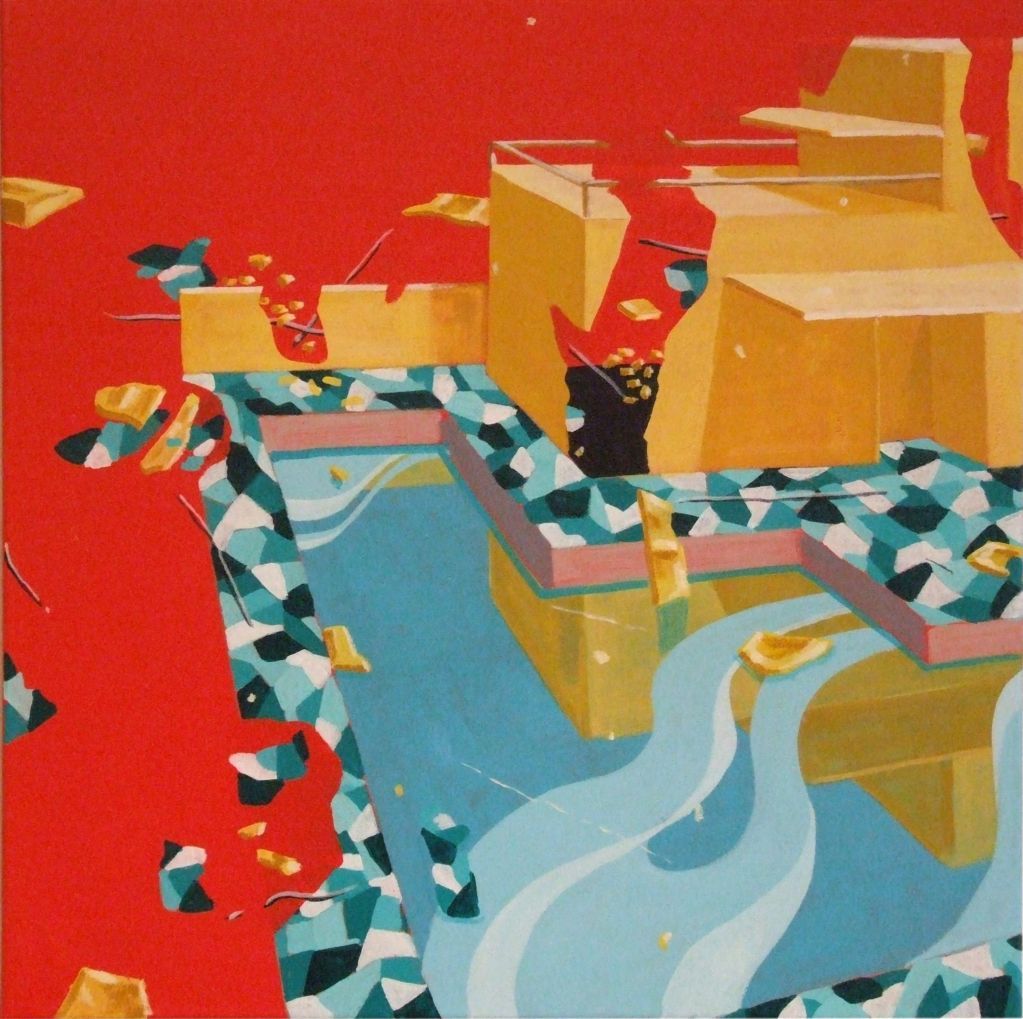
There are forms in “Happyville” that refashion the irregular patterning of terrazzo, marble chips set in cement. European travel accounts for this. In 2009 Perry had a lengthy stay in Rome. He showed me photographs he took of terrazzo covered walkways near Santa Maria Maggiore. Rome’s abundant mosaics also inform his art.
On another trip he spent time in Cordoba’s Great Mosque, and anyone who has seen that inexpressible expanse of marble, granite and onyx columns hoisting red and white striped archways can easily understand how such a thing would permeate his sense of perspective. “I incorporated depth after seeing those arches, a second epiphany like seeing the Phillips Collection.”
Perry House, from the Happyville Series, 2009, Acrylic on Canvas
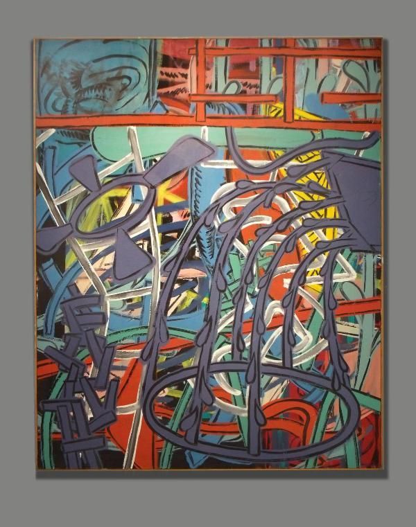
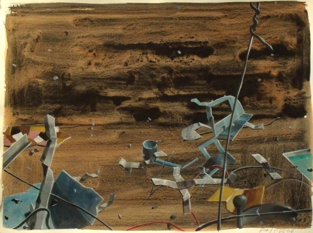
Also dismembered and exploded are the forms in the “Helter-Skelter” series, which reaches further into the dark and ominous. Its forms are “agitated,” Tom Moody detected.
Perry House, 7-20-09 from the Helter Skelter series, 2009, acrylic on Arches Aquarella, 22x30 (courtesy of Dan Allison)
Perry House, from the Helter Skelter Series, 2011, Acrylic on Canvas
“Of the forty something paintings Kalil put in the Diverse Works show, five were ‘Explosions’ and all the rest were ‘Innards’,“ Perry said, informing me of yet another series. “Innards” were abstractions inspired by body fluids, “inside and out, guts, blood, piss, cum,” he decorously elaborated. He also showed me an abstraction from the “Intrusion” series. It was a lovely canvas with overwhelmingly static blue rectangular bands in the foreground and sinuous organic a-tonal forms in the background. I saw paintings from the “Ship of Fools” series, and from the “Southern Dinner” series, that’s the one with Lucas Johnson’s fish.
As we ended our studio visit I asked Perry how he described his art. “I consider myself an abstract painter. I don’t approach abstraction through design, it comes out of content. Some of my abstraction remains closely and visibly tied to objective reality.”
“Perry House: Elegance/Violence” opens at the Art Car Museum on Saturday June 2, with an opening reception at 7-10pm. “It’s not a retrospective,” he said, “because it won’t have art from the 60s and 70s. The art only goes back to 1983. I can’t even call it a 30 year survey because it only has about 20 percent of my work. They carried out 60 something paintings, and hung it and it was too crowded. Some of my paintings are too big. So Jim Harithas came in, and re-hung the show. Jim removed 13 paintings, and now it looks great.”
Perry House, from the Helter Skelter Series, 2011, Acrylic on Canvas

“Richard Stout is sweet. He called to tell me he’s going to miss my opening because he’ll be in Rome. I told him fuck you. Did you know my first art class was at a small mom and pop school across the street from Richard’s house? It was the Texas Academy of Art. I didn’t know Richard then, it was 1963.
At this point in my studio visit, Perry and I are talking about “the old days.”
“I can’t drive in front of what used to be the 11th Street Café without thinking about Lucas and Don and Dick. We met there every day, I mean every day. We drank a lot of beer, talked a bunch of b.s. We also talked about art. Lucas would talk about Mexico, and Don about the art scene in London, and Dick, well Dick was Dick. Mostly we talked about women.
It’s weird, Lucas quit smoking and drinking, Wray quit, the others quit smoking and drinking, and they’re all gone, and I’m still here, smoking and drinking. But remember I was 10 years younger (b. 1943). When I did my “Southern Dinner” series and I painted fish on those distorted bowls. That was for Lucas, because he loved to fish – did you know Lucas died fishing?”
Well yes, possessing a tiny bit of knowledge about Houston artists, I knew Lucas Johnson died fishing. Let’s turn to the topic of influence. Was his art impacted by the years he spent with Lucas, Don Foster and Dick Wray? “Well only in one way,” Perry said. “Everybody was working big, so I thought, I’ll work big. So now I have a lot of big paintings.” He pointed to large canvases stacked against the wall.
Perry gave me a tour of the living space above his studio. There are artworks in the small kitchen and also a few framed articles about him. One glossy mag published an image of a collector’s fancy living room decorated with Perry’s triptych The Fountain - The Dead Tree - The X-House, but incorrectly attributed the painting. In his bedroom he pointed to an antique head board that framed the bed in which his daughter was born. The head board is one of the recurring pieces of iconography in his art. Another repeated motif is the broken pearl necklace. It’s from a memory of pearls breaking during teenage car sex, and he employs it to alliterate transience.
And back downstairs he showed me some of his student works from around 1969, the earliest output he considered “successful.” These were made at the California College of Arts and Crafts in Oakland where Perry finished his MFA in 1971. Hippie-dippy Berkeley in '69 must have been um, memorable. Perry’s grin speaks nostalgia and amazement, and then he reflected on the tasteless studio building in which he painted. “There were Hells Angels on one side and Black Panthers on the other.”
How did the Texas boy get to California? It was after his military service, during which he worked design jobs, and devoured art publications. “I was in the library looking at university catalogs, and someone on the opposite side of the bookshelf pushed some books, and the Berkeley catalog fell into my hands.” But prior to entering a university art program, there was a distinctly transformational moment. “It came when I viewed the Phillips Collection. When I saw that I knew I would be a painter.”
Perry taught at Cal State in Bakersfield until the mid-seventies when he returned to Houston. The decision to return was made after reading an Art in America article that described Houston’s vibrant art scene as one in which an artist could actually survive. For 40 something years he has been making art and teaching.
Teaching was necessary. Perry did not have the personality to act available and kiss up to collectors. “I had no ability to aggressively chase money so I had to teach. Playing up to collectors can feel awful, the things we have to do to sell paintings can be nasty business.” Through the years he taught at Glassell, the Art Institute, and Houston Community College.

Photo of Perry House by Casey Williams, 1996
“Did I tell you I got fired from Contemporary Art Museum for fighting with Rolf Westfall?” After returning to Houston, Perry worked for a short while for Jim Harithas at CAM as a museum assistant. One day Westfall pissed him off, “so I slugged him. We fought and I was fired.” The time spent around Jim Harithas though was revelatory. Jim did pain in the ass things like make the staff re-paint an entire gallery until the color was precisely the shade he had in mind, but his presentation was impeccable. “I’ve never seen anyone install a show as well as Jim.”
In Houston he began to have regular exhibitions. Barbara Rose and Susie Kalil included him in the 1985 Fresh Paint: The Houston School at the MFAH, where his art is in the permanent collection. Kalil mounted a solo exhibition at Diverse Works. There were shows at the Art League and Lawndale, and several at the Glassell.
And he gained gallery representation. The Graham Gallery gave him an exhibition, so did Robison Gallery, he had numerous years with Davis and McClain when they partnered, he showed at Betty Moody, at McMurtrey, and at Inman. His most recent alliance is with gallerist Dan Allison. Exhibition exposure stretched to other Texas cities, as well as to Los Angeles, Kansas City Missouri, New Orleans and New York.

Perry House, Untitled, Acrylic on Canvas, 1983 (courtesy Nau-Haus)
As one would expect, his exhibitions elicited critical commentary. Newspaper critics Mimi Crossley, Susan Chadwick and Patricia Johnson covered him, and he was reviewed in Art Lies and ArtPapers. Art critic Tom Moody wrote insightfully about him in blog reviews and in Art Forum. In discourse about a multi-panel piece from the 70s, Moody proclaimed it “Di Chirico-esque in mood.” He called another piece “classically surreal” and went on to say, “at the risk of sounding like ad copy, no one in Houston (or anywhere) does work quite like this.”

Perry House, untitled, acrylic, early 70s (courtesy of Tom Moody)
Moody found his brushwork distinct. “The paintings are done in acrylic. House has a technique of layering washes of thinned out black over a finished image to give a kind of fractal scrim livening up the paint's inherent flat inertness. It's kind of an artificial aging patina but has nothing to do with making it look old--just more complex.”
In the center of the studio is a load bearing stud with a sheet of discolored paper nailed to it. Years ago Perry wrote on it the words “sectioned,” “distorted,” “exploded.” Major categories within his oeuvre intimate these notions.
Abstract paintings in the “Explosion” series have forms that are fractured and distorted. Some of the elements are recognizable and some are not. He said he began the “Explosion” series after the Oklahoma City bombing. “I watched coverage on television and saw that crumbled façade. The paintings are an important metaphor for life’s impermanence.”
The “Happyville” series mutated from the “Explosions.” “Happyville’s” more readable architectonic forms are similarly fractured and exploded. During our discussion about “Happyville” Perry opened his studio door and pointed to his neighbor’s house. “I looked at that house and wondered what would happen if it exploded and had Walt Disney colors.” That was in 2008. Terrorism was on his mind, “you know we’ll be attacked again, nothing’s going to stop that,” and so was the mortgage crises, “all of those upside down houses.”
Driving series such as “Explosion” and “Happyville” is a thorny incongruence. The art is directed by two imperatives - elegance and violence. And you can also find those two words scribbled on the discolored paper nailed to the stud. “There’s something beautifully sculptural and elegant about terrorism.”

Perry House, from the Happyville Series, 2008-2009, Acrylic on Canvas

Perry House, from the Happyville Series, 2008-2009, Acrylic on Canvas
“ArtForum called me a good colorist. The fact is I’m not very aware of color. I focus on value, what’s needed to make forms recede.” Well perhaps, but “Happyville’s” shrilly pastels sublimate violence.
There are forms in “Happyville” that refashion the irregular patterning of terrazzo, marble chips set in cement. European travel accounts for this. In 2009 Perry had a lengthy stay in Rome. He showed me photographs he took of terrazzo covered walkways near Santa Maria Maggiore. Rome’s abundant mosaics also inform his art.
On another trip he spent time in Cordoba’s Great Mosque, and anyone who has seen that inexpressible expanse of marble, granite and onyx columns hoisting red and white striped archways can easily understand how such a thing would permeate his sense of perspective. “I incorporated depth after seeing those arches, a second epiphany like seeing the Phillips Collection.”

Perry House, from the Happyville Series, 2009, Acrylic on Canvas
Also dismembered and exploded are the forms in the “Helter-Skelter” series, which reaches further into the dark and ominous. Its forms are “agitated,” Tom Moody detected.

Perry House, 7-20-09 from the Helter Skelter series, 2009, acrylic on Arches Aquarella, 22x30 (courtesy of Dan Allison)

Perry House, from the Helter Skelter Series, 2011, Acrylic on Canvas
“Of the forty something paintings Kalil put in the Diverse Works show, five were ‘Explosions’ and all the rest were ‘Innards’,“ Perry said, informing me of yet another series. “Innards” were abstractions inspired by body fluids, “inside and out, guts, blood, piss, cum,” he decorously elaborated. He also showed me an abstraction from the “Intrusion” series. It was a lovely canvas with overwhelmingly static blue rectangular bands in the foreground and sinuous organic a-tonal forms in the background. I saw paintings from the “Ship of Fools” series, and from the “Southern Dinner” series, that’s the one with Lucas Johnson’s fish.
As we ended our studio visit I asked Perry how he described his art. “I consider myself an abstract painter. I don’t approach abstraction through design, it comes out of content. Some of my abstraction remains closely and visibly tied to objective reality.”
“Perry House: Elegance/Violence” opens at the Art Car Museum on Saturday June 2, with an opening reception at 7-10pm. “It’s not a retrospective,” he said, “because it won’t have art from the 60s and 70s. The art only goes back to 1983. I can’t even call it a 30 year survey because it only has about 20 percent of my work. They carried out 60 something paintings, and hung it and it was too crowded. Some of my paintings are too big. So Jim Harithas came in, and re-hung the show. Jim removed 13 paintings, and now it looks great.”

Perry House, from the Helter Skelter Series, 2011, Acrylic on Canvas
Wednesday, May 30, 2012
Tu Crazy Baby: Ricky Armendariz at the Art League
by Robert Boyd
Ricky Armendariz, Tu eres loca pero yo tequiero anyway, 2012, oil on carved birch plywood, 24" x 24"
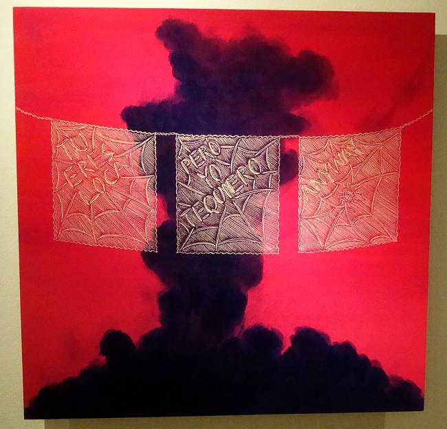
Ricky Armendariz's paintings in Tu Eres O No Tu Eres Mi Baby (Is You Is or Is You Ain't My Baby) at the Art League consist of two elements. There is a painted surface, usually just a couple of colors in a suggestive arrangement that could be read as something real or could be seen as an abstraction. Then there is a drawing or some lettering incised into the surface (the paintings are on plywood) with a fine router. The painted part is moody, dark and suggestive. The engraved drawings are humorous, direct and ironic. And it is the juxtaposition of these two unlike aspects that makes the work so interesting.
A lot of the work here is about juxtaposition--language, for example. English and Spanish co-exist in one sentence. Tu eres loco pero yo tequiero anyway (You're crazy but I love you anyway). And in this piece, the festive paper-lace decorations are superimposed on an ominous silhouette of an explosion.
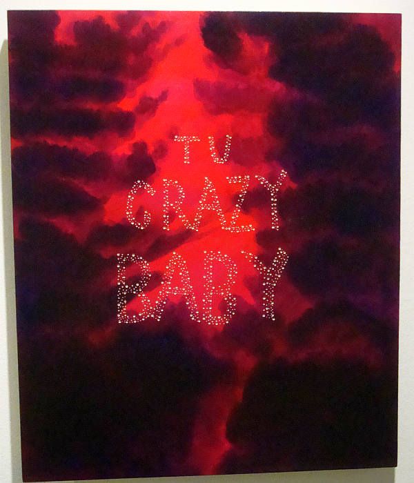
Ricky Armendariz, Tu Crazy Baby, 2012, oil on carved birch plywood, 20" x 24"
Work like Tu Crazy Baby is simultaneously ominous and funny. The expression uttered by a lover, "Tu crazy baby," can be playful or fearful. Your crazy lover may be a high-spirited clown. Or he may be violent or self-destructive or wildly unpredictable. Those dark roiling clouds could be his mind, opaque and unsettled. My first reaction was to laugh, but the implications are not necessarily funny.
Armendariz in his discussion of the work on opening night spoke of narcotraficantes and their wars in towns like Juarez, just across the border from Armendariz's hometown of El Paso. He mentioned the work of Rigoberto A. Gonzalez, who had a show earlier this year at the Art League. Gonzalez didn't shy away from grisly paintings of severed heads, but Armendariz issn't willing to commit that kind of image to plywood. He deals with the drug war in a more oblique way.
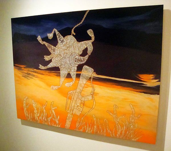
Ricky Armendariz, Dale Dale Dale, 2010, oil on carved birch plywood, 36" x 48"
In Dale Dale Dale (more or less, "Wow Wow Wow"), the piñata is being struck by an automatic rifle. In Burro, the wheel comes off what Armendariz identifies as a narcotraficante's fancy new truck.
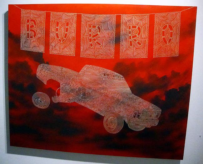
Ricky Armendariz, Burro, 2012, oil on carved birch plywood, 32" x 39"
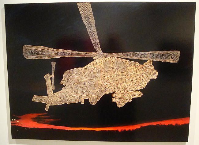
And Dame Dame Dame ("Gimme gimme gimme") has a military helicopter flying over a dark landscape bisected by a red river--a wound? This could be the Rio Grande, where the drugs cross from Mexico to the eager market that is the U.S.A. The helicopter could then be either Mexican or American. There is a good deal of ambiguity in these works. (Including ambiguous images--the more I look at this painting, the more I think what we are actually seeing is a horizon at sunrise or sunset, with low dark clouds. All we see of the sky is the red band. And on the left are lights of a landing field or highway. It's ambiguous enough that it could be read both ways.)
Ricky Armendariz, Dale Dale Dale, 2010, oil on carved birch plywood, 36" x 48"
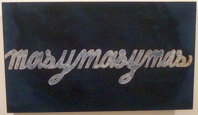
Ricky Armendariz, masymasymas, 2010, oil on carved birch plywood, 14" x 24"
But his overarching subject seems to be dangerous desire--wanting more and more, as masymasymas implies. Bad love affairs, drugs, money--all of these fit into that burning need for more. Ricky Armendariz depicts a world where things get bad, but they never get boring.

Ricky Armendariz, Tu eres loca pero yo tequiero anyway, 2012, oil on carved birch plywood, 24" x 24"
Ricky Armendariz's paintings in Tu Eres O No Tu Eres Mi Baby (Is You Is or Is You Ain't My Baby) at the Art League consist of two elements. There is a painted surface, usually just a couple of colors in a suggestive arrangement that could be read as something real or could be seen as an abstraction. Then there is a drawing or some lettering incised into the surface (the paintings are on plywood) with a fine router. The painted part is moody, dark and suggestive. The engraved drawings are humorous, direct and ironic. And it is the juxtaposition of these two unlike aspects that makes the work so interesting.
A lot of the work here is about juxtaposition--language, for example. English and Spanish co-exist in one sentence. Tu eres loco pero yo tequiero anyway (You're crazy but I love you anyway). And in this piece, the festive paper-lace decorations are superimposed on an ominous silhouette of an explosion.

Ricky Armendariz, Tu Crazy Baby, 2012, oil on carved birch plywood, 20" x 24"
Work like Tu Crazy Baby is simultaneously ominous and funny. The expression uttered by a lover, "Tu crazy baby," can be playful or fearful. Your crazy lover may be a high-spirited clown. Or he may be violent or self-destructive or wildly unpredictable. Those dark roiling clouds could be his mind, opaque and unsettled. My first reaction was to laugh, but the implications are not necessarily funny.
Armendariz in his discussion of the work on opening night spoke of narcotraficantes and their wars in towns like Juarez, just across the border from Armendariz's hometown of El Paso. He mentioned the work of Rigoberto A. Gonzalez, who had a show earlier this year at the Art League. Gonzalez didn't shy away from grisly paintings of severed heads, but Armendariz issn't willing to commit that kind of image to plywood. He deals with the drug war in a more oblique way.

Ricky Armendariz, Dale Dale Dale, 2010, oil on carved birch plywood, 36" x 48"
In Dale Dale Dale (more or less, "Wow Wow Wow"), the piñata is being struck by an automatic rifle. In Burro, the wheel comes off what Armendariz identifies as a narcotraficante's fancy new truck.

Ricky Armendariz, Burro, 2012, oil on carved birch plywood, 32" x 39"
And Dame Dame Dame ("Gimme gimme gimme") has a military helicopter flying over a dark landscape bisected by a red river--a wound? This could be the Rio Grande, where the drugs cross from Mexico to the eager market that is the U.S.A. The helicopter could then be either Mexican or American. There is a good deal of ambiguity in these works. (Including ambiguous images--the more I look at this painting, the more I think what we are actually seeing is a horizon at sunrise or sunset, with low dark clouds. All we see of the sky is the red band. And on the left are lights of a landing field or highway. It's ambiguous enough that it could be read both ways.)

Ricky Armendariz, Dale Dale Dale, 2010, oil on carved birch plywood, 36" x 48"

Ricky Armendariz, masymasymas, 2010, oil on carved birch plywood, 14" x 24"
But his overarching subject seems to be dangerous desire--wanting more and more, as masymasymas implies. Bad love affairs, drugs, money--all of these fit into that burning need for more. Ricky Armendariz depicts a world where things get bad, but they never get boring.
Monday, May 28, 2012
The Return of the Cosmic Techno-Gods from Space
by Robert Boyd
Within the comics community, Jack Kirby is revered. I have mixed feelings about his work. There is something inherently juvenile about it. It doesn't have the richness, the multivalence I look for in art. There is not a sense of deep humanity in the work, nor irony. But at the same time, it has a vigor--the vigor of certain folk art or of expressionist painting. He was no folk artist, but he was the industrial age's equivalent--an artist whose training and early career lead him to be a journeyman artist toiling within the commercial entertainment industry. But within this field, which has a tendency towards uniformity, he stood out drastically. One can think of certain respected comics artists who were his peers--John Romita, John Buscema, Neal Adams--and although each of these artists had a distinct style, compared to Kirby they were virtually the same artist.
Kirby, on the other hand, was unique. No one really imitated his style--not until much later, when such imitations were the results of deliberately post-modern strategies. If I had to describe Kirby figures, particularly from his work in the sixties and seventies, I would say they look like a rough-hewn wood carvings of figures that have somehow been coated with multi-color chrome. His work was simultaneously crude and futuristic.
And he created a genre, a type of character, that was unique. These are cosmic techno-gods. The first he created was Thor and his fellow Asgardians, which were created in 1962. Stan Lee was the co-creator of these characters. I won't try to parse the credit more finely than that. Of course, anonymous Norse holy men created this mythology. But Kirby and Lee turned these eternal myths into technological creatures. The technology was not ever really explained, but you could see it in the way that Asgard was portrayed--as a gleaming, high-tech megalopolis in space.

Jack Kirby, Galactus
I think the next cosmic techno-god was Galactus, the planet-devouring giant whose herald was the Silver Surfer. He was a bit more impressive as a god--much larger than humans, Galactus seems to be the embodiment of some elemental force of nature. But despite that, he also is a technological being. He has a space station and he must use equipment that he constructs to consume planets.

Jack Kirby, Galactus' space station
Kirby (sometimes with Lee and sometimes alone) created any number of techno-gods in the 60s and 70s to menace or mystify his super-hero characters--the Watcher, the High Evolutionary, Ego the Living Planet (who for obvious reasons is quite hostile to Galactus), Darkseid and the inhabitants of Apokolips, the Highfather and the inhabitants of New Genesis, the Eternals, and so on. It is my understanding that these characters and more are discussed at length in a new book called Hand of Fire: The Comics Art of Jack Kirby by Charles Hatfield, but I haven't read it yet. (It's on my to-read list.)

Jack Kirby, The Eternals
The reason I bring up Kirby and his creation of this type of character is that I've recently come across three comics that seem directly influenced by Kirby, but which come out of the world of art comics. These are Vortex by William Cardini (The Gold County Paper Mill), By This Shall You Know Him by Jesse Jacobs (Koyama Press), and Forming
 by Jesse Moynihan (Nobrow Press). As I mentioned in a review of the latest Kramer's Ergot, there seems to be a movement in art comics away from the quotidian, the realistic, the autobiographical. This is a big deal. Since the mid-70s, the default position for comics-as-art has been to tell narratives of ordinary lives. It was an extreme reaction to the continued reliance of "mainstream" comics on juvenile fantasy as its primary subject matter. In some ways, the realism of such comics as American Splendor or Palookaville could be said to be a reaction to the work of Jack Kirby. While there have always been exceptions to the realism trend (for example, Jim Woodring), around 2000 there was a major swing away from realism as an artistic ideal towards a use of the motifs of children's genre comics. (To clarify, when I say realism, I am not discussing the drawings style. Sometimes the drawing is quite expressionistic. I refer instead to the content of the stories.)
If the motifs of children's comics are fair game for art cartoonists, then Jack Kirby is likewise an acceptable source. In each of these comics, the basic ideas of Kirby's techno-gods are reused. Each artist picks and chooses what aspect of Kirby's project he will employ. And they also feel free to call on other sources and also to subvert Kirby's approach. The results are varied but fascinating.

William Cardini, cover to Vortex #1
There have been two issues of Vortex so far. I have discussed Cardini's work before here (an exhibit at Domy). That review from a year and a half ago contained this confession:

William Cardini, Vortex #1 page 3
Vortex tells the story of Miizard. He is lured to a world where he does combat with an extremely powerful alien creature. The battle, which takes up the entirety of the first issue, recalls mythologies. Miizzard is sliced into bits by his adversary, but the bits are alive and become multiple Miizzards, like Krishna. He defeats his opponent by devouring him, as Cronus devoured his children to prevent the prophecy of his being defeated them to come true.

William Cardini, Vortex #1, page 32
Cardini draws with a thick, watery line and fills the spaces between with a variety of patterns. His work recalls Kirby's in a way-both use thick black lines and black shapes in a non-chiaroscuro way (which reinforces their lack of realism). But Kirby's techno-gods had a connection to the human world. They looked like people and engaged with human beings. Cardini creates a pitiless, inhuman universe. The motives of the characters may not be "evil" (they include curiosity and a desire to be released from bondage), but all the characters are violent and selfish. I believe Cardini is thinking of these characters in terms of natural forces--erosion, volcanism, planet formation, novas, etc. Forces that shape worlds but are vast and impersonal. But I think by making his characters so venal, he weakens this metaphor.

Jesse Jacobs, By This Shall You Know Him, cover
Jesse Jacobs plays homage to Kirby on the cover of his book By This Shall You Know Him. The technological structure open to space appears to be made of wood, and in this is similar to the way Kirby often drew such structures (Kirby's were shinier, though). If Kirby had drawn this cover, all the crenulations would appear to be inexplicable technological apparatuses. Here they seem to be a remarkably complex piece of carpentry--made of purple wood.
The story here is about a group of techno-gods Ablavar, Blorax, Zantek and their teacher, who is unnamed. Their relationship to their teacher is much like art students to their professors. They work on projects that they show the teacher in a critique session (aka a "crit"). The other students are permitted to comment on the work as part of the crit. (In my review of Kramer's Ergot, I proposed an admittedly vague theory about artists who I called "The Art School Generation" and their willingness to dive into genre. This "crit" undertaken by techno-gods weirdly confirms this theory.) One of the gods, Ablavar, creates the Earth (populated by dinosaurs) as his project. Zantek criticizes it harshly and Ablavar decides to destroy the dinosaurs with a a meteor storm and start over.

Jesse Jacobs, By This Shall You Know Him, cover p. 18
Ablavar then creates mammals, birds and non-dinosaur reptiles, which his teacher and Blorax appreciate highly in the crit. Even the "exalted one," a techno-god who seems to be the superior to the teacher, appreciates them. Only Zantek disdains them, but his dislike for them appears to be the result of jealousy. He comes up with a plan for revenge--he creates humans. His Adam and Eve are like cave-men, with Eve being the smarter of the two.

Jesse Jacobs, By This Shall You Know Him, cover p.47
Zantek seduces Adam by teaching him to eat animals. Eve decides that Zantek is a bad influence and forbids Cain and Abel from associating with him. (It should be said that Jacobs never names these first humans, but the seem to be acting out a version of the Genesis story, so I am using the Biblical names.)

Jesse Jacobs, By This Shall You Know Him, cover p.73
And as in Genesis, Cain commits the first murder--because Abel, under the influence of Zantek, has been killing Ablavar's animals. Once Ablavar learns how Zantek has been subverting his world, he begins to fight with him. Like Kirby's Eternals or Galactus, Ablavar and Zantek are giants. The Earth and its inhabitants are usually depicted in shades of purple, while the techno-gods are mostly blue. So even when they are on Earth, they seem separate from the Earth. And as Ablavar and Zantek battle, civilization appears around them. Their fight, which is appears to be completely physical (punches thrown, stuff hurled), apparently takes place over millenia.

Jesse Jacobs, By This Shall You Know Him, cover p.80
A key difference between Kirby and Jacobs is that Jacobs is willing to make his techno-gods into actual gods--they create the Earth and populate it with animals and humans, just as most of the gods of myth and religion did. Kirby was working in a context of commercial comic books aimed at children. He wasn't in a position to supplant established religions with his own mythology--it might have caused controversy, And controversy might keep the Red Ryder BB gun manufacturer from buying ads in Thor or The Fantastic Four. Jacobs is free to explore religious ideas more directly than Kirby. He can posit Genesis as an art school crit, and no one will be too bothered.

Jesse Moynihan, Forming, cover
Forming by Jesse Moynihan likewise is willing to take on actual religions and myths, suggesting a creation of the Universe and of Earth that is similar to but distinct from the origins told in various world religions. His characters come from Greek mythology (including late Graeco-Egyption fusion), the Torah and Kabbalah, Zoroastrianism, medieval folklore, Dogon myth, and maybe a few I have missed.

Jesse Moynihan, Forming, page 6 bottom panels
The story begins in 10,000 BC (although it flashes back to a much earlier time later on). Mithras has been sent to Earth to exploit it in the classic colonial way. Humans on Earth, at this stage, have a telepathic oneness with nature. Mithras lands in Atlantis and immediately starts creating a crappy mining colony with giant slaves. To placate the humans, he marries one, Gaia.

Jesse Moynihan, Gaia and her offspring
This leads to one of the most bizarre aspects of the story, the mixture of myths. Noah and Gaia secretly have two children, Iapetus and Themis (who are two of the Titans in Greek mythology). In the meantime, the androgyne Serapis lands in Africa with the intention of setting up his own outlaw mining colony. His first encounter with humans, Adam and Eve, doesn't go well.

Jesse Moynihan, Forming, page 29 bottom panels
But Adam is eventually co-opted by Serapis. Just to complicate matters, we see a flashback in which a battle between Lucifer and Michael (who with his blue skin looks very Krishna-like) causes the universe to come into existence. Lucifer is punished by being placed in the center of the Earth.

Jesse Moynihan, Forming, page 24 bottom panels
Lucifer influences things by communicating with people on the surface. Likewise Ain Soph (the Kabbalah's word for God prior to his self-manifestation) is influencing Noah through visions.

Jesse Moynihan, Forming, page 39 top panels
And the gnome king Ghob is trying to undo the mess that Mithras has made. He communicates secretly with Mithras and Gaia's children (various Titans), influencing them to revolt against Mithras.

Jesse Moynihan, Forming, page 51 top panels
The number of characters in Forming is huge, and their motivations are complex. And this is just volume 1. The story is serialized on Moynihans' website--you can follow the continued story there. But despite the complex plot and numerous characters, the basic story is one of colonialism and the problems that persist after the colonial power has been driven out. Ghob is outraged that Cronus starts building cities after overthrowing Mithras. He wants things to go back to the way they were before. But this is a new age. As one character puts it, "You will wake at the end of the Third Age: the Age of Total Bullshit, to save us."
That is one thing that distinguishes Forming (and By This Shall You Know Him and other related art comics) is the language of the characters. Instead of using the elevated speech that Kirby and Stan Lee gave to Thor and Galactus, these characters use a vernacular that sounds decidedly un-god-like.
Moynihan's art doesn't try to blow your mind the way Kirby's often did. In fact, despite its subject matter, it has a kind of matter-of-fact quality. (This quality is reinforced by the unvarying grid pattern of the panels.) And yet the cumulative effect of it is powerful. The book is printed in an over-sized format, which helps you see just how beautiful it is. Moynihan's water-coloring deserves special mention.
It is impossible for me to imagine these comics existing without the example of Jack Kirby. And like Kirby, we don't have any complex, realistic human characters here. None of these artists are trying to create, say, a story like Jaime Hernandez's "Browntown" (from Love and Rockets: New Stories vol. 3), a powerful, realistic family story. But using techno-gods permits the artists to deal with subjects in interesting, metaphorical ways (art school, colonialism). It also acknowledges the history of comics, finding a way to be in dialogue with the past without replicating it endlessly, as most modern mainstream comics do. Forming, Vortex, and By This Shall You Know Him are also valuable as exemplars of a current practice in the world of art comics that doesn't have a particular name, but which definitely exists. I wish I had a clever word or phrase for it. Post-realism? Something like that.
Within the comics community, Jack Kirby is revered. I have mixed feelings about his work. There is something inherently juvenile about it. It doesn't have the richness, the multivalence I look for in art. There is not a sense of deep humanity in the work, nor irony. But at the same time, it has a vigor--the vigor of certain folk art or of expressionist painting. He was no folk artist, but he was the industrial age's equivalent--an artist whose training and early career lead him to be a journeyman artist toiling within the commercial entertainment industry. But within this field, which has a tendency towards uniformity, he stood out drastically. One can think of certain respected comics artists who were his peers--John Romita, John Buscema, Neal Adams--and although each of these artists had a distinct style, compared to Kirby they were virtually the same artist.
Kirby, on the other hand, was unique. No one really imitated his style--not until much later, when such imitations were the results of deliberately post-modern strategies. If I had to describe Kirby figures, particularly from his work in the sixties and seventies, I would say they look like a rough-hewn wood carvings of figures that have somehow been coated with multi-color chrome. His work was simultaneously crude and futuristic.
And he created a genre, a type of character, that was unique. These are cosmic techno-gods. The first he created was Thor and his fellow Asgardians, which were created in 1962. Stan Lee was the co-creator of these characters. I won't try to parse the credit more finely than that. Of course, anonymous Norse holy men created this mythology. But Kirby and Lee turned these eternal myths into technological creatures. The technology was not ever really explained, but you could see it in the way that Asgard was portrayed--as a gleaming, high-tech megalopolis in space.
Jack Kirby, Galactus
I think the next cosmic techno-god was Galactus, the planet-devouring giant whose herald was the Silver Surfer. He was a bit more impressive as a god--much larger than humans, Galactus seems to be the embodiment of some elemental force of nature. But despite that, he also is a technological being. He has a space station and he must use equipment that he constructs to consume planets.
Jack Kirby, Galactus' space station
Kirby (sometimes with Lee and sometimes alone) created any number of techno-gods in the 60s and 70s to menace or mystify his super-hero characters--the Watcher, the High Evolutionary, Ego the Living Planet (who for obvious reasons is quite hostile to Galactus), Darkseid and the inhabitants of Apokolips, the Highfather and the inhabitants of New Genesis, the Eternals, and so on. It is my understanding that these characters and more are discussed at length in a new book called Hand of Fire: The Comics Art of Jack Kirby by Charles Hatfield, but I haven't read it yet. (It's on my to-read list.)
Jack Kirby, The Eternals
The reason I bring up Kirby and his creation of this type of character is that I've recently come across three comics that seem directly influenced by Kirby, but which come out of the world of art comics. These are Vortex by William Cardini (The Gold County Paper Mill), By This Shall You Know Him
If the motifs of children's comics are fair game for art cartoonists, then Jack Kirby is likewise an acceptable source. In each of these comics, the basic ideas of Kirby's techno-gods are reused. Each artist picks and chooses what aspect of Kirby's project he will employ. And they also feel free to call on other sources and also to subvert Kirby's approach. The results are varied but fascinating.
William Cardini, cover to Vortex #1
There have been two issues of Vortex so far. I have discussed Cardini's work before here (an exhibit at Domy). That review from a year and a half ago contained this confession:
If it sounds like I haven't fully digested this art movement (and it is a movement), you are right. I've known the Fort Thunder artists for over a decade and I'm still trying to understand them--to devise a framework or theory that makes sense of their work. I feel I am about halfway there.This is still true. Maybe I'm 2/3rds there now. Vortex continues Cardini's project of creating a universe of techno-gods.
Welcome to the psychedelic space fantasy cosmos of the Hyperverse, a realm filled with immensely powerful beings who battle over worlds with strange geologies, and hoard advanced technologies left by ancient starfarers.
Mountains shift from molten to crystal in moments, and clumps of rock are inhabited by malevolent intelligences ready to hurl face-melting spells. [from the introduction to Vortex #1]
William Cardini, Vortex #1 page 3
Vortex tells the story of Miizard. He is lured to a world where he does combat with an extremely powerful alien creature. The battle, which takes up the entirety of the first issue, recalls mythologies. Miizzard is sliced into bits by his adversary, but the bits are alive and become multiple Miizzards, like Krishna. He defeats his opponent by devouring him, as Cronus devoured his children to prevent the prophecy of his being defeated them to come true.
William Cardini, Vortex #1, page 32
Cardini draws with a thick, watery line and fills the spaces between with a variety of patterns. His work recalls Kirby's in a way-both use thick black lines and black shapes in a non-chiaroscuro way (which reinforces their lack of realism). But Kirby's techno-gods had a connection to the human world. They looked like people and engaged with human beings. Cardini creates a pitiless, inhuman universe. The motives of the characters may not be "evil" (they include curiosity and a desire to be released from bondage), but all the characters are violent and selfish. I believe Cardini is thinking of these characters in terms of natural forces--erosion, volcanism, planet formation, novas, etc. Forces that shape worlds but are vast and impersonal. But I think by making his characters so venal, he weakens this metaphor.
Jesse Jacobs, By This Shall You Know Him, cover
Jesse Jacobs plays homage to Kirby on the cover of his book By This Shall You Know Him. The technological structure open to space appears to be made of wood, and in this is similar to the way Kirby often drew such structures (Kirby's were shinier, though). If Kirby had drawn this cover, all the crenulations would appear to be inexplicable technological apparatuses. Here they seem to be a remarkably complex piece of carpentry--made of purple wood.
The story here is about a group of techno-gods Ablavar, Blorax, Zantek and their teacher, who is unnamed. Their relationship to their teacher is much like art students to their professors. They work on projects that they show the teacher in a critique session (aka a "crit"). The other students are permitted to comment on the work as part of the crit. (In my review of Kramer's Ergot, I proposed an admittedly vague theory about artists who I called "The Art School Generation" and their willingness to dive into genre. This "crit" undertaken by techno-gods weirdly confirms this theory.) One of the gods, Ablavar, creates the Earth (populated by dinosaurs) as his project. Zantek criticizes it harshly and Ablavar decides to destroy the dinosaurs with a a meteor storm and start over.
Jesse Jacobs, By This Shall You Know Him, cover p. 18
Ablavar then creates mammals, birds and non-dinosaur reptiles, which his teacher and Blorax appreciate highly in the crit. Even the "exalted one," a techno-god who seems to be the superior to the teacher, appreciates them. Only Zantek disdains them, but his dislike for them appears to be the result of jealousy. He comes up with a plan for revenge--he creates humans. His Adam and Eve are like cave-men, with Eve being the smarter of the two.
Jesse Jacobs, By This Shall You Know Him, cover p.47
Zantek seduces Adam by teaching him to eat animals. Eve decides that Zantek is a bad influence and forbids Cain and Abel from associating with him. (It should be said that Jacobs never names these first humans, but the seem to be acting out a version of the Genesis story, so I am using the Biblical names.)
Jesse Jacobs, By This Shall You Know Him, cover p.73
And as in Genesis, Cain commits the first murder--because Abel, under the influence of Zantek, has been killing Ablavar's animals. Once Ablavar learns how Zantek has been subverting his world, he begins to fight with him. Like Kirby's Eternals or Galactus, Ablavar and Zantek are giants. The Earth and its inhabitants are usually depicted in shades of purple, while the techno-gods are mostly blue. So even when they are on Earth, they seem separate from the Earth. And as Ablavar and Zantek battle, civilization appears around them. Their fight, which is appears to be completely physical (punches thrown, stuff hurled), apparently takes place over millenia.
Jesse Jacobs, By This Shall You Know Him, cover p.80
A key difference between Kirby and Jacobs is that Jacobs is willing to make his techno-gods into actual gods--they create the Earth and populate it with animals and humans, just as most of the gods of myth and religion did. Kirby was working in a context of commercial comic books aimed at children. He wasn't in a position to supplant established religions with his own mythology--it might have caused controversy, And controversy might keep the Red Ryder BB gun manufacturer from buying ads in Thor or The Fantastic Four. Jacobs is free to explore religious ideas more directly than Kirby. He can posit Genesis as an art school crit, and no one will be too bothered.
Jesse Moynihan, Forming, cover
Forming by Jesse Moynihan likewise is willing to take on actual religions and myths, suggesting a creation of the Universe and of Earth that is similar to but distinct from the origins told in various world religions. His characters come from Greek mythology (including late Graeco-Egyption fusion), the Torah and Kabbalah, Zoroastrianism, medieval folklore, Dogon myth, and maybe a few I have missed.
Jesse Moynihan, Forming, page 6 bottom panels
The story begins in 10,000 BC (although it flashes back to a much earlier time later on). Mithras has been sent to Earth to exploit it in the classic colonial way. Humans on Earth, at this stage, have a telepathic oneness with nature. Mithras lands in Atlantis and immediately starts creating a crappy mining colony with giant slaves. To placate the humans, he marries one, Gaia.
Jesse Moynihan, Gaia and her offspring
This leads to one of the most bizarre aspects of the story, the mixture of myths. Noah and Gaia secretly have two children, Iapetus and Themis (who are two of the Titans in Greek mythology). In the meantime, the androgyne Serapis lands in Africa with the intention of setting up his own outlaw mining colony. His first encounter with humans, Adam and Eve, doesn't go well.
Jesse Moynihan, Forming, page 29 bottom panels
But Adam is eventually co-opted by Serapis. Just to complicate matters, we see a flashback in which a battle between Lucifer and Michael (who with his blue skin looks very Krishna-like) causes the universe to come into existence. Lucifer is punished by being placed in the center of the Earth.
Jesse Moynihan, Forming, page 24 bottom panels
Lucifer influences things by communicating with people on the surface. Likewise Ain Soph (the Kabbalah's word for God prior to his self-manifestation) is influencing Noah through visions.
Jesse Moynihan, Forming, page 39 top panels
And the gnome king Ghob is trying to undo the mess that Mithras has made. He communicates secretly with Mithras and Gaia's children (various Titans), influencing them to revolt against Mithras.
Jesse Moynihan, Forming, page 51 top panels
The number of characters in Forming is huge, and their motivations are complex. And this is just volume 1. The story is serialized on Moynihans' website--you can follow the continued story there. But despite the complex plot and numerous characters, the basic story is one of colonialism and the problems that persist after the colonial power has been driven out. Ghob is outraged that Cronus starts building cities after overthrowing Mithras. He wants things to go back to the way they were before. But this is a new age. As one character puts it, "You will wake at the end of the Third Age: the Age of Total Bullshit, to save us."
That is one thing that distinguishes Forming (and By This Shall You Know Him and other related art comics) is the language of the characters. Instead of using the elevated speech that Kirby and Stan Lee gave to Thor and Galactus, these characters use a vernacular that sounds decidedly un-god-like.
Moynihan's art doesn't try to blow your mind the way Kirby's often did. In fact, despite its subject matter, it has a kind of matter-of-fact quality. (This quality is reinforced by the unvarying grid pattern of the panels.) And yet the cumulative effect of it is powerful. The book is printed in an over-sized format, which helps you see just how beautiful it is. Moynihan's water-coloring deserves special mention.
It is impossible for me to imagine these comics existing without the example of Jack Kirby. And like Kirby, we don't have any complex, realistic human characters here. None of these artists are trying to create, say, a story like Jaime Hernandez's "Browntown" (from Love and Rockets: New Stories vol. 3), a powerful, realistic family story. But using techno-gods permits the artists to deal with subjects in interesting, metaphorical ways (art school, colonialism). It also acknowledges the history of comics, finding a way to be in dialogue with the past without replicating it endlessly, as most modern mainstream comics do. Forming, Vortex, and By This Shall You Know Him are also valuable as exemplars of a current practice in the world of art comics that doesn't have a particular name, but which definitely exists. I wish I had a clever word or phrase for it. Post-realism? Something like that.
Sunday, May 27, 2012
H.J. Bott and Susan Plum on Video
by Robert Boyd
These two videos, featuring artists H.J. Bott and Susan Plum just popped up on YouTube the other day.
ShauLin Hon, Canticle for Pop!
Susan Plum, Fluid Universe, ShauLin Hon, director of photography
The videos were photographed by ShauLin Hon. His YouTube page is here, if you want to subscribe, and his photography site, SLyworks, is here.
Hot Fun in the Summertime – A Closer Look at Record Albums
by Virginia Billeaud Anderson
It’s been nearly 100 years since Duchamp annihilated the definition of art with “Bicycle Wheel” (1913), which inspired Dean Daderko to organize for his Contemporary Art Museum curatorial debut “It is what it is. Or is it?”, a group exhibition based on the theme of how artists are using ready-mades today. CAMH ’s curator reminds us that Duchampian conceptualization “unites material, physical, and formal concerns with ideas, philosophies, concepts and feelings.” In other words, thought underlies use of the found object. It’s worth a trip to CAMH to see Jesus #2 (David Gilmour/Pink Floyd) in which Rachel Hecker appropriated the rocker’s early 70s face as the source of what is perhaps the most skillfully painted figure ever shown at Contemporary Arts.
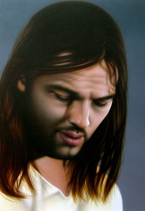
Rachel Hecker, Jesus #2 (David Gilmour/Pink Floyd), 2011, acrylic on canvas
But this story is about album covers. At CAMH William Cordova exhibits laberintos a three dimensional floor installation in which he grouped vintage record covers into a labyrinth design. Cordova is known for intellectually elevated use of found objects. His works contain literary and historical allusions, with an underlying theme of transformation; for example, a sculptural grouping of hundreds of discarded stereo speakers evocative of archaeological ruins at Machu Picchu. That installation commented on how ridiculous urban trash can be while referencing a civilization destroyed by the Spanish.
Back in 2008 when Franklin Sirmans included Cordova in NeoHooDoo: Art for a Forgotten Faith at the Menil, we learned Cordova's titles can give clues to meaning. The graffiti covered construction materials in “house that Frank Lloyd Wright built for Atahualpa” conjured the famous architectural innovator as well as the Inca ruler whose resistance got him executed by Pizarro. Both serve a subtheme of resistance or rebellion.
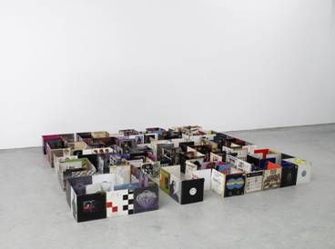
William Cordova, Laberintos - pa’ octavio paz y gaspar yanga, 2003-2009, Appropriated vinyl records from undisclosed Ivy League institution in response to that institution’s refusal to return 200 Inca artifacts from Peru after it originally borrowed them in 1914
I could not help recall the double-edge axes at Knossos that symbolize Minoan royal power, that the Minoan palace’s labyrinth held the Minotaur, and that Athenian youth were kidnapped to perform bull rituals. Laberintos' extended title points to additional meaning. The complete title is Laberintos - pa’ octavio paz y gaspar yanga.
Allusions here broaden to artifacts excavated from Machu Picchu by the archaeologist Hiram Bingham which reside at Yale University, to the Peruvian government’s attempt to reclaim them, to Gaspar Yanga, an African who led a 1570s slave rebellion near Veracruz, as well as to Octavio Paz’s book-length essay, The Labyrinth of Solitude, in which he describes the transformation of Mexican cultural identity to a form that negates both pre-Columbian and Spanish culture.
When we talked at CAMH, Cordova told me the labyrinth symbolizes transformation, which also leaves room for a personal interpretation. To proceed to the inner, and then back out, allegorizes growth and understanding.
Cordova was born in Lima and earned his MFA from Yale University . Yale University recently announced to the media that all of the Inca artifacts would be returned.
The albums in laberintos brought my mind to 2007 when Xaviera Simmons covered CAMH ’s walls with vintage black musician album covers. Electric Relaxation: Digital Good (How to Break Your Own Heart) was a wall mounted installation comprised of hundreds of vinyl disc covers which spanned back in time to Billie Holiday, and narrated musical history – the beauty in Lena Horne’s face, James Brown’s ecstatic squeal, Michael Jackson before he was a freak, mah man Otis. Sly Stone’s hippie knit hat transported me to 1969 when I had hair to my butt and played his music on “record players.”
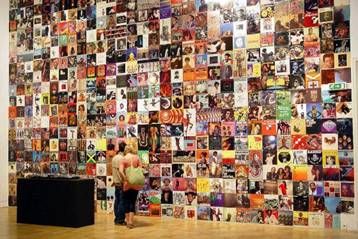
Xaviera Simmons, Electric Relaxation: Digital Good (How to Break Your Own Heart), 2007, album covers
To find all the albums Brooklyn-based Simmons searched New York’s record shops, and thrift and vintage stores and also traveled to what she called “America’s chocolate cities,” Washington, D.C., Baltimore, Harlem.
Unlike Cordova’s installation which had sculptural form, Simmons’ was mural shaped. Hers too had multiple layers of meaning. It expressed the artist’s love of music, showcased record sleeve art designs, hazy purplish red hues around Hendrix’s head, (my husband saw him set his guitar on fire) for instance, and illustrated such socio-political realities as Nat King Cole’s ridiculous white man’s hair style. Most importantly the art served as irreverent Duchampian placement of found objects onto hallowed museum walls, contradicting lofty notions about art with ready-mades related to the hood. Hot fun in the Summertime!
Friday, May 25, 2012
Videos! Videos! Videos! aka The Lazy Man's Blog Post
by Robert Boyd
I'm sure you've all seen this, but if you haven't, here's a great video about John Baldessari narrated by Tom Waits.
This video is about an exhibit by two Brazilian cartoonists/artists, Jaca and Fabio Zimbres. The exhibit is called Desenhomatic Ltda. You can see more images from this show here (and some more here). I've known these two artists for a long time--Fabio Zimbres sent me CDs by Os Mutantes back in 1993! (I sent him Gary Panter books in return.) They're as good (if not better) now than they were then. This exhibit just closed in Fortaleza. The video is in Portuguese, but just look at the art.
Hennessy Youngman is offering a MFA for $4.99 (plus postage). Sounds about right!
Lawn Art in the Heights
by Robert Boyd
View Robert's Houston Art Map in a larger map
I was driving around the Heights when I saw the following piece of lawn art at a house on the corner of 5th and Columbia.
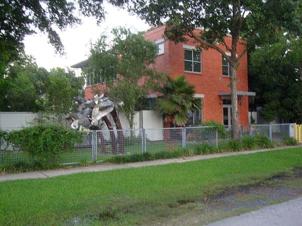
It is a group of palm trees, and I'd characterize them more as a Hurricane Ike-style palm trees rather than a Jimmy Buffett-style palm trees. They seems like they are frozen in violent motion.
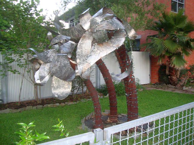
I've added it to my woefully out-of-date Houston Art Map. If you know of interesting lawn art out there in Houston and vicinity, let me know! (And if anyone knows who the artist on these palms is, plese contact me.)
Angela Davis Park
by Robert Boyd

Gabriel Martinez, Angela Davis Park
This makes me laugh every time I go over to the galleries on Montrose (Wade Wilson, Barbara Davis, Peel and Anya Tish). I often park my car in this empty lot, which has been designated a park in honor of famous 60s radical figure Angela Davis by Core Fellow Gabriel Martinez.
Subscribe to:
Posts (Atom)

