Saturday, March 27, 2010

Comicpalooza 2010

Well, bummer. I took a few photos of the Comicpalooza comics convention (which I visited yesterday) and somehow managed to lose them all. They are probably hidden somewhere on my computer.

So be it--the point of this post isn't to show Comicpalooza, but to put down some thoughts about it and comics conventions in generally. As I mentioned in my previous post, there are two comics worlds that overlap to a certain degree in certain places. These are the world of comics as art and the world of comics as entertainment. There's a lot I could write about these two worlds and their relationship with one another. That's a big post (or posts) and I'm not really ready to write it.

Comicpalooza was devoted to comics as entertainment. Virtually everything there was related to popular fannish genres and generally to the lowest common denominator examples of those genres. And that's OK. That is what the modern comic book convention has evolved into. Or, I should say, how the modern comic book convention has bifurcated. There are conventions like Comicpalooza and then there are art comics conventions like SPX and APE.

This year's Comicpalooza is a lot larger than last year's, which was held in a mall. But it felt smaller because it was dwarfed by the space it was in. It was in the Brown Convention Center, a structure so huge that it could have hosted a half dozen Comicpaloozas at once. As it was, the dealer's tables didn't even fill the hall they were in. That weekend, the center was hosting Comicpalooza, the Shell Eco-Marathon, and the 3/10 High Caliber Gun & Knife Show.

There was an artists' alley area (with several fairly "big name" artists) that was separate from the dealer's room. Artist's alley might have been the right place for a Kelly Deanne Robertson or Ted Closson to set up--but they would have stuck out there next to the fantasy/superhero/adventure/goth artists there.

I seriously regret that I lost photos of the "Curious Specimens." These were jars that contained what were purported to be the skeletons of fairies or pixies. They are beautifully crafted from bird bones, insect wings, wax, and other materials. They could stand next to any number of delicate pieces of assemblage art without shame. The artist's name is Peter D. Kinser. I can't find any images of them online, but if you are interested, his email is peter.d.kinser@juno.com. They're definitely worth checking out.

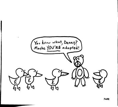
Even though he was selling rather unusual artworks, Kinser fit right in. His appearance and the appearance of his wares was very goth, and goth was a subculture well-represented here. But "indie" was not really on display much except at the 29-95.com booth. They were live-blogging and giving away copies of 29-95 contributor Joe Mathlete's comic book, Hooray! It's the Future. It's a funny little mini that would be right at home at SPX, but it really stuck out here. Here's one of his cartoons that made me laugh:
Joe Mathlete

Another cartoonist whose work I liked is Yehudi Mercado. He's an Austin-based multi-media artist who worked one summer as a pizza delivery boy, which presumably is the genesis of his amusing comic, Buffalo Speedway. This comic is firmly an "indie comic." It has a vibe similar to, say, Scott Pilgrim (but I liked it better than Scott Pilgrim because I don't really understand all the gamer stuff in Scott Pilgrim). At the risk of sounding snobbish (which is OK, because I am a snob), a comic like this is sort of halfway between "mainstream comics" (your Marvels and DCs) and the kind of comics I like best, which I call art comics. But even if I am a snob, I am not a puritan who denies himself pleasure. I really enjoyed Buffalo Speedway and was bummed out when the story didn't wrap up in volume 1. Will I have to wait til next year's Comicpalooza for volume 2?

Yehudi Mercado

Don't get me wrong--Comicpalooza was just fine as a comic show. I hope it's a success. It needs to grow if it is to remain viable for the Brown Convention Center (which is a great location). It was great to see Richard Evans (Memorial High School class of '81 homey) and his Bedrock City Comics crew there. I was disappointed that writer Gene Wolfe canceled his appearance, but shows like this have hiccups. I suspect it will get better and better--the progress between last year's show and this year's show was very evident.

Still, I would like to see a show where the exhibiting artists were mostly folks like Peter Kinser, Joe Mathlete, Yehudi Mercado, Kelly Deanne Robertson, Ted Closson, etc. But no one is going to put on a comics event in Houston just for me, alas!

Friday, March 26, 2010

I Like Ted Closson and Kelly Deanne Robertson

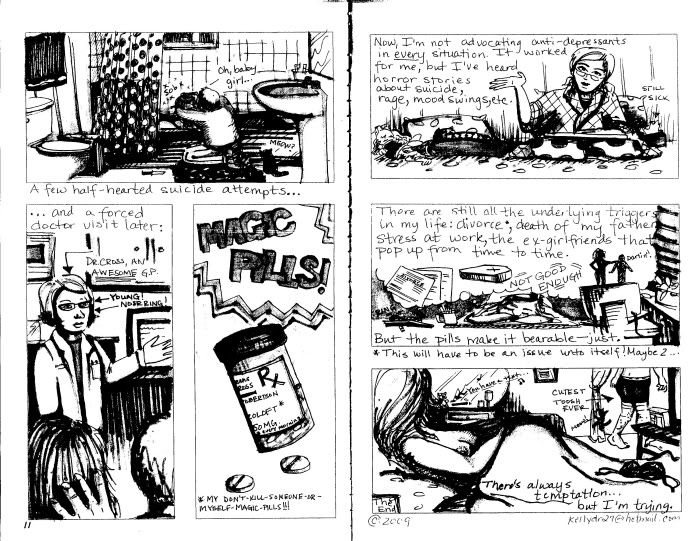
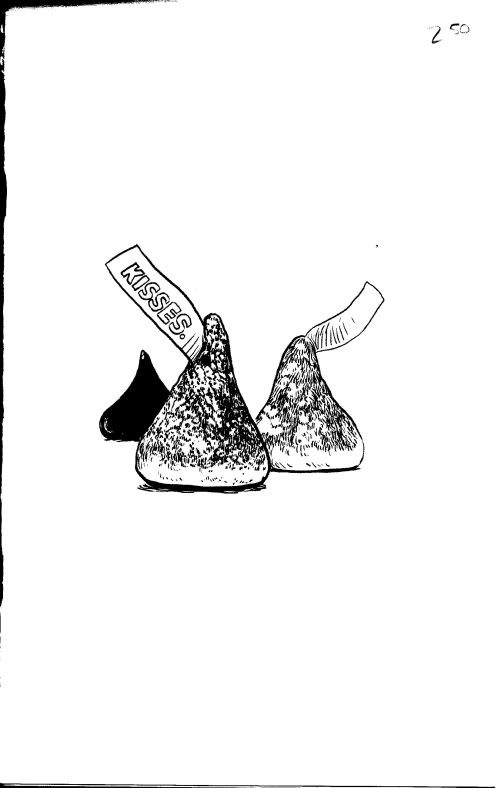
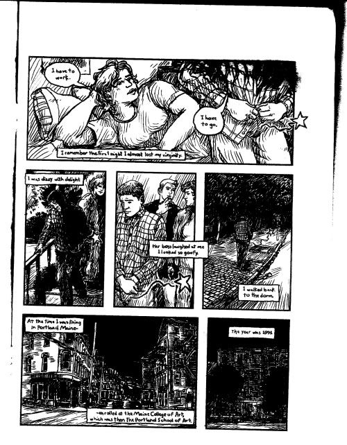
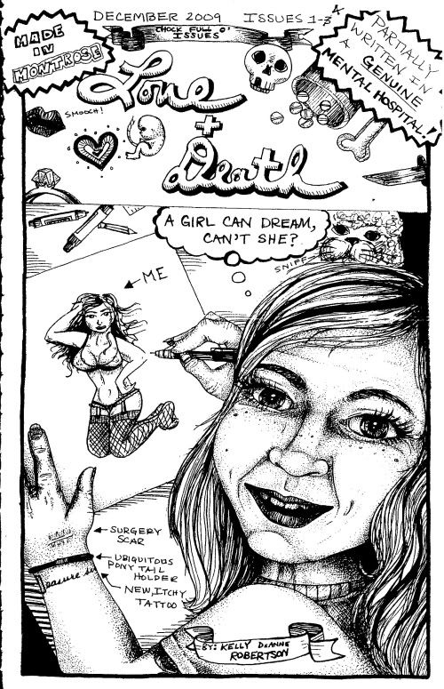
I liked them so much that I wrote a piece about their minicomics for 29-95. I and my editor would be happy if you went on over and read it. But I made a dumb error when I uploaded it--I forgot to upload art. So I'm hoping that will be corrected shortly, but until then, here is some art from both of these minicomics.

Kelly Deanne Robertson
Kelly D. Robertson, cover of Love + Death, 2009

Kelly Deanne Robertson
Kelly D. Robertson, Love + Death pages 11 and 12, 2009

Ted Closson
Ted Closson, cover of Kisses, 2010

Ted Closson
Ted Closson, Kisses page 1, 2010

Information about how to get them is in the 29-95 article. One place where you can't get them (as far as I was able to determine) is Comicpalooza. It's kind of shocking, really. You have have two cartoonists who have created pretty powerful comics here in town, but no one at the local comic con carries their work. But I'm not going to blame Comicpalooza or the dealers there. The fact is, they come from two worlds. Comics has largely split into comics as art and comics as entertainment, and these sets overlap less and less. Comicpalooza is about entertainment. (I'll have more to say about this later.)

Otto Dix

http://www.metmuseum.org/Imageshare/ma/regular/DP143028.jpg
Otto Dix, The Businessman Max Roesberg, Dresden, 1922

Neue Gallerie in New York City is having a big exhibit of Otto Dix paintings, and do I ever wish I was there to see it. Anyway, here are links to two online galleries, courtesy of the New York Times and New York Magazine.

Wednesday, March 24, 2010

Science Proves that You Should Show, Not Tell

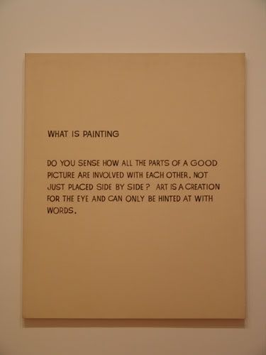
John Baldessari
John Baldessari, What is Painting, 1958, oil on canvas
In a finding sure to evoke concern and curiosity among curators, newly published research suggests presenting contextual information alongside a work of modern art may be counterproductive in terms of eliciting enjoyment or appreciation.
Writing in the journal Empirical Studies of the Arts, psychologist Kenneth Bordens of Indiana University-Purdue University, Fort Wayne, describes a study in which undergraduates evaluated artworks representing various styles. The 172 participating students had little or no knowledge about art. (Tom Jacobs, Miller-McCune, 2-16-2010)
This is an interesting finding, and one that may help curators decide how to present artworks. As a viewer, I often feel condescended to when I read the explanatory material. Or else the explanations just seem a bit simple-minded. But at the same time, if there is no explanation, I often wish there were. Something to help me understand what the hell I'm looking at. I don't know that a reasonable balance can be struck.

But what really blows me away is that there is a journal called Empirical Studies of the Arts! That's like having a journal devoted to the aesthetics of chemistry. Apparently U.H. subscribes, so I think a trip to the U.H. library is in order.

Jawshing Arthur Liou and Laine Whitcomb at Poissant Gallery

Jawshing Arthur Liou and Laine Whitcomb are two of four artists on display at the Poissant Gallery over on Center Street. Liou is a video artist and Whitcomb a photographer.

Jawshing Arthur Liou
Jawshing Arthur Liou, Nachi, video installation, 2010

I've mentioned I get impatient with video art. I mean this literally. I'm a gallery and I just don't like to stand still to watch a video. Especially an art video--after all, they're likely to be pretty slow and rather obscure. They demand attention, and a gallery is a hard place to give them that attention. There's a reason they show movies in darkened rooms with comfortable seats.

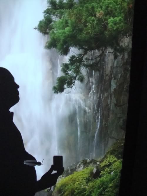
But some video doesn't make any defined time commitment on the viewer. These videos are like still images, but moving. That definitely describes Nachi. Poissant has placed Nachi in the back of the gallery. You walk into a dark space and hear a brook running over rocks. You round a corner and see it (a video image) and hear it more loudly. You see another image of the brook, and a distant roar. Finally, you turn another corner, and there is a wall-sized video of a waterfall, roaring loudly. This is what I mean by a still image that is moving. While you see the water tumbling down and full of violent movement, the overall image never changes.

Liou is trying with sound and video image to recreate the experience of seeing this truly majestic waterfall. In order to recreate the sensation that you are hiking ever closer to the falls, he uses motion-detectors to adjust the volume of the various sounds as you walk through the installation. The video images get successively larger. It's an old-fashioned ambition--Liou seems to be going for the sublime. He is using modern techniques to produce in a viewer the same feelings that were produced in the 19th century when they saw the paintings of Frederick Church.

Jawshing Arthur Liou
Jawshing Arthur Liou, Nachi (with my shadow), video installation, 2010

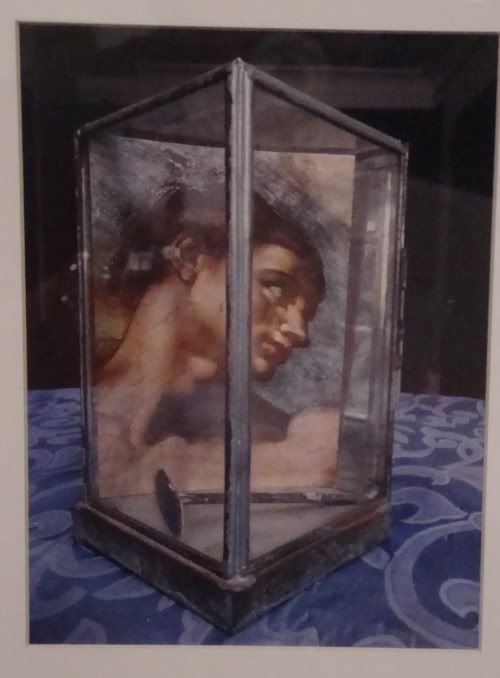
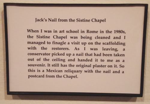
I appreciated what Liou was doing, and especially appreciated that he had created a vdeo that the viewer could experience fully at his own pace, but I was more moved by the photos of Laine Whitcomb. Whitcomb has photographed object belonging to his friends that hold some special significance for these friends. Each piece has two parts--a photograph of the object(s), and below it, a framed piece of text saying what the object is and why it is special.

Laine Whitcomb

Laine Whitcomb
Laine Whitcomb, Jack's Nail from Sistine Chapel, C-print photograph, 2010

The text is in first person, which obviously makes it a little more personal. I was reminded of some of my favorite photographs by Jim Goldberg (which were published in a book called Rich and Poor). Whitcomb and Goldberg both combined text with photos in a highly personal way. I sometimes complain about being made to read in a gallery or museum, but it really depends on what I'm reading. If the relationship of the text to the image is strong, it can really work. I realize "strong" is a fuzzy word. It can imply text highly integrated with the image, like in a Wayne White or Edward Ruscha painting. But here, it is not at all integrated--at least, not visually. The strength of the connection has to do with the relationship of the content of the two parts with each other and with the owner, who is implied by both image and text. In this way, the image and text have a very powerful relationship.

This show is up through April 10. It's worth taking a look.

Tuesday, March 23, 2010

Is There a Crisis in Art Criticism?

Yes.

This has been another episode of "Concise Answers to Obvious Questions."

But to avoid being a total asshole, I'll elaborate. For criticism to have a purpose, it must help readers identify and understand significant art. Practically speaking, critics should collectively be part of the larger group of people who decide what is good art. This is not an act of Olympian judgment (necessarily). It's just that for a given artist or a given work, the opinions of other artists, of curators, of gallery owners, and of collectors somehow coalesce into a vague consensus. Critics should be part of that consensus-making apparatus. A big part. But at this moment in history, critics are pretty much irrelevant to the process. (By the way, when I write "consensus," I mean that a situation in which broad disagreements can exist--even opposing camps. In such cases, there is nonetheless an agreement that a certain artist is worth having an opinion about. Most artists don't ever get that far.)

The view on the irrelevance of art criticism is expressed by two non-critics pretty forcefully--the economist Don Thompson in The $12 Million Stuffed Shark and sociologist Sarah Thornton's Seven Days in the Art World. A good book where critics address the crisis of criticism is Critical Mess, edited by Raphael Rubinstein.

Rubenstein wrote an essay on the failures of criticism in 2003. Around the same time, James Elkins published a similar short book (excerpted here). Rubenstein also includes an edited speech by Thomas McEvilley from 1994 that seems to anticipate many of the issues discussed, including the big one, the issue of judgment. Rubenstein basically portrays the argument (and it is an argument with basically two sides) as one between whether critics should offer judgment on art or not. McEvilley, a thorough-going postmodernist, basically says no--that's not the main purpose anymore, even though, of course, some judgment can hardly be avoided. Others disagree. The book hardly settles the issue, and many of the positions are quite nuanced (Arthur Danto and McEvilley especially).

Not surprisingly, what is interesting in a book like this is not the main argument, but all the little side arguments and observations. I've complained of my own tendency to be a "booster." Rubenstein in his introduction writes that this is a common attitude--given the relatively indifferent or hostile environment in which art (especially contemporary art) exists, art critics around the country feel obliged to be boosters--to talk art up. Rubenstein imagines an earlier, less pandering age. But, he writes:
It seems that the booster critic is central to modern art. Making the rounds in Chelsea not long ago I ran into Irving Sandler, who has been a tireless critic and chronicler of the New York art world for fifty years. [...] Sandler said something that surprised me: that in the '50s criticism in New York's Abstract-Expressionist milieu was almost wholly positive because critics like him felt they had to argue the case for what the artists were doing, to promote the cause of modern art in the face of a philistine or conservative audience. The image of the evangelical '50s critic was at odds with my picture of a more honest, judgmental critical practice, back when artists and critics were slugging it out at the Cedar Bar.
Elsewhere, contributors write about how intellectuals and academics (art historians, for example) don't take art criticism seriously--and Rubenstein's anecdote suggests one reason why.

Mentioned several times in the book is a round-table discussion put on by October (the journal founded by renegade, theory-steeped Artforum critics). One of the big arguments was against the notion of "bellelettristic" writing--essentially the fight between the theorists and the poets. Nancy Princenthal writes:
The problem with the contrast between defensible, systematic analysis and unapologetically writerly subjectivity is [...] a specious opposition. On one hand, there is no self-evident reason to make the linkages between art and theory that have been argued over the past twenty years, productive and often fascinating though they have been. Semiotics, Lacanian psychoanalysis, Marxist economic theory, structural anthropology--these are all fascinating fields, but they have no more compelling claims as explanatory systems for art criticism than do theology, mathematics, or the physics of color (to name a few heuristic precedents). 
On the other hand [...] good fiction and poetry can be every bit as lean, incisive and informative about actual experience in the real world, as any cultural or political theory.
Princenthal is writing about this roundtable, but her descriptions of the arguments allow her to make her own points. She discusses Marxist criticism and institutional critique, the province of one of a the roundtable participants, Benjamin Buchloh. As interesting as this kind of criticism can be (and Buchloh is definitely an interesting critic), there are multiple problems with it.
And since, as everybody knows, the great majority of art critics makes very little money writing art criticism, there is the danger that a kind of sanctimony can creep into the practice. Disinterestedness is actually, in some ways, a handicap. [...] At the same time, money is not the only register of power. In response to Buchloh [, Robert] Storr eventually responded, 'I find it curious that those currently engaged in critical activities (such as "institutional critique") seem to think everything is fair game except the academy. It is a dubious exception.'
Is it any wonder that many people resent the blithe Marxism of academics? This is not to say that Marxism isn't an interesting analytical tool, but I think there is a problem when almost all economic analysis of art or art institutions comes from that place. At this stage in my reading life, I would rather read The $12 Million Dollar Stuffed Shark--a non-Marxist economic analysis--than another puritanical critique of art as commerce.

Princenthal is not the greatest writer, but she is a good thinker about critical writing and is capable of great pith. For example, "In critical writing, clarity is close to an ethical imperative. It enfranchises readers." This is one reason I have always preferred McEvilley over all the other theory slingers.

Carter Ratcliff's essay starkly defines the conflict as being between poets and theorists, and comes down firmly on the poet's side. He even gives us a little history. ARTNews had historically been the home of poet-critics--Frank O'Hara, John Ashbery, etc. Artforum was formed in response to ARTNews, and it was where the theorists wrote. While the Artforum guys excoriate Clement Greenberg, Ratcliff accuses them of wanting to be Greenberg in the sense that thier work would have "rigor." But he criticisizes them for their potted theory, which for the most part takes bits and pieces from earlier writers (Walter Benjamin, for example), and decontextualizes them in service of this new rigorous theoretical criticism. In short, Ratcliff inverts the judgment argument, saying that it is not the poets and belleletrists who are imposing Olympian judgments, it is the theorists with their pretensions of quasi-scientific analysis. Ratliff knows that when he makes a judgment, it is inherently conditional. "Artworks are fictive, so is any account of the true nature of art. The best criticism feels at home with this uncertainty, or at one with it, and wants to illuminate it."

There is much more in this book worth reading, and all sides represent themselves pretty well. The essays are (surprisingly) readable, as if they each took Nancy Princenthal's admonition to heart. Personally, I found the book useful. It will probably have an effect on my own writing--not the least of which is to make me more self-conscious.

Sunday, March 21, 2010

Pan is on Facebook

 http://photos-e.ak.fbcdn.net/hphotos-ak-snc3/hs470.snc3/25779_362223008315_289926968315_3743385_6857027_n.jpg
This is just a reminder--if you are on Facebook and would like to be updated about new posts here, please become a fan of Pan.
http://hphotos-snc3.fbcdn.net/hs470.snc3/25779_358511408315_289926968315_3733297_6995708_n.jpg

New Acquisitions--Two Pieces by Ron Regé Jr.

Ron Rege
Ron Regé Jr., New York Times illustration, December 13, 2009

I just got a couple of pieces by Ron Regé, Jr. I got to know Regé in Boston--he was one of the cartoonists that had gathered in a scene around Tom Devlin. Regé's book Skibber Bee-Bye was published by Devlin's Highwater Books, as was his classic comic, Boys (written by J. Reidy). (Regé is also responsible for the best Spider-Man story since Steve Ditko, "High School Analogy".) Much of his work is now published by Drawn & Quarterly. I can't recommend it highly enough--I think he's one of America's greatest living cartoonists.

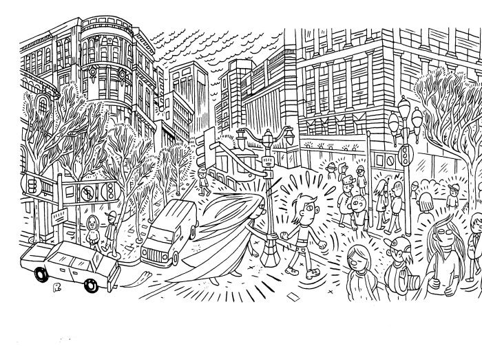
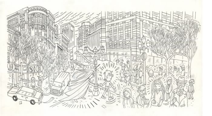
He's also a drummer and a member of a band called Lavender Diamond. So this piece (below) is somewhow related to the band--but I'm not sure how! I just liked this complex street scene.

Ron Rege
Ron Regé Jr., Lavender Diamond--Here Comes One

This is an ink drawing on bristol paper. It's very clean--there are no visible pencil lines or corrections, except for a couple of things that were whited out.

Ron Rege
Ron Regé Jr., Lavender Diamond--Here Comes One

This is a version scanned as a color image, and in it you can see where there were some sparkles around the central female character that have been whited-out.

Saturday, March 20, 2010

James Surls at Rice

Robert Boyd

Several weeks ago I heard that some James Surls sculptures had been installed on the campus of Rice. I was going to write about them, so I sent a note to Rice's PR people asking for information. They wrote back asking me to wait until they had an official press release and roll-out. I promised I would and asked to be put on the distribution list.

Yesterday (three weeks after I took my photos), Surls sent out an invitation. Still no word from Rice. So to heck with them. Here's what Surls sent (it looks like it's the press release that Rice was supposed to have sent):

ARTIST TOUR & RECEPTION

Please join us for this amazing event honoring artist James Surls
Monday, March 22, 2010
4-6 PM
Rice University

Raymond and Susan Brochstein Pavilion
4 PM - Artist tour of works
5 PM - Reception and remarks
Featuring a commissioned soundscape by Dagang Chen

Please reply by March 18 to 713-348-4111 or dpevents@rice.edu.
Parking is available in the Central Campus Garage.


BETWEEN PARADOX: A PUBLIC LECTURE BY ARTIST JAMES SURLS

The Rice University Public Art Program and Houston Arts Alliance present Between Paradox: a Public lecture by artist James Surls, Tuesday, March 23, 2010, Noon - 1 p.m. in Rice University, Herring Hall, Room 100. Light refreshments will be served following the lecture at 12:45pm.

Magnificent Seven: Houston Celebrates Surls is a partnership between the Rice Public Art Program and the Houston Arts Alliance, with support from a City of Houston Special Initiative Grant and private donations. The exhibition is on view March 1 through August 31.

Unfortunately, I can't attend any of these events (which seem designed to exclude people with jobs). But perhaps you can. That said, I feel comfortable showing the photos I took now.


James Surls, Standing Vase with Five Flowers, 2005

Surls likes flowers. He doesn't try to portray particular flowers--I think he just likes that particular petal shape. Perhaps because they are made of metal, they always remind me of boat props. In size, too, they are closer in size to large boat props. Consequently, I often feel a tension in Surls' sculpture between the organic and the machine.


James Surls, All Diamond, 2006

That tension is present here, too. The hard edged "diamonds" can be seen as either natural crystalline structures or mysterious manufactured objects. I am reminded of some of the semi-abstract book covers of science fiction books from the 1960s. The artist (or artists--I apologize for not knowing who he or she was) of those covers was inspired, I assume, by the work of Matta, and I see Matta in Surls' sculptures (especially "All Diamonds"). Surls' sculptures feel like inexplicable ancient artifacts of an extinct alien civilization.


James Surls, All Diamond detail, 2006


James Surls, Big Bronze Walking Eye Flower, 2008

Again a flower-like form, but the spiraling circular design makes me think of a mandala. There is a spiritual element to much of Surls' sculpture. Pieces like this seem designed to make you forget time, to find yourself in an eternal present. It belongs on an ashram or in a quiet garden where you can sit with it and be.


James Surls, Knot and Needle, 2007

But don't imagine that Surls is all about the hippie vibe. His pieces can have menace, too. Real menace in this case--don't play frisbee or football close to this--a misstep could be fatal. But it gets back to nature. Nature is red in tooth and claw, as Tennyson wrote. An armor of spikes is what keeps cacti and porcupines from extinction.


James Surls, Knot and Needle detail, 2007


James Surls, Again The Tree, Knot, Flower, and Me, 2009

Most of Surls' sculptures have one visual idea. This one combines several and it therefore feels a lot different from his other sculptures. It's east to see the tree, the knot and the flower. Does that mean that Surls is that droopy thing hanging down by the side?

There is one more sculpture that I didn't photograph in front of the inelegantly named Bioscience Research Collaborative. I think all of the sculptures are going to be up for six months, so you have plenty of time to check them out. Please do--they're wonderful.

Friday, March 19, 2010

Woody Golden's books

I saw these books at Hello Lucky, a store that sells clothes for people who are younger, skinnier, and cooler than me.

Woody Golden

They are by artist Woody Golden, one of the founding members of Box 13. He's a very interesting artist. And I love these books for the same reason I like Maurizio Cattelan's work.

Woody Golden

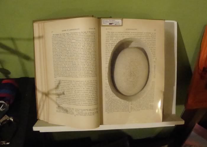
As you can see, the books have a compartment carved out of the pages. In the compartments are mysterious rounded objects. They look like stones, but also look like they may be carved from wood. If you look closely, they seem to have ghostly remnants of type on them. It turns out that Golden takes the carved out pages, glues them together into a solid block, then sands the block into these shapes.

Woody Golden

These stone-like shapes look like objects you would see in a surrealist painting by Magritte or Yves Tanguy. But what Golden has done is what Cattelan does--he has created an actual surreal object rather than a representation of one. It has a mysterious presence. They should be displayed on antique book stands in obscure corners of dark, rich, wood-paneled libraries where they can be found serendipitously. That way, their status as mysterious objects would be maximized.

Thursday, March 18, 2010

Look at Me!

Me with a Stephanie Toppin
Noted Houston blogger standing next to a Stephanie Toppin painting

They love me! They really love me!

Well, they like me at the Houston Press at least. They very graciously included me in a list of 10 notable Houston bloggers. I guess it's because I'm about the only active art blogger in town (who isn't an artist mainly dealing with his or her own work). B.S. Houston is mostly moribund (although he writes for the Free Press).

I am already a devoted reader of Off the Kuff, Swamplot (the best blog in Houston in my opinion) and Houston Calling.The Bloggess looks pretty good. Texans Chick doesn't interest me--not because it's bad, but because I am just not interested in the Texans or sports in general. Ditto the two food blogs, Blue Jean Gourmet and H-Town Chow Down--I'm not enough of a foodie to get full value from these blogs. Defending People is interesting but a bit too technical for me--it really is aimed at other lawyers. And the mommy blog, Blog con Queso, is totally impressive but again not really aimed at me.

There are actually lots of other interesting Houston bloggers, but the problem is that they have lives. And when you have a life, it's hard to post very often. Right now I think my favorite infrequent blogger is Slampo. I don't always agree with him, but I like the way he says what he says.

The piece that Cathy Matusow wrote about Pan portrays me as a total fanboy. That's fair. My blog is too uncritical. I've avoided doing bad reviews not out of a desire to avoid hurt feelings (although I don't relish hurting anyone's feelings) or a sense of boosterism. It's because I have a limited amount of time to write and would prefer to write about things I like. But this makes my blog a bit bland, and makes me a lazy art writer. I should follow the example of Albert Nurick of H-Town Chow Down and fearlessly pan what deserves to be panned. Because writing a bad review--not a gruesome slam, as entertaining as those can be to read, but one where I force myself to articulate clearly what I don't like and engage the work seriously--will help my writing in general. It will help me focus on what is good and what is not. There's a way to do it without being needlessly cruel or pointlessly dismissive. So that's my resolution--tougher criticism.

(One last note--every single one of the other bloggers (except for the coy Gus from Swamplot) is significantly better looking than me. It's not fair.)

Tuesday, March 16, 2010

In Which I Leave My Bloggish Safety Zone and Curate an Actual Art Exhibit

http://www.houstonfringefestival.com/files/QuickSiteImages/HOUSTON-fringe-fest-logo2.gif
The Houston Fringe Festival is a very cool event. Some readers may recall that I attended and blogged about it (here, here, here, here, and here) last year. This year is is expanding to four weekends from August 19 to September 11. And I'm sure it will be amazing.

But what is most exciting for me is that I'm going to be involved. No--don't worry. I'm not dancing. Definitely not. Oh no no no. Nope.

I will be curating the festival's art exhibit. The theater has a long wide hallway that kind of goes nowhere (actually it goes to other rooms that won't be open during the performances). So my job is to gather art for this space. It's an interesting challenge, but one I think I'm up to. I have only started thinking about the artists I might want. Right now I have a big fat list of disparate artists--I plan to winnow it down to four to six artists whose work I think would be interesting if shown simultaneously. Most (if not all) the artists will be Houston-based--there is a rich pool of talent here.

I suspect I have will have some new readers Wednesday (if all goes according to schedule). I've been saving this announcement for you all. I hope to see you in August at Frenetic Theater.

Monday, March 15, 2010

On the Road

I'm in Conway, Arkansas, for business. My work schedule means I don't really have time to check out the local art scene. And what art scene can be expected in a town of 50,000 in rural Arkansas? Well, there's this:

http://photos-e.ak.fbcdn.net/hphotos-ak-snc3/hs219.snc3/22680_326185768551_594553551_4580118_455778_n.jpg

This is apparently an annual show put on at a student-operated gallery at the University of Central Arkansas. (Conway is also home to Hendrix College and Central Baptist College.) I'm sorry I missed it!

Saturday, March 13, 2010

Lord Am I Tired

And I never want to see another photo as long as I live (or for at least two years).

Yesterday was the official opening of FotoFest, and I went to six openings. Then today I did the following:

Art Lies
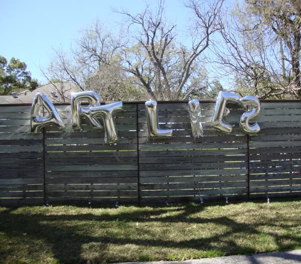
Went to the Menil community day, where Artlies had a booth and a balloon sign. Good crowd, lots of food, lots of kids climbing on the Jim Love sculpture.

Went to the Houston Center for Photography to look at their FotoFest shows. Nice crowd.

Went to Art Palace to look at the current show again. Pretty empty, a few people coming through--but the opening (very well attended) was last night so it was about what one would expect.

Went to FotoFest headquarters to look at the show again (it was a madhouse last night). Several people there checking out the show--it looked like they were getting good circulation.

Went to Domy while they were still installing the current exhibit. There were a few people lurking about, but obviously the show hadn't begun.

Went to Texas Gallery. Never been there before. It is downstairs from Marfrelas, and like Marfrelas, it doesn't have a sign. Nice, sedate crowd.

Went to Darke Gallery. Not packed, but they had as big a crowd as I had ever seen there.

Went to McClain Gallery. Quite crwded in the small back gallery where the new exhibit was.

Went to Rudolph-Blume. Saw people I had seen earlier at the Menil thing (a particularly attractive woman wearing a memorable shirt helped me remember). Good crowd.

Dennis Harper
Went to the Joannex. Light crowd, still seemed early. The installation above is called "Howdy Pilgrim" and it's by Dennis Harper.

Mariachi's at Station Museum
Went to the Station Museum. It was bananas. There were at least 100 people there, probably closer to 200. There was a kick-ass mariachi band playing (above).

Finally went to Box 13. Fairly small, sedate crowd (compared to some other Box 13 openings). It was still early for them. Saw the girl in the memorable shirt again.

 Pooped now.

And there are many other openings I could have gone to and would have liked to have gone to, but just didn't have the time or energy to hit. Lots of writing ahead for me here and on 29-95. Look for it.

Friday, March 12, 2010

More Powhida

The dude has pissed some people off. Accusing him of being a fame whore or criticizing his work on the basis that it will be incomprehensible (and irrelevant) 20 years from now is beside the point. The same could be said of any political cartoonist. The point is, are the criticisms Powhida is making valid? I think they are, and I think the fact that his actual criticisms (that a small number of superstar collectors are determining what is the best art and what gets collected and shown by museums, and that this seems likely to distort the world of art and to be corrupt) are not addressed in the Art Fag City post is pretty telling.

And I also think my purchasing of his print from 20x200 was very opportune! (Unintentionally, I swear.)

FotoFest Opening Night

FotoFest opening 2

Click here for a larger image.

Seen on the 610 Feeder on the Way to FotoFest

seen on the way to FotoFest

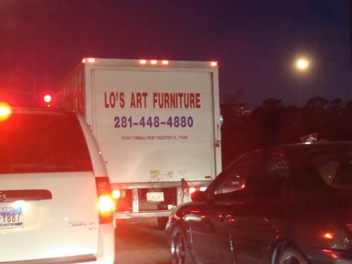
At the intersection of Memorial. Wonder what Lo considers to be "art furniture"?

Boogie Woogie


Most movies set in the art world are pretty terrible (Legal Eagles, anyone?) This one looks pretty hot, at least.

The Student Artists at UH Are So Good it Scares Me

I wrote a short review of the Blaffer student show, which is up at 29-95. Please read it--my editor would like that.

It got shortened a bit, so I am putting the bits that got cut here, plus some additional photos. (I don't do this out of vanity--I don't think my writing is all that. I do it because I want to make sure all the artists I liked in the show get some exposure.)

Sebastian Foray
Sebastian Foray, Where Do You Think You Are Going, ink on paper

Sebastian Foray
Sebastian Foray, Where Do You Think You Are Going, ink on paper

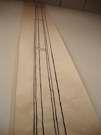
Sebastian Foray wins the award for tallest piece in the show. “Where Do You Think You Are Going,” an ink drawing on paper, goes up two stories, floor to ceiling in Blaffer’s tallest gallery. The drawing is of a particularly non functional ladder—the distance from the rungs seems to increase exponentially from the top, doubling with each rung. Otherwise, though, it looks like a well-crafted ladder! It could be a metaphor art itself—beautiful but useless.

Ted Closson
minicomic, Ted Closson


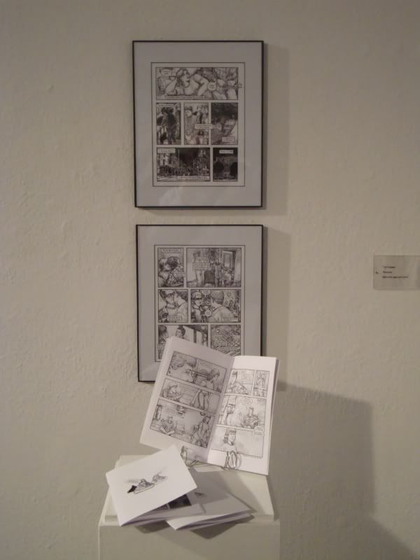
Ted Closson’s piece is a minicomic, and like many of the pieces in the show, it not only is an interesting piece in its own right, but also an interesting challenge for the curator. The finished product of a comic is the printed story. So you can frame the pages and put them on the wall, but it’s not ideal. You are seeing the art but not in the form it is supposed to be experienced. It’s a little like putting film stills on a museum wall to represent the whole film. Likewise, museums usually display books or printed ephemera in vitrines—separated from the viewer by glass. That, too, would prevent the viewer inthis case from truly experiencing Closson’s work, which is a narrative and is meant to be read. The compromised by putting two pages of art on the wall (but not originals, curiously—the drawings were created electronically, so there is no pen and ink original to display) with several copies of the comic itself on a plinth, available for viewers to read. (Fortunately, it was a very short story, so you didn’t have a crowd of readers blocking traffic.)

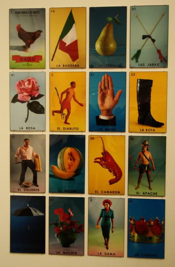
And here's another view of the Mauricio Lazo piece mentioned in the 29-95 piece:

Mauricio Lazo
Mauricio Lazo, Loteria, archival ink jet

William Powhida, The Brooklyn Rail, and 20X200

Robert Boyd

This should probably be three different posts, but they all kind of flow together. If you follow the goings on of the art world (and good for you if you don't), you may have heard of the controversy of a show at the New Museum in New York curated by Jeff Koons selecting from the personal art collection of Greek uber-collector Dakis Joannou--who just happens to be a trustee of the museum. Major conflict of interest. How? Remember what Don Thompson wrote in The $12 Million Dollar Stuffed Shark--museum shows brand art. Given two otherwise similar pieces by an artist, if one was included in a major museum show, it will on average be worth more. So this looks like a way for Joannou to increase the value of his collection.

Tyler Green wrote an excellent criticism of this practice. But it is unlikely to stop as long as contemporary art and big museums are seen as amusements for the rich. Why should the average person get too bothered? (More on this later.) The wittiest take-down was done as a drawing for the cover of the Brooklyn Rail by William Powhida.


William Powhida, cover of the Brooklynn Rail, November 2009

OK, that was really cool, but what is the Brooklyn Rail? It turns out that they are a monthly magazine (I've never seen a physical copy--is it more of a newspaper?) with distinctly contrarian views about art. In a recent editorial where they basically say ditto to a piece written by Roberta Smith for the New York Times (well worth reading, by the way), the editors of the art section of the Rail wrote the following:
As Ms. Smith made quite clear, New York museum curators “have a responsibility to their public and to history to be more ecumenical, to do things that seem to come from left field. They owe it to the public to present a balanced menu that involves painting as well as video and photography and sculpture. They need to think outside the hive-mind, both distancing themselves from their personal feelings to consider what’s being wrongly omitted and tapping into their own subjectivity to show us what they really love.”

We would go a step further and state unequivocally that many of these individuals have not only shirked their public responsibility, they have turned the museums into playgrounds for an elitist group of trustees and globetrotting art fair devotees, stocking their exhibitions primarily from “powerful galleries.” And if our position is not clear enough, it will become more so in the coming months through in-depth articles and well-researched drawings examining the actions of particular individuals, their public statements and their exhibition track record.  (editors, Brooklyn Rail,  March 2010)
Personally, I can't wait. Taking names and kicking ass makes for good reading. But part of the problem is that well-to-do collectors who are able to buy very expensive works of art end up having a lot of power within the art world. Now I don't find this particularly sinister. I think most of these people are really into art and want to be involved in some way. I can fully relate to this. I'm not an artist, but I like it and want to be involved. But people who have spent a lot of money on a thing (shares of a company, a house, a piece of blue-chip contemporary art) want it to retain its value. This is going to provide an incentive for some of them to do what Joannou has done.

So is there a solution? I have my doubts. Let's face it--artists and curators have been playing around with solutions with varying degrees of success for at least 40 years without really changing the system. The usual solution is to try to build an alternative space or scene. This works for a while, but it's hard to sustain. Money (and its lack) is always a problem. If you choose not to be commercial, you are reduced to begging for grants and donations. You can scrape by this way, but who is giving those donations? When you need to build a new roof for your space, the tip jar isn't going to cut it. You need a person or institution with deep pockets.

Here in Houston, if you talk to young artists or curators, these issues are always brought up. I always feel like the odd man out in such conversations. I'm older and have a knowledge of business and economics that most of the younger artists just don't have. So for me, the problem of sustaining a viable space or scene is fundamentally about cash flow, but for them it's about creating something within a hostile culture. (A gross simplification, of course.) But even so, Houston artists keep on doing, just as they have been for decades. You're a young curator like Keijiro Suzuki, and you whip together the Temporary Space, and for a time (hopefully a long time) it is a place where exciting art happens. But eventually, Suzuki (or someone) has to ask someone for money. If it is one person or one institution, that person or institution ends up having a lot of power over your space. (Note: I am not suggesting Suzuki is or ever will be a sell-out!)

But I think solutions come from getting more collectors involved. Instead of depending on the tastes and wishes on a small number of very rich people, disperse the art income to a large number of small collectors. That means more people buying less expensive art. I asked earlier, why should the average person care about the ethics of museums? If the population of "average persons" included a lot more small-scale art collectors, they might care--they might become an important constituency in these matters. I've written about one such scheme in the UK to encourage art collecting among non-rich folk. Another is 20x200. Jen Bekman is a gallery owner who came up with a way to connect to potential collectors who 1) are not rich, and 2) may not have access to lots of galleries.

Jen Bekman opened her pocket-sized gallery on the Lower East Side nearly 5 years ago with the mission of supporting emerging artists and collectors, and she's made a name for herself doing just that. 20x200 takes the mission one step further, making art available for everyone.
On a Sunday night back in January2007, Jen came up with a formula:
(limited editions x low prices) + the internet = art for everyone

As we see it, there are a lot of people out there who want to sell their art and a lot of people who'd like to buy it. They just have a hard time finding each other. The internet is the perfect place to bring those people together, and we're exactly the right people to make it happen. We're passionate about art and the internet at 20x200. We're really excited about creating a place where almost any art lover can be an art collector.
Cool idea. But how is it different from, say, Etsy? I like Etsy, but with art (like other artforms), you need gallery owners and curators and editors and other gatekeepers. This sounds very elitist, but without these people, you have a chaos of random art that would paralyze a lot of collectors (it would paralyze me, at least). Jen Bekman's 20x200 works for me because she is a good gatekeeper.So when I discovered her site (through Art Milk, another good gatekeeper), I went ahead and bought a print. (This was back in early March--I haven't gotten it yet.) Here's what I bought:


William Powhida, Why You Should Buy Art!, archival pigment print, 2010


Here's what Powhida (always verbose, if you haven't noticed) has to say about this piece.
When I was in Miami during Art Basel last December, I conducted an interview with New York Times journalist Damien Cave who repeatedly asked, "What's the alternative to the art market?" The question is not an easy one to answer.
Short of radical social and economic reform, which seems incredibly unlikely in our pro-Capitalist, market-trusting society, I struggled to articulate my thoughts surrounded by the spectacle of Basel. While I was down there, I also saw Jen Bekman's booth at PULSE and it reminded me that one of my answers to Mr. Cave should have immediately been "access." Access to contemporary art is often restricted by high prices, including my own, that put it out of reach of the majority of people who love art. 20x200 offers a way to make art and the experience of buying art accessible to the broader public than the limited pool of collectors who have the means to buy unique and often wildly expensive art objects. Art, in many ways, is a luxury commodity and the larger question remains, "what is enough?"
I believe that it's a matter of scale; prices leap from hundreds to hundreds of thousands based on branding and marketing. I hope that established artists who command hundreds of thousands of dollars for their art will consider what it means to sell to a very small collector class. Are they really reflecting their own creative expression or the tastes of the ruling class? I don't begrudge their wealth or values, but I do believe that art is made freely and for more than those who can afford to own it.
-William Powhida, Maker*
*Please see my bio for William Powhida the "Genius"

Monday, March 8, 2010

Another Devastating Review That I Liked

http://app1.kuhf.org/images/content/photos/Meckseper.jpg
Josephine Meckseper, Blaffer installation view, swiped from KUHF (I hope they don't mind--I am a member)

There was a show at the Blaffer Gallery Josephine Meckseper. I saw it late last year and thought it was kind of bad. Now what I should have done was to take notes about why I thought it was bad. Instead, I was too lazy. Fortunately, Michael Bise wasn't.
I thought Meckseper’s exhibition at the Blaffer Gallery was one of the worst shows I’ve seen there. A hipster pastiche of Hans Haacke and Haim Steinbach, Meckseper situates various images and objects that have to do with politics, advertising and the capitalist economy’s strategic conflation of the two, on shelves and in display cases that reference museum vitrines and department store windows. In addition to her exhibition at the Blaffer, Meckseper also created a razor-sharp critique of capitalism by designing a window display for the Houston Galleria’s Neiman Marcus. (Michael Bise, Glasstire, February 2010)
Bise definitely wasn't lazy like me!
But the fact that I’ve seen the Meckseper show half a dozen times and haven’t come away with much more than he did leads me to believe that there’s not much more there.

Young trust-fund artists from premium graduate schools have increasingly thrown themselves prostrate at the feet of Frankfurt School-style critical theory, offering up their tender nether regions in support of whatever social or cultural agenda the academic left finds currently fashionable. Rather than attempting to create visual art that is complicated and contrarian enough to allow new meaning to grow out of it, their work, like Meckseper’s, is created as an illustration of already baked — sometimes only halfway — ideas from the reading lists of tenured professors like [Semiotext(e) founder Sylvère] Lotringer who haven’t had to worry about making rent or paying for prescription drugs in a long time.

The problem is that neither Meckseper nor Lotringer will even claim her work as political. In an interview on KUHF’s Front Row, Meckseper asserted that her work was to be viewed ironically (whatever that means), while Lotringer claimed in his lecture that her work was not about politics but about the question of whether politics can be addressed by art. From a red, white and blue carpeted hallway to a silver showroom dummy adorned with a protest sign and a tiny American flag juxtaposed with a menorah, it’s pretty clear that Meckseper is not only addressing politics with art, but is doing so about as thoughtfully as Glenn Beck with a piece of chalk.
OK, it's unfair for me to present such large, undigested chunks of someone else's work. Cowardly even--if I have such a poor opinion of Meckseper's show, I should say so in my own words. Mea culpa.

My words in this case would do little more than echo Bise's--this show struck me as lazy and flabby. Seriously, if someone wanted to create art installations that made fun bad political art, they'd look like this. I saw neither incisive analysis nor heart on display here.

So thank you Michael Bise for being such a hard-ass, and thanks Glasstire for publishing this highly entertaining take-down.

My Review of Genesis by Terry Suprean

I have a new review up at 29-95. This one is of a show by Terry Suprean at the Temporary Space. Please check it out.

As usual, I have some left-over images.

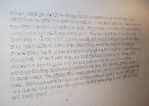
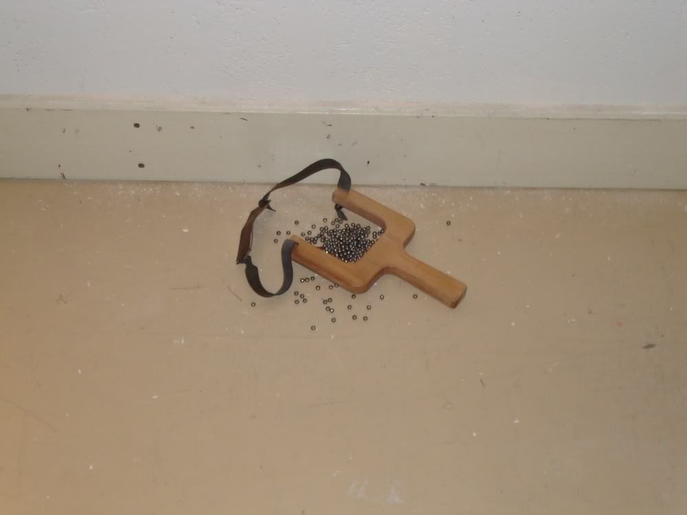
This one was a piece drawn directly onto the wall. The little dots are BBs shot into the wall with a sling-shot (which must have been one freaking powerful slingshot).

Terry Suprean

And below it on the floor was this:

Terry Suprean

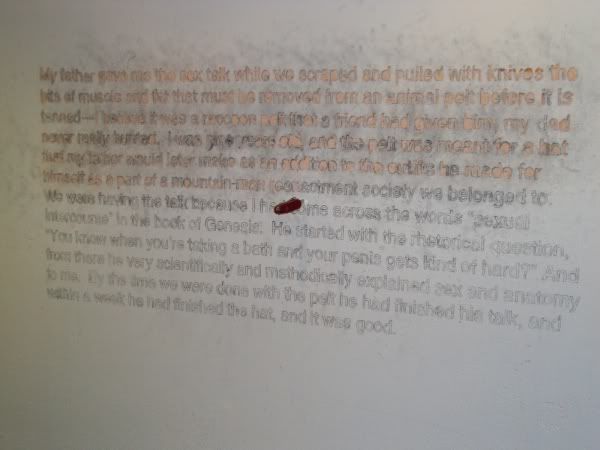
The other big wall piece was partially carved into the wall with a pen knife--which was then stabbed into the wall.

Terry Suprean

Sunday, March 7, 2010

Parking Lot Modern

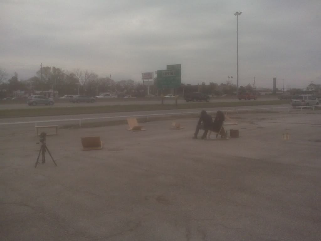
Wacdesignstudio (Jenny Lynn Weitz Amare-Cartwright and Scott Cartwright) staged a rather forlorn event alongside the North Freeway in the deserted parking lot of Landmark Chevrolet. It was a "guerrilla furniture sale." The furniture--mod wooden laminates--wasn't the most comfortable (definitely not for older folks who might find it hard to rise from floor level chaise lounges). It sure looked nice, though.

Here is my fuzzy photo of the event, taken with my camera phone.

wacdesignstudio

I think they were trying to make some kind of statement, there among the many closed businesses and among the myriad discount furniture outlets (Gallery Furniture most prominently). Standing in that wind-whipped parking lot, I wasn't sure what the statement was. Except maybe--we're here!

Wednesday, March 3, 2010

Mariscal's Animated Feature Chico & Rita

Did you know that the great cartoonist/designer Mariscal was making a feature film?

Javier Mariscal

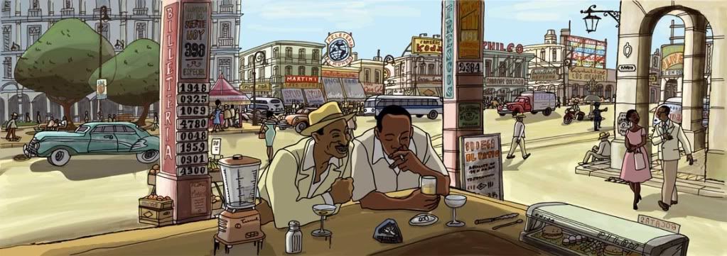
It's called Chico & Rita, and is about a Cuban jazz pianist and a singer in the late 40s. The technique to create it sounds similar to that used by Richard Linklater in Waking Life and A Scanner Darkly--the whole film was filmed live action and then animated.

It's scheduled to come out in 2010.