Wednesday, June 30, 2010

A Guide to Plop Art in the Woodlands

Robert Boyd

Ever feel like the great northern parts of the Houston metropolitan area are art-free? Actually, there are a few artistic outposts north of the north Sam Houston Parkway--the Pearl Fincher Museum of Fine Arts up in Spring, and the Kingwood LSC art gallery (open during the day from Monday to Friday, which pretty much excludes anyone with a job from ever seeing the exhibits...).  I'm sure there are artists up there, toiling away in their studios. What else?

It's no surprise that the Woodlands is home to a bunch of plop art. And now there is a guide. A guy named Anthony Motto has put together a book and a website cataloging the public art of the Woodlands.
From the moment I laid eyes on this particular statue, "On the Shoulders of Giants", it has been my goal to contribute something that would build an awareness and appreciation for each and every outdoor sculpture that resides in The Woodlands, Texas area.
The Woodlands outdoor sculptures collection is one of the largest collections of outdoor sculptures for a community of its size in the continental United States. There are numerous unique sculptures situated throughout The Woodlands area. It is my pleasure to present this massive collection of artwork here in a virtual tour format.
So is it worth a trip to the Woodlands to check out this sculpture collection? Eh, maybe not. Most of it seems pretty uninspired--the kind of inoffensive, bland sculpture that manages to get past some selection committee. (The perennial problem with plop art, really.) But there are a few pieces I liked.

Bob Mosier, With Love Always, welded steel plate with copper pages, 2006

This one is at the John Cooper School. Probably in the future, students there will wonder what those things in that sculpture are as they viz their electronic tablets...

Peter Reginato, Big Barbara, welded steel, paint, 1998

This one is colorful and playful, which are qualities I like in public sculptures.

Marc Rosenthal, The Rise of the Midgard Serpent, welded, painted metal, 1985

Ultra-playful. A little like Jim Love's Trojan Bear.

Charles Pebworth, The Family, welded painted metal, 1974

This was the Woodland's first public sculpture, one that I suspect most visitors to the Woodlands have seen. I like the repeating pregnant curves in it.

So all this makes me wonder if it is legal for a private citizen to put a sculpture in their yard in the Woodlands. Remember, the Woodlands, unlike Houston, has strict zoning rules. So a private sculpture might not fly.

I'm not sure that the sculpture of the Woodlands is worth a special trip, but if you are going to the Woodlands anyway, check out this website and pick some sculptures you want to see while you are there.

(Hat-tip to Glasstire.)

Tuesday, June 29, 2010

Comics at the Temporary Space

 Robert Boyd

The Temporary Space was Keijiro Suzuki's baby, and now that he is leaving town (having graduated, his student visa is running out), I don't know what will happen with it or whether it will continue. Even if it does continue, it will be an inherently different project than it was in the past. So much of what has been displayed there so far has depended on Suzuki's particular curatorial vision, and that will necessarily change. Art spaces in Houston (and everywhere) are always in flux, so I won't count it as a tragedy if the Temporary Space closes down, relegated to art history... Something else will probably pop up in its place (after all, the Joanna recently expanded and has been showing larger, more ambitious shows).

The last show under Suzuki's directorship is Unheralded Media from a Pop-culture monologue, a group show by four cartoonists, Ted Closson, Mark Nasso and Brian and Stevie McCord. What interested me most about the show was the installation concepts on display. Art exhibits of comics require creative thinking. Most comic art consists of black ink drawings on uniform-sized pieces of white board. So if you just frame the pieces and hang them, you get something that might be visually monotonous, and also get something that doesn't pop out from the wall (if the wall is also white).

So the obvious solutions are to paint the wall some non-white color or to frame or mat the pages in some contrasting color. Nasso and the McCords opted for the latter approach. But because they were all in one gallery, they each had a distinct framing concept that made it obvious from a distance where one artist's work ended and the next began.


Nasso's pages were matted with a dark brown mat. It gives the work a kind of antique feel that is appropriate for the fantasy subject matter.


Mark Nasso, Land of the Rats #1, comic book

Nasso's comic, Land of the Rats, isn't exactly to my taste. To describe it briefly, imagine a more serious, less pornographic version of Johnny Ryan's Prison Pit. But judge for yourself. You can get a copy at Nasso's website, The Underground Forest. The point is that the display was appropriate for the art, and distinct from the other artists in the gallery.

The McCords are a husband and wife team who are best known as performance artists. (One of their pieces involved having sex inside a white "fuck box.") Their exhibition concept here involved mounting the pages on thin sheet metal.


Like Nasso's brown matting, the grey sheetmetal helped the pages pop off the wall. They also had a cool concept for displaying copies of their comic, Spectacula, for sale.


This gets to another point about art exhibits of comics--the end-product for a comics artist is usually a printed object. So if a comic is in an art gallery (whether commercial or non-commercial), it makes sense to also include the printed comics. But galleries aren't bookstores--they don't have racks set up for selling comics and graphic novels. So specific, temporary racks of some kind need to be set up, which was done at The Temporary Space.


Brian & Stevie McCord, Spectacula, comic book

The McCord's comic was a somewhat incoherent story of a cat's quest for a job--first as a driver, then as a DJ. It's wordless and the story is a bit difficult to follow. The drawing is busy and pretty crude, which doesn't help in terms of story-telling clarity. But the result is vigorous, and they carried over their sheet-metal theme to the binding of the comic. It is bound with a folded piece of thin sheet metal, held together with three tiny nuts and bolts.

Closson had the most difficult display issues and the most interesting display. I've written about his work before. When it comes to displaying his work in an art gallery, he has one big problem--there are no physical originals. Even though his scratchy line-work looks totally hand-made, he actually produces it on a computer. So what do you display in this case? Closson's perfectly post-modern solution was to show process.


Like other cartoonists, Closson actually makes clay models of his characters. One of the most common but most overlooked aspects of comics is that an artist draws the same characters over and over. Clay figurines or busts allow the artist to draw this or that character from different angles, while maintaining a consistent visual appearance. Closson displayed some of his clay busts here.


He also showed script pages and printed-out art. Basically, a close observer would get a pretty good idea of how the finished product came to be through all this stuff.

Closson, too, came up with a visually interesting way to temporarily display his minicomics for sale.


The comic on sale was Never Worn (the title comes from the famous six-word short story by Ernest Hemingway: "For sale: baby shoes, never worn").


Ted Closson, Never Worn, comic

The story is an exceptionally economical telling of a story that resembles the first half of A.I. I won't say more lest I spoil it.You can see more Closson work here.

Finally, a back gallery had a slide show running of art from the show. It seemed pretty superfluous, but also was kind of cool the way they did it.


If this really is the last Temporary Space show, it's a good way to go. And I think it will be instructive for other Houston curators who want to show comic art.

Sunday, June 27, 2010

Recent Acquistions: Two by Lane Hagood

 Robert Boyd

The Hunting Prize has attracted a lot of controversy, but I think the winners have been pretty good. This year, Lane Hagood was the surprising winner--the youngest winner they have ever had. When it was announced he won, he was having an opening at Gallery 1724. I got there before Hagood did, and the discussion was about the prize. Weirdly enough, a former Hunting judge was present at the party. He thought that they went about the prize all wrong. He thought that there should be more than one winner (right now it is a winner-take-all thing) and that some thought should be given towards how much the artist needs the money. He had some other complaints as well, but he was pleased that Hagood won.

When Hagood walked in, he had a glow of triumph tempered with a slightly sheepish look--as if he were questioning whether this was really happening! He said he was surprised and that he thought others deserved the prize more.

Anyway, I liked the art in the 1724 show a lot. There were two pieces I really liked, and I kept weighing them. Should I get this one or that one. Instead I went for broke and bought them both. I picked them up last weekend.


Lane Hagood, The Collector, watercolor, pen and pencil on paper

I like the fact that the collector displays his paintings salon-style, and that among his treasures is a Philip Guston.


Lane Hagood, Diseased Writer, Acrylic, watercolor, googly eyes, and a pencil

Despite the way they are displayed on this blog, Diseased Writer is much larger than The Collector. So, I guess it has to be asked: what does it say about me that I picked these two works... That my next purchase should be a real-life "Portrait of Dorian Gray"?

Wednesday, June 23, 2010

Damning With Faint Praise

"The late paintings [by Andy Warhol] are really much better than people think they are." --Jerry Saltz, New York Magazine


(Actually, Salz likes these paintings a lot. I was just amused by his poor word choice.)

Sunday, June 20, 2010

A Brief Note on Claire Ankenman

Robert Boyd


Claire Ankenman, Phase (Complete) #5, mixed media, 2010

These photos are taken from the Moody Gallery website, where Ankenman has a show up. I tried taking some of my own, and they are just as inadequate as these at showing what you are actually seeing when you look at one of Ankenman's pieces. They are made of layers, some of which seem to be plastic or vellum sheets with holes in them. I think there is pencil involved, but it is hard to tell. These artworks seem to dematerialize before your eyes. I would say Ankenman is following in the footsteps of Robert Irwin and James Turrell.


Claire Ankenman, Phase (Fallible) #1, mixed media, 2010


Claire Ankenman, Phase (Fallible) #3, mixed media, 2010

I liked seeing these pieces. I saw them opening night, in a crowded party atmosphere--and that was all wrong. I had to come back. You need quiet contemplation to appreciate them. They barely exist as it is--any distraction will make them disappear completely.

Saturday, June 19, 2010

They Got A Name For the Winners In the World ... I Want a Name When I Lose

So you brought your art out to Lawndale (i.e., the Man!), paid your entry fee, and the Man said "ummmm... No." What do you do next? Well, any number of self-destructive acts come to mind, but might I suggest Gallery 1724's Salon Des Refusés?

Here are the rules (even an exhibit of rejects must have some rules):
*must be an artwork rejected from Lawndale Art Center’s The Big Show 2010 (present The Big Show entry label)

*one entry per artist

*Location: Gallery 1724, 1724 Bissonnet (between Dunlavy and Woodhead), Houston, TX 77005 (www.gallery1724.blogspot.com).

*Delivery times and dates: Monday, June 28, 4pm-9pm and Tuesday, June 29, 4pm-6pm.

*Exhibition dates: Friday, July 9 through Saturday, August 7, 2010

*Note: Artwork may be turned away due to size and available space.

*No juror

*No prizes

*Free to enter!

For additional information, contact Emily Sloan at 713-582-1198 or emily@emilysloan.com
I liked last year's Big Show, and one thing I like about the concept in particular is that an outsider looks at these representatives of Houston's art scene (those that bother to enter, at least) and without preconceptions decides who has done good work.

When I saw last year's show, I was just at the beginning of relearning Houston's art scene. So I saw the show with virgin eyes. It will be fascinating to see the show now, after having seen a lot of Houston's best (and worst) in galleries and other exhibits. Who gets included? Who is unaccountably excluded?

Having a "Salon Des Refusés" will make the experience even better. Indeed, if a city has a juried show, I think it almost must also have a Salon Des Refusés to make it work. Between the two, one can probably get a pretty good idea of what is going on as far as visual arts goes in a given city.

(Of course, there is something misleading about calling it the Salon Des Refusés. We don't have a powerful institution like the Academie des Beaux-arts in the U.S.--much less Houston. The Big Show is, indeed, a big show, but it's not the same as the annual national contest that France had.)

http://www.metmuseum.org/special/Americans_in_Paris/images/Whistler_White_Girl.L.jpg
James MacNeill Whistler, Symphony in White, No. 1: The White Girl, 1862

This is one of the paintings in the original Salon Des Refusés.

Sunday, June 13, 2010

One Comic Book Movie Adaptation I Actually Look Forward To

Comic book movies. Either they are based on pretty bad comics, and in that case their origins can be ignored, or (far more rarely) they are based on good comics, which makes one dread them in the same way one dreads movies based on good novels. No matter how good they are, they risk somehow betraying their source material. Once in a while, you get lucky. Ghost World is an OK movie based on a great comics. The Big Sleep is an excellent movie based on an excellent book. But double whammies like this are rare.


I loved the Posey Simmonds graphic novel, and this movie adaptation by Stephen Frears looks quite good too.

Thursday, June 10, 2010

If I Had $400,009 to Spare, I Would Buy This

http://images-84.har.com/e1/mediadisplay/84/hr2550984-17.jpg

This is the original location of the Aurora Picture Show--a former church converted to a micro-cinema seating 100 people, with living quarters in the back. The sale of the space was written up in Swamplot a couple of weeks ago and in the Chronicle. You can see an official listing for the property (with lots of photos) on HAR.

Whatever becomes of this location, it is part of the geography of the art history of Houston. It would be nice if it could remain so. That big front area where movies were shown will likely end up being offices for some home-based business. You could see a lawyer setting up there, for example. If it were me, though, it would become a gallery. Either for displaying my private collection (which would hardly fill that large space, but someday...) or a commercial gallery.

Anyway, if you are looking for an eccentric homestead that is a prt of Houston art history--here ya go!

Tuesday, June 8, 2010

Art and Comics Meet in Dallas

Here's a weird one. Apparently the Dallas Museum of Art gives out a bunch of grants each year to artists. One of the grants is the Otis and Velma Davis Dozier Travel Grant. (Just an aside--Otis and Velma?) And one of the two recipients of this grant this year is a cartoonist named Jeremy Smith.  
Jeremy Smith is a self-taught cartoonist who finds meaning in mundane moments and articulates them through image and text. He will use the Dozier Travel Grant to visit New York City and collaborate with Al Columbia, a professional cartoonist whom he greatly admires, exposing Smith to a new level of expertise and techniques. Smith has exhibited at The Public Trust and Art Prostitute galleries in Dallas, among others, and was a recipient of the Xeric Grant in 2007, which enabled him to publish his first book, Ropeburn. (Dallas Art News, June 7)
I am ashamed to admit I never heard of Smith or his comic. I will definitely have to check it out.

 https://www.artprostitutestore.com/image.php?type=P&id=85


You can order a copy of Ropeburn here. Smith has a blog--updated very infrequently--here and there is a brief interview with him here.

Kyle Olson at GGallery

Robert Boyd

Sometimes you go to an exhibit and you are flummoxed. It's embarrassing to admit you really don't get it. It's worse if you like the show but don't get it than if you dislike it. Because if you dislike it and don't get it, you can just walk away and forget it. Kyle Olson is willing to say a lot about his art. It's just that nothing he says really explains much. He writes:
In describing my project or practices, I concentrate on the things that I'm not doing. Art is not a thing which benefits terribly from positive description. I approach my studio practice without a positive system. Or perhaps I attempt to tear away the mental divisions one is left with when using positive descriptions. This is one of the most beneficial explanations I can think of for my work. (untitled statement)
Thanks a heap, Kyle.

His titles, full of double negatives and paradoxes ("Not Untitled", "Called an Untitled Name", etc.), don't help much either, except to reinforce that this art's meaning is for Kyle to know and for us to find out.


Kyle Olson, Not Untitled, satin, mahogony and steel

Some of his work is pretty identifiable as art. Not this. This is one of those pieces that, as Arthur Danto wrote about Andy Warhol's Brillo Boxes, needs the context of an art space to be identified as art. It's also the first piece in the show. This may be important. Olson numbers the pieces and while their location in the gallery is not in any identifiable line, they are meant to be seen in sequence. He writes:
I have loved reading comics since I was a child but I actually prefer to think of them as "sequential art." [note: people who refer to comics as "sequential art" are pretentious. Just sayin'.--ed. ]The thing I like most about them is the gutters, the space between the panels. It is this negative space that allows each reader to deviate from the fixed narration fo the comics and create an experience unique to themselves. [sic] It is this sense of sequentially [sic] that I hope to employ both within individual works and between each other.
Then the statement tells you in which order to look at the pieces. I interpret this as saying that the walk between the pieces--in order--is as much a part of the entirety of the show as are the pieces themselves.


Kyle Olson, Not Untitled and Unnamed, satin, pencil on paper, MDF [I'm not sure what MDF refers to]

The paper in this piece are stacks of post-its. In person, you can faintly see their flourescent colors through the satin covering. Of course, some of the post-its have drawings--which cannot be seen. The way the satin is bunched gives this shape the look of a white Devonian sea creature.


Kyle Olson, Not a Name, basswood, paper, gum

The strip of paper (that looks a bit like a measuring tape) is taken from a paper shredder that shredded prints of Olson's signature. The strip is taped up at Olson's height. The bowling pin? "A reference to games," Olson writes.


Kyle Olson, Not Called an Untitled Name, blown glass, bronze object, cast resin

In this piece, a simulacrum of a table has been made from cast resin. I guess it functions more-or-less as well as the table it imitates. Was the bottle also the product of skilled craftsmanship--in service of imitating something mass-produced? Could be.

Hey, maybe the title of the show, "Dedendum," will help us understand!


  • Dedendum Circle: The circle through the bottom lands of a gear.
  • Dedendum: The radial distance between the pitch circle and the dedendum circle. 
  • Pitch Circle: Theoretical circle upon which all calculations are made. This is the circle that rools without slipping with the pitch circle of the mating gear.
Well, maybe not. I am just as flummoxed now as when I started. I liked what I looked at, but understood nothing... Go to GGallery and check it out yourself. And if you figure it out, let me know.

Monday, June 7, 2010

Alyson Souza at Nau-Haus

Robert Boyd

Lots of good openings this past weekend. I'm not totally sure what to think of Alyson Souza's work. On one hand, it seems overly clever and "wacky." But what made me decide I liked it in the end was her juicy impasto. It was, in a way, the last technique one would expect for the pieces on view.


Alyson Souza, Noticeably Obsolete, oil on wood construction, 2009

What you can't really see in this photo is that the piece is actually constructed of several overlapping pieces of wood, each painted. Also, this image doesn't give you quite the full effect of the impasto. The pieces are exceptionally well-constructed. The oddball mixture of "typefaces" (all laboriously painted by hand) recalls Victorian design, as does the Pre-Raphaelite color sense.


Alyson Souza, They Were Not, 2009

The text, with its ironic descriptions of its subjects as thinking machines, is strictly 21st century. To me, the texts are the weakest aspect of the work. While I can imagine living with the beautifully crafted and painted foaces for a good long time, I'm not sure I would want to be reading the "clever," "humorous" texts after a few years. They seem the opposite of timeless.

But that's me. And maybe after a period of time I'd stop noticing the text and concentrate on the image, the shaped of the letters, the gooey thick paint, the curves of each wooden plane--all of which are delightful.


Alyson Souza, Happier Without, 2009

I wanted to show this one because of the "half-tone" on the face. Obviously her source is a photograph, possibly of another painting, that has been half-toned for printed reproduction. In her version of it, all those little dots are painted by hand. Amazing.

According to the Nau-Haus website, Souza is the daughter of Al Souza, the UH professor and generally widely admired Houston artist. I'm trying to think of a way to connect the work of father and daughter. Al often makes pieces out of layers of jigsaw puzzles. Alyson also layers her work, and the wood appears to have been cut with a jigsaw... That's all I got.


Alyson Souza, study for The Gift of Gab, water color, pencil, and collage on paper

The show also included a bunch of these very lovely studies.

Sunday, June 6, 2010

Kathy Kelley in Connecticut

One of my favorite Houston artists, Kathryn Kelley, has a blog. This past month, she has had a residency at a place called I-Park in East Haddam, CT, not too far from my old stomping grounds in West Haven and very close to delightful towns on Long Island Sound like Madison, New London and Mystic.

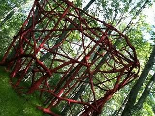
Kelley's posts have been full of pictures that give me the impression that I-Park is a magical place. I'm just going to show a few here to give you an idea of what wandering in the woods there must be like.

I-Park 2

I-Park 1

I-Park 3

I-Park 4

I-Park 5

Someone, I think Larry Reid, once told me he referred to this kind of art as "twig art." And it can look faintly ridiculous in a museum. But there in the woods? I can't help but love it. I really envy Kathy walking through those trees.

The whole point of her being there is to create a piece. Read through the bog in order and you will get to see the piece in various stages of completion.

Kathryn Kelley

Do the artists leave their pieces there at I-Park? It sort of looks like they do. I know the next time I am up that way, I'll make a detour to check it out.

(All photos by Kathryn Kelley.)

Art Outside the Loop

Robert Boyd

Anyone who has ever looked at my slightly out-of-date art map knows that most art in Houston is inside the 610 Loop. At least, most public venues for art--galleries, museums, art spaces, theaters, performance spaces, etc. So I was intrigued when Spacetaker and the Fresh Arts Coalition decided to bring an art event to CityCentre, which is a new mixed use development on the site of the old Town & Country Mall at the intersection of I-10 and the Sam Houston Parkway. The event would combine performing arts with visual arts.

It started with a show at an art gallery (an actual art gallery outside the Loop!) called Sculptures by Design.  I don't know if the art on display there that night is from their stock or if it was brought in just for this event. In any case, it was terrible.


Belinda Smith, Lisa Shot, encaustic and oil

De gustibus non est disputandum, but seriously what the fuck? The other art in the gallery wasn't as egregiously bad, but it was still pretty bad, ranging from mediocre to terrible. On the whole, it seemed lazy, ill-wrought, poorly conceived, and unintelligent.

This might be a problem with the gallery. Here's what it says about itself on its web-page:
Sculptures By Design showcases a vast range of artistic styles and talents ranging from impressionistic, expressionistic, hard-lined contemporary art, as well as realistic. A full experience is offered to you as well, with the power house of talent working in multiple mediums. The enchanting atmosphere of the studios and the endearing professional artists provide a host of excellent options for artistic desire. [...]

All artwork shown and sold is dedicated to the investment of longstanding value created by serious and professional artists. The studio works closely with artists locally, nationally, and internationally. We claim to be one of the most diverse in collection and style.
OK, that was one event of many. Next I went down to a place which hosted the Houston Motor Club. This is a business where you become a member in order to have the ability to use their range of exotic sports cars. Among the cars on display were various paintings on easels.


Like these paintings by ChicagoKim. I can't say if they were any good. They were overwhelmed by the vehicles all around them. They might as well have been displayed next to large piles of money. I did like the painting below--somehow it caught my attention despite the sea of high-end horsepower that surrounded it.


Matt Messinger, unknown title, oil (?) on canvas

The expressionistically drawn Fleischer-cartoon versions of rabbits appealed to me a lot. It reminded me a bit of the art of Mariscal.

But seriously, could anything compare with this piece of art?


In the same space, I watched some singers from Main Street Theater do some pieces from their Tom Lehrer review, Tomfoolery (coming up later this month). That was really nice, especially for someone like me who grew up loving Tom Lehrer. They didn't sing any of his political songs--they may have been too obscure, dealing with issues from the early 60s (although "Who's Next?" seems ever fresh), and maybe way too liberal for hard right Memorial.


Last, I watched a few short films in the Studio Art Grill.

On the whole, I'd say this was pretty successful. It was definitely a different crowd than the usual suspects one sees at gallery openings inside the Loop. In particular, I noticed a lot of young women dressed to the nines. CityCentre has a lot of happening bars, so younger, single, prosperous types were around. (I've hit some of the bars there with my brother before, and our verdict was that they were way too expensive, especially when the excellent Burlap Barrel is literally a block away). I wish the organizers had tried harder to get better visual art, but they may have been constrained by their gallery partner. A map of CityCentre showing where each performance was going to be would have been useful.

Thursday, June 3, 2010

Great Comic Art at the Latest Artcurial Auction

Here in the U.S., the big auction house for comics art is Heritage Auctions (in Dallas of all places). They run their auctions primarily but not exclusively online--it is really easy to bid with them.

I wish French auction house Artcurial made it as easy. Their website is in French and English, which implies to me that they want an international clientele. But the way they do internet bidding is really weird and confusing to me, not practical and easy the way Heritage does.

Still, they have really nice auctions with huge amounts of interesting comics art, mostly Franco-Belgian, but including some great pieces from around the world. The next Artcurial comics auction takes place June 5, so if you find yourself in Paris, stop by and bid on a few lots! Here are some of the things I would be bidding on if I were there...


http://www.artcurial.com/Thumb//536/10301536tn.jpg
Soirs de Paris cover by Avril

 http://www.artcurial.com/Thumb//567/10301567tn.jpg
A page from Aguirre by Alberto Breccia


http://www.artcurial.com/Thumb//029/10306029tn.jpg
A page from Leon La Came by Nicolas de Crecy


http://www.artcurial.com/Thumb//802/10301802tn.jpg
An illustration by Jacques Tardi for Death on the Installment Plan

Note on Anthony Caro: A Life in Sculpture

http://content-9.powells.com/cover?isbn=9781858942599
Anthony Caro: A Life in Sculpture, Julius Bryant, 2004

"I'm not a fan of Calder. There is something too elegant, fragile, in his work."

This is about as negative as Caro allows himself to get. This small book (the title makes it sound massive!) features a wonderful selection of photos and a long, breezy interview with the then 80-year-old Sir Anthony. As it happens, I agree about Calder. But Caro himself is someone whose work has been devalued over the years since his peak in popularity in the 60s.

It seems in the 60s (looking back) there were wars going on between the Clement Greenberg/Michael Fried-approved artists (Caro, Jules Olitski, Kenneth Noland, etc.), the Pop artists, the Minimalists, and (the ultimate winnahs!) the post-Minimalists. In retrospect, that all seems pretty silly. People try hard to pigeonhole artists (is John Chamberlain a "Pop artist"? Is Roger Brown?), but it is their own work that deserves response, not what club they belonged to.

I say this in part because I love Anthony Caro's work. I, like most people, was mainly familiar with his early-60s welded steel sculptures--which I have always liked tremendously. But this little book shows that there is a lot more to see. I will be making a point of seeking out these later Caro pieces.

Wednesday, June 2, 2010

A Public Service Message from Sketch Klubb

Dennis Hopper at Rice

Dennis Hopper came to the Rice Media Center in 1983 for a performance, the Russian Dynamite Death Chair Act, in which Hopper entered a coffin that was then blown up with dynamite. My old film professor, Brian Huberman, filmed it.


Here's what Huberman writes on his blog about that eventful evening.
The dynamite coffin stunt could not be performed at Rice for safety/insurance reasons, so Hopper hired a fleet of school buses to transport the audience to a race track north of town off Hopper road. Hopper brought in a Hollywood stuntman to design the event & all went as planned. The video clearly shows how out of control our hero was at this time who was being supplied with a steady diet of exotic substances.

Hopper vanished into Mexico following his Houston experience & the last I heard he was seen running naked through some city street. Too tough to be destroyed by such self abuse, Hopper later appeared on the cover of Vanity Fair, recovered, regenerated & ready…!
Then Brian adds...
p.s. I forgot to mention that the large guy making the sign of the cross is the writer Terry Southern and the jerk threatening to blow up my camera is the German filmmaker, Wim Wenders.
There is another first-hand account of that crazy evening is here. Alas, I was a freshman at Texas A&M when this craziness was happening. I transferred to Rice the next year. I had three classes with Brian while at Rice--he was a great, easy-going, laconic professor. He had what seemed to me a bizarre fascination with John Wayne (strange for an English guy--but his love of Wayne and Westerns in general were probably what brought him to Texas in the first place). He is still a professor at Rice after all these years. I practically lived at the Media Center for a year or so as an undergrad. And after Dennis Hopper blew through town, folks associated with the Ferus Gallery continued to visit Rice and do cool (if not actually explosive) things, including Robert Irwin and Ed Kienholz. I put it all down to the influence of Walter Hopps, who showed up in Houston in 1981.

(Hat-tip to Glasstire.)

Giant Inflatables: A Houston Vernacular

I should perhaps say a vanishing Houston vernacular, since rules on giant inflatables have been adopted by City Council that will limit their use. But as a long-standing part of our visual landscape, I think it is incumbent on our artists to explore the artistic possibilities of inflatables.

Jet Creations is a fabricator of inflatables. It looks like they have lots of off-the-shelf designs. For example:

http://www.jetcreations.com/images/stories/menu/lifelike.jpg

(I don't think the sexy model is part of the product line, though.)

And perhaps most amazing (at least to me) are the inflatable costumes.

http://www.jetcreations.com/images/stories/costumewww.jpg
You can get off the shelf an inflatable "soul brother" with comb in his afro.

OK, I am joking around, but really I see a lot of artistic possibilities here where an artist either hires a firm like Jet Creations to fabricate an inflatable piece of art, or simply figures out how to do it herself. We're a city that loves its giant inflatable gorillas. I think we, as a city, might enjoy some giant inflatable art--in whatever form it might take.