This looks fantastic. When Charles Berberian, one of the world's greatest cartoonists, calls a book "mindblowing," I pay attention. The publisher, Top Shelf, is a scrappy alternative/art comics publisher, and I am really impressed with this video they put together for Lucille. Apparently Ludovic Debeurme, the cartoonist, is also in a band--which is the source of all the music in the video. Check out Debeurme's website--his drawings and paintings are insane--in a good way.
Thursday, June 30, 2011
Lucille
by Robert Boyd
This looks fantastic. When Charles Berberian, one of the world's greatest cartoonists, calls a book "mindblowing," I pay attention. The publisher, Top Shelf, is a scrappy alternative/art comics publisher, and I am really impressed with this video they put together for Lucille. Apparently Ludovic Debeurme, the cartoonist, is also in a band--which is the source of all the music in the video. Check out Debeurme's website--his drawings and paintings are insane--in a good way.

This looks fantastic. When Charles Berberian, one of the world's greatest cartoonists, calls a book "mindblowing," I pay attention. The publisher, Top Shelf, is a scrappy alternative/art comics publisher, and I am really impressed with this video they put together for Lucille. Apparently Ludovic Debeurme, the cartoonist, is also in a band--which is the source of all the music in the video. Check out Debeurme's website--his drawings and paintings are insane--in a good way.
Tuesday, June 28, 2011
The Great Link Pan is Dead
by Robert Boyd
Chico and Rita finally arrives in the U.S.A.! You might recall that I wrote about Javier Mariscal's animated film Chico and Rita. That was over a year ago, and finally it is starting to appear here in festivals, although it apparently does not yet have U.S. distribution. Here's an interview with director Fernando Trueba (Mariscal's collaborator) from The Paris Review. And best of all, a trailer! (The Paris Review)
Chico and Rita trailer
Dueling Art Fairs. There is a nice long article on Glasstire about the Houston Fine Art Fair and the Texas Contemporary, two art fairs that will come to Houston in September and October respectively. Apparently, the director of the HFAF, Max Fishko, had some kind of falling out with the fair owners, quit, and started the Texas Contemporary as a competing art fair. Art fairs seem like comic book conventions for rich people. I've heard their growth has been largely about galleries needing to find new ways to compete with auction houses, which were stealing market share. The whole thing is above my pay grade. That said, if I were a young, un-galleried artist, I'd get together with some artist friends, pool our money, and rent a room or suite at the Hilton Americas during the fair. They could then have their own guerrilla mini-satellite art fair for a fraction of the cost of exhibiting at the "official" art fairs. (Glasstire)
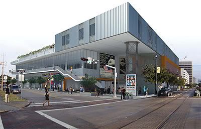
A freakishly realistic computer drawing of the Independent Art Collaborative
More Art in Midtown. A bunch of visual and performing arts groups--all renters and all too small to build their own space are getting together to build a shared space in Midtown. The boringly named Independent Arts Collaborative includes Diverse Works, FotoFest, the Catastrophic Theatre, Main Street Theater and Suchu Dance. The deal to finance and build it seems quite complex (and something I want to delve into in a little more detail later), and with so many stakeholders, it seems like a lot could go wrong. Still, it's exciting! It will make the whole area of Midtown from Lawndale up to the ICA one big Arts/Entertainment/Homeless Services/Rehab district! By the way, I hope they give the building a proper name. I suggest the Robert W. Boyd Center for the Arts. (CultureMap, The Houston Chronicle, Swamplot)
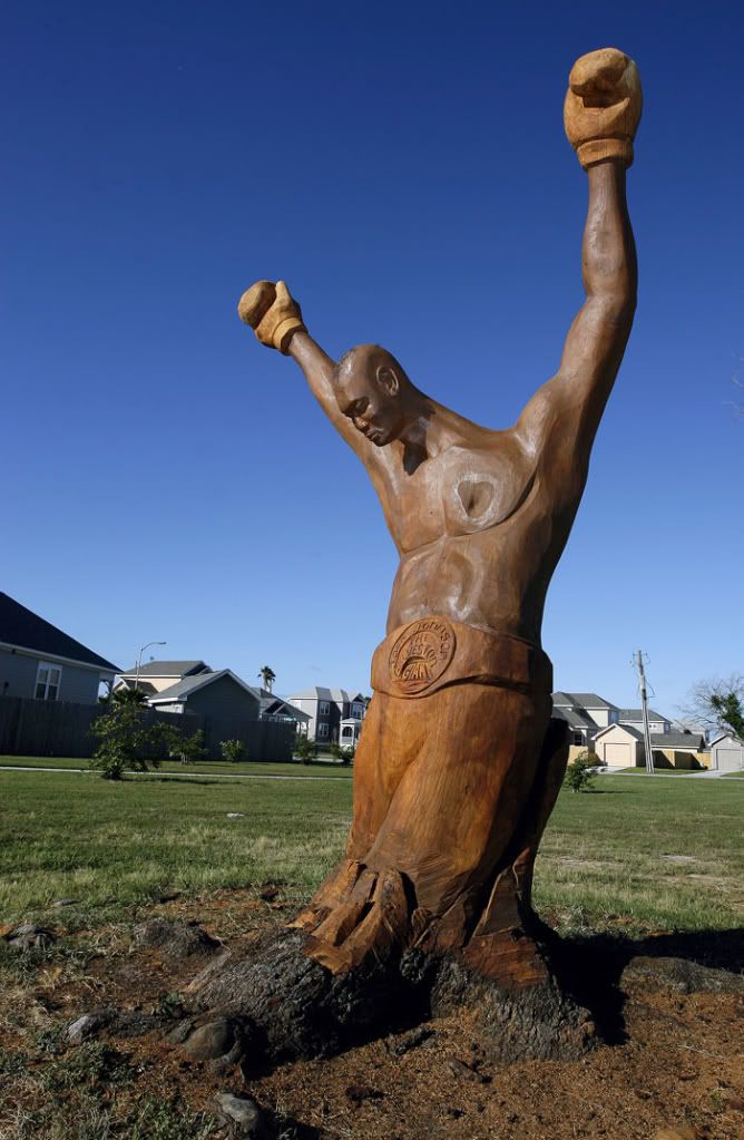
Earl Jones, Jack Johnson, carved wood from a tree killed by Hurricane Ike (photo by Jennifer Reynolds for the Galveston County Daily News)
One Last Scandal for the Champ, Jack Johnson. The first black heavyweight boxing champ, Jack Johnson (1878-1946), was dogged by scandal during his career. The Galveston native's whole life was a big "Fuck You" to white racist America. So a large sculpture carved by Earl Jones (who really needs a website to show off his work) from one of the oaks in Galveston that was killed by Hurricane Ike is a lovely tribute to the champ, right? But some of the neighbors don't agree. It draws too many tourists and looky-loos. And the last thing Galveston needs is tourists! Hell, if I were one of those neighbors, I'd be out there hawking Jack Johnson memorabilia! This whole carving sculptures into Ike-killed oaks is an amazing grassroots art thing in Galveston. Seriously, the city should publish a map online showing all the locations of these sculptures and promote it to tourists. I'd take that tour. (Galveston County Daily News)
Sunday, June 26, 2011
Many Mini Matching 10%
by Robert Boyd

photo by Shira Golding
A few days ago, I made a pitch to you, my readers, to support the Many Mini art residency at Skydive. And by "support," I meant to pledge some actual money via Kickstarter. There are four days left on this campaign, and 31 backers have pledged $1160 so far. That's an average of $37.42 per backer so far. That's pretty affordable, right? $37.42? If we can get 56 more people to donate that amount, we will meet the goal of $3250. This pays for the curators and some of the artists to travel here, their room and board while here, and all the expenses associated with the residencies.
56 generous art-lovers. That's it. I know way more than 56 people will read this post. All you need to do it go over to Kickstarter and promise $37.42.
And to make it a little easier on you... Here's the deal. For every $10 donated from now on, I will donate $1. A 10% matching fund. If you give $37, I will donate an additional $3.70. So any donation you give will have a 10% extra boost from yours truly.
Help the Many Mini do its week-long, 24-7, 50+ artist hullabaloo. Give the Many Mini $37, or $40 or $50. And I will add in an additional 10%. We just need 50-ish new donors. You can do it!
Lynda Benglis at Texas Gallery
by Robert Boyd
This is kind of a funny show. Lynda Benglis is best known for one in-your-face gesture--an ad she took out in Artforum in November, 1974. In it, she is posed nude (except for sunglasses) and is holding a huge dildo in front of her crotch. It was deliberately provocative and pornographic. Like a lot of female minimalist and post-minimalist artists, Benglis was feeling a little neglected by the art establishment. Judy Chicago had a similar problem, but chose a very different way to address it.
The thing is, as far as I can tell, this didn't help her career all that much. The gesture was controversial and divisive, and it got her written into art history--but not for her artwork. (That's why I'm not going to reproduce it here. It would suck all the energy out of the other images below, which defeats the purpose of a review, no? But you can perv it at her Wikipedia entry.) Her just-closed retrospective at the New Museum was an attempt to rectify this. It was fantastic timing on the part of Texas Gallery to have a show of her work right on the heels of the New Museum's retrospective.
I walked into this show knowing nothing about Benglis except for her notorious Artforum ad. I stupidly expected a show full of sexy, provocative art. But no--that wasn't what this show was about. The first thing I saw was this piece:
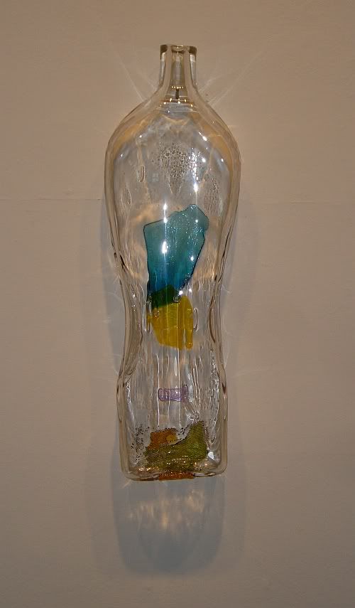
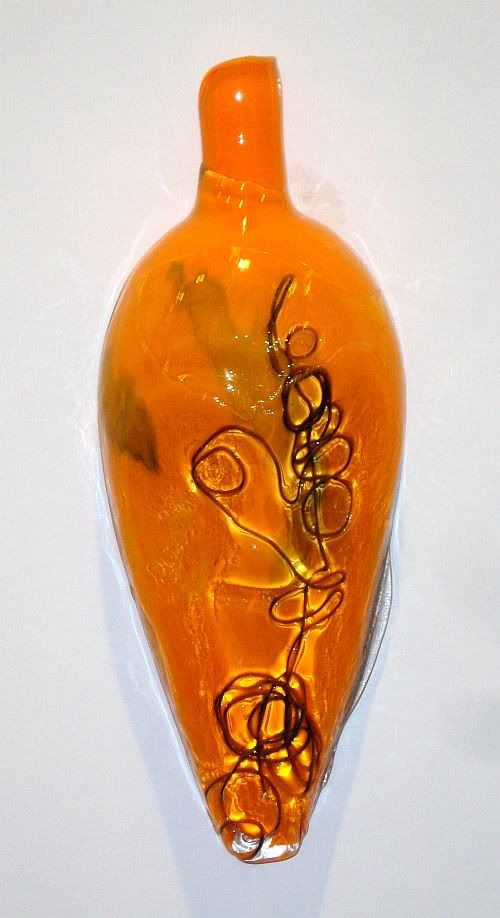
Lynda Benglis, Tickfaw, glass, 2010
Tickfaw is named after a tiny town in southern Louisiana. Benglis is from Lake Charles and studied at Tulane. All the pieces in this show are named after Louisiana towns. The name of the show is "Glass Masks", but these pieces remind me more of bottles and vases--except for the fact that they seem to be completely solid.
Now here's the weird thing. If I walked in on this show at Goldesberry Gallery, and the name of the artist was Lynda Smith, I would respond to it very differently than I do knowing that it is Lynda Benglis's work. I can't see these works without thinking about the ad, the notoriety. It inherently affects critical judgment. Would Texas Gallery have put on a show of modest but pretty glass art pieces if it weren't for the name?
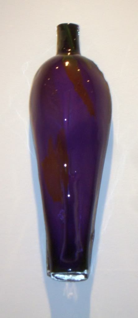
Lynda Benglis, Florien, glass, 2010
Still, knowing about her helps one understand these works. She states in a New York Times profile that growing up with Mardi Gras theatricality and especially masks influenced her work. The Louisiana place names connects this body of work to that period of her life. (Florien, like Tickfaw, is a village of fewer than 1000 people.)
Lynda Benglis, Robeline, glass and copper, 2010
In a few pieces, Benglis mixes copper with the glass. I don't know enough about glass art to know what this does, but there was a very interesting effect I noticed. The glass is transparent, but within the glass there are structures that catch and reflect the light. This became visible when I took photos of the copper and glass pieces with my flash on. Here is a close up of Robeline without flash.
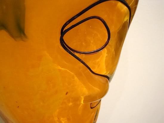
Lynda Benglis, Robeline detail, glass and copper, 2010
And here is a close-up with flash:
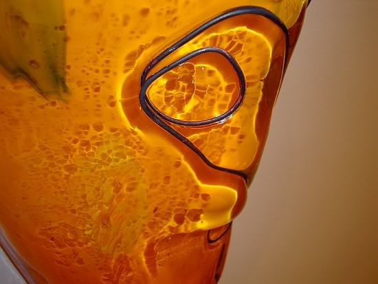
Lynda Benglis, Robeline detail, glass and copper, 2010
The dark parts (copper?) cast shadows within the glass. But in addition, you can see bright reflections within the glass as well. It's a lovely effect. I assume direct sunlight would give that kind of effect as well.
No big conclusions here. These are some nice, pretty pieces which happened to have been made by an unusually notorious artist. That's all.
This is kind of a funny show. Lynda Benglis is best known for one in-your-face gesture--an ad she took out in Artforum in November, 1974. In it, she is posed nude (except for sunglasses) and is holding a huge dildo in front of her crotch. It was deliberately provocative and pornographic. Like a lot of female minimalist and post-minimalist artists, Benglis was feeling a little neglected by the art establishment. Judy Chicago had a similar problem, but chose a very different way to address it.
The thing is, as far as I can tell, this didn't help her career all that much. The gesture was controversial and divisive, and it got her written into art history--but not for her artwork. (That's why I'm not going to reproduce it here. It would suck all the energy out of the other images below, which defeats the purpose of a review, no? But you can perv it at her Wikipedia entry.) Her just-closed retrospective at the New Museum was an attempt to rectify this. It was fantastic timing on the part of Texas Gallery to have a show of her work right on the heels of the New Museum's retrospective.
I walked into this show knowing nothing about Benglis except for her notorious Artforum ad. I stupidly expected a show full of sexy, provocative art. But no--that wasn't what this show was about. The first thing I saw was this piece:

Lynda Benglis, Tickfaw, glass, 2010
Tickfaw is named after a tiny town in southern Louisiana. Benglis is from Lake Charles and studied at Tulane. All the pieces in this show are named after Louisiana towns. The name of the show is "Glass Masks", but these pieces remind me more of bottles and vases--except for the fact that they seem to be completely solid.
Now here's the weird thing. If I walked in on this show at Goldesberry Gallery, and the name of the artist was Lynda Smith, I would respond to it very differently than I do knowing that it is Lynda Benglis's work. I can't see these works without thinking about the ad, the notoriety. It inherently affects critical judgment. Would Texas Gallery have put on a show of modest but pretty glass art pieces if it weren't for the name?

Lynda Benglis, Florien, glass, 2010
Still, knowing about her helps one understand these works. She states in a New York Times profile that growing up with Mardi Gras theatricality and especially masks influenced her work. The Louisiana place names connects this body of work to that period of her life. (Florien, like Tickfaw, is a village of fewer than 1000 people.)

Lynda Benglis, Robeline, glass and copper, 2010
In a few pieces, Benglis mixes copper with the glass. I don't know enough about glass art to know what this does, but there was a very interesting effect I noticed. The glass is transparent, but within the glass there are structures that catch and reflect the light. This became visible when I took photos of the copper and glass pieces with my flash on. Here is a close up of Robeline without flash.

Lynda Benglis, Robeline detail, glass and copper, 2010
And here is a close-up with flash:

Lynda Benglis, Robeline detail, glass and copper, 2010
The dark parts (copper?) cast shadows within the glass. But in addition, you can see bright reflections within the glass as well. It's a lovely effect. I assume direct sunlight would give that kind of effect as well.
No big conclusions here. These are some nice, pretty pieces which happened to have been made by an unusually notorious artist. That's all.
Saturday, June 25, 2011
Michael DeForge
by Robert Boyd

The best new cartoonists I have come across lately is Michael DeForge. (At least, he's new to me. I'm on the trailing edge of what's hot in the world of art comics.) I don't know much about him except that he's Canadian and was born in 1987, which makes him ridiculously young as far as I am concerned. (As it does in acting, Canada seems to have an outsized proportion of the world's great English-language cartoonists.)
I first encountered his work in the revived What Things Do web-comics site. This site includes comics by many of the best comics from the art comics side of the spectrum (i.e., the only side I really care about, as far as living cartoonists go)--Kevin Huizenga, Ron Regé Jr., John Porcellino, site creator Jordan Crane, and others. (One weakness--not too many women cartoonists. Not to suggest that they engage in tokenism, but right now, some of the most exciting art comics are by women like Gabrielle Bell and Lisa Hanawalt.)
His work is deliciously creepy. It reminded of a lot of the work I used to read in Raw and Weirdo--the two classic art comics anthologies of the 80s (edited by Art Spiegelman and Robert Crumb respectively). I can see touches of Kaz, Gary Panter, Marc Caro, Brad Johnson, Julie Doucet, etc., in his art. I'm referring to his drawing style, of course, but even moreso to the sheer unsettling strangeness of his work. You read it and it makes sense and even in some ways feels "realistic"--but in each story there is an overarching (or underlying) alien quality.

Michael DeForge, cover of Lose 3, 2011
For example, in Lose no. 3 (Koyama Press, 2011), he has a story called "Dog 2070." It's the story of Stephen, a very self-centered divorced guy. But he's a dog, a dog in a future world where dogs have pretty human lives. OK, so far not too strange. After all, there have been animal characters acting like humans in comics since the earliest comic strips, and the tradition of human-acting animals goes back to at least the ancient Greeks. His drawing is not highly realistic, but it contains a lot of detail and a lot of marks. I use the word "marks" as distinguished from "lines". This is a distinction that I first heard expressed by Gary Panter. Panter seemed to see lines as descriptive. Marks at best added texture, but they could also be seen as bits of ink that sat on the surface, that help you remember you are looking at a flat piece of paper with ink printed on it.
The dogs are not merely anthropomorphized animals. Instead, they seem to have a science fiction quality. For one thing, they have flaps of skin that allow them to glide (not too well, but still). Stephen, who hasn't glided in years, impulsively tries it at the wrong time of year and badly injures himself. The point is, they seem designed. Keep that in mind. They live in a world a lot like ours, except when DeForge draws it, it looks like a ruined wreck that has been partially rebuilt.

Micheal DeForge, from "Dog 2070" page 4, 2011
This makes me think of two post-apocalyptic novels, Oryx and Crake and The Book of Dave. In both, a calamity has left a future inhabited by genetically created creatures with some level of intelligence. That's what these dogs seem like--replacements for humans. And they believe themselves to be humans, living lives similar to how we lived in the early 2000s. Stephen is a massively self-absorbed office drone in this strange (but familiar) new world.

Micheal DeForge, from "Dog 2070" page 5, 2011
This gives hints of why he is divorced. He has a vague obsession with his ex-wife, and a strong desire to connect with his two boys. But the desire is not strong enough that he is willing to become famiar with their world, which leads to scenes of awkward generational misunderstanding.

Micheal DeForge, from "Dog 2070" page 14, 2011
All the events (except for the gliding) feel like the kind of thing you could see depicted in a modern realistic novel, say one by Jonathan Franzen. It's painful to read because it rings very true. And yet, you can never forget the weird mark-making of DeForge's pen or the strange mutant setting. The final scene hammers this home--Stephen dreams that he, his ex-wife and two boys are on all fours for some reason, struggling over a piece of meat (like real dogs do). He doesn't understand what he is seeing and it disturbs him--and us. DeForge takes various tropes and genre cliches and smashes them together to create a work of unsettling dislocation.

Michael DeForge, panels from"All About the Spotting Deer", 2011
"All About the Spotting Deer," which was published online at What Things Are and as a small comic from Koyama Press, takes as its base structure the high school science report. It talks about this strange creature (which appeared in "Dog 2070" as a mode of transportation)--it's diet, its mating habits, its habitation, its interactions with people and civilization, etc. The Spotted Deer has the appearance of a perfect cartoon animal--maybe one from an obscure 1920s animated cartoon. But the essay provides careful scientific-sounding explanations for all its cartoonish features.

Michael DeForge, panels from"All About the Spotting Deer", 2011
I get the impression that these is more to DeForge's work than I can see from the stories I've read. He may be creating a "world" in the same way that Jaime Hernandez or Jim Woodring did. This could be risky, especially if the world he creates explains everything--and therefore removes the strangeness. But ideally, such a world--if it actually exists and is implied in DeForge's work--would aggregate the strangeness. From what I've seen so far, it has the potential to be an unusually rich creation.
One final note--Koyama Press is a relatively new publisher, specializing in art books and comics. When you think of the great alternative comics publishers--Fantagraphics and Drawn and Quarterly--they started off with a small stable of artists and nurtured them for a long time (the Hernandez Brothers, Chester Brown, Seth, etc.). I hope Koyama Press will form a similar relationship with DeForge. Art comics artists need good publishers as partners.

Michael DeForge, panel from page 1 of "All About the Spotting Deer", 2011
The best new cartoonists I have come across lately is Michael DeForge. (At least, he's new to me. I'm on the trailing edge of what's hot in the world of art comics.) I don't know much about him except that he's Canadian and was born in 1987, which makes him ridiculously young as far as I am concerned. (As it does in acting, Canada seems to have an outsized proportion of the world's great English-language cartoonists.)
I first encountered his work in the revived What Things Do web-comics site. This site includes comics by many of the best comics from the art comics side of the spectrum (i.e., the only side I really care about, as far as living cartoonists go)--Kevin Huizenga, Ron Regé Jr., John Porcellino, site creator Jordan Crane, and others. (One weakness--not too many women cartoonists. Not to suggest that they engage in tokenism, but right now, some of the most exciting art comics are by women like Gabrielle Bell and Lisa Hanawalt.)
His work is deliciously creepy. It reminded of a lot of the work I used to read in Raw and Weirdo--the two classic art comics anthologies of the 80s (edited by Art Spiegelman and Robert Crumb respectively). I can see touches of Kaz, Gary Panter, Marc Caro, Brad Johnson, Julie Doucet, etc., in his art. I'm referring to his drawing style, of course, but even moreso to the sheer unsettling strangeness of his work. You read it and it makes sense and even in some ways feels "realistic"--but in each story there is an overarching (or underlying) alien quality.

Michael DeForge, cover of Lose 3, 2011
For example, in Lose no. 3 (Koyama Press, 2011), he has a story called "Dog 2070." It's the story of Stephen, a very self-centered divorced guy. But he's a dog, a dog in a future world where dogs have pretty human lives. OK, so far not too strange. After all, there have been animal characters acting like humans in comics since the earliest comic strips, and the tradition of human-acting animals goes back to at least the ancient Greeks. His drawing is not highly realistic, but it contains a lot of detail and a lot of marks. I use the word "marks" as distinguished from "lines". This is a distinction that I first heard expressed by Gary Panter. Panter seemed to see lines as descriptive. Marks at best added texture, but they could also be seen as bits of ink that sat on the surface, that help you remember you are looking at a flat piece of paper with ink printed on it.
The dogs are not merely anthropomorphized animals. Instead, they seem to have a science fiction quality. For one thing, they have flaps of skin that allow them to glide (not too well, but still). Stephen, who hasn't glided in years, impulsively tries it at the wrong time of year and badly injures himself. The point is, they seem designed. Keep that in mind. They live in a world a lot like ours, except when DeForge draws it, it looks like a ruined wreck that has been partially rebuilt.

Micheal DeForge, from "Dog 2070" page 4, 2011
This makes me think of two post-apocalyptic novels, Oryx and Crake and The Book of Dave. In both, a calamity has left a future inhabited by genetically created creatures with some level of intelligence. That's what these dogs seem like--replacements for humans. And they believe themselves to be humans, living lives similar to how we lived in the early 2000s. Stephen is a massively self-absorbed office drone in this strange (but familiar) new world.

Micheal DeForge, from "Dog 2070" page 5, 2011
This gives hints of why he is divorced. He has a vague obsession with his ex-wife, and a strong desire to connect with his two boys. But the desire is not strong enough that he is willing to become famiar with their world, which leads to scenes of awkward generational misunderstanding.

Micheal DeForge, from "Dog 2070" page 14, 2011
All the events (except for the gliding) feel like the kind of thing you could see depicted in a modern realistic novel, say one by Jonathan Franzen. It's painful to read because it rings very true. And yet, you can never forget the weird mark-making of DeForge's pen or the strange mutant setting. The final scene hammers this home--Stephen dreams that he, his ex-wife and two boys are on all fours for some reason, struggling over a piece of meat (like real dogs do). He doesn't understand what he is seeing and it disturbs him--and us. DeForge takes various tropes and genre cliches and smashes them together to create a work of unsettling dislocation.

Michael DeForge, panels from"All About the Spotting Deer", 2011
"All About the Spotting Deer," which was published online at What Things Are and as a small comic from Koyama Press, takes as its base structure the high school science report. It talks about this strange creature (which appeared in "Dog 2070" as a mode of transportation)--it's diet, its mating habits, its habitation, its interactions with people and civilization, etc. The Spotted Deer has the appearance of a perfect cartoon animal--maybe one from an obscure 1920s animated cartoon. But the essay provides careful scientific-sounding explanations for all its cartoonish features.

Michael DeForge, panels from"All About the Spotting Deer", 2011
I get the impression that these is more to DeForge's work than I can see from the stories I've read. He may be creating a "world" in the same way that Jaime Hernandez or Jim Woodring did. This could be risky, especially if the world he creates explains everything--and therefore removes the strangeness. But ideally, such a world--if it actually exists and is implied in DeForge's work--would aggregate the strangeness. From what I've seen so far, it has the potential to be an unusually rich creation.
One final note--Koyama Press is a relatively new publisher, specializing in art books and comics. When you think of the great alternative comics publishers--Fantagraphics and Drawn and Quarterly--they started off with a small stable of artists and nurtured them for a long time (the Hernandez Brothers, Chester Brown, Seth, etc.). I hope Koyama Press will form a similar relationship with DeForge. Art comics artists need good publishers as partners.
Friday, June 24, 2011
Howard the Duck is an Orphan Now... Gene Colan: 1926 - 2011
Robert Boyd
Gene Colan was a comic book artist who mainly worked for Marvel Comics as a freelancer. I just read that he passed away last night after a long period of illness. He's an important figure in the history of comic books, and for me personally, he was an important artist. He was one of the first artists I discovered on my own and knew by name--and by style. I could always spot a Gene Colan page--he was a unique artist whose drawing style ran counter to the popular mainstream comics styles of the day (typified by John Romita and John Buscema). When I was in junior high, I fell in with a group of kids who were into comic books. They (Jim Mooney, Bud Thomas, Jonathan Kessler, Larry Garrett, and John Richardson) got me interested in comics as well. Despite this, we remain friends. I already liked comic strips and MAD a lot, so it was a natural step. This was the mid-70s. One of the first comics I ever bought on my own was this one:

Gene Colan, Howard the Duck #4
Colan was the primary visual artist on the comic book Howard the Duck, which quickly became my favorite. I would say that he is best known for Howard the Duck, Tomb of Dracula (another 70s era Marvel comic) and Daredevil, a long-running comic (still being published today) that he drew from the mid-60s to the early 70s. This is one of my favorite Daredevil covers by Colan:

Gene Colan, Daredevil #38 cover
Colan was a master of chiaroscuro. A lot of my favorite cartoonists are such masters--Milt Caniff, Chester Gould, Frank Robbins and more. Colan had a particular skewed and dynamic style of laying out panels on the page and depicting the action within. It always seemed to me that his style would have been perfect for straight-up hard-boiled detective fiction, but in the world of mainstream comics with its insanely constricted choice of acceptable genres, Colan had to draw a whole lot of superhero comics. (He was luckier than a lot of his peers in this regard in that he had successful runs on a satirical comic and a horror comic in addition to his superhero work.)
Here are a couple of pages from Howard the Duck--the first comic book I ever loved. Its two main creators, Steve Gerber and Gene Colan are now dead, which is making me feel pretty old today.

Gene Colan, page from Howard the Duck #26

Gene Colan, Howard the Duck #5, p. 31
Rest in peace, Gene.
Gene Colan was a comic book artist who mainly worked for Marvel Comics as a freelancer. I just read that he passed away last night after a long period of illness. He's an important figure in the history of comic books, and for me personally, he was an important artist. He was one of the first artists I discovered on my own and knew by name--and by style. I could always spot a Gene Colan page--he was a unique artist whose drawing style ran counter to the popular mainstream comics styles of the day (typified by John Romita and John Buscema). When I was in junior high, I fell in with a group of kids who were into comic books. They (Jim Mooney, Bud Thomas, Jonathan Kessler, Larry Garrett, and John Richardson) got me interested in comics as well. Despite this, we remain friends. I already liked comic strips and MAD a lot, so it was a natural step. This was the mid-70s. One of the first comics I ever bought on my own was this one:
Gene Colan, Howard the Duck #4
Colan was the primary visual artist on the comic book Howard the Duck, which quickly became my favorite. I would say that he is best known for Howard the Duck, Tomb of Dracula (another 70s era Marvel comic) and Daredevil, a long-running comic (still being published today) that he drew from the mid-60s to the early 70s. This is one of my favorite Daredevil covers by Colan:
Gene Colan, Daredevil #38 cover
Colan was a master of chiaroscuro. A lot of my favorite cartoonists are such masters--Milt Caniff, Chester Gould, Frank Robbins and more. Colan had a particular skewed and dynamic style of laying out panels on the page and depicting the action within. It always seemed to me that his style would have been perfect for straight-up hard-boiled detective fiction, but in the world of mainstream comics with its insanely constricted choice of acceptable genres, Colan had to draw a whole lot of superhero comics. (He was luckier than a lot of his peers in this regard in that he had successful runs on a satirical comic and a horror comic in addition to his superhero work.)
Here are a couple of pages from Howard the Duck--the first comic book I ever loved. Its two main creators, Steve Gerber and Gene Colan are now dead, which is making me feel pretty old today.
Gene Colan, page from Howard the Duck #26
Gene Colan, Howard the Duck #5, p. 31
Rest in peace, Gene.
Wednesday, June 22, 2011
It's Video Time!
by Robert Boyd
Here are a few videos I have seen and liked lately. I think everyone has linked to this "artist statement" video by Charlotte Young:
But her other videos are funny and interesting, too--like this one, ART HATE: The Swindon Riots.
Check out more of her videos here.
Now if you don't know about Hennesy Youngman AKA Henrock, you must see these highly informative videos. Frankly, I think an emerging artist trying to make it in the art world will find his or her path greatly smoothed by watching these videos. Here are the two most recent one. Henrock takes on "Beauty" and "The Sublime." (He's truly the Emmanuel Kant of our time.)
ART THOUGHTZ: On Beauty
ART THOUGHTZ: The Sublime
Don't you feel enlightened?
Resistance by Hagit Barkai at Nau-Haus
by Dean Liscum
During the month of June 2011, Nau-haus Gallery exhibits Hagit Barkai's show Resistance. Barkai has participated in several group shows, but this is her first solo exhibition and it's replete with new and old pieces.
She specializes in a style of portraiture that I characterize as emotional Platonism in that her works communicate not an action or a personality but an emotional ideal. These works, particularly her earlier works, remind me of Lucien Freud or R.B. Kitaj or Eric Fischl, who are often praised for their "psychological penetration" of the subject. Their subjects were often famous people with whom most viewers could have a passing familiarity and make an assessment as to whether the painting captured the subject be it Leigh Bowery or Steve Martin. I don't know the psychological states of the subjects of Barkai. However, I can measure the psychological reaction that they provoke in me. Barkai contorts bodies and facial expressions to match an emotional ideal that runs the gambit of human discomfiture.
Barkai's subjects are known only to her and known intimately in that she has a personal relationship with those she paints. In some of her works, she provides enough context in the background or in the title for the viewer to grasp the archetypal scene. Even though the viewer doesn't know the subject, s/he knows the situation and can read it or read into it as s/he sees fit. Two works from her "Home" series that exhibit this characteristic are Aisen and Tyson and Bat Ami.
As Robert Boyd pointed out to me, Aisen and Tyson is a wedding portrait that "...seems to deliberately recall that foundational painting of Western bourgeois art history, the Arnolfini Wedding by Jan van Eyck." It's a common trope used to portray the dynamics in a relationship. The groom stands slightly in front of his bride. His arm either reaches back for his bride or pulls her along with him. Her face broadcast a defeated resignation, his a blurred defiance underscored by his brilliant red suit. Their wedding costumes shroud their bodies. Based on positioning, color, and facial expressions, this union doesn't exactly augur ecstasy for either of them, especially Aisen.
Another picture painted using this same approach is Bat Ami, which literally means "daughter of a nation." The female subject's clothing hangs on her body, ill-fitting and uncomfortable as if its only purpose is to hide (perhaps shame) or protect (perhaps humility). Her facial expression is one of both discomfiture and the wonder of either alienation or disbelief. The subject doesn't occupy the picture plane. Rather, Barkai thrust her into this setting of existential dread.
Another group of works move closer to that emotional ideal. In co-curator Surpik Angelini's essay "The Art of Hagit Barkai: Between the Abject and the Sublime", she observes that Barkai's creative process and thus her work is "rooted in what Heidegger termed 'Dassein' or being in the world".
What I see in these paintings are figures in a world stripped of context. These works are meditations on the body. They are signs for our humanity. Symbols of emotional states. At first glance, they appear to be signifiers with out a signified (references without a reference for those of you not steeped in semiotics or Saussure). The settings are vague and oblique or non-existent. Unlike Francis Bacon or Frichl, the subject is not a famous person like Pope Innocence X or Steve Martin, but private people in unknown (and unknowable) spaces. Thus, these works signify (reference) neither a literal person nor do they transcribe an event. Rather, they illustrate an emotion by forcing you the viewer to match Hagit's signifying image with a complex of emotions that serve as the signified (what is referenced).
You see this quality in works like Vomiters (not everywhere) and Blindfolds, which is if not an a priori rendering of dread then it's at least visceral one.
Confronted with human forms in these positions, you the viewer must make sense of them, constructing a context, supplying a narrative.
The images are primal not only in their subjects' nakedness and poses, but also in the way that the works are constructed. Barkai slathers and scraps paint across her canvases, grating, tearing, bruising, smearing the materials and the images that they compose. Her leaden, earthy palate further facilitates the feeling of too, too solid flesh. The hues of the figures exude not death but an awareness of mortality, the gravity of bodies, the weight of vulnerability.
And yet, you could consider none of this (from semiotics to the mechanics of painting), understand none of this, see one of Hagit's paintings and "feel" exactly what these works are about.
I dare you to meditate on these pictures for a minute and successfully resist the impulse to understand, to explain, to feel these pictures. If a universal language of vulnerablity, unease, disquiet exists, Hagit has discovered it.
Postscript
As always, Dan Allison and the Nau-haus staff do an excellent job of supporting their artists. On the Nau-haus webpage dedicated to Resistance, Allison has posted the artist's statement and CV, written his own review, and published the essay, "The Art of Hagit Barkai: Between the Abject and the Sublime" by Surpik Angelini. Nau-haus has also compiled a catalog of the show that can purchased online. My only criticism of the gallery is the burden of plenty. I'd have liked a little more space between the works, but when that's my only complaint, I realize just how good the show is.
During the month of June 2011, Nau-haus Gallery exhibits Hagit Barkai's show Resistance. Barkai has participated in several group shows, but this is her first solo exhibition and it's replete with new and old pieces.
She specializes in a style of portraiture that I characterize as emotional Platonism in that her works communicate not an action or a personality but an emotional ideal. These works, particularly her earlier works, remind me of Lucien Freud or R.B. Kitaj or Eric Fischl, who are often praised for their "psychological penetration" of the subject. Their subjects were often famous people with whom most viewers could have a passing familiarity and make an assessment as to whether the painting captured the subject be it Leigh Bowery or Steve Martin. I don't know the psychological states of the subjects of Barkai. However, I can measure the psychological reaction that they provoke in me. Barkai contorts bodies and facial expressions to match an emotional ideal that runs the gambit of human discomfiture.
Barkai's subjects are known only to her and known intimately in that she has a personal relationship with those she paints. In some of her works, she provides enough context in the background or in the title for the viewer to grasp the archetypal scene. Even though the viewer doesn't know the subject, s/he knows the situation and can read it or read into it as s/he sees fit. Two works from her "Home" series that exhibit this characteristic are Aisen and Tyson and Bat Ami.
 |
| Aisen and Tyson, 2010 H84 x W48 inches Oil on canvas |
 |
| Bat Ami, 2010 H60 x W48 inches Oil on canvas |
Another group of works move closer to that emotional ideal. In co-curator Surpik Angelini's essay "The Art of Hagit Barkai: Between the Abject and the Sublime", she observes that Barkai's creative process and thus her work is "rooted in what Heidegger termed 'Dassein' or being in the world".
 |
| Midday (other people might argue), 2007 H60 x W36 inches Oil on canvas |
You see this quality in works like Vomiters (not everywhere) and Blindfolds, which is if not an a priori rendering of dread then it's at least visceral one.
 |
| Vomiter (not everywhere), 2009 H42 x W54 inches Oil on canvas |
 |
| Blindfolds, 2008 H42 x W54 inches Oil on canvas |
The images are primal not only in their subjects' nakedness and poses, but also in the way that the works are constructed. Barkai slathers and scraps paint across her canvases, grating, tearing, bruising, smearing the materials and the images that they compose. Her leaden, earthy palate further facilitates the feeling of too, too solid flesh. The hues of the figures exude not death but an awareness of mortality, the gravity of bodies, the weight of vulnerability.
 |
| Caves: 2, 2008 H19 x W20 inches Oil on canvas |
And yet, you could consider none of this (from semiotics to the mechanics of painting), understand none of this, see one of Hagit's paintings and "feel" exactly what these works are about.
I dare you to meditate on these pictures for a minute and successfully resist the impulse to understand, to explain, to feel these pictures. If a universal language of vulnerablity, unease, disquiet exists, Hagit has discovered it.
Postscript
As always, Dan Allison and the Nau-haus staff do an excellent job of supporting their artists. On the Nau-haus webpage dedicated to Resistance, Allison has posted the artist's statement and CV, written his own review, and published the essay, "The Art of Hagit Barkai: Between the Abject and the Sublime" by Surpik Angelini. Nau-haus has also compiled a catalog of the show that can purchased online. My only criticism of the gallery is the burden of plenty. I'd have liked a little more space between the works, but when that's my only complaint, I realize just how good the show is.
Tuesday, June 21, 2011
Many Mini Me
by Robert Boyd
I wrote a few weeks ago about Kickstarter campaigns in the Houston art world, and I want to update one of them. You have 9 days left to fund the Many Mini Residencies. For their final push, they've created a new video (above) that explains the whole thing.
At this point, the residents have been chosen and they have been slotted in. Remember, Many Mini is an art residency at Skydive (an earlier incarnation was done in Berlin), but instead of an artist getting space to work for a week or a month or whatever, the artists get space for a maximum of 12 hours. In the end, only Chuck Ivy applied for a full 12 hour shift (as far as I can tell). Everyone else is doing a briefer residency. The schedule is now up on the Many Mini website.
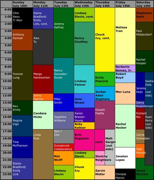
Many Mini schedule
As you can see, there are a lot of artists participating. Some of these residencies will be open to the public, but I don't think they all will. (I assume the website will clarify this soon.) Notice what's happening on Friday, July 15 at 9 am. Yep, I will be doing an hour-and-a-half residency. My plan is to write a Pan post. I may take photos and talk to some of the artists who will be there earlier in the week and write about them. But I'm keeping my options open. And yes, my residency will be open to the public, if you want to stop by and ask questions. (Skydive is on Norfolk near Star Pizza--go check it out. They are usually open every Saturday.)
Some of Houston's best artists will be there, doing their thing--including Elaine Bradford, Linda Post, Jeremy DePrez, Emily Peacock, Rachel Hecker, and many others.
There are some travel expenses for some participating artists involved, as well as some other expenses (the video and the Kickstarter site details this). Consequently, it will be very useful to get this Kickstarter grant, which comes purely from the generosity of folks like you, my dear readers. So if you haven't done so, head on over to Kickstarter and make a pledge--no amount is too small! (But bigger donations get better premiums--just like public radio!)
Note on Raul Gonzalez at Caroline Collective
by Robert Boyd
I didn't like all the pieces by Raul Gonzalez that I saw at the Caroline Collective last Saturday--his approach seems too all over the place. But one benefit from having such an unfocused approach is that maybe, just maybe, some of your pieces will hit a sweet spot. That's how I feel about a lot of this work.

Raul Gonzalez, Work Ahead, acrylic and marker on canvas, 2009
His paintings and drawings show the world seen from the street--specifically the world of work. They combine graphic elements with recognizable illustration.In Work Ahead, the quoted graphic (the warning sign) dominates, but within the sign are other graphic elements and drawing.

Raul Gonzalez, Exit Only, acrylic, ink, tape and marker on masonite, 2010
Exit Only also combined illustrative elements within a freeway sign graphic.

Raul Gonzalez, Construction Barrel, acrylic, ink and marker on canvas, 2010
A couple of paintings use intense "safety orange" as their primary element. Having a flat color underpainting, then leaving large swathes of the canvas unpainted (except for the underpainting) makes the image seem to float. Here, the color is highly symbolic--it acts as a warning as well as a call to attention. It speaks to our experience of driving in the streets of a dynamic, changing city, where repairs and new cosntruction are always happening. That speaks to Houston, but really, I think almost anyone who lives in a big city can relate to these kinds of images. They speak to modern urban life in the age of the automobile.

Raul Gonzalez, More Work Ahead, in and spray paint on floor laminate, 2010
My favorite work in the show is the painting More Work Ahead. By doing a bit of landscape drawing on the left then a small drawing of a traffic barrel in the bottom right, Gonzalez effectively depicts the feeling of a wide boulevard--a vast treeless expanse of concrete--without drawing it. We roll over these roads, but aside from our rapid passing, many of them are non-spaces, voids, heat islands that repel human life. Life occurs on the edges of these concrete deserts.

Raul Gonzalez, More Work Ahead detail, in and spray paint on floor laminate, 2010

Raul Gonzalez, More Work Ahead detail, in and spray paint on floor laminate, 2010
In some ways, these pieces remind me of certain early modernist American paintings--the stylized depictions of modern urban America by Charles Demuth, Joseph Stella, Charles Sheeler and so on. It's a good lineage to have.
The show is only up through June 24, so rush over before it closes.
![]()
Subscribe to:
Posts (Atom)

