Saturday, November 28, 2009

One of the Biggest Collectors in the World

So today I decided to stop by the new Deborah Colton Gallery location on North Blvd. near Rice Village. I walked into a huge gallery space with enormous pictures. A few moments later, a man walked up to me, shook my hand, and introduced himself as Lester Marks. I introduced myself, and he asked right away, "Are you a collector?" I was a bit surprised--I had never been asked that at a gallery before. If I had had time to think, I might have thought, is he sizing me up as a possible customer? Does he want to know whether it is worth his time to talk to me?

But I didn't really even have time to form a thought. I told him I was a collector on a very small scale (as both regular Pan readers know). He then told me that he was one of the biggest collectors in the world, and director of this gallery, and therefore he didn't need to make sales. He invited me to enjoy the art, explore the galleries, ask him any questions I might have.

It was a truly strange encounter! I have to admit, I thought Marks was kind of a loon. Who goes claiming to be one of the biggest collectors in the world? But it turns out he really is a big collector, perhaps one of the top 200 in the world. (I say "perhaps" because he was listed in the Art News top 200 in 2004, but hasn't been listed in their annual since--that said, I have no idea what the criteria for being on that list is.) A quick Google search showed that he is definitely a local art mover and shaker. It just goes to show that sometimes, when someone says something completely crazy, it might nonetheless be true.

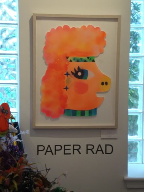
Anyway, the art--they had multiple group shows going on, and I found it very jumbled and confusing. Some pieces were good, some didn't move me at all (blown up polaroids of Madonna, for example). Here was one piece I saw:

Paper Rad

Guess who made this? Heh. (I had seen a Paper Rad video piece at Debrah Colton a few years ago, too, back when she was upstairs from David Addickes.)

This new gallery has tons of potential, but I think they will benefit from focusing on one or two artists at a time, and from being less scattered in their curatorial approach.

You Are There by Jacques Tardi

Robert Boyd


You Are There by Jacques Tardi and Jean-Claude Forest

Of all the comics published in 2009, none has deserved more acclaim yet faced more indifference (as far as I can tell) than You Are There. For reasons I don't understand, Jacques Tardi is tough for American readers to take. It's not like his work has lacked for American publishers--starting in the 70s, his Polonius was published in Heavy Metal.  Fantagraphics, the publisher of You Are There, has made prior attempts at translating Tardi--a Nestor Burma mystery in Prime Cuts and Griffu in Pictopia (I was the editor of that one). NBM published two delightful color albums featuring Adele Blanc-Sec, and her adventures continued for hundreds of pages in Dark Horse's Cheval Noir comic series. iBooks published another excellent Nestor Burma story in a graphic novel format, and Drawn & Quarterly has published several chapters from Tardi's brutal yet beautiful It Was The War of the Trenches. In these works, American readers got a real sense of the breadth of Tardi's work, and responded with a collective shoulder shrug. (I enjoyed all of these books and stories.)

Among French readers, You Are There appears to be held in special regard. Publisher/translator Kim Thompson has said that Tardi holds a place with the current generation of alternative French comics similar to that held by Crumb here in the U.S. Writer Jean-Claude Forest is also a legend in the history of comics, most famous for creating Barbarella in 1962. As I write this, I realize I am setting up the reader for two possible reviews. One is that after all this build up, I tell you that You Are There is ironically a dud. The other is that it lives up to my high opinion of Tardi's work. The good news, in short, is that the latter option is true. And if you don't want to read anything about the plot of You Are There, take my word about its excellence and stop reading right here.

The protagonist is Arthur There, last son of a family that once owned Mornemont, a vast estate which has somehow been subdivided into smaller estates by various rich families, leaving There with possession of the walls between the estates. He lives in a narrow house perched on one of the walls.


He earns a meager living opening gates for the various estate owners (making certain never to touch the ground as he does so)--in this small way, they are still dependent on him. They are his gates after all. Most of his income goes to his legal team (including the president of the bar association) who are charged with reclaiming title for There to Mornemont.


But as you can see, they are mainly showering There with legal bullshit in order to keep him paying his retainer. This particular legal meeting takes place on a boat--the only place where There can leave his walls is to step onto docked boats (Mornemont lies on the shore of a large lake--I couldn't tell for certain, but it may be an island in the lake). Consequently, he gets his sustenance from a grocery boat. The captain of this boat is the last in a long line of grocer-sailors.


You can see that this story doesn't exactly pretend to be realistic. (That said, There's bizarre property holdings, the walls between the estates, have all kinds of analogues in the real world. I would not be surprised if Forest read such a story of real estate absurdity and was inspired by it to write this tale.) Once the bizarre circumstances of There's life are outlined, Forest brings in the classic complication--love. There sees Julie Maillard (daughter of one of the estate owners) nude through a window. Julie is a bit of a tease (and There is no prize catch.) But There is so inexperienced and shy, she must take the initiative. Her post-coital monologue is hilarious, all the more so because Tardi portrays There's stunned amazement at what has just happened in a very surreal way.


Meanwhile, far from Mornemont, the government is in trouble. They are about to lose their majority, and when that happens, their corruption will be revealed. They learn that in 1784, the king granted a certain Marquis sovereignty over his tiny fiefdom in exchange for services rendered in Golconda. The Marquis nominally retained sovereignty after the Revolution (at which point he became a mere citizen), and that sovereignty has passed down, father to son, to the final heir. That heir is Arthur There. The government therefore concocts a plan to help There regain his land, and for the government to go into internal exile in Mornemont when they lose the the next election. Exile from which they cannot be extradited, where they pull the strings of their new puppet sovereign. As it turns out, they arrive at just the right moment, when the landowners, tired of Arthur's antics, have attacked his walls. They are no match for the power of the French government, though.

But Arthur doesn't end up happy--the landowners are expelled and Arthur owns all the land again. The government withdraws when they unexpectedly win the election. But his joy has been ruined by Julie's promiscuity and the fundamental impossibility of happiness.

Like many of Tardi's works, You Are There is set in the early 20th century. It doesn't pay to try to locate a precise year for this work. Forest and Tardi aren't creating a historical novel per se. They aren't realists (although Tardi is capable of creating realistic fictions.) They use history as an absurd jumping off point, much as Mark Helprin did in A Soldier of the Great War or Italo Calvino did in The Cloven Viscount, The Nonexistent Knight, and The Baron of the Trees.

Is this a satire on property and heredity? It can be read that way. Part of There's problem is that his "victory" means Julie's dispossession. What delights me is not the meaning of the work, but the bizarre world Forest and Tardi have created. Tardi's art, which combines the liveliness and simplicity of the best cartooning with a well-observed realism is perfect for this kind of surreal tale.

I hope this new series of Tardi books (this one and West Coast Blues are the first) will spark new interest in this great cartoonist among American readers. His work deserves to be read and will endless reward readers who seek it out.

Friday, November 27, 2009

Jen Blazina and Donna Rosenthal

This morning I took advantage of the gorgeous weather and rode my bike on the new Heights bike trail for the first time. The Koelsch Gallery is on Yale where the trail crosses it, and since I had never been in this gallery, I decided to take a look. There were two exhibits, work by Donna Rosenthal and Jen Blazina. I came at the worst possible time for a blog post--the shows close November 28. Update: I'm told the exhibits will remain up Sunday (29th) and half the day Monday (30th), so you still have a chance to see the work of these artists.

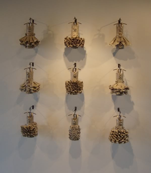
Rosenthal makes doll-sized clothing out of newspaper and magazine pages. These are three dimensional suits and dresses,  displayed hanging on tiny scale model hangers. They look a little like clothing one might be picking up from the drycleaner or a clothing store (except small and made of paper).

Donna Rosenthal dresses

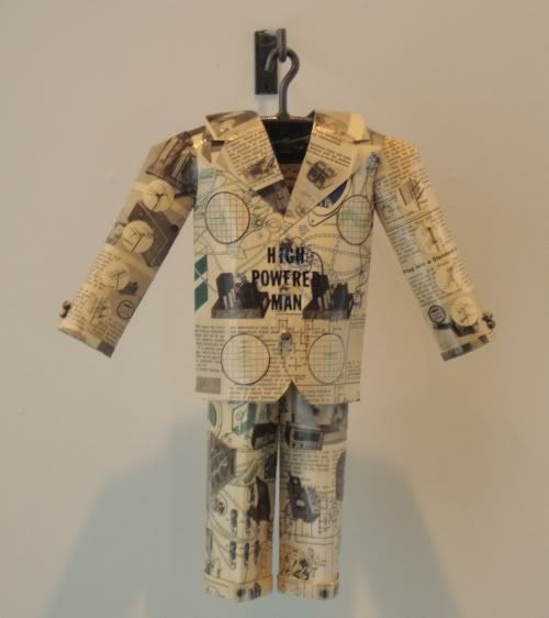
There is some relationship between the source material (in both senses of the phrase) and the finished object. For example, the "High-Powered Man" is constructed of vintage texts about electricity.

High Powered Man
Donna Rosenthal, High-Powered Man, paper and gel, 2009

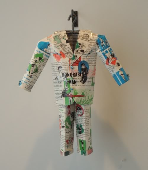
"Honorable Man" comes from old Boy Scout publications.

Honorable Man
Donna Rosenthal, Honorable Man, paper and gel, 2009

Jen Blazina's work is more mysterious and more interesting. Her work in this show consists of purses made of solid cast glass. Like Rosenthal's pieces, these hang down from the wall in a way that recalls a store display.


Of course, unlike a store display which is trying to catch your attention, these purses are just barely there. They aren't invisible, but they approach invisibility. They are empty, of course (and hence functionless), but very solid. Depending on how strong the chains are, they could be pretty deadly weapons.


Perhaps the two artists are paired as commentary on fashion. Art is non-functional fashion, in a sense. As a guy, I can hardly comprehend the cost of purses. I'm flabbergasted by what women will pay for these functional, practical things. But as an art lover, I have no problem with these purses being costly art objects. There is no logic between these two beliefs except to acknowledge that we choose items for conspicuous consumption in highly personal ways, ways which are informed by many things--including our genders.

Thursday, November 26, 2009

Painting Below Zero by James Rosenquist

 Robert Boyd


Painting Below Zero by James Rosenquist

James Rosenquist was one of the early pop artists. He has an almost perfect pop biography--midwestern boy, learns the fine art of painting billboards, moves to New York and wows the swells with his paintings of jet fighters and spaghetti. His new autobiography doesn't challenge this capsule biography, but it enriches it a lot.

I think for people my age and younger, the weird thing about Rosenquist's story was that he was a billboard painter. This is a profession that doesn't exist anymore, and one could be forgiven for being surprised that it ever existed. The idea that it was cost-effective to hire an artist to paint your billboard seems amazing today. But apparently it was common at one time. Rosenquist got his start painting billboards on the road in the midwest, including many in Minneapolis. These required a combination of sign-painting skills (he had to paint large display fonts) and more-or-less realistic painting. But beyond that was the skill of painting big--not being able to see the whole while you are painting, yet coming out of it with an intelligible image. Obviously this is a skill that mural painters have always had to master. On top of all this, he had to learn to paint it quick.

He had artistic ambitions beyond billboard painting, so he moved to New York to study at the Art Students League. He continued to paint in New York, joining a billboard painter's union, painting bottles of booze on the sides of buildings all over Brooklyn. He made a good living doing this, and in Painting Below Zero, he never hints that he might have thought of this as a job without a future (as it most certainly was). His desire to leave billboard painting behind had everything to do with his artistic ambitions and nothing to do with the fact that billboard painting was about to go the way of the dodo.

His fine art painting in this period (the 50s) was abstract. He worshiped de Kooning and Franz Kline, and for serious contemporary artists of the time, that was what was in the air. But he also new that he wanted to make his own mark in his own style. But he started meeting a younger group of painters who in time would revolt against abstract expressionism. It started with Ray Johnson (who really seems like he was a "connector" in that world), and got to be friends with people like Agnes Martin, Ellsworth Kelly, and others. When he was looking for loft space to paint, he met Jasper Johns and Robert Rauschenberg. It was their work that showed Rosenquist a way out of Abstract Expressionism.

The interesting thing about Rosenquist was that he used his billboard experience extensively in his art. I'm not just talking about the large scale of his paintings and the "creamy" painting surface--although those are important. He wanted viewers to overwhelmed by the images, and to see them in fragmentary ways, like he did when he painted a billboard. Hence the overlapping, truncated images in his work. This is one reason why reproductions of his work are so inadequate--they make all the fragments instantly visable and comprehensible. A full-size Rosenquist painting is virtually impossible to see all at once, unless it's in a huge room. And that's intentional.

Ironically, he didn't even meet the two biggest pop artists, Warhol and Lichtenstein, until 1964. This reuse of banal imagery was just in the air. Rosenquist doesn't even quite see it that way--he always had an emotional connection with what he was painting. Obviously there was irony in his art, but that wasn't the main point. He loved the objects he painted (or hated them when he got around to painting F-111).

What I like about this kind of book is the description of the social scene in which the artist operated. How did people meet; how does a kid from Minneapolis find other artists? How do they entertain themselves (lots of drinking, apparently). Rosenquist is quite amusing in talking about the bars they hung in. It was OK to hang at the Cedar Tavern or Max's Kansas City, but if a bunch of painters showed up at Elaine's, they might end up getting booted. The centrality of drinking is kind of intense. I think it damaged a lot of creative people at that time--de Kooning certainly. And for an artist to "network" with his peers, he had to drink.

After Rosenquist moves away from New York, his life is a lot less interesting and more stable. He still has his friends (he was very close to Rauschenberg his whole life), but now he had a family and property and success. He still was doing big bold work. Now he is one of the survivors of his generation, and his memories are welcome. Painting Below Zero was a thoroughly entertaining book.

Wednesday, November 25, 2009

A Bunch of Artists at Lawndale

There is a long tradition in the work of women artists of depictions of the vagina with various degrees of abstraction (think Georgia O'Keefe, Judy Chicago). A sub-category of this kind of art would be enormous sculptural depictions of said genitalia. I have decided to call this Gigantic Vagina art. Obviously the foremother of this genre of Niki de Saint Phalle. In her artist's statement, Monica Vidal does not mention or imply the word word "vagina." But look at this piece and tell me it isn't a prime example of Gigantic Vagina art.

Monica Vidal
Monica Vidal, Tumor Hive, plywood, fiberglass rod, fabric, 2008-2009

In this show, she also has a costume (meant to recall a distinctly unpleasant Aztec ritual of wearing a suit of flayed skin until it rotted off--she can be seen wearing her modern felt version on her Facebook page) and some drawings. But the Tumor Hive overwhelms everything else--as you would expect a Gigantic Vagina to do. It's an elaborate and rather beautiful structure.

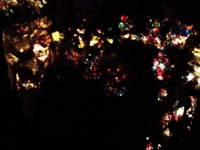
Kia Neill has created for Lawndale an artificial cavern. (Ironically, you have to take an elevator up to see it.)

Kia Neill
Kia Neill, Grotto, papier mache, chicken wire, blinking lights, 2009

It's really quite dark--the only light are the shining "gems" encrusted in the wall. I kept expecting a Sleestak to jump out. What it really reminded me of (and I think this is in line with Neill's intent) were the cave-like environments at Astroworld when I was a kid. They used some kind of sparkly substance to build their ultra-fake cave simulacra. But for a kid from Houston--land of no hills, rocks, or caves, they were magic. A little of that magic comes back in Neill's Grotto.

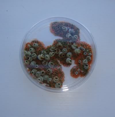
I liked Jasmyne Graybill's creeps-inducing mold sculptures at The Big Show, and I like them here.

Jasmyne Graybill
Jasmyne Graybill, Gestation, latex and flock, 2009

Graybill teaches art at Sam Houston State, and I am informed by a mutual friend that she is kind of a clean freak. Not someone with a natural love for mold cultures. I think what appeals (and repels) is the combination of the mold's alienness and its sci-fi tendency to take over whatever object it has started growing on.

Jasmyne Graybill
Jasmyne Graybill, Unknown Specimens (detail), polymer clay, 2009

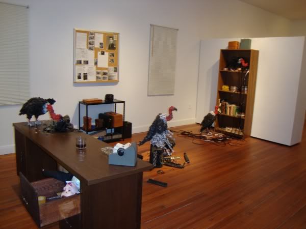
The last one I liked was  this big installation, Vicious Venue, by Shawn Smith. It seems that Smith's main work is creating three-dimensional sculptural objects that look like pixelated images of real things. In this installation, he has created a coroner's office from the 1930s or 40s that basically looks completely normal--you walk in as if you were the coroner in 1935. But scattered about the room are vultures--life-size vultures, depicted as pixelated images.

Shawn Smith
Shawn Smith, Vicous Venue, furniture, office objects, balsa wood, 2009

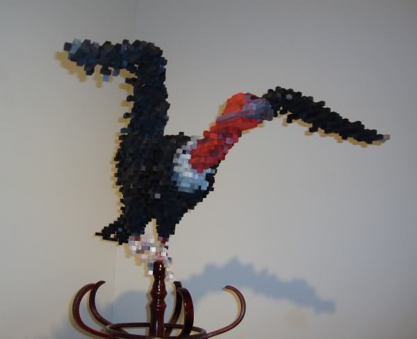
Here is one of the pixelated vultures up close.

Shawn Smith
Shawn Smith, Vulture on Coatrack (wings up), balsa wood, ink, acrylic paint and coatrack, 2009

He says in his statement that he is interested in relating electronic images back to "things," and obviously that is part of what's going on here. But only part. We have this period office (which appears to be a coroner's office--not just a generic place of work) being attacked by vulture images from the future--I don't know what that means to Smith, but it seems very specific.

Lots of great stuff at Lawndale. I'm not sure how long it's all going to be up--but the next show opens on December 2, so I wouldn't delay in checking these installations out.

Beth Secor at Inman Gallery

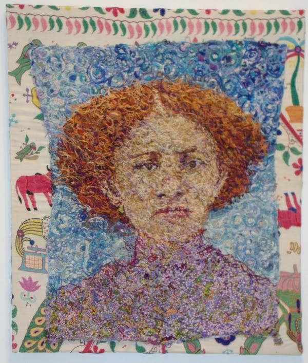
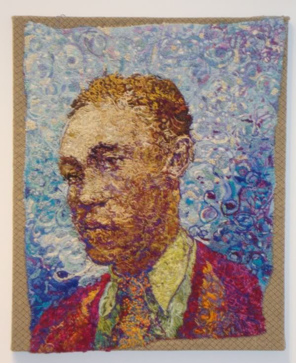
The first time I saw one of Beth Secor's embroidered portraits, I was deeply impressed. Now that I have seen some more of them, I am still impressed. They look so damn good, with their slashing lines of color, going in all directions, coming together to form an image.

Exoduster Kansas
Beth Secor, Exoduster, Kansas (sometime in the 1870s), embroidery on cloth, 2008

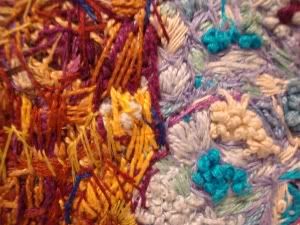
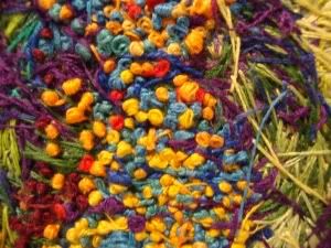
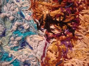
The little threads hit you visually like the small vigorous brushstrokes of Van Gogh. When you see the chaos of thread in these pieces, it seems almost miraculous that it comes together into an image. For example, this:

photo booth detail

this:

photo booth detail

and this:

Photo booth detail

manage to miraculously coalesce into this:

Man from Photo Booth
Beth Secor, Man From Photo Booth, 3/4 Portrait, embroidery on cloth, 2007

I don't want to give the impression that I admire it merely as a stunt. Hardly. What I like about these pieces is their beauty--and this beauty is present no matter how close to the picture plane you get.

Apparently, all these faces are from one family, but since the titles don't have names, a casual viewer would never pick up on this. The source material was an abandoned box of photos found in a Houston home. Were they left by earlier residents? I don't know. It's interesting that Secor would take some pictures she found and spend what had to be a lot of time and effort converting them into these remarkable embroidered objects. I'm glad she did.

Tuesday, November 24, 2009

Hergé by Pierre Assouline

Robert Boyd


Hergé: The Man Who Created Tintin is a refreshing in the modern age of biography. These days, biographers seem compelled to write doorstoppers, regardless of whether the additional detail helps a reader understand the subject. Assouline sticks to what is important, and creates a complex portrait of one of the great comics artists of all time.

For fans of Hergé, what will be the most distressing is his long dalliance with ultra-rightist and fascist movements in Belgium. Most fans know about his association during the Nazi occupation with Le Soir, a paper that became a pro-Nazi propaganda organ during the war. But Assouline shows how close Hergé was with people and institutuions associated with the Belgian ultra-right from the beginning of his career. In the end, it is hard to say whether he was politically a fascist or whether he was naive in his choice of friends (after all, many of the fascist and rightist friends and mentors were helping his career progress). The only way he escaped some fairly harsh punishment was when he joined forces after the war with a former Resistance fighter, Raymond Leblanc, to publish Tintin magazine. (His book publisher, Castermann, had also come through the occupation without a Nazi taint.) But even after the war, Hergé was always bitter at the way his collaborator friends were treated. It was as if he didn't understand the evil with which they were complicit!

In the end, lots of fascists and semi-fascists created great art (just as many communists did). It is difficult to read an ideology into Tintin, a character who always comes across as fundamentally decent and helpful. The early racist and anti-communist books were not reprinted for quite a long time (and even when they were, they remained in un-redrawn black and white editions, which help identify them as youthful follies and non canonical works). Tintin is a great work; Hergé and his studio (including Bob De Moor and Jacques Martin) created true classics.

One complaint about the translation. While it is very readable, translator Charles Ruas is evidently ignorant of comics. This is demonstrated by his use of incorrect jargon--for example, he refers to "panels" as "frames." This is a mistake you often see when non-comics specialists write about comics. "Frames" is a really good word--it is a better metaphor than "panels." But within the world of comics, for whatever reason, "panels" is the word that has evolved for each separate image in a comic. Ruas should have read Understanding Comics before translating this book.

Charles Saatchi on Charles Saatchi

Robert Boyd


A trivial book, it does at least give some insight into the practices of Charles Saatchi, one of the most prominent collectors of original contemporary art in the world. He displays his art in his own personal museum and is a huge power in the world of contemporary art. A good deal of the success of the YBAs can be attributed to his patronage. This book is presented in very large type and in a Q&A format--you can read it in an hour. Not worthless, but not terribly enlightening. Too bad--we know a lot about how artists and critics think, but not much about collectors.

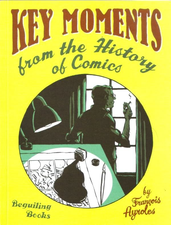
Key Moments from the History of Comics

Key Moments 1

This book is a trifle, to be sure, but a highly amusing one. It may be a little perplexing to English-language readers, as so many of the "key moments" it portrays are from the world of Franco-Belgian comics. And some of the jokes fall flat. But much of it is clever and delightful.

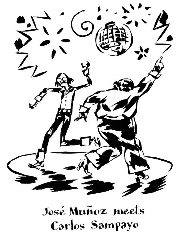
It's main value is that it brings the cartooning of François Ayroles to an English-speaking readership for the first time. Ayroles is a French cartoonist best known for his formalist experiments published by L'Association. This volume was published by The Beguiling in association with his appearance at a comics festival in Toronto (a great way to honor a special guest to a convention, in my opinion). Ayroles has a really appealing, inky yet cartoony style that might remind some people of Blutch's art.

Here's a sample of the work. Given the seriousness--the toughness--of the comics work of Muñoz and Sampayo, I suspect this scenario is a bit far-fetched.

Key Moments 2

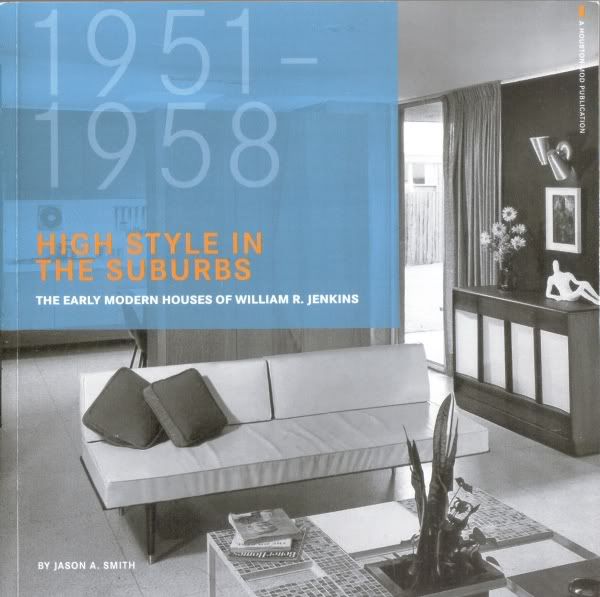
Mid-Century Modern, Houston Style

William Jenkins book

I want to make a brief mention of this book, which I read last week. It's modest (62 pages, discussing 11 houses designed by William Jenkins) but important for the cultural history of Houston. (Yes, I know--"cultural history" and "Houston" are words that don't seem to go together naturally.) These were modernist houses design by William R. Jenkins and built in Houston between 1951 and 1958. They were all built in the southwest part of town, near the Bellaire and Post Oak. Jenkins was an important Houston architect who eventually became dean of the U.H. architecture school during an important period of its expansion (when the Philip Johnson structure that houses the school was built).

This book goes through each house one by one, with plans, period photos, contemporary photos (when available--not all the houses are still around), and brief but informative descriptions of each house and how it came to be.

The publisher is an organization devoted to significant modernist buildings in Houston (from the modest, like these houses, to the huge, like the Astrodome). Houston Mod is doing great work in both raising awareness of Houston's architectural history and documenting it. (In some cases, Houston Mod members are buying and restoring mid-century modernist houses--and thus saving them from developers who would thoughtless scrape the lot and replace the houses with neo-Tuscan McMansions.)

(Now if only they could update their website with ordering info for this book. I got my copy at the MFAH bookstore.)

Monday, November 23, 2009

New Acquisitions--Stephanie Toppin and Jorge Galvan

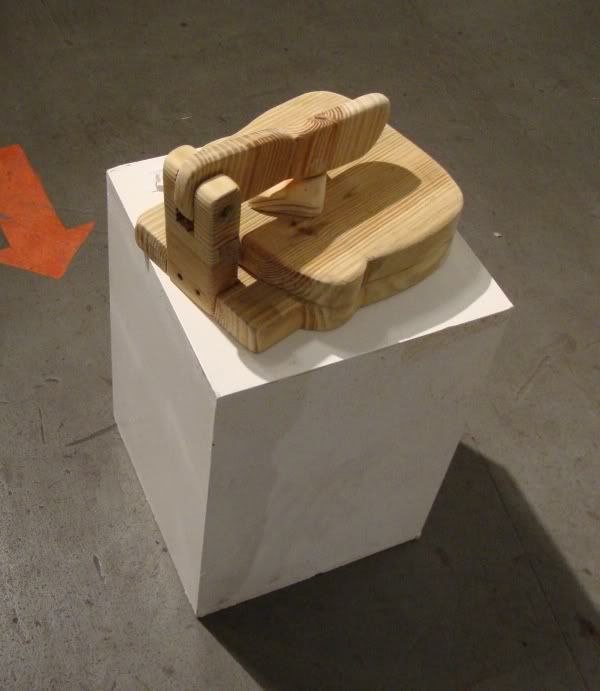
I mentioned in my previous post how much I liked "American Bred" by Jorge Galvan. I liked it so much that I bought it. Galvan is an senior at U.H. He's thinking about MFA programs--which one would be right for him, what he can afford. He feels he still has a lot to learn. I think, however, he is astonishingly accomplished, and expect nothing but great stuff for the next 50 years from him. Here's another view of "American Bred."

Jorge Galvan

And here it is open.

Jorge Galvan

This is a very finely crafted Anglo-American version of the humble tortilla press, like this one:

tortilla maker

According to Galvan, "American Bred" is fully functional.

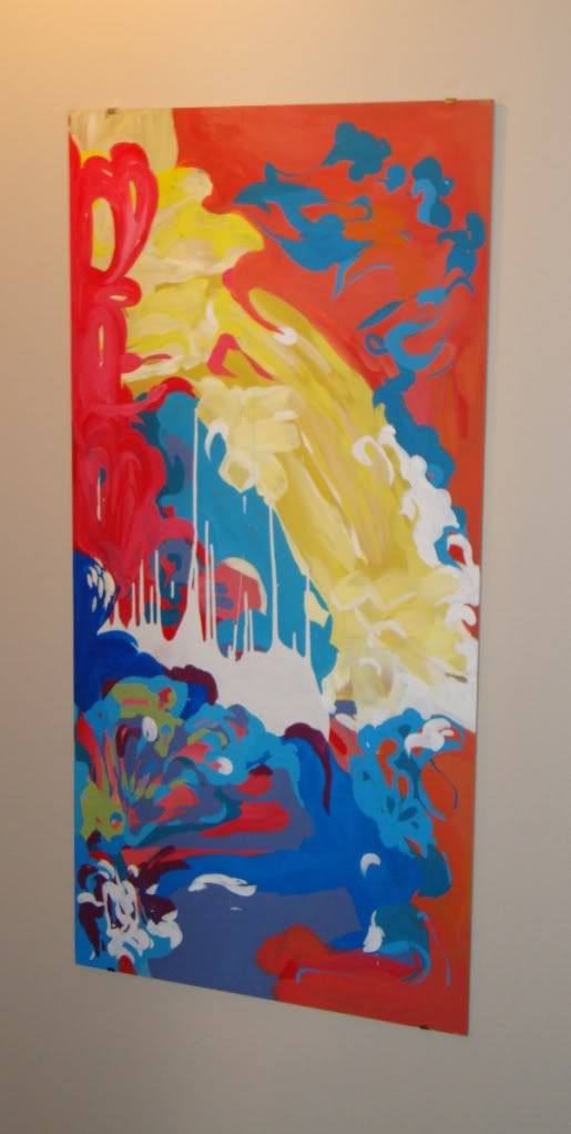
I have been a fan of Stephanie Toppin's painting since I saw her work at Diverse Works last summer, and subsequently at Box 13. I bought a few of her drawings around that time and then took the plunge to buy a painting when she exhibited at Rudolph Projects.

Like Galvan, Toppin is a really young painter. I don't really know what her background is, but I like her colorful abstractions. The paint appears to be housepaint and she paints on large masonite boards. This photo makes the colors look brighter than they actually are (as if the paint has some flourescent pigment mixed in that was lightened by the flash).

Stephanie Toppin

Artcrawl 2009

by Robert Boyd

Saturday was Artcrawl 2009--my first Artcrawl. It was drizzly and a little cold, pretty bad weather for walking from studio to studio. But that didn't keep crowds of people from showing up. I was impressed by the crowds I saw. I was a little nervous about going--would the art be any good? Just because an artist has a studio doesn't make the art worth seeing. I was a little worried it would be lots of mediocre craft-show art, bad Sunday painters, etc. And to be sure, there was a lot of art that was amatuerish, a lot that was half-baked, a lot that was derivative, a lot that was just plain inept. But who cares about that stuff? There was a lot that worked for me.

The first place I went to was the Houston Foundry. This was a place that in my most recent Houston Streets post I mistaken identified as Blumenthal Sheet Metal. Blumenthal is across the street. But they clearly have a relationship--there are metal sculptors in the Houston Foundry, including Michelle O'Michael. This impressive space is her studio:


Wouldn't that be a cool place to work. Right next door to it was another impressive studio for some artist who works in metal (anyone know who? I don't):


It's not all large scale metal art there (as the studio's name implies). Christina Roos is a ceramicist, but the work of hers I liked best were her paintings and printed works.


I am often put off by deliberately child-like artwork, so I can't exactly say why these paintings charmed me so. But they did.

Manning the door at Houston Foundry was Jorge Galvan. He did a great piece that I wrote about a while back called "This Land Was Made" at Project Row Houses. The piece that caught my attention here was "American Bred."


The punning title is a bit corny and too obvious, but the craftsmanship of the object combined with the bi-cultural irony of it cannot be denied. Also, like "This Land Was Made," it has a working-class humility that I like. It feels like an honest piece of work. And Jorge Galvan is an undergrad at U.H. Astonishing work from such a young artist, I think.

The next stop was the Hardy and Nance Street Studios. Alex "Primo" Luster and Mike Luster are guys involved in the grafitti/street art scene in Houston. I liked Primo's studio quite a bit.


Mike Luster was showing clips from his documentary film Stick Em Up! about the wheat-pasting poster scene in Houston (think Give Up, for example). The art produced by people like Gonzo247, Skeez, Give Up, and Primo seems to be more-or-less completely outside of the commercial gallery world, but they have in thier own way staked claim to a part of Houston's art community (as well they should). So it was cool to see this during Artcrawl.


When I walked into Ray Phillips' space, I was imediately knocked out by his densely layered paintings. Looking at this one, one might think about, say, Sigmar Polke. And the one below might remind one of Jasper Johns.


But to be honest, these paintings feel like slick versions of earlier work. Phillips is obviously a very skilled painter with a lot of visual imagination. I hate to ever suggest an artist's facilities are a handicap, but this work feels like empty mastery.

I then visited a few other studios, including the Dakota Street Lofts, but didn't see anything there that caught my eye. The next place with good art was Mother Dog Studios. Among the many artists there was Jo Ann Fleischhauer. The first thing that caught my eye was this collection of bird nests.


In each of those glass-walled boxes is a real bird nest. (I hope she didn't evict any birds to collect the nests). I don't want to hazard a guess about the meaning of this piece. But I like natural history museums and the conventions of display in those museums (vitrines, dioramas, etc.). (Needless to say, I love the Museum of Jurassic Technology.) This piece seemed like a playful rearranging of conventional natural history museum concepts. (I believe this was part of an installation called "Butterfly Effect.")

Then there were these wax houses.


These were left over from a Project Row Houses installation called Pocketful of Stars. I asked her if the houses were for sale, and she mentioned that a lot of people had asked the same thing, and that she thought it was weird that people would want the left-over bits of an installation. We discussed the idea of selling off bits of installations, and I couldn't think of an example of anyone who had done so (even though I would be shocked if no one did so). But I think her puzzlement over this is naive. People like souvenirs. Additionally, the houses are quite attractive by themselves as objects. Most folks are never going to have an artist's installation in their home. But having a left-over bit of one might be nice.

She had an installation up in an adjacent room.


Peony Prayer, Jo Ann Fleischhauer, 2004

If you have a spare room in your house, you can fill it with this installation for a mere $32,500. She had several of the wax-covered books in her studio space, and again I thought--these are by themselves compelling objects. The installation may be their intended home, but I think they can exist outside the installation and still be art.

Mother Dog Studios was co-founded by an artist named John Runnells, and his studio was full of amusing profane art. This piece of undressed art history amused me a lot.


Obviously this a riff on Madame X by John Singer Sargent. And I love it, the way it is presented as a almost 19th century medical photograph (I don't know how else to describe it). But I also love that he casually left it on the floor and let a power cord hang in front of it. Not a very precious artist, is he?

One final piece from Mother Dog Studios by an artist called Naftali. I'm not sure she has a studio there (she isn't listed on the Mother Dog Studio web page). But whatever. I loved this untitled work.


I guess you would describe it as a relief. The medium is cut up bicycle inner-tubes. As Kathy Kelley explained to me later, part of the pleasure of working with inner tubes is that they are very fleshy. And indeed, this piece looks like a field of those alien-appearing primitive worms that anchor themselves to the ocean floor.

After that, I drove down to Commerce Street, where there was another little group of artist warehouses, including the now infamous CSAW. Nothing in these spaces struck me as interesting. I did like the sculptures where Navigation goes into a tunnel under Commerce and the railroad tracks. I was held up walking from one studio to another by a passing train, so I took this photo.


Does anyone know the artist? If so, please comment!

And as I walked down Commerce Street, I saw Skeezer Stinkfist painting in an open warehouse space (not officially part of the Artcrawl). 


We had a beer and chatted a bit. If this space is where he paints, I have to say he isn't suffering for not being in CSAW. (Indeed, it seems that many of the evicted artists have gone on to bigger and better things. Living well is the best revenge.)

Then I made my way to El Rincon Social. I'm not sure what the story is with this place--it doesn't appear to house studios. When I walked up (around 6:30 pm), the cops were there shutting down their music (a dude playing acoustic guitar--amplified, but still...). There were a bunch of paintings and objects on the walls, but it was hard to know who the artists were. Here's one that knocked me out.


This struck me as a very modern version of the old pulp painting tradition. That kind of painting was often very lush and rich. I particularly like covers of Argosy from World War II. Obviously this painting tradition has a strong relationship with hardboiled crime fiction, and this is obviously an image from a neo-noir story. Is there a story? Is this a work of illustration, or is this a purely stand-alone work? Either way, it works. (Again, if you know the artist, please let me know if the comments. I want to give credit where credit is due.)

While I was there, I met two of the folks who run the Station Museum, Keijiro Suzuki and Alan Schnigter (I think). This piece is by Schnigter.


The ladder really makes it, don't you think? We had a discussion about how hard it is for local institutions to collect contemporary art. They take so long to make decisions, and are paralyzed by the fear of making a wrong decision (because no one can be sure what art being made today will be worth remembering 10-20-50 years from now). So I think they depend on local collectors to buy contemporary art with the understanding that it might end up at the MFAH later (after history has time to render at least a preliminary verdict). Of course, this was just three guys idly speculating in a warehouse, so who knows?

Finally I went out to Box 13, the last stop on my personal crawl. (I missed a few venues, which I regret. But it was hard to see everything.) They have a show up that they originally did in Nuevo Laredo. It's called Hasta La Basura Se Separa. Here's a piece by Kathy Kelley from the show.


She told me how she liked rubber's skin-like quality, and she liked to sew her pieces. I joked that she sounded like Buffalo Bill. But really her work reminds me of Louise Bourgeois, Eva Hesse and Robert Morris. The softness and fleshiness of it, the way gravity acts on her work, are all appealing. It looks great, but it also pretty much begs you to touch it.

There were no crowds here, unfortunately. Box 13 is a little off the beaten path for this event, and there are apparently no nearby studios, so you don't get critical mass like you do off Nance or Commerce Street. Too bad, because this show has lots of great stuff.


This piece is by Hunter Cross (his name sounds like the protagonist from a Lee Child book.) A piece like this reminds you that Christmas is approaching. When I was a kid, the parents hid the presents in a closet that we always found. Barbed wire may have been more effective.


This piece is by Michelle Mayer, and when you see it, you see see just a glow coming from inside the suitcase (just like the briefcase in Pulp Fiction). As you approach it, you realize that the glow is a projected image.


But it's not a still image--someone keeps adding "things" to the suitcase.


I am not sure who the artist is here (help?), but I like it. I like the way it combines a real object with a cartoon-like depiction of puddled water.

Artist Jonathan Clark uses Box 13's most awkward exhibition space very cleverly in this installation called "The Golden Spiral."


And there are many other intriguing pieces in this show, which I highly recommend.