by Robert Boyd
Josh Bernstein, Non Plus Ultra detail, mixed media on plexiglass, 2011
According to Bryan Miller Gallery's press release about this show, Galveston, a suite of works by Josh Bernstein, is about Cabeza de Vaca, the Spanish colonizer who discovered Texas and spent nine years wandering the state and Northern Mexico after most of the members of his expedition died. De Vaca's story is an astonishing tale, an epic odyssey of Europe meeting Native America. De Vaca's account of his journey (variously called The Report and Shipwrecks) is apparently the source for Bernstein's art. But Bernstein is doing something more than just illustrating De Vaca's story.
Most of us who grew up in Texas were required to learn Texas history (I had it in junior high). One of the facts we learn is that De Vaca was shipwrecked (for a second time) in Galveston, where he encountered some Karankawa tribespeople, who enslaved them. So Bernstein's project involved photographing locations in Galveston combined with images of people in costume and other things--inhuman things. That's where it departs from De Vaca. Bernstein seems to have combined De Vaca's story of terror and hardship with a supernatural terror. The terror reminds me of H.P. Lovecraft's terror with a dash of The Narrative of Arthur Gordon Pym. An artist who mined some of the same earth was late underground comix artist Jack Jackson, particularly in the stories The Secret of San Saba and God's Bosom.
Josh Bernstein, After Four Days, photocollage, mixed media on plexiglass, 2011
For a sixteenth century Spaniard, sailing the Gulf of Mexico and landing in Texas just 35 years after Columbus's first voyage must have been very much like entering a dark and demonic Lovecraftian dimension. And although De Vaca eventually grew to sympathize with the native peoples, his time in Galveston was associated with pure terror--being enslaved by a tribe that practiced ritual cannibalism.
So Bernstein depicts Galveston as a place of supernatural terror. He mixes natives up in it--there are Aztec aspects to Galveston's terror, for example.
Josh Bernstein, Battery Croghan, photocollage, mixed media on plexiglass, 2011
He turns Battery Croghan into a Aztec-seeming structure. The figure on the right has something (tentacles? fire?) coming out of his eyes.
Josh Bernstein, Battery Croghan detail, photocollage, mixed media on plexiglass, 2011
Readers of H.P. Lovecraft might feel that a lot of what underlies his fiction is a deep fear of the other. A racist in his personal life, the horror in Lovecraft's stories was about encountering beings whose motives and very existence was beyond human comprehension. Spaniards encountering native Americans must have had a similar reaction. It took Cabeza de Vaca nine years of wandering among the peoples of Texas and Northern Mexico to start to understand them, to see them as humans and not as incomprehensibly alien.
Josh Bernstein, The Thing in the Headlight, silver gelatin print mounted on plexiglass, 2011
Bernstein sets many of his works in what are obviously present day situations. I see this as adapting another favorite horror trope--the rediscovery of an ancient evil that was slumbering in a specific location. Obviously the haunted house is a classic version of this. So here were have some thing--a ghost? a Karankawa deity?--caught on film as if by accident. The overexposed part of the film makes it seem all the more authentic, as if captured on film purely by accident.
Josh Bernstein, Port, silver gelatin print mounted on plexiglass, 2011
Of course, sometimes a picture doesn't need an implied narrative to be spooky. Night, fog and a few lights can do the trick, as in this atmospheric ship portrait.
Josh Bernstein, Blueprint, C-Print, collage mounted on plexiglass and wood, 2011
Josh Bernstein, Non Plus Ultra, mixed media on plexiglass, 2011
Sunday, July 31, 2011
Saturday, July 30, 2011
Use Your Illusion at Colton & Farb
by Robert Boyd
This show was kind of a big sprawling mess. Pretty much every square foot of the gallery was used here to display art, often not to its advantage (there was a lot of art shoved into narrow hallways). It was hard to detect a theme or organizing idea in Use Your Illusion, which was curated by artist Paul Horn. But the thing about a big group show like this is that if the whole doesn't work, well, some of the parts might.
What hit me hardest was a gallery mostly full of work by Daniel Johnston. Daniel Johnston is a musician and kind of an outsider artist. For a few years, he was lionized by the alternative rock community, who loved his bizarre-but-heartfelt songs and saw in his mental problems a kind of authenticity. I highly recommend the documentary The Devil and Daniel Johnston. Visual art has always been a major part of Johnston's work. But Horn doesn't just show a bunch of Johnston art.
installation view, Daniel Johnston Gallery at Colton and Farb
When I showed up at the gallery, Daniel Johnston music was playing. His plaintive voice, singing a song full of longing, was what I was hearing when I walked into this gallery. I almost had tears in my eyes.Seeing all this art and all this pop-culture detritus (from Johnston's home) was a highly emotional experience. (Then the music changed to the Red Hot Chili Peppers and the spell was broken.)
Daniel Johnston's comic rack
I had a shock of recognition when I looked at Johnston's comic book rack. I had bought many of the same comics from my local UtoteM when I was a kid. (Johnston is a couple of years older than me, so I suspect he did the same--the difference is that he kept them all.) You can see a predominance of Captain America comics here--Captain America is a character who figures prominently in Johnston's work.
Daniel Johnston, drawings
Daniel Johnston, untitled
The three-eyed guy also figures pretty prominently in his work. I'm guessing that Johnston has some story about this guy; that he means something in particular to Johnston. For an artist who wears his heart on his sleeve, though, understanding Johnston is not easy. His mind is operating in a different place from ours. But this strangeness didn't prevent me from being very moved by this installation and the artwork here.
Daniel Johnston, untitled
But the crowded gallery issue played out here. In this small gallery that should have been devoted to Johnston alone was this work by John Paul Hartman.
John Paul Hartman, Amerimou5e (44), mixed media, 2011
I like Amerimou5e (44); it's funny and clever. But why is it in a room with Daniel Johnston's work? Horn should have edited the show a bit so that unnecessary juxtapositions like this could be avoided.
Matt Messinger, Popeye, Black and white gesso and charcoal pencil on found linen on canvas
One of the artists in the show is Matt Messinger. I have a gut-level reaction to artists who use comics characters in their work, and it seems like a lot of Houston artists do this for some reason. (The reason I have this negative reaction is complex, and probably deserves its own blog-post.) It's for this reason that I have resisted Matt Messinger's artwork for so long, even though whenever I see it, I like it. Popeye, with his ultra-windmilling arms, done on a surface that looks old and worn, is awesome. I earlier described his work as a combination of Cy Twombly and E.C. Segar, but another comparison I would make is with cartoonist Al Columbia, who draws in a deliberately old-fashioned style on damaged, torn paper.
You might notice this picture has abright yellow area in the upper center. That's not on the painting. One of the annoying things about the hanging of this show is that it was lit by track lights with narrow, strong beams. They tended to burn a "hot spot" in the middle of many of the works, which really shows up in delicate compositions like this one.
Matt Messinger, Lover, oil and black gesso on canvas, 2011
Not all of Messinger's work involves appropriated 30s cartoon characters. He goes deeper into art history for this image--it feels prehistoric.A spooky silhouette of a deer with a human (?) head makes me think of pre-classical Greece and the chimera they created to explain the world. The writing and glyph-like figures in the upper right add to this feeling, and the red spot in the lower left is just devastating.
Another artist who dealt with the "primitive" is Solomon Kane. (I laughed when I saw his name because Solomon Kane was also the name of pulp hero created by Robert E. Howard of Conan fame.) His work in this show consists of maximalist wall reliefs.
Solomon Kane, Mother of the World, African ostrich egg, Baule mask from Africa, African kudu horns, wooden orchid from Indonesia made of hibiscus wood, female torso form, wooden mannequin hands, polyurethane intermediate, calk, glue, car paint, acrylics, inks, watercolors, glass paint, ceramic paint, fabric paint, fluorescent and iridescent paint, industrial car sealant, on wooden panel, 2011
(This is another piece that had an overly narrow spotlight on it.) These highly encrusted works typically involve African masks--in this case, a Baule mask. (The Baule people are a populous ethnic group in Ivory Coast.) He then adds bodies to the masks, using body forms that seem to be parts of shopping dummies. Then the whole thing will be encrusted with stuff and paint. The surfaces are highly irregular, dark but richly colored.
Solomon Kane, African Gothic--Correcting Historical Misconceptions, Chokwe and Baule tribal masks from Africa, African kudu horns and skull plate, male and female torso form, male and female mannequin hands, wooden flowersm polyurethane intermediate, calk, glue, car paint, acrylics, inks, watercolors, glass paint, ceramic paint, fabric paint, fluorescent and iridescent paint, industrial car sealant, on wooden panel, 2011
I don't totally understand what Kane is trying to say, but these are such striking pieces visually that I'm not sure it matters. Maximalism is about presenting an overwhelming collection of inputs, which Kane does. Yet despite the super-encrusted surfaces of these pieces, the whole is never lost.
John Bruce Berry, Return 6, resin and bicycle parts, 2010-11
John Bruce Berry has been exhibiting art in Houston since 1965 (!) and, weirdly enough, is a practicing physician as well. (There seem to be several doctor/artists in Houston, for some reason.) I liked these bicycle parts in resin--especially the way they were lit from below. Of course, one thinks of prehistoric insects preserved in amber. One could imagine intelligent beings, scraping carefully on the ruined surface of Earth 65 million years from now, finding one of these and puzzling over it. They have a kind of permanence to them, to be sure. And if you had to preserve one technological object for future archeologists, the bicycle would be one of my own top three choices.
Berry's art was crowded into a hallway, but because it was compact, I could photograph it. Not so with Paul Horn's own work or the paintings of Kevin Peterson. I couldn't get enough distance from their works to take a good photo. Horn's work resembles Kane's in the sense that they both deal with maximalist information overload. Horn's works are dense three-dimensional paper collages, often employing a lot of comics/cartoon imagery--because of this, you can see where he was coming from with a lot of the choices in this show. Peterson paints very realistic pictures of urban, often graffiti-covered spaces with figures of children in the scenarios--specifically well-dressed, prosperous-looking white children. I assume he is going for a degree of irony by posing them in front of gritty, graffiti-covered urban walls. But on a formal level, he is placing a volume in front of a carefully painted flat surface. He plays with this formal aspect even more in Waiting, where a young girl is standing in front of cruddy curb and wall. There are six holes cut in the canvas and sewn open, and the viewer can see another layer, about two inches behind the canvas. I'm not sure it works, but it's an interesting concept.
Not all the work worked. I could have done without Dandee Danao's work. His work really feeds into my antipathy towards artists who appropriate comics. Whatever interest his work has is because of the inherent power of the images he stole. There is no there there. Unlike Messinger's work or Johnston's, the viewer has no feeling that the artist feels anything towards his subjects. It's art barely worth a smirk.
Dandee Danao,Batman, Superman and Apocalypse, acrylic and ink on canvas
(For all you non-superhero fans, the toothy fellow on the right is Apocalypse, a lame X-Men villain.) If the show had left out Danao, all those artists hanging in the narrow hallways could have had a better exhibition space for their work--and the show overall wouldn't have felt so crowded. But that's a small complaint--whatever its faults, there is a lot to like in Use Your Illusion.
Thursday, July 28, 2011
Slightly Used Links
by Robert Boyd
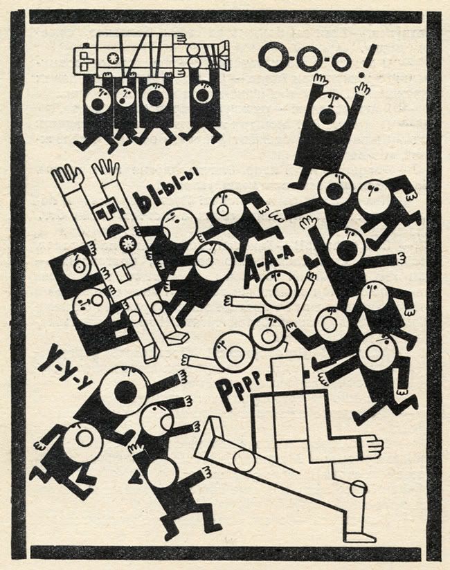
illustration from Hands Up! or Enemy no. 1 by Rifkat Shayfutdinovich Bagautdinov, 1971
Hands up! I love these illustrations by Rifkat Shayfutdinovich Bagautdinov from a 1971 Soviet YA novel, Hands Up! or Enemy no. 1. (50 Watts)
What's up with museum guards? Theodore Bale is a local critic who is unfortunately not nearly as prolific as I personally would like. I liked this piece on the Stan VanDerBeek and Charles LeDray shows (at the CAMH and MFAH respectively). I agree with him strongly about the staging of the LeDray exhibit (as I wrote earlier this year), but what I like best were his interactions with the guards, including one who told him "not to point at [the] object." (Texas, a Concept)
The Wall Street Journal's art coverage sucks. That's the short version of this piece by Ben Davis. Some zingers: "You have to at least try to connect with the art of the present if you want people making art in the present to care about what you are saying. Taken as a whole package, the WSJ gives off the impression of being a paper that understands why people might buy contemporary art — just not why people might like it." And the conclusion: "Of all of the outrages within Rupert Murdoch's far-flung empire, letting the Wall Street Journal's art pages slide into irrelevance because it chimes with a sort of conservative worldview is probably a relatively minor one. But, you know, it is still one of them." ("How Conservative Ideology Stunted the Wall Street Journal's Art Coverage" by Ben Davis, ArtInfo)
I thought only comic book artists got treated this bad. Have you ever heard of DegreeArt.com? They are "an innovative company selling, commissioning and renting the finest artwork created by the students and recent graduates emerging from the most prestigious art establishments," (according to their website). They aim their services at art students and recent graduates (i.e., hungry suckers). I became aware of them after reading this post. They have some of the harshest terms I have ever read:
a Mondrian-inspired hat by Philip Colbert
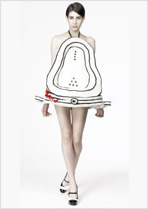
Women should not dress as urinals, probably. Many of the clothes designed by Philip Colbert are knock-offs of famous art. Including a dress based on Fountain by Marcel Duchamp. The Mondrian hat is nice, though. (The Rodrik Band)
Fountain dress by Philip Colbert
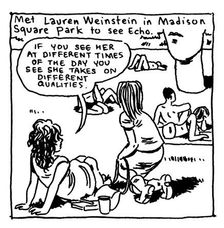
Gabrielle Bell, panel from her 26th Daily Comic, 2011
Making me feel bad for thinking that Jaume Plensa's sculptures were kitschy. I really hate those Jaume Plensa "Tolerance" dudes over on Allen Parkway, and I'm not alone. I'll admit that Echo in Madison Square Park in New York is slightly less obnoxious, but still. But there is always another side of the story! (Lucky by Gabrielle Bell)
illustration from Hands Up! or Enemy no. 1 by Rifkat Shayfutdinovich Bagautdinov, 1971
Hands up! I love these illustrations by Rifkat Shayfutdinovich Bagautdinov from a 1971 Soviet YA novel, Hands Up! or Enemy no. 1. (50 Watts)
What's up with museum guards? Theodore Bale is a local critic who is unfortunately not nearly as prolific as I personally would like. I liked this piece on the Stan VanDerBeek and Charles LeDray shows (at the CAMH and MFAH respectively). I agree with him strongly about the staging of the LeDray exhibit (as I wrote earlier this year), but what I like best were his interactions with the guards, including one who told him "not to point at [the] object." (Texas, a Concept)
The Wall Street Journal's art coverage sucks. That's the short version of this piece by Ben Davis. Some zingers: "You have to at least try to connect with the art of the present if you want people making art in the present to care about what you are saying. Taken as a whole package, the WSJ gives off the impression of being a paper that understands why people might buy contemporary art — just not why people might like it." And the conclusion: "Of all of the outrages within Rupert Murdoch's far-flung empire, letting the Wall Street Journal's art pages slide into irrelevance because it chimes with a sort of conservative worldview is probably a relatively minor one. But, you know, it is still one of them." ("How Conservative Ideology Stunted the Wall Street Journal's Art Coverage" by Ben Davis, ArtInfo)
I thought only comic book artists got treated this bad. Have you ever heard of DegreeArt.com? They are "an innovative company selling, commissioning and renting the finest artwork created by the students and recent graduates emerging from the most prestigious art establishments," (according to their website). They aim their services at art students and recent graduates (i.e., hungry suckers). I became aware of them after reading this post. They have some of the harshest terms I have ever read:
By submitting any material to us, you automatically grant DegreeArt.com the royalty-free, perpetual, exclusive right and license to use, reproduce, modify, edit, adapt, publish, translate, create derivative works from, distribute, perform and display such material (in whole or part) worldwide and/or to incorporate it in other works in any form, media, or technology now known or later developed. You also acknowledge that DegreeArt.com is not obliged to publish any material submitted by you on any DegreeArt.com publication.Jeez, that is actually worse than the work-for-hire terms that Jack Kirby and other comics artists slaved under for decades at Marvel and DC. Art students--never agree to any terms like this, ever. (Cathedral of Shit)
a Mondrian-inspired hat by Philip Colbert
Women should not dress as urinals, probably. Many of the clothes designed by Philip Colbert are knock-offs of famous art. Including a dress based on Fountain by Marcel Duchamp. The Mondrian hat is nice, though. (The Rodrik Band)
Fountain dress by Philip Colbert
Gabrielle Bell, panel from her 26th Daily Comic, 2011
Making me feel bad for thinking that Jaume Plensa's sculptures were kitschy. I really hate those Jaume Plensa "Tolerance" dudes over on Allen Parkway, and I'm not alone. I'll admit that Echo in Madison Square Park in New York is slightly less obnoxious, but still. But there is always another side of the story! (Lucky by Gabrielle Bell)
Note on Under the Big Top at McClain
by Robert Boyd
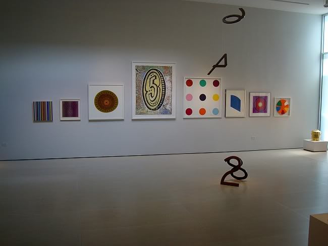
This conceptually weak show is like a lot of shows one sees in summer at the galleries--various odds and ends from the storeroom. For example, a wall full of paintings and prints by a variety of blue chip artists.
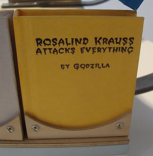
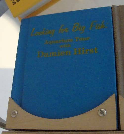
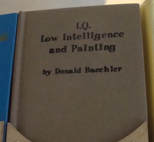
On the wall, left to right: untitled, 5.06 by Rob Reasoner, (untitled) by Victor Vasarely, Target-660 by Stephan Dean, Five by Donald Baechler, Trytophan by Damien Hirst, Blue by Ellsworth Kelly, Mandala 03 by Alexander Haas, Untitled Spin Painting by Damien Hirst. Far right--Dream by Sylvia Fleury. Foreground, hanging from the ceiling--A Piece of Infinity #13, Jonathan Borofsky
It's hard to see where the circus theme comes in with most of these pieces. At the very least, I associate circuses with stimulation (over-stimulation, actually); this weird grouping, on the other hand, is really kind of boring. Except for the Jonathan Borofsky piece. Whatever happened to Jonathan Borofsky? It seems like in the late 80s/early 90s, you couldn't turn around without seeing his work. Now he seems largely forgotten. Personally, I always liked his work and I like this piece. It appeals to the math geek in me.
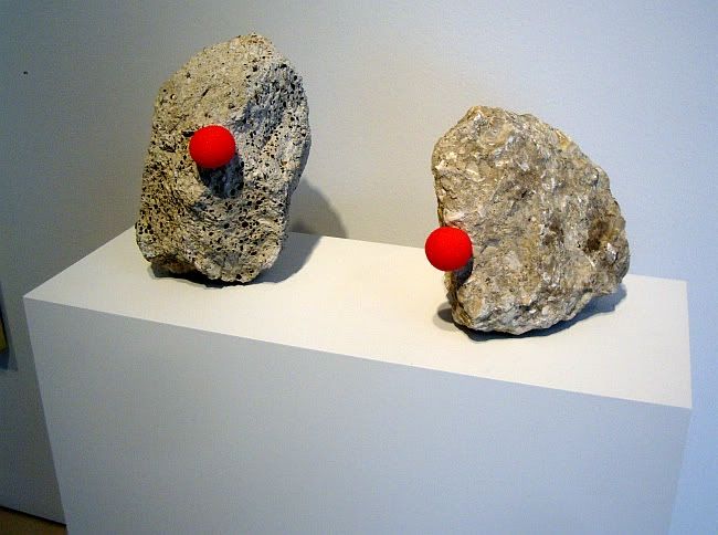
I don't mind that McClain wants to clear out its overstock--lots of retail establishments do this. I just wish that instead of creating a fake-ass theme like "Under the Big Top," they had called it something like "Summer Clearance Extravaganza." The whole "circus" thing feels like an afterthought. There are a few clown paintings (I always wonder who hangs pictures of clowns in their homes) and there's this piece by the Art Guys that actually made me laugh.
The Art Guys, Clown Noses (Double Self-Portrait), clown noses on broken concrete, variable dimensions, 2011
They also had a kinetic piece, Pretty as a Picture.
The Art Guys, Pretty As a Picture, cut plywood lettters, gear motors, wood, wire, 2009
I guess it's obvious that in this exhibit, I liked the things that made me laugh. And nothing made me laugh more than this piece Dennis Oppenheim.
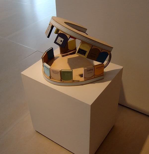
Dennis Oppenheim, Upper Cut, plywood, steel, enamel paint, silkscreen on books, 2000
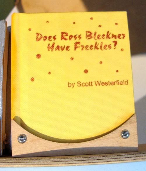
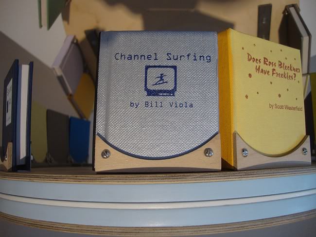
A gallerina told me that she thought this was a model for a larger public piece, which seems extremely unlikely. That said, I would have preferred a giant mouth with books for teeth than his Radiant Fountains sculpture at the airport. But there are two reasons why I doubt that this was meant to be a model for a large public piece. First, it's part of an edition (9 of 27). Second, the book titles are nasty, funny and quite personal. Oppenheim is doing a little score settling.
Dennis Oppenheim, Upper Cut detail, plywood, steel, enamel paint, silkscreen on books, 2000
I thought it was particularly funny that Hirst and Baechler both also had pieces in this show.
Dennis Oppenheim, Upper Cut detail, plywood, steel, enamel paint, silkscreen on books, 2000
Saturday, July 16, 2011
Various Random Arts Seen in the Last Two Weeks
by Robert Boyd
It has been an art-filled two weeks, Pan readers. There are several reviews in line, but before I got to them, I just wanted to pay homage to a few random pieces of art that I saw recently.
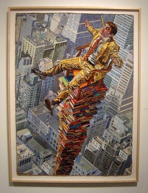
Mary McCleary, Tower, mixed media collage on paper, 2011
Mary McCleary's work is always a pleasure to look at. This one is hanging in the middle gallery at Moody Gallery. (And for $60,000 it can be yours!)
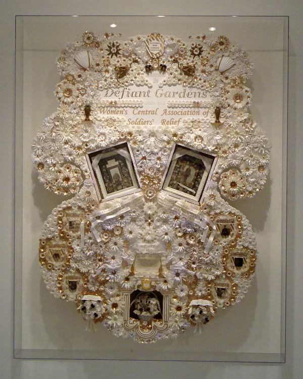
Dario Robleto, Defiant Gardens, mixed media, 2011
When I write "mixed media" in regard to this work by Dario Robleto, I am taking a liberty. As anyone who has ever checked out a work by Robleto knows, he lists every bizarre ingredient on the little information tag--and this list is essential to the art. You might even say the list is part of the art. Here's what he made Defiant Gardens from:
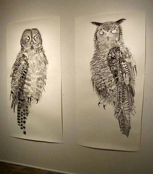
Jules Buck Jones, Great Grey, ink on paper, 2010
Jules Buck Jones drew these owls with spooky blank eyes. I include them here because I like owls. (Did you know that Jules Buck Jones was a member of Boozefox?) You can see his work now at McMurtrey Gallery.
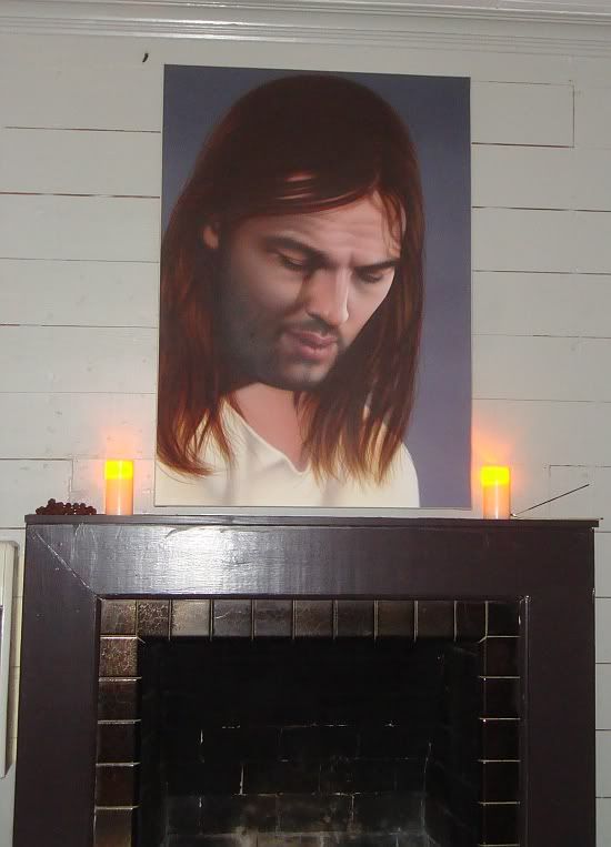
Rachel Hecker, Jesus, 2011
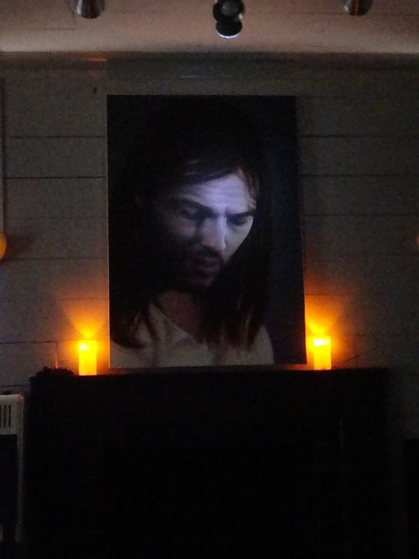
This was what I saw (when I used the flash on my camera) at The Chapel, Rachel Hecker's residency at Many Mini. This was the description:
Rachel Hecker, Jesus, 2011
It has been an art-filled two weeks, Pan readers. There are several reviews in line, but before I got to them, I just wanted to pay homage to a few random pieces of art that I saw recently.
Mary McCleary, Tower, mixed media collage on paper, 2011
Mary McCleary's work is always a pleasure to look at. This one is hanging in the middle gallery at Moody Gallery. (And for $60,000 it can be yours!)
Dario Robleto, Defiant Gardens, mixed media, 2011
When I write "mixed media" in regard to this work by Dario Robleto, I am taking a liberty. As anyone who has ever checked out a work by Robleto knows, he lists every bizarre ingredient on the little information tag--and this list is essential to the art. You might even say the list is part of the art. Here's what he made Defiant Gardens from:
Cut paper, homemade paper (pulp made from soldiers' letters sent home and wife/sweetheart letters sent to soldiers from various wars, cotten), carrier pigeon skeletons, WWII pigeon message capsules, dried flowers braided by war widows, mourning dress fabric, excavated shrapnel and bullet lead from various battlefields, various seeds, various seashells, cartes de visites, gold leaf, silk, ribbon, wood, glass, foam core, glueYou can see Defiant Gardens in the rear gallery at Inman Gallery.
Jules Buck Jones, Great Grey, ink on paper, 2010
Jules Buck Jones drew these owls with spooky blank eyes. I include them here because I like owls. (Did you know that Jules Buck Jones was a member of Boozefox?) You can see his work now at McMurtrey Gallery.
Rachel Hecker, Jesus, 2011
This was what I saw (when I used the flash on my camera) at The Chapel, Rachel Hecker's residency at Many Mini. This was the description:
For two hours, the residency space will be converted into an ecumenical/non-denominational chapel for prayer, worship, meditation, or quiet reflection. The centerpiece of the chapel will be a painting of Jesus based on a photograph of Pink Floyd’s David Gilmour. The Rev. Rachel Hecker has received the Credentials of Ministry from the Universal Life Church, and will perform ministerial services, as requested.My photo above is a misrepresentation. The only light in the room was from candles and a little light leaking in from outside. It was a gloomy environment. Hecker had three rows of hard wooden pews (her denomination must be quite staunch--no fancy padded pews for the congregants). This was a one-night-only even, but I'm sure this painting (and more like it) will be on display somewhere sometime soon. Probably Texas Gallery.Here's what it looked like--sort of--in the dark.
Rachel Hecker, Jesus, 2011
Labels:
Dario Robleto,
Jules Buck Jones,
Mary McCleary,
painting,
Rachel Hecker
Subscribe to:
Posts (Atom)