Showing posts with label Sketch Klubb. Show all posts

Wednesday, January 22, 2014

The Bart Book of the Dead

Robert Boyd

The catalog says it best: "Sketch Klubb is a group of friends who get together every other Saturday morning to draw." It was 12 guys, but one of them, Michael Harwell, recently died. 1,000 Crappy Barts for Michael Harwell plus Klay Klubb is a tribute to their lost compadre.


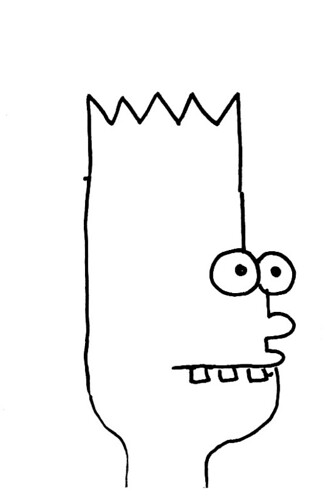
When you walk into the big back gallery of Box 13, there is a vitrine with an open sketchbook. This is Harwell's sketchbook, and the page we see has 16 drawings of Bart Simpson's head. There are a minimal number of lines in the Matt Groening-designed head of Bart, and Harwell deliberately takes them apart.

Starting from this page, the surviving members of Sketch Klubb--Seth Alverson, Rene Cruz, Russell Etchen, Sebastian Forray, Lane Hagood, Cody Ledvina, Nick Meriwether, Eric Pearce, Patrick Phipps, J. Michael Stovall and David Wang--drew 1000 versions of Bart Simpson, which are on the three walls surrounding the vitrine.


They aren't very memorable drawings. The goal was quantity over quality. This may reflect the ethos of Sketch Klubb. They've put together a few zines and a book before, but I suspect the idea is to get together and draw without having an endgame in mind. Doesn't matter if it's "good."


Not that there weren't a few drawings that were clever. Like this Creature from the Black Lagoon Bart.


Or this Bart who looks a little like Hank Hill crossed with Walter White.


How about an airbrushed Bart with 13 eyes?


Or a sweaty Bart with a beard and boobs for eyes. (There were a lot of mutant Barts in the show.)


The work was hung in a off-hand, unprofessional way--pages curled up in the humidity. But that seemed right. After all, they weren't creating something for the ages--this was a temporary tribute to Harwell that no doubt recalled their casual Saturday morning get-togethers.

Slightly more finished work was on display in the front gallery of Box 13. These were ceramic objects made by Sketch Klubb. None of the work was labeled, so for the purpose of this review, just assume a collective authorship for these bizarre ceramic knick-knacks.


(Thank God the "MAN MILK" jug was empty.)


Some of them are pretty funny, and they seem like a natural extension of the artistic ethos of Sketch Klubb.

The individual artists in Sketch Klubb do a wide variety of work on their own, but as diverse as their styles are, I'd say that what they have in common is an element of humor. The question I have is that was it their sense of humor that drew them together in 2005, or is their sense of humor as artists partly a result of their time together in Sketch Klubb?

I saw this exhibit on opening night. The crowd was boisterous and good humored. I wonder what it would be like to see when the galleries are quiet and unpopulated.


Sunday, May 1, 2011

Marc Bell meets Sketch Klubb

Marc Bell

Part of the "Crappy Bart" series, drawn by Marc Bell for Sketch Klubb.


Share


Sunday, January 16, 2011

I Request that the Following Piece of Houston-centric Art be Made

A graphic novel, written and drawn by Sketch Klubb, about a zombie attack on HIVE, which would then have to be defended by generally hapless performance artists. Starring Nestor Topchy. Featuring Jim Pirtle, the sexyATTACK suicide squad, Emily Sloan, the Art Guys, Nancy Douthey, Julia Wallace, Culturcide, etc. (Suggestions welcome!) At the climax, when it seems like HIVE will be overrun, Marina Abromović parachutes in to defeat the zombies with her death stare.

Sunday, December 12, 2010

Comics I Got In Brooklyn, part 2

Robert Boyd


Th8 cover, 2010 (not sure who the artist is)

Continuing my reviews of comics purchased at the Brooklyn Comics & Graphics Festival, this is an anthology called (I think) Th8, edited by Zara Messano and Gil Gentile. This thick issue is apparently the final issue. It is printed in what has become a somewhat standard format (since Fort Thunder)--silkscreened cover and photocopied interiors. Unusually, this comic is bound with string--it is very much a hand-made object. And if the format derives from Fort Thunder, the contents do as well. I would say that Ben Jones (and Paper Rad) and C.F. are big influences. But some of the work also reminds me of Sketch Klubb (which itself has a lot of Fort Thunder influences).


Magic Sweater [sic], untitled, 2010

This page (one of two by Magic Sweater) is one that reminds me a lot of Sketch Klubb. Magic Sweater is apparently an artist from Melbourne, Australia. His website has a huge quantity of his highly amusing drawings. As you can see in this piece, he often uses repeated images--I'm guessing he scans in individual figures then layers them into these dense compositions.


Shalo P., untitled, 2010

Shalo P is a video artist from San Francisco. His (her?) work here is comics deconstructed. There are recognizable comics elements--panels, word balloons--but the drawing spills out of those forms, falling over them, overlapping. I find it quite appealing (if a little disturbing in its violence).

Th8 also includes interviews with C.F. and Vanessa Davis. The C.F. interview, apparently conducted as a list of questions sent to C.F., is amusing because C.F. is frustrated and even angered by some of the questions.


Patrick Kyle, Black Mass #2 cover, 2009

In Black Mass #2, Patrick Kyle follows the format described above--silkscreened cover, photocopied interiors. But the contents are not as radical as that in Th8. Kyle tells a more-or-less conventional story. A man named Turdswallo Blackteeft who has left his home in Transylvania for "Canadia." Turdswallo is needed by his relatives in Transylvania to help utter the "true name" of an oppressive king. But Turdswallo is injured in Canadia. This is issue 2 and there is a third issue, so this is just a section of the story, and a bit confusing because of it. I'd like to see a book collection.


Patrick Kyle, Black Mass #2 interior page, 2009

The storytelling requires a little work on the part of the reader. There are no distinct panels, so the sequential actions visually bleed into one another. However, it is a lot more of a traditional comic than Th8. Kyle's rubbery drawing is especially appealing.


Michael Kupperman, Creative Time Comics cover, 2010

Creative Time is an art organization in New York. Creative Time Comics was a two year web project where a variety of artists were invited to do comics on any issue of the day they cared to address. Some of the artists are artists mostly associated with comics, and some are more associated with the fine arts scene. This publication represents the overlap of comics and art that typifies the Brooklyn Comics and Art Festival.

However, one thing that distinguishes Creative Time Comics from most of what was on display is the high-quality format--full-color pages on nice paper. Creative Time is supported by a lot of foundations and companies, just like any other arts organization.

The cover is by Michael Kupperman and relates to a story he has inside, where Tintin has become an angry American Rush Limbaugh-like character.


Robert Pruitt, The Struggle, 2010

Robert Pruitt should be familiar to most of my Houston readers. The artist, formerly from Houston, now in Chicago, was part of the Otabenga Jones and Associates group. All of those artists had a distinct comics influence, Pruitt included. So he seems a natural for a project like this, but the work here is not all that interesting. He is much better as an artist doing large scale single-image works designed for display on the wall. This is one of the pitfalls when you try to bring people in from the art world into comics--no matter how sympathetic they are with comics, they may not rise to the occasion. Still, I think this is something that should be attempted, and I'm glad Creative Time and Pruitt made the effort.


Edie Fake, Twice As Bad As Previously Thought, 2010

Edie Fake is an artist I know nothing about. I was completely impressed by this story. The metaphor of the BP oil leak as tears seems obvious once you see it, but I hadn't thought of it until I saw Fake's depiction. This is something comics does well--a visual metaphor like this might not work in another medium, or might seem surreal. But in comics, we can accept it easily. The drawing is beautiful and powerful. Fake has done other comics work which I now intend to check out. (He also drew the logo for comics criticism site Hooded Utilitarian.)


Jon Lewis, Klagen: A Horror cover, 2010

I have known Jon Lewis for almost 20 years--he, Tom Hart, Jason Lutes and Ed Brubaker were the young punk cartoonist gang in Seattle when I lived there working for Fantagraphics. He is best known for his comic series True Swamp, which I believe is still ongoing online. This small comic, published by Uncivilized Books, is a limited edition of 200. I would not be surprised if Lewis sold every single one of them at the Brooklyn show. In any case, you apparently cannot order it from Uncivilized Books, at least not yet. Update: You can now order this book from the Uncivilized Books site.


Jon Lewis, Klagen: A Horror pages 8-9, 2010

The story of Klagen, according to Lewis, is about a "death cult." At the convention, I asked him if he meant something like Aum Shinrikyo, but he meant something with less purpose that that. After all, Aum Shinrykyo's attacks and attempted attacks were part of a strategy, not an end unto themselves. However, the story in this comic is apparently just a prologue to a longer work. We encounter the cult without understanding much of it. Klagen is the name of a rock band in the book--and their relationship to the cult is not obvious.

The book has an interesting design. It is drawn in pencil, but where the cult manifests its occult powers, we see inky black silhouettes. On top of this, there is a grey haze over all the pages, except where the word balloons and narration blocks are. This makes them pop visually. The paperstock itself is a bilious yellow, fitting with the gloom and horror of the story.

One plot point that I had a hard time swallowing was that after seeing a strange black spirit form copulating on an alter, and after seeing his friend Brian die before his eyes, the protagonist Eric still goes to the Klagen concert. I don't know--if I were Eric, I might be a little too freaked out by what I had just seen to go check out a rock concert!

More reviews at part 1, part 3, and part 4 (and more to come).

Sunday, August 1, 2010

More Recently Read Art Books

http://content-2.powells.com/cover?isbn=9781933619262
Hand+Made: The Performative Impulse in Art and Craft curated by Valerie Cassel Oliver
This show at CAMH was fantastic. The catalog is also good, but the photos could have been larger. The book is very useful if you've seen the exhibit--it contains a lot of photos of the performances that are linked to the crafted objects in the show. Seeing these photos and reading about the performances helps bring the idea of the exhibit to life. Part of me thinks it is ridiculous that craft has to sneak into the museum under the guise of performance, but the proof is in the pudding--great show, good catalog.

Pen to Paper
Pen to Paper by Lars Denicke and Peter Thaler
There is this school or movement in drawing that relates to Paper Rad and Fort Thunder, along with dollops of illustration and street art and "bad art." Sketch Klubb sort of belongs in this movement. (I missed their show opening last night at the Joanna, dammit!) The artists in this world seem to discover each other through Flickr. This book is a collection of some really interesting examples of this kind of work. It includes work by Sketch Klubb's Lane Hagood, including a piece that I have framed and that is looking at me right now with 100 eyes, Diseased Writer. The text is minimal--a little too minimal. I wouldn't have minded knowing a little bit more about each artist.

Paul Klee
A Piece of the Moon World: Paul Klee in Texas Collections
This little book is a Menil Collection book from 1995. Last year they had a "Paul Klee in America" exhibit that was excellent. Klee can reasonably be considered a grandfather (or great grandfather) of some of the artists in Pen to Paper. That's a connection that should be investigated.

Data Flow
Data Flow, Robert Klanten, Nicolas Bourquin, Thibaud Tissot, Sven Ehmann and Ferdi van Heerden
As our world becomes more awash in data, infographics become increasingly important. We still rely heavily on photographs and video for visual information, but the problem with them is that they are brilliant at showing the particular, but very poor at showing the general or at showing trends. Infographics don't deal with the particular; they deal with data. Consequently, it strikes me that artists and designers need to understand data much better. Data is full of pitfalls. A good handler of data has to know how to pull out the meaningful data out of the data torrent. She needs to know a good deal about statistics and math in general. She needs to be able to take raw data and process it into something meaningful--all before creating the graphic. Unfortunately, this book still shows designers as being purely visual technicians (and highly creative ones at that)--there is no sense that there is a new breed of statistician-designers.

http://www.artnet.com/Magazine/features/finch/Images/finch1-27-2.jpg
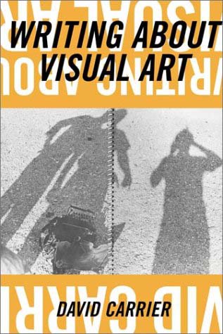
Writing About Visual Art by David Carrier
The basic idea of this book is that art writing is "a relatively unexamined genre." And boy does he examine it here. He seems to have read everything, and a lot of this book is writing about what has been written from Vasari to the present. He talks about narratives in art writing, and how narratives fell away to a kind of "presentness." He calls this kind of writing "God's eye views," and while he has a lot of sympathy for it, he thinks it fails. Then he returns to narrative, but what he calls "gallery narratives" and "museum narratives." Suddenly, he's talking about the sociology and economics of art, and he wants this kind of writing combined with the writing about the "present" nature of the art. His ideal is later Arthur Danto. Not a bad book--very interesting ideas presented in a meandering style.

http://content-0.powells.com/cover?isbn=9783791338330
(Non) Conform: Russian and Soviet Art from 1958-1995
This is a big picture book of art from the Ludwig Collection. Ludwig, a candy tycoon from Germany, was a famous art collector but a highly controversial one. He was said to have collected official Soviet art and displayed said art in his private museum as a sop to the Soviets, where he looked to increase his business. This book is full of art both by official Soviet artists and underground artists. There are writings, most of which interestingly come in the form of answers to six questions:
1) Does post-Stalinist art have a chance of being perceived objectively?
2) Which qualitative features characterise "official" art and which "non-official"?
3) Can one count on a dialogue between the two "Soviet cultures"?
4) What role is played by market interests?
5) Does the revision of Socialist Realism influence the assessment of the surovyy stil' ("severe style")?
6) How do you see contemporary Russian art against the background of the historical context?
Most of the answers by the critics here are really boring. They skate around the main issues, in my view. After all, these critics are lending themselves to a very compromised endeavor here. The only responder who seemed completely free of bullshit was Norton Dodge, a famous collector of Russian conceptual art who was collecting it when it was quite dangerous to do so. It is bracing to read non-jargony sentences like this: "...the fact remains that art was subject to central party and government approval and those who did not conform could be subject to punishment." The period covered in this book dates from the "thaw" after Stalin's death to just after the fall of the U.S.S.R. Generally speaking, the "official" art seems fairly bad. But there is a lot of good art (and good pictures here) by artist like Erik Bulatov, Mikhael Grobman, Ilya Kabakov, Igor Makarevich, and others. Also, it seems that art from the Baltic states was top notch.

http://content-2.powells.com/cover?isbn=9780714857572
Drawing Live by Javier Mariscal
Pretty disappointing. I loved Mariscal in the erly 80s, but the Mariscal of that time, who was drawing comics, doing posters, designing nightclubs, designing furniture, etc., eventually got swamped by demand for his work and had to become a studio full of people who, evidently, draw like Mariscal. The work after the Barcelona Olympics is only occasionally interesting, and it makes up the bulk of this book.

Wednesday, June 2, 2010

Monday, April 12, 2010

The Joannex

Here's another tardy review. I saw this show about a month ago and meant to write about it then. I wanted to mention it now, though, because they have a new 1-night-only show on Saturday called "Are You There God? It's Me, Birdie." Anyway, the last show was a big group show. The Joanna's previous shows were in a small house, but this time they had a large house to show their stuff. They packed it with a pretty incoherent collection of work. Here are some of my favorite things from the show.

When you walked up to the house, you saw this.

Nick Meriwether
Nick Meriweather, Dali's Mustache, mixed media, 2010

Here's a little video I took so you can see the mustache in action.


The mustache was powered by a leaf blower.

Nick Meriwether

This was similar to those spastic attention getting dudes you see in front of stores. I've heard them referred to with the surprisingly poetic term of "air dancers." They're cheesy, and this piece was a witty play on their cheesiness by associating Dali (a master of cheese) with them. It also was an excellent attention getter for the Joannex. I don't really know anything about Mr. Meriwether, but he has a Flickr page here.

Dennis Harper
Dennis Harper, Howdy Pilgrim, mixed media installation, 2010

When you walked in, this piece dominated the room. There are two ideas at work here--the religious putt-putt game, and the giant face made by the eyes and fireplace mouth. I'm not sure how these two ideas are related. The face was funny like an old black-and-white cartoon. The putt-putt combined an icon with a game of skill. The golf-balls were painted gold, which enhances the Byzantine feel of the piece. And luckily for our salvation, it was pretty easy to get the ball into the hole.

The artist is a guy name Dennis Harper, who I wasn't familiar with. I'm not sure if this is the same artist, but if this is his website, and these two articles are about the same Dennis Harper, then he has an interesting history--doing underground comix in the 1970s, but going back to school in the 2000s to get a BFA and MFA--wow. Definitely an artist I'd like to know more about.

Francis Giampietro
Francis Giampietro, not sure what this is called, wood and protein powder, 2010


Francis Giampietro was back with more wood and protein powder. Like he did in Contrapposto, he used protein powder (which guys use to bulk up with) as one of the elements. He likes playing around with heavy wood structures. Was he making a comment on masculinity... and carpentry? Who knows--I just know I liked it. Maybe it unconsciously appealed to the bro in me.

Jeremy Deprez
Jeremy Deprez, another on I don't know the title of, torn stretched canvas

Here's another artist I know nothing about. He has a blog, though. This piece seems pretty dissimilar to the pieces on the blog. An homage to Lucio Fontana, I assume?

Sketch Klubb
Sketch Klubb, this lack of titles is getting old, silkscreen

This appealed to me because a naked tattooed Betty turns me on. Don't ask to understand the mysteries of men's minds. The tattoos are apparently by individual members of Sketch Klubb.