by Robert Boyd
No one except me. And I had a press pass. The point is, a big music festival like the Free Press Summer Fest brings people interested in music and partying, not necessarily in that order. Anything extra is at best icing on the cake. Otherwise, it's something to be ignored. On top of that, any visual art at an event like Summer Fest is going to be competing with a lot of other stuff for your attention--a festival like this is all about sensory overload. Compare this to the calm, quiet environment of a museum, where it's all about making the art the center of your attention.
So given these challenges, what art works at Summer Fest and what doesn't? Broadly speaking, I'm going to say that pictures don't work. They are too static and have too much competition--not the least are enormous video screens flanking the main stages.
Fancypants/Hay Merchant painting
For example, there were several paintings that may or may not have been by
Matt Messinger hanging in the "Fancypants" tents. [
Correction: These paintings were
not by Matt Messinger. I don't know who they were by. They were apparently brought by
The Hay Merchant, who was the concessionaire in this tent.] Access to these air-conditioned tents cost paying festival-goers an extra $40. The Fancypants tents were a refuge from the heat and a bar all in one. Did the people inside these tents particularly notice these relatively subtle paintings hanging from the ceiling? In a different setting, they might have had a very different presence, but here, they felt extraneous.
Fancypants/Hay Merchant painting
Fancypants/Hay Merchant painting
But maybe these somewhat austere, monochromatic paintings are not appropriate for Summer Fest. Perhaps larger, more colorful paintings would attract more attention.
Molly Clark had several colorful, cartoony banners. I found her characters amusing and delightful.
Molly Clark, banner paintings on a pedestrian overpass
These cute monsters were hanging up on a pedestrian bridge over Allan Parkway (under which most festival-goers had to walk to enter or leave SummerFest).
Molly Clark, painted banner
This one was attached to a fence at the top of the embankment above one of the main stages. All her banners were large, colorful, and cute, done in a style that recalls both children's book illustration and the "cute brut" style of alternative comics typical of such artists as
James Kochalka. In short, they have a lot of appeal. But did people stop to check them out? I'm sure some did, but that wasn't the norm.
people ignoring art
Instead of attentive viewers, this art was greeted with indifferent crowds rushing to and fro--to the next act on a different stage, to the porto-potty, to get water or beer to drink, or to the Fancypants air-conditioned tent to cool off. As nice as Molly Clark's art is, it just wasn't in the right place to be noticed.
Eric Castorena, banner on pedestrian overpass
The same could be said about
Eric Castorena's witty mashup of
Davy Crockett and
Tom Waits.
Amie Jones, Eyes Over Texas
Even
Amie Jones' massive god's eye-like constructions,
Eyes Over Texas, seemed to struggle to compete with the other attention-grabbing aspects of the festival. In just a slightly different setting, I think these two cosmic eyes would be very striking--unsettling, even. But here, it was hard to get people to look up.
The point is that paintings (or things like
Eyes Over Texas, which acted like paintings by virtue of being hung up) had a tough time commanding people's attention. Given this, what might work better is something that
intervenes. Something that is physically in your path. In short, sculptural objects would seem to have an advantage in this venue.
Michael C. Rodriguez, installation at Summer Fest
Michael C Rodriguez's installation was more of a painting than a sculpture, but because it was free-standing, it had a sculptural presence.It was hard to avoid this large Roy Lichtenstein-ish painting, and people huddled in its shade. Its size and location helped it be seen--it wasn't unobtrusive like some of the other artwork. I like the tattoo on the female figure's arm.
Brett Osborne, With All Music Blaring, I Can Hardly See Straight, ceramic
Brett Osborne's
With All Music Blaring, I Can Hardly See Straight has a smaller footprint than the Michael C. Rodriguez piece. Note to future Summer Fest sculptors--work
big. Osborne is better known as a tattoo artist than a sculptor, but I found this piece pretty ingenious. I will confess--I would have been nervous to display a large ceramic piece like this among the sixty thousand intoxicated Summer Fest patrons.
Brett Osborne, With All Music Blaring, I Can Hardly See Straight (detail), ceramic
Jacob Calle, They Give Us Their Artifacts As Gifts to Prove They Existed
Chelsea Paquette, They Give Us Their Artifacts As Gifts to Prove They Existed
Jacob Calle's dinosaur and Chelsea Paquette's mammoth were pretty nice, but they were placed in an out-of-the-way spot (near the entrance, but once you entered you were already past them). So they didn't accomplish the task of
getting in your way--which was an important means of getting your art noticed at Summer Fest.
Henry Moore, Large Spindle Piece, bronze, 132 inches
The finest sculpture at Summer Fest got the least respect. Henry Moore's
Large Spindle Piece is a permanent feature of the park, and I guess the Summer Fest people had to protect it. At least, I assume that's why they fenced it. But even worse than the fence is the random crap surrounding it.

Perhaps the best way to make a splash artistically at Summer Fest was to do performance instead of static art. I don't know who these "protesters" were, but I sure noticed them. (And I heartily agree--Summer Fest was hell--unless you could retreat into an air-conditioned Fancypants tent from time to time.)
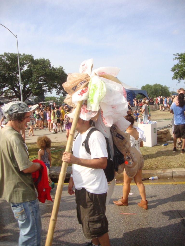
countercollectivecollectivecollective, Countercrawlture
I am pretty sure that these guys with plastic bindles were part of countercollectivecollectivecollective's Countercrawlture. So there was a mobile performance aspect (the bindle guys) and a stationary aspect.
countercollectivecollectivecollective, Countercrawlture
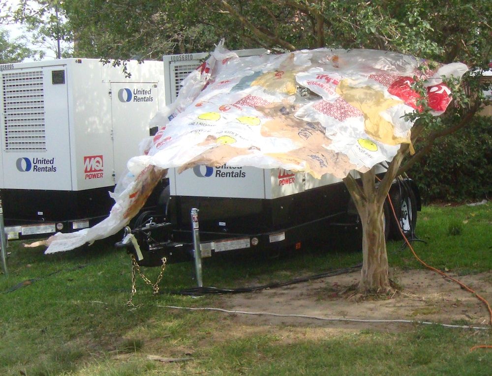
The stationary part included these banners made of plastic bags.
countercollectivecollectivecollective, Countercrawlture
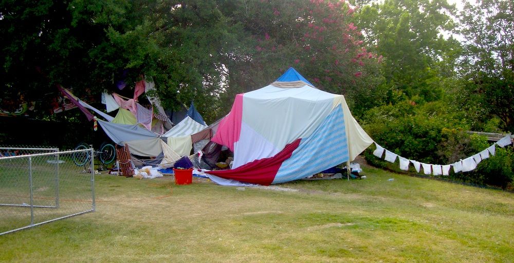
Yes, right on the edge of Summer Fest, an orgy of consumption, was this art installation that looked like a homeless encampment. My understanding was that it was meant to be a place where you could get away from the crowds and take a nap. And it was in fact in a curiously peaceful part of the Summer Fest area--the area behind stage 3 where there was a group of oak trees providing shade. The part that looks like a laundry line on the right was a string of Walmart plastic bags with one bottle or can in each.
The work that worked best was, like Countercrawlture, interactive. I think that is one of the keys to a successful piece of art at Summer Fest. On that count, Stephanie Toppin's person-sized geodesic dome, Imaginary Head Space, worked.
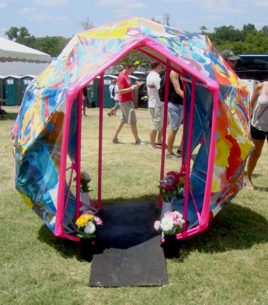
Stephanie Toppin, Imaginary Head Space
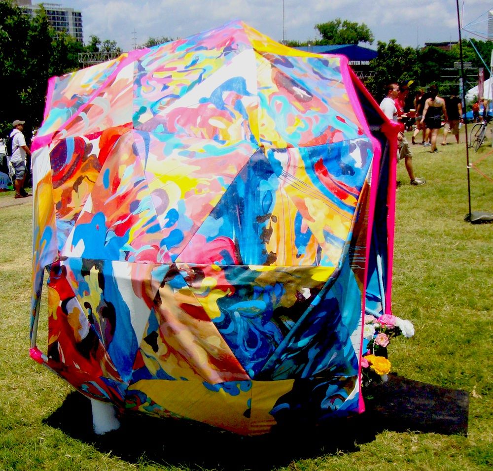
Stephanie Toppin, Imaginary Head Space
Imaginary Head Space was just big enough to accommodate one person--or maybe two if they were small. There wasn't anything to do inside it except get out of the sun and hang out. Toppin told me that she was worried that people would leave garbage or worse in it. Her nightmare was coming in Sunday morning and finding poop inside. However, mostly what people left was not bad--some people even left flowers in it.
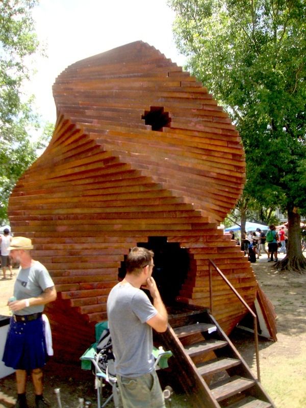
Woody Golden, Terra Antenna, styrofoam and wood
Another place to hang-out was Woody Golden's Terra Antenna. This enormous styrofoam and wood structure worked because it was large, it was in the way (you had to walk past it, pretty much), and it was interactive in that it had a space inside where people could chill out (and probably smoke some weed, but I never witnessed that).
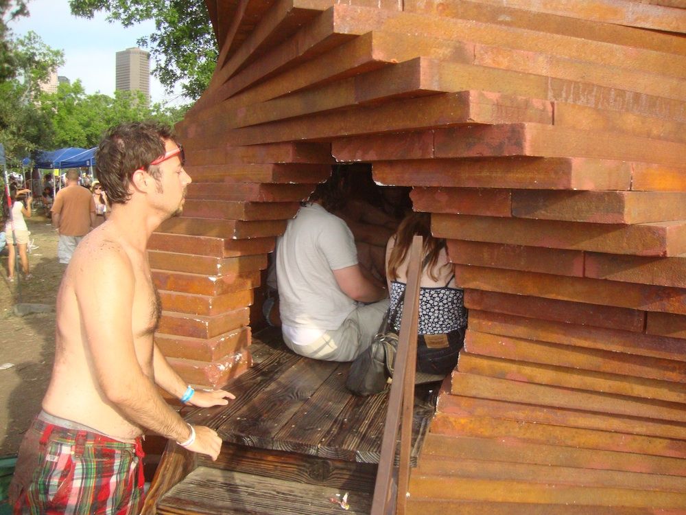
Woody Golden, Terra Antenna, styrofoam and wood
Like all the artists, Golden had free access to the Fancypants tent. But they didn't give the artists free beer. He was shocked when he learned the beers there cost $7, even for artists. An outrage!
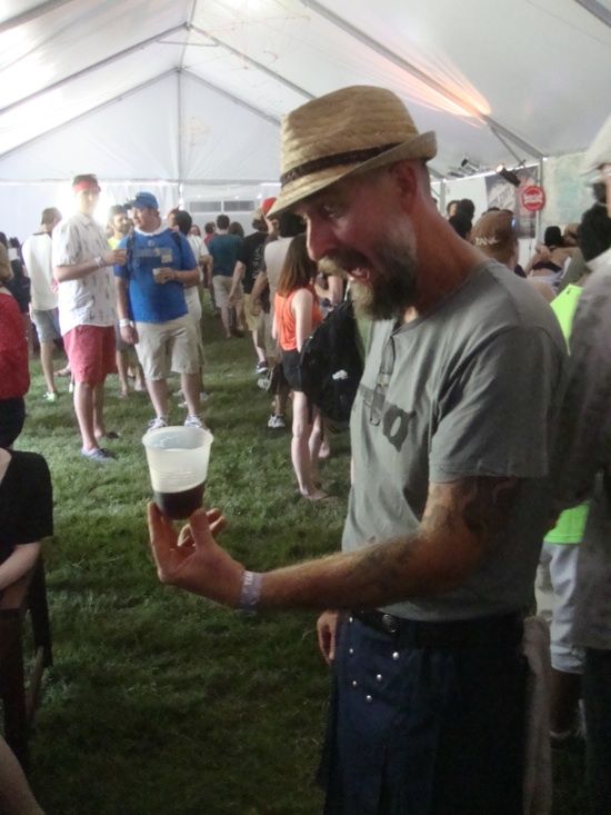
No respect for artists in the Fancypants tent
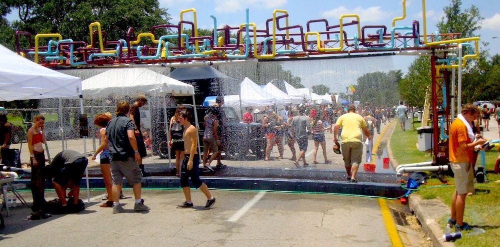
So I've established that the best pieces of art at Summer Fest should be highly visible, they should be big, they should be in the way, and they should be interactive. These are the pieces that people will notice among the general hullabaloo of a music festival. And the piece that best embodied all these qualities was Water Gate, a collaboration between Exurb and TX/RX Labs. These are two groups of artistic tinkerers that I would describe as engineering-oriented art collectives. (I've written quite a bit about Exurb in the past.) In a way, this seems like the perfect kind of art for Houston--we're a city lousy with engineers, after all. Houston needs its own E.A.T.
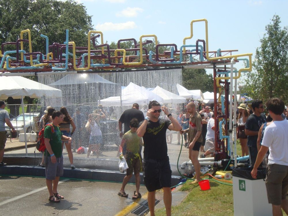
Exurb and TX/RX Labs, Water Gate, pvc pipe, electronic equipment, pumps, water
Water Gate straddled the westbound lanes of Allen Parkway. It rained a continuous curtain of water on overheated festival-goers who needed a spritz. And it had a motion detector that could tell if there was someone walking up--and a small gap in the curtain of water would appear whenever this happened.

Exurb and TX/RX Labs, Water Gate, pvc pipe, electronic equipment, pumps, water
Exurb and TX/RX Labs, Water Gate, pvc pipe, electronic equipment, pumps, water
The only problem with Water Gate was that they suffered technical problems. This is the danger with all engineering projects. The design may be sound, and the testing and commissioning may be perfect, but until you are operating in field conditions, you don't know what will happen. In this case, they failed to anticipate how dirty the people going through the gate would be. Specifically, a lot of people came through the Water Gate after having ridden on Patrick Doyle's Paint Slide. This was another interactive art piece (a highly successful one, judging by the number of paint-coated people I saw), where people literally slide down the side of a hill on a slide covered with wet paint. So these colorful, paint-spattered people would use Water Gate to clean off a bit. The paint (and dirt) ended up clogging one of the pumps that was circulating the water, and by late afternoon Sunday, Water Gate wasn't working anymore.
Disappointing, sure. But now they know--it's just an engineering problem to be fixed. The concept is sound and the piece is beautiful. Water Gate is exactly the kind of installation you would want to have a hot summer festival. I hope Exurb and TX/RX Labs work out the bugs and install it at other events this summer.


