Showing posts with label painting. Show all posts

Tuesday, December 11, 2012

The Misuse of Kitsch: Michael Arcieri's Cold War Paintings

Robert Boyd

Michael Arcieri's new show at Avis Frank Gallery features a bunch of paintings of cold-war era imagery in canvases where three distinct images are arranged vertically.


Michael Arcieri, Bonneville Blast, 2012, oil on canvas, 48" x 45"


Michael Arcieri, New for Spring, 2012, oil on canvas, 48" x 45"

You will be forgiven if when you look at these paintings you are reminded of James Rosenquist--particularly I Love You in my Ford.


James Rosenquist, I Love You in my Ford, 1961, oil on canvas, 6'10¾" x 7'9½"


Michael Arcieri, Chaser, 2012, oil on canvas, 44" x 42"

Arcieri's Chaser will remind you of Rosenquist's F-111.


James Rosenquist, F-111, 1964-65, Oil on canvas and aluminum, 10' x 86'


James Rosenquist, F-111 (detail), 1964-65, Oil on canvas and aluminum, 10' x 86'

Michael Arcieri doesn't come off well in these comparisons. I Love You in My Ford related the all-American automobile to both sex and death, and in doing so spoke to its era of burgeoning highway expansion and the freedom promised by universal car ownership. Arcieri's images, by contrast, are a nostalgia trip. Their easy ironies might have been shocking if painted in 1961, but even then the juxtapositions would have seemed obvious and heavy-handed. Now, they are pointless. The Cold War ended--decisively--in 1989. Since then, the U.S. (and the world) have not faced an existential threat of war. This isn't to say we might not in the future. But as a subject of art, the Cold War has lost its urgency. Whereas, when Rosenquist painted F-111, every American above the age of 9 or so knew that nuclear war could erupt at any time, and if that happened, the nation, if not the world, would be obliterated.

In short, Arcieri's cold war paintings are trite and unoriginal. Arcieri is a skilled painter, but he employs those skills in this exhibit to make modestly clever works that have no urgency to them, no personal feeling. Comparing him to James Rosenquist, an artist captured the zeitgeist in a powerful and unexpected way, is unfair perhaps--but Arcieri brings the comparison on himself by blatantly copying the style that Rosenquist invented. It's a weird thing to say about an artist like Rosenquist who cultivated a distancing, mock-commercial-art style, but his work exudes authenticity; Arcieri's paintings are well-wrought but empty pastiches.


Michael Arcieri, Joe From the Bar, 1949, 2011, oil on canvas, 30" x 24"

In a separate gallery, Arcieri has a group of paintings, including Joe from the Bar, 1949, which look  paintings of freeze-frames from old movies shown on an old black-and-white television. But again, the strongest sensation one gets looking at these is of their profound unoriginality.


Gerhard Richter, Onkel Rudi (Uncle Rudi), 1965, oil on canvas, 87 cm x 50 cm

Again Arcieri is channeling another painter from the 60s--Gerhard Richter. And again, Arcieri falls far short. Joe From the Bar, 1949 is a banal film image. Onkel Rudi is, however, Richter's actual uncle. Rudi (Rudolf Schönfelder) was a Wermacht soldier and died in combat in World War II. Aside from the personal meaning of the image for Richter, it reflects the anguish that people of his generation felt acutely--that their parents and older relatives had all been Nazis. Like James Rosenquist's 60s paintings, Richter's employ a startlingly original idiom to tap into the spirit of his generation of Germans. Arcieri copies that idiom to make a banal but well-executed painting.

It's unreasonable to expect Arcieri to be as brilliant as Rosenquist and Richter, but he shouldn't paint like them if he doesn't want to be compared to them.  He can paint very well--he now needs to find his own direction and his own subject.

Share

Monday, November 26, 2012

Wrapped Up In Books with Seth Alverson and Lane Hagood

Robert Boyd


Cronopios installation view at Kaboom Books

Lane Hagood is a bookworm. This was obvious when he won the Hunting Prize for a painting called Books I Have Possessed. Books have remained a subject for his work. And even when books are not directly referred to in his paintings, his work still feels bookish. It gives one the feeling of old libraries or cramped bookstores like Kaboom.


Kaboom is the kind of place where one might find an out-of-print book like Around the Day in Eighty Worlds by Julio Cortázar, and Lane Hagood is the kind of person who would pick it up. Julio Cortázar (1914-1984) was an Argentine writer who was one of the first writers of "el Boom," a flowering of writing in Latin America that reached across borders and languages in the 1960s and 70s. He's best known in the English speaking world for his short stories (his first book in English was Blow-Up: And Other Stories--the movie Blow-Up is loosely based on Cortázar's story) and his novel Hopscotch. Around the World in Eighty Days is an unusual book, a collection of short non-fiction pieces, reviews, essays, etc., that is considered somewhat autobiographical. I say "considered" because I've never read it. (The extent of my Cortázar is the Blow-Up collection.) One thing about it is that it is full of illustrations and collages, some by Cortázar and some chosen by him. These illustrations intrigued Hagood and inspired this exhibit, Cronopios. Hagood and his collaborator in this project, painter Seth Alverson, describe the genesis in this brief dialogue:
Seth- Hey this book has really cool pictures in it.
Lane- Yeah, it’s a good book. That’s why I bought it, idiot.
S- Wouldn’t it be neat if I picked my favorite pictures out of the book and painted them, and you picked your favorite pictures out of the book and painted them, and I didn’t know which ones you picked, and you didn’t know which ones I picked? Th
en we would see how much we have in common. It would be a fun surprise at the end!
L- That sounds like a good time. I like little paintings.
S- I like little paintings too. How many pictures should we paint?
L- I dunno. Like 15?
S- Sure, that’s enough. 


A "cronopio" is a type of character in Cortázar's stories of the 60s. In this exhibit, Hagood and Alverson claim to be cronopios. Cortázar described cronopios like so:
When cronopios will travel, the hotels are full, the trains have already left, it's raining buckets, and taxis do not want to take them or charge them high prices. The cronopios not discouraged because they firmly believe that these things happen to everyone, and at bedtime they say to each other: "The beautiful city, the beautiful city." And dream all night of the city's fantastic parties to which they have been invited. The next day they rise thrilled, and that's how cronopios travel. [from "Historias de Cronopios y de Famas" by Julio Cortázar, 1962, translated by Google with some help from me.]
A friend of mine recently wrote "One thing about no one reading anymore is I'm somehow more okay with people not reading anything than I was with people reading stuff that was wrong." That he shared this aphorism on Facebook is probably meaningful. It feels as if the age of reading books is ending. That gives this show an elegiac feel. In its content and its setting, it is a celebration of bookishness, a quality diminishing in the modern world.


To see the paintings, one must mimic an activity of browsing in a bookstore. This activity is less adventurous than being a flâneur or walking in a Situationist dérive, but it's related to them. You wander the shelves--so expansive and maze-like at Kaboom--looking for the paintings, but also seeing the spines of innumerable books that you will never read. But, if you are a bookworm, you also know that you will eventually read some of them.


And sometimes you see where Hagood and Alverson have painted their own versions of the same image. Their choices are different for the most part, just as any two readers reading the same book have a different understanding of the book. This was something that Barthes theorized about, and which Borges discussed in a much pithier way. Given the number of potential readers for a number of potential books, meanings multiply explosively. A bookstore is a symbol for infinity.


Bookstores are hangouts for anti-social nerds, for people who would rather read than live. This is what we bookworms sometimes believe about ourselves. But going to Kaboom affords us the chance to speak with someone who is a priest or shaman to our class--the bookstore owner. Kaboom is owned by John and Dee Dillman. They prepared a veritable feast for Cronopios, served out on the back patio of Kaboom.


And John Dillman won't let me leave without telling me what he is reading and asking about what I am reading (biographies of Harold Ickes and Emma Hart, Lady Hamilton, respectively). He's the one who told me that Donald Barthelme was great but that his brothers are terrible. I don't totally agree, but as I looked at this show, I thought about Donald Barthelme. Like Cortázar, he favored the short story, and like Cortázar, he occasionally made texts sprinkled with his own illustrations and collages.


Dillman was inspired by Hagood and Alverson and Cortázar. So he drew the following image on the street in front of Kaboom.


An enormous hopscotch court. A beautiful homage to the ultimate cronopio, Julio Cortázar.

Share

Sunday, November 18, 2012

Trenton Doyle Hancock's Mirror

Robert Boyd


This was the invitation to Trenton Doyle Hancock's new show at James Cohan Gallery in New York. The lenticular card shows two images, one of the works in the show, As U Now Enliven a Test..., and a photo of the artist wearing glasses with drawn, bulging eyeballs on the lenses. This is a clue to the work. Hancock's subject is himself. It's quite a change from his earlier world-building project. This world, involving the human/vegetable hybrids called the "mounds" and the fallen ape-men known as "vegans," is delineated in great detail in his book, Me A Mound.

When you look at Hancock's work, it's obvious he is influenced by underground comics and art comics. But this influence is not just stylistic, but thematic. His early work involved taking a fairly odd (and indeed out-and-out silly) concept and building an entire world out of it with its own mythology, history, geography, etc. This is something that happens a lot with young alternative cartoonists. Sometimes they never progress beyond it--Dave Sim is a classic example of someone who took a jokey concept (a sword-wielding barbarian like Conan except he's an aardvark) and turning it into a career of sorts. The basic (and intentional) stupidity of the original concept his comic Cerebus was forgotten as it became a 25-year project. Chester Brown's serialized Ed the Happy Clown threatened to become something similarly overblown, but Brown nipped it in the bud. It wasn't the expressive vehicle that was going to see him through his 30s and 40s. Daniel Clowes must have had a similar revelation after spending several years drawing his jokey, amusing Lloyd Llewellyn comics followed by his deliciously creepy Like a Velvet Glove Cast in Iron. Clowes and Brown moved beyond these surreal sins of their youth into a kind of realism (loosely defined). Brown in particular started producing autobiographical stories.

This is not to say that their earlier work was bad. It's simply that it had an end-point. The one cartoonist who failed to realize this, Dave Sim, ended up creating a bizarre, cranky work that survives as an eccentric but occasionally brilliant artifact of comics instead of what he apparently wanted, a Gesamtkunstwerk that incorporated philosophy and religion and myth into its massive structure. Hancock might have ended up producing a body of art that was the equivalent of Cerebus if he had continued to elaborate on the mounds and vegans. Instead, he has followed the path of Chester Brown in a way, creating a body of work that is highly personal.

Trenton Doyle Hancock, The Irreducible Crucible, 2012, mixed media collage on canvas, 18" x 24"

Many works in the show are self-portraits--although with The Irreducible Crucible, one might night deduce that without Hancock writing "I AM TDH" on the piece itself. Hancock may be using himself as a subject, but he has not suddenly become a realist. His hyperactive style, full of surreal distortions, remains active in this new body of work.


Trenton Doyle Hancock, ...and then it All Came Back to Me, 2011, mixed media on paper, 9" x 8"


Trenton Doyle Hancock, As U Now Enliven a Test, 2012, acrylic mixed media on canvas, 24" x 24"


Trenton Doyle Hancock, If You're Too Fat, You Should Buy Clothes That Fit, 2012, acrylic mixed media on canvas, 14" x 11" x 3/4"

The bulging bloodshot eyes make me think these three portraits are of Hancock himself (if only because of the way he depicted himself on the lenticular invitation.) These two portraits depict a mouthless figure with bands of black and white fun on their faces. Or possibly the fur is a mask. The bulging eyes suggest surprise or awe. The black and white stripes could refer to a racial self-conception--particularly is you read them as details of a mask that the character is wearing. The images are arresting. The vigorous drawing reminds of Gary Panter, an artist Hancock has acknowledged as an influence.


Trenton Doyle Hancock, The Everlasting Arms, version #2, 2010, acrylic mixed media on canvas, 60 x 60"

The black/white theme is present in The Everlasting Arms as well. Certain motifs are repeated in many of the works. The combinations of black, white, grey and pink color schemes. Graphic raindrop shapes, red or pink, perhaps symbolic of blood. (The fact that the two arms are severed reinforces the blood interpretation. But the oozing sores with their black pus suggests the arms were removed as a prophylactic precaution instead of by violence. Whatever the reason for their removal, it is one disturbing image.)


Trenton Doyle Hancock, All Things Known and Nothing to Own, 2012, acrylic mixed media on canvas, 10" x 8" x 3/4"

All Things Known and Nothing to Own again brings us the black, white, grey and pink color scheme. The pink forms a kind of penumbra around the face, as in If You're Too Fat, You Should Buy Clothes That Fit and ...and then it All Came Back to Me. But All Things Known and Nothing to Own adds another pink feature, the figure's enormous lips. While Hancock's work owes a debt to ccomics and cartoons, this piece reminds us of the way African-Americans were often treated-visually and as characters--in comics strips and books in the past. This figure could be an aged "Ebony" from Will Eisner's The Spirit. But at the same time, it come across as yet another version of TDH himself.


Trenton Doyle Hancock, The Former and the Ladder or Ascension and a Clinchin', 2012, acrylic and mixed media on canvas, 84" x 132" x 3"


Trenton Doyle Hancock, The Former and the Ladder or Ascension and a Clinchin' detail, 2012, acrylic and mixed media on canvas, 84" x 132" x 3"

Maybe the mask in the other paintings hides a nothing--a headless TDH frantically setting up the ladder (to success?) as in The Former and the Ladder or Ascension and a Clinchin'. The totality of the work on display here displays an anxiety, a wide-eyed and stunned disbelief. Maybe Hancock is reacting to his astonishing success. He can't pretend to be blasé about it. This is an artist that draws apemen fucking mounds of earth, a grungy son of underground comics, now doing murals on Cowboys Stadium and opening at Chelsea galleries. I'd be a little a little freaked out, too.

Share

Friday, November 16, 2012

In the Desert with Gilad Efrat

Robert Boyd

Gilad Efrat's paintings of the Israeli Negev desert (currently on view at Inman Gallery) are monochromatic, much as one assumes the desert itself is. This help accentuate the sense of dryness and barrenness. But it also gives them a feeling of being drawings instead of paintings. We expect paintings to have more color, and we expect drawings to be monochromatic.


Gilad Efrat, Negev III, 2012, oil on linen, 55" x 55"

But this sense that we are looking at a drawing is also a product of Efrat's painting technique.


 Gilad Efrat, Tamarisk, 2012, oil on linen, 43.25" x 43.25"

In Tamarisk, we see an image of the eponymous desert bush. But as we look more closely at the canvas, we see this:


Gilad Efrat, Tamarisk (detail), 2012, oil on linen, 43.25" x 43.25"

Efrat lays on thick paint then wipes it away to create the image. This technique reminds me a little of Mark Tansey's technique, but the difference (as I understand it) is that Tansey erases the paint when it is semi-dry. It appears that Efrat removes the paint when it is still wet. But the effect is quite similar--somewhat monochromatic paintings in which the drawing is emphasized.

 
Gilad Efrat, Tamarisk (Negev), 2012, oil on linen, 43.5" x 43.5"

And it is bravura drawing. That's what catches your eye first. The dense thicket of branches of the tamarisk plant is one of his favorite subjects in this show, and to my eye, it seems like a real drawing challenge. A challenge that Efrat meets handily.


Gilad Efrat, Tamarisk (Negev), 2012, oil on linen, 58.875" x 72.625"

The tamarisk is an old world desert shrub that Efrat undoubtedly saw much of in the Negev, the southern Israeli desert that comprises a little over half of Israel's territory. It is described as a place where Israel puts things that it wants to keep away from the cities--prisons, military bases, etc. About a quarter of the population of the Negev is Bedouin, and their settlements are also one of Efrat's subjects.


Gilad Efrat, Bedouin (Negev), 2012, oil on linen, 37.25" x 63"

He also paints moonscapes. It's not easy to know whether these moon paintings are based on photos from the moon or if they are images of particularly barren spots in the Negev. They have a sharp, airless look that makes them feel moon-like.


Gilad Efrat, Untitled (Moon), 2010, oil on linen, 27.5" x 27.5"


Gilad Efrat, Untitled (Moon), 2011, oil on linen, 27.5" x 27.5"

But they could easily be scenes from the Negev.

We have a tendency to look at Israel through a political lens, and perhaps there is a political interpretation one can make of these paintings. (Some of his earlier work is more obviously political, however.) But I think such an interpretation would be a tortured squeezing of a square peg into a round hole. These are, above all else, pictures. They show us images that Efrat found interesting to paint done in a technique that gives the images a specific feeling. They are very well done, compelling pictures. And that's enough.


Share

Saturday, September 29, 2012

Exploring what is visible but unseen to Regina Agu

Dean Liscum

Regina Agu's show Visible Unseen is the sixth exhibition in Fresh Art's 2012 ARC Exhibition series. The show both exemplifies its title and more than holds its own in this impressive series, which showcases emerging Houston artists.

I spoke with Regina Agu at the opening. She is lithe, graceful, unassuming, and very approachable. She casually and confidently interacted with the audience, patiently and repeatedly providing context about the pieces and answering audience member's questions. Often, I heard her repeat herself because her work invites inquiry. We the viewers, however, frequently had the same thoughts but didn't have enough foresight to approach her en masse and let her answer our inquiries just once.

Despite having talked with her at length about "...biological, historical and scientific references coupled with current event commentary (through a) present day lens" (to quote a post by Nathaniel Donnett on the events FB page), I wouldn't have known she was a graduate of Cornell with a Bachelor of Science in Policy Analysis and Management or a world traveler. Nevertheless, I should have. Not because she's wearing a Cornell cap or beginning every other sentence with "when I was studying Policy Analysis and Management at Cornell..." or "...the last time I flew into Lagos..", but because a definite mental acuity and worldliness permeated her conversation. In other words, it's all there, visible but unseen.

Her art work in this exhibition is the same. The works are about disparity of medical ethics employed by physicians on various ethnic groups, the ownership and origination of knowledge, and the cultural and personal vs. the stereotypical. However, when you first approach them, that's not necessarily your first impression. The works are also meticulously crafted and beautiful and reticent to reveal their themes. But if you spend some time with the art and the artist, if you dig, they open up and reveal themselves.

I dug--with a lot of help from Agu--and here's what I discovered.

The series began with the work "Night Doctors", which was originally created for the show entitled "The Immortal Life of Henrietta Lacks: A Response by African-American Artists" at Mountain View College in Dallas, TX. The show was in response to and in support of the publication of the book The Immortal Life of Henrietta Lacks by Rebecca Skloot. In this book, Skloot reveals how after Lacks' death from cervical cancer, doctors took tissue samples without her or her family's knowledge or permission. The medical community then developed those cells into the HeLa Immortal Cell Line, which has been used to develop cures and make advances in cancer, AIDS, and other research.


Regina Agu, Night Doctors No. 1 

Another chapter in the book, "Night Doctors," from which the seminal work in this series derives its name, details how fear tactics were used on slaves to perform experimental procedures and reveals the trafficking from the South to the North of slave corpses for medical resources.  (Agu summarizes it much better than I on her blog.)

Informed by these facts, I realized that in a number of pieces in which she uses bibliography pages from medical text, what I was witnessing is an aesthetic act of reclamation.


Regina Agu, The People Could Fly 

The People Could Fly is a perfect example of employing formalist elements and collage to "explore hidden and forgotten histories". She imposes a metaphorical figure composed of repurposed images on to the bibliography of a medical text. Gold paint blocks out all the names, dates and studies from which this knowledge originates. By systematically eliding all the knowledge attribution from these medical documents, Agu imbues the work with a gilded formalism. Her aesthetic choices are more than merely formalist decisions about how to balance the composition. These marks challenge the fallacy that knowledge originates from the work or insight of a single individual (a theme that John Lienhard often ridicules in his series the Engines of our Ingenuity). They also attempt to restore credit to the patients and participants of these medical experiments by denying the medical myths perpetrated by these attributions. Symbolically, she eliminates from the history books those credited with the medical discoveries in the same way many of them discounted or explicitly eliminated the contribution of their marginalized patients.


Regina Agu, Introduction to ... 

In Introduction to... Agu "doctors" the stately portrait photos of many of the doctors who engaged in this socially accepted but exploitative practice. The aesthetic choices made in Dental Records (Heirlooms) exemplify the power of Agu's techniques. I love the way in which the light blue, alphabetic separator for Js underlines the gilded teeth and anchors the piece.


Regina Agu, Dental Records (Heirlooms) 

Oracle is superficially beautiful, but ultimately unnervingly eerie. At first glance, the female figure is mesmerizing. However, upon closer inspection, the cutting up and segmenting of the body in the image invokes the memories of all the bodies parts that were experimented upon. Agu's Oracle predicts a cure, but it also illustrates the cost to those involved in developing that cure. It alludes to the fact that at one level the medical community treated the bodies of African-Americans and other ethnic groups as bodies of parts that were merely parts of experiments.


Regina Agu, Oracle 

Another group of Agu's works uses similar techniques to address an alternative theme, that of the stereotypical vs. the personal. In this series of collages, I see Agu "excavate ideas and rituals that [she] inherit from family, from our backgrounds, and from our most basic instincts" as she declares in her artist statement. In works such as A Rare Specimen - Mami Wata Suite No. 3, Agu uses collage to combine the contemporary with the traditional, personalizing her rendition of Mami Wata, a spiritual-mythical figure that embodies African beauty.

Regina Agu, A Rare Specimen - Mami Wata Suite No. 3 

Guaranteed Wax Block Prints plays off a claim that all fabric makers in Nigeria make because of the prevalence of cheap knock offs.

Regina Agu, Guaranteed Wax Block Prints


Regina Agu, installation at Fresh Arts 

Her one installation continues the theme of discovering through uncovering. In it she has covered one wall of the gallery with personal pictures from her childhood and her travels. Over the course of the exhibition, she will cut-tear-rip a familiar textile pattern from her childhood in Nigeria into the pictures. This act personalizes and reclaims the fabric pattern for herself as she not only re-creates it with her hands, but creates it out of her own images and memories.

I certainly plan to return before the show ends on October 26, 2012 and see what emerges. I recommend attending her Artist Talk at the Artist SPEAKeasy: Wednesday, October 17, 6:30 - 8:30 p.m.

(Thanks to Jenni Rebecca Stephenson from Fresh Arts for coordinating and Regina Agu for providing all the photos except the last one.)


Share


Thursday, September 27, 2012

Pan Recommends for the week of September 27 through October 3

Here's what's got us excited this week.

Joseph Cohen: Ten Propositions at Peveto, 5–7 pm, Thursday, September 27, 2012. We quite liked his mini-show at HFAF recently, and this looks like it may be more in that series.

Ten Years Till Tomorro by Anderson + Medrano at Gallery M Squared, 7–9 pm, Thursday, September 27, 2012. Artistic collaborators and Fodice Foundation founders with a show of photos (and who knows what else).

CraftTexas 2012 at Houston Center for Contemporary Craft, 5:30–8 pm, Friday, September 28. Forty artists are displayed in this biennial juried exhibit, which should be great. Among the artists included are local favorites Edward Lane McCartney and Catherine Winkler Rayroud.

Hillevi Baar: Ambrosia at PG Contemporary, 6–9 pm, Friday, September 28. Baar's work seems quite varied, so I have no idea what to expect from this show.

Mustafa Davis: The Warm Heart of Africa at Eldorado Ballroom @ Project Row Houses, 12–3 pm, Saturday, September 29. A documentary about Malawi by photographer/filmmaker Mustapha Davis.

Surrender Dorothy: Painting into Collage, 1960's through 2000 by Dorothy Hood at New Gallery/Thom Andriola, 6–8 pm, Saturday, September 29. One of Houston's all time greats gets a solo show. Her Clifford Still-esque paintings are well-worth seeing.

Share

Aaron Parazette Keeps You Off Balance

Robert Boyd

Aaron Parazette's show at the Art League, Flyaway, includes on very large wall piece and six modestly-sized paintings. The difference in scale is so vast that it's really hard to see anything but Flyaway, the wall piece, when you walk into the gallery. It is facing the viewer and grabs your attention in such a way that it might be a number of minutes before you turn around and notice the other work.


Aaron Parazette, Flyaway, 2012, acrylic wall painting, 7' x 56'

Flyaway wraps around two walls. Each wall has a focal point where several lines converge. The intersections of these lines, and the edge of the painting itself, form flat geometric shapes. Parazette fills each geometric shape with a color form a narrow palette--dark green light green, dark blue, medium blue, light blue, black and white. This deliberate limiting of colors has been a prominent aspect of his art for a while now. The title of his current series of paintings, Color Key, refers to it. At his last solo exhibit, I found this approach a bit boring. But by putting it on the wall at this scale, Parazette changes the whole dynamic. Size matters. At this scale, the straight lines of the wall painting engage with the straight lines where the floor and ceiling meets the walls, and where two walls meet each other. The triangles and trapezoids echo the perspective space of the room. You are enveloped by the painting just as you are enveloped by the gallery itself. Flyaway loses the autonomy of an individual easel painting, but gains a dialogue with the architecture. Too many colors might have spoiled that dialogue. That was one thing the minimalists realized--keep it simple and suddenly it's not about the art object as an autonomous thing, it's about the viewer, the architecture, the object and their ever shifting relationships with one another. And that's what you get with Flyaway.


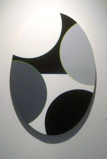
Aaron Parazette, Color Key 33, 2012, acrylic on linen, 15" x 22"

So the question is, how do the smaller paintings hold up against Flyaway? You have pieces like Color Key 33, with an even more restrained palette, where everything feels perfectly balanced in this perfect ellipse. This work is completely pleasant but not very exciting. The point that draws my eye and prevents it form being a work of dull perfection is the tangent pint in the upper right, where four lines converge at the edge of the canvas. They teach you not to do this in art school, and the way it pulls you in is why. It's the kind of rule-breaking you need to make this painting work.


Aaron Parazette, Color Key 36, 2012, acrylic on linen, 17" x 32"

Color Key 36 and Color Key 37 are interesting because they suggest three dimensions. They come across as orthographic projections and remind me a little bit of Al Held. And as with Al Held, there is a tension between viewing them as three-dimensional objects and a two-dimensional surface. The paintings don't allow you to make an easy choice between the two modes of seeing. It seems like an interesting departure for Parazette. But what I like most about them are the almost vibratory outlines of the various triangles and rectangles. The green shapes in Color Key 36 get a narrow orange outline, and the white shapes get a pinkish outline. The colors of the outlines shift as they are placed against larger areas of color (sky blue, black, white, yellow-green and a darker green). This shifting is what holds my attention here because even more than the ambiguously three-dimensional shapes, the shifting, vibrating outlines fail to resolve--and that is very interesting to look at. (Of course, these jpegs fail to do them justice.)


Aaron Parazette, Color Key 37, 2012, acrylic on linen, 20" x 15"

Each of these paintings has one further feature that helps to keep the viewer off balance--they aren't symmetrical. So despite a severely minimized number of visual elements, these Color Key paintings have tricky, unexpected elements. Looking at them is a little like listening to Thelonious Monk--they seem formal and austere but they repeatedly hit you with something unexpected.


Aaron Parazette, Color Key 34, 2012, acrylic on linen, 34" x 24"

This effect is especially pronounced with Color Key 34, which looks like it really wants to be a very well-balanced symmetrical composition. Parazette's imp of the perverse won't let the viewer off that easy. Again we have the narrow colorful outlines, which take on all the more significance in this otherwise grey-tone painting. And the arrangement of the partial circles on the canvas, which feels rational, in fact continually seeks to roll the whole thing to the right.

With deliberately limited means, Parazette plays little games with his viewers. The result is highly engaging and pleasurable. And I also want to recommend the catalog that the Art League published to accompany this exhibit. In it, we get to see a small sampling of earlier Parazette work. I was pretty much completely unfamiliar with anything before the "splash paintings" from the late 1990s and was therefore pretty surprised to see where this formalist game-player had come from. Suffice it to say, the game-playing has been there all along.

Share