Showing posts with label drawing. Show all posts

Monday, November 19, 2012

Sometimes a car is just a car (Not!)

Dean Liscum

Debra Barrera's Kissing in Cars, Driving Alone at Moody Gallery is the sexiest show that I've seen so far this year.

Bar none.

Yet there are no full frontal nudes, no orgiastic tangle of limbs, no burnished cocks or plush pussies rendered in photo realist detail on a monumental scale. It's just automobiles: paraphernalia, drawings, parts.

Jeff Koons would be very, very disappointed.

Let me explain what I mean by "sexy" because it's both a powerful word and also a very personal one that tends toward ambiguity. In other words, your "sexy", my "sexy", and Mitt Romney's "sexy" might not match up. (Although magic underwear may be the garment that binds our "sexy" together.) For me, "Sexy" is mental. It's a state of mind. It's an approach and an attitude that focuses on the minutiae to the point of obsession. And I'm not just talking about the physical details. I'm also referring to the symbolic, the psychological, the political, the social, and the metaphysical details that compose and converge into an art work.

If the devil is in the details, my version of "sexy" is the devil's devil.

Barrera's approach to the automobile--how she handles it, how she represents it--makes me swoon. And partly because cars are the perfect metaphor for life in the U.S. As a symbol they represent freedom, sex, and death, making an emotional connection as well as serving as a signifier. For I suspect, regardless of where you misspent your youth, chances are that you either had your first sense of adult autonomy or had your first sexual experience or your first encounter with death in an automobile. Or all three.

Barrera leverages that symbolism in her sensual and reverential treatment of cars. It's most obvious in her photographs of the personal detritus that she salvaged from wrecks. She collected personal belongings left behind in wrecked cars and beautifully photographed them in a way in which each subject becomes an objects d'art and also a visual, narrative poem: a clutch of red balloons, a rusting tiara, a molding precious bible. The 8" x 10" frames each contain an entire life's story. They invite you to imagine them.


Debra Barrera, Balloons, 2012, archival inkjet print, 8" x 10 5/8"


Debra Barrera, Precious Moments Bible, 2012,  archival inkjet print, 8" x 10 5/8"

The sensuality comes through in her drawings of cars. The detailed graphite renderings of the cars reminds me of fellow Moody Gallery artist Michael Bise. The suspension of the subject and the drawings lack of mundane contextual details suspend the subject and elevate it to an ideal, similar to the drawings of Robert Pruitt. Where as his stark presentation of his subjects force you to confront his blend of ethnic and social and political symbols and stereotypes, Barrera's sports cars read as an erotic ideal. Each one is a petite mort, distilled from time and space, complete and unending within the confines of the frame as if within an evening of making love. The timelessness is evident in Circuit (Mont-Tremblant) in which the cars eternally race toward a non-existent finish line, accelerator to the floor, engines screaming.


Debra Barrera, Circuit (Mont-Tremblant), 2012, graphite on paper, 20" x 28"

Two other pieces draw on the automobile's sex-death symbolism. In Skoda Favorit over Toroweap, a car has driven over a cliff and we are witnessing it moments before impact, wincing with anticipation of the power and pain on impact, a moment before completion, before climax.


Debra Barrera, Skoda Favorit over Toroweap, 2012, graphite on paper, 28" x 18"
 
The other drawing features the Lamborgini that Grace Kelly drove at the 1967 Grand Prix in Monaco. The reference to the sex symbol Grace Kelly adds to the pieces sexual allure but it is Barrera's masterful rendering of the Lamborgini, the 20th century sex symbol equivalent of Michelanglo's David, that delivers it. The allusion to death is included in the reference to Grace Kelly, who suffered a stroke and drove her car over a cliff. Such a beautiful princess. Such a sexy car. Such a romantic death.


Debra Barrera, Princess Grace Drives in Monaco, 2012, graphite on paper, 28 1/2" x 16 1/4"

The third aspect of the show is the parts. Here too, Barrera consistently handles her chosen objects with the same sensuality, the same loving care that an automobile enthusiast would exhibit or a gear head would give.


Debra Barrera, El Camino on Earth (Texas), 2012, 1972 Custom El Camino with 1993 Corvette engine

She does that with automotive enamel. In I'd rather have a Lamborghini than memories, Barerra lovingly lacquers a suitcase with the automotive equivalent of Yves Klein Blue. The piece's title is an acknowledgement of the instant gratification ethos of the American culture. The treatment of the piece of luggage is an extension ad absurdum of the concept. If you can't have the beautiful blue Lamborghini, then you can at least have its shiny metallic coat.


Debra Barrera, I'd rather have a Lamborghini than memories, 2012, suitcase, automotive spray paint (Gallardo Blue), various travel momentos of the artist including movie and airline tickets, museum guides, diamond bracelent, one love letter, and restaurant mints, 24" x 19" x 6"

In her most playful piece, Someday Looks So Good Right Now, she sexes up death, automotive style. She tricks out a walker by painting it with sparkling automotive paint and chroming out the cross bars. Death may be inevitable but you can stagger with some swagger toward it in all your gear head glory.


Debra Barrera, Someday Looks So Good Right Now II, 2012, medical walker, automotive enamel, leatherette, stainless steel, 36" x 19" x 6" 

Of course these subjects: the automobile, sex, death, and freedom are openly available to her (and female artists the worldwide, except may be Saudi Arabia) because of the women that push the boundaries. Barrera pays homage to one of those women, Dorothy Leavitt, a pioneer in female motor racing and independence.


Debra Barrera, For Dorothy Leavitt, 2012, 1986 Pontiac Firebird rearview mirror, automotive enamel, spotlight

In an age of the Lilly Ledbetter Fair Pay Act and binders of women, I imagine Barrera is subtly, symbolically asserting two things: 1) women (and their equality) may be closer than they appear and 2) once women (at least women like herself and Dorothy) have passed men, they won't be needing rear view mirrors ever again.

I don't care what your sexual preference is, that kind of confidence is dead sexy.

Share

Sunday, November 18, 2012

Trenton Doyle Hancock's Mirror

Robert Boyd


This was the invitation to Trenton Doyle Hancock's new show at James Cohan Gallery in New York. The lenticular card shows two images, one of the works in the show, As U Now Enliven a Test..., and a photo of the artist wearing glasses with drawn, bulging eyeballs on the lenses. This is a clue to the work. Hancock's subject is himself. It's quite a change from his earlier world-building project. This world, involving the human/vegetable hybrids called the "mounds" and the fallen ape-men known as "vegans," is delineated in great detail in his book, Me A Mound.

When you look at Hancock's work, it's obvious he is influenced by underground comics and art comics. But this influence is not just stylistic, but thematic. His early work involved taking a fairly odd (and indeed out-and-out silly) concept and building an entire world out of it with its own mythology, history, geography, etc. This is something that happens a lot with young alternative cartoonists. Sometimes they never progress beyond it--Dave Sim is a classic example of someone who took a jokey concept (a sword-wielding barbarian like Conan except he's an aardvark) and turning it into a career of sorts. The basic (and intentional) stupidity of the original concept his comic Cerebus was forgotten as it became a 25-year project. Chester Brown's serialized Ed the Happy Clown threatened to become something similarly overblown, but Brown nipped it in the bud. It wasn't the expressive vehicle that was going to see him through his 30s and 40s. Daniel Clowes must have had a similar revelation after spending several years drawing his jokey, amusing Lloyd Llewellyn comics followed by his deliciously creepy Like a Velvet Glove Cast in Iron. Clowes and Brown moved beyond these surreal sins of their youth into a kind of realism (loosely defined). Brown in particular started producing autobiographical stories.

This is not to say that their earlier work was bad. It's simply that it had an end-point. The one cartoonist who failed to realize this, Dave Sim, ended up creating a bizarre, cranky work that survives as an eccentric but occasionally brilliant artifact of comics instead of what he apparently wanted, a Gesamtkunstwerk that incorporated philosophy and religion and myth into its massive structure. Hancock might have ended up producing a body of art that was the equivalent of Cerebus if he had continued to elaborate on the mounds and vegans. Instead, he has followed the path of Chester Brown in a way, creating a body of work that is highly personal.


Trenton Doyle Hancock, The Irreducible Crucible, 2012, mixed media collage on canvas, 18" x 24"

Many works in the show are self-portraits--although with The Irreducible Crucible, one might night deduce that without Hancock writing "I AM TDH" on the piece itself. Hancock may be using himself as a subject, but he has not suddenly become a realist. His hyperactive style, full of surreal distortions, remains active in this new body of work.


Trenton Doyle Hancock, ...and then it All Came Back to Me, 2011, mixed media on paper, 9" x 8"


Trenton Doyle Hancock, As U Now Enliven a Test, 2012, acrylic mixed media on canvas, 24" x 24"


Trenton Doyle Hancock, If You're Too Fat, You Should Buy Clothes That Fit, 2012, acrylic mixed media on canvas, 14" x 11" x 3/4"

The bulging bloodshot eyes make me think these three portraits are of Hancock himself (if only because of the way he depicted himself on the lenticular invitation.) These two portraits depict a mouthless figure with bands of black and white fun on their faces. Or possibly the fur is a mask. The bulging eyes suggest surprise or awe. The black and white stripes could refer to a racial self-conception--particularly is you read them as details of a mask that the character is wearing. The images are arresting. The vigorous drawing reminds of Gary Panter, an artist Hancock has acknowledged as an influence.


Trenton Doyle Hancock, The Everlasting Arms, version #2, 2010, acrylic mixed media on canvas, 60 x 60"

The black/white theme is present in The Everlasting Arms as well. Certain motifs are repeated in many of the works. The combinations of black, white, grey and pink color schemes. Graphic raindrop shapes, red or pink, perhaps symbolic of blood. (The fact that the two arms are severed reinforces the blood interpretation. But the oozing sores with their black pus suggests the arms were removed as a prophylactic precaution instead of by violence. Whatever the reason for their removal, it is one disturbing image.)


Trenton Doyle Hancock, All Things Known and Nothing to Own, 2012, acrylic mixed media on canvas, 10" x 8" x 3/4"

All Things Known and Nothing to Own again brings us the black, white, grey and pink color scheme. The pink forms a kind of penumbra around the face, as in If You're Too Fat, You Should Buy Clothes That Fit and ...and then it All Came Back to Me. But All Things Known and Nothing to Own adds another pink feature, the figure's enormous lips. While Hancock's work owes a debt to ccomics and cartoons, this piece reminds us of the way African-Americans were often treated-visually and as characters--in comics strips and books in the past. This figure could be an aged "Ebony" from Will Eisner's The Spirit. But at the same time, it come across as yet another version of TDH himself.


Trenton Doyle Hancock, The Former and the Ladder or Ascension and a Clinchin', 2012, acrylic and mixed media on canvas, 84" x 132" x 3"


Trenton Doyle Hancock, The Former and the Ladder or Ascension and a Clinchin' detail, 2012, acrylic and mixed media on canvas, 84" x 132" x 3"

Maybe the mask in the other paintings hides a nothing--a headless TDH frantically setting up the ladder (to success?) as in The Former and the Ladder or Ascension and a Clinchin'. The totality of the work on display here displays an anxiety, a wide-eyed and stunned disbelief. Maybe Hancock is reacting to his astonishing success. He can't pretend to be blasé about it. This is an artist that draws apemen fucking mounds of earth, a grungy son of underground comics, now doing murals on Cowboys Stadium and opening at Chelsea galleries. I'd be a little a little freaked out, too.

Share

Monday, October 15, 2012

Mardi Gras and Flying Kites: Some Thoughts about Lynda Benglis (NSFW)

Virginia Billeaud Anderson

Among the numerous articles written about Lynda Benglis around the time of her 2011 New Museum retrospective was "Lynda Benglis: Still in Art’s Avant-Garde" published in the New York Times. In it Hilarie Sheets stated that Benglis continues to bring “a visceral quality to her experimentations with glass, video, metals, ceramics, gold leaf, paper and plastics.”

Now Sheets is a very important writer whose critical commentary I’ve admired for years, but if Benglis’ glass sculpture Tickfaw (2010) is one the experimentations upon which Sheets based her statement, I’m certain the critic did not understand the meaning of that work’s title. A New York writer can’t possibly know Tickfaw, Louisiana. Benglis’ titling of her glass piece after a secluded south Loos-iana swampy bayou constitutes mockery of art world grandiosity and a bit of fun in the face of collectors and critics.

Being ignorant of the fact that she could drive her boat to the Prop Stop’s wet T-shirt contest, and ride in Blood River Marina’s Mardi Gras boat parade would not have prevented Sheets from understanding that Tickfaw was saturated with allusions. The concentrated symbolism which defines Benglis’ art stretches back to Contraband (1969) in which acid trip colors irreverently affronted Serra and Ryman’s macho monochrome minimalist sculptures while alluding to oil-polluted bayous.


Lynda Benglis, Tickfaw, 2010, glass, pigment, mixed media, size unknown

Some of Benglis’ associations have been elusive. The bronze and polyurethane sculptures exhibited a couple of years back at Cheim & Read in New York were titled after Swinburne. The English writer Swinburne, critic Alfred MacAdam pointed out, had sadomasochistic tendencies, and these combined with his “astonishing delicacy,” MacAdam wrote, could be seen “as the intellectual and esthetic background of Benglis’s wall pieces, some of which vaguely suggest a female figure that had been burned and then preserved as a precious relic.” MacAdam found bronze surfaces reminiscent of rope, evoking bondage, another Swinburne connection, and breast-shaped polyurethane to constitute homage to fertility.

MacAdam would have been guided by Benglis’s explanation of the organic fluidity of her floor sculptures, which evoked "the depravity of the 'fallen' woman" or, from a feminist perspective, a "prone victim of phallic male desire".

Erotic preoccupations were more strait-forward in 2007 when the same gallery demonstrated affinities between Benglis’s globby wrinkled forms and the older Louise Bourgeois’ sexual sculptural forms. Both artists made penises in bronze.

As one would expect that 2007 exhibition displayed the famous 1974 Artforum ad image, which Benglis devised to address male domination of the early 70s art world. Benglis has said in interviews that much research and planning went into the ad’s construction. She probably could not have imagined the image would still be generating dialogue almost forty years later. "Sizing Up the Dildo: Lynda Benglis' Artforum Advertisement as a Feminist Icon" is one example of the sort of lofty exhortation it inspires.

Benglis also could not have anticipated New Museum retrospective curators writing that her “singular practice both intersected with and transcended the categories of post-Minimalism and feminist art.” Or that she would influence numerous younger artists such as Cindy Sherman and Matthew Barney.


Lynda Benglis, Artforum ad, 1974

Although I’ve seen the Artforum ad image many times, it still causes my mouth to fly open. The wrinkles and veins in that astounding prick are a primary stylistic element in Benglis’ art.


Lynda Benglis, The Graces, 2003-2005, Cast polyeurethane, lead, stainless steel, 103 x 26 x26

On September 7, Inman Gallery opened the exhibition Paper Space: Drawings by Sculptors (through October 29) which includes Benglis’ 1979 Untitled (#26). It’s easy to see how the drawing’s purple columnar form anticipates later sculptures such as the totemic biomorphic Graces, and looks ahead to the glass works. Wanting to know more about Benglis’ drawing I contacted Inman.


Lynda Benglis, Untitled (#26), 1979, collage on handmade paper, 26 x 33 inches

It turns out Inman Gallery took Benglis’ drawing on consignment from Texas Gallery for the drawing exhibition, so Texas Gallery kindly passed on a bit of insight. The pink “mask” form and the green and gold foil elements relate to the Mardi Gras Benglis saw in her Louisiana upbringing. Mardi Gras would have been inescapable when the artist studied at Newcomb. Benglis has spoken clearly about the impact of Mardi Gras on her aesthetic.

According to Texas Gallery the drawing also relates to Benglis’ Atlanta Airport commission titled Patang. And also to collages and works on paper in the 1979-1980 Patang series, which included thread, fabric and foil decorative objects.

Further, passages in the drawing relate to kites in India, which have faces and eyes as decorative elements. “Patang" is also the title of a recent movie about the largest kite festival in India, which takes place in Ahmedabad where Benglis lives part of the year with her husband Anand Serabai. Texas Gallery directed me to kite festival images.


Kite Festival - Ahmedabad India


Share

Tuesday, October 9, 2012

The Nostalgic Sublime: Eric Zimmerman at Art Palace

Robert Boyd

Before blogs there were zines. Before the iPod, there were mix-tapes. It's always struck me as weird that some of the signature aspects of the internet were anticipated in the years before the internet took over. In 1963, Xerox introduced the first desk-top photocopier. The first commercial cassette tape was introduced a year later. These two analog technology breakthroughs enabled new grassroots subcultures to emerge, stealthily, right at the moment when intellectuals were fretting over the loss of regional cultures to the unstoppable bulldozer of capitalist mass culture. Of course, zines predate 1963, and the underground trade in non-mainstream musics has been going on since the introduction of the 78 RPM record. But the cassette and the photocopier made this kind of thing much easier.

This is not only important as a part of our culture, it's personally important to me. I produced my first zines in 1976 (after having read a zine by some older kids at my school), and started making mixtapes almost as soon as I had a stereo to make them on. (I even made 8-track tape mixtapes because my first car had an 8-track player instead of a cassette player.)

My first zine, Superghost #1, predates Eric Zimmerman's birth by three years. By the time he reached adulthood, the great flowering of zines had ended (the golden age of zines could be defined as the period when Factsheet 5 was being published, 1982-1998). The death of the mixtape might be said to coincide with the founding of Napster in 1999. Zimmerman is a product of the internet age.


Eric Zimmerman, Endless (Disharmony), graphite on paper, 26 1/4" x 38 3/4"

So the show, Endless Disharmony & Telltale Ashes at Art Palace is for him an examination of the recent past, a period he partially lived through but probably didn't participate in in any meaningful way because he was too young. Endless (Disharmony) depicts a particular type of cassette tape. Instead of a tape with two distinct ends (which was typical), this one is a tape loop that would only hold a small amount of sound. (This kind of contraption became obsolete with the introduction of auto-reverse tape recorders, which turned all cassettes into endless tapeloops.)

What first intrigued me is that Zimmerman drew this. Aside from exhibiting his bravura drawing skills, what would his reason be for drawing a opened cassette instead of just photographing it? The process of drawing it in such a realistic, detailed way must have been painstaking. It seems tedious. ut perhaps it makes sense to employ such a method when depicting an obsolete object. The time he took creating it honors the cassette tape.


Eric Zimmerman, Endless (Horizon), graphite on paper, 26 1/4" x 39"

Endlessness is a theme running through the work here. How can a horizon be endless? It can't--by definition horizons are where the vidible part of the land ends and turns to sky. No horizon suggest no land--a void. Perhaps a void with the word "endless" superimposed.


Eric Zimmerman, Oblivion, zine, edition of 500, 8 1/2" x 5 1/2"

Zimmerman's zine Oblivion (hilariously described as a limited edition of 500--far higher than the average print run of the average zine) is a zine in the classic format--photocopied on 8 1/2 x 11 inch pages, folded, and saddle-stitched. The seeming randomness of the contents reflects a lot of zines. It has a highly idiosyncratic glossary. It has pages and illustrations that have to do with mountains and mountain-climbing but other photos that seem to have nothing to do with the rest.

The work doesn't easily open itself up to the viewer. My interpretation, that it deals with a kind of nostalgia for pre-digital era, is inherently flawed. I'm seeing the work through a personal lens. In the other zine in the show, Telltales Ashes, Zimmerman writes a rambling, disconnected essay. One sentence stands out for me: "Here we are looking for the modern sublime--nostalgia for something lost or not yet obtained--wandering through territory along a trajectory in a transitory state."

The sublime is a key. But I disagree that it is modern. The modern sublime would leave the word "ENDLESS" out of the picture. It would be just be the pitch black drawing. The void.  Adding a word--especially one so redundant and yet contradictory--makes this a postmodern exploration of the sublime. Zimmerman's use of such postmodern media as the zine and the mixtape (which he simulates with an iPod in the piece Grid - Old Coyote Calls - Void) place his search for the sublime purely in the realm of nostalgia and history. This work doesn't pretend to achieve some kind of ultimate state. Instead, it looks backwards and forwards at the same time.

Zimmerman's nostalgic quest for the sublime is visually best expressed in a series of collages called Fields. The images are formed from cut up photos from nature magazines. Zimmerman uses these fragments to create images of forest deeps, caves, chaotic vortices, etc.


Eric Zimmerman, Field No. 13, 2012, collage on paper, 8" x 7 1/2"


Eric Zimmerman, Field No. 1, 2012, collage on paper, 8" x 7 1/2"

And looking at these, one can't help but think of Casper David Freidrich, an early artistic seeker after the sublime in the Kantian sense. But unlike such contemporary seekers as, say, James Turrell or Olafur Eliasson, Zimmerman's quest for the sublime is without hope. He is too arch and ironic. He can't permit himself to be a "pure" seeker of the absolute. He knows how the magic is done. The work is a quest for the sublime and is about a quest for the sublime. This latter part undermines the former. But the work is more intelligent for containing this contradiction.


Share

Sunday, July 22, 2012

The Big Show: A Little Bit of Everything Else

Robert Boyd

While The Big Show 2012 had plenty of paintings and plenty of craft-based work, the reality is that, as usual, there was a hodgepodge of all kinds of artwork. To wrap up our coverage, I want to look at a few other pieces that caught my eye.


Patrick Renner, Sunburst, 2012, found painted wood and polyurethane, 18" x 24"

I was talking to Jim Nolan the other night at the opening of a show he curated, and he spoke of the show being about painting without painting. Sunburst by Patrick Renner falls into that ambiguous category. I guess Sunburst could be considered a collage, but what is interesting about it is that Renner achieves painterly effects without actually applying paint to anything. If he had simply painted those colors on a canvas, I don't think it would have been nearly as interesting. The weathered wood scraps not only come with interesting textures and patterns of wear, they come with history. All of this was something else before.


Edward Ramsay-Morin, Cutaway Portrait #4, 2012, inkjet paper on archival paper, 17" x 15"

Cutaway Portrait #4 by Edward Ramsay-Morin is a collage of the modern sort--images joined together electronically instead of cutting and pasting actual images. The two images both seem to come from the 60s--a man with slicked-back hair, a black suit, and a skinny tie; and a photo of Earth with the Moon in the foreground, perhaps shot by an Apollo spacecraft. The man's face has been cut-away to show this image of outer space. The cutaway edge is given shading to make it appear as if the man's face was, in fact, a thin shell. The image suggests the phrase "inner space," and given the vintage of the photographic elements, one is made to think of such 60s-era explorations of "inner space" through psychedelic drugs, through meditation, through religious and shamanic ritual, etc. This juxtaposition of the human-scale with the cosmic also reminds me of William Blake's "Auguries of Innocence":
To see a world in a grain of sand,
And a heaven in a wild flower,
Hold infinity in the palm of your hand,
And eternity in an hour.
Katie Wynne, Untitled (Satin), 2011, motorized tie-rack and satin, 4" x 60" x 40"

Another piece that juxtaposed two unlike things together was Katie Wynne's weirdly beautiful Untitled (Satin). An insect-like device wriggles its "legs" on a piece of satin, gradually balling it up. The device is actually a motorized tie-rack. (Question: who on earth needs a motorized tie rack? Just curious.) The shiny black carapace and legs give this piece a decidedly creepy presence, while the blue satin radiates the appearance of luxury. The motion is hypnotic. I assume that from time to time, the tie-rack must be turned off and the satin flattened out. This is a kinetic sculpture, but it requires human intervention. What I loved was that it has a strong effect with a minimum of elements.


Tommy Gregory, Power & Priorities, 2011, cast resin, 20" x 16"

The first three pieces mentioned in this post were essentially made of found objects--old wood, repurposed images, a piece of cloth and a motorized manufactured item. When I looked at Power & Priorities by Tommy Gregory, I thought that this, too had been assembled out of found objects. But strangely enough, Gregory went through the trouble to cast the light switched and power sockets with resin. That seems like an unnecessary extra step. Still, the piece works. It may be the oldest trick in the conceptual playbook, but there is something about taking a thing that we are used to seeing in isolation and grouping it with many similar or identical things that works, as Tara Donovan has proven many times.


John Adelman, Esdras (Duelist), 2012, gel ink on paper mounted on wood panel, 30" x 48"

Similarly, John Adelman's piece Esdras (Duelist) is created using a repetitive process. He may be writing words out from the dictionary with his gel pens. Whatever the source of the words, his technique for writing them renders them illegible. They become texture and value instead of words. By using a very precise process or algorithm to create the piece, it becomes something that in theory, anyone could execute by duplicating his process, like a Sol Lewitt wall drawing. But it is extremely unlikely that anyone would voluntarily duplicate the obsessive routine Adelman used to create this piece.


Kassandra Bergman, Always, 2011, glitter and cardboard, 32" x 25"

The few pieces I've seen by Kassandra Bergman, including another one in this show called My St. Mark's Place, have been photographic. But I haven't see enough of her work to know if Always is an idiosyncratic work for Bergman. I can't precisely say why this piece appealed to me. It combines elements that are optimistic and glamorous--the glitter, the word "always"--with elements that seem mundane and boring--the nondescript sans-serif font, the minimal design. The glittery center with its promise of eternity is surrounded by a flat plane of white, a non-space, a nothingness. It makes one question the value of "always." It's like two people pledging eternal love without taking into account the daily sameness a marriage can become. (Maybe that's what I'm seeing--a reason to be thankful I'm single.)

In the end, Marco Antonini's Big Show was not unlike the others--a combination of pieces designed to appeal to the eye, pieces that demonstrated mastery, and pieces that were conceptually interesting--sometimes all in a single work. But I commend him for increasing the breadth of the show in terms of the types of work displayed while exercising his curatorial prerogative to brutally edit the show.  I hope future curators follow his lead.


Share


Monday, June 25, 2012

Aroused: A Closer Look at Mark Williams’ Untitled 2012

Virginia Billeaud Anderson

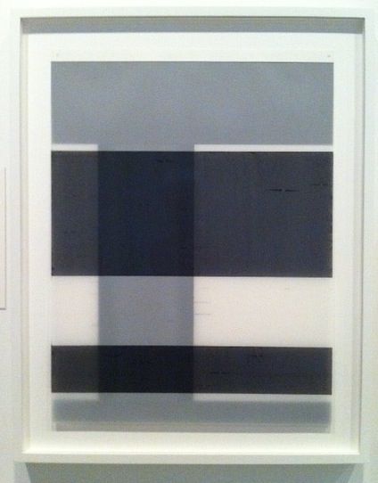
Not long after the gurus at ARTnews defined his paint application as “mechanical,” Mark Williams offers a restless geometric abstraction with ambiguous blurred elements that veer into gestural. You have to stand before Untitled, 2012 at Wade Wilson Art to see its vitality, this work’s uneven paint, enhancing imperfections and overall translucence are not visible in a reproduction.

The shift from controlled and programmatic to somewhat disordered made me want to ask questions so I contacted Williams. He made Untitled he said by painting oil on polypropylene with a silkscreen squeegee. First he created a grid by placing vertical and horizontal strips of tape on glass. In constructing this preliminary “design” or template, applying and removing tape, he worked intuitively. The grid’s resulting imperfections compel him to call it “a broken grid.” He then painted the sheet of plastic as it lay above the grid, and here was also improvisational, applying paint as messy and liberated as he pleased.

Untitled, 2012
Mark Williams, Untitled, 2012, Oil on polypropylene, 40" x 52"

When I met Williams he used tape more precisely. To create Untitled, 2011, painted layers of frosted mylar for the Synthetic Supports: Plastic is the New Paper exhibition at the Museum of Fine Arts, he used tape to design the painted areas. We discussed the fact that tape had a different role for the Wade Wilson piece. “It is true,” he said. “I have eliminated the use of tape as a masking element. Now tape has a new function, it becomes a template.”

The 2011 show at MFAH thematically focused on the use of polymer by contemporary artists such as Williams, and in it he showed that layers of painted plastic assumed weird depth and refraction. For that show Curator Rebecca Dunham also pulled from MFAH’s permanent collection, so we got to see art by some of the biggies, such as two drawings by Jasper Johns who pioneered the technique of ink on plastic. “I’m hanging next to a Man Ray,” Lucinda Cobley who was also in the show told me, “it can’t get better than that.”

Untitled, 2011
Mark Williams, Untitled, 2011, Paint on stacked layers of mylar in the exhibition Synthetic Supports: Plastic is the New Paper

Williams did not begin experimenting with plastic until 2010, so ARTnews could not have known of looser brushstrokes to come. In his article Christopher French described Williams’ use of tape to paint large monochrome geometric forms on canvas and correctly noted busy-ness from opposing geometrics and “uncertainty” at the forms’ edges, by which he meant expressive irregularities at the tape-defined borders, as in the painting Choice. The critic went on to write, “If the main forms broadcast a straightforward geometry, his marginalia add the sort of pathos associated with Robert Motherwell’s paintings,” and that is a lovely thing to say about a painter.

Choices, 2006
Mark Williams, Choice, 2006, Acrylic on canvas, 40” x 60”

Ink drawings from 2007 and 2008 indicate a certain delight in imprecise forms and serve as forewarning of gestural strokes on plastic. These works on paper are elegantly ill-defined. He recently displayed drawings in a solo exhibition at the Galerie Schlegl in Zurich.

Untitled #9, 2008
Mark Williams, Untitled #9, 2008, Ink on paper drawing, 12” x 9”

Summing up his thoughts about Untitled, 2012 at Wade Wilson, Williams said, “it is the result of my ongoing interest in structure (the grid) and gesture (the paint).” But he appears to be aroused by the paint.

Williams and I had booze together (research) so I know a little about him. For years he has worked as an art installer at MoMA. Now try to imagine having your hands, literally, on that art, installing the de Kooning show, the Cindy Sherman, moving works in and out for light and temperature control. How can that not overwhelmingly impact his output?

So who does he look at? “As I move through the museum certain works do catch my eye,” he said. “Some favorite artists are: Robert Mangold, Brice Marden, Anne Truitt, Donald Judd, Robert Ryman, Mark Rothko, Dan Flavin and Blinky Palermo.” Ryman is included in the Impressions show at Wade Wilson Art through July 7.


Share


Tuesday, March 27, 2012

The Scroll


So I'm getting ready for bed this past Friday night, and I'm describing to my wife a piece of art I had seen earlier that day. I began by telling her how this guy has been working on this drawing for seven years, and she immediately quips "so it speaks to you", followed by a bit of laughter as she rolled over. She's absolutely right of course; it totally does. Consider this less of a review and more of an open love letter to Randall McCabe's scroll.


Randall McCabe, untitled, ink on paper with spindles, 6.5" x 1800" (840" visible), 2005-2012 (ongoing)

The piece (officially untitled) is currently on display at Lawndale Art Center in the Project Space, the easily overlooked exhibition space tucked between the residency studios and the administration offices on the third floor. I had gone to Lawndale to check out The Photographic Mirror, a group show curated by my friend Chuy Benitez, and also take in Emily Peacock's and Linda Post & Jim Nolan's exhibitions (which Robert Boyd has already written about here and here, respectively). Yet it was McCabe's work that completely blindsided me in the best possible way.

Randall McCabe, untitled, ink on paper with spindles, 6.5" x 1800" (840" visible), 2005-2012 (ongoing)

The primary work of the exhibition – the scroll itself – wraps around approximately three quarters of the total wall space in the gallery. Thus, we're confronted with approximately 70 continuous feet of a singular drawing. Granted, the drawing is only 6 1/2 inches tall, but that thin strip wrapping around the room is commanding nonetheless. In reading the accompanying text, it is revealed that the drawing is actually 150 feet in length, yet we are only privy to this one portion. The remainder of the drawing is rolled up and concealed on two mounted spindles at either end.

The mark-making on the scroll, which is comprised mostly of short hatching lines in limited directions, immediately made me think of the work of both Sol LeWitt and Man Bartlett. I thought of LeWitt and his wall pieces because McCabe seems to be following some prescribed set of mark-making rules for this piece. Although the composition of the scroll changes as it transitions from one end of the room to the other, the underlying marks remain consistent over that span, where horizontal, vertical, and 45º diagonal lines are arranged into roughly half-inch square modules. Moreover, there's a simplicity and looseness in the appearance of the line work, which suggests that these are marks that could be made by almost anyone (trained draftsman or not).


Randall McCabe, untitled (detail), ink on paper with spindles, 6.5" x 1800" (840" visible), 2005-2012 (ongoing)

Given its full length of 150 feet, the drawing has clearly taken a long time and has required immense dedication. Those qualities, paired with the use of small, repetitive marks, makes me think of Bartlett's circle drawings and point pieces. [Full disclosure: Bartlett has exhibited his point pieces and other works at Skydive Art Space, where I am a co-director. His work remains fresh in my mind.] Yet while Bartlett's drawings are more clinical and precise in execution, McCabe's scroll features a variety of tones, shapes, and blemishes. Another significant distinction is that both Bartlett's and LeWitt's pieces have an endgame; that is, they reach a point of completion. This drawing, however, is ongoing. It's 150 feet...and counting.

Started in 2005, McCabe has been working on the scroll for the past seven years. The section presented in the gallery accounts for (approximately) the year between late 2008 to late 2009. I can guess this because McCabe occasionally writes a date along the bottom of the drawing, and I assume these dates are related to when that section was worked on or completed. The time-stamps begin to suggest that this scroll is more than a durational drawing; it is a record, a document. It gets even more personal in a couple of spots where the numeric date is accompanied by an event in the artist's life, as shown below.


Randall McCabe, untitled (detail), ink on paper with spindles, 6.5" x 1800" (840" visible), 2005-2012 (ongoing)

I wonder how often these personal notes are included over the entire length, and why. Has the scroll become something more than the train-of-thought exercise described in the McCabe's statement? Do such noted life events correspond or inform the drawing's composition, or are they just simply notes, detached from the surrounding marks?

The composition does shift across the room, ranging from cloud-like white spaces in the earliest segment, to completely shaded areas over the middle, and finally to landscape-esque contours towards the end. Around the time of the home burglary in 2009, the "landscape" tightens, and the white space of the drawing begins to be pinched by dark forms above and below it. A thin scratch of white leads us into the concluding spindle, where the last couple of years of the drawing reside, hidden safely away.

Randall McCabe, untitled (detail), ink on paper with spindles, 6.5" x 1800" (840" visible), 2005-2012 (ongoing)

So of course, I now really want to see what I can't. How greedy is that? The artist himself says he has never seen more than 7 continuous feet of the drawing at any one time. Here he's giving us 70, but I'd love for a peek at all 150. The thickness of the rolled up portions on either end are evidence to the large amount of drawing left unrevealed. This only prompts more delicious questions: Why was this segment specifically chosen? Was it random? What do the most recent sections look like? The earlier ones? What other life events are recorded here? Is there any engineering feat possible that could allow a viewer to – for lack of a better word – scroll through the entire composition? But I digress. (The installation of the piece as it is, by the way, is quite nice, particularly in bending the drawing around the corners of the room.)

So, yes, my wife was indeed correct. The scroll speaks to me, and it continues to bounce around my head in the days since I saw it. I am happy that McCabe decided to share his drawing – and its great unveiling – with the rest of us.


Share

Saturday, March 17, 2012

Death-Haunted Houston: Dianne David, Toni Beauchamp, Mark Aguhar

by Robert Boyd

I apologize to all readers about how much death there has been on this blog lately. With Moebius, Dale Yarger, Ken Price, Charlie Stagg and Mike Kelley, it's been a parade of obituaries around here. With Dale, I've been lucky to be in contact with so many other people who loved him. I never knew Charlie Stagg, but since he died, I've heard so many good stories about the man that I really wish I had.

Unfortunately, Death didn't head down to Padre for Spring Break. Dianne David, Toni Beauchamp and Mark Aguhar all died recently. You might not be familiar with all three of these names, but each one is a person who had an affect on Houston's art, and each represents a different generation.


Dianne David Gallery
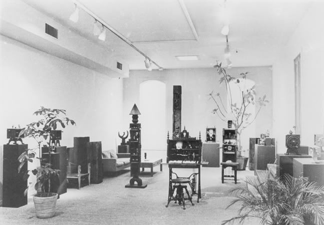
The Dianne David Gallery with a Roy Fridge show from 1966

Dianne David (1938 or 39 to 2012) was the founder of an early modern gallery in Houston, David Gallery. The David Gallery existed from 1963 until 1982 and gave the first Houston shows to a wide range of artists, including Dorman David (her brother), Bob Camblin, Lucas Johnson, Earl Staley, Roy Fridge, Jim Love, David McManaway, Charles Pebworth, Donald Roller Wilson, William T. Wiley, Larry Rivers, Seymour Leichmann, and Guy Johnson. And that's about all I know about it (and her). But this is enough. These are some of the most important artists to emerge in Houston during the 60s and 70s. Gallerists who show local artists are important--they are gatekeepers and taste-makers. Starting a gallery that shows contemporary cutting-edge art by Houston artists is never a sure thing, and in 1963 it must have seemed an extremely risky enterprise indeed. Thank goodness Dianne David did it.

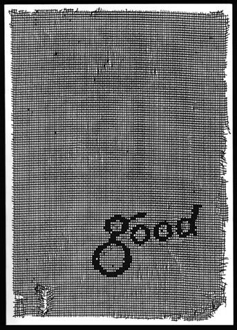
Good
Good, an anthology of writings about Houston edited by Toni Beauchamp

Toni Beauchamp (1945 to 2012) had a definable effect on Houston and its art, but it's hard to put one label on her. Glasstire called her a "patron," but she was much more than that. Even though she and Dianne David were born less than 10 years apart, David started her gallery young (she was 24 or 25) while Beauchamp waited a long time to make her mark. That's why I count them as belonging to different generations. David was a pioneer. Beauchamp's work built on the work of pioneers. For example, her MA thesis was about James Johnson Sweeney, the director of the Museum of Fine Arts in Houston in the 60s, who brought the museum into the modern age. This kind of local art history continued in many of the publications she worked on for the Blaffer, where she was an assistant director. She was instrumental in bringing modern public art to Houston, and served on the boards of many key local arts institutions. And she edited one of the best books about Houston, Good. When she died, she was working on a similar book about Marfa, which is on schedule to be published.

Transy Girlriend
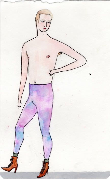
Mark Aguhar, Transy Girlfriend Looks (Colin S.), watercolor, ink, gouache & lipstick on paper, 2011

 Mark Aguhar (1987 to 2012) was a young artist whose work I had seen only once, at Lawndale in a solo exhibit called M2M in early 2011. I didn't write about that show because its theme of gay male sexuality was something I couldn't relate to. I felt like anything I wrote would lack insight, to say the least. Aguhar was from Houston and studied art at UT. When she died, she was getting her MFA at the University of Illinois. Aguhar, like many artists of her generation, had a large presence online. Aside from her professional web page where you can see her many drawings and sculptures, she had a blog, Blogging for Brown Gurls. Its subtitle was "I'm starting a new blog and it's all about self-acceptance." It's terrible when someone so young dies--and when it's an artist, we are left wondering what kind of work lay in his future that will now never be made.

Days like this make you feel like death is stalking Houston. Drink a toast tonight to David, Beauchamp and Aguhar, OK?


Share