I'm over the hump on these
Brooklyn Comics and Graphics Festival reviews. If you've been reading all these, thanks! And for my usual readers who are looking for reviews of Houston area visual art, I haven't forgotten you! I'll have more reviews of art shows soon.
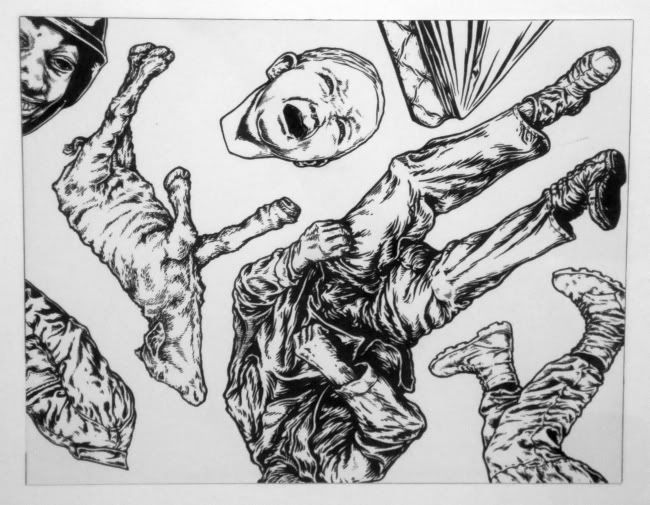
 Noah Lyon, Retard Riot #24 cover, 2008
This is the smallest mini I got (4.5 x 2.5 inches, 16 pages). I picked it up because I liked the bleak hopeless cover. With a name like Retard Riot, one figures
Noah Lyon is a punk cartoonist who values shock value highly. Think of Johnny Ryan, for example.
 Noah Lyon, Retard Riot #24 pp. 8-9, 2008
He lacks Ryan's demented irony, though. This comic strikes me as unrelentingly dark, black humor with an extra helping of grim.
 Jordan Crane, Smoke Signal #7 cover, December 2010
Smoke Signal
 is quarterly tabloid published by
Desert Island Comics. (Here's a tangential Desert Island Comics story I heard last night, by the way. I was talking to a guy who used to live in that neighborhood. Now you may recall that Desert Island is located where a bakery used to be. They kept part of the old sign.
My friend used to go to that bakery frequently, but one day he was walking down that street--which is very busy--and saw that someone had been hit by a truck in front of it. It was the owner of the bakery. He recalled the horror of seeing her shoe in the road. I wonder how long after that did Desert Island take over the space? Did the bakery shut down because of her death? It seems like almost like a parable of gentrification. Old super-practical neighborhood business, owner dies, artsy hipster business takes its place.)
So anyway,
Smoke Signal. It's a thick anthology where artists have one or two huge tabloid pages to work with. That said, lots of what is here are obviously just parts of longer stories, some which seem to be serialized in
Smoke Signal, some I'm not sure of. So it can be a bit of a frustrating reading experience.
 Tim Lane, detail from Belligerent Piano, 2010
One artist who used the large tabloid pages very effectively was
Tim Lane. This image is just a small part of the page--the whole page has 37 tiny panels of unremitting psychological torture. At first, as I read it, I thought it was too much. OK, I get it--dude with the gun is a sadist and his victim is scared shitless. But the gunman's dialogue just keeps going, referencing Horishima and the Holocaust as examples of when guiltless people die. It's so intense that it ends up having a powerful cumulative effect. This effect is amplified by the constant change in perspective--looking up, looking down, looking up, looking down, etc.
 Tim Hensley, Psycho & Vertigo, 2010
Tim Hensley
 does the back cover, a series of "Little Lulu"-like episodes from the life of Alfred Hitchcock. They're excellent little bits of minimalism. This approach is a surprisingly good way to paint a portrait of a real historical figure.
 Sammy Harkham, Crickets #3 cover, 2010
Crickets
 #3 by
Sammy Harkham was one of the big deals of the show. Apparently it was meant to be published by Drawn & Quarterly, but ended being self-published. Why?
I don't exactly know. A review in
Comics Comics mentions that in this issue, Harkham took a serious turn for a more literary style of comic making. Harkham is known as a splendid cartoonist but is perhaps best known for editing
Kramers Ergot, which was really the most important "art comics" anthology. It really pushed forward the concept of non-literary comics. So
Crickets #3 is kind of a dramatic switch.
It works, though. The first story, "The New Yorker Story" is about a man trying to write a story for
The New Yorker. Ironically, the story itself could be a
New Yorker story, and I mean that in the best way possible. It's a perfect little short story.
 Sammy Harkham, "Blood of the Virgin" p. 28, 2010
The second story, "Blood of the Virgin", is set in the late 60s. Seymour is a film editor for Roger Corman-style B-movie studio. The story loops around his personal life and his life as part of this commercial enterprise, and it's an interesting, complex story. One aspect, which comes out on this page and elsewhere, is Seymour's disdain for (if not
ressentiment of) anything arty, whether it be French films or even some of the work of his coworkers. This is something that's going to have echoes for lots of people working in creative fields. The mainstream comics worker who sniffs at the pretensions of art comics, or the comics creator of any stripe who resents the art world with its incomprehensible artwork and superior attitude. The examples are plentiful. And Seymour is contrasted in this regard to his colleague Oswald, who also turns out to be a professional rival.
 John Mejias, Paping: The Teachers Edition, 2007
John Mejias
John Mejias, Paping: The Teachers Edition, 2007
John Mejias'
Paping: The Teachers Edition is a collection of stories about being a K-8 art teacher that were published in his minicomic
Paping. Mejias taught in the Bronx and on Long Island. The stunning cover is probably the best part of this collection--the interior suffers from some indifferent production (bits of panels get cut off, for example) and extremely episodic story-telling--appropriate for minicomics, but less so for a large, integrated work.
That said, there is a lot to like here. When cartoonists do autobiographical work or realistic fiction, we often see a lot of lifestyles of the poor and hipsterish. People don't have jobs or they work as artists for a living. One ends up with a lot of comics about doing comics or other highly introspective works. This is not necessarily bad--see Gabrielle Bell's
Diary, which is the next comic I'm reviewing--it's just that one hungers to see some
other part of the world. Mejias' work is about himself, but it's also about his students and fellow teachers and the whole educational system.
 John Mejias, The Teacher's Edition p. 7 (detail), 2007
Early on, you get a lot of bitterness about the weird world of New York City teaching. (The next chapter is called "No Good Deed Goes Unpunished.") And the insane explanations given for whitewashing Mejias's murals are certainly enough to make someone bitter. But fortunately, the rest of the book isn't like this. It's more observational, and while he deals a lot with his own state of mind, he gradually lets other characters take center stage--certain students, some colleagues, etc. Eventually, he brings in other voices, illustrating a story by fellow teacher Jody Buckles, and printing a story by Shawn Cheng about being a student in Taiwan and in New York. And Mejias incorporates some of the work of his students into his comics as in this story, where one of his colleagues, school psychologist Dr. "Doc" Adams, has died suddenly of a heart attack.
 John Mejias, The Teacher's Edition p. 42 (detail), 2007
 John Mejias, The Teacher's Edition p. 43 (detail), 2007
I loved this. I like the idea of incorporating student work into one's own work. I guess you have to be careful that you aren't exploiting them. In this case, Mejia was mourning his close friend, and his student managed to produce something highly moving that spoke to Mejia's own grief.
 Gabrielle Bell, Diary cover, 2010
This is the second
Gabrielle Bell reviewed in this spasm of reviews.
Diary is drastically different from
All My Dreams Come True. Diary is autobiographical and told with dense, wordy panels.
 Gabrielle Bell, Diary p. 5, 2010
And as you would expect in a diary, Bell doesn't try to give you a big picture. These comics are relentlessly focused on what is happening to her, which could be deadly. But Bell is funny and self-deprecating, which makes them work.
 Gabrielle Bell, Diary p. 18, 2010
This story, about Bell's attempt to adopt
The S.C.U.M. Manifesto by
Valerie Solanis, seems to be entirely fictional (although it's hard to tell). It's a story about over-promising, and hilariously builds a matryoshka doll of falsehoods--which doesn't even really unravel when she finally "comes clean" at the end.
Bell was selling original art at her table. I was struck by how tiny her originals were. In addition to selling finished pages, she was also selling individual panels. These were panels that she drew but ended up changing in the finished works. I bought one from the Valerie Solanis story.
 Gabrielle Bell, untitled, 2010
If you compare this panel to the one that got printed, the only difference I can find is that Bell's mouth is open in the printed version and closed here. By the way, the size of this original panel is 2.75 inches square.
