Today I report on I Shock Myself, a memoir by American ceramicist Beatrice Wood. I'm primarily interested in her for her early friendship with Marcel Duchamp and other early dadaists who made their way to New York during the World War I.
Showing posts with label Marcel Duchamp. Show all posts
Showing posts with label Marcel Duchamp. Show all posts
Saturday, September 18, 2021
Book Report: I Shock Myself by Beatrice Wood
Labels:
Beatrice Wood,
Marcel Duchamp
Thursday, August 27, 2020
Robert Boyd's Book Reports: 3 New York Dadas + The Blind Man
by Robert Boyd
I decided to start using my free time (being an unemployed guy whose job was ended by COVID) creatively. I've been reading a lot, so I decided I would record brief reports of books as I read them. This is my first attempt (which I think will be obvious when you watch it). The book being discussed is 3 New York Dadas + The Blind Man.
Labels:
Marcel Duchamp
Tuesday, March 8, 2016
Art's Greatest Whoremonger
Robert Boyd
William N. Copley is the subject of a major retrospective the Menil Museum called William N. Copley: The World According to CPLY curated by Toby Kamps.
In Linda Nochlin's classic essay "Why Have There Been No Great Women Artists?", she also asked "Why have their been no great artists from the aristocracy?" Obviously the relationship of the aristocracy to art is strong--the aristocracy were the primary patrons of art for a good portion of human history (and in some circles remain so today), but for a variety of reasons, they haven't been the makers of art. And why not? They would be blessed with the time and wealth necessary to support such a career if they chose to pursue it. But she concludes that there are certain social situations--economic, familial, in terms of academic support--that mitigated against this, just as they mitigated against women art practitioners. She points out that there is no inherent reason why an aristocrat can't be a great artist any more than there is that a woman can't be--to claim otherwise would be to say that the spark of genius never occurs in aristocrats or women.
William Copley was an aristocrat in the American sense. He and his brother were adopted by the Copley family and raised to be heirs to this utilities/newspaper fortune. His adoptive father had made a fortune in utilities in Illinois (and served as a U.S. Congressman). Ira Copley and his wife Edith had tried unsuccessfully to have children; three died in infancy before 1910. So they adopted James Copley then William Copley shortly thereafter. The family moved to San Diego when William was about 10 years old where Ira Copley bought San Diego's two leading newspapers, the Tribune and the Union, and merged them into one powerhouse. For readers under 40, it may be hard to imagine just how important newspapers were in the 20th century. I think they were the most important mass medium of the century, more important than film or television or radio. They had real power, and their owners were among the most powerful people in the U.S.A.
Copley was at Yale when Pearl Harbor was attacked by the Japanese. He was drafted early and served in North Africa and Italy. Ira Copley died shortly after the war and left his two sons equal shares of the Copley Newspaper business. The idea was that both men would run the newspapers, but they had a falling out over politics. William was left-wing while James (like his father) was a staunch Republican. William sued James in the mid-50s to force him to buy him out of his partnership. (James's papers would subsequently be a major force in California Republican politics, and James Copley was one of Richard Nixon's major backers.)
Copley had gotten interested in Surrealism in the late 40s and met Man Ray, who was living in Los Angeles, in 1947. Copley eventually met all the major surrealist artists and built up an extensive personal collection of their work. In this regard, he was fulfilling his socially accepted role as an aristocrat, being a patron of the arts. But in 1947, he started painting. He got encouragement from his surrealist friends.

William N. Copley, Portrait of Marcel, 1951, oil on canvas, 44.8 x 37.1 cm
Copley's 1951 portrait of Marcel Duchamp is highly atypical of his work. Most of his figures have a minimal amount of detail and the faces are often completely blank. Copley's focus on Duchamp's wrinkly face marks this to my mind as a highly personal work. Perhaps Copley wanted to get it right as a tribute to an important mentor. According to Copley, Duchamp encouraged his painting. Copley called Duchamp, "My best friend." On painting, Copley wrote of Duchamp,

William N. Copley, Tomb of the Unknown Whore, 1965, Acrylic on canvas, 190 × 285 cm
A review by Richard Flood of a solo show at Phyllis Kind Gallery in Artforum astutely observed, "It's not hard to understand Copley's neglect at the hand of American curators--the work is simply too naughty, a quality not sought after by public trusts . . . Naughty art in America has always been a private affair, something best appreciated over brandy in air redolent of cigar smoke." New Museum founder Marcia Tucker was one of Copley's greatest champions (Copley was included in her important group show, "Bad" Painting, in 1978--a show that signaled the return of figurative painting as a respectable activity). In 1986, she put on an exhibit by Copley called "The Tomb of the Unknown Whore." More of an installation than an exhibit of pictures, visitors were encouraged to leave graffiti (in chalk) on the walls. Perhaps Richard Flood would not have been surprised by some of the comments in the guestbook: "misogyny disguised as art" and "garbage," among others.
It surprises me a little that I haven't heard similar rumblings abut this current show. Copley spent a lifetime objectifying women. His paintings were often ribald and erotic. He grew up in all-male boarding schools, so a painting like Capella Sextina may have represented the ultimate adolescent fantasy for a young man in that environment.

William N. Copley, Capella Sextina, 1961, oil on canvas, 162 x 130 cm
But in one important way, these naked ladies are not particularly erotic. Copley's drawing skills were pretty limited at best. He couldn't really manage a naturalistic drawing. The figures in his work seem more like cartoons--flat colors with solid outlines, simplified figures and not much detail (often faces are completely left off). Curator Dan Nadel included Copley in his exhibit What Nerve!, which was dedicated to a tradition of "alternative figuration" in American art. It might well have been called "cartoon figuration". This has been an undercurrent in American art for at least a hundred years.

William N. Copley, On the Beach (A La Mer), 1962, oil on canvas, 116.2 x 88.9
Why is "cartoon figuration" important, lingering as it does just below art historical notice? I have a theory: it has to do with the ubiquity of comics. Not comic books--they were ubiquitous in the 1940s but fell off dramatically in the 50s and 60s--but comic strips. Above I spoke of the popularity of newspapers in the 20th century. They were a mass medium that reached just about everyone, and one of the most important, popular features of newspapers were comic strips. During Copley's boyhood in the 1920s and 30s, he surely saw comics like Popeye, the Gumps and other comic strips that featured simplified humorous figures. If there is a cartoonist I would reference in relation to Copley, it would be James Thurber. Thurber contributed cartoons to the New Yorker from 1930 through the 50s.

James Thurber, cartoon from the New Yorker, 1936
When I see Copley's somewhat shapeless figures, I see Thurber at the same time. However, this may be a case of "each writer creates his precursors", as Borges wrote in his essay "Kafka and His Precursors." As far as I know, Thurber had no influence whatsoever on Copley. And as we can see in On the Beach (above), Copley uses formal devices derived from comics that Thurber avoided (word balloons, for example).

William N. Copley, Mack n Madge, 1962, oil on canvas, 161.6 x 76.2 cm
Mack n Madge is a remarkable example of cartoon figuration. It is designed like a typical Sunday comics page from the 1930s, where the story takes up an entire page. The word balloons curiously are blank--they serve the purpose of representing the idea that dialogue is happening as we would expect on a comic strip. There is a kind of love triangle--Madge (the always-nude blonde) and Mack are hounded and stalked by the policeman. The figure of Mack, an everyman wearing a suit and bowler hat, shows up over and over in Copley's paintings. He kind of represents an eternal John. The pair are hounded into suicide by the cop (who seems to haunt their graves after death). Perhaps Copley was thinking of Krazy Kat, which had a similar triangle. But in Krazy Kat, Ignatz hates Krazy (and is continually hitting her in the head with a brick) while Mack loves Madge. The flat, simplified colors also suggest a relationship to Sunday comic strips.

William N. Copley, Harem (recto), 1958, oil on canvas, 186.7 x 190.5 cm
This hinged screen, Harem, is the first work you see at the Menil when you walk into the exhibit. Again we have the anonymous bowler hatted man, who may remind one of the similar figure from so many Magritte paintings. And a room full of naked blonde women engaging in exercise. If this kind of thing offends you, you probably should stay far away from this exhibit. It's works like this that inspired the title of this post. I don't know if Copley was really a whoremonger, but brothels, streetwalkers, prostitutes and sexually available women are some of his favorite subjects for painting.
The catalog for the exhibit is excellent (if quite expensive). Copley was never one for grand art theories, and the essays here are blessedly free of theorizing. Toby Kamps writes a brief biographical essay, Jonathan Griffin writes about Copley as a patron of artists, Paul B. Franklin writes about his long relationship with Duchamp, and Gwen L. Allen (author of one of my favorite books on art, Artists' Magazines: An Alternative Space for Art) writes about Copley's quixotic publishing experiment in the 1960s, SMS. SMS were a series of portfolios that included work of artists that interested Copley. For an artist who seemed somewhat impervious to current trends of his time in terms of his own work, SMS was a bit surprising. You wouldn't expect Copley to respond to heavily theorized art like conceptualism or Fluxus. Allen writes,
Copley had a gallery for about a year in the late 40s where he showed art by the surrealists. His standard deal was to guarantee them 10% regardless of how many pieces were sold. Because he sold almost none of the pieces, he ended up with a nice-sized collection of surrealist art. He continued to collect for the rest of life and built up a great collection of surrealist and contemporary art. (He said he thought all artists should collect art, a sentiment I agree with.) Because of financial reversals, he was forced to auction off much of his collection in 1979. Seven of these works ended up purchased by the Menils, including a Magritte and a Jean Tinguely which are on display in the entryway as you walk into the Menil from the North. The Menil also owns a large number of Copleys. Copley and the Menils clearly shared many interests.
After seeing and enjoying this exhibit, I'm still not sure what I think about Copley. Was he an aristocrat who willed himself into becoming a great artist? So much of his work seems risible (and he explicitly loved humor in art), and the clumsiness of his drawing is unappealing to me. But many of the works have memorable visual appeal. Maybe they would be most enjoyable, as Richard Flood suggested, in a room full of cigar smoke and booze.
William N. Copley: The World According to CPLY is on display at the Menil Museum until July 24, 2016.
William N. Copley is the subject of a major retrospective the Menil Museum called William N. Copley: The World According to CPLY curated by Toby Kamps.
In Linda Nochlin's classic essay "Why Have There Been No Great Women Artists?",
William Copley was an aristocrat in the American sense. He and his brother were adopted by the Copley family and raised to be heirs to this utilities/newspaper fortune. His adoptive father had made a fortune in utilities in Illinois (and served as a U.S. Congressman). Ira Copley and his wife Edith had tried unsuccessfully to have children; three died in infancy before 1910. So they adopted James Copley then William Copley shortly thereafter. The family moved to San Diego when William was about 10 years old where Ira Copley bought San Diego's two leading newspapers, the Tribune and the Union, and merged them into one powerhouse. For readers under 40, it may be hard to imagine just how important newspapers were in the 20th century. I think they were the most important mass medium of the century, more important than film or television or radio. They had real power, and their owners were among the most powerful people in the U.S.A.
Copley was at Yale when Pearl Harbor was attacked by the Japanese. He was drafted early and served in North Africa and Italy. Ira Copley died shortly after the war and left his two sons equal shares of the Copley Newspaper business. The idea was that both men would run the newspapers, but they had a falling out over politics. William was left-wing while James (like his father) was a staunch Republican. William sued James in the mid-50s to force him to buy him out of his partnership. (James's papers would subsequently be a major force in California Republican politics, and James Copley was one of Richard Nixon's major backers.)
Copley had gotten interested in Surrealism in the late 40s and met Man Ray, who was living in Los Angeles, in 1947. Copley eventually met all the major surrealist artists and built up an extensive personal collection of their work. In this regard, he was fulfilling his socially accepted role as an aristocrat, being a patron of the arts. But in 1947, he started painting. He got encouragement from his surrealist friends.

William N. Copley, Portrait of Marcel, 1951, oil on canvas, 44.8 x 37.1 cm
Copley's 1951 portrait of Marcel Duchamp is highly atypical of his work. Most of his figures have a minimal amount of detail and the faces are often completely blank. Copley's focus on Duchamp's wrinkly face marks this to my mind as a highly personal work. Perhaps Copley wanted to get it right as a tribute to an important mentor. According to Copley, Duchamp encouraged his painting. Copley called Duchamp, "My best friend." On painting, Copley wrote of Duchamp,
He taught me all I needed to know about painting; that painting was a thing to do. ... When I finally had an opportunity to show him what I did, he told me only that I should continue. That was enough to dedicate me to work.From their meeting in the late 40s until Duchamp's death in 1968, Copley financed many of Duchamp's activities--a monograph and a catalogue raissoné, a new edition of the Box in a Valise, a reconstruction of The Large Glass (by English artist Richard Hamilton), and Copley bought Étant donnés: 1° la chute d'eau, 2° le gaz d'éclairage . . . (which Duchamp showed to him in 1966) for $60,000 ($438,000 in 2016 dollars) on the condition that he give it to the Philadelphia Museum of Art. Duchamp had been working on it in secret since the 1940s. That work demonstrates a connection between the overt eroticism of much of Copley oeuvre and Duchamp's own eroticism. In fact, Duchamp composed a dirty poem about his friend:
There was a painter named Copley(Written in 1963). Nude women and prostitutes were eternal subjects for Copley. He liked to paint them naked or in sexy lingerie. He was married 6 times. A work he returned to on two different occasions in his life was a monument to the "unknown whore." (Which he painted first in 1965 and returned to in the mid-80s.)
who would never miss a good lay
and to make his paintings erotic
instead of brushes, he simply used his prick

William N. Copley, Tomb of the Unknown Whore, 1965, Acrylic on canvas, 190 × 285 cm
A review by Richard Flood of a solo show at Phyllis Kind Gallery in Artforum astutely observed, "It's not hard to understand Copley's neglect at the hand of American curators--the work is simply too naughty, a quality not sought after by public trusts . . . Naughty art in America has always been a private affair, something best appreciated over brandy in air redolent of cigar smoke." New Museum founder Marcia Tucker was one of Copley's greatest champions (Copley was included in her important group show, "Bad" Painting, in 1978--a show that signaled the return of figurative painting as a respectable activity). In 1986, she put on an exhibit by Copley called "The Tomb of the Unknown Whore." More of an installation than an exhibit of pictures, visitors were encouraged to leave graffiti (in chalk) on the walls. Perhaps Richard Flood would not have been surprised by some of the comments in the guestbook: "misogyny disguised as art" and "garbage," among others.
It surprises me a little that I haven't heard similar rumblings abut this current show. Copley spent a lifetime objectifying women. His paintings were often ribald and erotic. He grew up in all-male boarding schools, so a painting like Capella Sextina may have represented the ultimate adolescent fantasy for a young man in that environment.

William N. Copley, Capella Sextina, 1961, oil on canvas, 162 x 130 cm
But in one important way, these naked ladies are not particularly erotic. Copley's drawing skills were pretty limited at best. He couldn't really manage a naturalistic drawing. The figures in his work seem more like cartoons--flat colors with solid outlines, simplified figures and not much detail (often faces are completely left off). Curator Dan Nadel included Copley in his exhibit What Nerve!, which was dedicated to a tradition of "alternative figuration" in American art. It might well have been called "cartoon figuration". This has been an undercurrent in American art for at least a hundred years.

William N. Copley, On the Beach (A La Mer), 1962, oil on canvas, 116.2 x 88.9
Why is "cartoon figuration" important, lingering as it does just below art historical notice? I have a theory: it has to do with the ubiquity of comics. Not comic books--they were ubiquitous in the 1940s but fell off dramatically in the 50s and 60s--but comic strips. Above I spoke of the popularity of newspapers in the 20th century. They were a mass medium that reached just about everyone, and one of the most important, popular features of newspapers were comic strips. During Copley's boyhood in the 1920s and 30s, he surely saw comics like Popeye, the Gumps and other comic strips that featured simplified humorous figures. If there is a cartoonist I would reference in relation to Copley, it would be James Thurber. Thurber contributed cartoons to the New Yorker from 1930 through the 50s.

James Thurber, cartoon from the New Yorker, 1936
When I see Copley's somewhat shapeless figures, I see Thurber at the same time. However, this may be a case of "each writer creates his precursors", as Borges wrote in his essay "Kafka and His Precursors." As far as I know, Thurber had no influence whatsoever on Copley. And as we can see in On the Beach (above), Copley uses formal devices derived from comics that Thurber avoided (word balloons, for example).

William N. Copley, Mack n Madge, 1962, oil on canvas, 161.6 x 76.2 cm
Mack n Madge is a remarkable example of cartoon figuration. It is designed like a typical Sunday comics page from the 1930s, where the story takes up an entire page. The word balloons curiously are blank--they serve the purpose of representing the idea that dialogue is happening as we would expect on a comic strip. There is a kind of love triangle--Madge (the always-nude blonde) and Mack are hounded and stalked by the policeman. The figure of Mack, an everyman wearing a suit and bowler hat, shows up over and over in Copley's paintings. He kind of represents an eternal John. The pair are hounded into suicide by the cop (who seems to haunt their graves after death). Perhaps Copley was thinking of Krazy Kat, which had a similar triangle. But in Krazy Kat, Ignatz hates Krazy (and is continually hitting her in the head with a brick) while Mack loves Madge. The flat, simplified colors also suggest a relationship to Sunday comic strips.

William N. Copley, Harem (recto), 1958, oil on canvas, 186.7 x 190.5 cm
This hinged screen, Harem, is the first work you see at the Menil when you walk into the exhibit. Again we have the anonymous bowler hatted man, who may remind one of the similar figure from so many Magritte paintings. And a room full of naked blonde women engaging in exercise. If this kind of thing offends you, you probably should stay far away from this exhibit. It's works like this that inspired the title of this post. I don't know if Copley was really a whoremonger, but brothels, streetwalkers, prostitutes and sexually available women are some of his favorite subjects for painting.
The catalog
And yet SMS suggests otherwise: that he was in fact deeply engaged with many of the most advanced artistic practices of the 1960s, including Pop Art, Nouveau Réalisme, Fluxus, Mail Art, Earth Art, and Conceptual Art, as well as avant-garde music, poetry and performance.SMS by selling relatively inexpensive editions of art was meant to be an alternative to collecting art through galleries. The exhibit has several issues of SMS on display in vitrines. Individual issues of SMS are prized collectibles now.
Copley had a gallery for about a year in the late 40s where he showed art by the surrealists. His standard deal was to guarantee them 10% regardless of how many pieces were sold. Because he sold almost none of the pieces, he ended up with a nice-sized collection of surrealist art. He continued to collect for the rest of life and built up a great collection of surrealist and contemporary art. (He said he thought all artists should collect art, a sentiment I agree with.) Because of financial reversals, he was forced to auction off much of his collection in 1979. Seven of these works ended up purchased by the Menils, including a Magritte and a Jean Tinguely which are on display in the entryway as you walk into the Menil from the North. The Menil also owns a large number of Copleys. Copley and the Menils clearly shared many interests.
After seeing and enjoying this exhibit, I'm still not sure what I think about Copley. Was he an aristocrat who willed himself into becoming a great artist? So much of his work seems risible (and he explicitly loved humor in art), and the clumsiness of his drawing is unappealing to me. But many of the works have memorable visual appeal. Maybe they would be most enjoyable, as Richard Flood suggested, in a room full of cigar smoke and booze.
William N. Copley: The World According to CPLY is on display at the Menil Museum until July 24, 2016.
Labels:
James Thurber,
Marcel Duchamp,
Marcia Tucker,
William Copley
Wednesday, April 17, 2013
Chain Chain Chain
Robert Boyd
(Originally published on Glasstire.)

Katie Wynne, A chain of non-events, 2013, mixed-media installation
Katie Wynne's A chain of non-events at Lawndale is an installation of various bits of crap semi-connected to one another. I don't say crap in a pejorative way. I use it in the way that Karen Archey did--in identifying a genre of art she called "combining crap with crap." The term both opens up a lineage stretching back to Duchamp's assisted readymades to Robert Rauschenberg's Combines and Gluts to Jessica Stockholder's painted bits of crap and consumer products. It is Stockholder's work that A chain of non-events reminds me of most, but in general it can be seen as part of a tradition that is now 100 years old (Duchamp's first assisted readymade Bicycle Wheel was originally made in 1913).

Katie Wynne, A chain of non-events, 2013, mixed-media installation
When you walk into the Project Space at Lawndale, the work is stretched out more-or-less in an arc around you. The elements are not all physically connected, but there does seem to be an intent for viewers to follow from one to another. So starting from the left, we have a floor-element that consists of a rectangular wooden central part with two large rectangular end pieces. The end pieces are designed to hold a pair of oscillating fans so that the face up. The fans are on and blowing, but their wind is blocked by a nimbus of brightly colored scarves on each fan. I suspect that the fans were meant to blow the scarves more than I observed here, but perhaps there were too many scarves on each fan. In any case, they did puff up a bit due to the blowing air.
I liked the wooden structure which was simultaneously absurd and purposeful. But the scarves were too discordant a visual element. The colors in any given scarf were acceptable (if a bit loud), but all of them combined created a chromatic cacophony that detracted from the solid homemade virtues of the wooden fan-holder.

Katie Wynne, A chain of non-events, 2013, mixed-media installation
Continuing to our right, there is another wooden structure, this one bolted to the wall. It has painted pieces of fabric and cardboard hanging from it on strings. The paint is a light blue-green and orange--a very pastel, slightly Southern Californian color scheme. The painting reminded me of Jessica Stockholder and the cardboard reminded me of Robert Rauschenberg. It is significant that the cardboard is ripped, not cut. It gives the piece more of a junkpile feeling, less deliberate than a Stockholder assemblage.

Katie Wynne, A chain of non-events, 2013, mixed-media installation
This section in the corner is the busiest. In the left of the picture above, Wynne has mounted a shoeshining machine to the wall, where it spins hypnotically. Cheap motorized household machines appear to be important parts of the Wynne work I've seen (she contributed an extremely simple, elegant piece to The Big Show last year that consisted of a motorized tie-rack and a rectangle of blue satin cloth. Her use of these devices recalls Jean Tinguely's art. Tinguely was another master of crap on crap, gleefully scouring junkyards for old motors and debris with which he built his kinetic sculptures.

Katie Wynne, A chain of non-events, 2013, mixed-media installation
Wynne reprises the use of shiny satin-ish cloth in the drawer assembly. The gold cloth hangs over the edge of the open drawer. Underneath is another oscillating fan, covered with a single scarf. A paintbrush sticks up from the back of the fan into a slot in the drawer, where it swings back and forth.

Katie Wynne, A chain of non-events, 2013, mixed-media installation
The drawer is lined with the gold cloth which is covered with a thin layer of dirt. The curved slot for the brush is lined with gold cloth, so it almost looks like a smile peeking through the dirt. It's cleverly wrought and in a way reflects her earlier untitled piece in the Big Show, but it feels like too much is happening here. I don't see how the elements belong together, why there is dirt and satin here. The stuff on top of the table--string, yarn, tape, torn bits of painted cardboard--feel more unified than the seemingly more carefully planned and constructed drawer element.

Katie Wynne, A chain of non-events, 2013, mixed-media installation
There is another wall-mounted wood structure which leads the viewer to a more-or-less freestanding structure made of stool parts (?), painted cardboard and other crap.

Katie Wynne, A chain of non-events, 2013, mixed-media installation
While the rest of A chain of non-events sprawls wildly, this one keeps it all close in. It looks like it wants to explode and fling its crap wide, but it's not ready. This made me think of The Rape of the Sabine Women (1574-82) by Giambologna. This sculpture is identified as being an immediate precursor to the baroque and to Bellini's extravagant creations. The overt emotionalism and dynamism seem baroque, but the way Giambolgna keeps it all tightly contained in a narrow cylinder of space marks it as still a Renaissance sculpture.

Katie Wynne, A chain of non-events, 2013, mixed-media installation
Wynne could have taken the bits of crap she used in this object and spread them across the floor or up the wall. But like Giambolgna, she constrains it.
The problem with A chain of non-events is that while there are interesting passages here and there, it fails to cohere. The elements are too independent, but many of them don't stand up on their own as individual works. But the virtues are an interesting use of materials, color, and space. And it helps to see this as work in line with a long tradition. Overall, it reminded me a bit of Rauschenberg's The 1/4 Mile or 2 Furlong Piece. This is another large piece (very large) that consists of many individual elements. The elements don't really come together, though. Perhaps that is in the nature of "crap on crap." Because of the disparate origins and natures of the materials, extra effort must be paid to giving them a sense of unity. The element that works the best for me in Wynne's installation is the stool piece--it feels the most like a single autonomous piece of work. With its human-sized volume and excellent colors, it's my favorite "non-event" of A chain of non-events.

(Originally published on Glasstire.)

Katie Wynne, A chain of non-events, 2013, mixed-media installation
Katie Wynne's A chain of non-events at Lawndale is an installation of various bits of crap semi-connected to one another. I don't say crap in a pejorative way. I use it in the way that Karen Archey did--in identifying a genre of art she called "combining crap with crap." The term both opens up a lineage stretching back to Duchamp's assisted readymades to Robert Rauschenberg's Combines and Gluts to Jessica Stockholder's painted bits of crap and consumer products. It is Stockholder's work that A chain of non-events reminds me of most, but in general it can be seen as part of a tradition that is now 100 years old (Duchamp's first assisted readymade Bicycle Wheel was originally made in 1913).

Katie Wynne, A chain of non-events, 2013, mixed-media installation
When you walk into the Project Space at Lawndale, the work is stretched out more-or-less in an arc around you. The elements are not all physically connected, but there does seem to be an intent for viewers to follow from one to another. So starting from the left, we have a floor-element that consists of a rectangular wooden central part with two large rectangular end pieces. The end pieces are designed to hold a pair of oscillating fans so that the face up. The fans are on and blowing, but their wind is blocked by a nimbus of brightly colored scarves on each fan. I suspect that the fans were meant to blow the scarves more than I observed here, but perhaps there were too many scarves on each fan. In any case, they did puff up a bit due to the blowing air.
I liked the wooden structure which was simultaneously absurd and purposeful. But the scarves were too discordant a visual element. The colors in any given scarf were acceptable (if a bit loud), but all of them combined created a chromatic cacophony that detracted from the solid homemade virtues of the wooden fan-holder.

Katie Wynne, A chain of non-events, 2013, mixed-media installation
Continuing to our right, there is another wooden structure, this one bolted to the wall. It has painted pieces of fabric and cardboard hanging from it on strings. The paint is a light blue-green and orange--a very pastel, slightly Southern Californian color scheme. The painting reminded me of Jessica Stockholder and the cardboard reminded me of Robert Rauschenberg. It is significant that the cardboard is ripped, not cut. It gives the piece more of a junkpile feeling, less deliberate than a Stockholder assemblage.

Katie Wynne, A chain of non-events, 2013, mixed-media installation
This section in the corner is the busiest. In the left of the picture above, Wynne has mounted a shoeshining machine to the wall, where it spins hypnotically. Cheap motorized household machines appear to be important parts of the Wynne work I've seen (she contributed an extremely simple, elegant piece to The Big Show last year that consisted of a motorized tie-rack and a rectangle of blue satin cloth. Her use of these devices recalls Jean Tinguely's art. Tinguely was another master of crap on crap, gleefully scouring junkyards for old motors and debris with which he built his kinetic sculptures.

Katie Wynne, A chain of non-events, 2013, mixed-media installation
Wynne reprises the use of shiny satin-ish cloth in the drawer assembly. The gold cloth hangs over the edge of the open drawer. Underneath is another oscillating fan, covered with a single scarf. A paintbrush sticks up from the back of the fan into a slot in the drawer, where it swings back and forth.

Katie Wynne, A chain of non-events, 2013, mixed-media installation
The drawer is lined with the gold cloth which is covered with a thin layer of dirt. The curved slot for the brush is lined with gold cloth, so it almost looks like a smile peeking through the dirt. It's cleverly wrought and in a way reflects her earlier untitled piece in the Big Show, but it feels like too much is happening here. I don't see how the elements belong together, why there is dirt and satin here. The stuff on top of the table--string, yarn, tape, torn bits of painted cardboard--feel more unified than the seemingly more carefully planned and constructed drawer element.

Katie Wynne, A chain of non-events, 2013, mixed-media installation
There is another wall-mounted wood structure which leads the viewer to a more-or-less freestanding structure made of stool parts (?), painted cardboard and other crap.

Katie Wynne, A chain of non-events, 2013, mixed-media installation
While the rest of A chain of non-events sprawls wildly, this one keeps it all close in. It looks like it wants to explode and fling its crap wide, but it's not ready. This made me think of The Rape of the Sabine Women (1574-82) by Giambologna. This sculpture is identified as being an immediate precursor to the baroque and to Bellini's extravagant creations. The overt emotionalism and dynamism seem baroque, but the way Giambolgna keeps it all tightly contained in a narrow cylinder of space marks it as still a Renaissance sculpture.

Katie Wynne, A chain of non-events, 2013, mixed-media installation
Wynne could have taken the bits of crap she used in this object and spread them across the floor or up the wall. But like Giambolgna, she constrains it.
The problem with A chain of non-events is that while there are interesting passages here and there, it fails to cohere. The elements are too independent, but many of them don't stand up on their own as individual works. But the virtues are an interesting use of materials, color, and space. And it helps to see this as work in line with a long tradition. Overall, it reminded me a bit of Rauschenberg's The 1/4 Mile or 2 Furlong Piece. This is another large piece (very large) that consists of many individual elements. The elements don't really come together, though. Perhaps that is in the nature of "crap on crap." Because of the disparate origins and natures of the materials, extra effort must be paid to giving them a sense of unity. The element that works the best for me in Wynne's installation is the stool piece--it feels the most like a single autonomous piece of work. With its human-sized volume and excellent colors, it's my favorite "non-event" of A chain of non-events.
Thursday, July 28, 2011
Slightly Used Links
by Robert Boyd
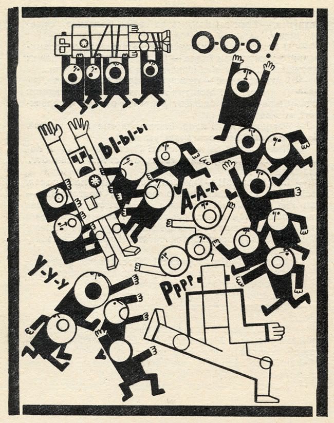
illustration from Hands Up! or Enemy no. 1 by Rifkat Shayfutdinovich Bagautdinov, 1971
Hands up! I love these illustrations by Rifkat Shayfutdinovich Bagautdinov from a 1971 Soviet YA novel, Hands Up! or Enemy no. 1. (50 Watts)
What's up with museum guards? Theodore Bale is a local critic who is unfortunately not nearly as prolific as I personally would like. I liked this piece on the Stan VanDerBeek and Charles LeDray shows (at the CAMH and MFAH respectively). I agree with him strongly about the staging of the LeDray exhibit (as I wrote earlier this year), but what I like best were his interactions with the guards, including one who told him "not to point at [the] object." (Texas, a Concept)
The Wall Street Journal's art coverage sucks. That's the short version of this piece by Ben Davis. Some zingers: "You have to at least try to connect with the art of the present if you want people making art in the present to care about what you are saying. Taken as a whole package, the WSJ gives off the impression of being a paper that understands why people might buy contemporary art — just not why people might like it." And the conclusion: "Of all of the outrages within Rupert Murdoch's far-flung empire, letting the Wall Street Journal's art pages slide into irrelevance because it chimes with a sort of conservative worldview is probably a relatively minor one. But, you know, it is still one of them." ("How Conservative Ideology Stunted the Wall Street Journal's Art Coverage" by Ben Davis, ArtInfo)
I thought only comic book artists got treated this bad. Have you ever heard of DegreeArt.com? They are "an innovative company selling, commissioning and renting the finest artwork created by the students and recent graduates emerging from the most prestigious art establishments," (according to their website). They aim their services at art students and recent graduates (i.e., hungry suckers). I became aware of them after reading this post. They have some of the harshest terms I have ever read:

a Mondrian-inspired hat by Philip Colbert
Women should not dress as urinals, probably. Many of the clothes designed by Philip Colbert are knock-offs of famous art. Including a dress based on Fountain by Marcel Duchamp. The Mondrian hat is nice, though. (The Rodrik Band)
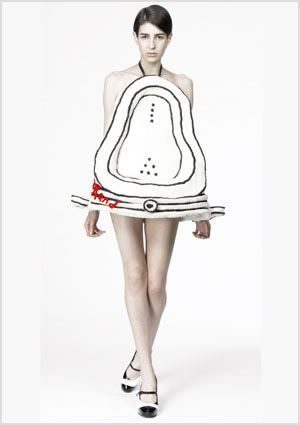
Fountain dress by Philip Colbert
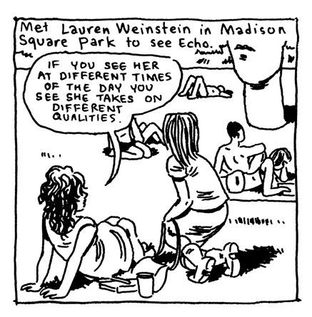
Gabrielle Bell, panel from her 26th Daily Comic, 2011
Making me feel bad for thinking that Jaume Plensa's sculptures were kitschy. I really hate those Jaume Plensa "Tolerance" dudes over on Allen Parkway, and I'm not alone. I'll admit that Echo in Madison Square Park in New York is slightly less obnoxious, but still. But there is always another side of the story! (Lucky by Gabrielle Bell)


illustration from Hands Up! or Enemy no. 1 by Rifkat Shayfutdinovich Bagautdinov, 1971
Hands up! I love these illustrations by Rifkat Shayfutdinovich Bagautdinov from a 1971 Soviet YA novel, Hands Up! or Enemy no. 1. (50 Watts)
What's up with museum guards? Theodore Bale is a local critic who is unfortunately not nearly as prolific as I personally would like. I liked this piece on the Stan VanDerBeek and Charles LeDray shows (at the CAMH and MFAH respectively). I agree with him strongly about the staging of the LeDray exhibit (as I wrote earlier this year), but what I like best were his interactions with the guards, including one who told him "not to point at [the] object." (Texas, a Concept)
The Wall Street Journal's art coverage sucks. That's the short version of this piece by Ben Davis. Some zingers: "You have to at least try to connect with the art of the present if you want people making art in the present to care about what you are saying. Taken as a whole package, the WSJ gives off the impression of being a paper that understands why people might buy contemporary art — just not why people might like it." And the conclusion: "Of all of the outrages within Rupert Murdoch's far-flung empire, letting the Wall Street Journal's art pages slide into irrelevance because it chimes with a sort of conservative worldview is probably a relatively minor one. But, you know, it is still one of them." ("How Conservative Ideology Stunted the Wall Street Journal's Art Coverage" by Ben Davis, ArtInfo)
I thought only comic book artists got treated this bad. Have you ever heard of DegreeArt.com? They are "an innovative company selling, commissioning and renting the finest artwork created by the students and recent graduates emerging from the most prestigious art establishments," (according to their website). They aim their services at art students and recent graduates (i.e., hungry suckers). I became aware of them after reading this post. They have some of the harshest terms I have ever read:
By submitting any material to us, you automatically grant DegreeArt.com the royalty-free, perpetual, exclusive right and license to use, reproduce, modify, edit, adapt, publish, translate, create derivative works from, distribute, perform and display such material (in whole or part) worldwide and/or to incorporate it in other works in any form, media, or technology now known or later developed. You also acknowledge that DegreeArt.com is not obliged to publish any material submitted by you on any DegreeArt.com publication.Jeez, that is actually worse than the work-for-hire terms that Jack Kirby and other comics artists slaved under for decades at Marvel and DC. Art students--never agree to any terms like this, ever. (Cathedral of Shit)

a Mondrian-inspired hat by Philip Colbert
Women should not dress as urinals, probably. Many of the clothes designed by Philip Colbert are knock-offs of famous art. Including a dress based on Fountain by Marcel Duchamp. The Mondrian hat is nice, though. (The Rodrik Band)

Fountain dress by Philip Colbert

Gabrielle Bell, panel from her 26th Daily Comic, 2011
Making me feel bad for thinking that Jaume Plensa's sculptures were kitschy. I really hate those Jaume Plensa "Tolerance" dudes over on Allen Parkway, and I'm not alone. I'll admit that Echo in Madison Square Park in New York is slightly less obnoxious, but still. But there is always another side of the story! (Lucky by Gabrielle Bell)
Subscribe to:
Posts (Atom)


