Showing posts with label Chris Day. Show all posts

Monday, December 20, 2010

Comics I Got in Brooklyn, part 6

Robert Boyd


 Chris Day, Second Contact cover, 2009

I got two books of a series by Chis Day.  Missing the first book, Marginal Ecstasy, and the third, Moribund '74, one might get a bit lost trying to make sense of them. But these aren't designed for making sense--they are yet more of those fuzzy-area publications. Is they comics or artist's books or both? Second Contact has an introduction that implies that it is a comic in the sense that it appears to be part of a story. The introduction reads:
This book contains images of, from, pertaining to the statue realm. A half reality. Our reality was burned. Few arrived here. In this realm things may change in an instant or never at all. What is flesh may soon be stone.
But the pages that follow don't tell any kind of comprehensible story. Instead, you get images like this:


 Chris Day, Second Contact page 8, 2009


Chris Day, Calf: Scenes From a Marginal Reality cover, 2010

This is the fourth book of the series. Both of the ones I picked up featured silkscreened covers on colored cardstock with photocopied b&w interiors. You can't quite see it in the scanned versions, but Day has carefully chosen a red carstock and a blue silkscreen ink that are almost the same value, which gives it a psychedelic, vibratory look.


Chris Day, Calf: Scenes From a Marginal Reality p. 12, 2010

Some of Day's imagery, like this one, reminds me a lot of Houston poster artist Give Up. The dark imagery and the high-contrast drawings/photos recall Give Up's posters. It has kind of a heavy metal vibe to it.


Lisa Hanawalt, I Want You #2 cover, 2010

Lisa Hanawalt is one of the most interesting artists that I discovered at this show. She's someone whose name I had read but just never read until now. I'm glad I did. Her art and comics combine absurdity, surrealism, disgust, and humor. A lot of her pieces remind me of classic 70s National Lampoon in the way that they combine a kind of gnarly obsession with bodily functions (and with bodies in general) with a dry, absurdist tone.


Lisa Hanawalt, I Want You "How to Flatter a Person" page 3, 2010

The fact that these pieces often feature numbered lists also recalls the Lampoon. This is a kind of humor that I don't see too much in comics today because cartoonists are often stuck on the idea of presenting a narrative. But formally, there is no reason that a comic can't be a list of things. Lists are especially good for humor, and they are also really good for magazines (where you have multiple short features). And that is what Hanawalt is doing with I Want You. It can be described as a one-artist anthology, but I think a better way to think of it would be a one-artist magazine. It's what Dan Clowes used to do with Eightball (and he even included lists, like "I Hate You Deeply"). Pete Bagge's Neat Stuff was structured this way, as well.


Lisa Hanawalt, I Want You "Extra Egg Room" page 4, 2010

But all her pieces are not straightforward humor pieces. Occasionally she dives right into out-and-out surrealism as in "Extra Egg Room." These bizarre stories (usually starring either He-Horse or She-Moose) also have their own absurd humor, but the real charge is the completely strange drawings.


Adam Higton, Yule Bringer cover, 2010

Adam Higton's booklet Yule Bringer is not a comic but a series of drawings. A bunch of jolly, cartoony figures inhabiting a dense dark woodland, they remind me a bit of Moomin. Moomin combined with prog rock. I found some photos of Higton online, and he looks perfect.


Adam Higton, Yule Bringer pages 13-14, 2010

His drawings are lovely and magical and fun, perfect for a cold winter's night, listening to The Piper at the Gates of Dawn or Jethro Tull on the headphones.


Tin Can Forest, Baba Yaga and the Wolf cover, 2010

The team of Tin Can Forest (Marek Colek and Pat Shewchuk) produced Baba Yaga and the Wolf, which is absolutely one of the most beautiful things I saw at the Brooklyn Festival. Based on Slavic folklore, it has a story of sorts about a man who beheads his brother and exchanges bodies in order to wed the girl he desires. However, he didn't realize that his brother was a werewolf. When he falls ill from guilt, his wife seeks Baba Yaga, the legendary witch, to cure him. Telling the story this way makes it seem much more straightforward than it actually is. It is being told to a young girl by her great-grandmother. The narration, however, is likely to come out of anyone's mouth (as indicated by the word balloons).


Tin Can Forest, Baba Yaga and the Wolf page 5, 2010


Tin Can Forest, Baba Yaga and the Wolf page 12, 2010

For example, the word balloon here is still the great grandmother speaking, even though it seems to be spoken by this utterly irrelevant demon sitting by a camp fire. These little dislocations add to a fantastic, magical quality. It seems that after a long period of realism as an ideal for alternative comics, we're seeing a return of fantasy--with a particular emphasis on folklore and fairy tales. (I wonder if cartoonists are influenced at all by Kiki Smith in this regard?)

Appropriately, I end my reviews of the comics in my Koyama bag with a great one from Koyama. But I still have some graphic novels from the festival to review, so stay tuned.

Saturday, December 11, 2010

Comics I Got in Brooklyn, part 1

Robert Boyd

Looking online at various "con reports" about the Brooklyn Comics and Graphics Festival, one thing that amused me was that some attendees would take everything they bought, spread it out on the floor, and take a photo. It was funny, but at the same time, I get it--"Look at my haul!"

I didn't want to do that, but I thought I might do something similar. So what I am going to do is a series of short reviews of everything I bought in Brooklyn. And so I don't overwhelm you readers, I will be doing it in bunches of no more than four or five reviews per post. This is the first.


Pat Aulisio, Abstracted Comics (cover)

Pat Aulisio is an art student at The University of the Arts in Philadelphia. (Update: Aulisio tells me he graduated two years ago!) His other comics seem fairly straightforward. This one, though, is not. What he has done here is taken drawings and comics, scanned them, made the linework a single, non-black color, and then layered them on top of each other. Sometimes the layers are opaque, obscuring the layers below, sometimes they are transparent. In any case, it leads to a visual cacophony. If you look hard, you can pick out the "comics" aspect from the noise.


Paul Aulisio, Abstracted Comics pages 8 & 9

So there is a reason he uses the word "abstracted" instead of "abstract." He is more-or-less starting from a non-abstract space and deriving an abstraction from it. His abstract comics pages are not designs that have a sense of space to them in the way that a painting by, say, Franz Kline does. Nor are they geometric or minimal. They cover the who surface--the page--with an all-over composition. The booklet is only 12 pages long. Within it is tucked a smaller booklet in black and white. It is more comprehensible as a comic--it has arranged panels--but the contents of the panels are more abstract than the ones in the color booklet.

Overall, this is a nice little project. Lovely to look at, interesting to think about. If I were Aulisio's art professor, I'd give him an A.

Compared to Aulisio, Paul Pope is an old-timer. He's always been a prolific artist with a quick, elegant drawing style. I haven't followed his work for a long time, but he was definitely an important artist. While his drawing style was rooted in American and European comics, he was a pioneer in bringing Japanese storytelling techniques to American comics. In particular, his comic THB stretched the narrative of its relatively straightforward story in much the same way would see from the wave of manga that was starting to get published (barely) in the U.S. at the time.


Paul Pope, THB: Comics from Mars #2 cover, August 28, 2010

This issue of THB is more or less a standard comic book (a format that has become vanishingly rare among alternative comics--but Pope has long straddled the "alternative" and "mainstream" worlds). It is a collection of short pieces that have appeared here and there.

The stories here are not really very good. That's always been Pope's weakness--his stories. What works is something separate from the "story"--the storytelling. Pope creates a good mood and includes tons of interesting and often amusing details. The Fellini-esque director of a Tom & Jerry-style cartoon, the hand-drawn cover of Ziggy Stardust and the Spiders from Mars, the "Flop Flapt Flap Flopt" sounds that the stellar repairman makes when he walks, and so on. "The Masked Karimbah," for example, implies a backstory and a resolution, but instead leads up to these panels:


Paul Pope, "The Masked Karimbah" from THB: Comics from Mars #2 cover, p. 29, August 28, 2010

In short, the point of the story is to name and describe the two fists. (Jay Stephens is another cartoonist.) I can live with the weak (or nonexistent) stories. This accumulation of amusing or atmospheric details is quite enough.

Photobucket
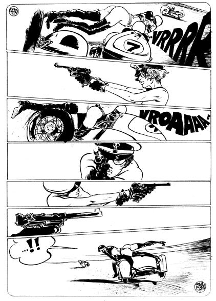
Paul Pope, "Motor Race" from THB: Comics from Mars #2 cover, p. 31, August 28, 2010

I include this page because Pope describes it as an homage to Guido Crepax, the great Italian erotic comics artist. While Pope often includes beautiful women as protagonists, he has avoided (to my knowledge) eroticism for the most part. Perhaps because of this, it wasn't obvious until I saw this page how similar his style is to Crepax's.  The two artists employ a similar sketchy approach, featuring languid, lean, beautiful figures.


Chris Day, Community cover, 2010

This small booklet (16 pages with a silkscreened cover) by Chris Day is a comic, but it's not obviously a comic. Indeed, the only reason I call it a comic is because it a booklet that contains a bunch of sequential images, references a website, Closed Caption Comics, in the inside back cover, and I bought it at a comics show. But the images look like this:


Chris Day, Community p. 7, 2010

So imagine if you saw images like this displayed individually but in the same order on the wall of an art gallery. Would you still call it a comic? I wouldn't. (Whereas, if you saw Paul Pope originals on a wall in a gallery, even if they were completely non-sequential, you would instantly identify them as comics.) This leads to two conclusions. First, as Duchamp demonstrated almost a hundred years ago, context matters a lot. And second, the Brooklyn Comics and Graphics Festival was about comics that overlap or edge into the realm of visual art or gallery art or whatever term you wish to use for art hung on walls in galleries. I guess you could say that some of what was on display there was liminal.

As for this particular work of art comics, the images seem to be constructed out of photos reproduced (and perhaps traced) as high-contrast images, collaged together with vertain linear elements. There are some words, but no story or characters. The connections one makes between the images is not obvious and is likely to differ greatly among various readers. But the images are interesting to look at and ponder.


Jordan Crane, Uptight #4 cover, 2010

I said traditional-format comic books are rare in the alternative comics world, but this review features two of them. Jordan Crane is a great cartoonist and a great editor, whose anthology Non was one of the first and best "art comics" anthologies, a clear predecessor to Kramer's Ergot. His stories tend to range from somewhat realistic slices of life to kid-style fantasies. This issue of Uptight contains both. The front story "Vicissitude," about an auto mechanic's marital problems, is of the former type. The cover of this issue kind of encapsulates the story--the shadow of the couple embracing overlaid over the image of the couple fighting. This cover gives just a hint of some of the expressive color Crane is capable of. Unfortunately, this is a black and white comic book. (You can see a great example of his color comics work here.) The second story, about kids who find a monster in their school, is called "Freeze Out." In it, Crane gives you an idea of what he would do if it were in color.


Jordan Crane, "Freeze Out" in Uptight #4 p. 25, 2010

This very subtle grey against black is what I'm talking about. At first, you might not even notice it. I didn't. But just like your eyes adjusting to a dark room, they adjust to this. But Crane has another trick up his sleeve. You can see a dialogue between a child and a monster, and once you realize there is a grey picture in the black, you assume that you will be able to see the kid and the monster. But you don't--you only see blowing puffs of wind, depicted in age-old comics shorthand.

Both of these are continuing stories from the previous issue. Fortunately, you can read the previous issue for free on Crane's excellent website what things do. Not only does it contain a treasure trove of Crane's work, but it also includes great work by a lot of other cartoonists.

See more reviews in part 2, part 3, and part 4. (And more parts to come...)