Showing posts with label Jordan Crane. Show all posts

Thursday, March 20, 2014

Gagosian Tweets

Robert Boyd

Gagosian Gallery is actually something like nine galleries, located in several countries on three continents. As of 2012, it was estimated that its annual sales were 1.1 billion dollars. Gagosian Gallery is in the business of selling extremely high-priced consumer items to very high net worth individuals. So why the hell would they buy an ad on Twitter? Who are they trying to reach?


Yet here it was, on my Twitter feed! Are they hoping to snag a few hedge-fund managers as clients this way? Seems doubtful. Of all their enterprises, only Gagosian Shop seems to sell things within the price range of any of the 99%. Gagosian's Twitter ad is a small mystery to me.

(Jordan Crane, by the way, is a really good cartoonist. Check his work out.)

Saturday, December 18, 2010

Highwater Books and Me

Robert Boyd


Marc Bell, The Right Thing the Wrong Way: The Story of Highwater Books, 2010

I picked up Right Thing the Wrong Way: The Story of Highwater Books at the Brooklyn Comics & Graphics Festival. It is a catalog from an exhibit at the Fourth Wall Project in Boston from earlier this year. I wish I could have seen it, but then again, I've seen it all before. I was sort of a hanger-on from the birth of Highwater.

Highwater Books was a small-press publisher that existed from 1997 to 2004. The man behind it was Tom Devlin, who is now creative director of Drawn & Quarterly. In 1996, I moved out to western Massachusetts to work for Kitchen Sink Press. There were no good comic stores in the Northampton area (by my own idiosyncratic definition of "good"), but I had heard good things about Million Year Picnic in Cambridge, MA. So I made a road trip out and liked what I saw a lot. I don't know if I met Tom that first trip out or not. (My memory of anything more than five minutes ago is really hazy.) Somehow I heard that Jessica Abel would be signing there. I had met Jessica in Chicago and really liked her self-published comics. I had reviewed them in my column "Minimalism," which I wrote for The Comics Journal. So I was looking forward to seeing her again.

This turned out to be an important moment for Highwater, which didn't exist yet. Jessica suggested that Tom bring Brian Ralph up from Providence, RI, for the signing. This was when Tom was introduced to Fort Thunder. Apparently Brian came up with his girlfriend and Paul Lyons, but I have no memory of them. (Lyons was later my roommate for about a week while he fruitlessly looked for a decent place to live in Northampton. I felt so bad about his abortive Northampton experience that I interviewed him later for the Fort Thunder issue of The Comics Journal.)

Anyway, I got to be friends with Tom and was pretty energized by his schemes, although I was always at arms length. In any case, he inspired me to start Westhampton House, which ended up losing me thousands of dollars, but did manage to distribute a bunch of pretty cool Eurocomics to the U.S.

But the next thing I did with Highwater was to draw a story for Coober Skeber issue 2. This was the infamous Marvel Benefit issue. Tom ask me if I wanted to do a story. So I picked Dr. Strange and did a really psychedelic story. But I didn't sign it because I was worried that Marvel might make trouble, which would be bad for me or, more importantly, my employer, Kitchen Sink Press. But really, I was just a big pussy.


Seth, Coober Skeber #2 cover, July 1997


Robert Boyd, Dr. Strange p. 4, 1997

I hung out in Somerville (where Tom lived in a group house with a bunch of other very cool people) as often as I could. Those guys had great parties. Jordan Crane moved to Somerville and he had his amazing Non series going on. Jordan, Tom and I decided to share a booth at San Diego, and Jordan silkscreened an absolutely astonishing repeating pattern with the names of out three publishing companies. The San Diego shows were always fun. (I introduced Tom to his future wife Peggy at one of those San Diego cons.) We also shared tables at shows in Boston and a memorable small press show in New York City. These were mostly letterpress poetry publishers, so I think there was a lot of perplexity when people looked at our stuff. But we met S. Clay Wilson there, who was there with his girlfriend and her mother, who was a funky beatnik poet/artist. They were great fun to hang out with.


Fabio, Comics Journal cover, October 2001

My last major contact with Highwater as an entity was when Tom guest-edited an issue of The Comics Journal. He asked me to write an article, so I chose to write about how manga was poised to take over the comics market. The article had a completely inside joke title--"On Second Thought, There Is a Need for Tenchi." But I'm really proud of it--I called the rise of manga in the U.S. Now that manga seems to have dropped in popularity (or leveled off), the fact remains that it has changed comics in the U.S.

Highwater petered out in 2004, but really lives on in Drawn & Quarterly. Many of the Highwater artists followed Tom to Drawn & Quarterly, and Tom's tastes are really defining a lot of what's happening wth Drawn & Quarterly. Other Highwater artists ended up at publishers like Fantagraphics, Picture Box, and Top Shelf and continue to do great work. And my limited association with Highwater remains one of the best experiences I ever had in comics.

Comics I Got in Brooklyn, part 5

I'm over the hump on these Brooklyn Comics and Graphics Festival reviews. If you've been reading all these, thanks! And for my usual readers who are looking for reviews of Houston area visual art, I haven't forgotten you! I'll have more reviews of art shows soon.


Noah Lyon, Retard Riot #24 cover, 2008

This is the smallest mini I got (4.5 x 2.5 inches, 16 pages). I picked it up because I liked the bleak hopeless cover. With a name like Retard Riot, one figures Noah Lyon is a punk cartoonist who values shock value highly. Think of Johnny Ryan, for example.


Noah Lyon, Retard Riot #24 pp. 8-9, 2008

He lacks Ryan's demented irony, though. This comic strikes me as unrelentingly dark, black humor with an extra helping of grim.


Jordan Crane, Smoke Signal #7 cover, December 2010

Smoke Signal is quarterly tabloid published by Desert Island Comics. (Here's a tangential Desert Island Comics story I heard last night, by the way. I was talking to a guy who used to live in that neighborhood. Now you may recall that Desert Island is located where a bakery used to be. They kept part of the old sign.

My friend used to go to that bakery frequently, but one day he was walking down that street--which is very busy--and saw that someone had been hit by a truck in front of it. It was the owner of the bakery. He recalled the horror of seeing her shoe in the road. I wonder how long after that did Desert Island take over the space? Did the bakery shut down because of her death? It seems like almost like a parable of gentrification. Old super-practical neighborhood business, owner dies, artsy hipster business takes its place.)

So anyway, Smoke Signal. It's a thick anthology where artists have one or two huge tabloid pages to work with. That said, lots of what is here are obviously just parts of longer stories, some which seem to be serialized in Smoke Signal, some I'm not sure of. So it can be a bit of a frustrating reading experience.


Tim Lane, detail from Belligerent Piano, 2010

One artist who used the large tabloid pages very effectively was Tim Lane. This image is just a small part of the page--the whole page has 37 tiny panels of unremitting psychological torture. At first, as I read it, I thought it was too much. OK, I get it--dude with the gun is a sadist and his victim is scared shitless. But the gunman's dialogue just keeps going, referencing Horishima and the Holocaust as examples of when guiltless people die. It's so intense that it ends up having a powerful cumulative effect. This effect is amplified by the constant change in perspective--looking up, looking down, looking up, looking down, etc.


Tim Hensley, Psycho & Vertigo, 2010

Tim Hensley does the back cover, a series of "Little Lulu"-like episodes from the life of Alfred Hitchcock. They're excellent little bits of minimalism. This approach is a surprisingly good way to paint a portrait of a real historical figure.


Sammy Harkham, Crickets #3 cover, 2010

Crickets #3 by Sammy Harkham was one of the big deals of the show. Apparently it was meant to be published by Drawn & Quarterly, but ended being self-published. Why? I don't exactly know. A review in Comics Comics mentions that in this issue, Harkham took a serious turn for a more literary style of comic making. Harkham is known as a splendid cartoonist but is perhaps best known for editing Kramers Ergot, which was really the most important "art comics" anthology. It really pushed forward the concept of non-literary comics. So Crickets #3 is kind of a dramatic switch.

It works, though. The first story, "The New Yorker Story" is about a man trying to write a story for The New Yorker. Ironically, the story itself could be a New Yorker story, and I mean that in the best way possible. It's a perfect little short story.


Sammy Harkham, "Blood of the Virgin" p. 28, 2010

The second story, "Blood of the Virgin", is set in the late 60s. Seymour is a film editor for Roger Corman-style B-movie studio. The story loops around his personal life and his life as part of this commercial enterprise, and it's an interesting, complex story. One aspect, which comes out on this page and elsewhere, is Seymour's disdain for (if not ressentiment of) anything arty, whether it be French films or even some of the work of his coworkers. This is something that's going to have echoes for lots of people working in creative fields. The mainstream comics worker who sniffs at the pretensions of art comics, or the comics creator of any stripe who resents the art world with its incomprehensible artwork and superior attitude. The examples are plentiful. And Seymour is contrasted in this regard to his colleague Oswald, who also turns out to be a professional rival.


John Mejias, Paping: The Teachers Edition, 2007

John Mejias' Paping: The Teachers Edition is a collection of stories about being a K-8 art teacher that were published in his minicomic Paping. Mejias taught in the Bronx and on Long Island. The stunning cover is probably the best part of this collection--the interior suffers from some indifferent production (bits of panels get cut off, for example) and extremely episodic story-telling--appropriate for minicomics, but less so for a large, integrated work.

That said, there is a lot to like here. When cartoonists do autobiographical work or realistic fiction, we often see a lot of lifestyles of the poor and hipsterish. People don't have jobs or they work as artists for a living. One ends up with a lot of comics about doing comics or other highly introspective works. This is not necessarily bad--see Gabrielle Bell's Diary, which is the next comic I'm reviewing--it's just that one hungers to see some other part of the world. Mejias' work is about himself, but it's also about his students and fellow teachers and the whole educational system.


John Mejias, The Teacher's Edition p. 7 (detail), 2007

Early on, you get a lot of bitterness about the weird world of New York City teaching. (The next chapter is called "No Good Deed Goes Unpunished.") And the insane explanations given for whitewashing Mejias's murals are certainly enough to make someone bitter. But fortunately, the rest of the book isn't like this. It's more observational, and while he deals a lot with his own state of mind, he gradually lets other characters take center stage--certain students, some colleagues, etc. Eventually, he brings in other voices, illustrating a story by fellow teacher Jody Buckles, and printing a story by Shawn Cheng about being a student in Taiwan and in New York. And Mejias incorporates some of the work of his students into his comics as in this story, where one of his colleagues, school psychologist Dr. "Doc" Adams, has died suddenly of a heart attack.


John Mejias, The Teacher's Edition p. 42 (detail), 2007


John Mejias, The Teacher's Edition p. 43 (detail), 2007

I loved this. I like the idea of incorporating student work into one's own work. I guess you have to be careful that you aren't exploiting them. In this case, Mejia was mourning his close friend, and his student managed to produce something highly moving that spoke to Mejia's own grief.


Gabrielle Bell, Diary cover, 2010

This is the second Gabrielle Bell reviewed in this spasm of reviews. Diary is drastically different from All My Dreams Come True. Diary is autobiographical and told with dense, wordy panels.


Gabrielle Bell, Diary p. 5, 2010

And as you would expect in a diary, Bell doesn't try to give you a big picture. These comics are relentlessly focused on what is happening to her, which could be deadly. But Bell is funny and self-deprecating, which makes them work.


Gabrielle Bell, Diary p. 18, 2010

This story, about Bell's attempt to adopt The S.C.U.M. Manifesto by Valerie Solanis, seems to be entirely fictional (although it's hard to tell). It's a story about over-promising, and hilariously builds a matryoshka doll of falsehoods--which doesn't even really unravel when she finally "comes clean" at the end.

Bell was selling original art at her table. I was struck by how tiny her originals were. In addition to selling finished pages, she was also selling individual panels. These were panels that she drew but ended up changing in the finished works. I bought one from the Valerie Solanis story.


Gabrielle Bell, untitled, 2010

If you compare this panel to the one that got printed, the only difference I can find is that Bell's mouth is open in the printed version and closed here. By the way, the size of this original panel is 2.75 inches square.

Saturday, December 11, 2010

Comics I Got in Brooklyn, part 1

Robert Boyd

Looking online at various "con reports" about the Brooklyn Comics and Graphics Festival, one thing that amused me was that some attendees would take everything they bought, spread it out on the floor, and take a photo. It was funny, but at the same time, I get it--"Look at my haul!"

I didn't want to do that, but I thought I might do something similar. So what I am going to do is a series of short reviews of everything I bought in Brooklyn. And so I don't overwhelm you readers, I will be doing it in bunches of no more than four or five reviews per post. This is the first.


Pat Aulisio, Abstracted Comics (cover)

Pat Aulisio is an art student at The University of the Arts in Philadelphia. (Update: Aulisio tells me he graduated two years ago!) His other comics seem fairly straightforward. This one, though, is not. What he has done here is taken drawings and comics, scanned them, made the linework a single, non-black color, and then layered them on top of each other. Sometimes the layers are opaque, obscuring the layers below, sometimes they are transparent. In any case, it leads to a visual cacophony. If you look hard, you can pick out the "comics" aspect from the noise.


Paul Aulisio, Abstracted Comics pages 8 & 9

So there is a reason he uses the word "abstracted" instead of "abstract." He is more-or-less starting from a non-abstract space and deriving an abstraction from it. His abstract comics pages are not designs that have a sense of space to them in the way that a painting by, say, Franz Kline does. Nor are they geometric or minimal. They cover the who surface--the page--with an all-over composition. The booklet is only 12 pages long. Within it is tucked a smaller booklet in black and white. It is more comprehensible as a comic--it has arranged panels--but the contents of the panels are more abstract than the ones in the color booklet.

Overall, this is a nice little project. Lovely to look at, interesting to think about. If I were Aulisio's art professor, I'd give him an A.

Compared to Aulisio, Paul Pope is an old-timer. He's always been a prolific artist with a quick, elegant drawing style. I haven't followed his work for a long time, but he was definitely an important artist. While his drawing style was rooted in American and European comics, he was a pioneer in bringing Japanese storytelling techniques to American comics. In particular, his comic THB stretched the narrative of its relatively straightforward story in much the same way would see from the wave of manga that was starting to get published (barely) in the U.S. at the time.


Paul Pope, THB: Comics from Mars #2 cover, August 28, 2010

This issue of THB is more or less a standard comic book (a format that has become vanishingly rare among alternative comics--but Pope has long straddled the "alternative" and "mainstream" worlds). It is a collection of short pieces that have appeared here and there.

The stories here are not really very good. That's always been Pope's weakness--his stories. What works is something separate from the "story"--the storytelling. Pope creates a good mood and includes tons of interesting and often amusing details. The Fellini-esque director of a Tom & Jerry-style cartoon, the hand-drawn cover of Ziggy Stardust and the Spiders from Mars, the "Flop Flapt Flap Flopt" sounds that the stellar repairman makes when he walks, and so on. "The Masked Karimbah," for example, implies a backstory and a resolution, but instead leads up to these panels:


Paul Pope, "The Masked Karimbah" from THB: Comics from Mars #2 cover, p. 29, August 28, 2010

In short, the point of the story is to name and describe the two fists. (Jay Stephens is another cartoonist.) I can live with the weak (or nonexistent) stories. This accumulation of amusing or atmospheric details is quite enough.

Photobucket
Paul Pope, "Motor Race" from THB: Comics from Mars #2 cover, p. 31, August 28, 2010

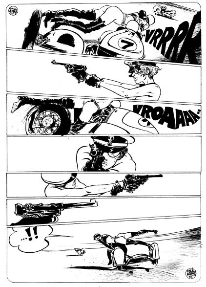
I include this page because Pope describes it as an homage to Guido Crepax, the great Italian erotic comics artist. While Pope often includes beautiful women as protagonists, he has avoided (to my knowledge) eroticism for the most part. Perhaps because of this, it wasn't obvious until I saw this page how similar his style is to Crepax's.  The two artists employ a similar sketchy approach, featuring languid, lean, beautiful figures.


Chris Day, Community cover, 2010

This small booklet (16 pages with a silkscreened cover) by Chris Day is a comic, but it's not obviously a comic. Indeed, the only reason I call it a comic is because it a booklet that contains a bunch of sequential images, references a website, Closed Caption Comics, in the inside back cover, and I bought it at a comics show. But the images look like this:


Chris Day, Community p. 7, 2010

So imagine if you saw images like this displayed individually but in the same order on the wall of an art gallery. Would you still call it a comic? I wouldn't. (Whereas, if you saw Paul Pope originals on a wall in a gallery, even if they were completely non-sequential, you would instantly identify them as comics.) This leads to two conclusions. First, as Duchamp demonstrated almost a hundred years ago, context matters a lot. And second, the Brooklyn Comics and Graphics Festival was about comics that overlap or edge into the realm of visual art or gallery art or whatever term you wish to use for art hung on walls in galleries. I guess you could say that some of what was on display there was liminal.

As for this particular work of art comics, the images seem to be constructed out of photos reproduced (and perhaps traced) as high-contrast images, collaged together with vertain linear elements. There are some words, but no story or characters. The connections one makes between the images is not obvious and is likely to differ greatly among various readers. But the images are interesting to look at and ponder.


Jordan Crane, Uptight #4 cover, 2010

I said traditional-format comic books are rare in the alternative comics world, but this review features two of them. Jordan Crane is a great cartoonist and a great editor, whose anthology Non was one of the first and best "art comics" anthologies, a clear predecessor to Kramer's Ergot. His stories tend to range from somewhat realistic slices of life to kid-style fantasies. This issue of Uptight contains both. The front story "Vicissitude," about an auto mechanic's marital problems, is of the former type. The cover of this issue kind of encapsulates the story--the shadow of the couple embracing overlaid over the image of the couple fighting. This cover gives just a hint of some of the expressive color Crane is capable of. Unfortunately, this is a black and white comic book. (You can see a great example of his color comics work here.) The second story, about kids who find a monster in their school, is called "Freeze Out." In it, Crane gives you an idea of what he would do if it were in color.


Jordan Crane, "Freeze Out" in Uptight #4 p. 25, 2010

This very subtle grey against black is what I'm talking about. At first, you might not even notice it. I didn't. But just like your eyes adjusting to a dark room, they adjust to this. But Crane has another trick up his sleeve. You can see a dialogue between a child and a monster, and once you realize there is a grey picture in the black, you assume that you will be able to see the kid and the monster. But you don't--you only see blowing puffs of wind, depicted in age-old comics shorthand.

Both of these are continuing stories from the previous issue. Fortunately, you can read the previous issue for free on Crane's excellent website what things do. Not only does it contain a treasure trove of Crane's work, but it also includes great work by a lot of other cartoonists.

See more reviews in part 2, part 3, and part 4. (And more parts to come...)

Monday, December 6, 2010

The Brooklyn Comics and Graphics Festival

I mentioned back in September that I was going to the Brooklyn Comics and Graphics Festival. I went, had fun, took photos. I also got a lot of books and comics, and I'll be writing about them in the coming month. But this post will be about the experience--and I'm writing it mostly as an excuse to inflict my terrible photos on you all. (If you want to see much better photos of the event, read this.) Now Pan readers who come here for the art coverage might find their eyes glazing over. But this festival is relevant to art lovers--it was put on and attended by a bunch of people who view comics as art, and among them are many who cross-over to the gallery world, whether in their own practice or just as people interested in art. I still think there is a distance between these two worlds that doesn't need to be there, but the Brooklyn Comics and Graphics Festival certainly represents to largest overlap of comics and the fine arts world. (Many in the comics world would cringe at this. But I guess what I want, and what I think this show represents in a way, is a comics world that is engaged with serious culture as opposed to one that is only engaged with the kitsch of the world, which is what you would mostly find at the San Diego ComicCon, for example.)


Gary Panter, Matt Groening, Bill Griffith and a bunch of other people

The people who were there were amazing--guests, exhibitors, and attendees. This is a young person's show, but the organizers made certain that a lot of people of my generation and of older generations were present. The show was put together (I think) by Dan Nadel of Picture Box, Gabe Fowler from Desert Island, and comics scholar Bill Kartalopoulos. Nadel is one of many people involved in comics who has been working on creating a new history of comics. By this, I mean trying to imagine a different canon. He has work in this regard in his two books Art Out of Time and Art In Time and to a certain extent in what he publishes in Picture Box. This kind of project is appealing to me. People are always reclaiming history (aesthetic or otherwise) to understand the present. See for example art critic Rapheal Rubenstein's The Silo.

Why this is relevant is that this show featured older guests--an attempt, maybe, to school the young hipster guests. Hence guests like Mark Alan Stamaty, who is not someone who is well-remembered in comics despite the fact that he produced a number of brilliant books over the years, especially the great MacDoodle Street.


Mark Alan Stamaty

He shared a panel with Jordan Crane, Brian Chippendale and Keith Jones, mostly on the subject of horror vacuii. 


Mark Alan Stamaty, Jordan Crane, Keith Jones and Brian Chippendale

The panels were quite nice. Lynda Barry and Charles Burns were great--Barry is hilarious in person. While Sammy Harkham (editor and publisher of Kramer's Ergot) and Francoise Mouly (co-editor of Raw and current art editor of The New Yorker) tended to ramble, they were entertaining.


Sammy Harkham and Francoise Mouly


Kim Deitch

So this revised history puts underground cartoonists like Kim Deitch in a pantheon.


Charles Burns and adoring fans

And creates a situation where a cartoonist like Charles Burns gets mobbed.


For me, it was great to see old friends like Jordan Crane...

 
Jon Lewis and Sam Henderson...


Doug Allen...


Jessica Abel and Matt Madden...


And Jason Little...


Little was debuting his new book, The Motel Art Improvement Service. I'll definitely be reviewing it later, but one thing that is really interesting about this book and the preceding volume, Shutterbug Follies, is Little's familiarity with contemporary fine art. Here he was dressed, as he always does for conventions, in an extravagant outfit. He used to include a straw boater or top hat with costumes, but he told me that when he would wear a top hat, he would end up getting bothered by steampunk fans, thinking that they had found one of their own. (Fiction fans may be interested to know that Little is married to novelist Myla Goldberg. The main character in his graphic novels is named Bee, which can't be a coincidence, can it?)

The space was packed with humanity. Despite temperatures outside in the 30s, it got really toasty in the church hall where the festival was held. Little asked me to spot his table so he could go to the restroom and shed his longjohns. This is what his table looked like from the driver's seat perspective.


Pat Ausilio

I think this is Pat Ausilio, who did a comic called Abstracted Comics. I liked this because despite the fact that it was 80-something degrees in the building, he kept his toque on. That is hipsterism above and beyond the call of duty.


Johnny Ryan

This is Johnny Ryan, the lowbrow cartoonist embraced by highbrow comics lovers.


Bob Sikoryak

This guy was so hardcore that he worked on a comic while attending a panel. Tight deadline, I guess. Update: This is apparently Bob Sikoryak.


Chris Pitzer and Josh Cotter

This is Chris Pitzer (proprietor of AdHouse) and one of the artists he publishes, the excellent cartoonist Josh Cotter.


Ben Catmull

Ben Catmull had a space right next to Jason Little's.


Gabrielle Bell and Tomasz Kaczynski

This is Gabrielle Bell and (I think) Tomasz Kaczinski. Bell was selling her original art, which is literally the smallest original art I have ever seen except maybe for Drew Friedman. In addition to selling individual pages, she was also selling individual panels. As I understood it, these were panels she completed but decided not to use. I bought one of those-- 2.75" square.

One final photo. I stayed in a hotel two blocks from the festival. And just around the corner was Desert Island, which I have to say is my ideal comic shop.


It is filled 100% with art comics and pretty much nothing else.

Sunday, September 26, 2010

A Curated Comics Show: The Brooklyn Comics and Graphics Festival

Brooklyn Comics and Graphics Festival

This December, I will be attending The Brooklyn Comics and Graphics Festival, which is kind of a big deal for me because I haven't been to a comics convention outside of Houston for many years. This has partly been a result of no professional need to go (I no longer work in the comics business), no particular desire to go, and not enough money. But lately I've been getting the ache to check one out. I almost went to TCAF and SPX, but in both cases, they both conflicted with things I wanted to do here (the Art Car Parade and the Fringe Festival). But this time I bit the bullet and bought a plane ticket for a long weekend in NYC. I'll spend one day hitting galleries and museums, and the next day at the festival.

I don't know much about the festival, except that this is its second year and that it got a very good reaction after the first year. But its biggest distinguishing feature is that it is a "curated" show. I'm not sure exactly what this means--I've been told details will be published on their site. But if I am correctly inferring the situation from the comments in this article, it sounds as if the organizers decided who they wanted to have exhibit and invited only those people. This is exactly how a curator might curate a group exhibit in an art museum. But here, we are not talking about exhibiting art (although I believe that will be part of the festival), but setting up tables to sell stuff--comics, original art, etc. In short, this is a dealers room-style show where the dealers have been selected by the organizers. (The "dealers" in this case will be artists and alternative comics publishers.)

A curated festival is highly unusual in the world of comics. It caused a degree of argument and upset among the commenters in the article by the Beat.  But I think this was mainly because folks aren't used to this approach in the realm of comics festivals. In other kinds of art festivals (and in pretty much all group art exhibits), this is a common practice. For example, the Bayou City Art Festival is juried, even though it is a completely commercial event. Exhibitors are judged on the quality of the work they have for sale and on the quality of their booth design. But comics festivals--even ones that are deliberately alternative--are governed by a powerful sense of tradition and inertia.

The difference between the Brooklyn Comics and Graphics Festival and the Bayou City Art Festival is that in the latter festival, potential exhibitors submitted a proposal, and the final selection was chosen from among the proposals. The BCGF apparently dispensed with the first step and solicited exhibitors they wanted. The upside to doing it this way is that you remove one difficult, time-consuming step from the process. The downside, however, is that you may miss out on a great new talent whose work you were hitherto unaware of.

But that is not a fatal flaw. In fact, I would say that every possible selection criterion for a festival of this sort is inherently flawed in some way. The traditional "first come first served" approach for comics conventions favors people who are already familiar with the comics world, who are, in a sense, insiders. It also doesn't guarantee the highest quality exhibitors, nor exhibitors who will be just right for the market the organizers are trying to reach. The BCGF curated show method also allows the organizers to reach out to potential exhibitors who might not ordinarily consider exhibiting at a show like this. It allows them to narrowly focus the festival for a specific kind of comics fan. I think this a completely reasonable, grown-up way to go.

As I find out more about the show, I will report it. And, of course, I will blog about the show itself when I go. In any case, it looks like it will be lovely. The guests include artists like Lynda Barry, Gabrielle Bell, Charles Burns, Jordan Crane, Renee French, Mark Alan Stamaty and Adrian Tomine and many more.