Showing posts with label assemblage. Show all posts

Wednesday, April 17, 2013

Chain Chain Chain

Robert Boyd

(Originally published on Glasstire.)


Katie Wynne, A chain of non-events, 2013, mixed-media installation

Katie Wynne's A chain of non-events at Lawndale is an installation of various bits of crap semi-connected to one another. I don't say crap in a pejorative way. I use it in the way that Karen Archey did--in identifying a genre of art she called "combining crap with crap." The term both opens up a lineage stretching back to Duchamp's assisted readymades to Robert Rauschenberg's Combines and Gluts to Jessica Stockholder's painted bits of crap and consumer products. It is Stockholder's work that A chain of non-events reminds me of most, but in general it can be seen as part of a tradition that is now 100 years old (Duchamp's first assisted readymade Bicycle Wheel was originally made in 1913).


Katie Wynne, A chain of non-events, 2013, mixed-media installation

When you walk into the Project Space at Lawndale, the work is stretched out more-or-less in an arc around you. The elements are not all physically connected, but there does seem to be an intent for viewers to follow from one to another. So starting from the left, we have a floor-element that consists of a rectangular wooden central part with two large rectangular end pieces. The end pieces are designed to hold a pair of oscillating fans so that the face up. The fans are on and blowing, but their wind is blocked by a nimbus of brightly colored scarves on each fan. I suspect that the fans were meant to blow the scarves more than I observed here, but perhaps there were too many scarves on each fan. In any case, they did puff up a bit due to the blowing air.

I liked the wooden structure which was simultaneously absurd and purposeful. But the scarves were too discordant a visual element. The colors in any given scarf were acceptable (if a bit loud), but all of them combined created a chromatic cacophony that detracted from the solid homemade virtues of the wooden fan-holder.


Katie Wynne, A chain of non-events, 2013, mixed-media installation

Continuing to our right, there is another wooden structure, this one bolted to the wall. It has painted pieces of fabric and cardboard  hanging from it on strings. The paint is a light blue-green and orange--a very pastel, slightly Southern Californian color scheme. The painting reminded me of Jessica Stockholder and the cardboard reminded me of Robert Rauschenberg. It is significant that the cardboard is ripped, not cut. It gives the piece more of a junkpile feeling, less deliberate than a Stockholder assemblage.


Katie Wynne, A chain of non-events, 2013, mixed-media installation

This section in the corner is the busiest. In the left of the picture above, Wynne has mounted a shoeshining machine to the wall, where it spins hypnotically. Cheap motorized household machines appear to be important parts of the Wynne work I've seen (she contributed an extremely simple, elegant piece to The Big Show last year that consisted of a motorized tie-rack and a rectangle of blue satin cloth. Her use of these devices recalls Jean Tinguely's art. Tinguely was another master of crap on crap, gleefully scouring junkyards for old motors and debris with which he built his kinetic sculptures.


Katie Wynne, A chain of non-events, 2013, mixed-media installation

Wynne reprises the use of shiny satin-ish cloth in the drawer assembly. The gold cloth hangs over the edge of the open drawer. Underneath is another oscillating fan, covered with a single scarf. A paintbrush sticks up from the back of the fan into a slot in the drawer, where it swings back and forth.


Katie Wynne, A chain of non-events, 2013, mixed-media installation

The drawer is lined with the gold cloth which is covered with a thin layer of dirt. The curved slot for the brush is lined with gold cloth, so it almost looks like a smile peeking through the dirt. It's cleverly wrought and in a way reflects her earlier untitled piece in the Big Show, but it feels like too much is happening here. I don't see how the elements belong together, why there is dirt and satin here. The stuff on top of the table--string, yarn, tape, torn bits of painted cardboard--feel more unified than the seemingly more carefully planned and constructed drawer element.


Katie Wynne, A chain of non-events, 2013, mixed-media installation

There is another wall-mounted wood structure which leads the viewer to a more-or-less freestanding structure made of stool parts (?), painted cardboard and other crap.


Katie Wynne, A chain of non-events, 2013, mixed-media installation

While the rest of A chain of non-events sprawls wildly, this one keeps it all close in. It looks like it wants to explode and fling its crap wide, but it's not ready. This made me think of The Rape of the Sabine Women (1574-82) by Giambologna. This sculpture is identified as being an immediate precursor to the baroque and to Bellini's extravagant creations. The overt emotionalism and dynamism seem baroque, but the way Giambolgna keeps it all tightly contained in a narrow cylinder of space marks it as still a Renaissance sculpture.


Katie Wynne, A chain of non-events, 2013, mixed-media installation


Wynne could have taken the bits of crap she used in this object and spread them across the floor or up the wall. But like Giambolgna, she constrains it.

The problem with A chain of non-events is that while there are interesting passages here and there, it fails to cohere. The elements are too independent, but many of them don't stand up on their own as individual works. But the virtues are an interesting use of materials, color, and space. And it helps to see this as work in line with a long tradition. Overall, it reminded me a bit of Rauschenberg's The 1/4 Mile or 2 Furlong Piece. This is another large piece (very large) that consists of many individual elements. The elements don't really come together, though. Perhaps that is in the nature of "crap on crap." Because of the disparate origins and natures of the materials, extra effort must be paid to giving them a sense of unity. The element that works the best for me in Wynne's installation is the stool piece--it feels the most like a single autonomous piece of work. With its human-sized volume and excellent colors, it's my favorite "non-event" of A chain of non-events.

Share

Wednesday, September 19, 2012

Border Paintings

Robert Boyd

Ray Smith isn't exactly an artist who I would expect to create large flat abstract paintings. His other work is figurative and has a neo-expressionist feel. But something about working with G.T. Pellizzi has allowed for a different artistic persona to emerge. The pieces in this show are austere. They suggest empty landscapes with sparse population. Quite unlike the Ray Smith carnival one finds on his website.


G.T. Pellizzi and Ray Smith, untitled (Border Painting), acrylic, earth, dried vegetation, 138" x 96"

G.T. Pellizzi's solo work, as far as I can tell, is also a a bit less barren that the paintings in this show (although not figurative like Smith's paintings). And in their other collaboaration, The Execution of Maximilian, where the process of making the pieces was ambiguously macho (shooting shotguns at cans of paint), the resulting works were literally splashy abstractions.

Smith is from South Texas and his family owns a ranch, Yturria Ranch, there. Pellizzi is from Cuernavaca, Mexico, and works both in the U.S. and Mexico. While their collaboration is relatively new, the artists have known each other for a long time. Given Smith's own border-land origins and Pellizzi's immigrant status, it seems natural that they would be attracted to "the border" as a subject. While the work in The Execution of Maximilian addressed more sensational aspects of the border (narco violence, machismo, the tradition of the gentleman hunter, etc.), the paintings in this show address the land itself.


 G.T. Pellizzi and Ray Smith, untitled (Border Painting), acrylic, earth, dried vegetation, 138" x 96"

The large, spare sandy paintings look like segments of flat, barren desert as seen from above. They each come across as a specific portrait of a precise 96 square foot area of ground. It is the act of putting them up on the wall vertically that is so surprising. They feel like they should be floor pieces. On the wall, our perspective changes and it's as if we, the viewers, are floating above the earth--not too high, but not with our feet on the ground. We are forced to se the ground differently; something we might normally pay little attention becomes our focus.

 
G.T. Pellizzi and Ray Smith, untitled (Border Painting), found fencing, acrylic, earth, dried vegetation, 94" x 93"

Pellizzi and Smith aren't willing to let you off scott free to contemplate the Earth. The big, somewhat blank Border Paintings allow one to imagine a desert devoid of human population. And while parts of the border are very sparesly populated, it's never completely untouched. Using scrap material and fencing reminds us of this. Fencing may remind us of the border fence, but more prosaically the fences people put up to establish property lines, to keep livestock from getting lost, etc. Barriers. It breaks up the land which Pellizzi and Smith are portraying.


G.T. Pellizzi and Ray Smith, Border Sign, electric light, found material construction, 97" x 97"

The worn wood and cut up tires that make up Border Sign tells us people are here, but the work conveys loneliness. The blank non-communication of the sign suggests a laconic race of people. They don't have much to say and there aren't to many other folks to say it to anyway. This kind of approach validates a cliche we have of the area, one which certainly isn't completely true. But given The Execution of Maximilian, the two artists may be working through such cliches of the border one by one. These preconceptions can be powerfully expressive--I think you see that in the work of James Drake or the writing of Dagoberto Gilb. And given Smith's deep roots in the area, I can forgive him for misdemeanor stereotype-mongering. The work is too strange and too strong to be undermined by that.

Share

Sunday, July 22, 2012

The Big Show: A Little Bit of Everything Else

Robert Boyd

While The Big Show 2012 had plenty of paintings and plenty of craft-based work, the reality is that, as usual, there was a hodgepodge of all kinds of artwork. To wrap up our coverage, I want to look at a few other pieces that caught my eye.


Patrick Renner, Sunburst, 2012, found painted wood and polyurethane, 18" x 24"

I was talking to Jim Nolan the other night at the opening of a show he curated, and he spoke of the show being about painting without painting. Sunburst by Patrick Renner falls into that ambiguous category. I guess Sunburst could be considered a collage, but what is interesting about it is that Renner achieves painterly effects without actually applying paint to anything. If he had simply painted those colors on a canvas, I don't think it would have been nearly as interesting. The weathered wood scraps not only come with interesting textures and patterns of wear, they come with history. All of this was something else before.


Edward Ramsay-Morin, Cutaway Portrait #4, 2012, inkjet paper on archival paper, 17" x 15"

Cutaway Portrait #4 by Edward Ramsay-Morin is a collage of the modern sort--images joined together electronically instead of cutting and pasting actual images. The two images both seem to come from the 60s--a man with slicked-back hair, a black suit, and a skinny tie; and a photo of Earth with the Moon in the foreground, perhaps shot by an Apollo spacecraft. The man's face has been cut-away to show this image of outer space. The cutaway edge is given shading to make it appear as if the man's face was, in fact, a thin shell. The image suggests the phrase "inner space," and given the vintage of the photographic elements, one is made to think of such 60s-era explorations of "inner space" through psychedelic drugs, through meditation, through religious and shamanic ritual, etc. This juxtaposition of the human-scale with the cosmic also reminds me of William Blake's "Auguries of Innocence":
To see a world in a grain of sand,
And a heaven in a wild flower,
Hold infinity in the palm of your hand,
And eternity in an hour.
Katie Wynne, Untitled (Satin), 2011, motorized tie-rack and satin, 4" x 60" x 40"

Another piece that juxtaposed two unlike things together was Katie Wynne's weirdly beautiful Untitled (Satin). An insect-like device wriggles its "legs" on a piece of satin, gradually balling it up. The device is actually a motorized tie-rack. (Question: who on earth needs a motorized tie rack? Just curious.) The shiny black carapace and legs give this piece a decidedly creepy presence, while the blue satin radiates the appearance of luxury. The motion is hypnotic. I assume that from time to time, the tie-rack must be turned off and the satin flattened out. This is a kinetic sculpture, but it requires human intervention. What I loved was that it has a strong effect with a minimum of elements.


Tommy Gregory, Power & Priorities, 2011, cast resin, 20" x 16"

The first three pieces mentioned in this post were essentially made of found objects--old wood, repurposed images, a piece of cloth and a motorized manufactured item. When I looked at Power & Priorities by Tommy Gregory, I thought that this, too had been assembled out of found objects. But strangely enough, Gregory went through the trouble to cast the light switched and power sockets with resin. That seems like an unnecessary extra step. Still, the piece works. It may be the oldest trick in the conceptual playbook, but there is something about taking a thing that we are used to seeing in isolation and grouping it with many similar or identical things that works, as Tara Donovan has proven many times.


John Adelman, Esdras (Duelist), 2012, gel ink on paper mounted on wood panel, 30" x 48"

Similarly, John Adelman's piece Esdras (Duelist) is created using a repetitive process. He may be writing words out from the dictionary with his gel pens. Whatever the source of the words, his technique for writing them renders them illegible. They become texture and value instead of words. By using a very precise process or algorithm to create the piece, it becomes something that in theory, anyone could execute by duplicating his process, like a Sol Lewitt wall drawing. But it is extremely unlikely that anyone would voluntarily duplicate the obsessive routine Adelman used to create this piece.


Kassandra Bergman, Always, 2011, glitter and cardboard, 32" x 25"

The few pieces I've seen by Kassandra Bergman, including another one in this show called My St. Mark's Place, have been photographic. But I haven't see enough of her work to know if Always is an idiosyncratic work for Bergman. I can't precisely say why this piece appealed to me. It combines elements that are optimistic and glamorous--the glitter, the word "always"--with elements that seem mundane and boring--the nondescript sans-serif font, the minimal design. The glittery center with its promise of eternity is surrounded by a flat plane of white, a non-space, a nothingness. It makes one question the value of "always." It's like two people pledging eternal love without taking into account the daily sameness a marriage can become. (Maybe that's what I'm seeing--a reason to be thankful I'm single.)

In the end, Marco Antonini's Big Show was not unlike the others--a combination of pieces designed to appeal to the eye, pieces that demonstrated mastery, and pieces that were conceptually interesting--sometimes all in a single work. But I commend him for increasing the breadth of the show in terms of the types of work displayed while exercising his curatorial prerogative to brutally edit the show.  I hope future curators follow his lead.


Share


Tuesday, June 19, 2012

Safari to the Suburbs 1: Luxuriant Refuse at the Pearl Fincher Museum

by Robert Boyd

I live in the suburbs. I know there are art-lovers here, but we are fairly uncommon--compared to those who live in hipper inner city neighborhoods. We are less concentrated in the population for the simple reason that the suburbs themselves are less concentrated. The suburbs place a high premium on outward conformity, so it's hard to tell who's artsy. Deeper inside the city, people are more likely to wear their artsiness outwardly--in their lawn art, their art cars, their fashions, their tattoos and hairstyles. But we suburbanites keep that stuff inside the walls of our homes. There are exceptions--the suburbs are too vast to be homogenous. But the problem with the suburbs is that there isn't enough of a concentration of artistic types to encourage arts institutions to form. Few people start galleries in the 'burbs. We hardly have any arts institutions.

But even so, there are exceptions. The Pearl Fincher Museum of Fine Art is one I've written about before. Located in Spring, it is near Steubner-Airline just north of FM 1960 on Cypresswood Dr. It's in a neighborhood that appears to be fairly upper-middle-class. The houses are the brick generica favored by Houston developers. Just to give you an idea of how spread out things are up there, the Woodlands is about 14 miles from the Pearl Fincher.  Nonetheless, the Pearl Fincher has community support--that can be seen by their well-attended openings, and their website claims that they have over 2000 donors. (They are not a 501(c)3 organization, so their finances are not reported publicly. Correction: They are a 501(c)3, but the name of the non-profit is the Cypress Creek Fine Art Association, not the Pearl Fincher Museum of Fine Art.)

Most of their previous exhibits have been exhibits by local artists (including student shows) or exhibits culled from the collections of local collectors. This seems like a good exhibition strategy for a young (established in 2008) suburban museum. It's an approach that promotes buy-in from the local artistic community. (Indeed, the Pearl Fincher has had a series of shows with the subtitle "Northwest Houston Collects".) But it's not a viable long-term strategy, because once you have that buy-in, you need to occasionally show things that are not from your own backyard. You're nurturing a local scene, and that means paying attention to that local scene, which the Pearl Fincher is doing well, but it also means injecting new ideas into that scene.

So I was excited when I heard about Luxuriant Refuse, a contemporary group show curated by Melissa Grobmyer and featuring the work of Adela Andea, Johnston Foster, Alison Foshee, Sarah Frost, Gwyneth Leech, Shawne Major, Aurora Robson, Betsabeé Romero, and Paul Villinski.

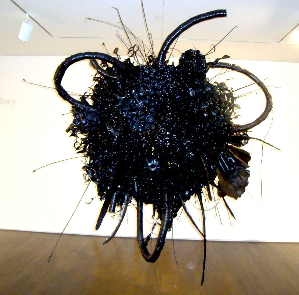
Belch
Aurora Robson, Belch (aka Tarball), 2009, discarded PET bottles, tinted polycrylic, rivets, steel armature, mica powder

Aurora Robson's work may be familiar to Houstonians from The Great Indoors, her installation at the Rice Gallery, or her installation at the Rice Recreation and Wellness Center. Those colorful pieces contrast to this large black encrusted sphere, floating slightly above eye-level like a menacing alien spacecraft.

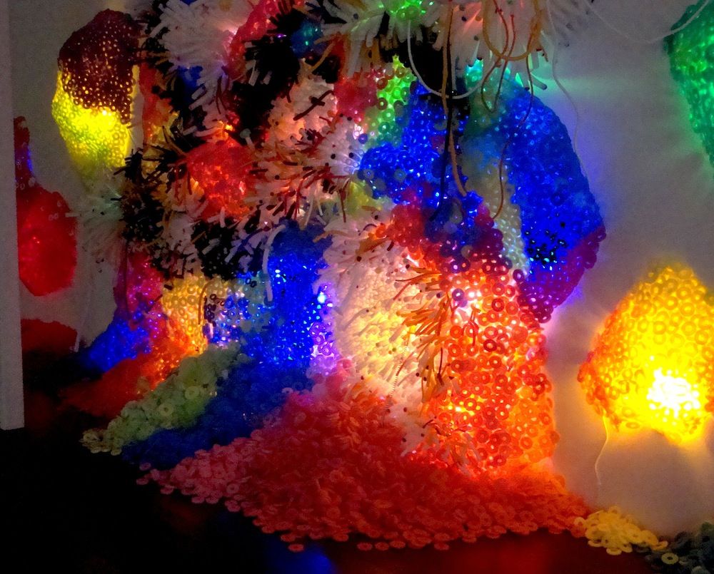
Bioluminescence
Adela Andea, Bioluminescence, 2012, pool noodles and cold cathode fluorescent lights mounted on wire mesh

Equally alien, but much more colorful is Bioluminescence by  Adela Andea. I question the categorization of pool noodles as refuse--is she actually making sculpture out of thrown-away materials, or did she buy a bunch of pool noodles new? But who cares? It's a pretty work and it's something I haven't really seen before at the Pearl Fincher--a site specific installation. (I know Andea has presented this work elsewhere, but I suspect it varies depending on the place of installation.)

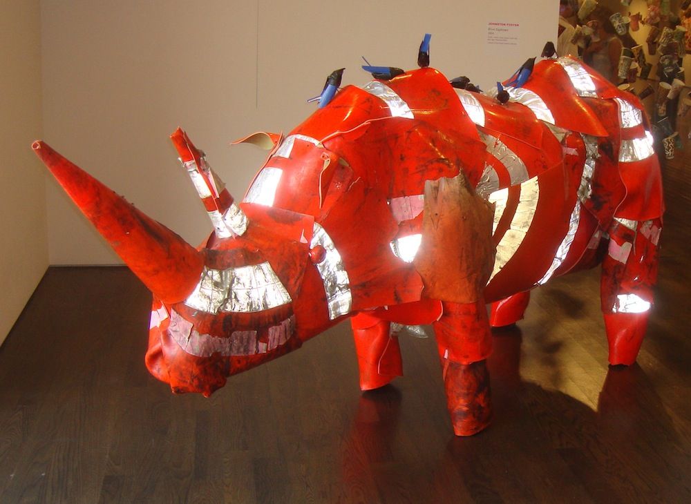
River Euphrates
Johnston Foster, River Euphrates, 2004, traffic cones, wood, plastic trash cans, duct tape, Venetian blinds

Johnston Foster's work--animals assembled from castaway plastic detritus--fits the theme of the show better. River Euphrates, a rhino made out of traffic cones, was a crowd-pleaser. The inclusion of the oxpeckers on the rhino's back was a nice touch.

The thing with pieces like River Euphrates, Bioluminescence and Belch (aka Tarball) is that they look cool. One could imagine someone curating a show of art made of trash and debris that would have been much more austere, more intellectual, more challenging. The choice here was to be accessible. Is the audience being condescended to? Is there a calculation that this suburban audience might not appreciate more difficult work? Or to put it another way, is there a deliberate choice not to alienate the audience?

(Years ago, when I worked for The Comics Journal, we were about to run an interview with cartoonist Paul Chadwick, the creator of a comic called Concrete. I mentioned to one of the editors that to me, Chadwick seemed totally mainstream and therefore should not be included in our magazine. This editor wisely responded, "To you and me he may seem mainstream, but there are many readers for whom Chadwick is quite radical." This has stuck with me and seems appropos here.)

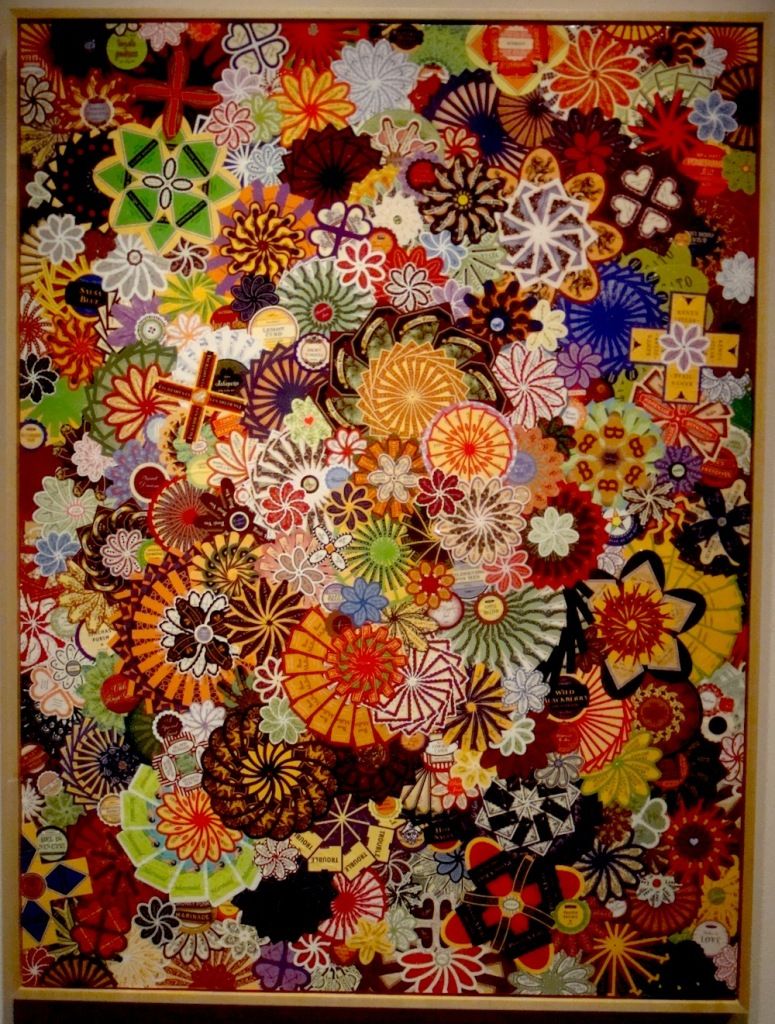
Ivanhoe
Alison Foshee, Ivanhoe, 2012, labels on canvas

The artists in this show veer between those who create work that is pretty and those whose work makes you think, "Wow, that's amazing." (Or sometimes both.) Alison Foshee uses product labels to create her beautiful, somewhat abstract flowers. 

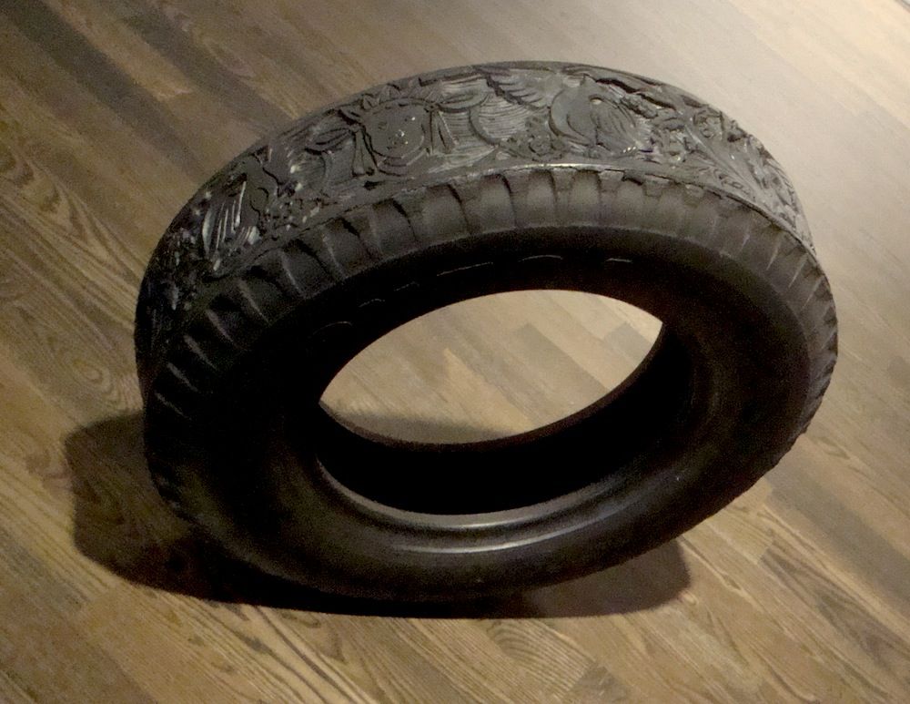
Tire
Betsabeé Romero, 2007, Tire, carved rubber truck tire

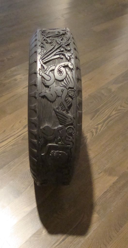
Tire
Betsabeé Romero, 2007, Tire, carved rubber truck tire

Betsabeé Romero's Tire belongs more in the "wow" category. Houstonians may remember his work which was included in the show Cosmopolitan Routes: Houston Collects Latin American Art at the MFAH.

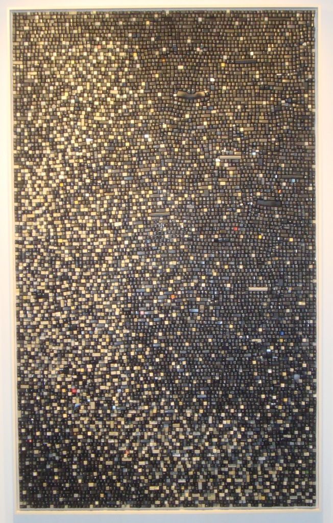
Sign Off
Sarah Frost, Sign Off, 2011, discarded computer keyboard keys

Sarah Frost is also one of the "wow" artists. Sign-Off, like many of her pieces, is composed of old computer keyboard keys. These keys are not only trash (and therefore appropriate for inclusion in this exhibit), but they're obsolete as well. Sign-Off is a formal work of light and dark, but it is also a reminder of how we produce millions of these little things knowing that most will be thrown away after at most a few years.

Frost was one of the stand-out artists at the Houston Fine Art Fair last year, and her piece there was one of the ones that sold. (I will return to the subject of the HFAF below.)

Consonance
Paul Villinski, Consonance, 1993-2006, gold leaf on found work gloves

Paul Villinski's Consonance is one work that is neither "pretty" nor "wow," and to me is perhaps the most intriguing work in the show. It combines the grungy (old work gloves) with the glamorous (gold leaf). The seven gloves are arranged horizontally so that the boundary between glove and gold leaf forms a kind of horizon line. He has, in a sense, created a landscape. This piece is from a series he did with gloves where he combined the sweaty, dirty work glove with some elegant addition, like gold leaf or embroidery.

I mentioned the Houston Fine Art Fair earlier. They sponsored this exhibit and had promotional material available for attendees on opening night. In addition, curator Melissa Grobmyer is a partner with M.K.G. Art Management, LLC., a private company that provides art acquisition and divestment services, appraisals, art inventory management, art leases and corporate archival services. Now it's not unusual for a museum show to be sponsored by a private company. It's the cost we have to pay to see exhibits in a country where the government doesn't typically pay the bills for art museums. But Luxuriant Refuse is a little different--both Hamptons Expo Group (parent company of HFAF) and M.K.G. are companies in the art business. And doing a show like this is a way to drum up business for themselves.

In fact, I think it's kind of brilliant (if ethically shaky). We know there are a lot of well-off people in North Houston. Some of them are into art, and the Pearl Fincher Museum has been cultivating those art-lovers for the past four years. M.K.G. would no doubt like to serve as art consultant for energy company executives in the Woodlands. HFAF would like the collectors who loan work to the Pearl Fincher--as well as aspirational collectors--to visit the art fair this September. I have no idea what deal was made between Hamptons Expo Group and the Pearl Fincher or between M.K.G. and the Pearl Fincher. But on the face of it, each party benefits. M.K.G. and HFAF get access to potential clients while the Pearl Fincher gets a very nice art exhibit. However, the exhibit is also risky for the Pearl Fincher--it's possible that people will see the museum as a shill for the two commercial enterprises. (Tyler Green would have a meltdown over this.)

I'm not sure how I feel. The blatant combination of art business and art museum feels a little skeevy. But I suspect that without the help of M.K.G. and Hamptons Expo Group, the Pearl Fincher would have found it difficult to mount a show like Luxurient Refuse. And that would have been a shame. It's the kind of show that can ease skeptical people into contemporary art. And I think this is an important task for museums--particularly those like the Pearl Fincher Museum located in the vast suburban plain far from the art center.


Share

Monday, February 20, 2012

Conversion Narratives

by Robert Boyd

As literary genres go, conversion narratives have it all. You get both the titillation of sin and the redemption that comes with conversion. For believers, this is as close as they can get to living in the twilight worlds of criminals and the demimonde. Cartoonist Eddie Campbell distilled the conversion narrative down to its essence in one panel from his masterpiece, Graffiti Kitchen.


Eddie Campbell, panel from Graffitti Kitchen page 4, 1988-92

The first conversion narrative (and the first autobiography written in the West) was Confessions by St. Augustine. It set the form into place and autobiographical conversion narratives have remained popular ever since. If you've ever read the Autobiography of Malcolm X, you know the one of the best parts is the "Detroit Red" section, when Malcolm was drug-dealing, gambling, robbing and pimping.And then we get the prison-house conversion.

Conversion narratives can be written or spoken. But until this weekend, I had never seen one in form of a CV. That's how artist Forrest Prince (whose show The Truth Will Set You Free is on view at P.G. Contemporary) presents his. It starts off with his life of sin.
1947 Willingly molested for money [Prince was 12 at the time--St. Augustine was a little more forgiving of the sins he committed prior to the age of 14.]
1948 Drug abuser. Babysat for prostitutes.
[...]
1953-56 USMC. Honorable discharge. 2 weeks in brig for leaving post. Sex addict on speed.
[...]
1958 Pimp and blackmailer.
1959 Dance teacher, Fred Astaire Studio. Gigolo and whore.
1960 Attempted suicide. Overdosed on sleeping pills.
[...]
1964 Arrested for running a call-girl service. Charged with pandering. Dismissed.
Then the conversion comes. The interesting thing is that he started to do art before becoming born again, but the two are clearly intertwined.
1969 Please God, save me! Began doing art work.
1972 Charged with assault to murder and carrying a pistol. Convicted; $300.00 fine (a case of a paranoid speed freak protecting himself from real and imaginary enemies).
 Surrendered to God: off meat, off drugs, off sex. PRAISE GOD!
1973 Slipped: sex, drugs and rock and roll. Still seeking, started serving.
His work was noticed by James Harithas, who gave him a one-person show at the CAMH in 1976. In some ways, his CV becomes more normal here, as he lists the exhibits he has had. But not completely normal.
1985 Larry Pfeffer Grant, $7,500. PRAISE GOD!
[...]
1992 Museum of Fine Arts, Houston, commission for a sculpture from Allison Greene. She wanted a large mirrored heart with "love" embedded in it. The deal fell through when the donor backed out, saying I wanted too much and since the Museum was not about to spend their cash on me, it was all over. But, Praise God! Bill Hill came by and snapped it right up. 
Prince also lists every time he was rejected for Lawndale's Big Show (2001, 2002, 2005, 2010).

Without Prince's conversion narrative, his work would seem pretty strange. It still seems pretty strange, but at least there is an explanation. When you look at a piece like Today's Lesson, you understand that it is the work of a highly religious convert.


Forrest Prince, Today's Lesson, blackboard, chalk, eraser, defense of animals bumper sticker, 37 x 49 x 2.25 inches, 1993

This is barely a piece of art--it's a sermon hectoring you to change the way you live.


Forrest Prince, The Money Changers Are Still In the Temples or Born Again My Ass, found objects, wood, acrylic, 22 x 15 x 5.75 inches, 2009

But Prince's Christianity is neither orthodox nor conventional. We live in a time when its hard to imagine a politically liberal form of Christianity because the Evangelical right has asserted itself so strongly that it (and fellow religious conservatives outside the evangelical movement) are the only kinds of Christianity that exist in media representations and popular culture. But Prince makes pieces like The Money Changers Are Still In the Temples or Born Again My Ass which criticizes Southern Methodist University for their association with George W. Bush.


Forrest Prince, The Money Changers Are Still In the Temples or Born Again My Ass detail, found objects, wood, acrylic, 22 x 15 x 5.75 inches, 2009


Forrest Prince, The Money Changers Are Still In the Temples or Born Again My Ass detail, found objects, wood, acrylic, 22 x 15 x 5.75 inches, 2009

His grievances aren't always religious. It's Time to Put Away Childish Things criticizes the MFAH, possibly for their baseball exhibit from 2005.  The title refers to First Corinthians 13:11: "When I was a child, I spake as a child, I understood as a child, I thought as a child: but when I became a man, I put away childish things." I interpret it as an attack on the MFAH for putting on a shallow, crowd-pleasing show that has nothing to do with art. But it may be that he sees the MFAH as a childish organization.


Forrest Prince, It's Time to Put Away Childish Things, mixed media, 16 x 12 x 6 inches, 2012


Forrest Prince, It's Time to Put Away Childish Things detail, mixed media, 16 x 12 x 6 inches, 2012

It also seems that Prince carries a grudge--after all, he includes his unsuccessful commission for the MFAH in his CV. And he remembers every time Lawndale rejected him. (Perhaps Prince needs to meditate on Matthew 5:39.)


Forrest Prince, Occupy Love, neon lights, mirror, 23 x 30 x 3.5 inches, 2011

Prince's political stance, which is always informed by his religious belief, is all over this show. Hence Occupy Love. Hence a piece exhorting the viewer to boycott Exxon-Mobil and BP. It's interesting and refreshing to see a Christian artist to take a left-wing stance in this present age, but Prince's work has some of the same weaknesses I see in much contemporary Christian art (as well as in much contemporary left-wing political art)--it's too preachy. I guess that goes with the territory. In the end, the story of Prince's conversion is more powerful than the artworks on display here.


Share

Sunday, October 30, 2011

Ward Sanders' Glimpses of an Imaginary Past

by Robert Boyd

Ward Sanders is a San Antonio artist who has had four solo shows at Hooks Epstein. Full disclosure: I bought a piece by Sanders at his last show. His work involves getting old wooden boxes or containers and filling them with scraps of paper and objects. The result is a tiny collection of objects that seem to tell a story of recall a forgotten time or place. They are all backward-looking--reliquaries for an imagined past. This time around, Sanders has added a literary element to it.


Ward Sanders, The Death of New Orleans, assemblage, 2011

I was lucky enough to speak to Sanders at the opening. I told him the combination of deliberate, artificial archaicism with a sense of mystery reminded of the writing of Jorge Luis Borges. I mentioned the story "Tlön, Uqbar, Orbis Tertius," in which a group of bibliophiles stumbles first across evidence of an unknown (fictional) country hidden in an encyclopedia, then a whole world, Tlön, which they come to realize is slowly taking over our world--even though it is completely fictional.


Ward Sanders, The Stars of Home, assemblage, 2011

This lead us into a conversation about literature that brings a fictional reality into the "real world"--he mentioned Invisible Cities by Italo Calvino as a major influence. We spoke of George Saunders, Will Self, and Flannery O'Connor. He talked about how David Eagleman's Sum: Forty Tales from the Afterlives had influenced this current show, as had his readings on fossils and paleontology.


 Ward Sanders, The Whores of Bellocq, assemblage, 2011

Literature was on Sander's mind when he made these pieces. The addition of the text, written in a formal voice, somewhat old-fashioned--a little like Borges--moves the work from an already fuzzy location as visual art to some hybrid. I usually recoil when artists include writing in their work. There are two problems with this practice. First, the writing is usually too long. It's an imposition to make someone in a gallery or museum read long texts. But worse is that the writing is almost always terrible. Most artists are not good prose stylists.


Ward Sanders, Homily on Genetics, assemblage, 2011


Sanders avoids both errors.Just as each box feels like a fragmentary record of something much greater, each text feels like a fragment of a novel or story that I personally would like to read. Something Calvino-esque.


Ward Sanders, Emily Dickinson's Herbarium, assemblage, 2011


Two of the works refer directly to New Orleans, a city where the past seeps into the present like no other American city. "The Whores of Bellocq" refers to E.J. Bellocq, who took many photos of the whores of Storyville. When you see these photos, you can see how they might appeal to Sanders. But his work is allusive--he doesn't use any of these well known photos in the work itself. 


As should be obvious from the photos, these are works of consummate craftsmanship. And there is an obvious link to the work of Joseph Cornell, but without the powerful feeling of francophilia that pervaded Cornell's work. Sanders work might make us think of Cornell or Borges, but it is rooted here in this part of America.


(All photos from Hooks Epstein.)


Share