Showing posts with label Paddy Johnson. Show all posts

Thursday, December 6, 2012

Art Bloggers' Big Score

Robert Boyd


Harbeer Sandhu, Art Writers grant recipient

For the past two years I have applied for the Creative Capital | Warhol Foundation Art Writers Grant in the blog category, and I've failed to be picked both times. This year I am especially jealous of Harbeer Sandhu, who won a brog-writing grant for his proposed blog Critical Condition. Why am I jealous? Harbeer Sandhu is (as many of you no doubt know) a Houston-based writer. If that is not enough to turn me green, read the description of Critical Condition from the Art Writers site:
The city of Houston, while offering artists much needed support in the form of work space, free time, gallery space, and even financial backing, lacks the supportive yet critical engagement necessary to fully realize its potential to be a rich arts community. Aiming to provide a local forum for art criticism connected to world literature and international concerns, Harbeer Sandhu will develop a Houston-based art blog featuring weekly posts focusing on the visual art of Houston and Texas in a global context.
I guess the nearly 1000 posts I've put up since September 2009 don't count as "supportive yet critical engagement." Grr. But this jealousy is unbecoming and unfair to Sandhu, who is a good writer and I'm certain will be a good blogger. You can read some of his writing here and here. I hope Critical Condition becomes an important voice for art locally.

This grant is extremely generous. Bloggers get $30,000. Sometimes the blog in question already exists, and sometimes it's just a proposal for a blog. That got me thinking. They've been giving away Art Writers grants since 2006, but have only been giving them for blogs since 2008. So how have Creative Capital | Warhol Foundation done? They have given away 20 grants so far--$600,000 for blogs! (Assuming that the $30,000 has been the amount given out ever year to every blog.) Have they gotten their money's worth? Have these blogs produced? And when I say "produced," I am referring to some mixture of quality and quantity. Quality is something we can all agree is desirable (even if we have disagreements on what it is). Quantity might not seem as obvious a virtue. But in my mind, a blog requires constant posting to be truly excellent.

The blogs I like best, regardless of genre, are continually updated. It has been said that newspapers are the first draft of history. Art blogs may be in some ways be considered the first draft of art history--except that art blogs are often highly personal. They may contain journalistic information--reviews of current shows (art blogs are virtually the only way for readers to get informed opinions about shows that are still up), reportage about various aspects of the art world, and editorial opinions. But at their best, this kind of information is filtered through a highly idiosyncratic voice; the word "I" is not avoided. For me, this mixture of the journalistic/critical and the personal is what is so appealing about my favorite blogs. Posts are often brief, even curt. The best blogs show the evolution in their author's thinking as well as the evolutions of the artists and institutions they cover. A single blog post may therefore be unmemorable by itself (unlike certain classic magazine articles and books). The blog, however, should be judged as a cumulative experience. But this can't happen if posts are too infrequent.

Therefore, in this post I will score each of the past winners of the Art Writers blog grant, looking at both quality (highly subjective) and quantity (completely objective). I'll grade them for content (A through F) and explain my thinking. Quantity, on the other hand, will be based on posts per month since the beginning of the blog or the date of the grant, whichever came first. I realize this disadvantages writers who write long but infrequent posts, and I'll note when that is the case for any particular blog. But in general, the higher the number, the better. What I hope you will get out of this (beyond a palpable sense of my envy) is an introduction to a bunch of art blogs, some of which I recommend highly.

2008 grantees

Paddy Johnson, Art Fag City. Art Writers picked an obvious winner right out the gate with Art Fag City. One of my chief sources of news and opinion about the art world, Art Fag City is pithy and well-written. And they publish multiple posts a day. Of course, Paddy Johnson couldn't do this solo--she is helped by Will Brand, Whitney Kimball and Corinna Kirsch. GRADE: A, 78.02

Anjali Srinivasan and Yuka Otani, How Is This Glass?. One thing that is really good about Art Writers is that they give grants to highly focused blogs like How is the Glass?, which is about glass art. However, it's not a very good blog. Srinivasan and Otani seemed to use the blog primarily to help in their curatorial projects. The posts were fairly infrequent and tailed off to nothing by 2012. They were divided between posts about individual artists and posts called [theme] which were small essays on certain aspects of glass art. The posts on the individual artists sometimes consisted of nothing but pictures, and sometimes had brief texts. The [theme] posts were the best--there they gave themselves enough room to tackle their subjects. The many pictures on this blog were a plus. The last post went up May 23, 2011. Another way to look at it is to notice that Art Writers paid approximately $326 for every post they posted since December 2008. Nice work if you can get it! GRADE: D, 1.92

2009 grantees

The New England Journal of Aesthetic Research by Greg Cook. It's hard for me to be objective about Greg Cook's blog; I've known Greg since the 90s and have long admired his work. (He actually got his start as a graphic novelist, with the charming Catch As Catch Can). Furthermore, The New England Journal of Aesthetic Research is similar to this blog in its focus on its region. Its slogan is "We proudly offer more New England art news and reviews than anyone else." Cook started the blog in 2006, and it currently is split between reviews, news, and upcoming show listings. Some of the most entertaining writing are his posts on "yokelism," which describes the philosophy of the blog--an intense concentration on locally-produced art--art from Boston in particular. Cook comes from a journalism background, and that tends to give his writing a "just the facts feel." (This impersonal style reaches its apotheosis when he's writing about himself in third person.) Also, I have to note that the blog is somewhat cluttered and navigation is difficult (the "quantity" score is an approximation). Grade: B, 12

Post-Internet by Gene McHugh. This is a perfectly irritating blog. It deals with the way the internet has changed art. In McHugh's final post (September 12, 2010), he writes
“Post Internet” is a term I heard Marisa Olson talk about somewhere between 2007 and 2009.
The Internet, of course, was not over.  That’s wasn’t the point.  Rather, let’s say this: what we mean when we say “Internet” changed and “post Internet” served as shorthand for this change.
All well and good, and the blog discusses issues around this subject and describes individual works of art and the work of particular artists whose work is relevant. But he includes no links, no jpegs, no gifs--nothing that the internet makes so easy for blogger. It's ironic and perverse, given his subject. He might as well be writing for a print journal (except that a print journal would at least occasionally show photos of the work under discussion.) McHugh's ideas are interesting, but the blog itself is not. Grade C-, 3.3 (The quantity score is so low because this blog petered out in less than a year.)


A Year of Positive Thinking by Mira Schor. This is a case where a well-established art writer decided to take up blogging. Aside from the length of her posts, she's done a great job and obviously gets a lot out of it, since she has continued long past a year. Apparently it is a continuation of something she sent out to subscribers via email. This is not so much a newsy blog as it is a personal blog. But by personal, I don't mean that Schor is writing a journal of her everyday activities. Instead, she is responding to art she has seen, books she has read, events she has witnessed, etc., in a personal way. Her primary concerns are feminism, painting and sculpture, and her own art, but she will write about anything that draws her attention. She is not prolific--her last post comes from October 13, 2012. Grade B, 1.58

2010 grantees

greg.org by Greg Allen. This is a blog that was already in existence when it won its Art Writers grant. In fact, its first post was in July, 2001, which surely makes it one of the oldest art blogs in existence. It also has the virtue of being broad, personal and pretty snappy. Some posts are quite brief, but occasionally Allen spreads his wings with a longer post. I like this variety. Allen is a prolific blogger. greg.org is very well illustrated and often includes embedded video. In short, a very good art blog. Grade A, 20.33

Our Literal Speed by Matthew Jesse Jackson, Andrew Perchuk, and Christopher P. Heuer. This can't be judged as a blog. It appears to be an art project of some sort. Maybe it was a blog at some point, but if it was, I can't find a trace of its old existence. Grade incomplete.

The Silo by Raphael Rubinstein. Rubinstein is a well-known art critic and a professor at the University of Houston. The Silo isn't really what I'd call a blog (but then again, if it's not a blog, I'm not sure what else to call it). Rubinstein's project is to write essays about overlooked artists who aren't discussed and are in danger of being written out of art history. (However, he occasionally writes about well-known artists like Cindy Sherman.) Most of them are living artists or artists active since at least the 60s. These short essays are excellent and quite illuminating. He doesn't post frequently, but I'm delighted when he does. I particularly liked his posts on George Sugarman and Daniel Spoerri. Grade A, 1.54

16 Miles of String by Andrew Russeth. Andrew Russeth started his blog in 2006 and his most recent post was October 20. His posting in 2012 has been very light, but this can be forgiven. His gig as editor of and contributor to GalleristNY likely keeps him pretty busy. I quite like GalleristNY chatty, newsy style. It's very different from 16 Miles of String which is simultaneously much more text heavy and includes many more photos. 16 Miles of String is also more personal, often recounting his own experiences attending openings and performances. It would be unfortunate but understandable if 16 Miles of String was now a defunct blog, but GalleristNY is a worthwhile if different endeavor. Grade B, 3.83 (the post-per-month score would be much greater except that once GalleristNY got underway, 16 Miles of String's posts got much less frequent. )

2011 grantees

Art Vent by Carol Diehl. I wrote about Art Vent last year. The only thing I have to add is that I wish she was a little more prolific. Grade B, 3.5

Art in Common by Jason Farago. In terms of quantity, you can't say Art Writers got their money's worth from Jason Farrago (15 posts since December, 2011). However, Farago makes up for it in quality. Except for the first post, in which he outlines a bit of his philosophy for the blog, each post is dedicated to a single piece of public art in New York City. He researches each piece and has something to say about its particular history, its location, and its place in the artist's oeuvre. He is also a sensitive critic. But beyond all that, each essay is personal--these aren't mere encyclopedia entries. As a blog, it doesn't quite work because the posts are too long and too infrequent. But as a collection of writings--as a book (which seems like the probable end-point for these pieces)--Art in Common is exceptionally good. Grade: A, 1.25

The Performance Club by Claudia La Rocco. I find this blog unsatisfying for a variety of reasons. It's a little hard to navigate. It skimps on photographs (one thing that blogs have over magazines is an infinite amount of space to reproduce photos--it seems like a waste for an art blog not to use this). And I don't find the writing particularly compelling, although it's not bad. But if you have a strong interest in the intersection of dance and performance art, this might be the blog for you. Grade C, 9.25

Presence Documents by Sohrab Mohebbi. Right now, Mohebbi is writing about the Syrian civil war through a lens of theory, particularly in discussing the photos and videos of "citizen journalists." In fact, one might say the Syrian civil war is his main subject--it more-or-less coincides with the blog and he has been posting about it from nearly its very beginning. The multiplication of images, particularly via the internet, is his subject. Occasionally he talks about artists and art, but often as not he'll be talking about the media or about amateur visual content on YouTube and elsewhere. His writing is fairly impersonal, dry and matter-of-fact, and sometimes heavily footnoted. Mohebbi is quite prolific. He includes photos, but fewer than I'd like, and they are irritatingly small on the blog. (You can blow them up by clicking on them, though.) So, not exactly a blog that's fun to read, but a serious effort and one that looks at images--so ubiquitous in modern culture--as more important than art per se. This is a position I ind myself increasingly drawn to. Grade B, 5

beyondasiaphilia by Valerie Soe. Another blog I've written about, it continues to cover Asian film (and occasional other subjects). A worthy subject but not one I have an interest in following so deeply. That said, it seems like a fine blog if you are an aficionado of Asian film. Grade B, 2.08

Art and Shadows by Meredith Tromble. Tromble hasn't been terribly prolific since she was awarded the grant last year--15 posts total. However, her posts are long meditations on the subject at hand. She may be writing about a particular artist, but the posts ramble over related subjects in a pleasant way. I don't want to say that she is unfocused, but instead to suggest that the subject of a given post might not be the art she opens the post with. It may be an idea that this art suggests. Her most recent post was in September, so Art and Shadows may be an ex-blog at this point. Grade B, 1.25

Printeresting by Jason Urban, R.L. Tillman, and Amze Emmons. I also wrote about this blog last year, and I want to add that it has been one of the most consistently excellent blogs I have read over the course of the year. Grade A, 21.67

2012 grantees

I won't write about the 2012 grantees yet, especially since two of the four grantees haven't started writing their blogs yet. But let me acknowledge them here. Caryn Coleman writes The Girl Who Knew Too Much, a blog about contemporary art and horror films--an intriguing combination!

Farrah Karapetian will be writing Housing Projects, which will track some specific house-based art projects in Detroit as well as generally covering art that uses the house as its basis. Seems pretty specific, but timely.

Black Visual Archive by Meg Onli documents and reviews contemporary black and post-black culture. Sounds like a mighty tall order for one little blog, but a project worth undertaking.

And as mentioned at the top of this post, Harbeer Sandhu will be writing Critical Condition.

Share

Tuesday, May 15, 2012

Frieze New York part 2

by Robert Boyd

(Continued from Frieze New York part 1)

One thing that also spoke to the elitist, anti-democratic feel of Frieze was the lack of union workers. There were mixed reactions to this--after all, many art writers are outraged by Sotheby's lock-out of its unionized art handlers. It seems patently unfair for entities like Sotheby's that are so rich and profitable to reduce benefits for its workers. But at the same time, unions at convention centers and display halls are just one more monopoly (like Aramark or Freeman), and as such a total pain in the ass to deal with.
The snaking tent is a triumph of design, affording a blessing rare enough alas in museums and almost unheard-of in North American fairs: natural, diffuse, overhead light.  (This was perhaps a tad over-augmented the Sunday of my last visit with harsh artificial light to compensate for an overcast start to the day.)  The curved layout  avoids the oppressions of the grid so that as the viewer moves through the space there is a sense of progress, of arriving at a new bend in the curve.  Spaces are neat but individualized and sight lines nicely varied.  According to David Nolan of David Nolan Gallery, the organizers managed to “get rid of the politics” that is the art fair norm.  The management told him “not one gallery complained about placement.”  There is ample space between sections, booths are big, the floor is strictly a uniform, gray wood paneling – rather than the oppressive concrete, cheap carpeting and pretentious cacophony of individual booth flooring solutions that mar the fair going experience at convention centers and armories. And because they had struck out with their own temporary structure at Randall’s Island, Frieze didn’t have to work with the catering contracts and intransigent unions of these venues.  This meant invitations to top-notch eateries like The Fat Radish and the late Leo Castelli’s watering hole, Saint Ambrœus, and it meant relaxed, friendly staff.  The perceived remoteness of the location and the steep entrance fee of $40 meant an absence of crowds.  Exhibitors I spoke to do not regret the selected volume of attendees as it meant a more committed (read “likely to spend”) kind of viewer had a better time of it. ["On an Island in the River – Sunday in Randall’s Park with Frieze" by David Cohen, Artcritical, May 6, 2012]
David Cohen doesn't seem to have too much problem with the lack of union workers. Paddy Johnson is less accepting.
While we heard the few dealers who had in-booth lighting were pleased they didn’t have to wait four hours for a union guy to come screw in their lightbulbs, the fair’s ongoing labor dispute with the Carpenters Union stands out. While interviewed for an industry documentary, a press person hovered over me, ready to shut down any conversation that might include the labor dispute. Frieze should be ashamed. ["The Lowdown on Frieze New York" by Paddy Johnson, Art Fag City, May 4, 2012]
And Geraldine Visco suggested the location was chosen specifically to avoid unions.
I boarded the M35 bus at 125th Street and Lexington Avenue and arrived at the entrance to Frieze 10 minutes later. I was immediately assaulted by the vision of a giant rat and an assortment of union men standing around protesting the fact that Frieze wasn’t using union labor. In fact, I was told that by a staff member that Frieze specifically chose Randall’s Island so they wouldn’t have to hire union employees. ["Frieze Frame on Randall's Island" by Geraldine Visco, Hyperallergic,May 7, 2012]
But I have heard a slightly different story. First of all, apparently Frieze in London is in a tent like this in Regents Park. The number of locations in New York City where one can erect a mile-long tent must necessarily be limited. Also, the problem with having the show in an established convention venue is that you end up dealing with mediocre monopolists who have exclusive contracts with the venue. The union labor at a convention center is just one more crappy monopoly that you are forced to deal with. As someone who has gone to a lot of conventions and dealt with these companies, I can relate.As far as I'm concerned, at a trade show (or an art fair), the union is the same as Aramark which is the same as Freeman--a provider of mediocre service that you are forced as an exhibitor to use. I don't blame Frieze for working around that.

Anyway, let's look at some more art:


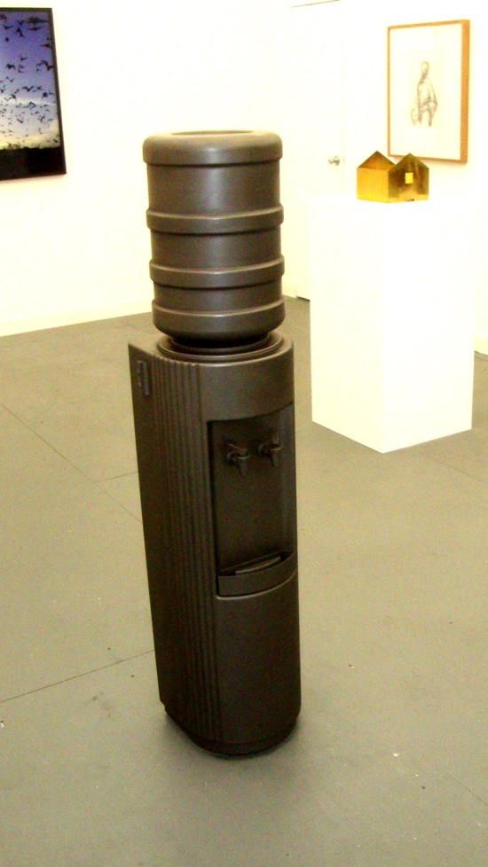
Water Cooler
Adam McEwen, Water Cooler, 2012, graphite at art:concept

Adam McEwen's Water Cooler could be used as a giant pencil in a pinch.

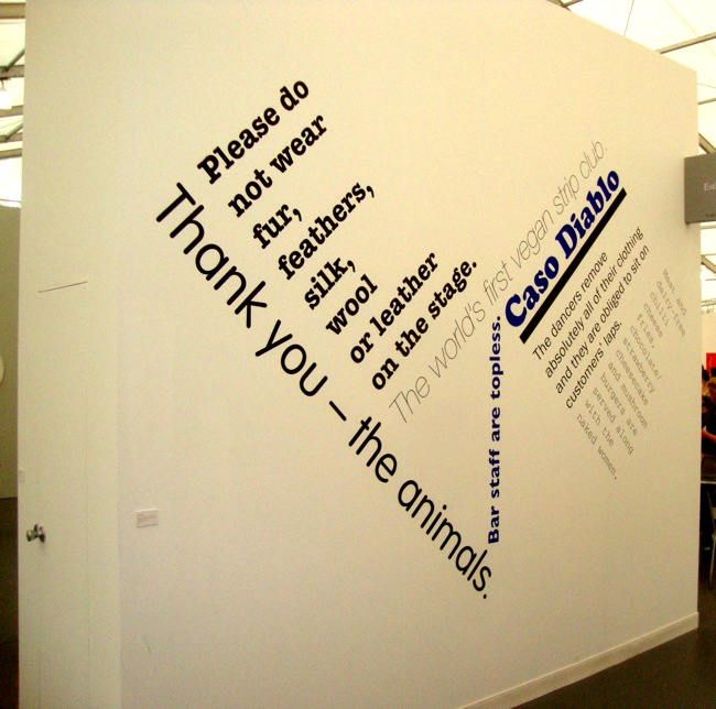
Casa Diablo
Angela Bulloch, Casa Diablo, 2012 at Esther Schipper

My friend Paul was amused by this piece by Angela Bulloch because, as he put it, he likes it when the politically correct is combined with the politically incorrect. And he added that it would have been even funnier if bicycles were somehow involved. (Vegan strippers who commute via fixed-gear bikes?)

Photobucket
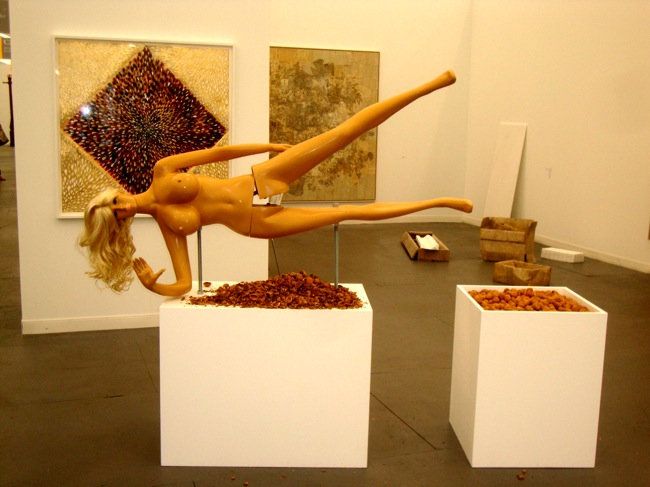
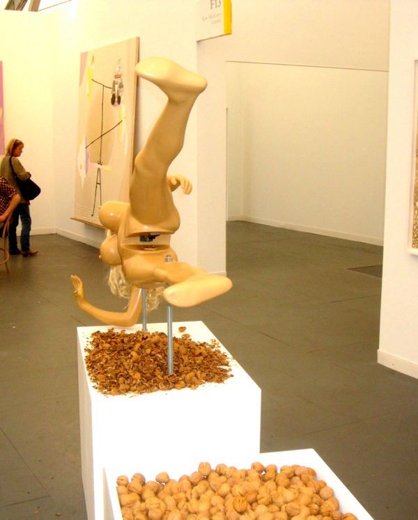
Jennifer Rubell, Lysa I, mixed media, 2012 at Breeder Gallery


Photobucket
Jennifer Rubell, Lysa I, mixed media, 2012 at Breeder Gallery

Speaking of politically incorrect, this sex-mannequin nutcracker by Jennifer Rubell was astonishingly crass. It belonged at Pulse, which seemed to be full of work like this. This strikes me as one of your "have your cake and eat it" pieces. It is a degrading image of a woman, but that's OK because it's also about sexism and objectification! I'm sorry, but I ain't buying it. It seemed much less a comment about anything than a decadent object for rich people. Plenty of visitors were willing to use the nutcracker--you can see the shells beneath the crotch. I was a little too creeped out to use it, personally.


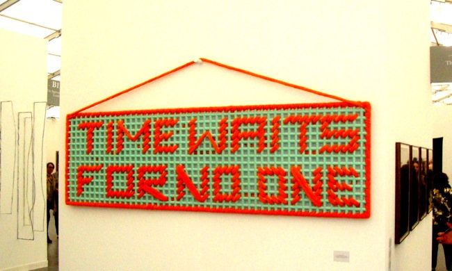
Time Waits for No One
Amanda Ross, Time Waits for No One, 2011 at Sfeir-Semler

The perfect artwork for all needlepoint/Rolling Stones fans.

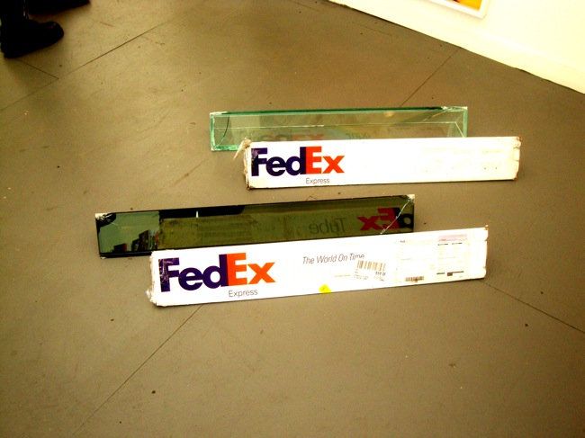
Fedex Tube by Walead Bashty
Walead Beshty, Fedex Tube c2005 FEDEX 139752 REV 10/05 SSCC shipping TBD. Los Angeles-city TBD trek# TBD. date TBD. 2011, 2009-, at Regen Projects

If you have ever had to ship posters, you probably used this weird-shaped Fedex box. It's their mailing tube box. What Walead Beshty did was to ship laminated glass designed to fit exactly in the box. The random breakages caused by the handling creates the unique prism-shaped sculpture at the end of the shipping process. But my question is, do you display the box as well, or just the glass? The glass by itself is an intriguing, pretty sculpture. But displayed with the box, it becomes a documentation of a process.

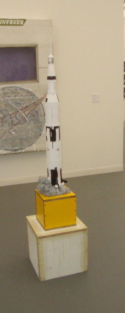
Saturn V by Tom Sachs
Tom Sachs, Saturn V (painted version), 2011, bronze, plywood base at Galerie Thaddaeus Ropac

Tom Sachs is apparently really into space travel.

Photobucket
Thomas Struth at Galerie Rüdiger Schöttle

Photobucket
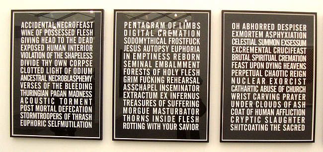
Steven Shearer, Poems, charcoal on rag paper at Modern Art

It seems that Steven Shearer has some stuff to work out.

Photobucket
Sophie Calle, "Des journées entières sous le signe du B, du C, du W. BB", 1998 at Galerie Perrotin

Photobucket
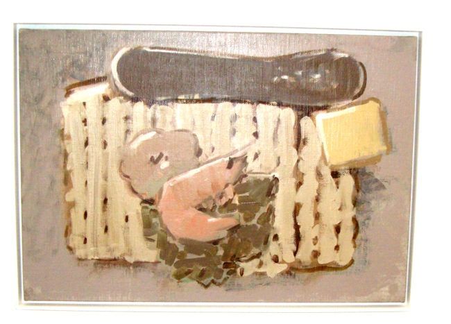
Ryan McLaughlin at Lüttgenmeijer

My photo doesn't do it justice, but I thought the paintings of food by Ryan McLaughlin had a real joie de vivre.

Photobucket
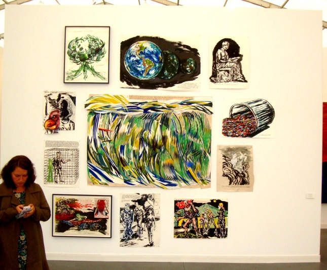
Raymond Pettibon at Regen Projects

Photobucket
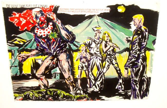
Raymond Pettibon at Regen Projects

Along with Sean Landers, Raymond Pettibon held down the "scary clown art" position at the fair.

(Continued in Frieze New York part 3)


Share

Monday, May 14, 2012

Frieze New York part 1

by Robert Boyd

I know I'm a little late on this. I wish I could say the reason is that I am going to have some startling original insights on the state of contemporary art or the art world. But really, this is the first big art fair I've ever attended. I was more like the hillbilly visiting the city, slack-jawed and saying "Gaw-ly!" In fact, I'll outsource my opinions to other writers who have had a little more time to process this phenomenon. And in between, I show some pictures of art that intrigued (or outraged) me.

(This post is divided into four parts not because any given part is long, but because so many artists were discussed, I kept running out of room to tag the posts. I only get 200-odd characters for labels.)

John McCracken, Galaxy, 2008 at David Zwirner

Some galleries were practically like museums--at least in terms of how well-known the work being shown was. David Zwirner was such a gallery.

Dan Flavin, untitled (to dear, durable Sol from Stephen, Sonja, and Dan) one, 1969 at David Zwirner

But Frieze was no museum. I met my friends Mark and Paul there. Both are collectors. Paul is an art fair veteran while Mark had never bought anything from an art fair. Mark was curious why they existed. Indeed, it seems strange that you would go to a tent on an island to see work from galleries that are open all year round in Chelsea. (That said, galleries from all around the world had booths here, so there's that.) This was something that Peter Schjeldahl remarked on in The New Yorker:
The whole idea of staging art fairs in New York may seem odd. Isn't the city a permanent art fair, with hundreds of galleries conveniently clustered in a few neighborhoods? But the gallery-centered template of the art business has changed, and the survival of New York dealers, as of dealers everywhere, now demands that they transport their goods and their personnel from their galleries, which present art with museum-like tenderness and gravitas, to the flimsily walled, cacophonous fairs, even if the trip spans just a few blocks. ["All is Fairs" by Peter Schjedahl, The New Yorker, May 7, 2012]
As a gallery owner friend once told me, he can see as many people in one fair as he might see in his gallery all year. So to answer Mark's question, art fairs exist to make money for galleries. A fair is a concentrated locus of buying and selling. A few people at Frieze were like me--looky-loos with no intention (and no means) of buying the art on display. But a good portion of the attendees were serious buyers. And based on what's been reported, they bought big.
Lisson Gallery had a good opening day at Frieze New York:
Ai Weiwei Marble Helmet, 2010 Sold for €50,000
Anish Kapoor Untitled, 2012 Stainless steel and lacquer Sold for £500,000
Haroon Mirza Scream Heist, 2012, Monitor, table top, speaker cable, amp, DVD/AV player, LEDs, Sold for £30,000 / $50,000
Haroon Mirza Rhizomatic, 2012 LCD monitor, strobe, amp, wood, LED’s, circuits Sold for £24,000 / $40,000
Haroon Mirza Important Information, 2012 modified LED display, headphones Sold for £22,000 / $36,000 ["Lisson Sells at Frieze NY" by Marion Maneker, Art Market Monitor, May 3, 2012]
 I was intrigued that high-tech electronic artwork such as the work by Mirza--full of parts that will wear out and become obsolete in a few years--sold so well. But what I think of as salable artwork (paintings primarily, and photos, and some sculpture) goes out the window at a high-end art fair like Fireze. If you can afford to pay $50,000 for a work of art, you can afford to take care of it, even if it is electronic, even if it requires constant monitoring, and even if it requires expensive modifications to your home to display it.

Navid Nuur, Mineralium, 2011-2012, sugar, magnets and iron filings at Alex Zachary Peter Currie

Navid Nuur, Mineralium, 2011-2012, sugar, magnets and iron filings at Alex Zachary Peter Currie

Mineralium by Navid Nuur is literally a pile of sugar and iron filings. Presumably, if you wanted to display this in your house, Nuur would have to personally come and install it. But does sugar last? And doesn't it attract pests? But presumably anyone with the wherewithal to buy this piece also has the means to store it safely.

Buster Graybill, Progeny of Tush Hog at Jack Hanley Gallery

Austin's Buster Graybill had this work, Progeny of Tush Hog, for sale at Jack Hanley Gallery. That yellow stuff is corn, I think. And that's the idea--these objects are meant to be filled with corn and left out in a field, where wild pigs or other critters can root under them and roll them around (causing more corn to fall out). So to own these (properly, at least), you need a ranch out in the country and you need to refill them with corn periodically.


Jim Lambie, Vortex 'Eau de Parfum,' 2012 at Anton Kern Gallery

This piece by Jim Lambie at Anton Kern Gallery, for example, would require their owner to literally build a wall for it, as the "vortex" portion of it is a fairly deep hole the wall.

Cory Arcangel, Bowl of Soggy Cornflakes at Team Gallery

And the funniest example of this is this bowl of soggy cornflakes by Cory Arcangel. I was at the Team Gallery booth looking at some wall tags for a piece of art when I saw a wall-tag that didn't seem to be for any visible piece. It was Bowl of Soggy Cornflakes by Cory Arcangel. I looked around, and sure enough, on the table where the booth employees sat was a bowl of soggy cornflakes. I asked about it and was told that what you got was the bowl, the spoon, a set of instructions, and a certificate of authenticity. You had to supply the cornflakes and milk, and the contents had to be renewed every eight hours. The Team Gallery gallerina I spoke with described the work as a parody of conceptual artworks that were series of instructions--for example, a Sol Lewitt wall drawing. But I think Cory Arcangel was also making fun of art fairs and the people who buy art in them. What was the most ridiculous thing that someone would buy? (I have an email into Team Gallery asking if it sold, and for how much. If they answer, I'll let you know.)

In any case, a person like me with a decent but relatively modest income needs to step outside his worldview to begin to understand what was happening at Frieze.
At Cheim & Read’s booth, partner and sales director Adam Sheffer was practically giddy. “It feels like 2007 all over again!” he exclaimed. The booth sold several Jenny Holzer pieces — an LED sign for $175,000, a bench for $100,000, as well as a work via JPEG — as well as a Chantal Joffe painting for $65,000, a Louise Fishman work for $125,000, and a Bill Jensen for $25,000. Reportedly on reserve was the 2,000-pound Lynda Benglis sculpture oozing out of the corner of the booth, which required the gallery to reinforce the floors underneath in advance of the opening.
London’s Victoria Miro sold several recent works “in the low to mid-six figures” by Yayoi Kusama, who has seen a rush of fresh interest on the heels of her Tate retrospective. “People are incredibly happy to be here,” said dealer James Cohan, who sold a number of pieces by Berlin-based Simon Evans for $30,000 to $75,000 by early afternoon. “They all say, ‘I guess this is going to become the fair in New York.’”
The swift sales continued over at Metro Pictures, where Robert Longo’s large, black-and-white close-up drawing of a waving American flag sold for $425,000 and a Cindy Sherman photograph from 1977 sold for $950,000. Casey Kaplan and Andrea Rosen reported selling out, or very nearly selling out, everything they had on the walls. Kaplan presented a solo show of Garth Weiser’s large, bright abstractions ($35,000-45,000 each). Rosen mounted a solo room of brand new vibrant paintings and wall collages by Elliott Hundley, all sold for $85,000, and an accompanying room of quieter work by Wolfgang Tillmans and Aaron Bobrow, among others. “I tend to bring work under $100,000 to Frieze,” Rosen said. “People who come here like to feel a sense of discovery, but also buy work they know is still reasonably established.” ["Sales Report: Frieze New York Makes a Convincing Case for Itself With an Opening Burst of Business" by Shane Ferro and Julie Halperin, Blouin Artinfo, May 4, 2012] 
Buying work under $100,000 gives the buyer a sense of discovery?

Lynda Benglis, Quartered Meteor, 1969-1975, lead (yes, lead as in the metal) at Cheim and Read

Sean Landers, Around the World Alone (Ancient Mariner) (left) and Around the World Alone (Slocum) (right), 2011, encaustic, terracotta. metal, wood at greengrassi

Sean Landers, Around the World Alone (Ancient Mariner) (left) and Around the World Alone (Slocum) (right), 2011, encaustic, terracotta. metal, wood at greengrassi

These Sean Landers are perfect for the kid's room!

Paul McCarthy, White Snow Dwarf, Sleepy #1 (Midget), 2012, slilcone (blue) at Hauser & Wirth

Everyone seemed to love the facility. Instead of holding Frieze in an existing building, the organizers built their own mile-long temporary structure. Lord knows what it cost.
Let’s begin with the location, for which there has been endless hand-wringing amongst art worlders. How will we ever get to Randall’s Island? Get a grip, people. A ferry to the Island runs every 15 minutes from 35th street and it’s fucking luxurious. Frieze doesn’t feel like a fair, it feels like an event. It’s not quite Venice, but then again most vaporetti don’t have concession stands. [...]
Once inside, the first thing you’ll notice is the design of the fair. Literally everyone we talked to mentioned how much they liked the lighting, which during the day is mostly natural and augmented by giant hanging fluorescents. We also noticed the spacious layout and booth size. Smaller booths rarely looked cramped, and larger booths often had large window like views into their spaces. So. Great.
But also: Buyer beware. Some art looks better here than it will in your home, which is, well, dangerous, given that a lot of the work is also pretty great. ["The Lowdown on Frieze New York" by Paddy Johnson, Art Fag City, May 4, 2012]
And this was part of the feeling of exclusivity that the organizers sought to create. This was evident in many ways. The ticket price ($40/day was meant to frighten away the looky-loos). The curated selection of galleries, which is apparently unusual if I am reading some accounts correctly. (How do other art fairs select their galleries?) The high quality cuisine--whereas if you have a fair in a convention center, you end up with food from whatever concessions monopoly has the contract (think Aramark).
And while Frieze co-founder Matthew Slotover tells the NYT that he is “very much pro-democratization and a larger engagement” with the general public, the fair’s location on a desolate island, and its sky-high entry fee, and even its galleries all mitigate against that. It’s the galleries who asked for — and received — fewer visitors, remember, and on Friday night I met one gallerist who was complaining that while she met some very high-end collectors on Thursday, the Friday crowd had altogether far too many “lookie-loos”. ["The Business of Art Fairs" by Felix Salmon, May 6, 2012]
(That gallerist was evidently talking about me and my ilk.)
Making my way into the immense white tent that houses the fair, I was shocked. The spaces are wide-open, well lit, generously proportioned, accommodating, sensual. Ceilings soar; a gentle curve in the tent stops vertigo. "How could an art fair feel good?" I wondered. The two-piered New York Armory Show has become drudgy, crowded, comfortably numb. By now I simply assumed that a big art fair in New York wasn't possible. Then I understood what made this art fair completely different than our own: Oxford!
The founders of this fair are Frieze magazine's English executive publishers, Amanda Sharp and Matthew Slotover. In New York and America, we're great at making things big and democratic, and bigger is better — the largest fair, the most galleries, turnover, largest crowds, two piers. That is why the Armory Show is more like a gloomy zoo, giant but visually dreary, shoddy-feeling, and unpleasant. Worse, because it's democratic about which  galleries may participate, the quality level is low. By contrast, the Frieze Fair mirrors the fact that the art business is not democratic but is based on a semblance of talent and ability, a quasi-meritocracy. The fair exudes a tribal feeling. This may strike some as elitist or about who-you-know, but it's actually a good thing, because the Frieze fair is a much better reflection of the serious-gallery landscape than the Armory Show is. An American group starting a fair would find it uncomfortable to screen galleries. The English, by contrast, view it as a responsibility. That process has the added benefit of taking a place that has often become strictly a trading floor and returning it, somewhat, to being a powwow, one where information, not just money, changes hands. ["Why the Frieze Art Fair Could Solve the New York Art Fair Problem" by Jerry Saltz, New York, May 5, 2012]
(Continued in Frieze New York, part 2)


Share