Showing posts with label Walter de Maria. Show all posts

Wednesday, December 21, 2011

Robert Boyd's Worst of 2011

by Robert Boyd

Not every show can be a good show. And some--a lot, really--are pretty damn bad. This isn't really a list of all the worst exhibits from last year. There are some venues that almost never put up good art. I don't see much value in pointing this out. Therefore, everything listed here is from an institution that should have known better. Not only were these shows bad, they were disappointing.

Walter de Maria, Trilogies at the Menil. I thought the rods through the Bel Airs were kind of nice, but it ultimately seemed like de Maria was leaching off the art of the classic automobile while adding the slightest piece of himself to it. The Statement Series paintings were merely banal. Ultimately I agree with the sentiment that this show was "a 25 cent idea with a million dollar budget."

Rod Northcutt's Indigenous Genius at Art League. This is a case where an artist had an idea that must have initially then seemed clever and beat it into the ground. The notion of beavers as indigenous artists, in addition to being kind of an insult to the real issues surrounding indigenous art, was like a one page comic strip in Mad Magazine inflated until it popped. The feeble concept simply could not sustain a major art exhibit.

Tara Conley and Tria Wood, My Life As a Doll at Diverseworks. I hate to include this show on the "worst" list because I like Tara Conley's work (her show at Laura Rathe Fine Arts was really good). But the overblown execution of this piece, combined with the smug and condescending content, was awful. It was heavy-handed preaching to the choir.

This is Displacement, curated by Carolyn Lee Anderson and Emily Johnson at Diverseworks. Most of the art in this group exhibit of Native American artists was simply bad and some of it seemed amateurish. Diverseworks' description of the show was that it "offers audiences multiple views of displacement from indigenous perspectives and encourages dialogue and critical commentary on the intersections of art and identity." I say, in order to accomplish something like this, it has to reach a minimal level of artistic competency, which it didn't.

Patricia Hernandez, Parody of Light by Patricia Hernandez. A parody should have the ability to show us the emperor's naked fat ass, to show us the cliches and bad faith in a piece of art. This show smugly told a bunch of sophisticated art fans what they already know--that Thomas Kinkade is an awful artist and a crass person. This was not a revelation that required an entire gallery.

The Spectacular of Vernacular, curated by Darsie Alexander at the CAMH. Pablo Helguera once wrote that for curators stuck for an idea, they should "a) open a dictionary and point a finger to any page randomly; b) take the 'selected' word as the topic of the exhibition and search Google using this word along with the phrase "contemporary art"; c) generate a preliminary artist list based on the names that will come up from the mentioning of this subject." (Manual of Contemporary Art Style). This curatorial algorithm is what I thought of when I saw this show.


Share

Tuesday, December 20, 2011

Dishonorable Mention--Houston Art Scenesters' Least Favorites of 2011

by Robert Boyd

Lots of folks in the Houston art scene selected their favorite shows/performances/whatevahs for Pan--so many that it took five blog posts just to list them all (you can read them here, here, here, here and here). But of the 14 who responded, only three offered up their "worst of Houston," and two of them requested anonymity. I can understand this--writing (and thinking) about things you don't like is often not as fun as doing it for things you like. I think this is one reason that there are more good reviews than bad reviews. But I think it's important to express the negative as well as the positive. Otherwise, we exist in an uncritical environment, a kind of pollyannish boosterism. No one is held to account. Critical dialogue is completely one-sided. So listed below are the worst of Houston, as chosen by Jim Pirtle and two anonymous local artists.

The attack on the Art Guy's tree. Jim Pirtle selected this without comment, but I wasn't sure if he saw it as the best or worst of Houston? I asked him to clarify, and he sent the following: "the killing of the art guys tree at the Menil. [Was that the best event or the worst?] more in the surreal category that a work of was so clearly misunderstood as commenting on gay marriage and that the piece was so controversial...and said sad things about the Menil.... and shocked me almost like book burning but by what I consider to be the most enlightened...and if art is about thinking the saga of that tree is conceptual agony" Nuff said!


Darke Gallery "If you didn't get to Austin to see the Texas Biennial." An anonymous respondent wrote "the principal of this was the worst. Lazy curating/zero curating, crazy title, overall tacky." Brutal. (That said, I thought the Darke Gallery had some fine shows--I especially liked the Kathy Kelley show.)

Gale Bills by Mark Wagner, 2011, currency and mixed media on panel
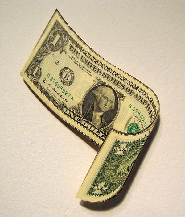
Mark Wagner's Gale Bill was on view at the Houston Fine Art Fair, symbolizing all the money whirling around the joint

The Houston Fine Art Fair. Here's what one respondent had to say: "Ugh. Just... man. So overblown and all-around awful." Weirdly enough, this was the only mention of either of the art fairs by the respondents to my polls.


Workworkworkworkwork by Charles LeDray at MFAH. One of my respondents really didn't like this show: "Charles LeDray work work disgusted me. I'm not interested in his tedious OCD-related doll clothes and I don't think they're art." (For a somewhat different take--mine--read this.)

Bel Air Trilogy

Walter de Maria, Trilogies at the Menil. The same respondent also loathed de Maria's show. "Walter de Maria was epic fail...a 25 cent idea with a million dollar budget."

George Gittoes, Witness to War at the Station Museum. That correspondent completed his own trilogy of vituperation by writing, "But the worst ...The Station's endless survey of propaganda posing as art hit a new low with the Witness To War: George Gittoes. If this is the left, color me totalitarian."

That's all from the Houston art community (at least the ones who answered my questions). Next up, my own personal favorites (and most disliked).


Share

Monday, October 17, 2011

The Strangeness of Walter De Maria

by Robert Boyd


Walter de Maria, Bel Air Trilogy (detail), 1955 Chevrolet Bel Air, stainless steel, 2000-2011 (from an ad in Artforum)

There is a strange exhibit of work by Walter de Maria up at the Menil Museum. De Maria is most famous for Lightning Field, a major piece of land art in New Mexico consisting of 400 stainless steel poles, arrayed in a 1 kilometer by 1 mile grid. The idea is that they would be frequently struck by lightning, but it turns out that lightning is not actually all that common where De Maria built Lightning Field.

This ironic non-functioning quality is also present in the three paintings in the show, the Statement Series. This consists of three enormous monochromatic paintings--red, yellow and blue--each with a stainless steel plaque in the middle. Each one has a gnomic statement engraved on it: "The color men choose when they attack the Earth" on the yellow, "NO WAR NO" on the red painting, and "YES PEACE YES" on the blue. The latter two seem utterly trite, while the first at least has some mystery to it. Collectively, they fail on all fronts. As personal expression, they seem simplistic and impersonal. As activism, they are utterly ineffectual. As argument, they are non-existent. Far from being powerful statements against war, they come across as pompous self-indulgences. Like a mammoth sculpture designed to be struck by lightning being placed in a location relatively devoid of lightning, these paintings are futile.

The second three-part piece, The Channel Series, is pretty enough--more stainless steel. Three shapes on the floor, a square, a circle and a triangle, made out of steel channel in which is a steel sphere which cozily fits into the groove of each. They look like they could be a game or part of a giant pinball machine. Their scale was relatively modest.

Which made it hard for them to compete with the Bel Air Trilogy--three cherry 1955 Chevy Bel Airs, each with a metal beam stuck through the front and rear windshields. The description makes one think of violence, like a car that has somehow run into a pole and gotten itself impaled. But that's not what you see when you got there, really. The stainless steel poles don't appear like they were rammed violently through the car--they seem, in contrast, to almost be floating. The effect is curiously magical.

Is Bel Air Trilogy self-indulgent? Absolutely. But it is beautiful to look at. Of course, most of that beauty comes from seeing these fantastic old cars. But the suspended steel beams add an otherworldliness to them. The sheer strangeness of it makes it all the more beautiful.


Share

Friday, September 30, 2011

A Tomb Grows at Rice University

by Robert Boyd (Rice BA, 1992, MBA 2008)

You have probably heard about the big new James Turrell thing being built at Rice. Called Skyspace (he couldn't come up with a new title?), it will sit in front of the Shepherd School in the no-man's land between the Jones School and the Baker Institute. This is what it's supposed to look like.


James Turrell, rendering of Skyspace

Here's another imaginary photograph of it:


James Turrell, Skyspace, Pomona College

Ha! Fooled you. (Fooled me, too, initially. A reader with good eyes pointed out my error.) That is a photo of another James Turrell Skyspace, made in 2007 at Pomona College. He's going to keep making them until he gets it right, I guess (or until people stop paying him to). Ours is currently being built. Here it is last night (I was over at Rice for a class and for the latest Rice Gallery show).


James Turrell, Skyspace, under construction


James Turrell, Skyspace, under construction

It looks like a tomb for a minor Sumerian tyrant. It really does have the look of an ancient burial mound. Instead, it will be apparently used as a musical performance space for Shepherd School students. I guess that's because concert spaces are something that they lack, unless you count this or this.

Skyspace is prominent on Rice Public Art, a new website (new to me, at least). This is a good thing to have because Rice's campus has a lot of interesting art on it, and this website provides a stroller with a guide. There's just one problem--it's incomplete. It lists nine pieces, including one in Fondren Library and one in the BioScience Research Collaborative that I don't know are accessible to the general public (I'll go check them out and report back). But it doesn't list Jim Love's Paul Bunyan Bouquet in the courtyard of Lovett College (is it gone?!) and most bizarrely, it doesn't list Willy's statue--the statue of William Marsh Rice right smack dab in the middle of the main quad.

It's like they are only interested in showing off their newest public art (although the Heizer piece has been there for a long time).

Since we have pieces by two of the big-name Earthworks guys at Rice, we should go for four-of-a-kind and get pieces by Nancy Holt and Walter de Maria.


Share