Showing posts with label Gary Panter. Show all posts

Sunday, November 18, 2012

Trenton Doyle Hancock's Mirror

Robert Boyd


This was the invitation to Trenton Doyle Hancock's new show at James Cohan Gallery in New York. The lenticular card shows two images, one of the works in the show, As U Now Enliven a Test..., and a photo of the artist wearing glasses with drawn, bulging eyeballs on the lenses. This is a clue to the work. Hancock's subject is himself. It's quite a change from his earlier world-building project. This world, involving the human/vegetable hybrids called the "mounds" and the fallen ape-men known as "vegans," is delineated in great detail in his book, Me A Mound.

When you look at Hancock's work, it's obvious he is influenced by underground comics and art comics. But this influence is not just stylistic, but thematic. His early work involved taking a fairly odd (and indeed out-and-out silly) concept and building an entire world out of it with its own mythology, history, geography, etc. This is something that happens a lot with young alternative cartoonists. Sometimes they never progress beyond it--Dave Sim is a classic example of someone who took a jokey concept (a sword-wielding barbarian like Conan except he's an aardvark) and turning it into a career of sorts. The basic (and intentional) stupidity of the original concept his comic Cerebus was forgotten as it became a 25-year project. Chester Brown's serialized Ed the Happy Clown threatened to become something similarly overblown, but Brown nipped it in the bud. It wasn't the expressive vehicle that was going to see him through his 30s and 40s. Daniel Clowes must have had a similar revelation after spending several years drawing his jokey, amusing Lloyd Llewellyn comics followed by his deliciously creepy Like a Velvet Glove Cast in Iron. Clowes and Brown moved beyond these surreal sins of their youth into a kind of realism (loosely defined). Brown in particular started producing autobiographical stories.

This is not to say that their earlier work was bad. It's simply that it had an end-point. The one cartoonist who failed to realize this, Dave Sim, ended up creating a bizarre, cranky work that survives as an eccentric but occasionally brilliant artifact of comics instead of what he apparently wanted, a Gesamtkunstwerk that incorporated philosophy and religion and myth into its massive structure. Hancock might have ended up producing a body of art that was the equivalent of Cerebus if he had continued to elaborate on the mounds and vegans. Instead, he has followed the path of Chester Brown in a way, creating a body of work that is highly personal.


Trenton Doyle Hancock, The Irreducible Crucible, 2012, mixed media collage on canvas, 18" x 24"

Many works in the show are self-portraits--although with The Irreducible Crucible, one might night deduce that without Hancock writing "I AM TDH" on the piece itself. Hancock may be using himself as a subject, but he has not suddenly become a realist. His hyperactive style, full of surreal distortions, remains active in this new body of work.


Trenton Doyle Hancock, ...and then it All Came Back to Me, 2011, mixed media on paper, 9" x 8"


Trenton Doyle Hancock, As U Now Enliven a Test, 2012, acrylic mixed media on canvas, 24" x 24"


Trenton Doyle Hancock, If You're Too Fat, You Should Buy Clothes That Fit, 2012, acrylic mixed media on canvas, 14" x 11" x 3/4"

The bulging bloodshot eyes make me think these three portraits are of Hancock himself (if only because of the way he depicted himself on the lenticular invitation.) These two portraits depict a mouthless figure with bands of black and white fun on their faces. Or possibly the fur is a mask. The bulging eyes suggest surprise or awe. The black and white stripes could refer to a racial self-conception--particularly is you read them as details of a mask that the character is wearing. The images are arresting. The vigorous drawing reminds of Gary Panter, an artist Hancock has acknowledged as an influence.


Trenton Doyle Hancock, The Everlasting Arms, version #2, 2010, acrylic mixed media on canvas, 60 x 60"

The black/white theme is present in The Everlasting Arms as well. Certain motifs are repeated in many of the works. The combinations of black, white, grey and pink color schemes. Graphic raindrop shapes, red or pink, perhaps symbolic of blood. (The fact that the two arms are severed reinforces the blood interpretation. But the oozing sores with their black pus suggests the arms were removed as a prophylactic precaution instead of by violence. Whatever the reason for their removal, it is one disturbing image.)


Trenton Doyle Hancock, All Things Known and Nothing to Own, 2012, acrylic mixed media on canvas, 10" x 8" x 3/4"

All Things Known and Nothing to Own again brings us the black, white, grey and pink color scheme. The pink forms a kind of penumbra around the face, as in If You're Too Fat, You Should Buy Clothes That Fit and ...and then it All Came Back to Me. But All Things Known and Nothing to Own adds another pink feature, the figure's enormous lips. While Hancock's work owes a debt to ccomics and cartoons, this piece reminds us of the way African-Americans were often treated-visually and as characters--in comics strips and books in the past. This figure could be an aged "Ebony" from Will Eisner's The Spirit. But at the same time, it come across as yet another version of TDH himself.


Trenton Doyle Hancock, The Former and the Ladder or Ascension and a Clinchin', 2012, acrylic and mixed media on canvas, 84" x 132" x 3"


Trenton Doyle Hancock, The Former and the Ladder or Ascension and a Clinchin' detail, 2012, acrylic and mixed media on canvas, 84" x 132" x 3"

Maybe the mask in the other paintings hides a nothing--a headless TDH frantically setting up the ladder (to success?) as in The Former and the Ladder or Ascension and a Clinchin'. The totality of the work on display here displays an anxiety, a wide-eyed and stunned disbelief. Maybe Hancock is reacting to his astonishing success. He can't pretend to be blasé about it. This is an artist that draws apemen fucking mounds of earth, a grungy son of underground comics, now doing murals on Cowboys Stadium and opening at Chelsea galleries. I'd be a little a little freaked out, too.

Share

Thursday, July 12, 2012

The Comics Art Market Is Just as Screwed Up as the Fine Art Market

Robert Boyd

These are all current (as of about noon, July 12) bids on original comics art that will be sold in Heritage Auction's July 26-28 Vintage Comics & Comic Art Signature Auction


Share

Wednesday, March 28, 2012

Kramers Ergot #8 and the Art School Generation (NSFW)

by Robert Boyd

Kramer's Ergot

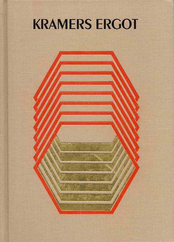
The new volume of Kramers Ergot, edited by Sammy Harkham, is out. This anthology started out as a small saddle-stitched 48-page magazine in 2000. Subsequent issues have been thicker and more book-like with an ever-expanding cast of contributors culled from the cream of the art comics movement. Issue 7 was a mammoth, tabloid-sized hardcover book. The current volume is a smaller hardcover book that at first glance could be mistaken for a generic graduate level textbook published by Wiley. The cover features the title in a fairly nondescript font, all caps. Underneath is a repeating hexagon printed in orange and gold. The image and the type are debossed into the beige cloth cover. All in all, it seems designed deliberately to be unobtrusive--the exact opposite of volume 7's attention-grabbing production.

But aside from the modesty of the exterior, one thing that struck me was how much Kramers Ergot 8 follows the classic structure of art comics anthologies going back to RAW (1980 to 1991) edited by Art Spiegelman and Françoise Mouly and Weirdo (1981 to 1993) edited by Robert Crumb, Peter Bagge, and Aline Kominsky. Like its antecedents, Kramers Ergot features avant garde comics that shade over into the art world. (With Weirdo, you had artists like Raymond Pettibon and Robert Crumb; RAW featured work by David Sandlin and Gary Panter.) Like Weirdo and RAW, Kramer's Ergot is a collection of short pieces. And like it's predecessors, Kramer's Ergot reprints of older work that no one would hitherto group with art comics. (With Weirdo, there was an incredible naive strip featuring frogs; RAW famously rediscovered the work of Fletcher Hanks.) Why would a comics anthology operating in 2012 in a quite different context as these earlier anthologies resemble them so much?

When I say different context, let me emphasize that when RAW and Weirdo were in their heyday, there were very few "graphic novels"--certain none that had a readership outside the comics subculture. Comics scarcely existed in the world of educated, artistically-sophisticated readers and viewers. The work that was interesting to Crumb, Spiegelman and Mouly at the beginning Weirdo and RAW was work that had no audience. I get the impression that Spiegelman and Mouly had a good idea of their desired constituency. They wanted to reach the artistically sophisticated readers in New York City--their peers, in other words. Weirdo was effectively aiming for readers interested in seeing work extremely far out of the mainstream--comics by the insane, the homeless, the totally untrained. Weirdo in the beginning was an art brut comic.

Given that for the most part, Weirdo and RAW were presenting works that had no pre-existing audience, it made sense to make these magazines anthologies. None of the editors knew which artists would resonate, and given their limited resources, it would have been unfair to gamble everything on one artist. An anthology was a safer bet.

But why did they publish the earlier work? I think in part because the work they were doing was such a departure from comics that had come before that they felt a need to establish an alternate art history of comics. This is not a history in the sense that the editors and cartoonists were influenced by these earlier artists (who were often extremely obscure). Instead, they wanted to show how aspects of their current practice had been anticipated. For example, Fletcher Hanks, a very primitive superhero/adventure/science fiction artist active only from 1939 to 1941, was rediscovered and reprinted in RAW. RAW was also one of the first venues to publish the work of Henry Darger.

So flash forward to 2012. The context for art comics has changed substantially. The graphic novel is a fairly popular and well-established form, thanks in part to Art Speigelman's Maus. Cartoonists whose thematic and formal approaches to comics are highly sophisticated have had success with their own books (for example, Daniel Clowes and Chris Ware). And yet, Kramer's Ergot 8, published 30 years after the first issues of RAW and Weirdo (and 20 years after those anthologies wound down), resembles them in structure. I think I know the reason why. The way to view this is to think about how cutting edge art enters the art world. If you want to show artwork that is on the very edge of contemporary art practice, you will likely show it in an artist-sun or alternative space. It will likely show up in a group show first. Solos shows, commercial galleries, and museums come later. The reason for this are the same as the reasons for the format of Kramers Ergot 8--this is still the safest and best way to introduce new, challenging work to viewers. A museum won't show this work until it has been validated by criticism and exhibition history. A commercial gallery won't show it until some commercial possibilities have been evinced. A solo show is probably out of the question because you (the gallery director) will worry about what the board of directors might think if the show is a flop. The classic art comics anthology, like the cutting edge group show at an alternative gallery, is a strategy of hedging.
Jimbo
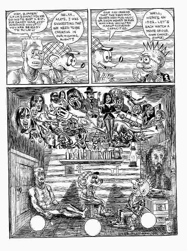
Gary Panter, Jimbo page 9, 2010

Hedging may be the reason Harkham opens with a story by Gary Panter. Panter is one of those liminal artists, existing in the outskirts of the comics world and the art world. As one of the RAW artists, his work has a pedigree. The story here, featuring his now somewhat archaic punk character Jimbo, is typical and excellent. In Jimbo's world, fast food joints are dangerous robotic entities. Jimbo lives in a consumerist dystopia, in this case a Brave New World-like space of entertainment as narcotic. It's not the most original idea, but Panter does it well. This story is curiously linear, with clear (if slightly ratty) drawing--very unlike some of his earlier classic work, such as Dal-Tokyo. When I first encountered Panter's comics in the early 80s, I was challenged by them. They worked against comics conventions I knew. I loved them because they seemed so punk. But in 20-odd years, Panter's ruptures have become familiar, and he seems less interested in playing with the form of comics. His work, curiously, is some of the most conservative in Kramer's Ergot.
Cody
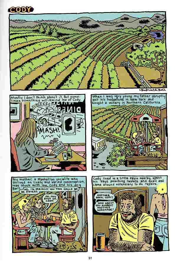
Gabrielle Bell, "Cody" page 1, 2012


The same could be said about Gabrielle Bell's story "Cody." The artwork is fairly polished and realistic (although I will say that if I saw this 30 years ago, I would have seen it as radical or experimental--which shows how much the baseline has changed). The story pretends to be autobiographical, and the set-up will strike readers as not only very realistic, but also as fitting into the tradition of alternative comics. In 1995, illustrator Debbie Dreschler started publishing a series of stories of childhood incest that had a powerful affect on the readers and creators of art comics. "Cody" at first seems similar to those Dreschler stories. But it takes a turn into unreality when the Bell character (age 13 in the story) tells her father about Cody's unwanted sexual advances. It turns out that her father was being blackmailed by Cody, and decided that since Cody was blackmailing him and about to start molesting his daughter, he had to go. Bell's father kills Cody and the two of them dispose of the body. Is any portion of this story true? Was there a creepy guy named Cody who said uncomfortable sexual things to her? (I assume she didn't just out her father as a murderer.) This kind of question comes up a lot when you read Gabrielle Bell's work. It operates in the autobiographical space--a venerable space in art comics that was dominant in the late 80s and 90s. But Bell keeps undermining autobiography. ("Cody" is the only "autobiographical" story in Kramer's Ergot 8.)
The Ultimate Character
Ben Jones, "The Ultimate Character" page 10, 2012

Ben Jones is more typical of the type of artist that I associate with the Kramer's Ergot esthetic. His story "The Ultimate Character 2002"  leaves behind most of the artistic concerns of the 80s and 90s alternative comics movement. His drawing is extremely unslick, but at the same time avoids the aggressive quality of early Gary Panter, Lynda Barry or Julie Doucet. The title reveals a concern about "characters," but the modern cartoonist's concern with characters is quite different from the traditional notion of characters as fictional persons with personalities and complexities (a more literary idea of a character). In Jones' comic, the word "character" means a personage with highly visual features that make him memorable and trademarkable. In this comic, the "ultimate characters" are two people with giant dog-heads for bodies. Extremely memorable and visual (once you've seen them, you will be able to recognize them by their profiles), they are characters in the new sense of the word. The unnamed pair find a strange object, they try and fail to sell it on Antiques Roadshow, and find that the object contained the body of an alien, which one of the giant dog heads eats. The drawing is minimal and lazy--it contains barely enough information to tell the story. In a way, I was reminded of a certain strain of artwork I've been seeing lately, where artists seem to be creating minimalist objects, but using deliberately shabby materials (for example, Cordy Ryman). This work is in dialogue with Minimalism and Post-Minimalism. I see artists like Ben Jones as in dialogue with earlier art comics pioneers like Gary Panter. (Jones is, like Panter, an artist in the art world, both as a solo artist and formerly as a member of the collective Paper Rad.)

I have a theory about these hybrid artists who live in the comics world and the art world simultaneously. I think they don't care about comics. Comics are another means of expression, no more important than any other. Therefore, they have no interest in elevating the form--a major project of the RAW/Weirdo generation. Using an extremely low-brow genres is just fine with them because to them it is just an aspect of the medium they are playing with. Highly polished drawing (like, say, the drawing of Dan Clowes or Chris Ware) is also not particularly important. What's important is to provide enough signifiers that tell a viewer that this is a comic you are reading. If this is their goal, it makes sense that their subject matter would not be autobiographical, or similar to realistic novels, or designed in such a clever way that you might not recognize it as a comic at first. Or, in other words, their approach is unlike the majority of American and European art comics of the 80s and 90s and most of the 2000s.

I think of these cartoonists as the "Art School Generation." It's not just that they went to art school; lots of cartoonists do that. It's that they went to elite art schools, and that some went even further and got MFAs there. They are steeped in the current thinking in contemporary art. They didn't rebel against their instruction that way Chris Ware did (Ware went to the School of the Art Institute of Chicago, one of the most elite art schools in the U.S.).
Barbarian Bitch
Anya Davidson, "Barbarian Bitch" page 5, 2012

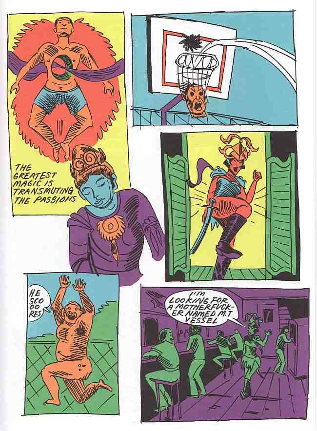
Anya Davidson is, as far as I can tell,  a member of the Art School Generation. She offers a comic called "Barbarian Bitch" which also embodies some of the approaches of the current generation--minimal, adolescent drawing, extreme cartoonish violence, and use of highly discredited genres (sword and sorcery/barbarian adventures in this case). In "Barbarian Bitch," Davidson weaves Buddhist sayings through the story (these sayings are by Atisha, an 11th century Tibetan Buddhist master). This is actually a bit unusual--you see plenty of references to pop culture in these comics, but not so much to classical culture. I don't know much about Davidson, but what I can glean from the internet is that she may be a graduate of SAIC.
Kramer's Ergot
CF (Christopher Forgues), "Warm Genetics House" page 8, 2011

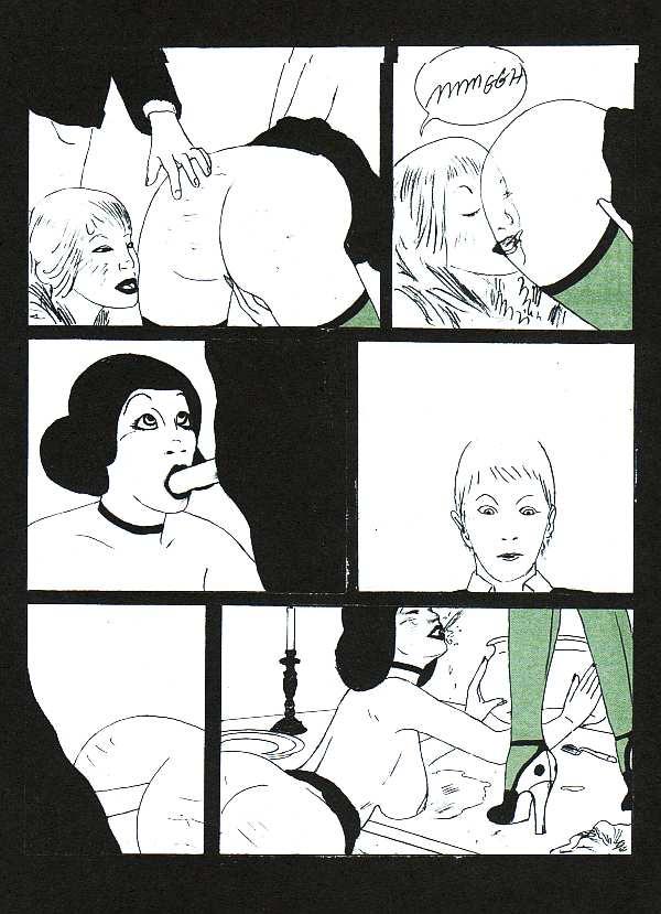
Perhaps the most influential of this generation of artists is CF (Christopher Forgues). His story in this issue of Kramer's Ergot is "Warm Genetics House," a perverse story of a male teacher who invites a female student to dinner at his house, where he and his sister have violent sex with the student. Forgues comes out of an elite art school background as well--The Massachusetts College of Art and Design. (Ben Jones is also an alumnus of MassArts.) I've seen work by Forgues that is highly polished with anatomically correct figures. But for his purposes, that kind of drawing isn't necessary. Here the lowbrow genre he references is porn, and he draws it just well enough to be comprehensible (even if the enigmatic story as a whole is not).
Kramer's Ergot
Ron Embleton and Frederic Mullally, Oh, Wicked Wanda page 6, 1975

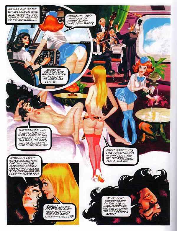
And perhaps that reference to porn is why Harkham included a lengthy section of Oh, Wicked Wanda! by Ron Embleton and Frederic Mullalley. This comic was published in the 70s in Penthouse. Like most "sexy" comics published in men's magazines in the 60s and 70s, it was very highly produced while being completely inane at the same time. Harkham devotes an astonishing 40 pages to this tripe. Why? I'm not sure but he may be thinking that this is an exemplar of dopey porno comics, which is the kind of thing that can be quoted by art-school generation cartoonists like CF. (In CF's case, "Warm Genetics House" seems less like Oh, Wicked Wanda than like The Adventures of Phoebe Zeit-Geist by Michale O'Donoghue and Frank Springer, minus the humor.)

Gumbone and Coke
Takeshi Murata, Gumbone and Coke, 2011

In addition to Oh, Wicked Wanda!, Kramer's Ergot deviates from purely contemporary comics by including a portfolio of digitally altered photographic work by Takeshi Murata, an American artist working in video, photography and digital art. Aside from the striking quality of Murata's images, his inclusion may have been a statement about Kramer's Ergot context. It says that this is a comics publication with strong leanings towards contemporary visual art. That is also implied by the introduction, which discusses art history. I advise readers to skip it--it's a string of cliches and misinformation, and doesn't speak to the work that follows it.

I'm still trying to understand the work of the Art School Generation. That's one reason I wrote this review, to think through their work and its implications. As difficult as much of this work is, Kramer's Ergot remains a key publication in the broader world of art comics and for the Art School Generation.


Share

Friday, October 28, 2011

Texas Contemporary Art Fair part 3

by Robert Boyd

This is continued from this post.


Dante Brebner, dioramas, 2010

These boxes by Dante Brebner at Muriel Guepen Gallery had a lot of people bending over into uncomfortable positions to look inside. Extremely plain from the outside, on the inside they have elaborate dioramas.


Dante Brebner, Western Scene, diorama mixed media, 2011

Some booths had so much colorful artwork that they transcended the "white cube" effect. Mindy Solomon Gallery from St. Petersburg, FL, was one of those.


I was surprised to see a gallery from St. Petersburg--I lived in Tampa for a year and I never knew St. Petersburg had any art. (I always saw St. Petersburg as a sleepy, louche beach town.)

Amongst the extremely colorful art they showed was four paintings by Sean Noyce. I liked these paintings as soon as I saw them, and even more when I saw the video that Noyce had made about them. Check it out--it shows the paintings in progress and how he made some of the artistic decisions he made.


Sean Noyce, paintings from the Cloud Watching series, 2010-11


Color grabs you. I'm sure that idea goes through the minds of some exhibitors as they plan to compete visually with everyone else. So we see work like this:


Michael Velliquette, Metta Titan 5 (left) and Metta Titan 6 (right), mixed media on paper, 2011

I think one can see the influence of Ben Jones in Michael Velliquette's colored-paper collages. Appropriate (and very enjoyable) work for a trendy gallery like DCKT Contemnporary.


Cruz Ortiz, Norteño Power, gouache on paper, 2011

This intensely-colored piece by Cruz Ortiz (David Shelton Gallery) was a bargain at $975, and it had a triumphant red dot next to it. (I wonder if $975 is a more psychologically attractive price than $1000?)

(Another thought--both here at at the Houston Fine Art Fair last month, San Antonio galleries were really well represented, especially compared to Austin. Why is that?)


Gary Panter, Local Business, acrylic on canvas, 2004

One of my favorite artists, Gary Panter, had his own color-bomb up at Fredericks & Freiser. I have two Gary Panter drawings, but I have always loved his paintings (I included one in the first show I curated, Misfit Lit at COCA in Seattle, 1991). This is typical--he puts a pattern (stripes, plaid, etc.) down then paints things over it.Fredericks & Freiser also had several John Wesley paintings, which I quite liked.


John Wesley, three paintings, acrylic on paper

But not everything was colorful and bright at this fair. Kopeikin Gallery from Los Angeles specializes in photography, including single dramatic images like this one by Jeffrey Milstein.


Jeffrey Milstein, photo of a big jet

This image of a jet is startling because it's taken from an unexpected angle. Is it art? Sure, I guess, but mainly planes are cool.


Katrin Kurfman, picture of a square

This photo by Katrin Kurfman (I think--now that I am Googling her name, I'm finding nothing) actually makes you wonder if what you're seeing is real. It may be a culture-specific reaction. In the U.S., it's impossible to imagine a seemingly uncontrolled mixture of cars, motorcycles and pedestrians--with no lines painted to separate them. The uniform greyness of the ground makes them appear as if they are all floating in space.

How different it is from this desolate photo.


James Evans, Prada Marfa, digital photograph, 2005

This photo by James Evans was displayed at the Ballroom Marfa booth. It is an amusing tweak of the artworld. I'm sure it gave folks at this fair a chuckle. Perhaps less so in Marfa, where the median income is $37,616 (compared to a national median of $51,425). The typical person in Marfa is far more likely to be buying second-hand Dickies than Prada.

Ballroom Marfa also had this beautiful piece of craftsmanship by Matthew Day Jackson.


Matthew Day Jackson, Sculpture for my Right Hand, silver, leather, thread, 2007

I wonder if Ballroom Marfa is familiar with this section of the Texas Penal Code:
Sec. 46.05. PROHIBITED WEAPONS. (a) A person commits an offense if he intentionally or knowingly possesses, manufactures, transports, repairs, or sells:
[...]
(6) knuckles;
 and
§ 46.01. DEFINITIONS. In this chapter:
[...]
(8) "Knuckles" means any instrument that consists of finger rings or guards made of a hard substance and that is designed, made, or adapted for the purpose of inflicting serious bodily injury or death by striking a person with a fist enclosed in the knuckles.
I won't tell if you won't.

Money Art

Just like the Houston Fine Art Fair, there seems to be a theme of money in some of the art in this show. Why? Cartoonist Jay Lynch had a theory that went like this--you get what you draw. If you draw peasants eating potatoes like Van Gogh, you are doomed to be poor. Chris Crites is pretty much guaranteed to get arrested. So if your subject matter is money--even if you are "critiquing" it--I say money may head your way. I'm surprised more artists don't draw money.


Lauren DeCioccio, One dollar, hand-embroidery on cotton, 2010

Lauren DiCioccio lovingly embroiders money. Expanding on the Jay Lynch theory, the amount of effort and craft she put into it should lead to a big monetary pay-off. I wonder if Jack Fischer Gallery sold this piece at the show.


Ray Beldner, Benign Corporate Dictatorship (after Pablo Picasso's "Study for Guernica" 1937), sewn U.S. currency, 2002

Ray Beldner (at the Catharine Clark Gallery) seems to have kind of a mixed attitude towards money. He's quite willing to trivialize great art with money (which really puts art in its place), and obviously he is willing to sell his art for lots of money at a commercial gallery, but he has to be such a downer about corporations. If someone buys this piece, you want to know how they got their money? Corporations.

But his next piece is a perfect illustration of the Lynch principle.


Ray Beldner, Money Bags, sewn US currency and recycled rubber, 2011

"You get what you draw," baby! Or sculpt in this case.


Steve Lambert, Everything You Want, Right Now!, mixed media, 2011

Steve Lambert cuts to the chase by not being specific. If you get what you draw (or sculpt or whatever), he gets it all. Wouldn't this look great on the wall of some hedge fund manager? I think so.

Out of space! To be continued in part 4


Share


Thursday, December 16, 2010

Comics I Got in Brooklyn, part 4

Robert Boyd

If you're reading this, then you probably have read my other three reviews of comics and other items published at the Brooklyn Comics & Graphics Festival. A note on method: I'm not choosing comics to review that go together thematically or that make interesting contrasts. I have most of the comics I bought in a red canvas bag given to me by Koyama Press. So I have been reaching into the bag and pulling out four or five items at random to review. The stuff in the bag tends to be smaller, thinner items--comic books, minicomics, pamphlets, etc. I also bought several graphic novels which, being larger and heavier, are stacked separately. I'll review them once I'm done with the contents of the Koyama bag. But I wanted to mention the Koyama bag because it gives me an excuse to mention Koyama Press, which is exemplary of one aspect of what this festival is about: the fuzzing of the line between the art world and the comics world. This is how Koyama Press describes itself: "In addition to publishing books, Koyama Press has financed such diverse projects as zines, comics, artist designed t-shirts, installations, photo montage work, print folios, letterpress cards and more." And if you look at their catalog, you will find--in addition to comics--a lot of books that look much more like art books (or artists' books) than comics. Koyama Press does not come off as a comics publisher or even as a comics publisher that dabbles in art books on the side. It's an art publisher that includes comics proudly in its mix. This is something I will return to later in this review.


Gabrielle Bell, All My Dreams Come True cover, 2010

This minicomic (published by Lightful Press) by Gabrielle Bell is formatted with one panel per page. So although the story is 62 pages long, it is not terribly complex or involved. This is not to say it is uneventful. The protagonist, after an encounter on a train that leaves her with a strange man's briefcase, is flung into a series of dangerous situations in various locales. It seems to be taking place in the 30s or 40s, but it's vague. The lack of solid grounding and logic make it seem like a transcribed dream, but it is not fantastic like a dream. Motifs repeat as the scenes subtly change. I was reminded a bit of Donald Barthelme stories like "A Picture History of the War." A traditional story has anchors holding it fast to the "real world"; even a science fiction story attempts to do this, usually with a lot of exposition to explain why it could be real. Fantasy stories are praised for internal consistency, which means while they might not be anchored to the reaf world, at least they make sense on their own terms. This story (like many of Donald Barthelme's), dispenses with those anchors. It's unsettling.


Gabrielle Bell, All My Dreams Come True pp. 31-32, 2010

Update: Commenter Volsticks mentions that this story was in Kramers Ergot #7. I had completely forgotten that. The format was completely different, of course. Kramers Ergot #7 was the tabloid-sized issue, and Bell's story was presented complete on one page. So, does it change a story to present it in two drastically different ways? The art was identical in each case.


Jason Little, Gimmick Illustrated #1: Vlak chapter 1 cover, 2010

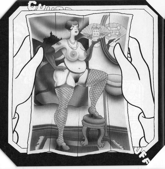
Another quasi-suspense story set partly on a train is Vlak by Jason Little. Little premiered his new graphic novel, Motel Art Improvement Service, at the festival--I will be reviewing it later. But he also had this intriguing comic. It is mostly wordless. A man arrives in an Eastern European city sometime in the early 20th century and loses his top hat. He goes to a hat store and buys a new hat. The store owner stuffs a piece of paper into the brim to help the hat fit better. Later on a train, the man discovers the piece of paper in the hat. He pulls it out, and sees this:

Vlak
Jason Little, Gimmick Illustrated #1: Vlak chapter 1 p. 30, 2010

He is mortified by this, at least at first.


Jason Little, Gimmick Illustrated #1: Vlak chapter 1 p. 31, 2010

There is not enough here to feel out where the story is going. It has numerous little surreal touches (the steam engine is powered not by coal but by burning books) and hints of an Eric Ambler-like thriller (secret police on the train, etc.) Also, you will notice that in the pornographic photo, the woman is holding a fan. We can see the back of the fan in the mirror behind her, and on the back of the fan is a floorplan of a building--presumably the castle depicted on the front of the fan. So this suggests a spy-thriller. In any case, I am eager to see where this goes.


Madeleine Fairbairn and Robbie Guertin, Epic Love cover, 2009

Robbie Guertin and Madeleine Fairbairn are a couple, and this mini is a series of cartoons about their couple-hood. Each of the two take turns drawing cartoons.The book is consequently pretty episodic. There is no story arc here--we are plunked down in the middle of this relationship and see fairly trivial glimpses of it.


Madeleine Fairbairn and Robbie Guertin, Epic Love pp. 6 & 7, 2009

As you can see, Fairbairn and Guertin have fairly distinct drawing styles. I think Guertin is on the left and Fairbairn is on the right. These two cartoons are typical--the feel of this is casual, a fun little project that a couple can do together. They aren't particularly funny cartoons and the drawing is nothing special. In short, it's OK for a minicomic, but not something they could push much further.


Gary Panter, Jimbo cover, March 24, 2010

Gary Panter is one of the giants of comics, a somewhat polarizing figure (at least in the past) because his work skitters on (and often over) the edge of readablility. There is so much to say about Panter that I don't even want to try. Suffice it to say that he is the embodiment of this fuzzy intersection of the art world and the comics world. And this is not just because he is a painter who shows his work in galleries, but also because while most great alternative cartoonists' work can reasonably be described as literary to an extent, Panter is the one whose work feels least literary and feels most like other contemporary visual art in its approach and concerns.


Gary Panter, Jimbo pp 4 & 5, April 13, 2010 and April 15, 2010

So it's funny to pick up this Jimbo minicomic at this festival. Of all comics shows, this is one where Panter work in its most radical manifestation would be highly welcome. His progeny were present in force. And yet, this is perhaps the most straightforward Panter comic I have ever read. It has a comprehensible story with a beginning, middle and end. The dialogue is straightforward, legible, in commonplace word balloons. The panels are neatly ruled and arranged  in a traditional way. The drawing is crisp and the spaces depicted have a Renaissance perspective logic to them. What's going on here?! I don't know, but this was an amusing minicomic--a trifle--by a master. A minicomic like this is a little like, I dunno, György Ligeti writing a minuet in the key of C, just to remind people that he could if he felt like it.


Joel Spaesmaker, Forest Small Book Series, Book One: La Recoleta Cemetery, Buenos Aires, Argentina., 2008

This, at first glance, could be mistaken for a minicomic. The format is minicomic-like. And if you go by Scott McCloud's hyper-formalist definition, it is a minicomic. (For a bunch of reasons, I hold no truck with that definition or any essentialist definition of comics. But many do.) And, more importantly, it was being sold at a comics show. It's in the world of comics. But when you read it, or any of the other books in the series, it's pretty clear that they aren't comics. They are closer to artists' books.


Joel Spaesmaker, Forest Small Book Series, Book Two: Of Great Masses Moving at Visionary Speeds., 2008

What is an artist's book? Here's how Wikipedia defines it:
Artists' books are works of art realized in the form of a book. They are often published in small editions, though sometimes they are produced as one-of-a-kind objects referred to as 'uniques'.
Artists' books have employed a wide range of forms, including scrolls, fold-outs, concertinas or loose items contained in a box as well as bound printed sheet. Artists have been active in printing and book production for centuries, but the artist's book is primarily a late 20th century form.
Maybe the best known artist's books are those by Edward Ruscha. At least, best known to me. These include such little books as Royal Road Test and Various Small Fires and Milk. So artists' books seems pretty close to a lot of the minicomics and other small publications I've been reviewing the last few days, right?


Joel Spaesmaker, Forest Small Book Series, Book Three: Things on Walls, Volume One., 2008

By total coincidence, I have been reading a manuscript of a book by a friend of mine that has a chapter on this very subject--the differences and similarities between comics, artists' books, and children's picture books.  I don't want to quote it or even name the book (it will be published in Fall of 2011 and I think is going to be an important book for anyone thing seriously about comics as art going forward). But what this chapter spoke of was how despite very real similarities between certain artists' books and certain comics, they were still viewed institutionally as distinct classes. It's the word "institutional" that is key here. A store specializing in artists' books like Printed Matter is pretty obviously not a comic book store. Even if you search the word for comics, you end up with entries that describe a book as "being told in comics format." They actually have to explain to their customers that a comic is a comic.

But comics--particularly "minicomics" in the sense of handmade comics--are very similar to artist's books, and I think we are seeing comics that cross the boundary, that inhabit both worlds. Just like we are seeing artists that inhabit both worlds. And that's why after an initial feeling of surprise, seeing this set of artist's books at the Brooklyn Comics & Graphics Show felt OK.


Joel Spaesmaker, Forest Small Book Series, Book Four: Lessons Learned, Volume One., 2008

I like Joel Spaesmaker's Small Books.  They deal with his fascinations and document his life in an interesting, elliptical way. I initially picked up the set because of Book One. I once spent two days wandering around in this cemetery, La Recoleta, looking at the amazing mausoleums of Buenos Aires' elite. I was looking for Borges' grave (he is buried in Switzerland, apparently--but the internet wasn't around when I made my fruitless search). I thought it was cool that Spaesmaker had been there and recorded his trip in this 'zine. Looking back, I think it is perfect that books like this were mixed in at a comics show. Comics shows almost always include some non-comics stuff. That stuff, though, is usually stuff aimed at genre fans--movie merchandise, toys, etc. Because the Brooklyn Comics & Graphics Festival deliberately positions itself as an art comics show, it is only appropriate that the extra stuff in this show come more from the art world than from the genre entertainment world.


Joel Spaesmaker, Forest Small Book Series, Book Five, We Are Children of the Earth & Sun., 2008

Many more reviews to come. I have a little time off, so I should be able to write them all before the beginning of next year. And of course, you can read the earlier Brooklyn posts at part 1, part 2, and part 3.