Showing posts with label Cheyanne Ramos. Show all posts

Monday, September 10, 2012

People Keep on Painting in Houston

Robert Boyd

Twenty-seven years ago, the Houston Museum of Fine Art mounted an exhibit called Fresh Paint. It featured work by 44 painters and attempted (unsuccessfully) to define a Houston school of painting. Aaron Parazette's goal with In Plain Sight (on view at McClain Gallery) is more modest. In the catalog for the exhibit, Parazette wrote, "While there has been no shortage of opportunities to see paintings created by Houston artists, the opportunity to consider a large group of such work has been missing." That is one thing In Plain Sight accomplishes. Another, perhaps, is to introduce collectors to the work of local painters they may not have yet seen. McClain is a blue chip gallery, and being shown there potentially provides entrée for artists who have mainly shown in alternative art spaces or smaller galleries.

Parazette adds that "the exhibit is non-thematic and multi-generational by design, with the work selected to represent a full range of painting being made in Houston." The word "multi-generational" jumped out. Many of the Fresh Paint painters are still around and painting. Were any of them were included in In Plain Sight? Just two as far as I can see, Gael Stack and Perry House.

Unlike Fresh Paint, In Plain Sight makes no claims for its content except that it is broadly representative of work in Houston. However, choosing to do a painting show implies that painting is really important in Houston. And let's acknowledge that painting is the most economically viable fine art in town. It's easy for galleries and art fairs to show and easy for collectors to acquire. It doesn't require a lot of floor space to display it. It lasts a long time. It's highly optical. And this show certainly demonstrates that there is painting being done for all tastes. (But I'd like to see similar shows for other genres of contemporary art in Houston--as well as shows for those liminal works that don't easily fit into one genre or another.)

Here are a few--but just a few--of the paintings in In Plain Sight that I liked. The show is up through October 13, and I highly recommend stopping in and checking it out.


Bill Davenport, It's hard to be hip over 30, 2004, acrylic on canvas, 27" x 29"

It was nice to see a Bill Davenport painting if only to remind us that Bill Davenport can paint very well. I don't think of Davenport as a painter per se--Bill's Junk is sort of a social sculpture, and a lot of his other work is sculptural, participatory or both. But painting is a part of his work as well.


Christian Eckart, 3 Unit Superimposed Circuit Painting 2006, 2006, acrylic urethane on 1/2" aluminum plate, 115" x 84"

This sleek beautiful piece by Christian Eckart makes me think of old-timey slot-car race tracks.


Jeremy DePrez, Totem, 2012, acrylic, oil and wax on canvas over shaped support, 77" x 44"

It's hard for me to imagine Jeremy DePrez making a work titled Totem, much less a colorful Sean Scully-like painting like this. But he did and it's great.


Lane Hagood, Hand Painting, 2012, oil on canvas, 64" x 48"

So much of what Lane Hagood does are dumb paintings of smart things. Hand is kind of a dumb painting of a dumb thing that you can't stop looking at. That, in essence, is the mysterious power of Lane Hagood.


Mark Flood, The Things, 2011, acrylic on canvas, 87" x 83"

Mark Flood has split his painting into two streams--cynical dyspeptic misanthropic paintings on one hand and beautiful abstractions incorporating lace on the other. With The Things, he seems to have achieved a synthesis of the two.


Pat Colville, Gray Form, 2011, acrylic on canvas on panel, 36" x 36"

Pat Colville is someone who should have been in Fresh Paint but wasn't for some reason. She's a Houston art treasure. She does paintings that make me think of biological or mineralogical  forms seen under a microscope. I love the way the forms float.


Ryan Geiger, the deeper i dig, the deeper i get (right panel), 2012m acrylic on paper, each panel 30" x 22"

I wasn't really aware of Ryan Geiger's work when I saw this piece. The text and the fine rendering give it a hint of Wayne White. I certainly want to see more of his work after seeing this piece.


Susie Rosmarin, (title unknown), 2003, acrylic on canvas 72" x 84"

Susie Rosmarin's optical effect paintings are hypnotic. But it's difficult to get their colors right in a photo--which is my way of apologizing for getting them wrong here. Just go see the exhibit!


William Betts, Frigate, 2011, acrylic on canvas, 48" x 72"

William Betts is best known for his paintings based on images from CCTV surveillance. This image of a warship seems to be filtered through some digital imaging system, which gives it a curiously in-the-moment feeling.


Cheyane Ramos, Item, 2012, acrylic on canvas, 36" x 24"

Cheyanne Ramos has incredible painting skills, but she isn't showing it off in Item and an earlier similar painting, Kerri Green and the Living Unicorn. She seems to be playing with the concept of "fan art," including the awkward painting (those bizarre highlights, for example) and the weird couplings. The funny thing (for me, at least) is that the pop culture references fly right over my head. I think these figures exist in some pop culture property, but I have no idea which. I also love her snazzy new signature.

Share


Wednesday, May 2, 2012

UH MFA Thesis Exhibition part 2: Seven Years Bad Luck

by Robert Boyd

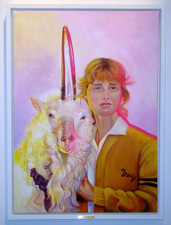
Kerri Green and the Living Unicorn
Cheyanne Ramos for Sebastian Forray, Seven Years Bad Luck, pt. 2 (Kerri Green and the Living Unicorn), 2012, acrylic on canvas

The weirdest part of the UH MFA thesis show was a little sub-show by Sebastian Forray called Seven Years Bad Luck. I didn't understand it, but I loved it. But I was troubled by my lack of analytical ability. I'm an art critic, dammit! I should be able to create an explanation for any art I see, even if I have to make something up whole cloth. So I broke down and asked Sebastian Forray about the show. I'm still not sure if I understand it, but at least some questions have been answered.

First of all, the show consists of five paintings and the contents of a vitrine. The paintings are numbered, and none of them are painted by Forray. They all have titles like Seven Years Bad Luck, pt. 2 (Kerri Green and the Living Unicorn). According to Forray, "Some are straight commissions, others are collaborative, and one was made with almost no input from myself."

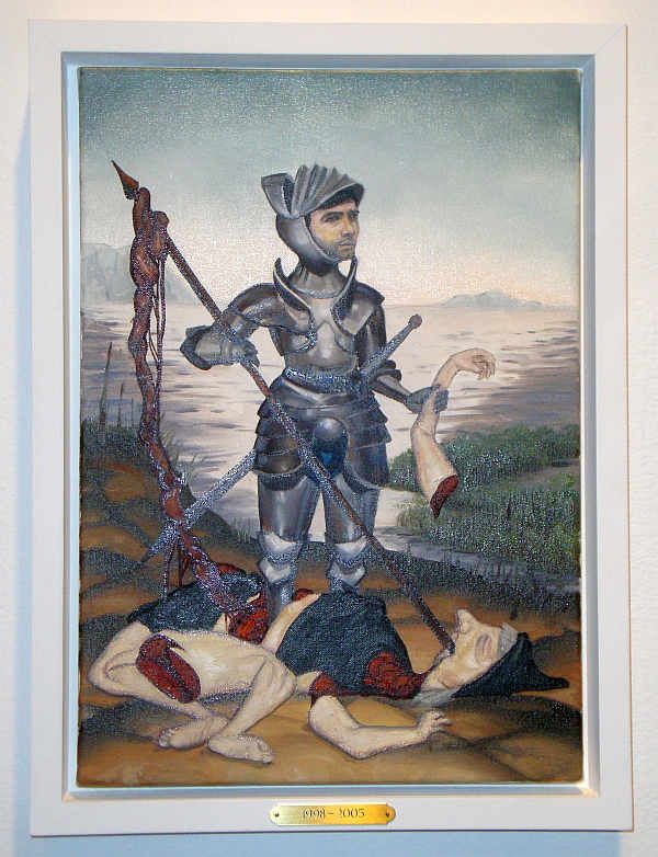
The Slaying of the Blair Witch
Seth Alverson for Sebastian Forray, Seven Years Bad Luck, pt. 4 (The Slaying of the Blair Witch), 2012, oil on canvas

His collaborators/hired guns include some of the best-known young artists in Houston. And generally they are painters (one piece is mixed media) who exhibit a high level of craft in their own work. Seth Alverson and Cheyanne Ramos are virtuosos in their own paintings. I'd say they held back a bit for these paintings. Ramos in particular seems to have deliberately given her painting of Goonies star Kerri Green a "thrift store painting" awkwardness (that hot pink "glow" on the right of the figure, for example), and the same could be said of Seth Alverson's The Slaying of the Blair Witch. The fact that both these highly skilled painters did work that feels somewhat awkward and amateurish makes me think that this was a request on the part of Forray.

Fresh Loaf '92 in Hooker's Green
Emily Halbardier for Sebastian Forray, Seven Years Bad Luck, pt. 3 (Fresh Loaf '92 in Hooker's Green), 2012, oil on canvas

Emily Halbardier's work, by contrast, has been described as coming across "as under-skilled or shallow in its processes," but as an artistic strategy. "Deskilling" in other words. And we see this in Fresh Loaf '92 in Hooker's Green, but I think we also may be seeing a deliberate attempt to create an artwork as if it were created by another person--in this case, a teenage boy. The fantasy motifs, the raised knife, the cartoonish sexualized female figures (including one with approximately 46 boobs), the scatology, etc., all seem like the creations of another persona. (This strategy reminds me a bit of Jim Shaw's work. Coincidentally, Shaw has also long been interested in thrift store paintings.)

A Painting by the Graustark Gang
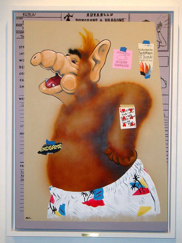
Graustark Gang for Sebastian Forray, Seven Years Bad Luck, pt. 5 (A Painting by the Graustark Gang), 2012, acrylic on canvas

Does A Painting by the Graustark Gang fit in with my "fake thrift store paintings" theory. I would say yes because all paintings of Alf are by definition thrift store paintings. But who are the Graustark Gang? They are Jessica Ninci, John Forse, Sam Ackerman and Michael Harwell. I liked the notes "taped" (painted) to the image.

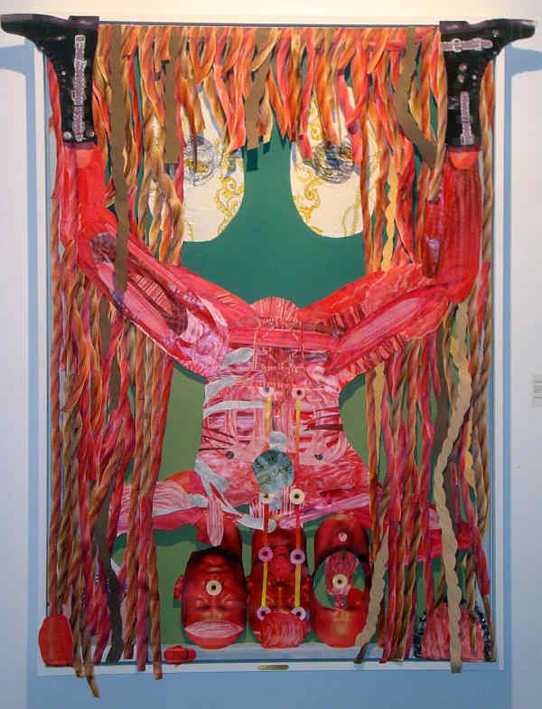
The last piece (pt. 1, if you're keeping track) is by Cody Ledvina. It's the only non-painting.

Life With 432 i's
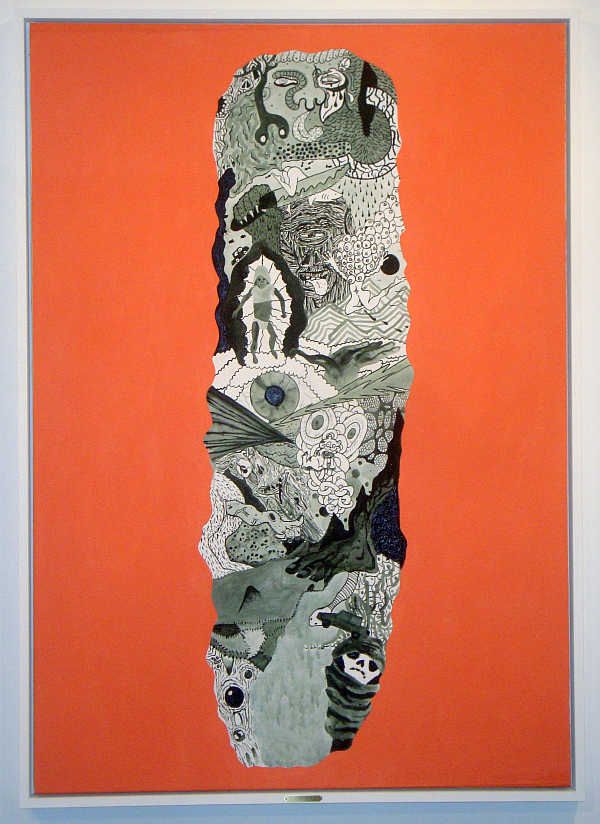
Cody Ledvina for Sebastian Forray, Seven Years Bad Luck, pt. 1 (Life with Four Hundred Thirty Two i's), 2012, mixed media on panel


Life with Four Hundred Thirty Two i's really kind of screws up my thrift store painting theory. First of all, it's not a painting, and in my experience, thrift store art tends to be paintings. They may have absolutely bizarre imaginations, but thrift store artists seem to be quite conservative when it comes to materials. In any case, the whole thrift store painting idea wasn't really going anywhere, anyway. Maybe I should defer to Forray instead of trying to think up ideas about this art on my own.

So I asked him, what do parts 1 to 5 represent? He replied, "Each one represents a seven year section of my life (which began in 1977). There are plaques on each painting identifying the years. I am turning 35 this year, so I split my life into five seven year sections, each contributor got one section to make a painting for. Again, depending on who it was and what they wanted, I provided brief or detailed biographical information (or instructions), but also encouraged the other artists to incorporate their own memories/details from the same seven-year period." Damn, that was simple. So Ledvina's piece represents a period in either Forray or Ledvina's life when one of them was a red, three-headed man. Seven Years Bad Luck, pt. 2 (Kerri Green and the Living Unicorn) represents the years 1985 to 1992, and The Goonies came out in 1985. Maybe Forray had a crush on Kerri Green. Halbardier's part 3, with its teenage boy imagery, happens to coincide with Forray from age 15 to 21, so that fits. Part 4 covers the years 1999 to 2006, and The Blair Witch Project came out in 1999. But what Alf has to do with Forray's late 20s and early 30s--well, that one I don't get. But that's OK. The point isn't to puzzle these paintings out.

But I did wonder about the lack of art from the artist himself. Was this some kind of arch conceptual statement about authorship? But the answer is simpler and more straightforward. "Painting grads have to produce two shows during their graduating semester. One in the small projects gallery, and one for the MFA show. I did all my own work for the small project gallery where I defended my thesis. Curating is also part of what I do so I decided to base the MFA show on this aspect of my 'practice.'" As a curator, Forray is being highly interventionist. I mean, the usual conception of a curator involves a degree of deference to the art. Not here--he is the ringmaster, the architect, and the show is about him.

The Vitrine of Ancillary Failures
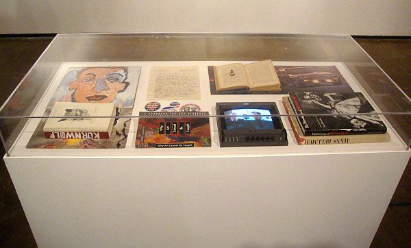
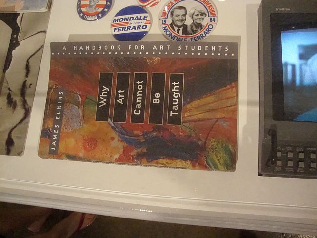
Sebastian Forray, The Vitrine of Ancillary Failures, 2012, vinyl records, books, buttons, brochure and television monitor in a display case

Hence this display case and its various mopey, dyspeptic objects. "The Vitrine of Ancillary Failures is a collection of failures, missteps, underdogs/antagonists that have caused an impact on me in some way," Forray writes.

The Vitrine of Ancillary Failures
Sebastian Forray, The Vitrine of Ancillary Failures detail, 2012, vinyl records, books, buttons, brochure and television monitor in a display case

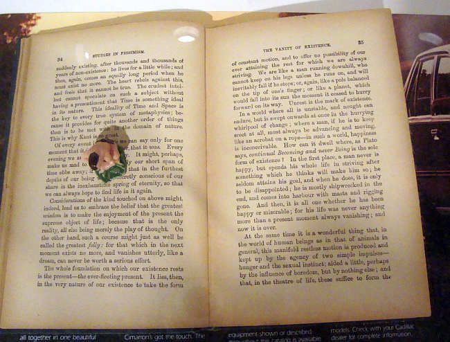
So we have this James Elkins book, Why Art Cannot Be Taught: A Handbook for Art Students, that calls into question the whole project of teaching art in a college setting, next to campaign buttons from the disastrous Modale-Ferraro 1984 presidential run. We have Self-Portrait by Bob Dylan, widely considered one of his all-time worst records. And we have a copy of Studies in Pessimism by by Arthur Schopenhauer.

The Vitrine of Ancillary Failures
Sebastian Forray, The Vitrine of Ancillary Failures detail, 2012, vinyl records, books, buttons, brochure and television monitor in a display case

All in all, the vitrine is almost a caricature of student disillusionment. It's over-the-top, and its presence in a MFA thesis show is humorous. There is something inherently optimistic about a show like this. A bunch of students are about to graduate, after all. And this is their best work, the product of two years of studying.And here's Debbie Downer with a vitrine full of bad vibes. What could be be more perfect?


Share


Tuesday, July 27, 2010

New Acquisitions--two small collages and a purple crown

Robert Boyd

If it seems like I have been buying a lot of art lately, it's sort of true. Mostly it's just that I've received a lot of art lately and also that I finally have some time to write about art I bought earlier.

For example, this small collage by Hayden Fosdick (who has one of the best names I have ever heard). I actually got this at Gallery 1724 several months ago, but forgot about it until recently! What made me remember it was his excellent collage in The Big Show.


Hayden Fosdick, untitled (?), collage, 2010

I know nothing about Fosdick, except that I am fairly certain he bears no resemblance to this man.

I also recently bought another small collage. Cheyanne Ramos had a show at McMurtrey Gallery which featured paintings with realistic setting, but where a central figure or object had been blanked out as a silhouette and replaced by a bunch of overlapping images of processed food products. Along with these paintings, she was selling a bunch of tiny collages, where she had taken postcards, cut out the central image, and replaced it underneath with a bunch of cutouts of food product photos, perhaps from the Sunday paper coupons.


Cheyanne Ramos, untitled, collage, 2010

Her collages seem almost like "sketches" for the paintings--or at least where she worked out her basic ideas for them. Cheyanne Ramos is another artist with a cool name about whom I know little. I've seen her work at The Joanna and Box 13, as well as the McMurtrey Gallery. I know she studied to get an MFA at UH, but that's about it. You can see more of her work here.

Finally, in a drastically different medium, is this purple crown by Virginia Scotchie.


Virginia Scotchie, untitled (Purple Crown), ceramic, 2010

This I got at Goldesberry. She had shown several months ago, and I really liked her work. She made cool textures and shapes. There were a number of similarly sized pieces that were all good. It was hard choosing. I finally picked the purple crown because it seemed so absurd. It's beautiful and makes me smile. (You can see a lot more similar objects on her web page.) She is also a professor at the University of South Carolina.

Monday, September 14, 2009

Open Season

Robert Boyd

This weekend was the beginning of the "new season" for art. I'm not sure what that means--there were plenty of gallery shows this summer. I know in New York, well-to-do collectors head out to their summer homes, so the art industry, which is a consumer luxury item industry after all, slows down. For example, there is usually only one issue each of Art in America and Artforum in the summer. But why this should apply to Houston, I don't know.

Be that as it may, tons of shows opened in Houston last week. I only went to one opening (opening parties are not a good way to look at art). But I went to a few galleries after opening nights, however.

Diverse Works season opening show '"Now that I'm by myself," she says, "I'm not by myself, which is good."' is almost all video. I have no problem with video or film as an art-form. But I hate seeing video in a gallery. It is just not an environment conducive to watching video or film. Video (generally) demands your time. If you are going to get anything useful out of a video, you need to sit still and watch it unfold for whatever its length is. And that can be a challenge, especially if the video is perplexing, hermetic, outside your comfort zone--which is what art video mostly is.

There's a reason movie theaters are the way they are. You sit in a comfortable seat--that helps a lot while you watch two hours of film (or eight hours, if you are watching Our Hitler). The theater is dark, so it concentrates your attention on the projected image. And, perhaps most importantly, you can only see one movie at a time at a movie theater. You don't have two movies showing simultaneously, their blaring soundtracks competing in your ears for attention.

So Diverse Works for this show was the exact opposite of a movie theater--no comfy chairs, no darkened room, multiple videos (and soundtracks!) playing all at once.

I will mention the work of Laurel Nakadate. Her videos got my attention for all the wrong reasons: she is beautiful and gets naked in many of them. But they were definitely uncomfortable--she seemed to star with a bunch of weird older men, some who pretended to brutalize her or murder her, some on whom she held toy guns, instructing them to beg for mercy. The men were good sports--acting ability wasn't at a premium, and there was a lot of giggling as the dudes said things like, "Please don't kill me!"

 
Laurel Nakadate, "Beg for Your Life" still,  video, 2006

But for the most part, I just couldn't connect with the material I was seeing. That, if anything, is my main complaint about a lot of the new shows I saw this weekend. Peel Gallery, new art from Mexico City--it was just a jumble of brightly-colored faux-naif stuff. None of it felt particularly original (not a sin by any means), engaging, or memorable. The flower art up at the Barbara Davis Gallery were so forgettable that I had to look the show up to remember what I had seen there. (Still, flowers--they'll probably sell and for a commercial gallery, that's what counts.)

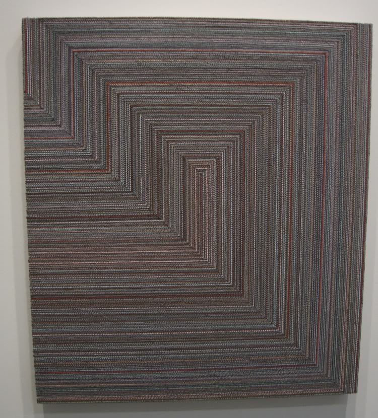
I had never been to CNTRL Gallery before--they had three artists up. One who was doing some kind of intervention on newspapers, making them hazy, washed-out, and unreadable; one who made rather unexciting 3-D fabric sculptures; and one who did what appeared to be severe, early-Frank-Stella-like abstractions made from carpet remnants.

Grey Red Pink
Sasha Pierce, grey red pink, oil on canvas, 2009

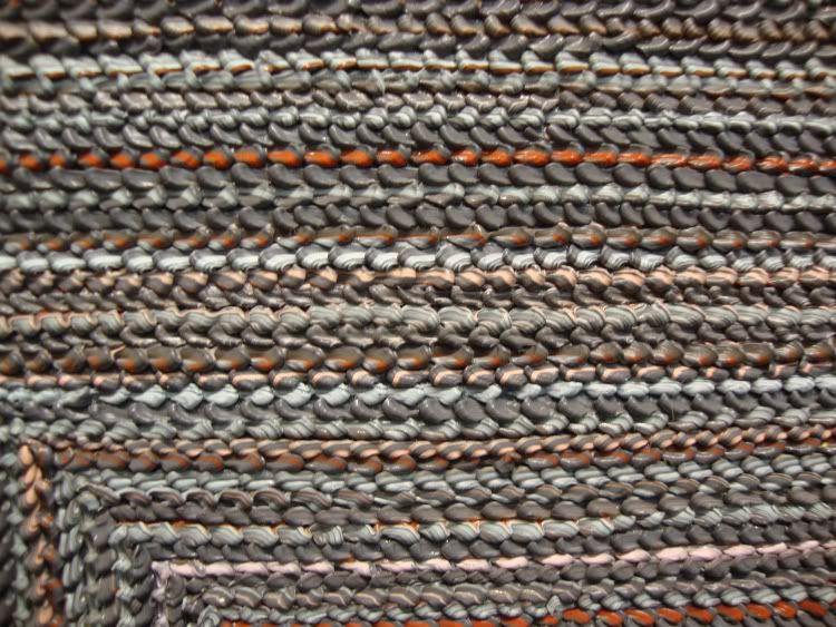
But I took a closer look at Sasha Pierce's work--a lot closer.

Grey Red Pink detail
Sasha Pierce, grey red pink detail, oil on canvas, 2009

This is not carpet--it's paint. How the hell did she do that?! Still, her paintings look like they were made with industrial no-stain carpet. She has accomplished something amazing in her technique, and used it to make some pretty boring paintings.

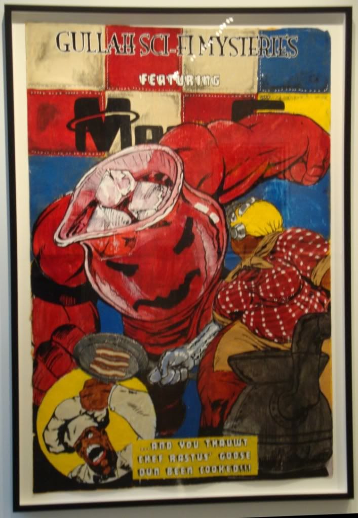
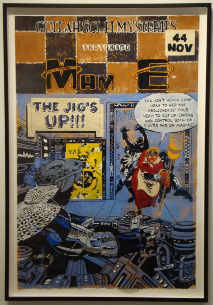
At least good old Dawolu Jabari Anderson came through. He had a show at Joan Wich of his giant comic book cover paintings and his drawings. His drawings are weak tea, obviously copied from other drawings or photographs, without any indication of drawing mastery. But his paintings are fun, pastiches of Jack Kirby comics covers but starring an "Aunt Jemima"-style character called Mam-E.

Pig Knuckles
Dawolu Jaban Anderson, "Pig knuckles served with a punch?", latex, acrylic and ink on paper, 2009

Amazing that I saw two pieces of art featuring the Kool-Aid man this weekend. One more and it'll be a trend.

 The Jig's Up
Dawolu Jaban Anderson, "The Jig's Up", latex, acrylic and ink on paper, 2009

In the end, I think these paintings are sort of trivial, and I think riffing on Kirby creates a kind of incoherence and is a substitute for having an original idea. But even as I write those words, they seem too harsh for these humorous, likable works. (Sorry for the lameness of my photos. They always look pretty sharp when I take them. Consider it an inducement to go see the pieces in the flesh--or at least check them out on the Joan Wich website.)

One show I liked a lot even though I had low expectations was the "Collected Works" show at Inman Gallery.  The gallery is celebrating its 20th anniversary, so it put on a show of various pieces by a bunch of different artists that had been borrowed from collectors who originally bought them from Inman. I could see how this would be a way for a gallery to pat itself on the back, but it also seemed a little contrary to mission of a contempary art gallery--to bring new work to a public of potential and existing buyers. My objection was a bit abstract, I'll admit. And it went away as soon as I saw the work. It was a jumble--too many different pieces in different styles. But there was so much there that was really good that you can safely dismiss my initial reservations.

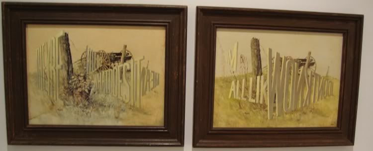
Wayne White 1
Wayne White, "They're All Like What Does It mean and I'm All Like I Don't Know," acrylic on framed lithographs, 2003

For one thing, I got to see a Wayne White word painting up close. This two-part painting is quite small and has a totally different presence than "Big Lectric Fan to Keep Me Cool While I Sleep." It's nice to be able to see this side of his work while the other big installation is up just a few blocks south.

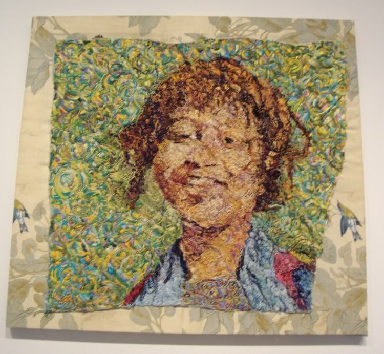
Beth Secor
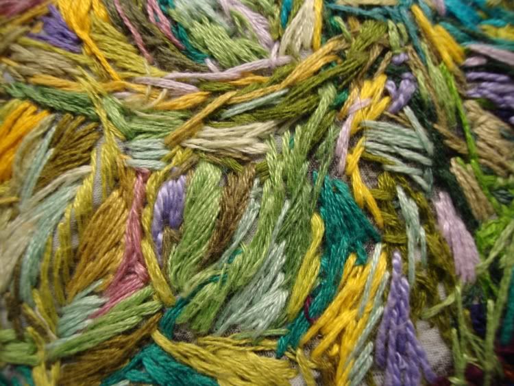
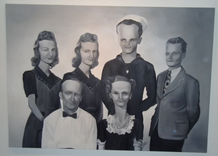
Beth Secor, "Girl, Around 1938," embroidery on textile, 2008

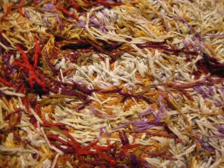
I only really know Secor from her snarky, funny Glasstire columns. But I love this art! This is a piece that like Sasha Pierce's rewards looking close. Obviously Secor labored mightily to make this--embroidery is not a fast art. And yet it looks so expressive, so sketchy, so spontaneous. The colors are great, and it's great to see how she achieves her color effects by layering different colored threads.

Beth Secor detail
Beth Secor, "Girl, Around 1938" detail,  embroidery on textile, 2008

Beth Secor detail 2
Beth Secor, "Girl, Around 1938" detail,  embroidery on textile, 2008

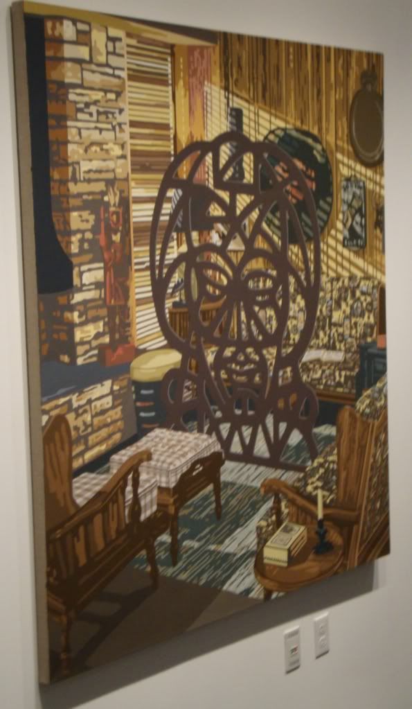
I also liked this extremely detailed realistic domestic painting (below), especially trying to figure out what that thing in the middle of the room is. It feels vaguely menacing.

Blinds
Jim Richard, "Blinds," oil on linen, 2009

There were many other interesting pieces at the Inman--definitely worth checking out.

Finally, I went to The Joanna for their secret Saturday sale. I met Cody Ledvina who showed me around and told me a little about their evolving philosophy of pricing the art. Almost everything was under $200--apparently this approach was decided on after they drastically overpriced the art at the I Love You Baby show in July.The big exception were two huge canvases by Cheyenne Ramos (who normally shows at Joan Wich).

Cheyenne ramos
Cheyenne Ramos, don't know what this one is called...

Her paintings were definitely my favorites of the show there. The Joanna is a house where Mr. Ledvina lives that he rents from The Menil Foundation. They clear out the living room for the occasional exhibit. The Joanna can't put a sign out front (part of the lease agreement), but they are pretty sure that the Menil knows what they are doing.

That is all for this past weekend--but there are still plenty of shows that have just opened that I haven't seen yet. So look for more next week...