Showing posts with label ceramic. Show all posts

Sunday, June 10, 2012

Invisible Curator: Fragile Weapons

by Robert Boyd

axes
James Drake, glass axes

I was out checking out galleries Saturday and saw these two glass axes by James Drake at Moody Gallery. They are resting in a bed of bubble wrap.

rifle
Charles Krafft, AK47 Rifle, slip cast hand-painted porcelain

shotgun
Charles Krafft, Mossberg Shotgun, slip cast hand-painted porcelain

Then over P.G. Contemporary were these porcelain weapons (among many others) by Seattle artist Charles Krafft. It was interesting to see all these very fragile representations of objects that are potentially very dangerous in real life. Such a representation is inherently ironic and a typical post-modern strategy (making large sculptures of small things, making soft sculptures of hard things, etc.).  Drake and Krafft are very different artists, but both of them deal with violence in their work. Another artist who deals with similar subjects in related ways is Camp Bosworth. Curators, feel free to build on this idea--free of charge.


Share


Friday, February 24, 2012

Ken Price, 1935-2012

by Robert Boyd

Ken Price
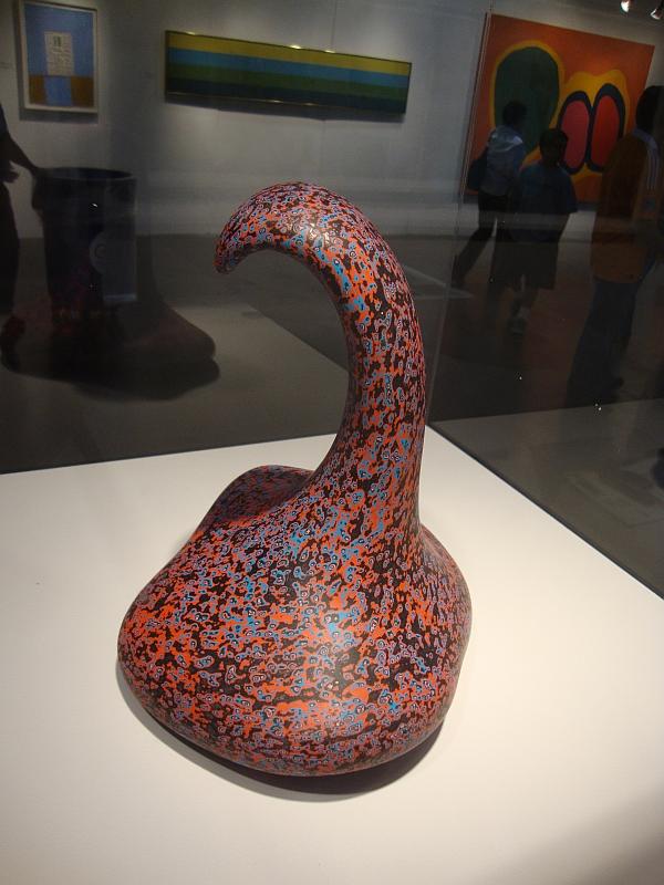
Ken Price piece that was on view at the Houston Fina Art Fair last year

Ken Price, the brilliant ceramic sculptor, one of the Ferus boys, died today in New Mexico. Jerry Saltz offers a very nice remembrance. The Menil has some Ken Price pieces, some of which were displayed last year. I hope they will be brought out again. This has been a bad month--Mike Kelley, Charlie Stagg, and now Ken Price.


Share

Tuesday, September 13, 2011

Jeff Forster's Progress

by Robert Boyd

I can't say I have been following Jeff Forster's career for a long time--I first saw his work in April of last year. But he has an old website that seems to date from 2007 and one can see his work has evolved quite a bit. Back then, his work was divided into two groups, Relics and Earthworks & Remnants. It is certainly possible to see in these works the roots of his current work. The "Relics" were ceramics that "stem from modern everyday household forms that society is familiar with." He derived "great satisfaction in reusing discarded items to create art." Forster deliberately made these ceramic pieces look aged--he wanted them to appear to be ancient sacred objects. But for his work moving forward, the key thing is the idea of a relic and the appearance of age. The Earthworks also were created to have the appearance of great age.

In 2010, Forster displayed work at Poissant Gallery that not only looked old, but was actually crumbling. Instead of a stately ruin, the work looks like a neglected mess.

Forster
Jeff Forster, Frailty, found object, porcelain, native Houston clay, 2010

 My thought after seeing this was that it mimicked what one would experience in an abandoned building. For example, a house that was flooded out during Katrina--what does it look like when you go back after all the water has receded and dried up? Artists and architects have long been fascinated by ruins--one need only think of the etchings of Piranesi or the follies (sham ruins) of 18th century England. But Forster is doing something a bit different. Those earlier lovers of ruins imagined a cleaned-up idea of the ruin compared to Forster's debris-strewn floor. But I think the relationship is strong, and as a consequence, I think we could apply to Forster's work in this vein an 18th century word, picturesque.
But among all the objects of art, the picturesque eye is perhaps most inquisitive after the elegant relics of ancient architecture; the ruined tower, the Gothic arch, the remains of castles, and abbeys. These are the richest legacies of art. They are consecrated by time; and almost deserve the veneration we pay to the works of nature itself.(William Gilpin, Three Essays on Picturesque Beauty, 1794)
I think in Forster's work, we have a modern interpretation of the Picturesque--perhaps the Enlightenment-era notion of the picturesque combined with nostalgie de la boue. This is something I can relate to. I take an indecent pleasure in seeing pictures of destroyed cities and towns--whether the result of natural disaster or war or mere neglect. And the ubiquity of such images of "disaster porn" in the mass media suggest I am not alone in this shameful voyeurism. The Sex Pistols got it right when they referred to "a cheap holiday in other people's misery." After all, when we see something like Frailty, it is implied that something bad happened. Buildings aren't abandoned for good reasons.  Eviction, delinquent taxes, bankruptcy, fcoreclosures, etc.--these lie behind this work.

 Forster
 Jeff Forster, Endangered Species, native clays and palm fronds dipped in porcelain then fired, 2010

He pushes it even further in Endangered Species (from an exhibit in September 2010 at the Art League). While frailty had the remains of a wooden box mounted on the wall, Endangered Species is a portrait of total decay. Two nondescript objects are on the floor surrounded by a partially swept nimbus of random ceramic flakes. One might wonder where the structure is here? The answer lies in the walls of the Art League's gallery. As an installation, Endangered Species uses its space as part of the piece itself. The gallery is the ruined building, its floor scattered with debris.


Still, these smallish pieces by Forster suggest that with more space, he could build a structure--the actual ruin. That's what he did with Abandoned, which was shown this summer at the Houston Center for Contemporary Craft's show of former artists-in-residence, Crafting Live(s): 10 Years of Artists-in-Residence.

Forster
Jeff Forster, Abandoned, reclaimed wood, concrete, local vegetation, native clays, 2011

Abandoned takes the ideas he developed in Frailty and Endangered Species and pushes them about as far as they can go in a gallery setting. Here we clearly see the remnants of a structure.It appears to be made of wood, with straw or pine needles on the roof. One could imagine stumbling across it in rural West Texas or Northern Mexico. My grandparents had a small farm in Louisiana. By the time I started visiting them, they were too old to farm and had leased their land to timber companies. In the woods (formerly fields), there was an old long-abandoned sharecropper's cabin. This piece stirred strong memories of that cabin. It too was strewn with detritus that hinted at the lives of its former inhabitants.

Forster
Jeff Forster, Abandoned (detail), reclaimed wood, concrete, local vegetation, native clays, 2011

This leads us to Forster's current work, a solo show called Detritus currently on view at Lawndale. To advance his postmodern picturesque effect, he has had to move his work outside, into Lawndale's back yard. Each of the pieces in the show has its own name, but I can't match the names to specific pieces, so please forgive my imprecision.

Forster
Jeff Forster, Detritus installation, reclaimed fencing and lumber, steel, local vegetation, concrete, adobe, paint, local and recycled clays

The first thing I noticed was how neat and tidy everything was. These large, somewhat abstract shapes are carefully spread about Lawndale's neatly manicured (if somewhat dry) lawn. They seem designed to suggest the ruins of obscure industrial structures. As someone who has looked at a lot of Forster's earlier work, the second thing I noticed was the lack of small broken bits of ceramic refuse, as we had seen in Frailty, Endangered Species, and Abandoned.

Forster
Jeff Forster, Detritus installation, reclaimed fencing and lumber, steel, local vegetation, concrete, adobe, paint, local and recycled clays

I pointed out the difference between Forster's work and the Picturesque of Gilpin and Horace Walpole. Those 18th century Englishmen didn't want actual ruins--they weren't looking for burned-out cities or weed-strewn lots. They placed their faux ruins in carefully designed gardens. The power of Forster's earlier pieces was in their feeling of actual decay--places where some tragedy had happened and which no one had touched since. A sharecropper's cabin with the litter of old newspapers and 1930s Sears catalogs on the floor. That is not what we see in Detritus, despite its name. It is closer to a folly like the Jealous Wall  -- a beautifully constructed sham ruin artfully set in a lovely lawn.

Forster

Jeff Forster, Detritus installation detail, reclaimed fencing and lumber, steel, local vegetation, concrete, adobe, paint, local and recycled clays

In expanding the scale of his work, Forster has moved closer to the 18th century ideal of the picturesque. I don't see that as a forward step. Detritus lacks the power of his earlier work. It feels like a misstep. When Kara Walker, for example, makes use of a quirky 18th century art form (silhouette), she gives it a modern resonance--and power. Forster seemed on that path until now. But as someone who is following Forster's experiment with updating the picturesque, I am hoping that he will move past Detritus. Perhaps what Forster needs is a piece of property where he can build a relatively permanent folly. A project like that would be similar to an earthwork, or to La Ribaute, Anselm Kiefer's "city" in France. Given several acres, Forster could build his own folly, perhaps a complex of ruined structures--structures that would decay naturally over a span of years. It would be a monument to entropy.

(Here I have to acknowledge that I own a piece of Forster ceramic--I bought it at a Box 13 fundraiser in 2010. And I have to acknowledge as well that when I own a piece for an artist, that puts me in the position of rooting for his or her artistic success.)


Share

Sunday, June 12, 2011

Drill Bit Totems by Susan Budge

by Robert Boyd

I was surprised when I walked into New Gallery to see these objects.


Susan Budge, Out of the Depths installation view, ceramic and steel, 2010-11

This sculpture group by Susan Budge, collectively called Out of the Depths, takes drill bits as its subject. Specifically, the drill bits are tri-cone rotary drill bits--the type that are used to drill for oil. 


Tri-cone rotary drill bits

The three cones crush up the rock while drilling mud is conveyed down the center of the drill pipe, exiting through a hole in the middle of the bit, where it carries the crashed up rock (known as cuttings) back to the surface on the outside of the drill pipe. (This is information that rarely comes up in art criticism, but it seems appropriate here.) Invented in 1934 by engineers at Hughes Tool Company, they are still in use today all over the world. For Houston, this is a very important piece of technology. I've often wondered why more artists here don't take this kind of thing as a subject or starting point for their work. Budge's interest is familial--her grandfather was a roughneck--an oil field worker--and her father was a petroleum geologist.


Susan Budge, Out of the Depths detail, ceramic and steel, 2010-11

Budge reverses the direction of the drill bits--they are coming out of the ground instead of going into it. She also puts them on undulating stands to bring them so just below eye-level. The zig-zig stands seem like 1980s new-wave decorative elements. I think these objects are meant to be totemic,  but they come off as somewhat unserious. (That said, they are beautifully crafted.)

On a similar theme are her ceramic representations of hard-hats.


Susan Budge, Tribute and Sacrifice installation, ceramic, 1999-2011

Hard hats are a loaded symbol. In the late 60s and 70s, "hard hat" was a metonym for the conservative working-class men who harbored a resentment towards hippies, African Americans, and other groups who were changing America in uncomfortable ways. (The hard-hats aged and became today's Tea Party.) But I think Budge's conception of hard hat wearers is far more positive, referencing earlier conceptions of working class men as the noble proletariat, the doers. Even though hard hats are worn by a variety of workers in a variety of circumstances, I associate these hard hats with oil and gas workers because of their proximity to the Out of the Depths sculptures and because of Budge's own family history. I also associate it with oil and gas production because I'm in that business myself; I see hard hats (and wear one) whenever I am on a worksite. I work in an office playing with spreadsheets, just like most of my co-workers, and yet every single one of us has at least one hard hat hanging on the wall.

Budge divides the hard hats into two series, Tribute and Sacrifice. Tribute seems straightforward--tributes to the roughnecks and roustabouts out in the oil patch. The Sacrifice hard hats, created in 2010-2011 are quite eerie. They each have a eye staring out from the top of the hard hat. The eye is realistically depicted and slightly uncanny because of it. While the Tribute hard hats are in a variety of fanciful colors. the Sacrifice hardhats are all white. It occurs to me that the Sacrifice hard hats may have been made in response to Deepwater Horizon disaster on April 20, 2010. Eleven workers were killed when the Deepwater Horizon exploded--all wearing hard hats, most likely. Of all the work in the show, I found the Tributes and Sacrifices to be the most moving.


Susan Budge, Sacrifice, ceramic, 2010-2011

Some of the other pieces in the show are identified as "Shalakos" and "Koshares."  Shalako, according to Wikipedia, is "a series of dances and ceremonies conducted by the Zuni people at the winter solstice, typically following the harvest." Wikipedia goes on to note that because Shalako is at least partly open to non-Zunis (unlike other ceremonies), it has achieved a certain popularity with the "New Age" crowd. And these mysterious totemic objects have something of a New Age feel to them.


Susan Budge, Shalako, ceramic, 2011


Susan Budge, Baby Shalako and Baby Koshare, ceramic, 2011

"Koshare" refers to a type of Hopi Kachina, specifically a representation of a clown or trickster figure.


Susan Budge, Koshare, ceramic, 2011

Budge makes reference to her spiritual beliefs in her statement, and my conclusion is that these beliefs are of the New Age variety.  While their eyes give them a bizarre quality, these statues feel fundamentally decorative. They don't strike one with the power of quasi-shamanic performances by Marina Abramowicz and Ulay or Joseph Beuys; or various disorienting surrealist masterpieces like Europe After the Rain by Max Ernst or the She Wolf by Jackson Pollock. These are probably unfair comparisons to make, but worth making if only because Budge's art seems to make big claims for itself. It wants to be spiritually serious. The thing is, one can see putting one of these handsome, well-crafted sculptures in one's garden or in a corner of the house, but one can't see leaving an offering to it. The possible exception to this are the deeply unsettling Sacrifice sculptures. The CEO of Transocean should hang one of these in his office and spend a few minutes every day with it, remembering by name the 11 who died on the Deepwater Horizon. That would be an appropriate offering.


Share

Sunday, January 16, 2011

Urban Animals by Merrie Wright

Photobucket
Merrie Wright, Decaying Swallow, earthenware sculpture and digital print

Merrie Wright is a ceramicist who teaches up at UT Tyler. Her show at Goldesberry Gallery combines ceramic sculptures of animals and photos of those sculptures in appropriate setting. What is amusing is that each of the animals--all of them wild animals--seems to have developed protective coloring to help them survive a tough urban environment. So the swallow above has coloring that resembles the fading, peeling paint of a park bench.

Photobucket
Merrie Wright, Graffiti Bluebird, earthenware sculpture and digital print

Graffiti Bluebird assume the dramatic colors of the spraypainted wall behind it.

Photobucket
Merrie Wright, Graffiti Bluebird, earthenware sculpture and digital print

Once you take them out of the environment, their coloring seems odd to say the least, if not completely arbitrary. Of course, the thing is that these color schemes only work as camouflage in highly specific circumstances--the bluebird has to be standing in front of a very specific piece of graffiti to be invisible--otherwise, I suspect this color scheme would call attention to itself--which would exert a lot of negative evolutionary pressure on this particular breed of bluebird.

So that begs the question--are these animals chameleons, able to change their color to fit in? That might be the case with the bluebird and swallow, but that theory falls apart with the exhibition's coyote.

Photobucket

Merrie Wright, Construction Zone: Coyote, earthenware sculpture and digital print

The coyote is not blending in with the background--here he is imitating a specific "natural" feature of the landscape. I think there are certain insects that do this, but this coyote is taking it to the extreme.

Photobucket
Merrie Wright, Construction Zone: Coyote, earthenware sculpture and digital print

Most Houstonians are familiar with urban wildlife. We've all seen squirrels and a large variety of birds, and I'd bet that most of  us have seen possums, raccoons and skunks in their neighborhoods on occasion. I haven't heard of coyotes or foxes in Houston, but I've read that coyotes are becoming fairly common in other cities--even New York. And the suburbs north of Houston have been experiencing an increased deer population. These animals turn out to be extremely adaptable to urban environments, and perhaps Wright is commenting on this adaptability. (In The World Without Us, Alan Weisman predicts that if humans suddenly disappeared, wild animals would quickly recolonize human places--they are already here after all--and easily shove aside domesticated dogs, which might become extinct. He gives good odds for the survival of cats, though.)

Photobucket

Merrie Wright, Reserved Parking: Squirrel, earthenware sculpture and digital print

But another meaning suggested itself to me as I looked at these pieces. The standard camouflage of these animals has from time immemorial been to hide them in nature--to help them look like nature. And the practice of art from Lascaux to the end of the 19th century was, with certain important exceptions, about depicting nature--including men and women as part of nature. But as the human-made world has come to dominate, the subject of art has evolved to the depictions of human-made things. When Pop Art first hit the world, a lot of the critical and curatorial response was about how these artists were depicting mundane man-made stuff (the first Pop Art museum show was titled "New Paintings of Common Objects").

Wright's animals are like artists, who after centuries of camouflaging themselves as nature, now, in her vivid tableaux, camouflage themselves as man-made stuff. The question is whether this show is celebrating this... or regretting it.

Of course I may be overinterpreting it. I think it would be easy to feel delight looking at these pieces without digging much deeper. That you can dig deeper is a bonus.

Tuesday, July 27, 2010

New Acquisitions--two small collages and a purple crown

Robert Boyd

If it seems like I have been buying a lot of art lately, it's sort of true. Mostly it's just that I've received a lot of art lately and also that I finally have some time to write about art I bought earlier.

For example, this small collage by Hayden Fosdick (who has one of the best names I have ever heard). I actually got this at Gallery 1724 several months ago, but forgot about it until recently! What made me remember it was his excellent collage in The Big Show.


Hayden Fosdick, untitled (?), collage, 2010

I know nothing about Fosdick, except that I am fairly certain he bears no resemblance to this man.

I also recently bought another small collage. Cheyanne Ramos had a show at McMurtrey Gallery which featured paintings with realistic setting, but where a central figure or object had been blanked out as a silhouette and replaced by a bunch of overlapping images of processed food products. Along with these paintings, she was selling a bunch of tiny collages, where she had taken postcards, cut out the central image, and replaced it underneath with a bunch of cutouts of food product photos, perhaps from the Sunday paper coupons.


Cheyanne Ramos, untitled, collage, 2010

Her collages seem almost like "sketches" for the paintings--or at least where she worked out her basic ideas for them. Cheyanne Ramos is another artist with a cool name about whom I know little. I've seen her work at The Joanna and Box 13, as well as the McMurtrey Gallery. I know she studied to get an MFA at UH, but that's about it. You can see more of her work here.

Finally, in a drastically different medium, is this purple crown by Virginia Scotchie.


Virginia Scotchie, untitled (Purple Crown), ceramic, 2010

This I got at Goldesberry. She had shown several months ago, and I really liked her work. She made cool textures and shapes. There were a number of similarly sized pieces that were all good. It was hard choosing. I finally picked the purple crown because it seemed so absurd. It's beautiful and makes me smile. (You can see a lot more similar objects on her web page.) She is also a professor at the University of South Carolina.

Tuesday, July 20, 2010

Creature Comforts at Anya Tish

Robert Boyd

The current show at Anya Tish almost makes sense. You get kitschy irony with Wesley Harvey's ceramics, mixed with the sugar overload of Ann Wood's assemblages, the poster-colored cuteness of Mindy Kober's gouaches and the cartoony figures in Jennifer Nuttall's pieces. Dawn Black seems to  be the odd artist out, to my eye. What really links these artists is that they all have achieved a certain level of local prominence in the world of non-profit artspaces like Lawndale and Box 13. The show was curated by Nuttall, but if one thinks of it from Tish's perspective, for her, as for any gallerist, taking on a new artist is a risk. A group show hedges but does not eliminate that risk. So achievement in other arenas may help a gallerist decide which risk to take. Of course, this has nothing to do with the quality of the exhibit. But as regular readers know, I like to think about the economics and sociology of visual art.

In fact, the show is pretty good. I first saw Mindy Kober's work at The Big Show last year. In that show, she had a witty piece showing a group of school children observing (being menaced?) by large floating Russian Supremacist abstract shapes. Her drawing style, outlines with flat colors and minimal details recalls old children's books, and because of that likewise recalls the absurdist cartoons of the great Glen Baxter. That approach is carried over into this show.


Mindy Kober, Not Another Kitty Painting, gouache on paper, 17 x 24", 2010

A group of Civil War-era soldiers are fighting around two gigantic kittens, one collared and immobile, the other nosing around with curiosity. The soldiers don't appear to be Union vs. Confederacy--their uniforms are all mixed up. And the "landscape" they occupy is a flat mustard-colored field. The lilliputian men, the kittens, the flat colors all scream "aw cute," a feeling only slightly mitigated by the four dead or wounded soldiers in the picture.

But her strongest drawing is Undertow, for which I don't have a reproduction. It's another gouache, but much larger--60 x 90". It's an ocean scene with the horizon at about the middle of the page. But don't let the fact that there is a horizon fool you into thinking there is a comprehensible space here. Scale is less important that fitting all the elements in--elements that relate to the ocean. So you have modern swimmers and beach-goers mixed in with Poseidon and Triton, as well as a couple of battling Patrick-O'Brian-style wooden ships. All done in Kober's simplified, story-book outline style.It's my favorite piece from this show.

Ann Wood's pieces are sculptural assemblages made with hunting decoys. (Elaine Bradford has been using decoys in her art recently as well--does that mean it's a trend?) In both her pieces, Scream and Bitter Sweet, the decoys are covered with gooey, almost edible-looking foam.


Ann Wood, Scream, decoy, polyurethane foam, flowers, plastic fruit, 2010


Ann Wood, Scream, decoy, polyurethane foam, flowers, plastic fruit, 2010

 It looks as if the pieces were actually assembled there in the gallery, with the foam poured onto the floor. The bright pink foam in Scream--well, it screams at you. It's the first thing you notice in the room. It feels so artificial, so plastic and fake. It's both amusing and disturbing that a deer is coated with it. One could read this as a conflict between a more natural state of things and a highly artificial state. It could have an environmental interpretation. But I think it's key that the pink is really appealing. It might be a crime against nature to cover a deer in pink chemical foam, but it looks really cool.


Ann Wood, Bittersweet, decoy, foam, rubber, pushpins

I think the theme is a little more obvious in this one--bird coated with a nasty dark substance. Seems as if that has been in the news a bit lately. But that is undermined a bit by the fact that the duck is also covered with little colored dots--it looks like it has been dipped in chocolate and covered with sprinkles. Rather than being a victim of BP, it looks like a creation of Krispy Kreme. We have nature under assault, but looking sugar-sweet.

Wesley Harvey also employs cuteness in his work. Harvey teaches art in San Antonio. Like many adjunct professors, he works for multiple schools, including the Southwest School of Art and Craft (Gary Schott also teaches there). His work in this show is ironic and kitschy.


Wesley Harvey, And all the yellow bunnies..., porcelain, glaze, gold leaf, velvet, 2009

But the irony is not subversive. I don't think that's his goal. Far from undermining the saccharine nature of his subjects, Harvey seems to be ramping that aspect up. Looking at And all the yellow bunnies is like eating a pound of chocolate Easter eggs.


Jennifer Nuttall also plays with irony, but hers seems the least interesting. Smiley cartoon figures trapped in bureaucratic political nightmares. Her figures have faces that look like those of 80s punk cartoonist Krystine Kryttre.


Jennifer Nuttall, Detention & Removal, illustration board, duct and brown masking tape, oil, 2010

My problem with these pieces is that the approach Nuttall takes doesn't particularly serve her political message very well. In particular, she undercuts it with the cuteness of the characters. It's unfair of me, but I want to political art to have the power of Jacques-Louis David and the moral clarity and inclusion of the viewer of Hans Haacke.


Dawn Black, The Snake and the Rising of the Stag, goauche, ink, watercolor on paper, 2010

Dawn Black doesn't trade in irony like the rest. Her mysterious, haunting figures in their indistinct, empty spaces are both specific and dreamlike at the same time. Pictures contain hints of rituals, bizarre performances, illicit activities, etc., without being specific about what these activities might signify. Especially interesting and intriguing is the "Conceal Series," small color drawings of masked people--a huge variety of people wearing a huge variety of masks.


Dawn Black, Conceal Project #116, goauche, ink, watercolor on paper, 2010

The outfits of these figures may conceal, but they also reveal quite a bit about the character (and possibly the obsessions) of the subjects. Black's skilled drawing of clothed figures, along with a flair for the mysterious, is what makes all this work.