Showing posts with label collage. Show all posts

Saturday, September 29, 2012

Exploring what is visible but unseen to Regina Agu

Dean Liscum

Regina Agu's show Visible Unseen is the sixth exhibition in Fresh Art's 2012 ARC Exhibition series. The show both exemplifies its title and more than holds its own in this impressive series, which showcases emerging Houston artists.

I spoke with Regina Agu at the opening. She is lithe, graceful, unassuming, and very approachable. She casually and confidently interacted with the audience, patiently and repeatedly providing context about the pieces and answering audience member's questions. Often, I heard her repeat herself because her work invites inquiry. We the viewers, however, frequently had the same thoughts but didn't have enough foresight to approach her en masse and let her answer our inquiries just once.

Despite having talked with her at length about "...biological, historical and scientific references coupled with current event commentary (through a) present day lens" (to quote a post by Nathaniel Donnett on the events FB page), I wouldn't have known she was a graduate of Cornell with a Bachelor of Science in Policy Analysis and Management or a world traveler. Nevertheless, I should have. Not because she's wearing a Cornell cap or beginning every other sentence with "when I was studying Policy Analysis and Management at Cornell..." or "...the last time I flew into Lagos..", but because a definite mental acuity and worldliness permeated her conversation. In other words, it's all there, visible but unseen.

Her art work in this exhibition is the same. The works are about disparity of medical ethics employed by physicians on various ethnic groups, the ownership and origination of knowledge, and the cultural and personal vs. the stereotypical. However, when you first approach them, that's not necessarily your first impression. The works are also meticulously crafted and beautiful and reticent to reveal their themes. But if you spend some time with the art and the artist, if you dig, they open up and reveal themselves.

I dug--with a lot of help from Agu--and here's what I discovered.

The series began with the work "Night Doctors", which was originally created for the show entitled "The Immortal Life of Henrietta Lacks: A Response by African-American Artists" at Mountain View College in Dallas, TX. The show was in response to and in support of the publication of the book The Immortal Life of Henrietta Lacks by Rebecca Skloot. In this book, Skloot reveals how after Lacks' death from cervical cancer, doctors took tissue samples without her or her family's knowledge or permission. The medical community then developed those cells into the HeLa Immortal Cell Line, which has been used to develop cures and make advances in cancer, AIDS, and other research.


Regina Agu, Night Doctors No. 1 

Another chapter in the book, "Night Doctors," from which the seminal work in this series derives its name, details how fear tactics were used on slaves to perform experimental procedures and reveals the trafficking from the South to the North of slave corpses for medical resources.  (Agu summarizes it much better than I on her blog.)

Informed by these facts, I realized that in a number of pieces in which she uses bibliography pages from medical text, what I was witnessing is an aesthetic act of reclamation.


Regina Agu, The People Could Fly 

The People Could Fly is a perfect example of employing formalist elements and collage to "explore hidden and forgotten histories". She imposes a metaphorical figure composed of repurposed images on to the bibliography of a medical text. Gold paint blocks out all the names, dates and studies from which this knowledge originates. By systematically eliding all the knowledge attribution from these medical documents, Agu imbues the work with a gilded formalism. Her aesthetic choices are more than merely formalist decisions about how to balance the composition. These marks challenge the fallacy that knowledge originates from the work or insight of a single individual (a theme that John Lienhard often ridicules in his series the Engines of our Ingenuity). They also attempt to restore credit to the patients and participants of these medical experiments by denying the medical myths perpetrated by these attributions. Symbolically, she eliminates from the history books those credited with the medical discoveries in the same way many of them discounted or explicitly eliminated the contribution of their marginalized patients.


Regina Agu, Introduction to ... 

In Introduction to... Agu "doctors" the stately portrait photos of many of the doctors who engaged in this socially accepted but exploitative practice. The aesthetic choices made in Dental Records (Heirlooms) exemplify the power of Agu's techniques. I love the way in which the light blue, alphabetic separator for Js underlines the gilded teeth and anchors the piece.


Regina Agu, Dental Records (Heirlooms) 

Oracle is superficially beautiful, but ultimately unnervingly eerie. At first glance, the female figure is mesmerizing. However, upon closer inspection, the cutting up and segmenting of the body in the image invokes the memories of all the bodies parts that were experimented upon. Agu's Oracle predicts a cure, but it also illustrates the cost to those involved in developing that cure. It alludes to the fact that at one level the medical community treated the bodies of African-Americans and other ethnic groups as bodies of parts that were merely parts of experiments.


Regina Agu, Oracle 

Another group of Agu's works uses similar techniques to address an alternative theme, that of the stereotypical vs. the personal. In this series of collages, I see Agu "excavate ideas and rituals that [she] inherit from family, from our backgrounds, and from our most basic instincts" as she declares in her artist statement. In works such as A Rare Specimen - Mami Wata Suite No. 3, Agu uses collage to combine the contemporary with the traditional, personalizing her rendition of Mami Wata, a spiritual-mythical figure that embodies African beauty.

Regina Agu, A Rare Specimen - Mami Wata Suite No. 3 

Guaranteed Wax Block Prints plays off a claim that all fabric makers in Nigeria make because of the prevalence of cheap knock offs.

Regina Agu, Guaranteed Wax Block Prints


Regina Agu, installation at Fresh Arts 

Her one installation continues the theme of discovering through uncovering. In it she has covered one wall of the gallery with personal pictures from her childhood and her travels. Over the course of the exhibition, she will cut-tear-rip a familiar textile pattern from her childhood in Nigeria into the pictures. This act personalizes and reclaims the fabric pattern for herself as she not only re-creates it with her hands, but creates it out of her own images and memories.

I certainly plan to return before the show ends on October 26, 2012 and see what emerges. I recommend attending her Artist Talk at the Artist SPEAKeasy: Wednesday, October 17, 6:30 - 8:30 p.m.

(Thanks to Jenni Rebecca Stephenson from Fresh Arts for coordinating and Regina Agu for providing all the photos except the last one.)


Share


Sunday, September 9, 2012

Troy Dugas's Product-label Mandalas

Robert Boyd


Troy Dugas, Distilled Pride, 2012, vintage product labels on wood panel, 48" x 48"

Troy Dugas describes the work in his current show at McMurtey Gallery like this:
My collages are made from vintage product labels purchased in unused bundles. The material is cut or shredded then arranged onto flat surfaces (paper, canvas, or wood) to produce artwork that appear woven. Repetition, pattern, precision, and scale are used to distract from the original purpose of the label to sell a product. The essential elements of color, shape, and line are utilized in a new way, and the altered context of the source material provides new meaning. The immediacy of the graphic label is substituted with aesthetic sensation and contemplation. There is a certain mischievous pleasure in the process of this transformation, and at the same time, a kind of meditation.
The sentence  "Repetition, pattern, precision, and scale are used to distract from the original purpose of the label to sell a product" is ironic--after all, these collages are in fact products for sale in a gallery. But what interests me is that these labels are themselves the product of artists. Designers toil endless hours to make product labels that will catch the eye, that will be associated with the product in the mind of the consumer, etc. These artists are often not considered artists because of the nakedly commercial nature of their work--but as I mention above, artwork you see in a gallery or at an art fair is just as much merchandise as the products whose labels Dugan used.

Given the graphic richness of product labels, it's not surprising that contemporary artists make work based around them. Andy Warhol didn't make paintings of Campbell's Soup cans and sculptures of Brillo boxes merely because of their banal ubiquity--he was attracted to their graphic strength as well. In fact, the designer of the Brillo box, James Harvey, was himself an abstract expressionist painter. Critic Irving Sandler relates a story about Harvey and Warhol in his memoir, A Sweeper-Up After Artists. He had teased Harvey about Warhol's appropriation and in response, Harvey sent him a signed box of Brillo as a gag gift. When Warhol saw it, he immediately called Harvey and offered a trade, a signed Brillo box for a Brillo Box. And Warhol was far from the only artist to work with product labels. In fact, there are other artists who use product labels to create design-heavy colleges, similar to Dugan's. I recently saw some by Alison Foshee at the Pearl Fincher Museum. And Al Souza has made collages of cigar bands.


Troy Dugas, The Finch, 2012, vintage liquor labels on wood panel, 48" x 48"

Most of Dugas's collages are circles inscribed in a square (The Finch is an exception). This gives them the look of a mandala. That adds a layer of irony to the work--staring at them could be an aid to meditation if they were used as mandalas, and yet the hustle and bustle of consumer culture is the opposite of meditative, it is the essence of being in the material world, of being in the world of Māyā. Is Dugas suggesting that enlightenment can be found in consumer culture? He speaks of the meditative nature of the work, after all. (One is reminded of the Zippy the Pinhead comic by Bill Griffith in which, at the suggestion of Zippy, Buddhist monks start meditating in front of spinning washing machines at a laundromat--which with their circle-in-a-square design also resemble mandalas.)


Troy Dugas, Wurtzberger, 2012, beer labels on wood panel, 48" x 48"

Adding to the irony is that many of the labels Dugan uses are beer labels or liquor bottle labels. Perhaps starring at one of these while intoxicated will aid a viewer in having an epiphany. "It's coming through a crack in the wall / on a visionary flood of alcohol." (from "Democracy" by Leonard Cohen)


Troy Dugas, Alexander Keiths, 2012, beer labels on wood panel, 48" x 48"

I find Dugan's collages quite beautiful, perhaps all the more so because I suspect they will fade pretty quickly. The paper used on produce labels is not the best--exposed to oxygen they will yellow--and the inks, particularly the blue and black inks, used in commercial printing have a tendency to fade. When you look at old collages (those by Kurt Schwitters displayed at the Menil last year, for example), you see the faded, yellowed remnants of something that must have been quite bright and vivid when originally made. That gives this kind of a work a poignancy.


Troy Dugas, Alexander Keiths (detail), 2012, beer labels on wood panel, 48" x 48"

But they won't fade for many years, and you can see them now in their prime at McMurtrey Gallery through October 13.


Share


Sunday, July 22, 2012

The Big Show: A Little Bit of Everything Else

Robert Boyd

While The Big Show 2012 had plenty of paintings and plenty of craft-based work, the reality is that, as usual, there was a hodgepodge of all kinds of artwork. To wrap up our coverage, I want to look at a few other pieces that caught my eye.


Patrick Renner, Sunburst, 2012, found painted wood and polyurethane, 18" x 24"

I was talking to Jim Nolan the other night at the opening of a show he curated, and he spoke of the show being about painting without painting. Sunburst by Patrick Renner falls into that ambiguous category. I guess Sunburst could be considered a collage, but what is interesting about it is that Renner achieves painterly effects without actually applying paint to anything. If he had simply painted those colors on a canvas, I don't think it would have been nearly as interesting. The weathered wood scraps not only come with interesting textures and patterns of wear, they come with history. All of this was something else before.


Edward Ramsay-Morin, Cutaway Portrait #4, 2012, inkjet paper on archival paper, 17" x 15"

Cutaway Portrait #4 by Edward Ramsay-Morin is a collage of the modern sort--images joined together electronically instead of cutting and pasting actual images. The two images both seem to come from the 60s--a man with slicked-back hair, a black suit, and a skinny tie; and a photo of Earth with the Moon in the foreground, perhaps shot by an Apollo spacecraft. The man's face has been cut-away to show this image of outer space. The cutaway edge is given shading to make it appear as if the man's face was, in fact, a thin shell. The image suggests the phrase "inner space," and given the vintage of the photographic elements, one is made to think of such 60s-era explorations of "inner space" through psychedelic drugs, through meditation, through religious and shamanic ritual, etc. This juxtaposition of the human-scale with the cosmic also reminds me of William Blake's "Auguries of Innocence":
To see a world in a grain of sand,
And a heaven in a wild flower,
Hold infinity in the palm of your hand,
And eternity in an hour.
Katie Wynne, Untitled (Satin), 2011, motorized tie-rack and satin, 4" x 60" x 40"

Another piece that juxtaposed two unlike things together was Katie Wynne's weirdly beautiful Untitled (Satin). An insect-like device wriggles its "legs" on a piece of satin, gradually balling it up. The device is actually a motorized tie-rack. (Question: who on earth needs a motorized tie rack? Just curious.) The shiny black carapace and legs give this piece a decidedly creepy presence, while the blue satin radiates the appearance of luxury. The motion is hypnotic. I assume that from time to time, the tie-rack must be turned off and the satin flattened out. This is a kinetic sculpture, but it requires human intervention. What I loved was that it has a strong effect with a minimum of elements.


Tommy Gregory, Power & Priorities, 2011, cast resin, 20" x 16"

The first three pieces mentioned in this post were essentially made of found objects--old wood, repurposed images, a piece of cloth and a motorized manufactured item. When I looked at Power & Priorities by Tommy Gregory, I thought that this, too had been assembled out of found objects. But strangely enough, Gregory went through the trouble to cast the light switched and power sockets with resin. That seems like an unnecessary extra step. Still, the piece works. It may be the oldest trick in the conceptual playbook, but there is something about taking a thing that we are used to seeing in isolation and grouping it with many similar or identical things that works, as Tara Donovan has proven many times.


John Adelman, Esdras (Duelist), 2012, gel ink on paper mounted on wood panel, 30" x 48"

Similarly, John Adelman's piece Esdras (Duelist) is created using a repetitive process. He may be writing words out from the dictionary with his gel pens. Whatever the source of the words, his technique for writing them renders them illegible. They become texture and value instead of words. By using a very precise process or algorithm to create the piece, it becomes something that in theory, anyone could execute by duplicating his process, like a Sol Lewitt wall drawing. But it is extremely unlikely that anyone would voluntarily duplicate the obsessive routine Adelman used to create this piece.


Kassandra Bergman, Always, 2011, glitter and cardboard, 32" x 25"

The few pieces I've seen by Kassandra Bergman, including another one in this show called My St. Mark's Place, have been photographic. But I haven't see enough of her work to know if Always is an idiosyncratic work for Bergman. I can't precisely say why this piece appealed to me. It combines elements that are optimistic and glamorous--the glitter, the word "always"--with elements that seem mundane and boring--the nondescript sans-serif font, the minimal design. The glittery center with its promise of eternity is surrounded by a flat plane of white, a non-space, a nothingness. It makes one question the value of "always." It's like two people pledging eternal love without taking into account the daily sameness a marriage can become. (Maybe that's what I'm seeing--a reason to be thankful I'm single.)

In the end, Marco Antonini's Big Show was not unlike the others--a combination of pieces designed to appeal to the eye, pieces that demonstrated mastery, and pieces that were conceptually interesting--sometimes all in a single work. But I commend him for increasing the breadth of the show in terms of the types of work displayed while exercising his curatorial prerogative to brutally edit the show.  I hope future curators follow his lead.


Share


Thursday, September 15, 2011

The Houston Fine Art Fair Opens Tonight

by Robert Boyd

Unfortunately, I won't be there tonight... I have a class. I might try to stop by Friday, but realistically, I don't think I will make it until Saturday. Like a sucker, I bought a four-day pass (opening party tonight and then three full days). Then, about a week later, Linda Darke gave me four free passes. I gave one to fellow Pan blogger Dean Liscum, so I'm hoping he will have something interesting and timely to say.

For previews, here's CultureMap's "ultimate" preview, and here are photos of the installation of the show from The Houston Press. I've never been to an art fair, so for that reason alone I'm quite eager to check it out. I want to see the art, of course, but I also want to check out the scene.

What seems especially interesting about the Houston Fine Art Fair is the number of Latin American galleries exhibiting. Out of 81 galleries exhibiting, nine seem to be from Latin America.

Ugalde
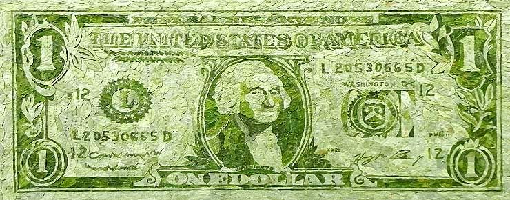
Gastón Ugalde, One dollar, Coca leaves collage, 2010

The above image comes from the website of Salar Galeria de Arte from La Paz, Bolivia. It's one of the South American galleries that look quite interesting. Another is Document-Art from Buenos Aires, which seems to specialize in artists' books.

The Houston Fine Art Fair may end up being a bacchanalia of commodity fetishism, plastic surgery and air kisses, but I suspect that it will be quite interesting to attend.


Share

Sunday, September 11, 2011

Invisible Curator: Natural History

by Robert Boyd

I don't know about you people, but this summer I have made it a point to spend as little time outside as possible. From front door to the car, from car to workplace, workplace back to car, car back to front door. However, if you have been outside a little more than me, you might have seen something like this:

Photobucket
photo by arch-ive.org, stolen by me from Swamplot

You can see a lot more overheated squirrels here. What these squirrels need is a handy body of water in which to cool off.

Photobucket
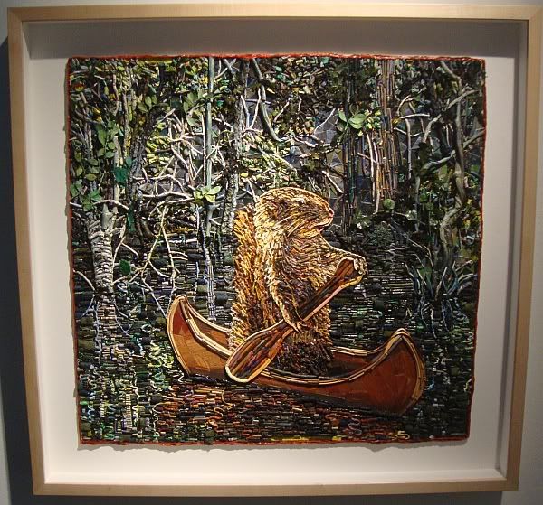
Mary McCleary, We'll Take a Boat to the Land of Dreams, mixed media collage on paper, 2011

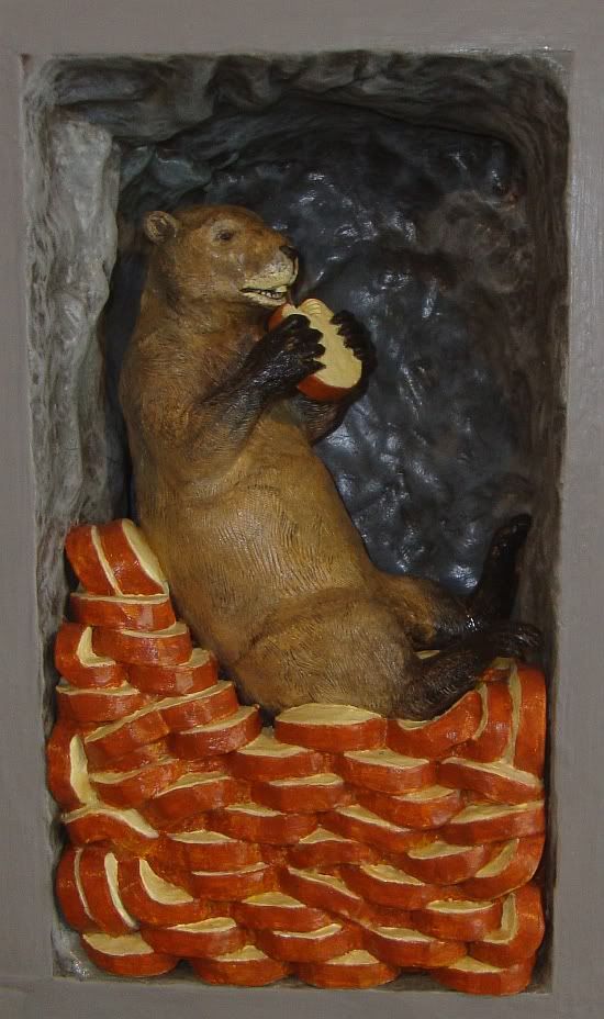
Unfortunately, all the ponds and puddles and birdbaths in Houston have dried up. Perhaps a change in diet would help Houston's squirrels--say nice cool cheesecake, right out of the fridge.

Photobucket
Joe Meiser, Groundhog with Cheesecake

You can go see Mary McCleary's squirrel at The Art League right now. Despite the presence of only one squirrel (that I noticed) in the show, it's pretty awesome. Joe Meiser's exhibit at Box 13 just closed, but you can see the artwork on his website.

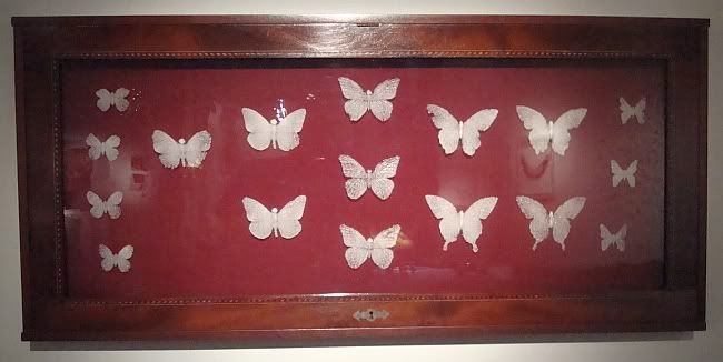
In my daily peregrinations from my front door to my car, I haven't noticed any butterflies at all. My scientific conclusion is that they spontaneously combusted in Houston's volcanic heat this summer. Fortunately, lepidoptery and natural history have a solution--dead butterflies pinned to flat felt surface, displayed in the air-conditioned halls of a museum. But that's not good enough for art, which wants to remove us one more degree from living, fluttering butterflies.

Crowder
Michael Crowder, Mariposa Mori, glass (pâte de verre), mahogany, felt, 2007

Crowder

Michael Crowder, Mariposa Mori detail, glass (pâte de verre), mahogany, felt, 2007

Mariposa Mori is an elegant substitute for living lepidoptera, no?

McCleary
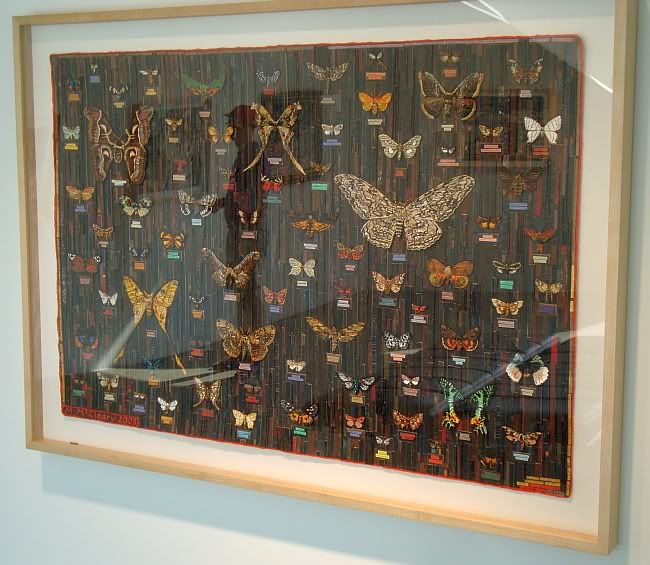
Mary McCleary, Sugaring Moths, mixed mediia collage on paper, 2008

In contrast to Michael Crowder's elegant albino butterflies, Mary McCleary (her again!) has riotously colored moths. You can see Michael Crowder's work right now at State Fair, a group show at Diverse Works. His little section sticks out like a highly refined, unusually beautiful sore thumb in this curatorial cacophony.

These four pieces would make a nice little natural history museum. My favorite way to experience nature--well air-conditioned and insect free.


Share


Sunday, March 20, 2011

Time Travel at the Art League

I missed the opening of this exhibit of work by Patrick R. Turk at the Art League, but that was perhaps a blessing in disguise. This work is best experienced alone. You enter a darkened gallery with a large hexagonal column in the center. Each face of the column has a lighted part at about eye level. The six lighted parts are composed of circular lenses of varying sizes and varying levels of magnification. When you look through the lenses, you see a brightly lit collage behind them. The collage is three dimensional, and in some the pieces, there are moving elements. Each collage represents a time frame. For instance, one of the pieces represents 360,000,000 B.C. to 65,000,000 (the age of the dinosaurs). We also get more recent (and briefer) time spans, like 1804-1869, which starts with Lewis and Clark's expedition and ends with the completion of the transcontinental railroad. The collage images refer to the removal of the Native Americans who were in the way of America's westward expansion. Two of the pieces depict the future--including a technocratic age of robots and a ecological collapse that leads to a desperate bit of last-ditch genetic engineering.

These interpretations come from the accompanying catalog. The reality is that a viewer--this viewer at least--wouldn't have a real clue what he was seeing. I could see the dinosaurs and Native Americans, but without the catalog, I wouldn't have understood the intent. But that's OK. What is great about these six pieces is how great they look. The second you walk in the room, you are compelled to view the pieces. And viewing them may make you gasp in delight.


Patrick R. Turk, The Time Travel Research Institute, wood, LED lights, glass lenses, paper collage, 2010-2011


submit to reddit

Saturday, March 5, 2011

The 2011 Core Exhibition

Every year the Core Program at the MFAH puts on an exhibit by the artists in residence. The 2010 exhibit, as I recall, was dry and boring. But what a difference a year makes! Even though this exhibit contains many of the same artists, the work feels fresh and exciting and stimulating. Maybe it's a difference in my attitude between then and now, or maybe the work has just gotten better. In any case, I want to talk about a few specific pieces that caught my eye--but I recommend you go to the Glassell School and see the entire show.

Kelly Sears is an animator who uses old photo from magazines and books in her work. In the work for this show, once we started it it could not end otherwise, her source material is a high school yearbook from the early 70s. The story is that something infected the minds of these particular high school students. It was not particularly noted at the time, but examining the yearbooks gives one a clue. This thing--this virus or agent--went on to infect the world, and the film comes across as perhaps the last step in an attempt to locate the source of the affliction. The images on the screen, black-and-white shots of students moving slowly against colored (somewhat vibratory) photos of the school building, are not threatening except in context. The sounds and narration (written) inject a feeling of tenseness and menace. Towards the end of the video, we start to see animated black goo dripping from the noses, mouths and eyes of the pictured students, and ultimately from the windows of the school. But I take this as symbolic of the infection because the narration makes it clear that whatever was going on wasn't really noticed  until after it spread to the general population.

Of course what comes to mind is the venerable horror sub-genre of some invisible evil spreading, whether it is something nameless and supernatural, or in more modern versions, a disease of some sort. Zombie fiction is a particularly unsubtle form of this story, as well as the diseases in movies like The Crazies. Of course, seeing this video, one could not help be reminded of the great graphic novel Black Hole by Charles Burns, where teenagers are the vectors for a sexually transmitted disease that slowly turns its victims into monstrous outcasts.

But the teenaged victims in Sears' video are marked not by physical symptoms, but by their actions. They shut down all the student clubs and the class officers all resign. The disease seems to cause them to turn inward and away from the kinds of voluntary social organizations that many think of as the glue that holds a healthy democratic society together. once we started it it could not end otherwise is sort of Bowling Alone reimagined as a horror film. It is a highly intellectual conception of horror--even Black Hole still featured plenty of classic body horror. once we started it it could not end otherwise belongs to a slightly different tradition. One is reminded a bit of House of Leaves by Mark Z. Danielewski, but even more so of "Tlön, Uqbar, Orbis Tertius" by Jorge Luis Borges, in which a group of Argentine and Brazilian rare book aficionados accidentally unleash the idea of a fully realized fictional world, Tlön, on our real world, which Tlön gradually starts to displace.

But what it reminds me of most are other Sears videos, which have similar themes, such as The Drift (2007), where astronauts bring back a kind of addicting music from outer space. (This video is included on Buffet, an anthology of art video by Houston area artists.) If we think of  once we started it it could not end otherwise and The Drift together, it becomes clear that Sears might be talking about the idea of a counterculture, a dropping out from the mainstream, majority culture. In both videos, the point of view of the narrators is that this is a bad thing, destructive to society. You can see examples of Sears animation here and here.

Julie Ann Nagle, Breakdown of a Long Chain, wood veneer, polyethylene, foam, aqua resin, paint, space blankets, Bakelite, padauk, and tree trunk, 2011

Julie Ann Nagle is a sculptor. Looking at her work, I get the feeling she is interested in science and that hand-maiden of science, exploration. In this sculpture, she has depicted the prow of a ship (a wooden ship, which could apply to any ship from medieval times to current day yachts, but that I am interpreting as being from the age of sail). The figurehead is particularly unusual.

Julie Ann Nagle, Breakdown of a Long Chain detail, wood veneer, polyethylene, foam, aqua resin, paint, space blankets, Bakelite, padauk, and tree trunk, 2011

 Instead of a more typical goddess or mermaid figure, we have a man wearing a long coat in the act of doing a cat's cradle. The long coat looks like a lab-coat, so I think we can interpret him as a scientist figure. The title of the piece could refer to chemistry when long chain molecules are broken down into smaller constituent parts. (For example, when the long hydrocarbon chains present in heavy crude are "cracked" in the refining process into the smaller hydrocarbon molecules used in gasoline.) A scientist on the prow of a ship makes me think of discovery and crossing unexplored frontiers. But the cat's cradle in his hands is a warning of sorts. In Kurt Vonnegut's novel Cat's Cradle, the cat's cradle was symbolic of futile, irrelevant gestures in the face of technological horror. And in that novel, a scientist has created a form of water, ice-nine, that freezes at room temperature. By the end, ice-nine is released on the world, effectively destroying it. Vonnegut was famously skeptical of mankind's ability to keep its scientific prowess from being used for destruction. Nagle seems to be echoing this fear. At the very least, the sculpture has an ambiguous relationship with science and discovery.
Julie Ann Nagle, Adrift in Current Patterns, Velour, Tyvek, polyethylene barrels, gold leaf size, gold space blankets , 2011

This piece immediately conjures up memories of the Deepwater Horizon oil spill if we take barrels as symbolic of oil. (Barrels are 42 gallons, and while this measure is used for other liquids, it is primarily used for oil.) But the irony is that she has made it quite beautiful--even luxurious. The undulating velour sea, the gold-plated barrels--it's very pretty.


Fatima Haider, installation view of three pieces, 2011


These are three pieces by Fatima Haider, each related to one another. Each piece consists of a collage of cut-up phone book pages on the left and a brown rectangle on the right. The collage pieces are apparently pasted on wasli, which is a kind of super-smooth acid-free paper that was invented in India in the 10th century and which was used for painting miniatures. It struck me as ironic, pasting these pieces of phone book (which are printed on the roughest, cheapest, most-acidic paper possible) onto this fine hand-made paper.


Fatima Haider, Names, phone book, tape, wasli, photograph, and plexiglass, 2011


From a distance the pieces are speckled grey planes with lighter grey fissures. You have to get in close to see what Haider has done.

Fatima Haider, Names detail, phone book, tape, wasli, photograph, and plexiglass, 2011

As you can see, she has taken the names from a phone book page, razored them out of the book, and pasted them down. One can't look at this without imagining the artist bent over a table, perhaps with a magnifier, X-acto knife in hand. It seems like it must have been a tedious process.But the vision also makes one think of those ancient miniature painters, who likely assumed a similarly hunched posture as they painted on their wasli with their minute brushes.

Phone books are huge catalogs of data. The computer has pretty much obviated the need for them. Haider is treating the phone book as data, and her process is like a database program or Excel file that filters out particular bits of the data, reorganizing it. But she does it in a nonsensical way: names without the numbers is not a terribly useful collection of data.

Fatima Haider, Numbers detail, phone book, tape, wasli, photograph, and plexiglass, 2011

The data is even more useless when you just have numbers.

Fatima Haider, ... detail, phone book, tape, wasli, photograph, and plexiglass, 2011


The most hilariously useless bit of data extracted are the ellipses, the dots connecting the names to the numbers. The tedious effort of carefully cutting these tiny dots out and pasting them down on paper seems all-the-more absurd in this piece, but it's really the same for all three. Haider has acted as a kind of human computer to take useful information and convert it into a well-structured but nonsensical database in physical form.

Clarissa Tossin, Matter of Belief, inkjet, Plywood and acrylic paint, 2010

When you look at Clarissa Tossin's work online, you see lots of extravagant, beautiful color pieces. But her more recent work seems more conceptual. That's a loss in a way, but her conceptual work is still quite inviting visually as well as interesting conceptually. Matter of Belief is a clever piece that requires a bit of viewer interaction. You see two stacks of paper currency--US dollars and Brazilian reales. But when you look at them closely, you see that one side of each is a dollar and the other a real.

Clarissa Tossin, Matter of Belief banknotes, inkjet on paper, 2010

This is what is written on the table:

Clarissa Tossin, Matter of Belief detail, inkjet, Plywood and acrylic paint, 2010

To understand this piece, it's useful to know a little bit about the economic history of Brazil. But I can already feel readers' eyelids dropping. Feel free to skip the next few paragraphs if you wish. Brazil had more-or-less ordinary periods of growth and slowdowns between 1945 and 1973. But like every net oil importer, Brazil was hit hard by the 1973 oil shock. So imagine this--money from Brazil (and Europe and the U.S.) is pouring into the coffers of the oil exporters like Venezuela and Saudi Arabia and Iran. These exporters put this money into banks--big international banks. Now banks can't just hold money--that's a liability on their books. So they needed places to lend the money, and there was so much money to lend that the interest rates were quite low. So countries like Brazil got very cheap loans. But paying back these loans fed into inflation, a long-time Brazilian problem. It helped produce hyperinflation. This problem helped bring down the military government. The first two civilian governments were both corrupt and incompetent and failed to tame inflation.

The third civilian government had a finance minister named Henrique Cardoso. He was not an economist--he was a left-wing sociologist who had been a long-time opponent of the military government. But he got together some economists to implement a plan. The plan they came up, plano real, with involved indexation, pegging the Brazilian currency to the dollar. Interestingly, they did this prior to introducing the new currency, the real. The idea was to create a belief that there a virtual Brazilian currency that was as stable as the dollar. After a while, once the virtual currency was widely understood to exist and be stable, they turned the old currency into a new real currency. This story was amusingly related on an episode of This American Life. The result of this is this was a turnaround for Brazil, which is now one of the most dynamic and important economies in the world.

What I liked about this piece was that the superstition that Tossin refers to is a folk version of the very complex, mathematically-modeled economic plano real. Classical economics is always referring to the rational self-interest of economic actors, and the superstition of carrying a dollar is anything but rational. But modern economics--which includes large doses of psychology (known as behavioral economics)--allows for this. Educated people may look down on these superstitions, but as plano real proved, changing a people's belief system--in this case, belief in the value of their money, can effect real economic change.

There were additional pieces in the exhibit by Nick Barbee (a table of disparate objects, and a self-published book cataloging them), Steffani Jemison's interesting pieces involving transparent overlays against the wall, which create subtle double-images, and Lourdes Correa-Carlo's photographic installation of the inside of a tin roof (describing this does no justice to the visual wow of this work). If you have a chance, I highly recommend you visit this exhibit.


submit to reddit

Tuesday, November 2, 2010

Lance Letscher at McMurtrey Gallery

It's weird that there are three big collage shows up in Houston right now. The biggie, of course, is the Kurt Schwitters exhibit at the Menil. Then the Al Souza show at Moody Gallery. And then this one, the most colorful of the three, Austin artist Lance Letscher on view at the McMurtrey Gallery.

Lance Letscher
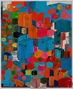
Lance Letscher, Most of My Little Ones, collage on masonite, 2010

When I saw the Schwitters exhibit, one thing that struck me was how brown his collages were. How they were composed of varying shades of beige and tan. And one sees the opposite when one looks at the collages of Al Souza and Letscher. But looking at Schwitters is, perhaps, the future of looking at Souza and Letscher. All these printed sources that Letscher cuts up, they are going to fade. The paper they are printed on will get brown. The glue he used to attach them may acquire a visible color as it ages. So enjoy their brilliance today--it won't last. (All this may be untrue if the images he collages are actually printed with archival inks on acid-free paper--which would be nice but not expected.)

Lance Letscher
Lance Letscher, Space Station #2, collage on masonite, 2010

A bunch of the collages in this show feature these colorful rectangular boxes. Some of them are arranged in a kind of modular fashion to be "space stations." When you see photos of the International Space Station, you see something conceptually similar. It, too, is a modular structure, where each module was brought up separately and attached to the whole in space. But where the ISS is black (solar panels) and white (everything else), Letscher's station is a riot of colors. And it appears infinitely variable--the modules are all more or less the same, and as we can see in three variations, can be arranged in any old way.

There is something boyish happening here. Letscher is building models of space craft, not too different from a kid playing with Legos. This feeling of being a boy making things carries through in other pieces, too.

Lance Letscher
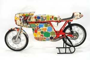
Lance Letscher, Minarelli Racer, collage on vintage motorcycle, 2010

I think connecting with those boyish interests is on Letscher's mind. He has just written and illustrated a children's book called The Perfect Machine. The very first line in the book is, "Once there was a boy whose head was filled with ideas. He loved to draw and think."

Lance Letscher
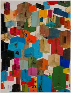
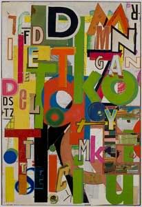
Lance Letscher, TKO, collage on masonite, 2010

Lance Letscher
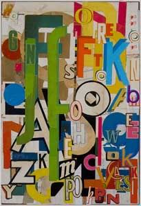
Lance Letscher, FK, collage on masonite, 2010

Letscher makes a nod to his collage forebearers (including Schwitters)  with several collages composed mostly of letters and word fragments. I've long thought that this approach to collage was an attempt to take the flood of data that we get every day as a result of living in an industrial civilization, and turning that data into nature. Or at least neutralizing the data by robbing it of linguistic meaning, leaving only (at best) visual meaning. As jumbled and chaotic as these compositions are, they are also pleasing and relaxing once one forces oneself to stop reading them. That's actually a little tough for a habitual reader like me, but worth it here.

Sunday, October 31, 2010

Al Souza, Jim Love, James Drake and Jess at Moody Gallery

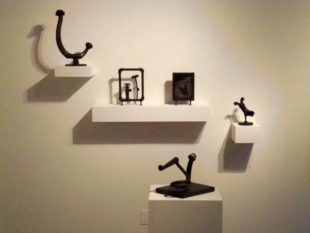
Moody Gallery has three exhibition rooms, and usually they have one big exhibit up front and in the middle room, and then a second exhibit in the back. This time, they have Al Souza in the front gallery, a show devoted to the trio of Roy Fridge, Jim Love, and David McManaway in the back and a little group show in the connecting gallery. Here's an installation view of the Fridge-Love-McManaway show showing a selection of small Jim Love sculptures.

Jim Love

The middle gallery exhibit is kind of a weird hodge-podge. It's just called "Group Exhibition," and it features work by David Ireland, Jess, James Drake, and Jay DeFeo. Why these artists?

James Drake
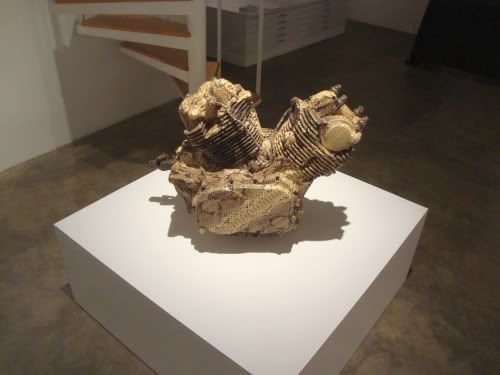
James Drake, Snakeskin Engine, motorcycle engine, python skin, 1994

That question applied to James Drake is easy to answer. He's one of the artists that Moody Gallery represents. And right now, he has a large show on view at the Station Museum. And as Don Thompson contends in the $12 Million Dollar Stuffed Shark, being shown in a museum adds brand value to an artist. So while Drake's brand is being enhanced, why not remind people where you can buy Drake (for you have $30K to spare)?

James Drake
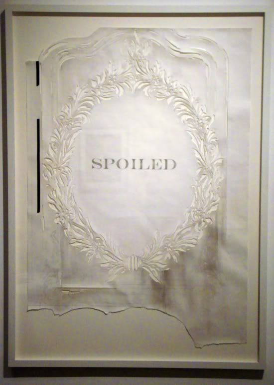
James Drake, Spoiled, graphite, tape on hand-cut paper, 2010

But what about us plebes who don't have $30K? Well, if you're like me, and you liked the Drake show at the Station Museum, this gives you a chance to see of couple of more excellent pieces by the artist. And that's an important service that commercial art galleries perform--they are like little free museums. I don't have much to say about Snakeskin Engine that I didn't say about a similar piece at the Station Museum, but check out Spoiled! This cut-paper technique was one Drake used in a few pieces at the Station show. I didn't get a good photograph of them then, but I liked them. They seem very delicate and almost feminine, which something unexpected from an artist as consistently macho as Drake. But Drake undercuts this femininity. One of the Station Museum cut-paper pieces shows a snarling dog. This one is, obviously, spoiled--dirtied and torn. Drake's work is filled with pain and regret at male violence. Perhaps here is is addressing specifically violence by men towards women. At least, that seems like one possible reading. (This ambiguous machismo is, to me, the hallmark of certain artists associated with Texas--Drake, James Surls, and Michael Tracy.)

Jess
Jess, Xrysxrossanthemums, collage, 1978

But as I mentioned, there are also pieces by Jess and Jay DeFeo, two artists associated with the San Francisco beatnik scene. Why pull these out of storage (besides their excellence)? In the case of DeFeo, she has work up right now in the Menil as part of their recent acquisitions show. A little branding there, maybe. And Jess? I don't know. While he does have work in the excellent Poems & Pictures show at the Museum of Printing History, but it's hard to imagine that adding much brand value to Jess's work. But maybe just because that show will remind a few people about Jess, Moody thought it worth the effort to bring this piece out of storage. But another reason is that it might remind people of classic Al Souza.

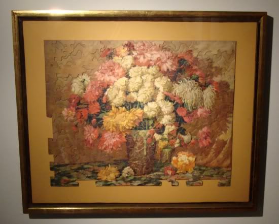
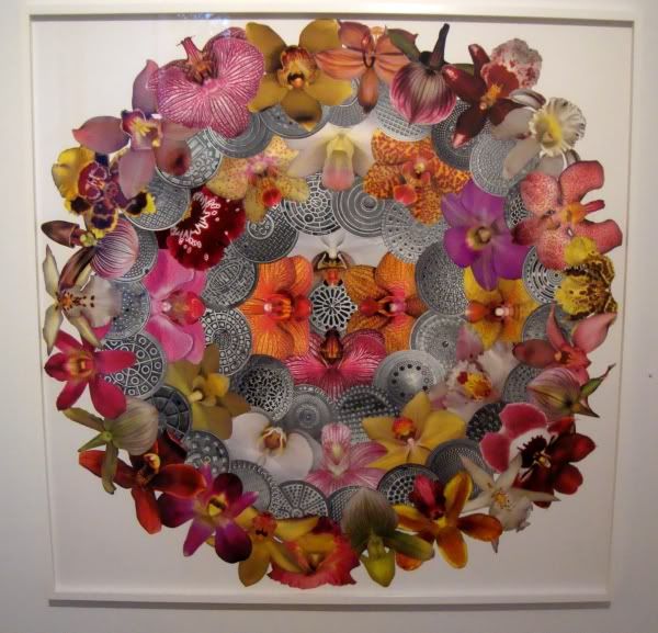
Al Souza is probably best known for creating dense collages out of picture puzzles. While there are lots of collages here, none of them are made from puzzles, and generally they feel less visually choatic than the puzzle collages. He uses circular forms in several of them, including Man Holes.

Al Souza
Al Souza, Man Holes, cut paper, 2009

This collage is arranged in six concentric circles. The circles alternate between black and white images of manhole covers and color images of orchids, with a single manhole cover at the center. I loved this utterly unexplicit but nonetheless rather smutty picture. Of course, one is supposed to think of vaginas when one looks at the orchids. Now to consider a vagina to be a "man hole" is pretty damn crass, but what can I say--it's right there on paper. (I wonder, though, if I would have made the association without the title.)
Man Holes is both beautiful and juvenile, which seems to be a tension that Souza likes to play with.

Al Souza
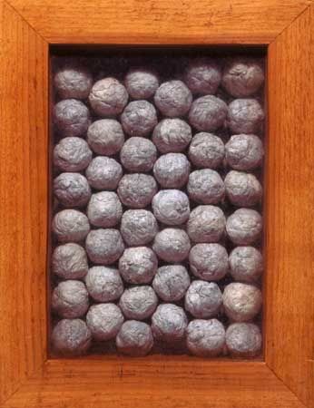
Al Souza, 46 Big Spitballs, paper in wood and glass box, 2005

This is an older piece and has even been displayed at Moody Gallery before. But even with a relative bargain price (at $3000, it's the cheapest piece in the show), it may be a hard sell. I'm guessing spitballs are a little too cutting edge for the Houston collecting community. I like it--I think it looks great and I am happy to be slightly creeped out by it.

But don't get me wrong. I picked out two works which have a kind of 11-year-old boy taboo quality to them, but the whole show is not like that. There is a lot of humor in the works, but also elegance and beauty.