Showing posts with label Ellsworth Kelly. Show all posts

Saturday, March 10, 2012

Kyle Young at Art Palace

by Robert Boyd

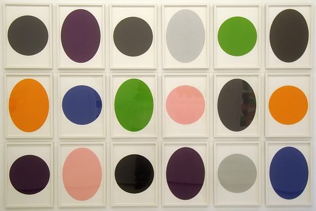
Infinite Reduction Series
Kyle Young, Infinite Reduction Series, monotypes, 72" x 110", 2012

Infinite Reduction Series by Kyle Young at Art Palace is the key to all the other pieces in the show. The work, both monotypes and paintings, involve cutting up and reassembling circles and ellipses and collaging the results together.
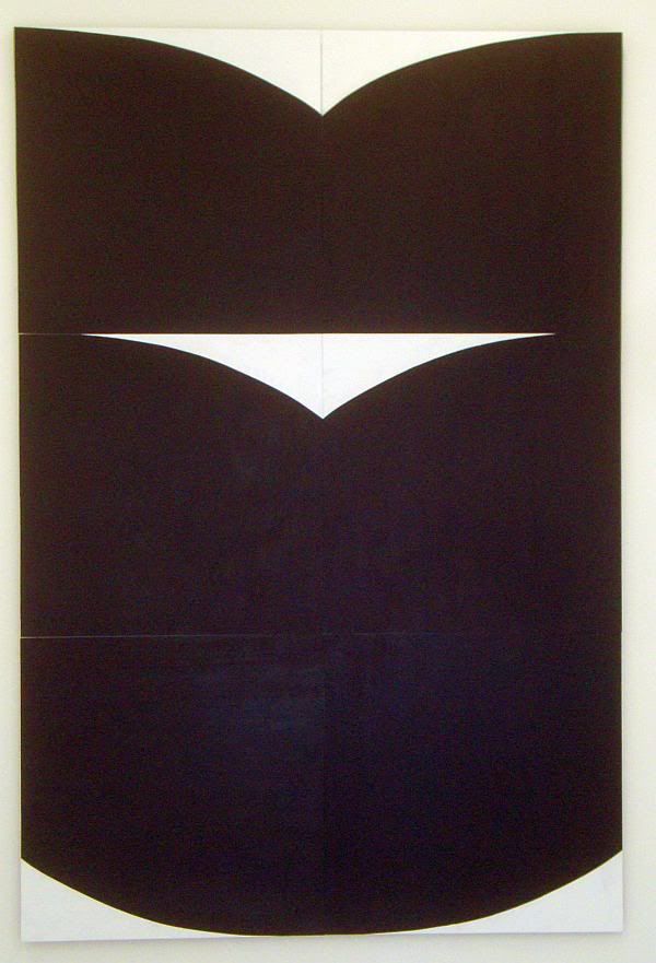
Chalice Reversed
Kyle Young, Chalice Reversed, acrylic on panels, 116" x 77", 2011
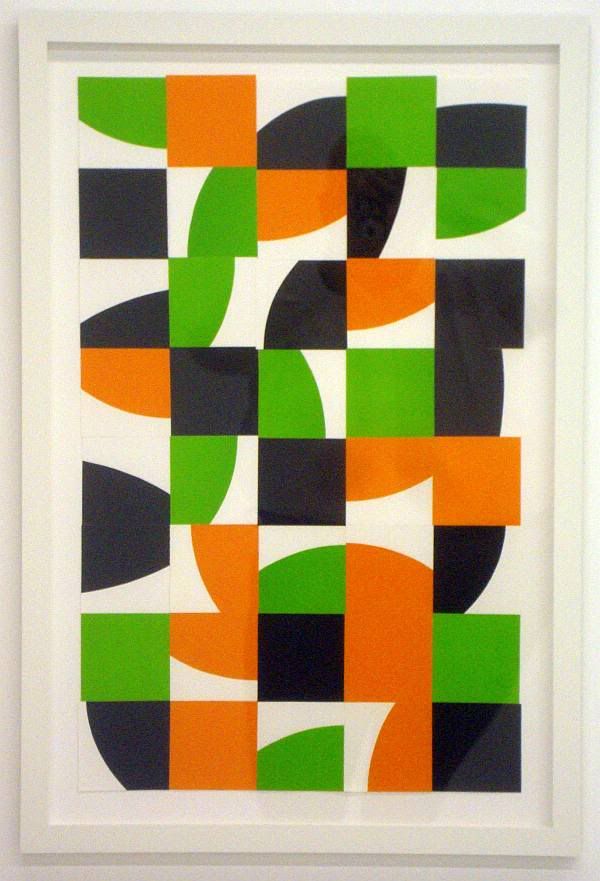
In Search of Human Contact
Kyle Young, In Search of Human Contact, monotype collage, 32" x 20", 2012
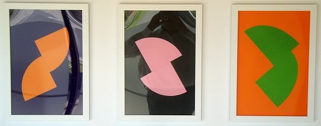
three Portraits
Kyle Young, from left to right, Portrait in Orange and Purple, Portrait in Pink and Gray, Portrait in Green and Orange, monotype collages, 21 1/2" x 14 1/2" each, 2012

My first reaction to these was that they reminded me of Ellsworth Kelly--bold geometric forms, simple color schemes (only two or three colors), very flat colors (not sign of brushstrokes in the paintings). But the way he assembles his pieces might also remind a viewer of Robert Mangold. What this says to me is that whatever else he is doing, Kyle Young is in a dialogue with early minimal painters. This dialogue is not oedipal. There is no obvious anxiety of influence. He seems to respect his forefathers and is willing to work in the vocabulary that they created.
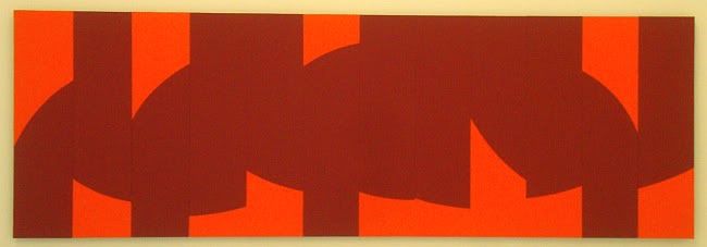
Dialogue -- Red & Orange
Kyle Young, Dialogue--Red & Orange, acrylic on panels, 40" x 121 1/4", 2012
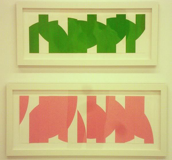
Dialogue-- Green and Thank You, Robert -- Pink
Kyle Young, top Dialogue--Green, monotype collage, 8" x 24", 2011; bottom Thank You, Robert--Pink, monotype collage, 8" x 28", 2011

In these pieces called Dialogues, I think the title refers to the dialogue between the two colors. The collage is arranged so that it almost looks like typography--like a sign. But it could also be the dialogue I mentioned above. And the piece Thank You, Robert--Green might refer to any Robert, but it could be Robert Mangold he's thanking, couldn't it?
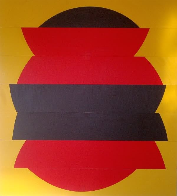
Fathers
Kyle Young, Fathers, acrylic on panels, 88" x 80", 2011
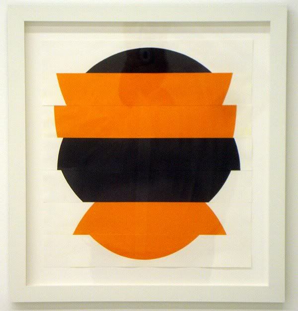
In Honor of Our Fathers II
Kyle Young, In Honor of Our Fathers II, monotype collage, 17 1/2" x 16", 2011

I don't mean to suggest that this exhibit is all about Young's relationship with his minimalist daddies, but with pieces like these, it's not a totally crazy conclusion. But the fathers in Fathers and In Honor of Our Fathers II could be a reference to the circles and ellipses that were sliced up and reassembled to create these collages. In fact, the fact that the word "fathers" is plural might refer to the fact that in each, two circles were sliced up, one black and one red (in the painting) or orange (in the monotype collage). But there are other possible fathers that Young could be referencing, including artistic forefathers.

The pieces are lovely to look at. They encourage a viewer to mentally unassemble them to figure out how Young took apart their source circles and ellipses. And the more art historical viewer might look at this show in relation to such "fathers" as Kelly and Mangold.

Share

Thursday, June 16, 2011

Myke Venable's Big Squares

by Robert Boyd

Myke Venable's art almost dares you to say something about it. It mainly just is. Describing any particular painting in this show is a trivial, unenlightening task.

Photobucket
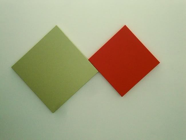
Myke Venable, MV 32 Sage/DD Orange (Dare Devil Orange), latex on canvas, 2011

Two square canvases, each hung at a 45 degree angle. the larger one is a pale yellow-green and the smaller one a bright orange. The larger is to the left of the smaller from the viewer's point of view, and the two touch each other ever-so-slightly. Once you've said all this, then what? And Venable doesn't give you anything in the titles. He's not like Barnett Newman, who would give his paintings titles like Achilles or Vir Heroicus Sublimus. Nope, Venable goes for just the facts, ma'am. Each painting is named after the color of paint used.

Photobucket
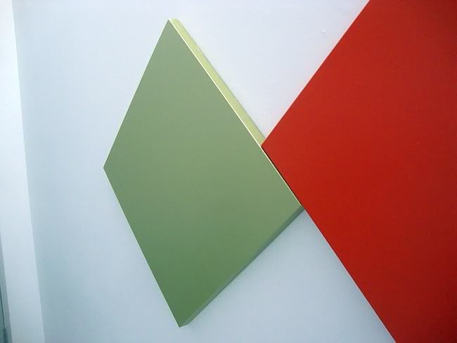
Myke Venable, MV 32 Sage/DD Orange (Dare Devil Orange), latex on canvas, 2011

These paintings are so minimal that it's reasonable to ask if they are paintings at all. They aren't framed and the colors extend over the edge of the canvas. They have a certain sculptural presence. And if one is an arch-formalist, then flatness and integrity of the picture plane are important indicators that you are in the presence of pure painting. These aren't really flat.

Photobucket
Myke Venable, MV 24 Orange, acrylic on canvas, 2011

If you go into the Gallery Sonja Roesch, it seems designed for "pure painting"--the interior is a big white neutral box. In many ways, it seems like the ideal setting to allow big modernist paintings to just be themselves--no distractions, no visual clutter.

Photobucket
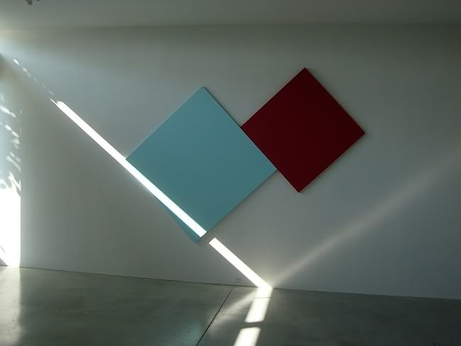
Myke Venable, MV 30 CadRed/Sky Blue, latex on canvas, 2011

It's a totally neutral space except for one thing--it has narrow clarestories on the east and west walls. So early in the morning and late in the afternoon (when the opening for this exhibit occurred), the sunlight will shoot like a laser through the windows into the space. The floor is so highly polished that it reflects the sunbeam back up. The effect of this dramatic light was to highlight the angles on Venable's wall-sized painting MV 30 CadRed/Sky Blue, which was hanging on the north wall of the gallery. So you have a painting that in a dramatic way is in dialogue with the light in the room.

This is a fundamental quality of minimalist paintings, whether Ellsworth Kelly or Agnes Martin or Venable. There is a kind of humility in these paintings, even when they are very large. The humility comes from knowing that they aren't really finished in the studio, but instead only becomes complete in situ--and this last step is not something the artist can fully control.

For example, Venable often uses fluorescent colors in his painting. If a fluorescent color is somewhere where sunlight (which contains ultraviolet light as part of its spectrum) hits it, it will have a kind of glow. But if it is an interior space that only receives artificial light, that glow will be absent. Venable doesn't control the final disposition of the painting--he doesn't know what shadows will be cast on it, what kind of light will be hitting it, etc. This is ironic. These works seem austere and hermetic, but really they depend on engagement with the world to achieve completion.

Photobucket
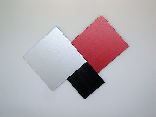
Myke Venable, MV 25 Silver/Scarlet Red/Black, acrylic on canvas, 2011

Photobucket
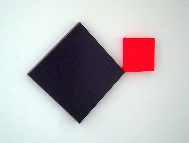
Myke Venable, MV 26 Purple/Fluorescent Pink, acrylic on canvas, 2011

(Author's note: I own two small Myke Venable paintings.)


Share

Thursday, November 26, 2009

Painting Below Zero by James Rosenquist

 Robert Boyd


Painting Below Zero by James Rosenquist

James Rosenquist was one of the early pop artists. He has an almost perfect pop biography--midwestern boy, learns the fine art of painting billboards, moves to New York and wows the swells with his paintings of jet fighters and spaghetti. His new autobiography doesn't challenge this capsule biography, but it enriches it a lot.

I think for people my age and younger, the weird thing about Rosenquist's story was that he was a billboard painter. This is a profession that doesn't exist anymore, and one could be forgiven for being surprised that it ever existed. The idea that it was cost-effective to hire an artist to paint your billboard seems amazing today. But apparently it was common at one time. Rosenquist got his start painting billboards on the road in the midwest, including many in Minneapolis. These required a combination of sign-painting skills (he had to paint large display fonts) and more-or-less realistic painting. But beyond that was the skill of painting big--not being able to see the whole while you are painting, yet coming out of it with an intelligible image. Obviously this is a skill that mural painters have always had to master. On top of all this, he had to learn to paint it quick.

He had artistic ambitions beyond billboard painting, so he moved to New York to study at the Art Students League. He continued to paint in New York, joining a billboard painter's union, painting bottles of booze on the sides of buildings all over Brooklyn. He made a good living doing this, and in Painting Below Zero, he never hints that he might have thought of this as a job without a future (as it most certainly was). His desire to leave billboard painting behind had everything to do with his artistic ambitions and nothing to do with the fact that billboard painting was about to go the way of the dodo.

His fine art painting in this period (the 50s) was abstract. He worshiped de Kooning and Franz Kline, and for serious contemporary artists of the time, that was what was in the air. But he also new that he wanted to make his own mark in his own style. But he started meeting a younger group of painters who in time would revolt against abstract expressionism. It started with Ray Johnson (who really seems like he was a "connector" in that world), and got to be friends with people like Agnes Martin, Ellsworth Kelly, and others. When he was looking for loft space to paint, he met Jasper Johns and Robert Rauschenberg. It was their work that showed Rosenquist a way out of Abstract Expressionism.

The interesting thing about Rosenquist was that he used his billboard experience extensively in his art. I'm not just talking about the large scale of his paintings and the "creamy" painting surface--although those are important. He wanted viewers to overwhelmed by the images, and to see them in fragmentary ways, like he did when he painted a billboard. Hence the overlapping, truncated images in his work. This is one reason why reproductions of his work are so inadequate--they make all the fragments instantly visable and comprehensible. A full-size Rosenquist painting is virtually impossible to see all at once, unless it's in a huge room. And that's intentional.

Ironically, he didn't even meet the two biggest pop artists, Warhol and Lichtenstein, until 1964. This reuse of banal imagery was just in the air. Rosenquist doesn't even quite see it that way--he always had an emotional connection with what he was painting. Obviously there was irony in his art, but that wasn't the main point. He loved the objects he painted (or hated them when he got around to painting F-111).

What I like about this kind of book is the description of the social scene in which the artist operated. How did people meet; how does a kid from Minneapolis find other artists? How do they entertain themselves (lots of drinking, apparently). Rosenquist is quite amusing in talking about the bars they hung in. It was OK to hang at the Cedar Tavern or Max's Kansas City, but if a bunch of painters showed up at Elaine's, they might end up getting booted. The centrality of drinking is kind of intense. I think it damaged a lot of creative people at that time--de Kooning certainly. And for an artist to "network" with his peers, he had to drink.

After Rosenquist moves away from New York, his life is a lot less interesting and more stable. He still has his friends (he was very close to Rauschenberg his whole life), but now he had a family and property and success. He still was doing big bold work. Now he is one of the survivors of his generation, and his memories are welcome. Painting Below Zero was a thoroughly entertaining book.