Showing posts with label Myke Venable. Show all posts

Wednesday, December 21, 2011

Robert Boyd's 2011 Honorable Mention

All of the shows listed below were excellent, and on a different day, I might have placed any one of them in the top 10.

Lisa Gralnick: The Gold Standard at Center for Contemporary Craft. This was a very interesting show that included sculptures made of plaster and gold--where the percent of gold was determined by how much gold it would take to buy the thing depicted.


Stephanie Toppin's couch in Jim Peterson, Jr.'s garage

Stephanie Toppin's couch. Of all the things associated with the Art Car Parade this year, this is my favorite. After the parade, Toppin's couch was lost for several months until I happened to find it at Jim Peterson, Jr.'s house. Mystery solved!


The Time Travel Research Institute Presents by Patrick Turk at Art League. Instead of his usual dense psychedelic collages, Turk made these pieces have a sense of physical space and even added motion to some. Mindblowing.

Jim Nolan, Today is Tomorrow at Art Palace. Jim Nolan's art is what happens when minimalism goes downscale. Made often from items purchased at 99¢ Only stores, it is the perfect art for our belt-tightening times.
Photobucket
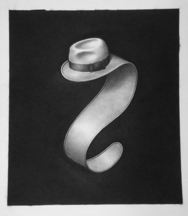
Jim Woodring, Lazy Robinson, charcoal on paper

Jim Woodring and Marc Bell, Walpurgis Afternoon at Lawndale. I'm picking a show I curated, which is a bit unfair. What can I say? I thought it was great--two cartooonists/painters whose work I've admired for decades, and between whom I felt there was a connection. It seemed natural.


Raul Gonzalez, More Work Ahead, ink and spray paint on floor laminate, 2010

Raul Gonzalez at the Caroline Collective. Raul Gonzalez is a real street artist--and by that, he paints Houston's streets and uses as motifs street signs. Indeed, the colors of street signs pervade his work. He has created the vision of Houston that seems most true.
Photobucket
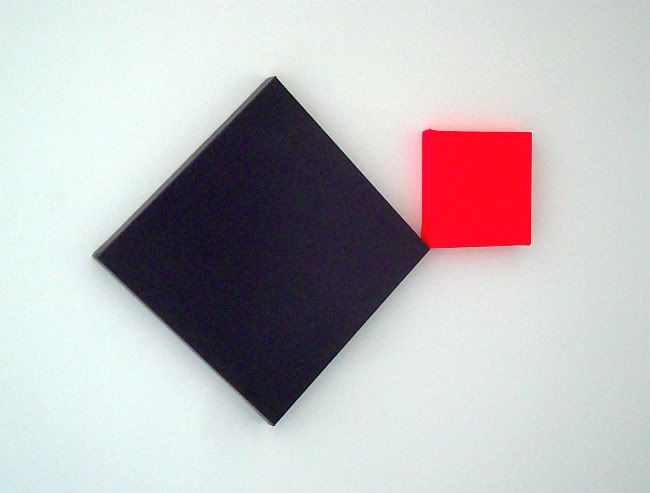
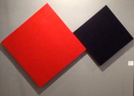
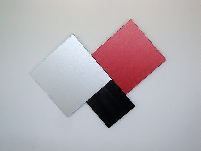
Myke Venable, MV 25 Silver/Scarlet Red/Black, acrylic on canvas, 2011

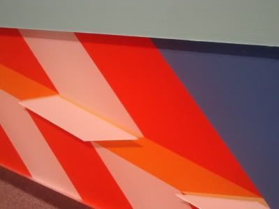
Myke Venable at Sonia Roesch. The only way these paintings could be more minimal would be to turn them from two or three color paintings to one-color paintings. As a consequence of their minimal content, they lack autonomy--they collaborate, in a sense, with the room they're in. And that's what I like about them.

Southern/Pacific at Lawndale. Really lovely show filled with interesting pieces curated by recent transplant to Houston, Paul Middendorf. This was road-trip art--he picked up art in Portland, Oregon (where he used to live) and Marfa and finally Houston. It was a fine way to introduce Houston art viewers to some interesting out-of-towners.

 
Hagit Barkai, Aisen and Tyson, Oil on canvas, 2010

Hagit Barkai, Resistance at Nau-Haus. Hagit Barkai's paintings linger in my mind. It's not the extreme one, the ones showing highly distressed people--although those are good. It's piece like Aisen and Tyson and Home More or Less that stick with me.


Dennis Harper and Friends, iPageant at the Joanna. This show was a giant performance extravaganza. Dennis Harper constructed some of his patented oversized paper sculptures--this time of a 60s era television soundstage. It was within this construct, aided by multiple closed-circuit televisions, that Harper staged his variety show. I only hope it wasn't a one-time event.

Ward Sanders at Hooks Epstein. San Antonio artist Ward Sanders has had four shows at Hooks-Epstein, but for this one, he added a new element. In addition to his mysterious, lovingly-created boxes, he has a piece of text. It turns out his writing, at least in these short fragments, is excellent. The world of visual art could lose Sanders to the literary world.

Ibsen Espada, Reformulaciones at New Gallery. One of the original Fresh Paint artists, Espada has apparently laid low for a while. This show was a powerful (and hopefully triumphal) return. Muscular abstractions.

Photobucket
Sharon Engelstein's Green Golly got its own room at Pan Y Circos

Pan y Circos at PG Contemporary. Curated by yours truly. We had a huge space for this group show, and it turned out great. I am especially proud to have brought El Dinersito by Jorge Galvan to the attention of Houston's art crowd.

Robert Pruitt, You Are Your Own Twin at Hooks Epstein. Every time I've seen Pruitt's portraits, I've loved them. There seems to be a rising generation of artists and intellectuals who are heavily invested in African American identity and history and simultaneously into science fiction and gaming and other nerdy pursuits. For example, the writer Ta-Nehisi Coates. And Robert Pruitt.

Kim Dingle at Front Gallery. The Front Gallery is Houston's newest gallery, and its smallest. The inaugural show, full of oil-sketches of hyper-active girls, was a fantastic beginning.

Lisa Qualls, absence at Koelsch. Here is a highly conceptual show (portraits of an ancestor who left behind no visual image) that is simultaneously highly personal. I found it quite moving.

Share

Thursday, June 16, 2011

Myke Venable's Big Squares

by Robert Boyd

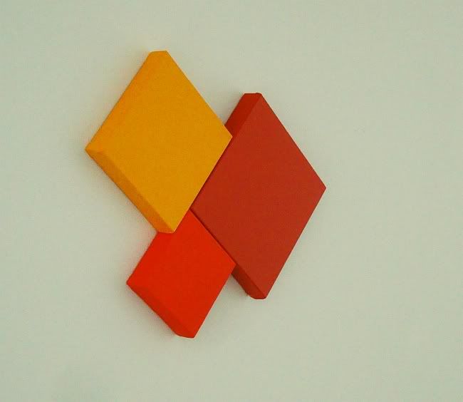
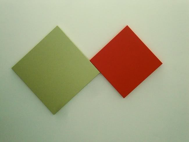
Myke Venable's art almost dares you to say something about it. It mainly just is. Describing any particular painting in this show is a trivial, unenlightening task.

Photobucket
Myke Venable, MV 32 Sage/DD Orange (Dare Devil Orange), latex on canvas, 2011

Two square canvases, each hung at a 45 degree angle. the larger one is a pale yellow-green and the smaller one a bright orange. The larger is to the left of the smaller from the viewer's point of view, and the two touch each other ever-so-slightly. Once you've said all this, then what? And Venable doesn't give you anything in the titles. He's not like Barnett Newman, who would give his paintings titles like Achilles or Vir Heroicus Sublimus. Nope, Venable goes for just the facts, ma'am. Each painting is named after the color of paint used.

Photobucket
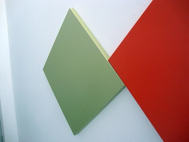
Myke Venable, MV 32 Sage/DD Orange (Dare Devil Orange), latex on canvas, 2011

These paintings are so minimal that it's reasonable to ask if they are paintings at all. They aren't framed and the colors extend over the edge of the canvas. They have a certain sculptural presence. And if one is an arch-formalist, then flatness and integrity of the picture plane are important indicators that you are in the presence of pure painting. These aren't really flat.

Photobucket
Myke Venable, MV 24 Orange, acrylic on canvas, 2011

If you go into the Gallery Sonja Roesch, it seems designed for "pure painting"--the interior is a big white neutral box. In many ways, it seems like the ideal setting to allow big modernist paintings to just be themselves--no distractions, no visual clutter.

Photobucket
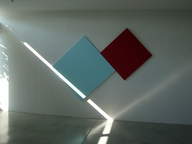
Myke Venable, MV 30 CadRed/Sky Blue, latex on canvas, 2011

It's a totally neutral space except for one thing--it has narrow clarestories on the east and west walls. So early in the morning and late in the afternoon (when the opening for this exhibit occurred), the sunlight will shoot like a laser through the windows into the space. The floor is so highly polished that it reflects the sunbeam back up. The effect of this dramatic light was to highlight the angles on Venable's wall-sized painting MV 30 CadRed/Sky Blue, which was hanging on the north wall of the gallery. So you have a painting that in a dramatic way is in dialogue with the light in the room.

This is a fundamental quality of minimalist paintings, whether Ellsworth Kelly or Agnes Martin or Venable. There is a kind of humility in these paintings, even when they are very large. The humility comes from knowing that they aren't really finished in the studio, but instead only becomes complete in situ--and this last step is not something the artist can fully control.

For example, Venable often uses fluorescent colors in his painting. If a fluorescent color is somewhere where sunlight (which contains ultraviolet light as part of its spectrum) hits it, it will have a kind of glow. But if it is an interior space that only receives artificial light, that glow will be absent. Venable doesn't control the final disposition of the painting--he doesn't know what shadows will be cast on it, what kind of light will be hitting it, etc. This is ironic. These works seem austere and hermetic, but really they depend on engagement with the world to achieve completion.

Photobucket
Myke Venable, MV 25 Silver/Scarlet Red/Black, acrylic on canvas, 2011

Photobucket
Myke Venable, MV 26 Purple/Fluorescent Pink, acrylic on canvas, 2011

(Author's note: I own two small Myke Venable paintings.)


Share

Friday, November 5, 2010

Houston Abstractionists Outside the Loop

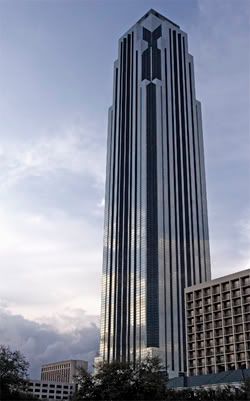
It's convenient that almost all the visual art on public display is inside the Loop, indeed in six specific inner loop neighborhoods--the Museum District, Montrose, the West End, the Heights, Downtown and (increasingly) the East End (with a few outposts in the 3rd Ward and the 5th Ward). Convenient for people like me who go to see multiple art shows every weekend. But it's also unfortunate that the vast majority of the Houston area, that part outside the Loop, is pretty much an art-free zone. So it was surprising and kind of exciting that The New Black, Contemporary Concepts in Color and Abstraction was opening in the lobby of Williams Tower (formerly Transco Tower), the tallest building in the Galleria area. He was a show of four abstract painters doing uncompromising work. And it was not in the "safe" environs of one of the Colquitt galleries or Lawndale or Box 13. I'm always intrigued by art like this:

Myke Venable
Myke Venable, Venetian Blue/Cobalt Blue/Fluorescent Yellow, acrylic on canvas, 2010

In an environment like this:

Philip Johnson
Philip Johnson and John Burgee, Williams Tower, 1983

Its many tenants include energy companies, insurance companies, real estate developers (including Hines, which developed this building and many of the most architecturally memorable buildings in Houston), law firms, financial service firms, HR firms, and banks. At least half of them come in through this lobby every morning. So this show was seen by a lot of white collar workers who probably have no idea what to make of it. And they may, therefore, be hostile to it.

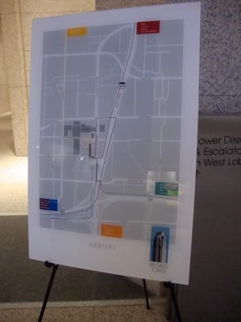
I spoke about this to Myke Venable at the opening. He told how it had been difficult to explain to his family what he was doing, and he mentioned it to an art professor who reminded Myke that he had been studying art for several years, and that his family had never studied art. It's simply a fact to appreciate modern art or contemporary art is something that requires long exposure or education. That said, because of influential modernist designers like Paul Rand, we see geometric abstractions in the form of maps and info-graphics every day. For example, in the lobby of Williams Tower--right in amongst the art--were a pair of signs like this.

Williams Tower Sign

I wonder if any of the office workers made a connection.

Anyway, the show is really good. It was an unusual collection of artists--three geometric abstractionists and one more gestural, painterly abstractionist, Veneman. They could also perhaps be divided into artists who were influenced by natural forms (Guidry and maybe Veneman) and one whose work recalled architecture (Leach) and one whose work was so completely abstract that it seemed divorced from the world of things we see.

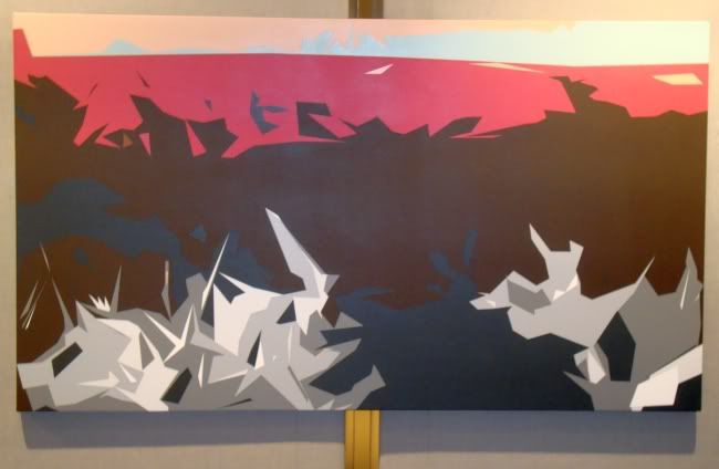
Michael Guidry seems to be working from actual landscapes, which he abstracts to the simplest possible groupings of colors.

Michael Guidry
Michael Guidry, Your Messed Up Life Still Thrills Me, latex on canvas over wood panel, 2010

Please excuse my bad photographic skills--this is the only Guidry I shot that was in focus. And unfortunately, it is the least recognizable as a landscape (except for its basically horizontal composition). The way he deals with landscape reminds me of early, primitive three-dimensional renderings of landscapes on computer. By simplifying the forms down to a minimum of colors and complex polygon shapes, computers could process the data it took to depict a viewpoint moving through space in a landscape. Because this was just a moment in the history of computer graphics, it gives Guidry's landscapes a curiously nostalgic look. It's as if he is saying that when computer artists learned to create super-realistic depictions of places, as in Avatar, they lost something. I think so, too.

Jonathan Leach takes a more architectural approach to his straight-edge paintings. I reviewed his show at Sonya Roesch last year, and some of those pieces are also shown here. But there are a lot of newer pieces as well. Leach's work is characterize by bright, fluorescent colors (hard to photograph adequately, alas) and extremely hard-edges. The paint is applied with a minimum of gesture, but is not perfectly flat. You can still see the parallel lines caused by the brush, or the dots of raised canvas. The exception to this is when Leach paints on the opposite side of clear plexiglass (a technique that Jim Nutt also used in his early paintings), which gives a supersmooth, somewhat inhuman look to the work. He plays with this effect in Move Me, where he paints on both the back and the front of a sheet of plexiglass.

Jonathan Leach
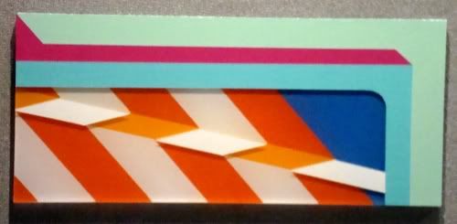
Jonathan Leach, Move Me, acrylic on plexiglass, 2010

The stripes painted on the side facing the viewer, as precise as they are, still show--barely--the hand of the maker. The ones painted on the side facing away have that inhumanly smooth quality. And because the plexi has thickness, the outside layer of paint floats above (and casts a shadow on) the inside layer.

Jonathan Leach
Jonathan Leach, Move Me detail, acrylic on plexiglass, 2010

Leach also plays with multiple canvases put together, as in As Predictions Suggest.

Jonathan Leach
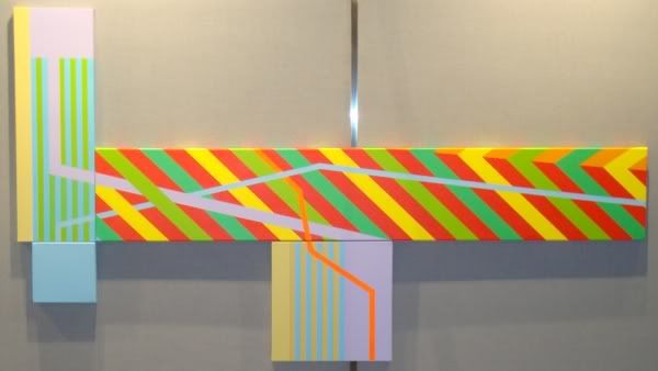
Jonathan Leach, As Predictions Suggest, acrylic on canvas, 2010

Works like this inevitably remind me of Peter Halley. Like Halley, Leach is building a composition out of specific formal elements. The work therefore recalls earlier geometric abstractionists and even minimalists. But it also seems to deliberately recall things or signs (literally) that we encounter in the world around us. As Predictions Suggest has elements of warning signs (the diagonal stripes), maps, and infographics. Even the fluorescent colors are highly suggestive of warning signage. This piece seems to be saying, danger ahead.

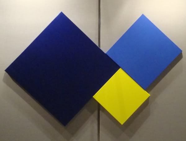
I would never have a reaction like that to a piece by Myke Venable. By using diamond-shaped canvases, he does recall the shape of certain traffic signs, but I don't think this is intentional. I think Venable's intentions are purely formal. At least, that's the reaction I have to his work when I see it.

Myke Venebale
Myke Venable, Cadmium Red/Violet, water-based enamel and acrylic on canvas, 2009

There are two ways to look at this art. One is to think in metaphysical terms, staring at the colors and thinking about the nature of color and the effect of one color next to another. And perhaps contemplate the cosmos as the same time. In short, view the paintings in a way similar to how Kazimir Malevich and Yves Klein. I respect that, but it's not a road I can follow as a viewer. The other way to approach these works is to think of them as a challenge the artist set for himself. Give yourself constraints--extremely limiting constraints--and try within these constraints to create a work that looks beautiful, that looks right. When I heard Robert Irwin speak at Rice about his early minimal paintings, this was how he did it. My old teacher, Stella Sullivan, worked this way on her symmetric geometric abstractions (which can be seen right now at William Reaves Fine Art).

However Venable creates the work, the result is appealing. (That's why I bought his piece at the Lawndale retablo show.)

Leach, Guidry, and Venable each work with flat colors, minimizing the visible hand of the artist. In that regard, Katherine Veneman is the odd artist out. Her work is gestural and painterly, and mark-making is clearly something important to her. Her work comes more directly out of the American abstract tradition.

Katherine Veneman
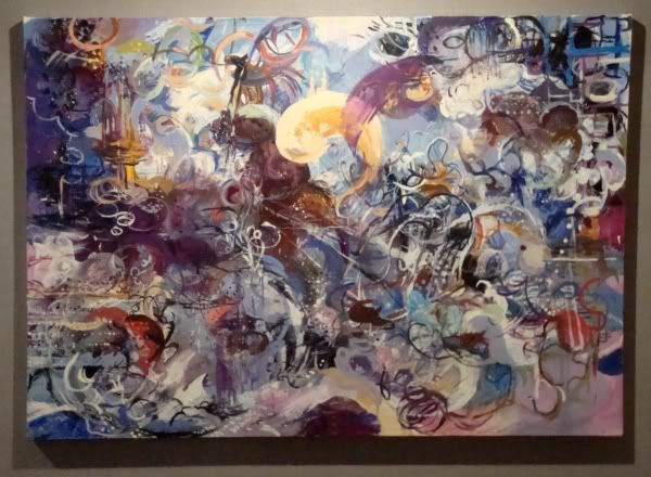
Katherine Veneman, Pause, oil and oilstick on canvas, 2007

Even her use of an oilstick to draw lines on the canvas recalls pre-drip Jackson Pollock. But her work otherwise doesn't resemble his at all. The swirling curliques here, the complex overlapping calligraphic arabesques, actually made me think of the work of Lari Pittman when I first looked at this piece. Veneman's work is far more spontaneous and gestural, but the density and curvilinear marks are similar.

Katherine Veneman
Katherine Veneman, Charting the Territory, oil, oilstick on canvas, 2002

Charting the Territory, on the other hand, made me think of Roberto Matta. And maybe that is the origin of her work--those late abstract surrealist works by people outside the main surrealist circle, people like Matta, Lam, and the American artists who later became abstract expressionists. This is a stream of abstraction that is always in danger of veering into kitsch--but I think Veneman avoids this pitfall with her beautiful canvases.

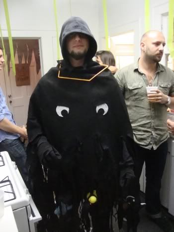
One final image for you, only tangentially related to this show. Here's Jonathan Leach dressed up as the BP oil spill.

Jonathan Leach

Sunday, October 24, 2010

Lawndale's Dia De Los Muertos Show

Every year for the past 23, Lawndale has had a show of "retablos" made by local artists. The artists pick up an 8" x 10" piece of tin from Lawndale and can do with it pretty much anything they want. I don't think the artists are even required to use the tin, but it does provide a limit to the size of the work. Two hundred and forty-five retablos were made, many by well-known local artists, but most by artists that are, as far as I could tell, "Sunday painters."

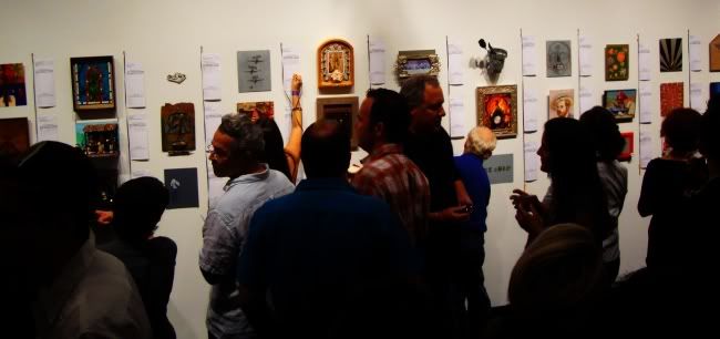
This show is a big fund-raiser for Lawndale. Funds are raised two ways. First, the works are auctioned off on opening night, and the artist can agree to give Lawndale some part of what he gets for selling her work. (Or the artist can take all of it. Or give Lawndale all of it.) Second, to attend you have to pay a fairly pricey entry fee. So this is sort of Lawndale's "gala." Like Box 13, the way they raise money is through the sale of a bunch of small artworks. In this case, it was a silent auction. Each piece had a slip of paper next to it with the title, description, artist, and minimum bid. People wrote their bids on the slip until 8:45 pm, when the auction was officially over.

Lawndale

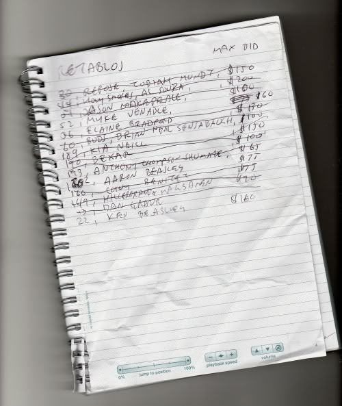
In about the middle of this picture, you can see a woman writing her bid. Now if you wanted to, you could see all the pieces in advance--Lawndale posted them on Flickr. That's what I did. Like the old comics nerd that I am, I made a "want list" before I went to the show.

Lawndale

The ones that were crossed out were ones where I was outbid. I expected that, so I'm not disappointed. Some of the names on this list are among Houston's best known artists. I would have loved to have gotten an Al Souza, but it quickly got up to $400 (and maybe more--I stopped looking after a while). One guy, a collector who signed his bids "Haynes," was constantly outbidding me--he and I had similar tastes apparently.

In the end, I won three pieces. I didn't take pictures of them, but you can see them on Flickr. Weirdly enough (and quite by accident), two of the pieces I won are by brothers, Kenneth James Beasley and Aaron Beasley. Kenneth James Beasley's piece is called Fallen Painter. Aaron Beasley's piece is a parody of Damien Hirst, called The Mental Impossibility of Life in the Mind of Something Dead. It looks like it might be a mess to keep because it contains a real dead shark in a jar. I'll let you know if it starts stinking. The third piece is by Myke Venable and it is called Recycled Retablo. Venable will be in a group show called The New Black: Contemporary Concepts in Color and Abstraction (along with Jonathan Leach, Mike Guidry and Katherine Veneman) that opens October 28, 2010, at Williams Tower. If you are in the Galleria area, check it out.

Saturday, July 24, 2010

The Big Show at Lawndale, part 2

(Continued from Part 1)

The ubiquitous Emily Sloan plays a little game with the whole format of the show. Her Kenmore piece is, in itself, a curatorial act. It's as if she is staking a claim for curation as artistic act. And she is playing on the tradition of tiny art spaces. (Think of Sharon Engelstein's Gallery One Three Seven or most famously, Duchamp's Box in a Valise.) In presenting the refrigerator as an art space, she "smuggles" in all the artworks on it and in it.


Valerie Powell, Outdoor Sculpture Garden, plastic and magnets, 2010 (?)

So Valerie Powell's magnets, which are similar to other work she has done, become the "outdoor sculpture garden" for this lilliputian art space. Inside, you have things like this tiny minimalist sculpture made of butter.


Loli Fernandez-A, Homage to Judd, butter, 2010

(Its geometric regularity recalls Judd, but its material recalls Beuys.)

There were a few abstract paintings I liked. I mentioned Joseph Cohen, or course. I also enjoyed these two very different pieces.


Myke Venable, Violet/Rose/Silver, acrylic on convas, 2009


John Tapper, Sure, acrylic latex paint, ink and paper on canvas, 2009

The angled geometries of Myke Venable's piece  appeal to me like a Robert Mangold painting, and I like the Philip Guston-like mark-making in Tapper's.

I'm going to close with a few disparate, unrelated pieces that I like from the show. There is not story that can be told here--and that is essentially true for the exhibit as a whole. Themes, tendencies, stories that emerge (naked ladies!) are countered or undermined by other tendencies (abstractions, feminist art). That's what you can expect from The Big Show. The work offered to the curator doesn't allow him to tell a story (beyond a story of plurality or chaos), even if he had any inclination to do so.


Hayden Fosdick, Sorrow and Despair Grip the Moon, collage, 2010

I bought a piece of Fosdick's from a show at Gallery 1724 earlier this year. His collages are simple and clever. This one really exemplifies "simple" and "clever"--but I want to also call attention to the excellent design that looks almost like early Russian avant garde design.


Joel Hernandez, Carmelita, archival inkjet print, 2008

Joel Hernandez had two great photographic portraits in the show. His subjects are shown in their own environments (I assume) and really come through as real people with constructed identities. The photos play in the fuzzy space between authenticity and artifice.


Anthony Day, Total Life Saver, floats and airbrush, 2010


Anthony Day, Total Life Saver, floats and airbrush (from above), 2010

This last piece looks like the classic "shit, the deadline's tomorrow and I haven't even started!" piece. (I did a few of those as an art student.) Still, sitting on its clean white plinth, it looks really good. And that's all ya need.(I have to say I like this better than his styrofoam pieces.)